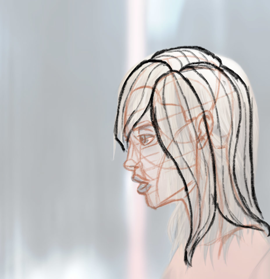
To add to @echo_jk great feedback, I think you could apply the same thing she mentionned to the hair. Finding the volumes in the hair can be a bit difficult so I like to start by simplifying them into simple shapes, almost like ribbons, so it's easier to get a sense of the volume. And then I gradually add details as I go along.
Speaking of the details, I find that keeping hair details more towards the extremeties of the hair (like the roots and the tips) and the places where hair get tighter together makes the hair look better and less busy than if you detail the hair everywhere. It might just be my personnal preference though.
With all of that said, here's a quick and rough example of how I approach this. I changed and simplify her haircut a bit just for this example, but you can obviously do much more detailed and intricate hair styles than this with the same approach.
I hope that helps and I feel like there's a lot of cool stuff you could do with this. So keep it up
Right on, thanks for the break down of the hair. I was evaluating on why I was getting that uncanny weird/odd look. Your note on where to prioritize strand details makes a ton of sense now. I actually just stumbled on Sycra's ribbon video regarding the larger forms of the hair and your point really drove that home.
I think breaking down the drawing with the planes and shapes like you did reveals the main issue going into this which was planning and having a solid drawing before rendering detail. I think looking back I only had a loomis head and threw colors on the canvas like a mongrel. Will definitely start to be more methodical to save myself headaches down the road...
Thanks for the awesome feedback, can't believe the amount of detail and time these replied are filled with. I'm starting over with the side profile as a continued exercise. here's a prelim super quick sketch that I want to throw out there to see if it something I could build upon further...
super sketchy sketch.
I think that you're doing good so far with this sketch. The only thing I'd maybe look out for is the shape of her skull which look squashed. It should look more like a circle than an oval.
Something a little bit like this
I think there's only a few other minor things I'd point out. The nostril should probably be moved back a little bit, away form the tip of the nose and the eyebrow is probably a bit too long for a profile view.
Other than that, I think that the features are well placed. I like the shape of the nose too. Overall she looks very graceful. I look forward to your progress
Here's another attempt at the side profile trying to take into consideration the great advice offered above @echo_jk and @cedricgo
I kept grayscale so I could focus more on the presiding issues and less on colors which would add another level of complexity. I also tried to focus on the masses/volumes of the hair vs outlines. I also decided not to get too caught up in the detail of hair and focus on readability of the greater forms. I think the most noticeable improvement was analyzing the planes of the nose. Additional feedback welcomed as always, really learned a lot with this exercise, mostly on trying to think of facial features less at outlines and more as volumes.
oh yes! this looks niiiice The nose looks definitely good! great improvement!
As for the feedback I would like you to take a look at the eye itself =)
You need to remember few things when you draw an eye
1) It is a ball that is located inside of a bone structure.
2) the eyeball is held on its place by eyelids.
3) since the eye has a round shape when you colour it treat it just as a round shape. It will have plenty of shadow on it because of the eyelids and sometimes even browbone can affect amount of shadow on the eyesocket. (usually in masculine faces)
eyelids from this angle will also have different perspective to it. it almost looks like this sign " > " and the eyeball wont be popping out of it so much so it turns to " |> " instead of " C>" also because of that the eye is located Behind the eyelids.
I hope that it somewhat makes any sense
Now i'm seeing it. It literally looks like my eyeball is dislocated from the socket. Instead, it should be "set" in the socket. This would probably lead to building up the brow ridge more appropriately, and get much more volume out of the eye area. I think because I've been drawing the eyeball and trying to build out from it, vs. drawing in the eye socket, brow ridge first. Yea, now looking at my eye, everything is popping out of the skull because i kept adding things (i.e. lids) on top of an eyeball, vs building the supporting structures first. makes sense the way you explained it, thank you.
Suggested Topics
Topic | Category | Replies | Views | Activity |
---|---|---|---|---|
Could I get a critique on my Dragoon? | Art Critique | 6 | 1.6k | Oct '19 |
3D Creature Anatomy | Art Critique | 0 | 1.9k | Jun '17 |
Night Life (personal project) | Art Critique | 4 | 1.7k | Aug '18 |
Critique wanted on Sci-fi military characters | Art Critique | 0 | 1.2k | Oct '17 |
How can I make these illustrations look more professional? | Art Critique | 3 | 1.3k | Jan '21 |