
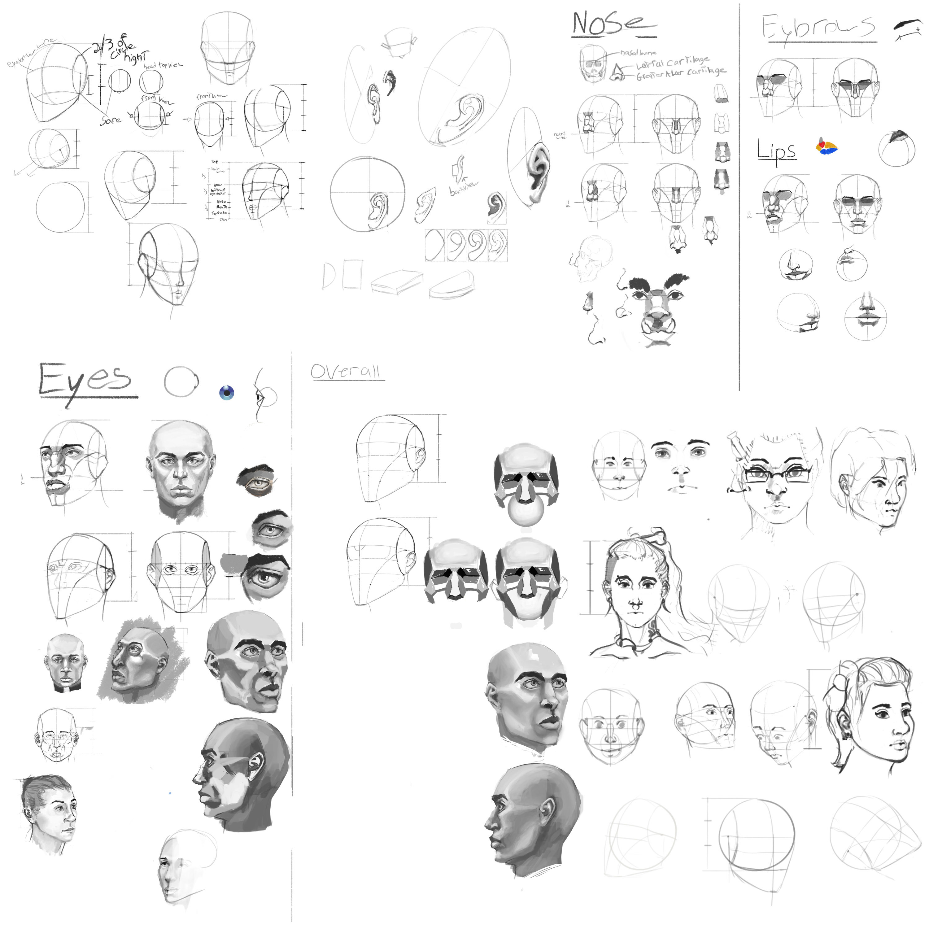
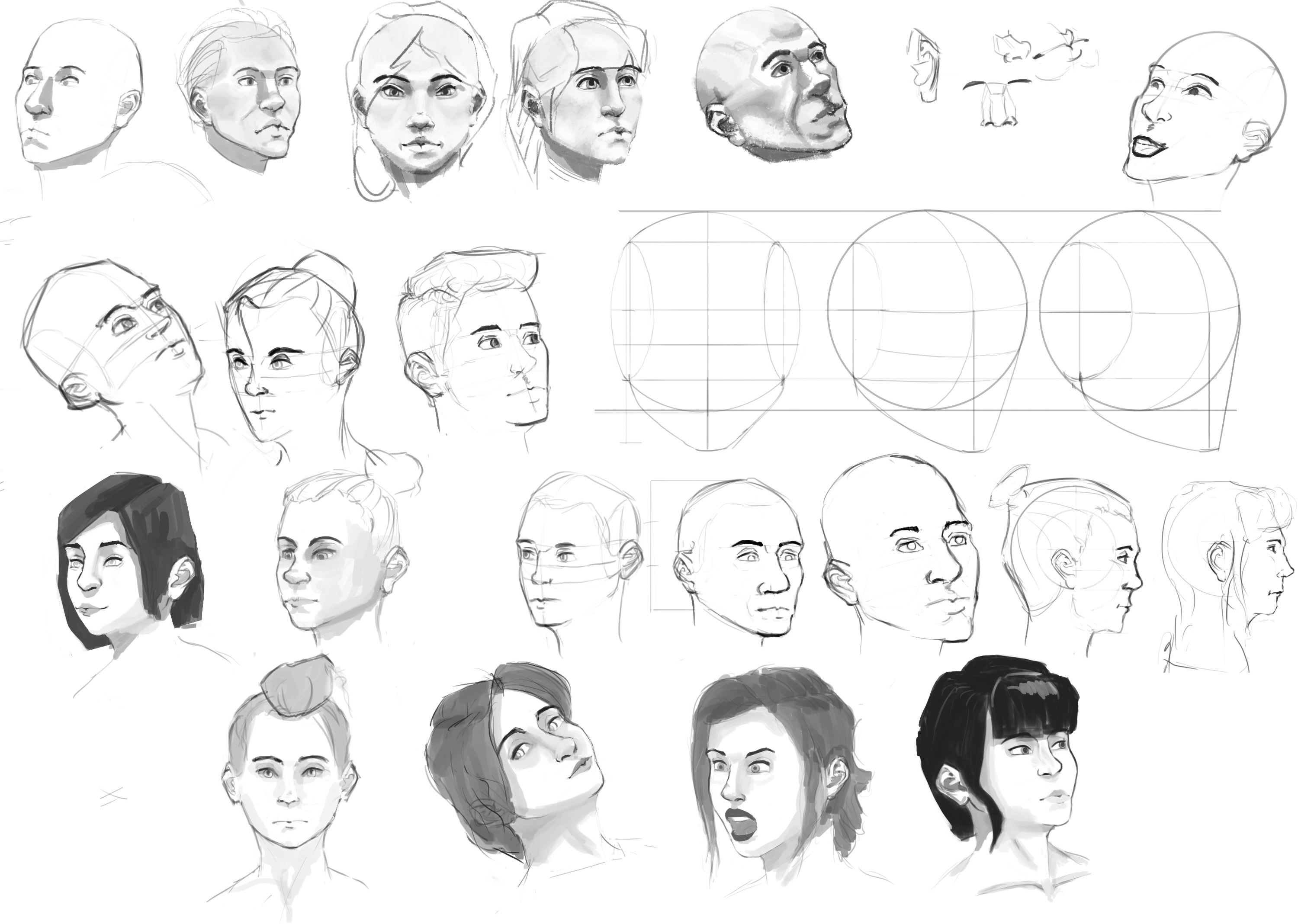
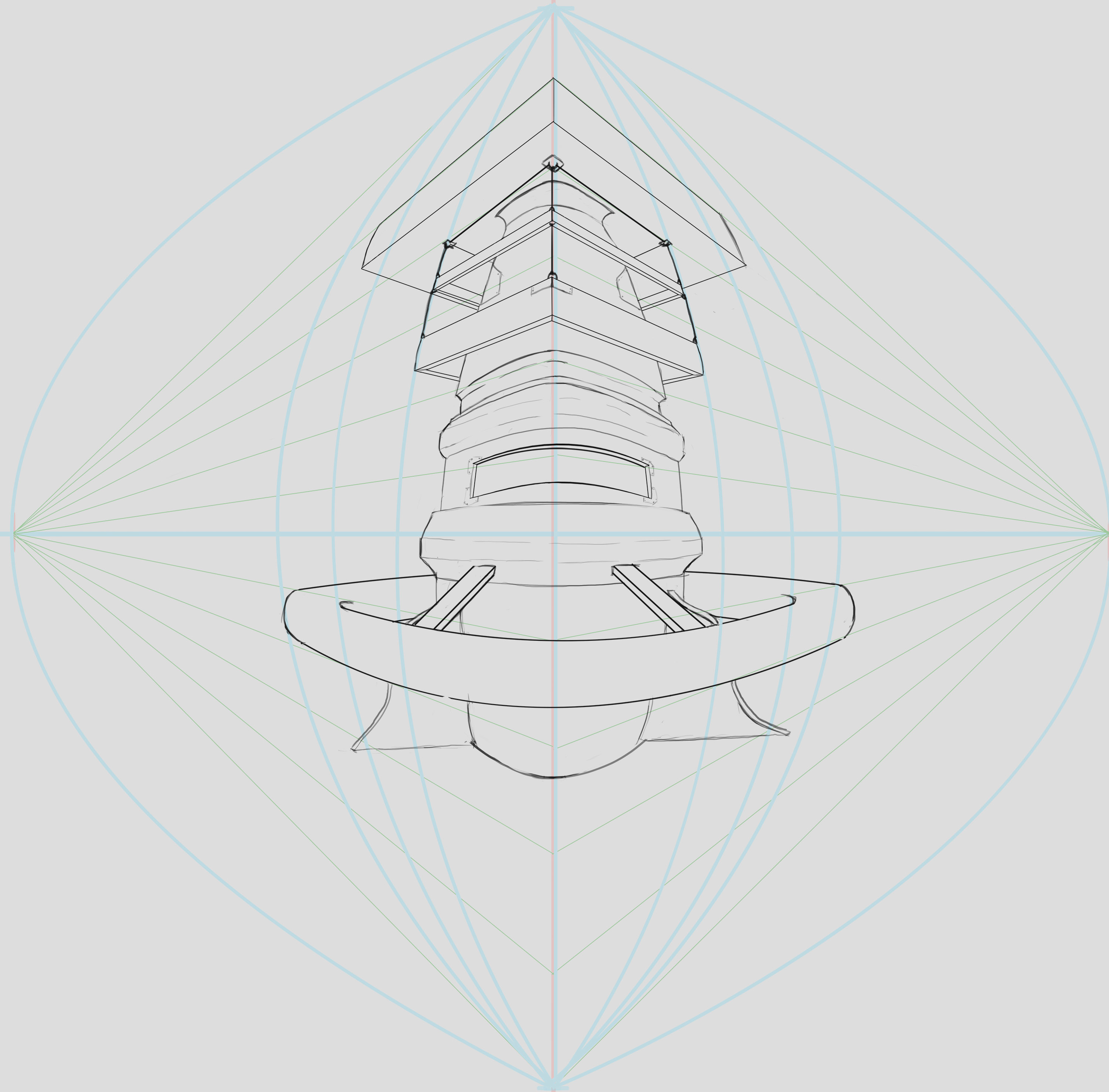
Great Stuff so far, keep up the volume it will help so much in remembering the Forms 


Your bridge idea, I really like your theme for this one. Mine was an exaggerated comic ish looking one. For your shadows overall I would suggest having them much darker. It's hard to see them, but hopefully you have your shadows in a separated layer and you can just adjust the levels and all that. Easy fix. But for gradients, I would say that for those supports above the door could go light shadow, then darker as you approach the inward corners of them then go a dark medium for the above part, if you get what I mean lol. I don't know the proper name of those supports. Other than that, I'm really liking your bridge. Out of curiosity, how long would you say you worked on this?
thank you for the advice i really appreciate it and i spent like a sad amount of time on it i have been sick so i spent 2 and a half days without much breaks on it
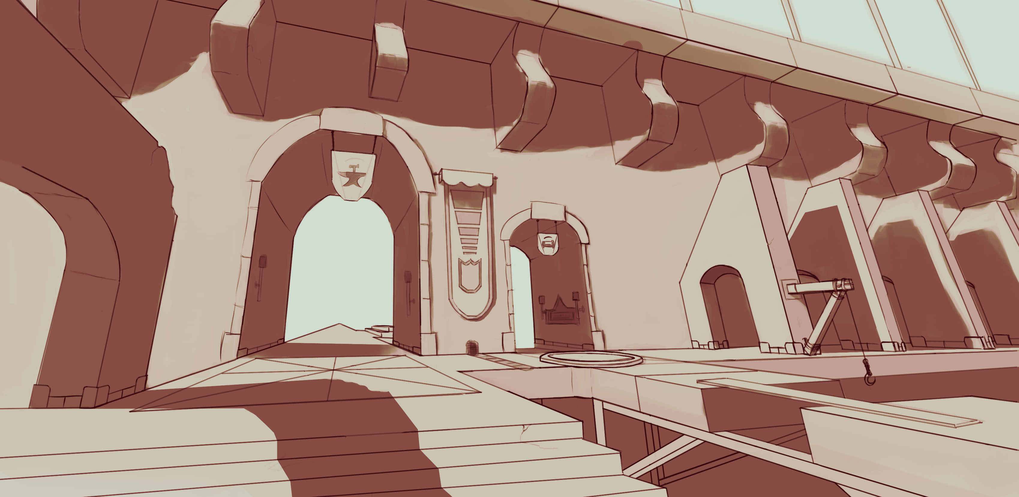
Thank you for the advice @ristarsonata it helped a lot, im still pretty clueless on shadow and gradient but i will keep at it.


Suggested Topics
| Topic | Category | Replies | Views | Activity |
|---|---|---|---|---|
| Colin (Profets) - Art School Journey | Art School | 19 | 2.4k | May '21 |
| Marco cprn - Art School Journey (Current - Term 5) | Art School | 295 | 22.8k | Jun '23 |
| Yaigrie / Nori - Art School Journey | Art School | 31 | 6.2k | May '23 |
| Jannis - Art journey | Art School | 16 | 547 | 15d |
| Term 1 - Photoshop for Digital Prod 1 | Art School | 0 | 203 | Jun '24 |