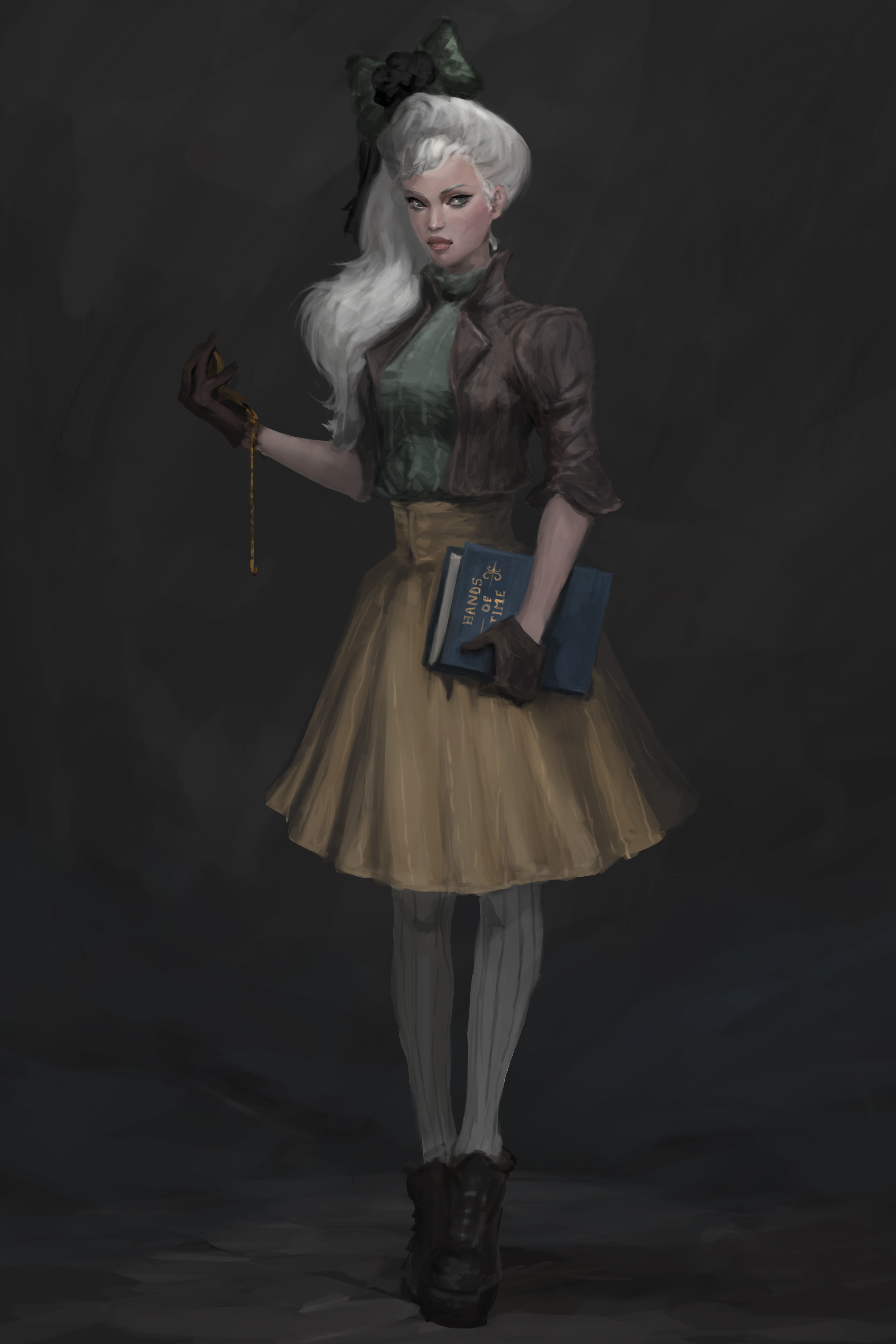
 Thank you! I finally cleaned that up. Meanwhile started 3 more ..I have a habit of taking too long to finish a piece, then I lose interest in it and just start something else. I found 8 from recently i started and abandoned, that are decent enough to not delete, but not finished. There’s also been a number of drawings I felt I “outgrew” - became better before I finished them, and it would be easier to start from scratch than fix them. Anyone else thinking that?in24.3k
 Lady Death Fanart Collectible: Part 6 Polypaint and base Hi, it’s time to share with you another part of the process to create this fanart piece. Polypaint As this is my first collectible fanart I didn’t have previous experience with polypaint so I tried my best and played a bit with it.I wanted to give a ghostly and eerie look to Lady Death, she is beautiful and deadly, but at the end of the day she is a woman that died and was reborn at hell as an avenging spirit, that’s why I gave her skin tone a bluish very cold tone.As you will see I gave myself some creative freedom to deviate from the traditional color scheme that this characater has in comics and illustrations.To add a bit of sensuality by painting some freckles on the face and the chest. The dark nature of this character was the perfect excuse to gave her a kind of goth make up, very dark shadows around the eyes, blue lips and fingernails. I know that the original character includes sexy red lips but I wanted this girl to have a sexy but at the same time creepy look, that’s why we can see some thin veins emanating from her eyes. The biggest chromatic change I did for this character is at the hair. Lady Death has a characteristic white weavy hair but in my fanart I decided to gave her a very saturated blue color.The reason behind this wasn’t only an aesthetic choice. I want that the face area strongly pulls the attention of the viewer so this area needed a stronger contrast. Another reason is that I want her to have a more modern look, as I mentioned before, I’m strongly attracted to women with goth/punk look. I gave myself half an hour or more to analyse the work of experienced sculptors that create collectibles and I discovered that the use of darker values on the skin is often applied to create a greater sense of volume and three-dimensionality. I found that areas with heavy ambient occlusion are the perfect places to paint with darker colors in order to increase the separation between different forms. Even though she has a bluish skin tone, I used a bit of warmer hues in areas that, in real life, tend to go towards red and pink, this is very obvious in the nose, cheeks, and knuckles. Thinking with a logical mind it’s completely absurd to have warmer tones on the body of a zombie like creature but I didn’t want to limit myself by using only blue tones, it looks boring and artificial. In real life these colors are created by blood vessels in areas where the skin is very thin. ** Scythe **for her weapon I applied a cool gray with some warmer variations, this color scheme is influenced by the work of H.R giger. Base I’d like to talk about the design for the base which, to be honest, I forgot to develop along with the character.My main idea with the base is to show that Lady Death inhabits a very sterile and arid land, at the end of the day she is at hell.You can see a that she walks over dirt and rocks, a sign that she’s surrounded by death and loneliness. As part of the landscape we can see some bones and skulls to reinforce the idea of lack of living creatures, yet we can see three hands that try to reach her legs.This hands represent that all creatures are subordinated to her power and seek an evil blessing with a simple touch of the princess of the damned.1- The hand with skin burns represents the souls of those who are newcomers to hell, tortured souls that suffer for the sins comitted on earth.2- The hand with greenish rotten skin and pustules is the reminder of the decay that has infected the souls of those who have been trapped and have forgotten their humanity3- Last but not least, the hand of a demon shows that even dark creatures and entities bow before her presence. The cherry on the top, at least in my vision, are the simese twins that emerge from the ground, this malevolent creatures remind us that in hell there’s only perversion and any trace of innocence is lost. Thanks for reading till this pointI’m really happy to be very close to finish this creative journey, last but not least it’s mandatory to talk about splitting the sculpture in several pieces to be printed, this will be my last entry before showing the final rendered images. See yaMay Zbrush be with youin1.4k

 memory 2min gartic phone, used ref 2m gartic, used ref for pose 2min gartic 2min gartic 2min gartic 2min gartic memory memory memory memory study memory memory memorymemory memory memory memory memory memory study memorystudy study stylized left memory, right study study memory memorymemory memory memory memorymemory memory, porportions r offmemory memorystudystudy memorymemorymemory memory memory memory memory memory memory memory, right leg is a bit broken The feeling of only getting 1 - 3 likes on a social media post will never not be discouraging. But nothing is discouraging enough to make me quit drawing. I think the strategy of drawing a lot of stuff and waiting a while to post is good though rather than posting it immediately and then feeling that sadness on the next set of drawingin

 studies studies juri study imagination, how I feel before a speech imagination imagination study something I drew for my presentation also drew this for my presentation, didn't fix the one hand being bigger than the other imagination + study study studies study study, I need to fix the face a bit based on screenshot from anime but in my style study. except for the eye study studies studies study. changed some things tho imagination imagination imagination study studies, except top right samurai based on anime screenshot wolverine studies, changed some of the poses a lil, not very good at all, but first time i drew the character ever. semi study studies study imagination imagination imagination , for first time ever i tried to draw over 3d model for middle pose, I dont like the result tbh, but it makes it much easier than coming up with it from memory.imagination, except right figurestudies imagination + studies, coming up with action poses r hard, these are not dynamic enough, I will redraw better ones in future. imagination , imagination imagination study, except for eye imagination imagination imagination doodles except for the two chrollos imagination storyboard thumbnail, idk if i ever shared this. my storyboards end up being a little detailed since i usually just draw in one layer.in22.1k

 Hello! My name is Vithor, I am from Brazil, studied Design at a local college worked as an illustrator for more than 10 years. I took a time off around 3 years ago and am trying to get back in my art shape and maybe become professional again. Here are some recent pictures: You can find timelapses for most of them on my instagram: www.instagram.com Vithor Albertim (@vithor_albertim) • Instagram photos and videos 123 Followers, 638 Following, 19 Posts - See Instagram photos and videos from Vithor Albertim (@vithor_albertim) Comments and critiques are always welcome.Cheers!in795

 Thank you @daceronine! If I remember I save in google cloud, I will have to stick a note to do it more often. Lamp is from life. Poses are from refs but I look at refs for a while and then try to do it myself and look it up if needed. Outfits and rest is from imagination Something went wrong while installing system so we will have to wipe everything again... pc works but something is wrong. We will wait till internet is done and I will save everything on cloud this time Threads came out in eu. It's been 3 days and I had more engagement than after half a year on instagram. It feels really nice I hope it stays this way A portrait of old dude. It's the same character I posted a while ago. Inspired by Bayard Wu work. At first I thought of him as a bear but I named him Fenrir and I think wolf suits him better. Eye gave me a bit of hard time but I think it is fine now. I focused on face and forgot about area below. The way I draw hair clashes with greying hair. I had the same problem while doing Lohse's white hair. Does it looks like it is greying here? I love how desaturated red looks blue there. I keep lying to myself that I will use different color scheme but It all comes down to this blue and yellowish one it is just flipped this time Have a great day!in48.2k
I believe you can make it. Your work is really well done. Even though there's always room for improvement, you getting commissions which in itself is a great thing. Just continue doing good work and improving. Hopefully you snowball into being able to switch careers. 
PS
Wow I actually really love crow god's work. I should study their work sometime. Also Whats you artstation?
Oh thank you! Its a long way there though T.T
Yeah, getting commissions was one way of improving fast and practice on stuff I wouldnt normally, like drawing men and modern clothes and backgrounds. Also i have found other applications of my art outside the game/fantasy realm which was nice.
This is my artstation:
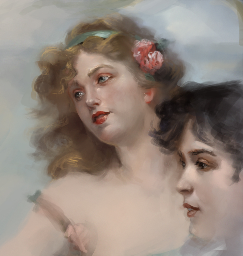
I have this fascination with artists Ruan Jia and G.Huang. I am under the impression that their style developed from studying classical paintings. So I decided to start studying as well. I have avoided hard work studies but I guess its the only way to get better.
This is Edward Bisson 3 graces. No color picking or trace.
10 days later
WOW!
Great work!
Wondering if you could give me a hint on how you got on that skill level.
I have experience with traditional painting and drawing, I am skilled in vector illustrations (can send you via PM if you want to take a look) but somehow I can't make good work digitaly 
Can you please give me some material that helped you grow your artistic skills?
Also, I see you come from Greece, greetings from Serbia 
Thank you Soki! Yeah sure! You can also post a link of your portfolio or add it on your account info.
Ill try to write a short reply haha! Two things helped me grow. The first was to browse through art and tutorials constantly. The second was the monthly competitions that cubebrush(the previous site) held. Being competitive, and getting feedback were very helpful for me. Losing was even more helpful :D. Deviantart and Artstation are good places to start and if you create a sketchbook here posting your work, receiving feedback its always helpful. But the important thing is to draw what you like and aim for what you want and the style you want.
I have a list of my Youtube subscriptions maybe they help
Apterus Graphics
Charlie Bowater
China Digital Painting
Cubebrush
darozchannel
ElenaSai & Cross
giorgio baroni
John Grello
kingkostasart
LEE EVAN
lius lasahido
Maxim Verehin
Proko
Puppeteer Lee
Ross Draws
Stanley Artgerm Lau
TamplierPainter
The Art of Aaron Blaise
webang111
Zezhou Chen
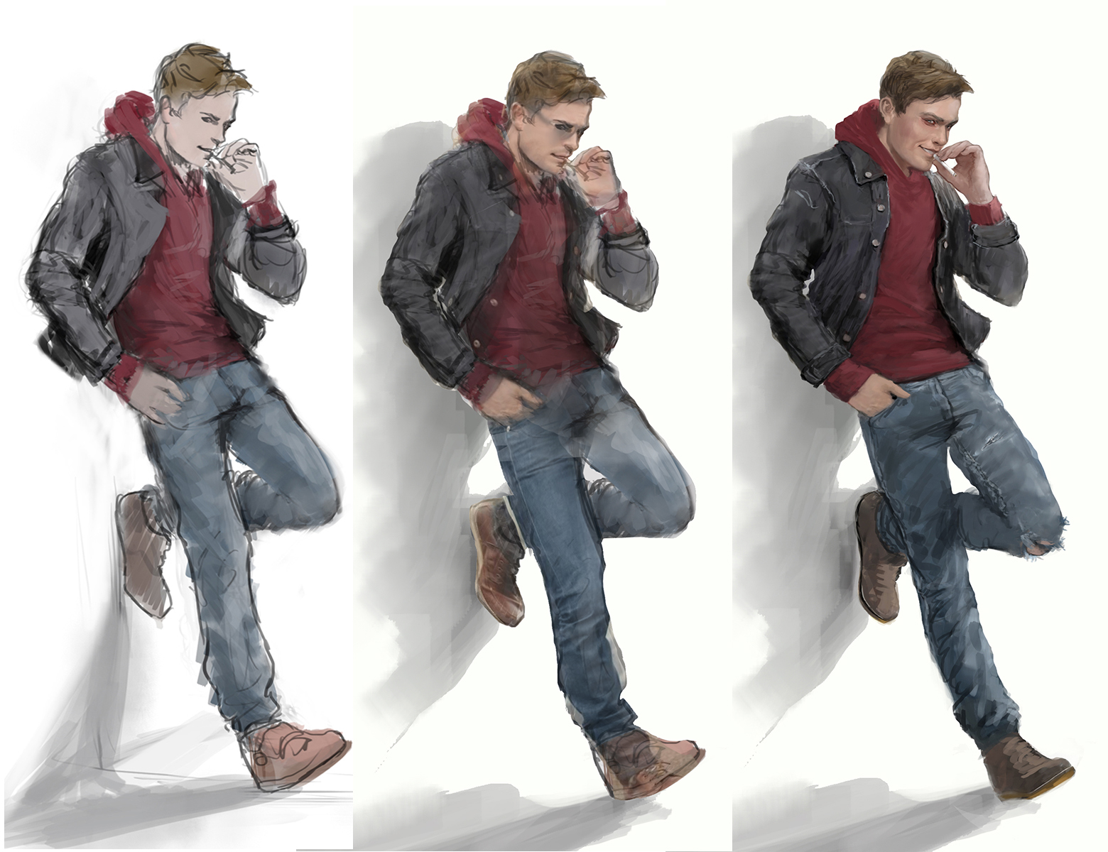
I wanted to share the process I use for creating fast comissioned characters.
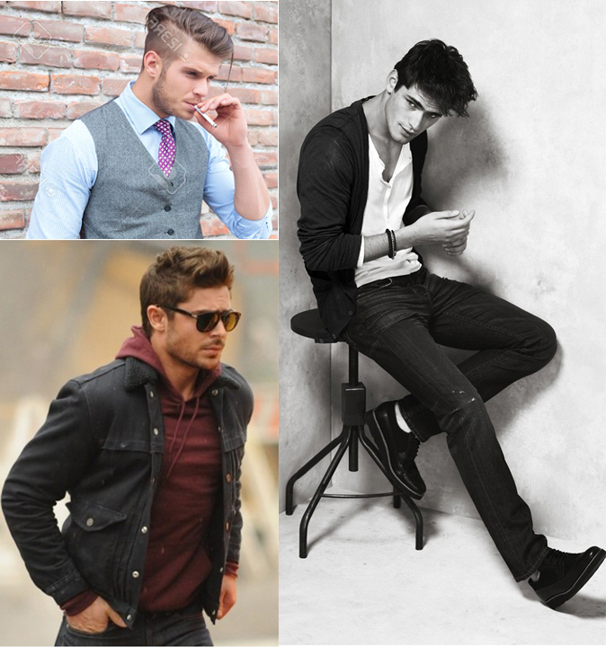
First I find pictures for the desired pose. I layer them appropriately and create a sketch. I drop the basic color. I throw photos and render till it looks smooth and painterly. Here is my reference photos both for pose and clothes and some progress shots.
When I do comissions I heavily rely on photos for the pose and the rendering. I dont do it for personal pieces where I enjoy drawing each pixel:p
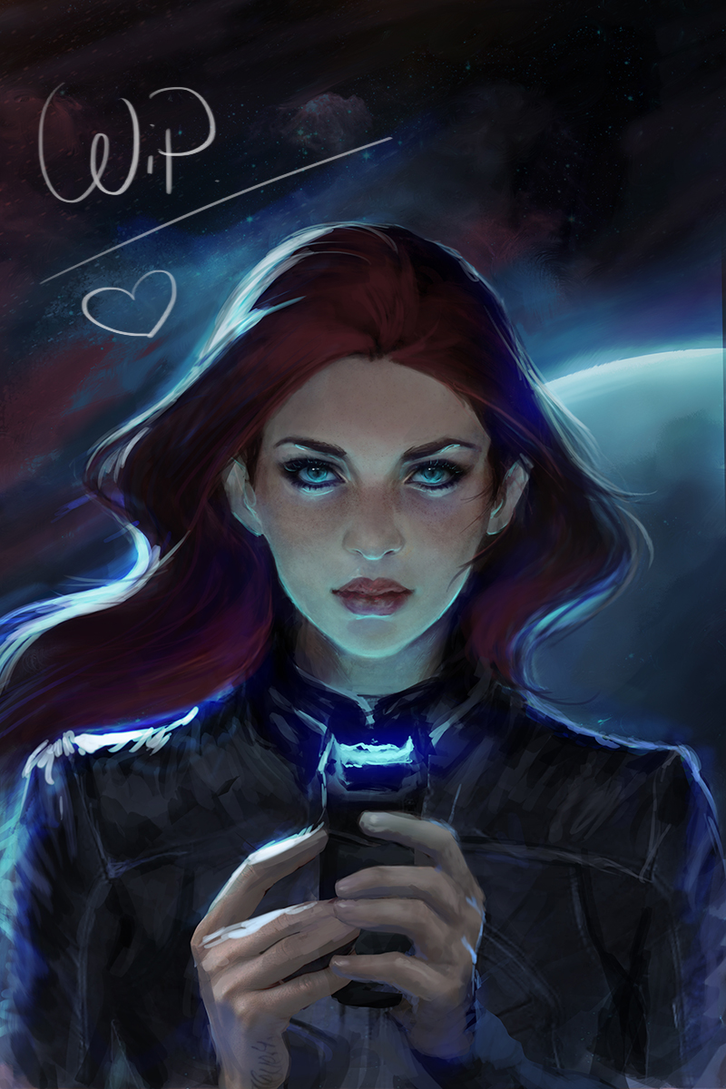
First off let me say this is look pretty cool so far. Really love her face and the lighting you have going on. With the stun gun so close, There will be more light on her face.
Guessing she's wearing a leather jacket?
If I could recommend something, it would be to give the piece a bit of a blur while having a more defined face that isn't blurred. Try to give it more of that cinematic look/appeal. Add more of the stun gun blue light to her face. Out side of cleaning up the jacket, I believe you can also add more of the blue light going directly on the jacket with a nice contrast to the black you have.
Did a quick PO to show what I mean. I believe your already going in the right direction. 
Maybe my blue is a bit overkill but you can adjust it to your liking if you choose to add a blur. Lastly it would be to find a texture for the planet in the back. Other than that solid stuff. Keep up the good work.
Thank you malcom!! Your paintover looks cool!! It has given me more perspective and a few ideas! Im gonna enhance the stun gun's light and the overall contrast. I am not familiar with blur I dont know how to use it properly. I might play with it though a bit on the hands on th elower part.
@marc Thank you Marc!! I will definitely upload them from now on.
@andrewnimble Thank you ^._^ im glad you like her look. I am affraid the image will not have any impact if the look is not strong enough.
I will post more wips!
Thank you everyone.


