

Crazy details :faint: !
No doubt this will look epic in the end ^^
@mr_dessin appreciate the kind words ^ ^;;
wip - working on general lighting for characters I'd like. Will fix the perspective in place for car and other props i'd like to put in later. Going with a cyberpunk grim dark feel. So will also change the main characters colors when I get to it.


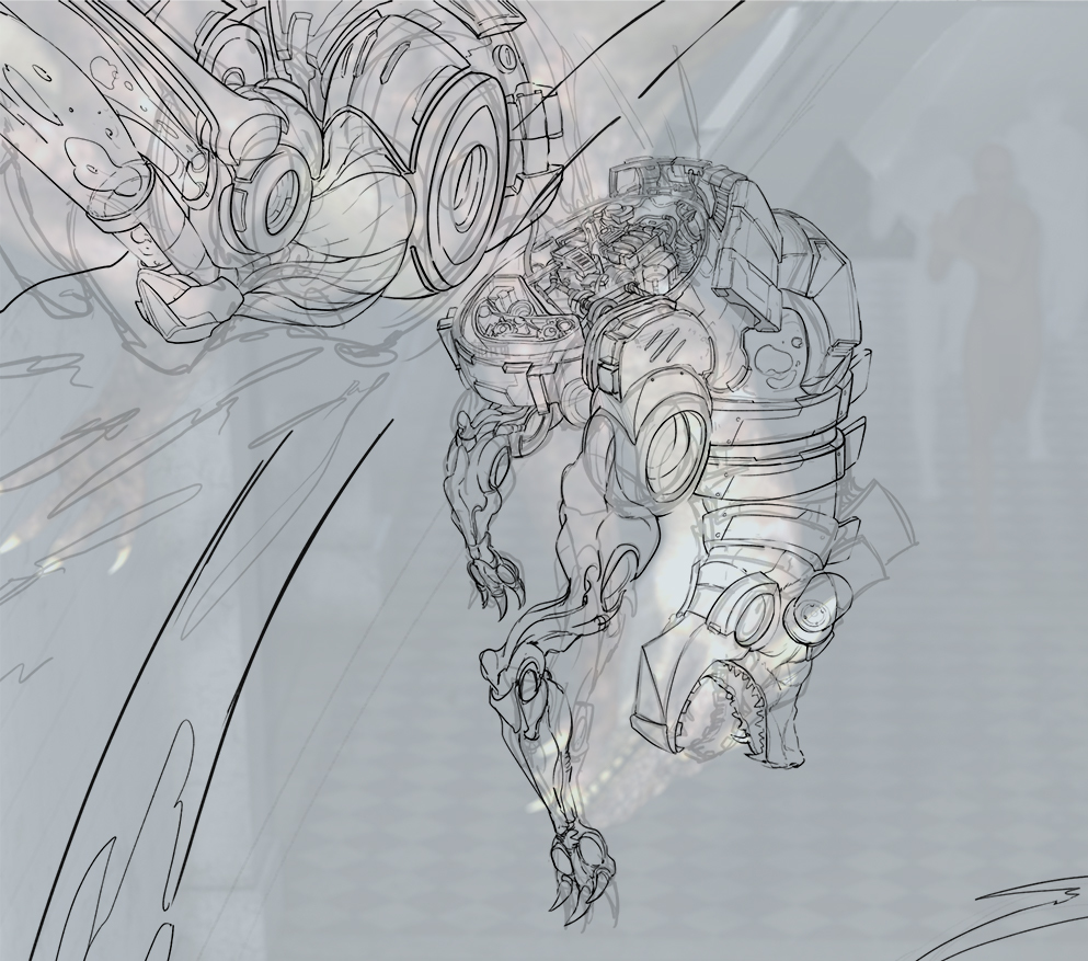
Here are my options. The top one is following the perspective of the camera from my reference 3d set up.
The bottom one is what I created that possibly fits the scene better
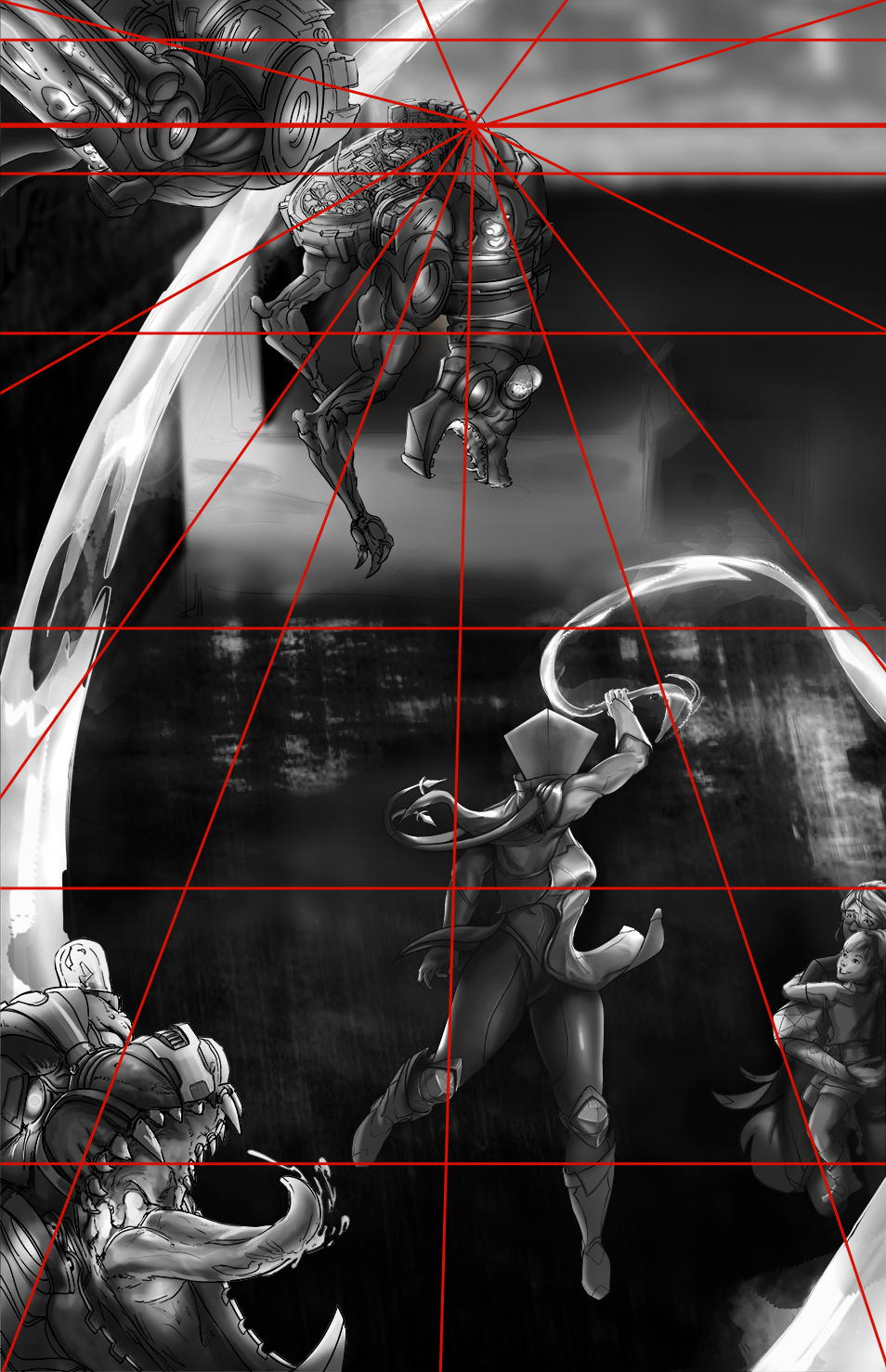
If I go with the top one since the vanishing point is so far up I could set up the bg to show more depth... but show less of the BG. If I go witht he one i created it'll show more of the cyberpunk BG elements I could put in... Mmmm..... I might go with the first one, it feels a little more challenging and allow me to work with the 'less is more' approach so time wise it could possibly help me as it takes away more elements I'd have to render. Also allows me to have opportunities to find creative solutions that mostly focuses from the top down and how I can incorporate cyberpunk properties.
Nice character! I did like the very first color scheme you used in the beginning, gives it a more space/void feel.
I also agree with you on the perspective, due to the time constraints cutting down elements would indeed help.
Good luck anyway!
@aeguilrod Ahh thanks for your input, definitely will be changing the color of the character, haha tbh cyberpunk came in after the fact I created the character so I'm thinking of colors like the first one or to white and gold since cyberpunk has all these colors that will bounce on her anyways. We'll see how it goes!
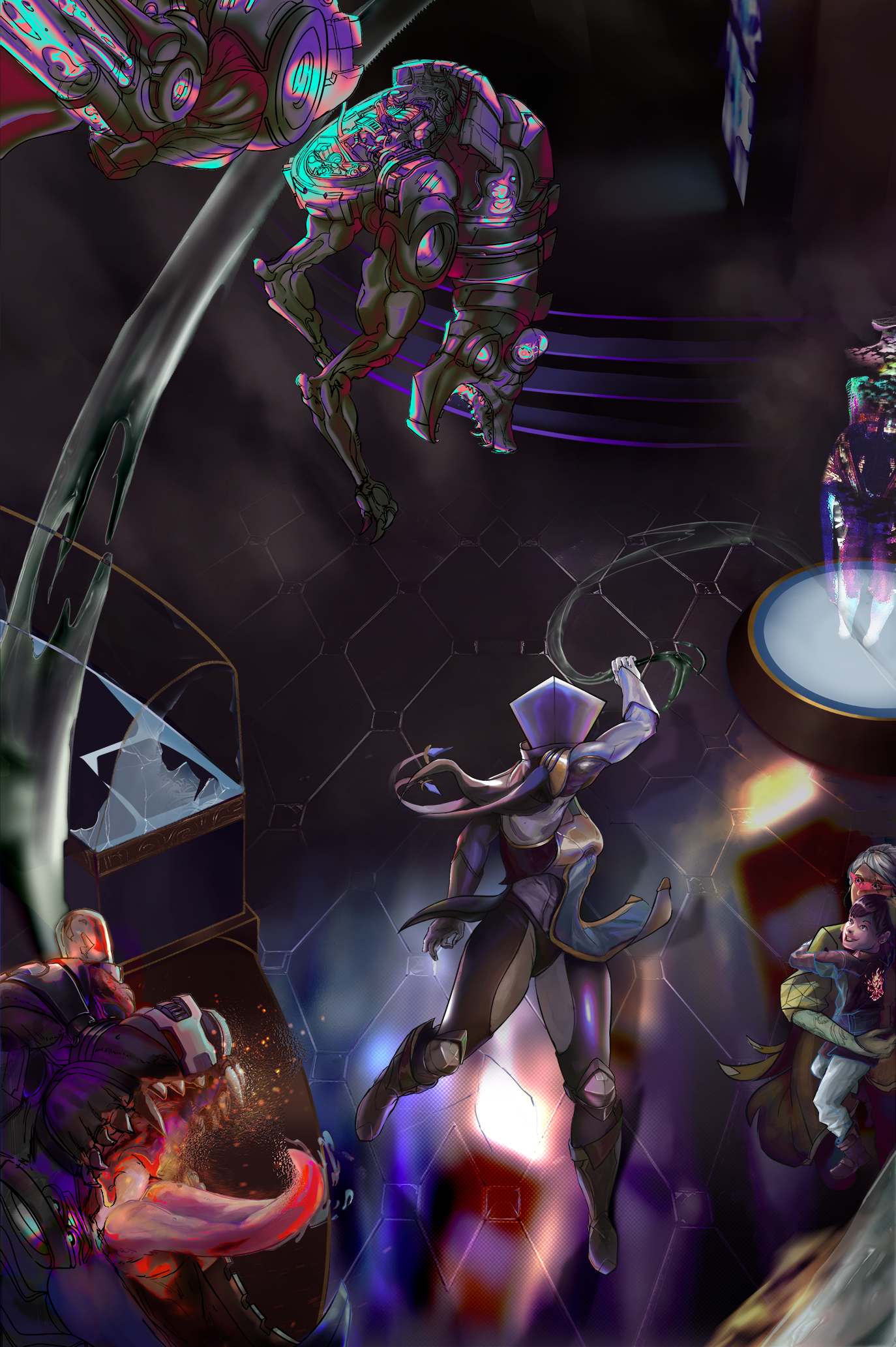
WIP - was really head scratching and finding out different environments that I'd like to portray the scene with. Ended up going for a mall of sorts. I want to get some wet, ground going though that I was inspired from my first image in some way, will see how it develops. Just find general color mood and where certain merchandise can be shown. I'm not afraid of the scene being too empty as I already know that I over-do a lot of my images sometimes with too many things on the screen. Especially once I put in effects like glass breaking, sparks, glowly stuff, smoke/fog/ ambient light it'll be just the right amt of stuff on the illustration. If it still feels empty I will put more characters, like crowd running away from the scene.


Supafresh colours! You put a lot of effort in the top mechanical dragon, it's pretty sad it is this tiny in the final illustration.
@innocent cheers man, yeah when I start rendering the doggos I'll try to bump up his size and see how it affects the composition. We'll see ^ ^
wip wip wip

The thing that is distracting us too much from your heroe is the dog face on left bottom corner (especially his eyes...maybe put a visor or something (or face cut in 2 parts ?)).
Otherwise, looking good !
@mr_dessin thanks man I'll keep that in mind, was really thinking of the flow of comp again after posting as well
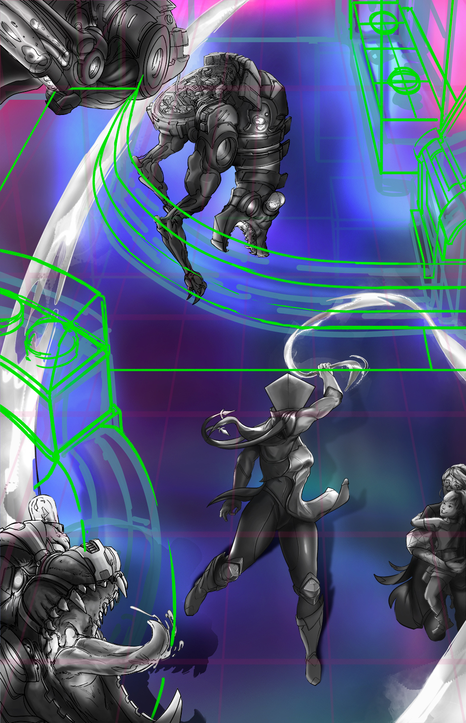
this is the direction I think I'll push till final


So much work you put into this! Looks incredible!!
@rabbitsleuths ty for your kind words ^ ^;;
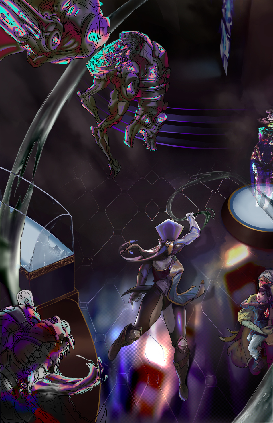
wip
reminder to do list tomorrow
test heat effect for top doggo and render metal doggo
render kid/mom better
add in reflected light on jewelry case
test out advertisement signs on more places.
do 2nd pass on main character

