Final UPDATE: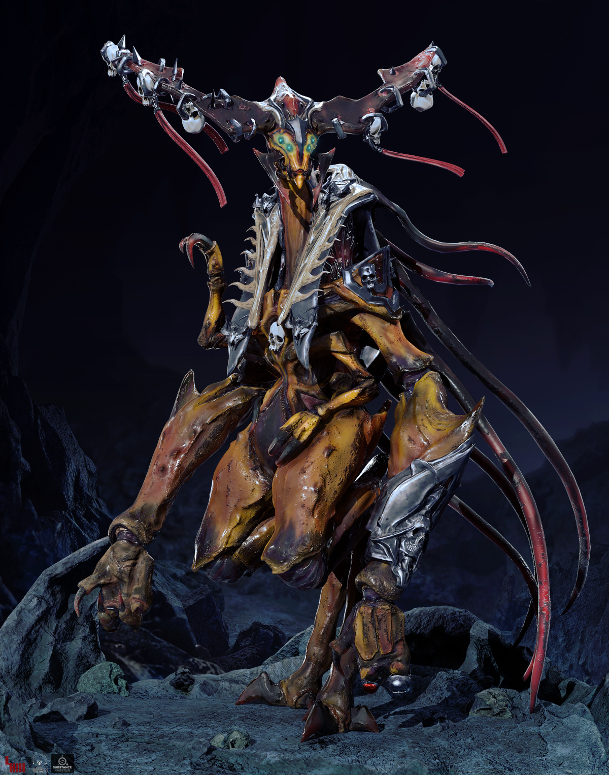
Final Submissions:
Name: Loraine Howard III
Email: lorainehowardiii@gmail.com
Website: Artstation Personal
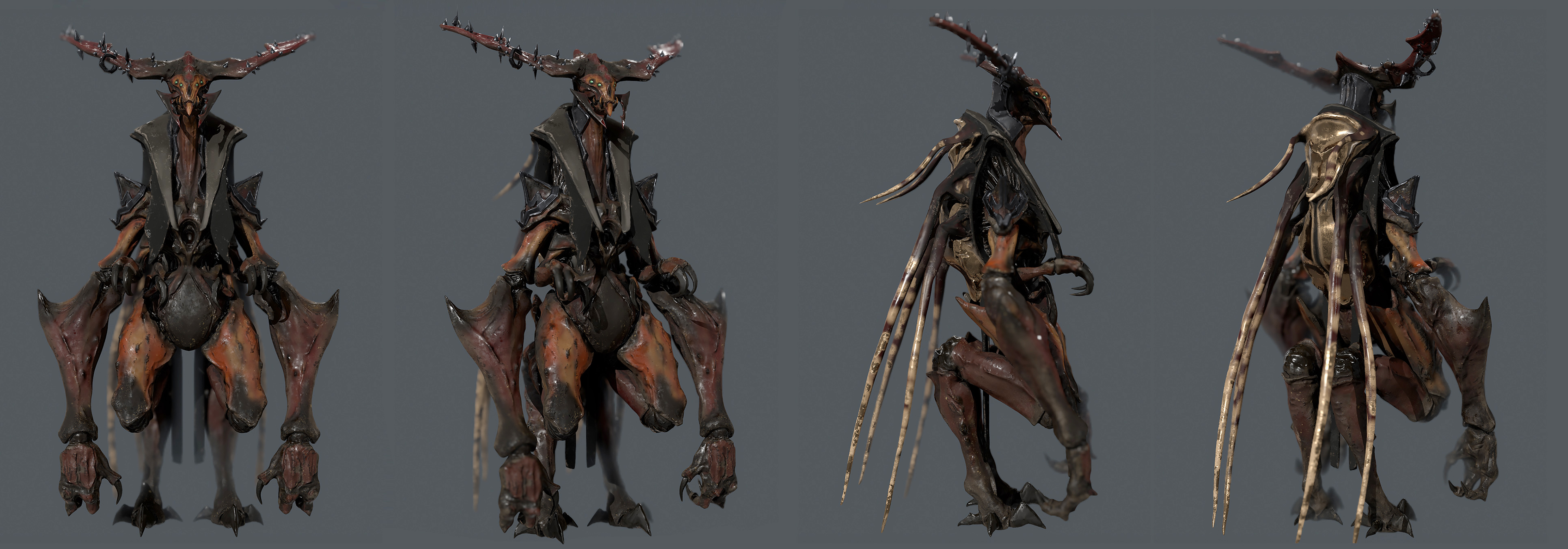
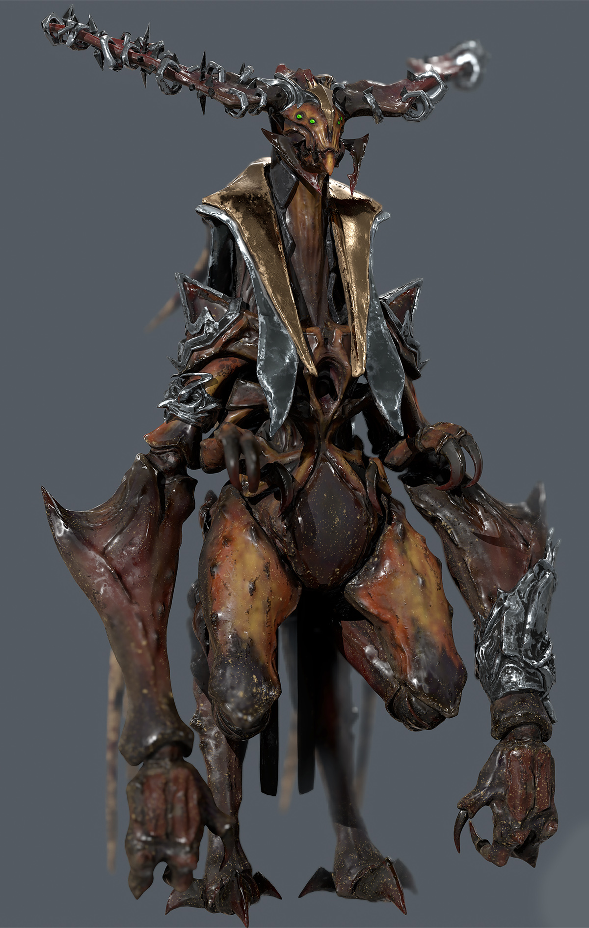
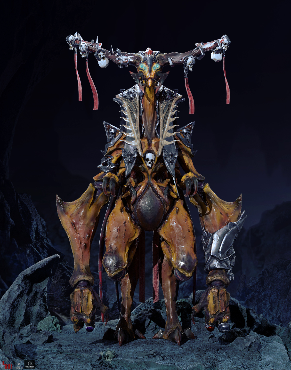
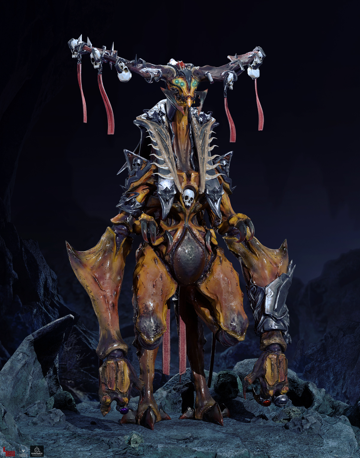
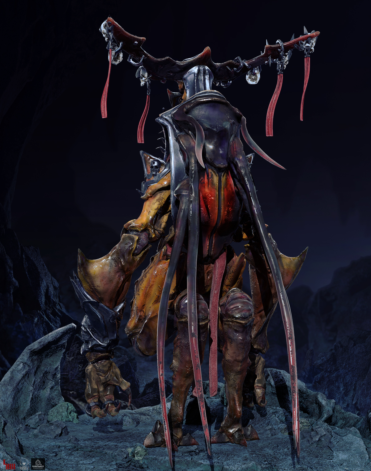
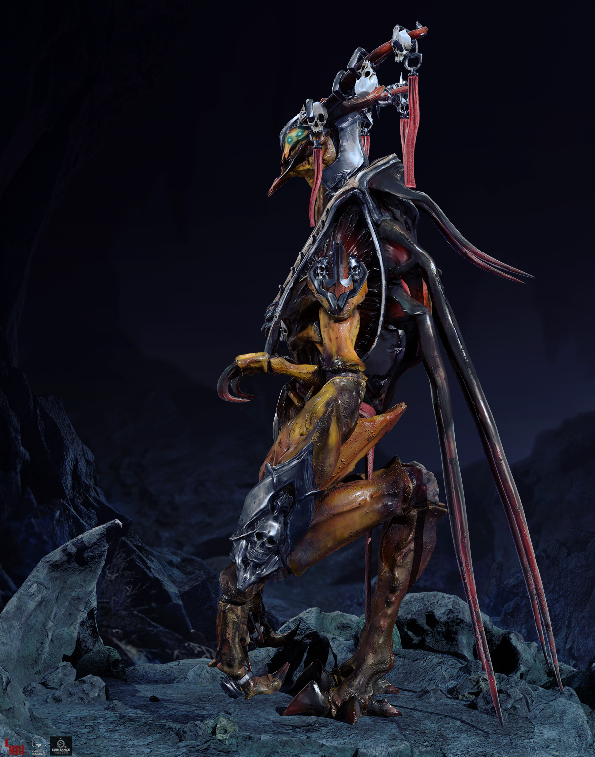
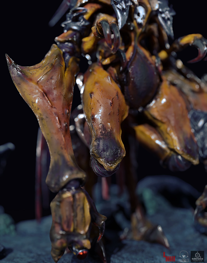
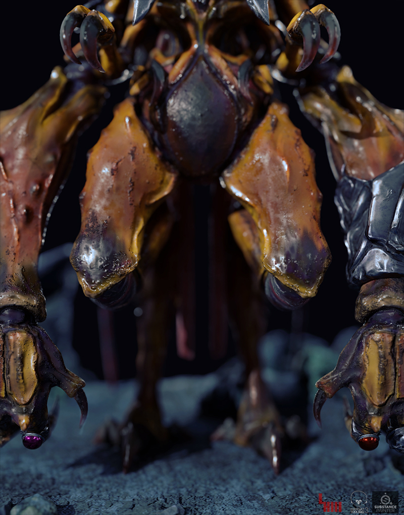
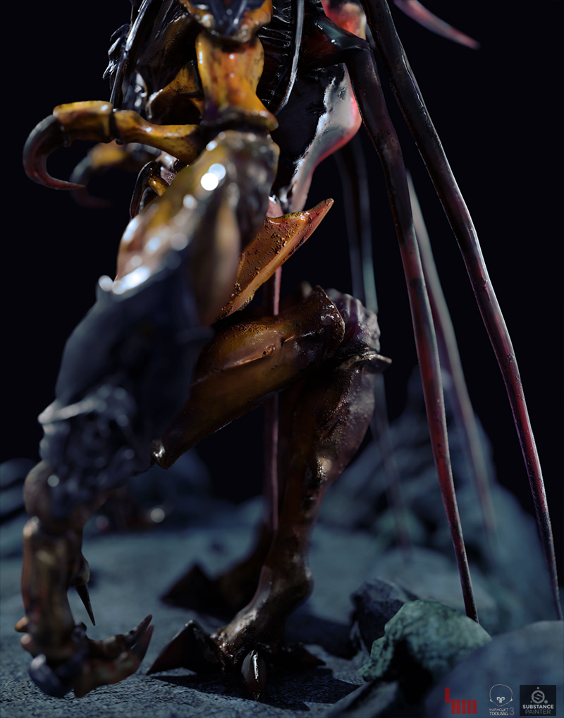
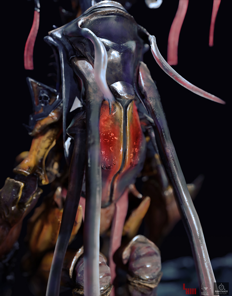
Final image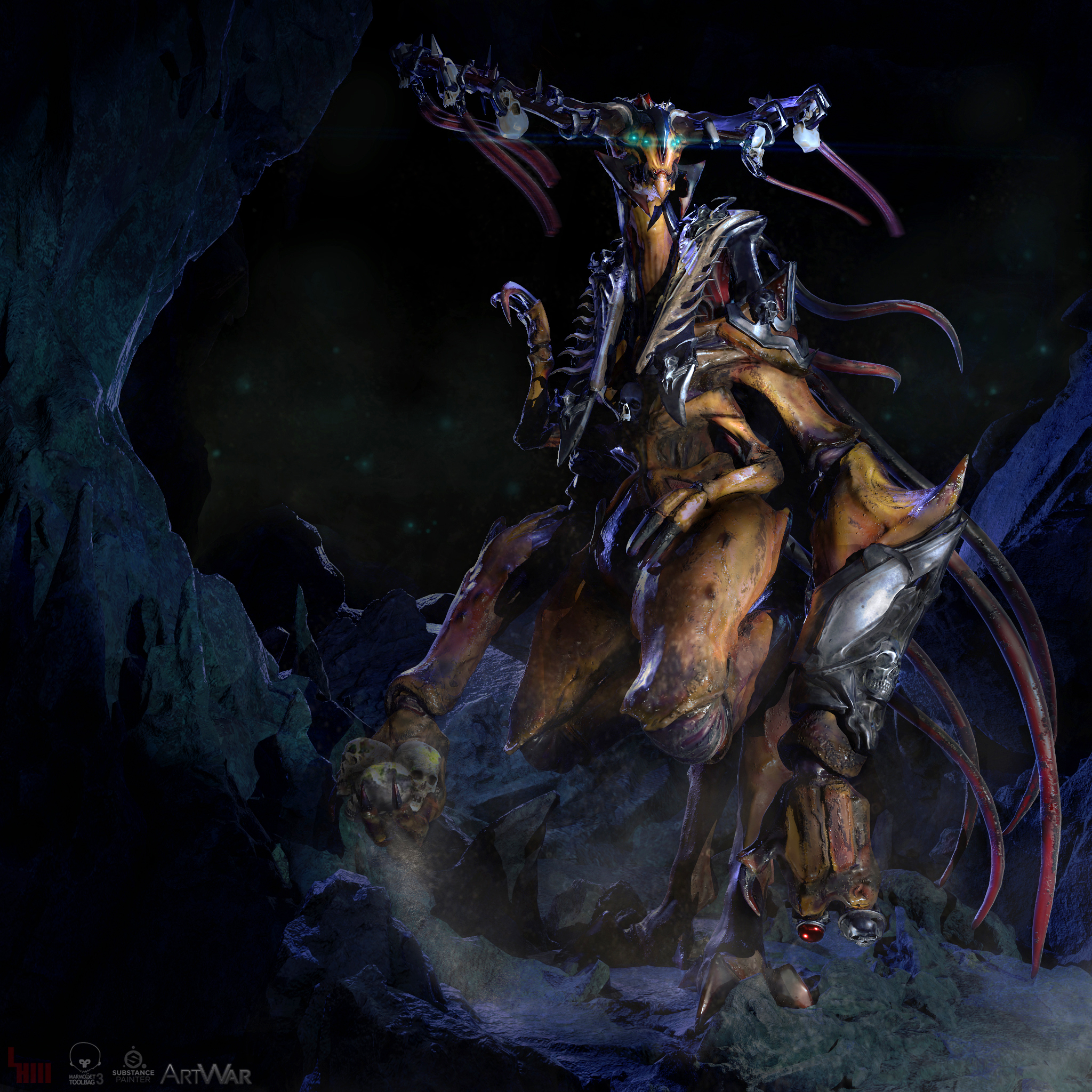
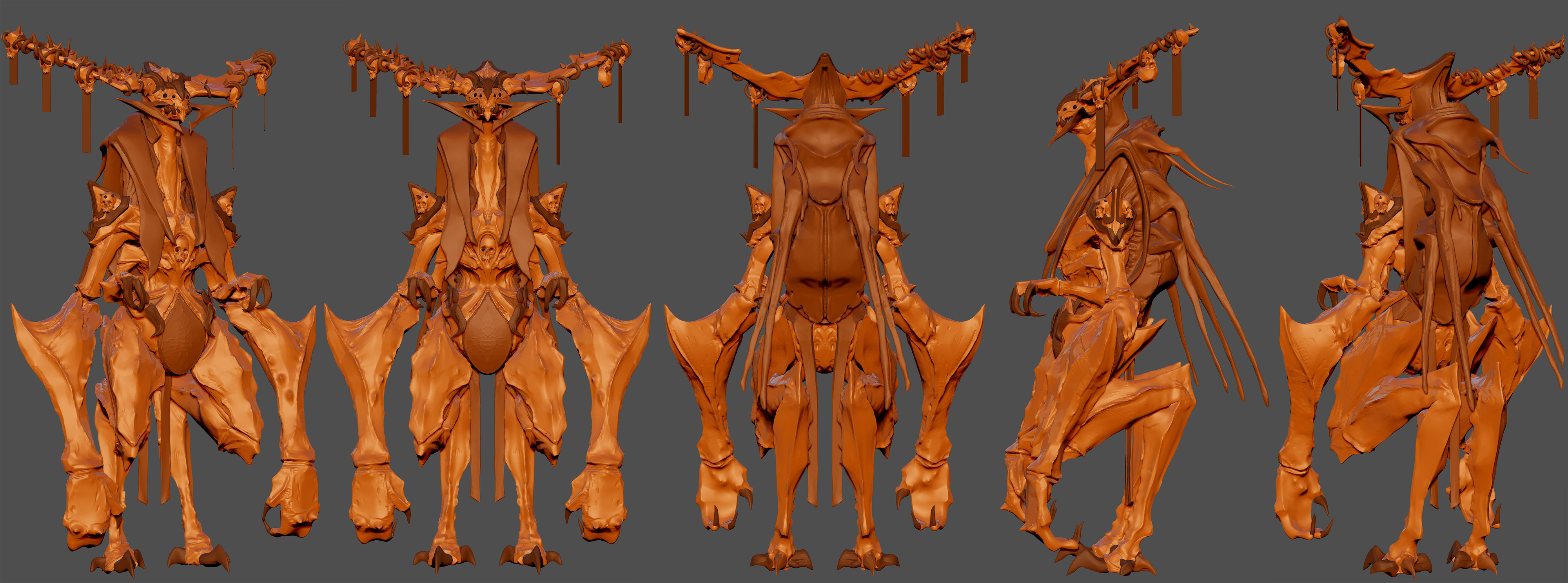
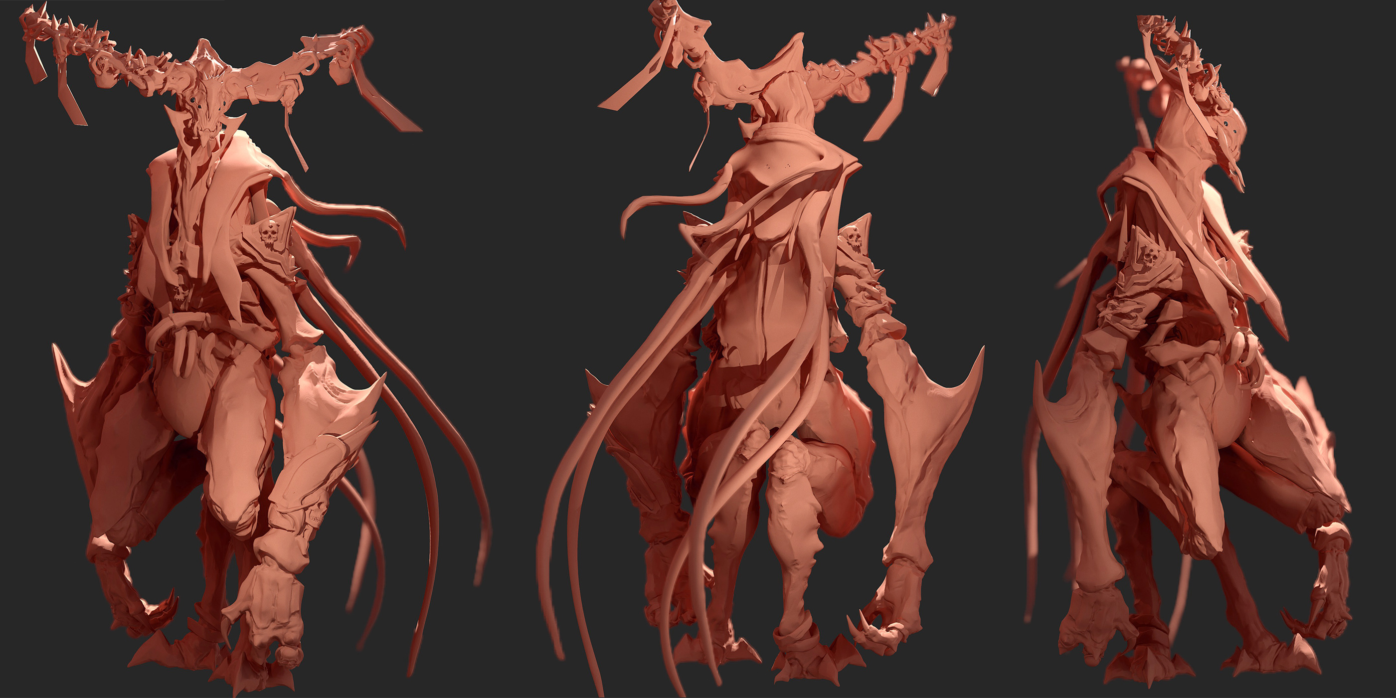
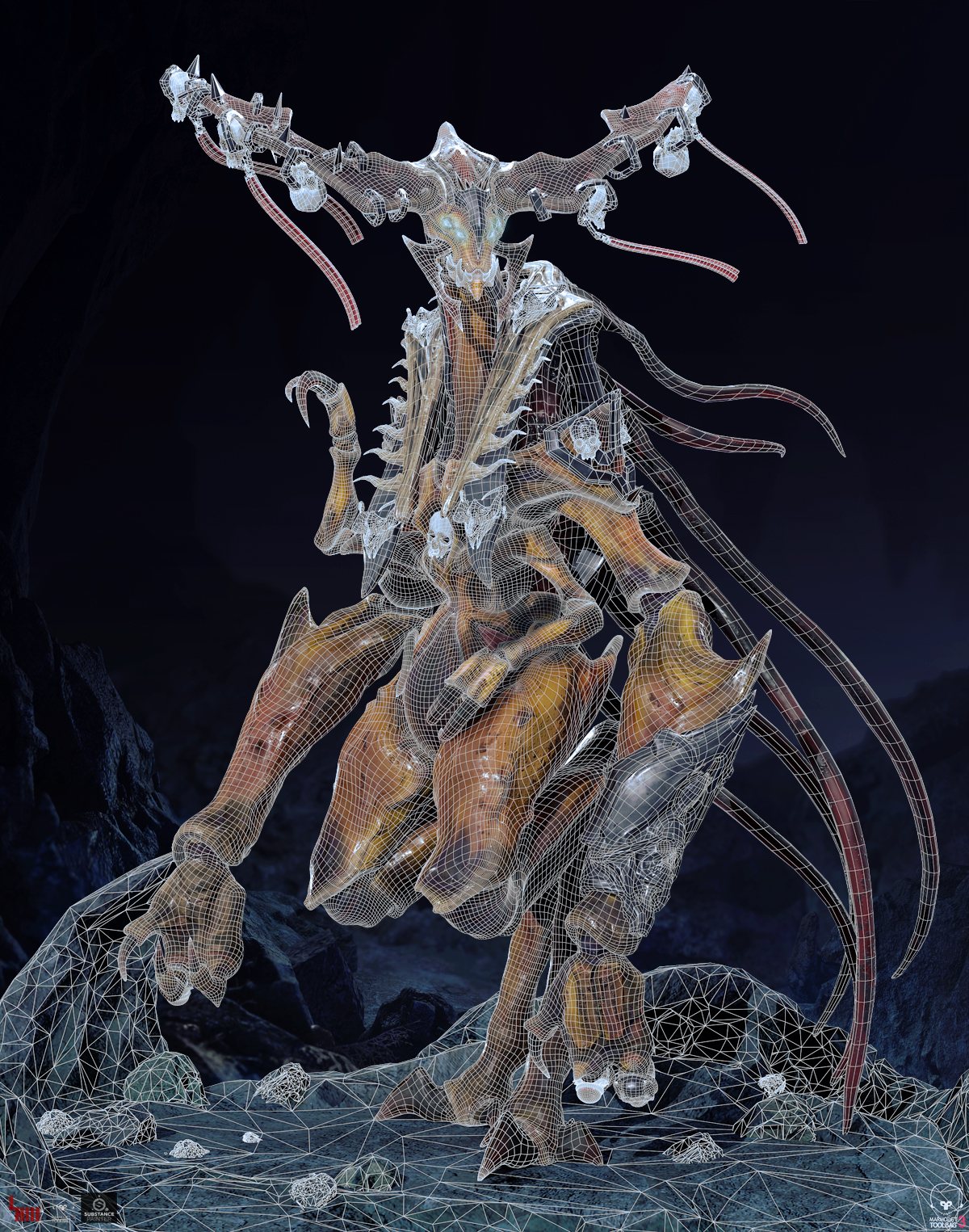
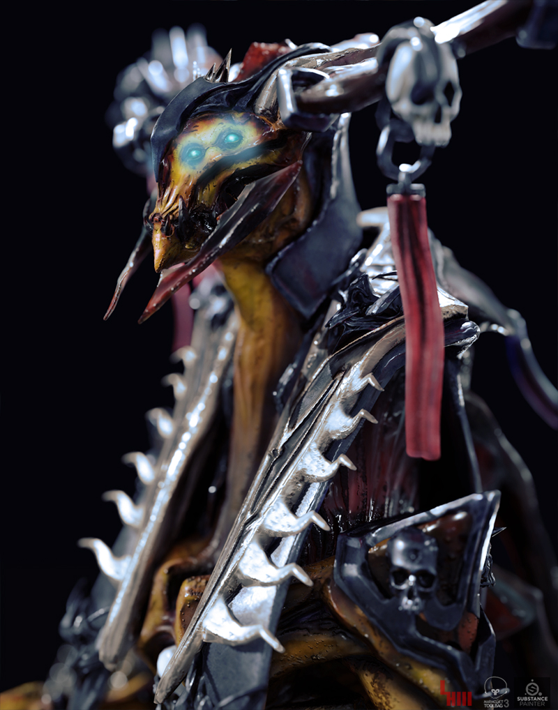
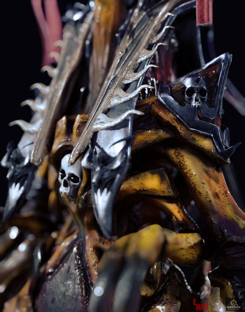
Detail Sheet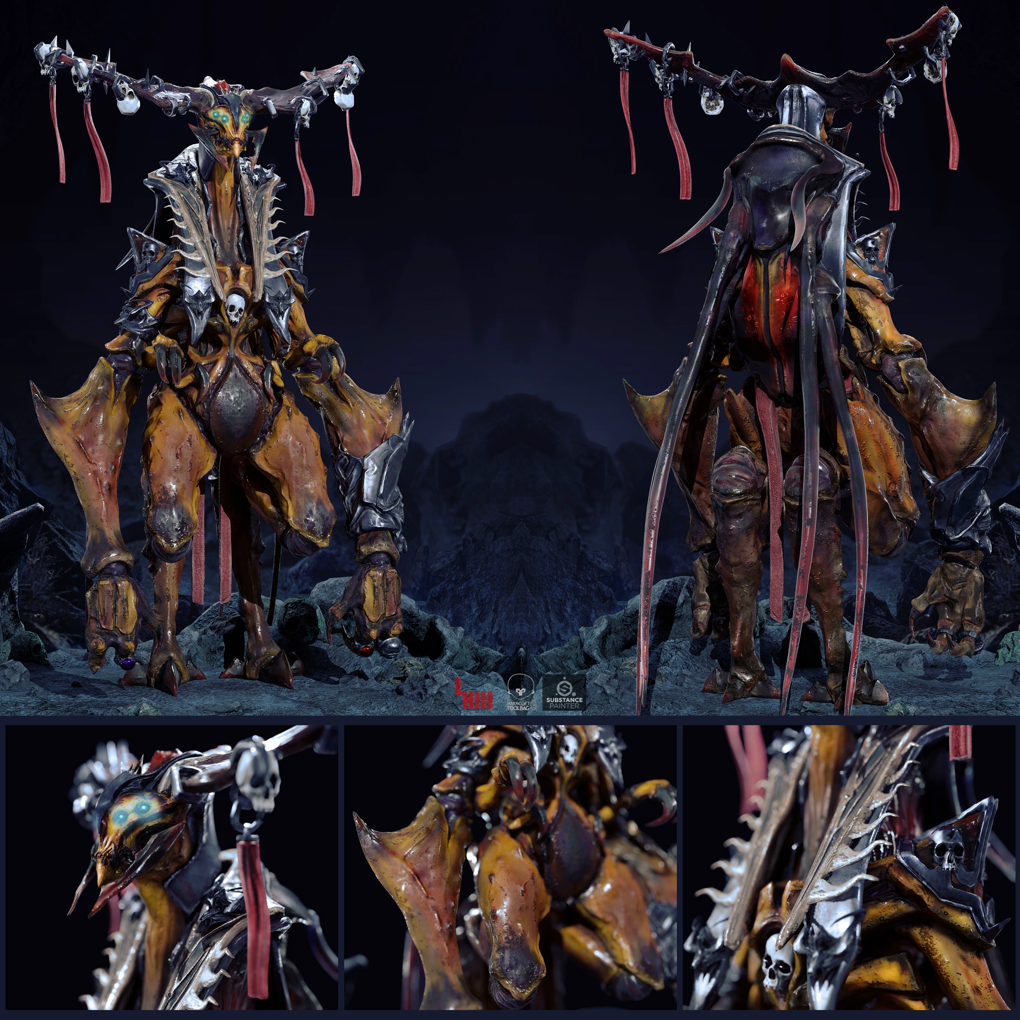
Concept Sheet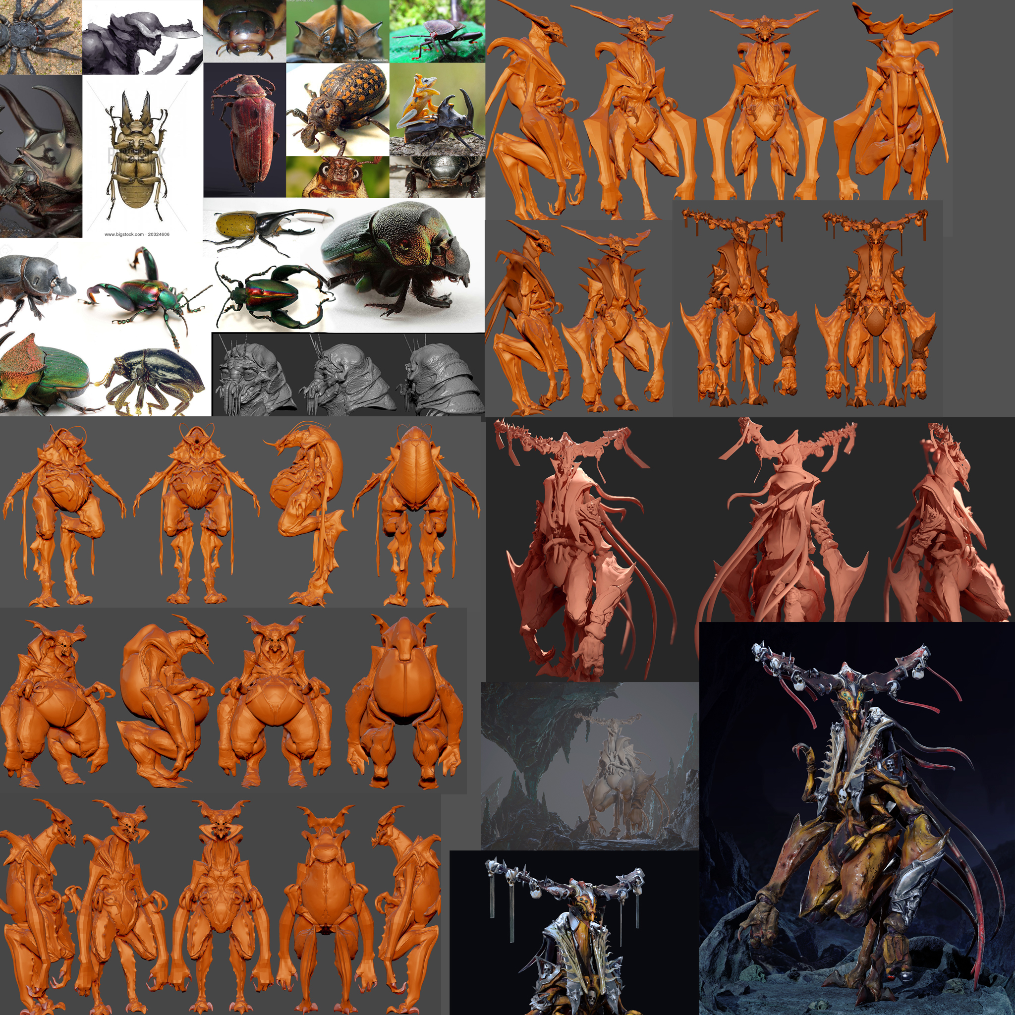
Hey Guys,
Sorry for being a Ninja for this Contest. I decided to take a shot modeling a creature this
time, I had in mind a wise Beetle Lord of the Grub race. Past week and half I've been trying different approaches to my idea. Not sure if I was going to join the competition but I'm feeling confident in my latest sketches.
I will post all of my early sketches to catch everyone up to my process. Hopefully you can get a good since of how my model evolves through my brain storming. Please comment!
I'll post my reference sheet later today, I need sleep...
Reference Sheet: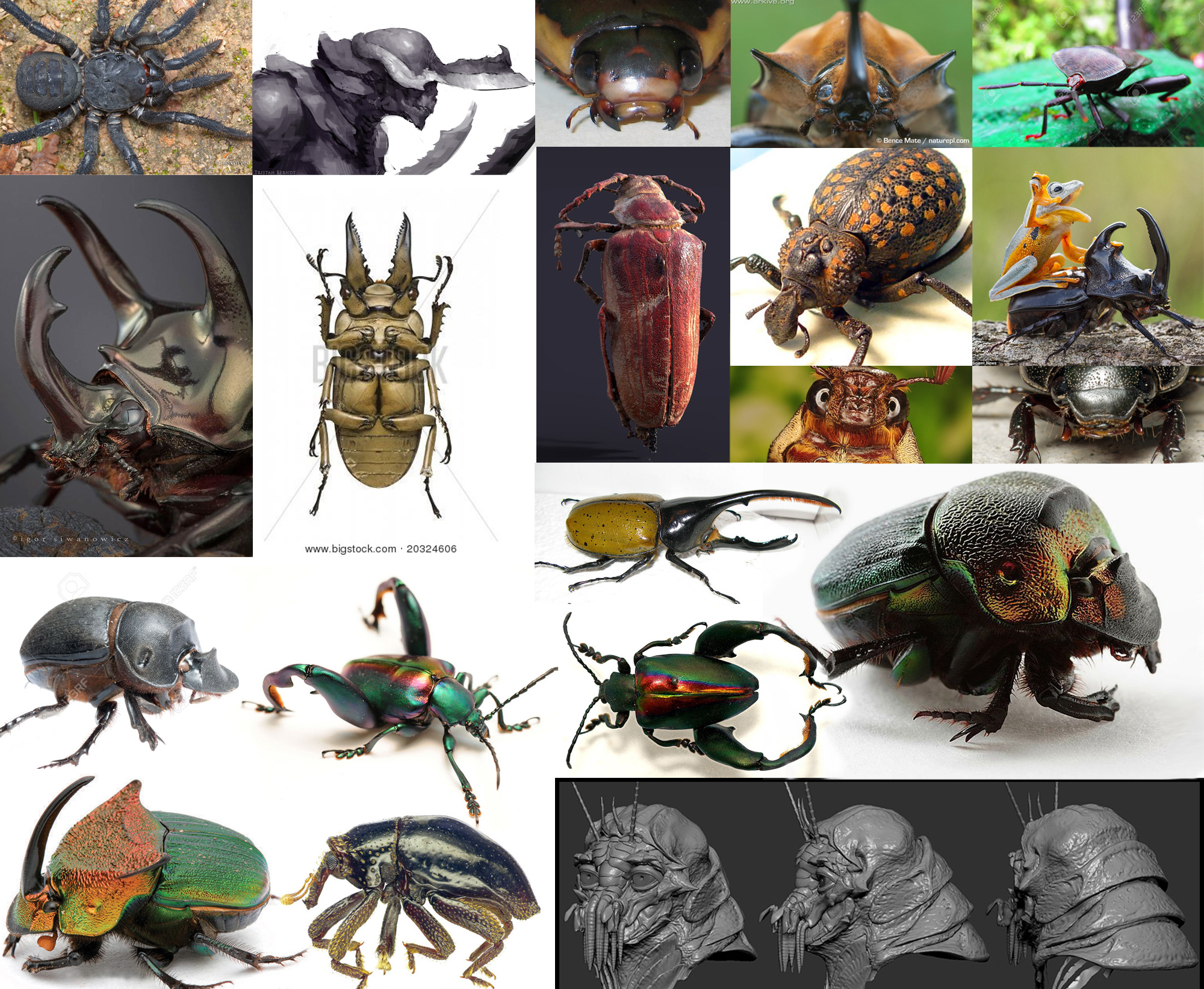
First Sketch: To Predictable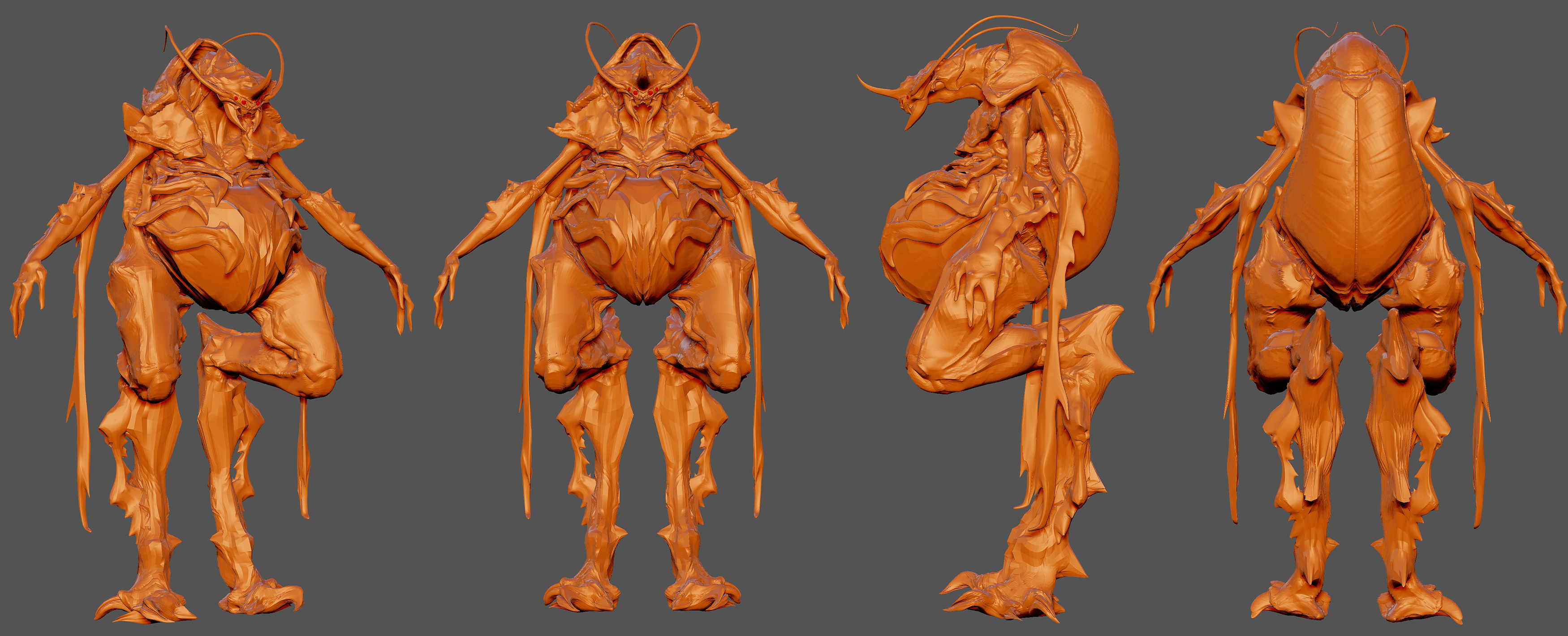
Second Sketch: Tried a different body type, pose is less wise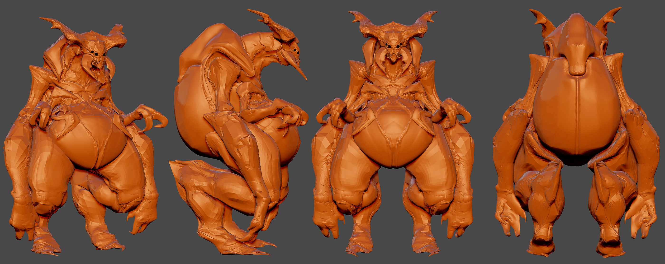
Third Sketch: Dailed back but explored different shapes, face too goofy....looks like a dog wants a bone.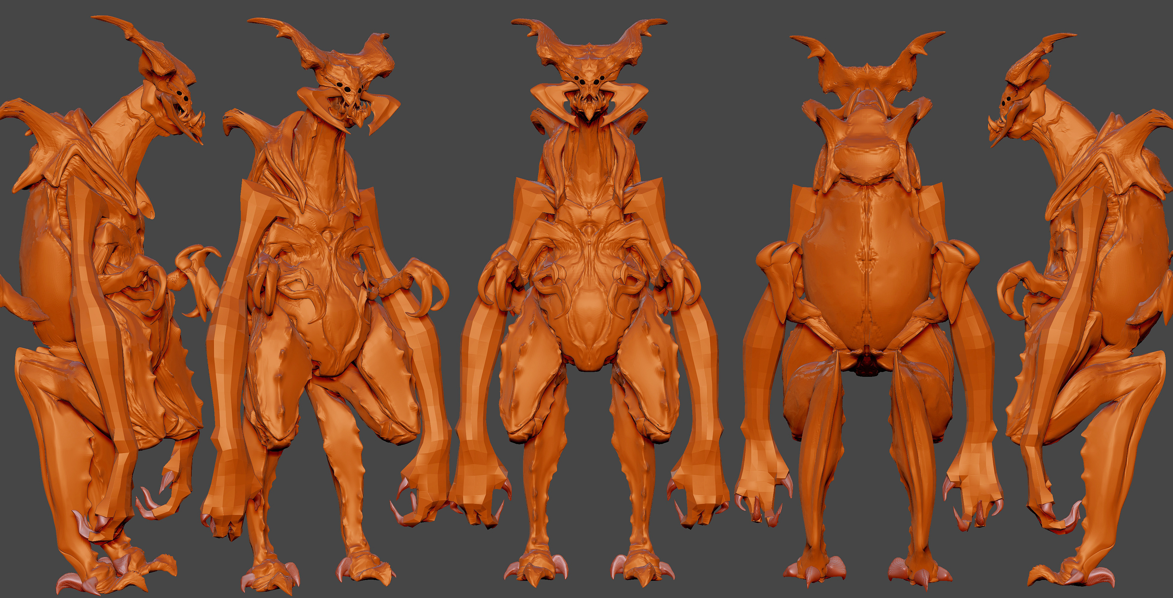
Fourth Sketch: I took shapes from sketch 2 and 3 and really pushed the shapes and made the posture more straight. Overall I like this proportions. I plan on pushing this idea even more.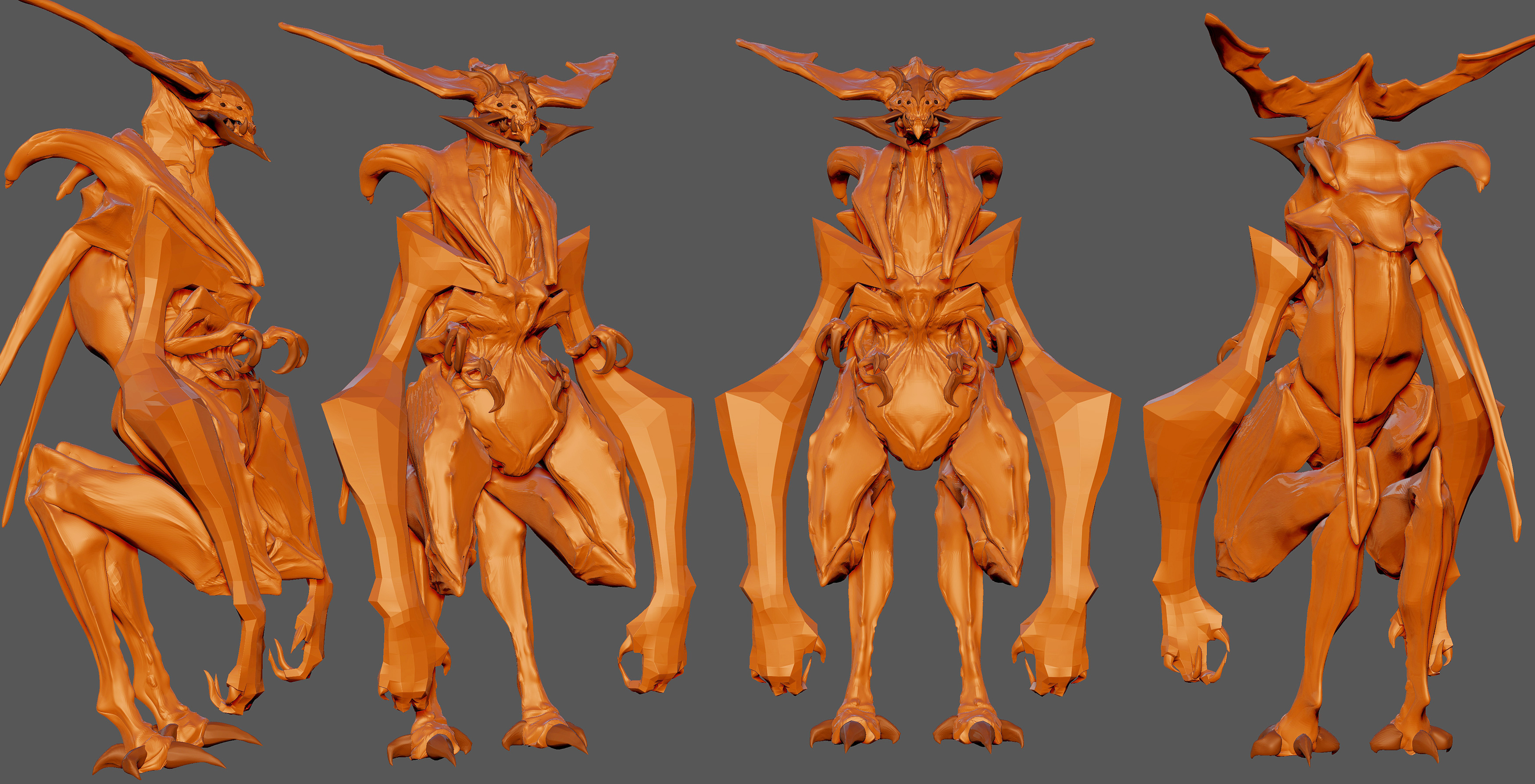
-
created
 Jan 14, '17
-
last reply
 Mar 7, '17
-
55
replies
-
14.6k
views
-
21
users
-
34
likes
-
36
links
| 17 | Lord_grub8.jpg dropboxusercontent.com |
| 16 | ArtStation - Loraine Howard III artstation.com |
| 7 | polycrunch.com |
| 3 | dl.dropboxusercontent.com/s/dukqt7alibjclfw/Lord_grub10.jpg?dl=0 |
| 3 | ArtStation - Loraine Howard III artstation.com |
There are 56 replies with an estimated read time of 4 minutes.