Here are some preliminary character sketches and thumbnail sketches. I'm excited to move on to the digital part of the process and tweak the bits of the character concept I haven't quite figured out yet, as well as put the whole thing together in a coherent piece.

Started adapting some of the (previously shown) thumbnail sketches into another type of loose thumbnails, except this time they are digital. This time, instead of "just drawing suggestions", I tried taking some of my previous ideas and see how they would work in the format I'd like to paint in.

Next stage: testing out colour schemes. I went into this stage knowing that I want to paint heavy clouds, so I experimented with which focal colour would suit which gradient etc. I personally liked the overall colour scheme of the 6th thumbnail, but I also liked the red colour of the 5th, so I might combine the two in the final illustration.

I finally started the illustration! I'm not sure about the look so far, as I'm on the fence about the perspective (and the fact that the anatomy from the waist down looks particularly wonky). I'm going to revisit some of the things I'm unsure about, and redraw some aspects of it so that the perspective might make sense. Other than that, I'm closing in on what mood I want for the piece, as well as how she is going to be lit (from the lightningstrike).

Update! I might still change the the way her legs are posed, but so far I think it's an improvement from the last update.

Yesterday I focused on adding some dimension to her face and hair, and today I mostly focused on the background with some minor changes in other areas (like skin and clothing).

The closeup of her face is a screenshot of what I did yesterday, while the fullbody image shows how far I've gotten at this point.

There are a lot of things to fix still, and while I render the things that still need rendering, I focus more and more on making the character and the background seem like they actually belong in the same image. In other words: added focus on lighting and shading.

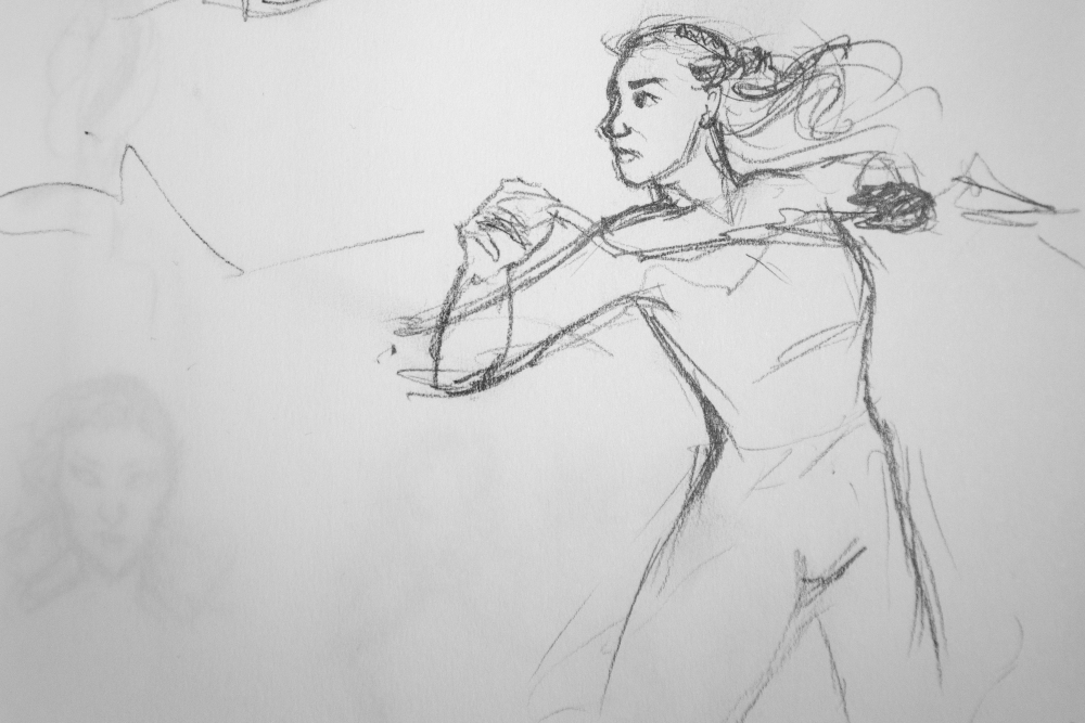
With regards to the outfit change: when exploring colour schemes in the thumbnails, I liked the red against the purpleish shades in the fifth one, and originally wanted to incorporate that in some way. I tried to bring that back when I found that I the green-on-green outfit didn't provide enough colour variation, making the image seem too flat to me (especially when paired with a relatively warm skintone). Also, the shape of the green top didn't work for me, so I experimented with long sleeves (while once again looking back to the thumbnail sketches).