• Gave myself 5 days to do something. This is what I managed to do. I'm trying to get better at illustrations, but I have patience to work on something for 3 days maximum :( Splash_Process.jpg5000x3140 2.21 MB Splash_Process-6.jpg3896x2429 2.83 MB concept list char copy.jpg5388x3000 1.7 MB
    20.4k
  • Did a character concept for a course.https://www.artstation.com/artwork/P6gm3y - more:) list1.jpg3541x1920 2.82 MB
    20.4k
  • Day 4: Star Wars May The 4th =] Queen Padmé Amidala in my art style! First time drawing her and I really enjoyed making this one! Used watercolours, ink pen, acrylic markers and gold paint for accents on my Canson mix media sketchbook. I hope you like it!
    80.6k
  • A creature design from a while back
    by
    6.5k
  • Here is some more recent stuff, I need to make more body studies
  • It's been a while and god, it is so cringe to go through all previous messages xDmy study.
    20.4k
  • Thank you! I finally cleaned that up. Meanwhile started 3 more ..I have a habit of taking too long to finish a piece, then I lose interest in it and just start something else. I found 8 from recently i started and abandoned, that are decent enough to not delete, but not finished. There’s also been a number of drawings I felt I “outgrew” - became better before I finished them, and it would be easier to start from scratch than fix them. Anyone else thinking that?
  • Lady Death Fanart Collectible: Part 6 Polypaint and base Hi, it’s time to share with you another part of the process to create this fanart piece. Polypaint As this is my first collectible fanart I didn’t have previous experience with polypaint so I tried my best and played a bit with it.I wanted to give a ghostly and eerie look to Lady Death, she is beautiful and deadly, but at the end of the day she is a woman that died and was reborn at hell as an avenging spirit, that’s why I gave her skin tone a bluish very cold tone.As you will see I gave myself some creative freedom to deviate from the traditional color scheme that this characater has in comics and illustrations.To add a bit of sensuality by painting some freckles on the face and the chest. The dark nature of this character was the perfect excuse to gave her a kind of goth make up, very dark shadows around the eyes, blue lips and fingernails. I know that the original character includes sexy red lips but I wanted this girl to have a sexy but at the same time creepy look, that’s why we can see some thin veins emanating from her eyes. The biggest chromatic change I did for this character is at the hair. Lady Death has a characteristic white weavy hair but in my fanart I decided to gave her a very saturated blue color.The reason behind this wasn’t only an aesthetic choice. I want that the face area strongly pulls the attention of the viewer so this area needed a stronger contrast. Another reason is that I want her to have a more modern look, as I mentioned before, I’m strongly attracted to women with goth/punk look. I gave myself half an hour or more to analyse the work of experienced sculptors that create collectibles and I discovered that the use of darker values on the skin is often applied to create a greater sense of volume and three-dimensionality. I found that areas with heavy ambient occlusion are the perfect places to paint with darker colors in order to increase the separation between different forms. Even though she has a bluish skin tone, I used a bit of warmer hues in areas that, in real life, tend to go towards red and pink, this is very obvious in the nose, cheeks, and knuckles. Thinking with a logical mind it’s completely absurd to have warmer tones on the body of a zombie like creature but I didn’t want to limit myself by using only blue tones, it looks boring and artificial. In real life these colors are created by blood vessels in areas where the skin is very thin. ** Scythe **for her weapon I applied a cool gray with some warmer variations, this color scheme is influenced by the work of H.R giger. Base I’d like to talk about the design for the base which, to be honest, I forgot to develop along with the character.My main idea with the base is to show that Lady Death inhabits a very sterile and arid land, at the end of the day she is at hell.You can see a that she walks over dirt and rocks, a sign that she’s surrounded by death and loneliness. As part of the landscape we can see some bones and skulls to reinforce the idea of lack of living creatures, yet we can see three hands that try to reach her legs.This hands represent that all creatures are subordinated to her power and seek an evil blessing with a simple touch of the princess of the damned.1- The hand with skin burns represents the souls of those who are newcomers to hell, tortured souls that suffer for the sins comitted on earth.2- The hand with greenish rotten skin and pustules is the reminder of the decay that has infected the souls of those who have been trapped and have forgotten their humanity3- Last but not least, the hand of a demon shows that even dark creatures and entities bow before her presence. The cherry on the top, at least in my vision, are the simese twins that emerge from the ground, this malevolent creatures remind us that in hell there’s only perversion and any trace of innocence is lost. Thanks for reading till this pointI’m really happy to be very close to finish this creative journey, last but not least it’s mandatory to talk about splitting the sculpture in several pieces to be printed, this will be my last entry before showing the final rendered images. See yaMay Zbrush be with you
    1.4k
  • memory 2min gartic phone, used ref 2m gartic, used ref for pose 2min gartic 2min gartic 2min gartic 2min gartic memory memory memory memory study memory memory memorymemory memory memory memory memory memory study memorystudy study stylized left memory, right study study memory memorymemory memory memory memorymemory memory, porportions r offmemory memorystudystudy memorymemorymemory memory memory memory memory memory memory memory, right leg is a bit broken The feeling of only getting 1 - 3 likes on a social media post will never not be discouraging. But nothing is discouraging enough to make me quit drawing. I think the strategy of drawing a lot of stuff and waiting a while to post is good though rather than posting it immediately and then feeling that sadness on the next set of drawing
  • Urban Dragon Girl Wip Urban Dragon Girl_wip1.jpg5000x5000 1.11 MB
  • Long time no see! New artworks produced lately
    6.4k
  • studies studies juri study imagination, how I feel before a speech imagination imagination study something I drew for my presentation also drew this for my presentation, didn't fix the one hand being bigger than the other imagination + study study studies study study, I need to fix the face a bit based on screenshot from anime but in my style study. except for the eye study studies studies study. changed some things tho imagination imagination imagination study studies, except top right samurai based on anime screenshot wolverine studies, changed some of the poses a lil, not very good at all, but first time i drew the character ever. semi study studies study imagination imagination imagination , for first time ever i tried to draw over 3d model for middle pose, I dont like the result tbh, but it makes it much easier than coming up with it from memory.imagination, except right figurestudies imagination + studies, coming up with action poses r hard, these are not dynamic enough, I will redraw better ones in future. imagination , imagination imagination study, except for eye imagination imagination imagination doodles except for the two chrollos imagination storyboard thumbnail, idk if i ever shared this. my storyboards end up being a little detailed since i usually just draw in one layer.
    by
    21.7k
  • Quick fun sketch. CyberFish.jpg2394x3857 674 KB
  • Neon Gambit This is a fan art of my all time favorite character Gambit from the X-Men.I made this a birthday gift (26.04.2024) to myself and honestly I really do like how it turned out in the end =] I hope you like it as well =]
    80.6k
  • Art Blog - April to September 2023 Suffer a little burn out. Look at some memes. Here's some art from in between. critique.jpg1333x5736 1.77 MB
    20.1k
  • And some more! Been painting over them a bit more this time. Some variants I tried for the old guy using mainly the liquify tool. Someohow looking a bit like Owen Wilson (not intended :D)
  • Cafe sketch/color study
  • Hello! My name is Vithor, I am from Brazil, studied Design at a local college worked as an illustrator for more than 10 years. I took a time off around 3 years ago and am trying to get back in my art shape and maybe become professional again. Here are some recent pictures: You can find timelapses for most of them on my instagram: www.instagram.com Vithor Albertim (@vithor_albertim) • Instagram photos and videos 123 Followers, 638 Following, 19 Posts - See Instagram photos and videos from Vithor Albertim (@vithor_albertim) Comments and critiques are always welcome.Cheers!
  • @patrycja.lerch Thank you I created another variant, which might capture the witch look I was going for better
  • Thank you @daceronine! If I remember I save in google cloud, I will have to stick a note to do it more often. Lamp is from life. Poses are from refs but I look at refs for a while and then try to do it myself and look it up if needed. Outfits and rest is from imagination Something went wrong while installing system so we will have to wipe everything again... pc works but something is wrong. We will wait till internet is done and I will save everything on cloud this time Threads came out in eu. It's been 3 days and I had more engagement than after half a year on instagram. It feels really nice I hope it stays this way A portrait of old dude. It's the same character I posted a while ago. Inspired by Bayard Wu work. At first I thought of him as a bear but I named him Fenrir and I think wolf suits him better. Eye gave me a bit of hard time but I think it is fine now. I focused on face and forgot about area below. The way I draw hair clashes with greying hair. I had the same problem while doing Lohse's white hair. Does it looks like it is greying here? I love how desaturated red looks blue there. I keep lying to myself that I will use different color scheme but It all comes down to this blue and yellowish one it is just flipped this time Have a great day!
  • Been bad about posting updates on the forum. I figure I should just throw down stuff. instead of waiting until I finish something.
    14.4k
  • Havent done much this year since I am focusing on learning programming and deving my own Indie Game . But here 's a New Year Piece 2024 , she 's the mascot for my Game Studio - Lucid Realm : Lucid Chan ! LucidChan_v001_sketches.jpg3072x4352 973 KB
  • IMG_0637.jpeg3240x4050 1.6 MB
  • Long Crested Eagle studyI had so much fun making this one and honestly I love that Eagle! It looks so cool! Used for this one high quality watercolours, high quality watercolour sketchbook/ cold press and it was 300 grams paper.I hope you like it!
    80.6k

Hi! As promised, here is another post explaining a bit more about some relevant details from my front view design of La Maja, aaand…revealing the surprise in the end (bit by bit!).

Well, as you have seen in my other posts, I kinda planned the mixture in between the soldier outfit and the majismo trend. But I realized I was introducing more the soldier outfit than clothes that could represent the majismo. That happened especially with the trousers. Firstly, jacket and trousers were inspired in the soldier uniform, but then, also the boots, and the sword…and it was way too much from my point of view. The only clothes that I had representing the majismo trend were the mantilla veil and the red cloth on the hip. I went back to check my references of majismo, and even if they had a looooot of detail, I knew I had to do a flower pattern (similar to the trousers that Rosalía wears in her videoclip “Di mi nombre” and that it is inspired in Francisco de Goya’s paint “La Maja vestida”). So I went that way, but definitely that wasn’t my first option. In fact, in the beginning it was planned to be fully plain, like a horse riding trousers and taking references from the cavalry soldiers. In particular, my favorite brand for this sort of trousers is ZALDI, and for me, there are some simple designs that I consider “classic”, as I have been wearing them since I can remember, since I was a child. So my instinct was to make that same design in La Maja.

And final decision, as I mentioned, was to change it to a closer look the majismo trend.

Let’s jump into the boots. A very funny thing happened during the process over here, and thank god I realized in time! I was designing boots with a zip. It might just sound such a normal thing, but the truth is that I’m designing a character living in the beginning of the 18th century and, according to Wikipedia, zips were not invented until the 19th century. The zip that we currently know was invented in the 1913 by Gideon Sundback, born in Sweden but emigrated to Canada. So, I re-made my design and used a shoelace instead, adding half chaps (they are my fav also for riding a horse, very comfy and cool to wear) and a couple of spurs, but the normal ones just for a better contact with the animal, not the cowboy with the spiky stars. They hurt :sob: . And, back to the fact that I needed to make it look more spanish, I had to use the leather straps that are sooo traditional in Doma Vaquera, what is called as a discipline and culture here in Spain. Quoting an article to explain it better, it means the following:

“Doma” means “dressage” in Spanish, and “vaquera” means “western.” So doma vaquera can be loosely translated as a Spanish version of Western dressage, similar to the American Western riding that originated from the fieldwork in an open space around cattle.

The foundation for doma vaquera is classical dressage. Doma vaquera horses show everything that dressage horses show: shoulder-in, half pass, pirouettes, flying changes, collected canter. However, everything is performed with more speed and impulsion than in competitive dressage. Horses are expected to break into explosive gallops from the halt and do extremely quick stops, rollbacks (half turn on the haunches) and pirouettes. If dressage is ballet for horses, doma vaquera is flamenco!

In Spain, doma vaquera is also connected with the art of bullfighting. Both the work in the bullfighting arena and with cattle requires speed, quickness, agility and a high degree of collection from the horse. Unlike in dressage riding, where riders ride with one (snaffle bridle) or two reins (double bridle) in each hand, doma vaquera requires the rider to hold the reins in one hand, typically the left. The right hand must be free for work, such as holding the garrocha, a long pole designed to distract the bull. The discipline of bullfighting from a horse is called rejoneo. The horse for rejoneo is a doma vaquera horse that performs movements such as piaffe, passage, terre-a-terre, jambette, pirouette on three legs, etc.

As I have researched, this discipline was official in the 19th century BUT it existed already since the 15th century in Spain. In fact, my first contact with horses was through this discipline, as my family was also educated and grew with it as our culture and like being part of us. I do admire which is the dressage bit and I find beautiful all the horse equipment designs, but I reject the part related to the bullfighting issue, so I don’t practice this discipline and I do another instead, which is non-harming at all 😊.

Back to the boots, I used the leather straps that you can find in the Spanish bridle as an accessory, and also, added this detail from the soldier hat, so I would not loose that feel of the Spanish independence war. Also I substitute that kind of feather that some hats had, and attached a rose, which is a flower that has also a lot of history in Spain, within legends, famous characters, etc. Of course, again representing majismo with this.

At some point, I thought about adding roses on the trousers. It would have looked like this:

I discarded this quite soon after a few tries.

As for the jacket and the X cross belts, most of it is the soldier uniform, but I included again a flower pattern to make it look, again, a mix with the majismo trend. Added a jewel in the X center, to make the aesthetic match with the earrings and the mantilla cannon wheel too. Shoulder pads were adapted again to the Spanish bridle and leather straps…but trying to distinguish them a bit from the boots, and these would look more like fur.

I guess those are the most relevant things that I had to explain, as maybe it was not clear for everyone taking just a first glance.

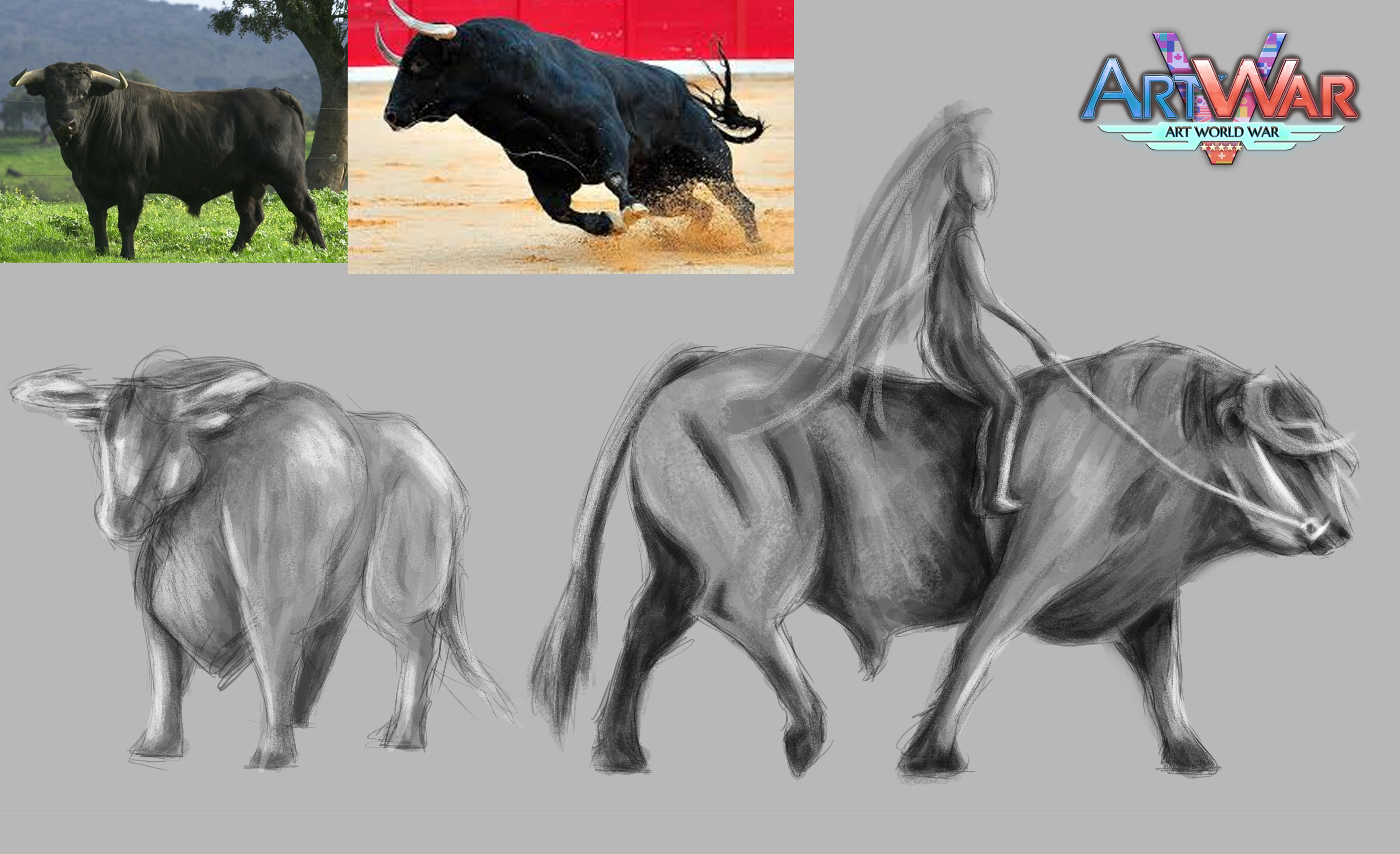
And...surprise revealed. She is coming with a creature. Of course, IT HAD TO BE A BULL! Changing a horse for a bull on this occasion was a clear decision for me from the start (also a challenge), because obviously I’ll magnify him. In English I know it is only called fighting bull, but the real name of the breed is “Toro de Lidia”. I love these animals and, sadly, hate the bullfighting tradition. They are not dangerous at all. In the contrary, they are as noble as horses. A bull is a Spanish iconic, and I think that all what it represents and its tragic life (due to humans and its tradition), matches perfectly with my character of La Maja (led to war, also provoked by humans). She can’t ask for a better partner to go to war.

I only have two thumbnails yet to check the proportions between both characters, but I’ll develop it soon.

wooooow this is looking awesome!!!! such nice colors and design
que lindas referencias, que lindos colores! exitos! muy buen trabajo

So much research and amazing work!

15 days later

Hello again! My last two weeks have been madness, and I'm trying my best to finish my entry to meet the deadline! The back view is still in process, but I decided that even if that it's not fully finished, I had to keep on with my illustration. Otherwise I'm sure I will feel overwhelmed in the end by it.

I have recorded myself while drawing a set of 9 thumbnails to work in composition. Of course, don't expect any details. In fact, I have used some bits of images that could help me quicker (by doing photobashing) to see what works better. After some discussion with close ones, I have decided that number 3 will be the chosen one, although I want to fix a bit more the space between elements. I have doubted in between 2, 3, 4 and 9. What do you think? Do you agree with carrying on number 3?

Song: Bagdad by Rosalia (to keep the right direction :+1: ) . Piano version.

Thanks for watching!

I'm wondering what it would look like, if the background would be in more contrasting colors. Maybe she would pop even more then.😄

11 days later

Definitely, I will work more in the background :smile: number 3 has been the chosen one in the end!

Time is passing by so quickly...I hope I can submit everything in time for the deadline! Leaving here a 3/4 view of my character, as I need it to develop a design for the final illustration.

15 days later

Hi! Well, no time for much more. Only a week left for the deadline. Doing my best to finish everything by then. Back view is finally done. My final Illustration is almost there.

I've decided to post this one too, without the spanish mantilla and veil, in order to appreciate a bit better the back view design.

14 days later

Hi! I've decided to make an extra post to explain a bit more my final entry. I haven't share barely any details of my process with the final illustration, so here it goes:

If you scroll up, you might have seen my quick sketchy thumbnails. The selected one was number 3:

Thumbnails are not my strength, but definitely, they helped me to make right decisions in time.

So, I kept up with my design and worked for ages on the silhouette of La Maja, riding her bull-war machine. First, the initial sketch:

And second, I'm posting the final version of the silhouette given that the art process became at some point very very messy! But at least you can check that the result was already pointing to the right direction:

One of the details that I corrected almost in the end was the sword. In the beginning, I did not think that I should make my character grabbing the sword together with the reins, but the more details I added, the more I realized that the sword had to be used just right there, as they were in war, in the middle of a battle.

I want to talk about the composition too. Even though I’m quite happy with the final result of my illustration (having in mind that I had a little time to create it as my days are busy with my job), maybe the cannon ended up being too big. Sometimes I think about it, and sometimes I just deal with it and say to me that it’s fine. After all, the name of the illustration is called “The last cannon”. Both, La Maja and her bull, and also the cannon gun were representing that same title.

I treated carefully the greyscale, although with such amount of details, it can be a bit more difficult than other pieces that I do with flat colours. Also, I’m pointing out with blue arrows the eye direction of the audience. That should be the path that an eye would follow to read the image, according to the diagonal lines of the composition and light/greyscale tones of colours.

As for the details of my characters, most of them have been explained above in other posts. If I have to say something else about this, it is again about the Doma vaquera style (Spanish western style). First of all, I did and interpretation of a horse on top of a bull, which ended up being more powerful as a war machine. However, there are some bits of the bull that are nods to a horse. For example, all the equipment (bridle and saddle) are originals from the Doma vaquera designs. But also, the mane has been adapted to the same hairstyle that is usual in that discipline. Bulls don’t have any mane at all. Only horses do. So, I decided to go forward and make that final mix in between them.

Finally, I hope you can distinguish the nod to the Spanish flag in my final illustration as well. In both, concept sheet and final illustration, I played with the idea of making an “old book” of history, as my main inspiration was the real History of Spain, The Independence War on 1808. In particular, based on the 2nd of May, as it was the bloodiest episode of war in our country. Also, never forget the artist Francisco de Goya, who let us see that war through his art, plus, the Majismo trend and Las Majas (dressed up and naked. You can take a look on google of Francisco de Goya's art piece “La maja desnuda”(naked), which is the same one of his other piece “La maja vestida” (dressed-up)). I need to add that, Rosalía performed as a Maja in her “Di mi nombre” Videoclip, and she was a huge inspiration for my design in the end. It all made a whole puzzle in my mind: a warrior, a lady, a strong and sexy woman and a modern view to be adapted to my digital art.

You could see a red frame (at the bottom and top of the images) representing the Spanish flag.

Having said that, I hope you could appreciate those red and yellow colours in the overall desings and illustration. Playing with fire was like heaven to represent those colours in top of the real colour materials of some other elements (outfit, veil, saddle, etc).

Again, about my characters, here is a bit of the storytelling behind them, so you can understand their backstory through the writing:

"La Maja is a young Spanish woman, set in the City of Madrid. She was taught with the same education as every single woman in Spain by that time. But something in her own nature was different, and when she was 16, she became part of the urban tribe of Las Majas, as a rebellion with all of those who thought she would be tamed alive. No, she was not a housewife, despite the fact that she knew that role deeply. No, she dreamed with a brighter future, performing her art, becoming a master of her craft.

Suddenly, one day war arrived to her life, and all the things that she refused to have, were then an option in her mind. With every single sound of a cannon shot in war, she imagined her future, with her children, with her family and friends. In her beloved warm land. At home. With freedom.

When the people that she loved never came back from war, she realized it was her turn to act. She had no choice to achieve her own dreams. Fail and die, and it will all be ended. Or win and live up the way you love.

But at the end of the day, she was only a woman. Men were the only ones made to go to battle. She hadn’t got a man’s uniform, neither the best sword. Not even a war horse. So, after her father died first while fighting, she took part of his uniform to honor him, his war medals, his old sword, and combined them with her own outfit to honor her spanish culture, her believes as a woman and human being the way she knew it, and to honor the strong and powerful women that represented Las Majas. She would look for a horse, but would not find any. Instead, she would run into an abandoned stables near her house, where a massive and brave bull was tied up. She set him free and whispered him with a soothing voice. Two untamed creatures that understood each other, those who shared the same destiny in life, now they gallop together to war, until the last cannon could be discharged to save their country: Spain."

I made these two adjustments to the final design of the front view: the chin had to be larger (I realized about it the more I was doing facial expressions) and part of the jacket had to be red to match with other bits of the outfit.

Here I leave Front and Back views with a higher resolution for you to see.

I hope you like this post. It has been a very nice experience, to take part in this contest, and I hope to be around in the following years! So, this is not an “adios” (goodbye), this is just and “hasta luego” (see you later) … 😉