


Hey, really nice concepts! Those weapons are so cool, and I really love her intimidating expression.

 Thank you! I finally cleaned that up. Meanwhile started 3 more ..I have a habit of taking too long to finish a piece, then I lose interest in it and just start something else. I found 8 from recently i started and abandoned, that are decent enough to not delete, but not finished. There’s also been a number of drawings I felt I “outgrew” - became better before I finished them, and it would be easier to start from scratch than fix them. Anyone else thinking that?in23.9k
 Lady Death Fanart Collectible: Part 6 Polypaint and base Hi, it’s time to share with you another part of the process to create this fanart piece. Polypaint As this is my first collectible fanart I didn’t have previous experience with polypaint so I tried my best and played a bit with it.I wanted to give a ghostly and eerie look to Lady Death, she is beautiful and deadly, but at the end of the day she is a woman that died and was reborn at hell as an avenging spirit, that’s why I gave her skin tone a bluish very cold tone.As you will see I gave myself some creative freedom to deviate from the traditional color scheme that this characater has in comics and illustrations.To add a bit of sensuality by painting some freckles on the face and the chest. The dark nature of this character was the perfect excuse to gave her a kind of goth make up, very dark shadows around the eyes, blue lips and fingernails. I know that the original character includes sexy red lips but I wanted this girl to have a sexy but at the same time creepy look, that’s why we can see some thin veins emanating from her eyes. The biggest chromatic change I did for this character is at the hair. Lady Death has a characteristic white weavy hair but in my fanart I decided to gave her a very saturated blue color.The reason behind this wasn’t only an aesthetic choice. I want that the face area strongly pulls the attention of the viewer so this area needed a stronger contrast. Another reason is that I want her to have a more modern look, as I mentioned before, I’m strongly attracted to women with goth/punk look. I gave myself half an hour or more to analyse the work of experienced sculptors that create collectibles and I discovered that the use of darker values on the skin is often applied to create a greater sense of volume and three-dimensionality. I found that areas with heavy ambient occlusion are the perfect places to paint with darker colors in order to increase the separation between different forms. Even though she has a bluish skin tone, I used a bit of warmer hues in areas that, in real life, tend to go towards red and pink, this is very obvious in the nose, cheeks, and knuckles. Thinking with a logical mind it’s completely absurd to have warmer tones on the body of a zombie like creature but I didn’t want to limit myself by using only blue tones, it looks boring and artificial. In real life these colors are created by blood vessels in areas where the skin is very thin. ** Scythe **for her weapon I applied a cool gray with some warmer variations, this color scheme is influenced by the work of H.R giger. Base I’d like to talk about the design for the base which, to be honest, I forgot to develop along with the character.My main idea with the base is to show that Lady Death inhabits a very sterile and arid land, at the end of the day she is at hell.You can see a that she walks over dirt and rocks, a sign that she’s surrounded by death and loneliness. As part of the landscape we can see some bones and skulls to reinforce the idea of lack of living creatures, yet we can see three hands that try to reach her legs.This hands represent that all creatures are subordinated to her power and seek an evil blessing with a simple touch of the princess of the damned.1- The hand with skin burns represents the souls of those who are newcomers to hell, tortured souls that suffer for the sins comitted on earth.2- The hand with greenish rotten skin and pustules is the reminder of the decay that has infected the souls of those who have been trapped and have forgotten their humanity3- Last but not least, the hand of a demon shows that even dark creatures and entities bow before her presence. The cherry on the top, at least in my vision, are the simese twins that emerge from the ground, this malevolent creatures remind us that in hell there’s only perversion and any trace of innocence is lost. Thanks for reading till this pointI’m really happy to be very close to finish this creative journey, last but not least it’s mandatory to talk about splitting the sculpture in several pieces to be printed, this will be my last entry before showing the final rendered images. See yaMay Zbrush be with youin1.4k

 memory 2min gartic phone, used ref 2m gartic, used ref for pose 2min gartic 2min gartic 2min gartic 2min gartic memory memory memory memory study memory memory memorymemory memory memory memory memory memory study memorystudy study stylized left memory, right study study memory memorymemory memory memory memorymemory memory, porportions r offmemory memorystudystudy memorymemorymemory memory memory memory memory memory memory memory, right leg is a bit broken The feeling of only getting 1 - 3 likes on a social media post will never not be discouraging. But nothing is discouraging enough to make me quit drawing. I think the strategy of drawing a lot of stuff and waiting a while to post is good though rather than posting it immediately and then feeling that sadness on the next set of drawingin

 studies studies juri study imagination, how I feel before a speech imagination imagination study something I drew for my presentation also drew this for my presentation, didn't fix the one hand being bigger than the other imagination + study study studies study study, I need to fix the face a bit based on screenshot from anime but in my style study. except for the eye study studies studies study. changed some things tho imagination imagination imagination study studies, except top right samurai based on anime screenshot wolverine studies, changed some of the poses a lil, not very good at all, but first time i drew the character ever. semi study studies study imagination imagination imagination , for first time ever i tried to draw over 3d model for middle pose, I dont like the result tbh, but it makes it much easier than coming up with it from memory.imagination, except right figurestudies imagination + studies, coming up with action poses r hard, these are not dynamic enough, I will redraw better ones in future. imagination , imagination imagination study, except for eye imagination imagination imagination doodles except for the two chrollos imagination storyboard thumbnail, idk if i ever shared this. my storyboards end up being a little detailed since i usually just draw in one layer.in21.8k

 Hello! My name is Vithor, I am from Brazil, studied Design at a local college worked as an illustrator for more than 10 years. I took a time off around 3 years ago and am trying to get back in my art shape and maybe become professional again. Here are some recent pictures: You can find timelapses for most of them on my instagram: www.instagram.com Vithor Albertim (@vithor_albertim) • Instagram photos and videos 123 Followers, 638 Following, 19 Posts - See Instagram photos and videos from Vithor Albertim (@vithor_albertim) Comments and critiques are always welcome.Cheers!in782

 Thank you @daceronine! If I remember I save in google cloud, I will have to stick a note to do it more often. Lamp is from life. Poses are from refs but I look at refs for a while and then try to do it myself and look it up if needed. Outfits and rest is from imagination Something went wrong while installing system so we will have to wipe everything again... pc works but something is wrong. We will wait till internet is done and I will save everything on cloud this time Threads came out in eu. It's been 3 days and I had more engagement than after half a year on instagram. It feels really nice I hope it stays this way A portrait of old dude. It's the same character I posted a while ago. Inspired by Bayard Wu work. At first I thought of him as a bear but I named him Fenrir and I think wolf suits him better. Eye gave me a bit of hard time but I think it is fine now. I focused on face and forgot about area below. The way I draw hair clashes with greying hair. I had the same problem while doing Lohse's white hair. Does it looks like it is greying here? I love how desaturated red looks blue there. I keep lying to myself that I will use different color scheme but It all comes down to this blue and yellowish one it is just flipped this time Have a great day!in47.0k
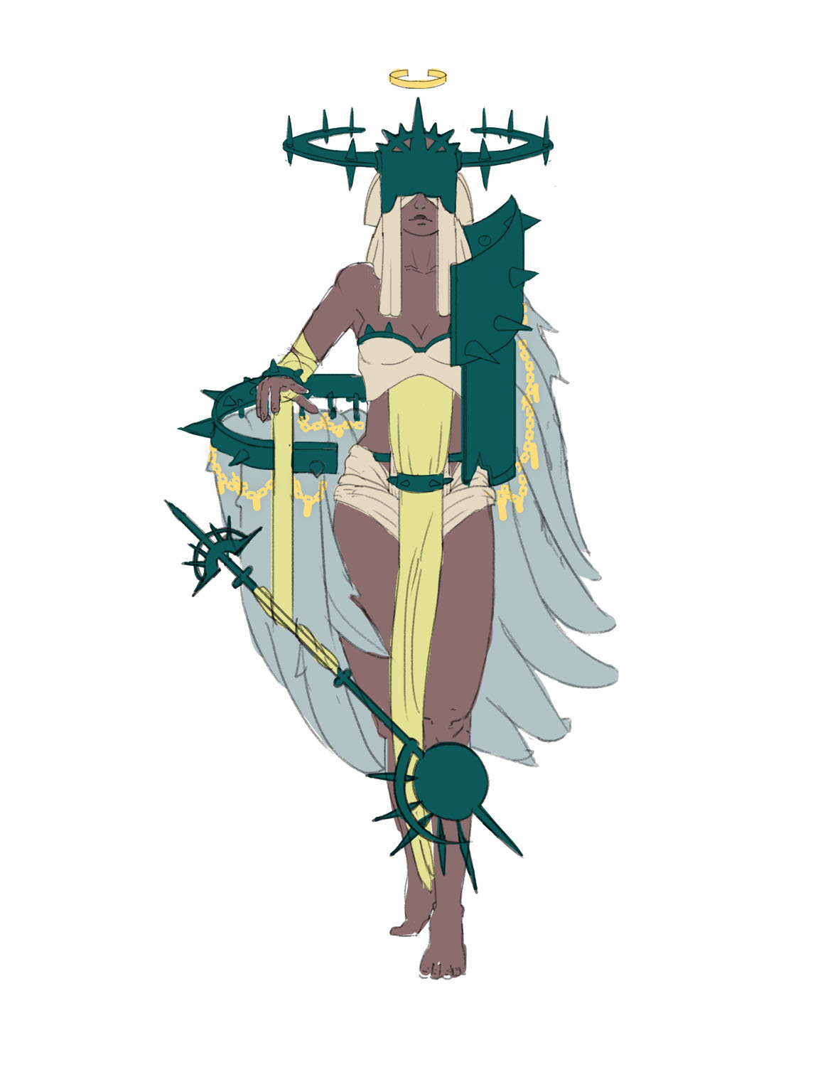
Great concepts! She reminds me of Lady Justice with her blinded eyes, which really suits her role. Looking forward to see how you will portray her in your final images!
Hey racnos, i like the concept and the idea you got in this design! i alos like the connection with the spikes, on the headpiece and on the wings, its always good to repeat a design on a character so that it doesnt look random! my only thought on this is, the wings, can she fly? if yes how? if no, i would suggest to maybe resize some of them that it doesnt look symetrical but keep the balancing! just that the viewer gets a clear vision what the wings are for 
cheers 
thanks @stefankoidl ! No, she cant fly! The wings are decoative
I was thinking that if she collect the feathers of other angels those feathers can have like a little chain with the names of the previous owners.
Here is a little update with the idea!

I really like the chains, they add that detail that I think the character needed.
Also, i made this for fun this morning! what if the champion is a concept for a League champion? just some clunky gifs ! 


I think all the colors suit your character except the greens but I'm sure you can find good colors if you go to ArtStation from similar characters
I don't think the green itself is the problem, I just think you need to incorporate some warmer, reddish colors into the design:)
I agree with @sanguine ! Perhaps a more rusty colour?
Thanks all for the feedback! I just come home since new year and will start working again later!
Really love the colors! I really love the idea of giving her League moves (I’m trying to envision her ult and her passive, but that’s just me nerding out tbh  ) and the asymmetry in her design. As for the green, I agree that the shade of green looks to evil and dark. I think that a light blue-green with hints of discoloration might look better (I don’t know yet if it’ll work, but I find that lighter versions of primary paint colors such as red, blue and yellow tend to give a more “good” look while darker versions of secondary colors like purple, green and orange tend to give a more “evil” look). Can’t wait to see the final result!
I think the concept of the character its pretty cool, an angel without an arm sounds awesome.
About the design i would try to add more details in the weapon, in the armor, etc, things that can tells us more about the archangel of punishment like the idea of having little chain with names. Hope to see more updates soon.
Hola, vengo a flotar.
Thanks to both of you @mystarryspace and @noodles !
i'm much happier with the result now, i still want to hear your opinions on the new design and color before starting the character sheet! sorry it takes me so long to decide what to do.

The chains and the feathers are still loosely done
I like the new colors, but maybe you can try a little bit darker versions of that yellowish green. The patterns fit well btw. Also you can try using an accent color for the metals
The new colors are great!!! Maybe the yellow of the chains look too saturated. 


Heya! Stopped by cause you asked me for me to, haha. Interesting concept, especially after seeing your references. For one, the silhouette is very much in a solid rectangle with no varying angles. I think something that could help is using more of a big to small shape breakdown. For example, the plates with three spikes are the same exact size and dimensions, which do not add variety to the read!
Try using each piece of armor individually to point towards the character's focal point, her head. Use specific elements towards the torso and slowly lose specific interest as you go down to her toes. People tend to look more towards the torso area because the head/face is what we naturally look for at first glance. I think you're kind of overthinking how much is needed to make your character look interesting/cool-which is probably why there is so much trying to grab one's attention atm! Try to simplify her armor design and it'll look more organized and interesting! Cheers-


