• Gave myself 5 days to do something. This is what I managed to do. I'm trying to get better at illustrations, but I have patience to work on something for 3 days maximum :( Splash_Process.jpg5000x3140 2.21 MB Splash_Process-6.jpg3896x2429 2.83 MB concept list char copy.jpg5388x3000 1.7 MB
    20.3k
  • Did a character concept for a course.https://www.artstation.com/artwork/P6gm3y - more:) list1.jpg3541x1920 2.82 MB
    20.3k
  • Day 4: Star Wars May The 4th =] Queen Padmé Amidala in my art style! First time drawing her and I really enjoyed making this one! Used watercolours, ink pen, acrylic markers and gold paint for accents on my Canson mix media sketchbook. I hope you like it!
    80.5k
  • A creature design from a while back
    by
    6.5k
  • Here is some more recent stuff, I need to make more body studies
  • It's been a while and god, it is so cringe to go through all previous messages xDmy study.
    20.3k
  • Thank you! I finally cleaned that up. Meanwhile started 3 more ..I have a habit of taking too long to finish a piece, then I lose interest in it and just start something else. I found 8 from recently i started and abandoned, that are decent enough to not delete, but not finished. There’s also been a number of drawings I felt I “outgrew” - became better before I finished them, and it would be easier to start from scratch than fix them. Anyone else thinking that?
  • Lady Death Fanart Collectible: Part 6 Polypaint and base Hi, it’s time to share with you another part of the process to create this fanart piece. Polypaint As this is my first collectible fanart I didn’t have previous experience with polypaint so I tried my best and played a bit with it.I wanted to give a ghostly and eerie look to Lady Death, she is beautiful and deadly, but at the end of the day she is a woman that died and was reborn at hell as an avenging spirit, that’s why I gave her skin tone a bluish very cold tone.As you will see I gave myself some creative freedom to deviate from the traditional color scheme that this characater has in comics and illustrations.To add a bit of sensuality by painting some freckles on the face and the chest. The dark nature of this character was the perfect excuse to gave her a kind of goth make up, very dark shadows around the eyes, blue lips and fingernails. I know that the original character includes sexy red lips but I wanted this girl to have a sexy but at the same time creepy look, that’s why we can see some thin veins emanating from her eyes. The biggest chromatic change I did for this character is at the hair. Lady Death has a characteristic white weavy hair but in my fanart I decided to gave her a very saturated blue color.The reason behind this wasn’t only an aesthetic choice. I want that the face area strongly pulls the attention of the viewer so this area needed a stronger contrast. Another reason is that I want her to have a more modern look, as I mentioned before, I’m strongly attracted to women with goth/punk look. I gave myself half an hour or more to analyse the work of experienced sculptors that create collectibles and I discovered that the use of darker values on the skin is often applied to create a greater sense of volume and three-dimensionality. I found that areas with heavy ambient occlusion are the perfect places to paint with darker colors in order to increase the separation between different forms. Even though she has a bluish skin tone, I used a bit of warmer hues in areas that, in real life, tend to go towards red and pink, this is very obvious in the nose, cheeks, and knuckles. Thinking with a logical mind it’s completely absurd to have warmer tones on the body of a zombie like creature but I didn’t want to limit myself by using only blue tones, it looks boring and artificial. In real life these colors are created by blood vessels in areas where the skin is very thin. ** Scythe **for her weapon I applied a cool gray with some warmer variations, this color scheme is influenced by the work of H.R giger. Base I’d like to talk about the design for the base which, to be honest, I forgot to develop along with the character.My main idea with the base is to show that Lady Death inhabits a very sterile and arid land, at the end of the day she is at hell.You can see a that she walks over dirt and rocks, a sign that she’s surrounded by death and loneliness. As part of the landscape we can see some bones and skulls to reinforce the idea of lack of living creatures, yet we can see three hands that try to reach her legs.This hands represent that all creatures are subordinated to her power and seek an evil blessing with a simple touch of the princess of the damned.1- The hand with skin burns represents the souls of those who are newcomers to hell, tortured souls that suffer for the sins comitted on earth.2- The hand with greenish rotten skin and pustules is the reminder of the decay that has infected the souls of those who have been trapped and have forgotten their humanity3- Last but not least, the hand of a demon shows that even dark creatures and entities bow before her presence. The cherry on the top, at least in my vision, are the simese twins that emerge from the ground, this malevolent creatures remind us that in hell there’s only perversion and any trace of innocence is lost. Thanks for reading till this pointI’m really happy to be very close to finish this creative journey, last but not least it’s mandatory to talk about splitting the sculpture in several pieces to be printed, this will be my last entry before showing the final rendered images. See yaMay Zbrush be with you
    1.4k
  • memory 2min gartic phone, used ref 2m gartic, used ref for pose 2min gartic 2min gartic 2min gartic 2min gartic memory memory memory memory study memory memory memorymemory memory memory memory memory memory study memorystudy study stylized left memory, right study study memory memorymemory memory memory memorymemory memory, porportions r offmemory memorystudystudy memorymemorymemory memory memory memory memory memory memory memory, right leg is a bit broken The feeling of only getting 1 - 3 likes on a social media post will never not be discouraging. But nothing is discouraging enough to make me quit drawing. I think the strategy of drawing a lot of stuff and waiting a while to post is good though rather than posting it immediately and then feeling that sadness on the next set of drawing
  • Urban Dragon Girl Wip Urban Dragon Girl_wip1.jpg5000x5000 1.11 MB
  • Long time no see! New artworks produced lately
    6.4k
  • studies studies juri study imagination, how I feel before a speech imagination imagination study something I drew for my presentation also drew this for my presentation, didn't fix the one hand being bigger than the other imagination + study study studies study study, I need to fix the face a bit based on screenshot from anime but in my style study. except for the eye study studies studies study. changed some things tho imagination imagination imagination study studies, except top right samurai based on anime screenshot wolverine studies, changed some of the poses a lil, not very good at all, but first time i drew the character ever. semi study studies study imagination imagination imagination , for first time ever i tried to draw over 3d model for middle pose, I dont like the result tbh, but it makes it much easier than coming up with it from memory.imagination, except right figurestudies imagination + studies, coming up with action poses r hard, these are not dynamic enough, I will redraw better ones in future. imagination , imagination imagination study, except for eye imagination imagination imagination doodles except for the two chrollos imagination storyboard thumbnail, idk if i ever shared this. my storyboards end up being a little detailed since i usually just draw in one layer.
    by
    21.7k
  • Quick fun sketch. CyberFish.jpg2394x3857 674 KB
  • Neon Gambit This is a fan art of my all time favorite character Gambit from the X-Men.I made this a birthday gift (26.04.2024) to myself and honestly I really do like how it turned out in the end =] I hope you like it as well =]
    80.5k
  • Art Blog - April to September 2023 Suffer a little burn out. Look at some memes. Here's some art from in between. critique.jpg1333x5736 1.77 MB
    20.1k
  • And some more! Been painting over them a bit more this time. Some variants I tried for the old guy using mainly the liquify tool. Someohow looking a bit like Owen Wilson (not intended :D)
  • Cafe sketch/color study
  • Hello! My name is Vithor, I am from Brazil, studied Design at a local college worked as an illustrator for more than 10 years. I took a time off around 3 years ago and am trying to get back in my art shape and maybe become professional again. Here are some recent pictures: You can find timelapses for most of them on my instagram: www.instagram.com Vithor Albertim (@vithor_albertim) • Instagram photos and videos 123 Followers, 638 Following, 19 Posts - See Instagram photos and videos from Vithor Albertim (@vithor_albertim) Comments and critiques are always welcome.Cheers!
  • @patrycja.lerch Thank you I created another variant, which might capture the witch look I was going for better
  • Thank you @daceronine! If I remember I save in google cloud, I will have to stick a note to do it more often. Lamp is from life. Poses are from refs but I look at refs for a while and then try to do it myself and look it up if needed. Outfits and rest is from imagination Something went wrong while installing system so we will have to wipe everything again... pc works but something is wrong. We will wait till internet is done and I will save everything on cloud this time Threads came out in eu. It's been 3 days and I had more engagement than after half a year on instagram. It feels really nice I hope it stays this way A portrait of old dude. It's the same character I posted a while ago. Inspired by Bayard Wu work. At first I thought of him as a bear but I named him Fenrir and I think wolf suits him better. Eye gave me a bit of hard time but I think it is fine now. I focused on face and forgot about area below. The way I draw hair clashes with greying hair. I had the same problem while doing Lohse's white hair. Does it looks like it is greying here? I love how desaturated red looks blue there. I keep lying to myself that I will use different color scheme but It all comes down to this blue and yellowish one it is just flipped this time Have a great day!
  • Been bad about posting updates on the forum. I figure I should just throw down stuff. instead of waiting until I finish something.
    14.4k
  • Havent done much this year since I am focusing on learning programming and deving my own Indie Game . But here 's a New Year Piece 2024 , she 's the mascot for my Game Studio - Lucid Realm : Lucid Chan ! LucidChan_v001_sketches.jpg3072x4352 973 KB
  • IMG_0637.jpeg3240x4050 1.6 MB
  • Long Crested Eagle studyI had so much fun making this one and honestly I love that Eagle! It looks so cool! Used for this one high quality watercolours, high quality watercolour sketchbook/ cold press and it was 300 grams paper.I hope you like it!
    80.5k

Hey there,

Thought I'd best make a start on my entry.

I had a bunch of different ideas floating around (as usual), but they were more tidbits of different things; nothing particular. Anything from exploring the four elements, referencing mythological creatures and exploring dark or death-related things like shadows and ghostly figures.

This led me to look into the many-varied Final Fantasy summons and design focusing around an element or particular type of creature; in this case water. I had originally thought to do something quirky or more comedic e.g. a bumbling not so evil character that's trying too hard. I later decided no to go that route, but also didn't want to create something too cliche.

I've narrowed down my idea to a siren-esque type of character that is quite dark, possibly a once beautiful face now with translucent or decaying flesh (will explore if this is more fish-like or human). If the bottom half is more human, I was thinking of 'dressing it up' or forming 'clothing' from things found along the sea bed e.g. sand, shells, coral etc...

I'll move onto some concepts next, though I won't be spending too much time on these as I'm not much of a concept artist and I tend to work things out as I sculpt / model.

Here's a bit of an update on my design process. Just roughly sketched out and tried to work through some of my ideas and refine them a bit.

I think I like the third one for the most part and will probably play around some more with the amount of deacy, 'clothing' and placement and proportion as I go. I won't worry about awesome poses for now as I can revisit this if needed or figure it out once the model is rigged.

Happy to hear any thoughts or suggestions.

Howdy!

I've been chipping away at the sculpt and here's what I have so far.

I think I have the proportions worked out for the most part and a fairly good base for the character. Next I'll be finalising the forms some more and making a start on the detail work.

Thanks for stopping by and feel free to share any tips or ideas.

Hey everyone,

Character update! I've made a few more adjustments and finalised the base forms for the most part and have now added all the spiky / spiny bits for the 'crown', 'hair', teeth and fins. I'm not entirely sure how I'll do the frilly red bits on the 'hair', but I'll probably leave that until later and use hair cards for it.

I've spent some time creating a custom VDM brush (I'm using ZBrush 4R8 by the way), partly because I've never created a custom brush, I wanted to use a new feature and because I chose to work with subdivisions. I figured it would be perfect for all the spikes, fins and fangs in my design and it is quite good and saves time to an extent. Playing around with it was heaps of fun too. The issue I had was that I couldn't use any modifiers to bend or tilt the brush, as they were greyed out. I had to make some manual adjustments instead with masking and polygroups, the good 'ol fashioned way and had to wonder how much time (if any) I actually saved in the longrun.

Anyway, that's my rant. I'm going to detail and polish up in and around aaaaall the spiky bits and start forming the 'clothing' and other objects picked up from the ocean floor. I'll need to wrap the sculpt up real soon or I might not be able to finish my character in time (eek!).

A couple more detailed shots.

All right!

I'll be wrapping up the sculpt soon (though ideally I would have done this already). I did another detail pass and added all the sea muck she picked up along the way. I considered leaving some details out of the sculpt, however, much like during the concept phase, as I played around with adding and removing certain elements, I thought it still looked best with everything 'intact'.

I still want to add the deaced / 'chewed off' areas like in the concept. Again I considered leaving this out, but I feel it balances out the overall design a lot more and makes it more intereseting.

Onward!

Another entry for today (I must be working real hard). The mistress now has all the gnarly decayed, chewed off, chopped up bits throughout. I didn't make the extra detail too defined as I was not only short on time, but not exactly sure how I was going to go about it. I left it somewhere in between and focused more on the forms. I can define it more or make it more gross looking when I texture it.

I was going to add some surface detail to the sculpt, but I decided that I'd show it in the texture instead. I am fairly sure that sculpting it in won't make too much difference, though I can always add it later if I change my mind.

She now has 2 eyes. I had considered having just the one or a gross dangling, decaying eyeball, but what I'll do instead is make both a bit different in size and / or colour.

12 days later

Hi!

It's been a heck of a week and I almost 'threw in the towel', but I'll stick it out and see how complete a piece I can come up with in a short amount of time.

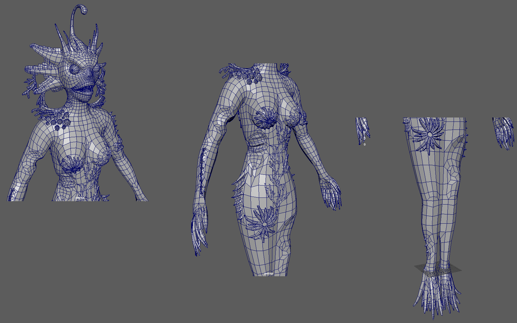
The retop has taken a lot longer that expected, but it will help make the next few steps in the process a little easier.

There have of course been a few setbacks along the way. I forgot that when exporting tools from ZBrush, any polygroups you have created will be broken up into separate meshes. One thing I liked about this (that I don’t think I knew before) was that hidden polygroups were removed from the mesh on export as I had some overlapping objects that this came in handy for.

Attempting to sort through and combine the meshes in Maya was not the best idea, so instead I had to re-export most of the meshes and make sure there were polygroups where I specifically wanted the mesh separated and not.

Some time wasted, but at least I’ll be sure not to forget next time.

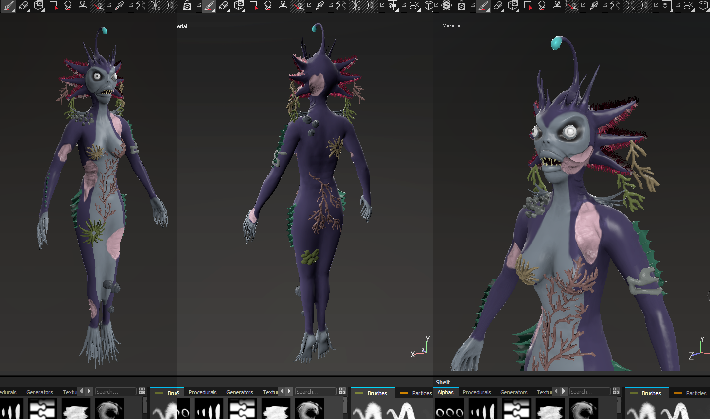
Speaking of time wasted, I uncovered a fun issue in Maya. After exporting everything from ZBrush (more than once :/), I imported all the .obj’s into a Maya scene and converted them to alembic (.abc) format as this reduces/prevents any lag you might experience when working with large files. This does almost double the file size, though did I consider that working with a large file might be a problem (despite having a fancy new system). Turns out I was right. Maya 2018 hates binary files (.mb) over 2GB. The workaround I found was to save it out from a previous version as a .ma file, though this will drastically slow things down.

This didn't work in my case unfortunately and I did lose some of the retop work I had done on the face. It wasn't a Maya 2018 specific issue, as I tried to both fix and replicate the error in a few previous versions of Maya.

A few things to avoid this in future would be to save the file out in more than one format and I could have exported what I already retopologised separately as a bit of a safeguard also.

Now I'm moving onto what will hopefully be a quick unwrap of my model.

Still chipping away at this even though I'm pretty sure I won't have anything complete enough in time to submit.

UV's are nearly done, just need to move a few things around to fit the space properly and scale.

Let's see what I can get done texture-wise before the deadline.

Welp, goes without saying that I wasn't able to finish my character in time. Although I figured I'll continue this thread as I finish things up regardless. I don't usually document my progress, but found that I actually don't mind and if one of you reading this can take something away from it also, that makes it even better.

I've just started learning how to use Substance Painter and so far so good. I baked out the normals and ao of all the bits and pieces for my character, popped them into Substance, did some touch-ups in Photoshop and tried to figure some stuff out on my own, but I had no idea what I was doing. I eventually found that you can paint straight over normal and ambient occlusion maps in both 2D and 3D views. I cleaned those up further and here's what I have.

I think I'm getting the hang of things now. It's a bit of a different headspace as far as how the software works vs. other programs I've used. The default shaders are kind of odd, but again, I'm getting the hang of getting things to work and display as I want.

Base colours are down, the ao and normal maps are playing along fairly nicely (after some adjustments) and I've started making some adjustments to my base. Now I can get onto some detail work. I have an idea of what I want, but I'll still play around with a coulple of things and work it out / flesh it out more as I go.