


Thank you so much! About the legs I think i know what you mean , I need to do more knee studies ! Thanks for the feedback ^^

 Thank you! I finally cleaned that up. Meanwhile started 3 more ..I have a habit of taking too long to finish a piece, then I lose interest in it and just start something else. I found 8 from recently i started and abandoned, that are decent enough to not delete, but not finished. There’s also been a number of drawings I felt I “outgrew” - became better before I finished them, and it would be easier to start from scratch than fix them. Anyone else thinking that?in24.3k
 Lady Death Fanart Collectible: Part 6 Polypaint and base Hi, it’s time to share with you another part of the process to create this fanart piece. Polypaint As this is my first collectible fanart I didn’t have previous experience with polypaint so I tried my best and played a bit with it.I wanted to give a ghostly and eerie look to Lady Death, she is beautiful and deadly, but at the end of the day she is a woman that died and was reborn at hell as an avenging spirit, that’s why I gave her skin tone a bluish very cold tone.As you will see I gave myself some creative freedom to deviate from the traditional color scheme that this characater has in comics and illustrations.To add a bit of sensuality by painting some freckles on the face and the chest. The dark nature of this character was the perfect excuse to gave her a kind of goth make up, very dark shadows around the eyes, blue lips and fingernails. I know that the original character includes sexy red lips but I wanted this girl to have a sexy but at the same time creepy look, that’s why we can see some thin veins emanating from her eyes. The biggest chromatic change I did for this character is at the hair. Lady Death has a characteristic white weavy hair but in my fanart I decided to gave her a very saturated blue color.The reason behind this wasn’t only an aesthetic choice. I want that the face area strongly pulls the attention of the viewer so this area needed a stronger contrast. Another reason is that I want her to have a more modern look, as I mentioned before, I’m strongly attracted to women with goth/punk look. I gave myself half an hour or more to analyse the work of experienced sculptors that create collectibles and I discovered that the use of darker values on the skin is often applied to create a greater sense of volume and three-dimensionality. I found that areas with heavy ambient occlusion are the perfect places to paint with darker colors in order to increase the separation between different forms. Even though she has a bluish skin tone, I used a bit of warmer hues in areas that, in real life, tend to go towards red and pink, this is very obvious in the nose, cheeks, and knuckles. Thinking with a logical mind it’s completely absurd to have warmer tones on the body of a zombie like creature but I didn’t want to limit myself by using only blue tones, it looks boring and artificial. In real life these colors are created by blood vessels in areas where the skin is very thin. ** Scythe **for her weapon I applied a cool gray with some warmer variations, this color scheme is influenced by the work of H.R giger. Base I’d like to talk about the design for the base which, to be honest, I forgot to develop along with the character.My main idea with the base is to show that Lady Death inhabits a very sterile and arid land, at the end of the day she is at hell.You can see a that she walks over dirt and rocks, a sign that she’s surrounded by death and loneliness. As part of the landscape we can see some bones and skulls to reinforce the idea of lack of living creatures, yet we can see three hands that try to reach her legs.This hands represent that all creatures are subordinated to her power and seek an evil blessing with a simple touch of the princess of the damned.1- The hand with skin burns represents the souls of those who are newcomers to hell, tortured souls that suffer for the sins comitted on earth.2- The hand with greenish rotten skin and pustules is the reminder of the decay that has infected the souls of those who have been trapped and have forgotten their humanity3- Last but not least, the hand of a demon shows that even dark creatures and entities bow before her presence. The cherry on the top, at least in my vision, are the simese twins that emerge from the ground, this malevolent creatures remind us that in hell there’s only perversion and any trace of innocence is lost. Thanks for reading till this pointI’m really happy to be very close to finish this creative journey, last but not least it’s mandatory to talk about splitting the sculpture in several pieces to be printed, this will be my last entry before showing the final rendered images. See yaMay Zbrush be with youin1.4k

 memory 2min gartic phone, used ref 2m gartic, used ref for pose 2min gartic 2min gartic 2min gartic 2min gartic memory memory memory memory study memory memory memorymemory memory memory memory memory memory study memorystudy study stylized left memory, right study study memory memorymemory memory memory memorymemory memory, porportions r offmemory memorystudystudy memorymemorymemory memory memory memory memory memory memory memory, right leg is a bit broken The feeling of only getting 1 - 3 likes on a social media post will never not be discouraging. But nothing is discouraging enough to make me quit drawing. I think the strategy of drawing a lot of stuff and waiting a while to post is good though rather than posting it immediately and then feeling that sadness on the next set of drawingin

 studies studies juri study imagination, how I feel before a speech imagination imagination study something I drew for my presentation also drew this for my presentation, didn't fix the one hand being bigger than the other imagination + study study studies study study, I need to fix the face a bit based on screenshot from anime but in my style study. except for the eye study studies studies study. changed some things tho imagination imagination imagination study studies, except top right samurai based on anime screenshot wolverine studies, changed some of the poses a lil, not very good at all, but first time i drew the character ever. semi study studies study imagination imagination imagination , for first time ever i tried to draw over 3d model for middle pose, I dont like the result tbh, but it makes it much easier than coming up with it from memory.imagination, except right figurestudies imagination + studies, coming up with action poses r hard, these are not dynamic enough, I will redraw better ones in future. imagination , imagination imagination study, except for eye imagination imagination imagination doodles except for the two chrollos imagination storyboard thumbnail, idk if i ever shared this. my storyboards end up being a little detailed since i usually just draw in one layer.in22.2k

 Hello! My name is Vithor, I am from Brazil, studied Design at a local college worked as an illustrator for more than 10 years. I took a time off around 3 years ago and am trying to get back in my art shape and maybe become professional again. Here are some recent pictures: You can find timelapses for most of them on my instagram: www.instagram.com Vithor Albertim (@vithor_albertim) • Instagram photos and videos 123 Followers, 638 Following, 19 Posts - See Instagram photos and videos from Vithor Albertim (@vithor_albertim) Comments and critiques are always welcome.Cheers!in797

 Thank you @daceronine! If I remember I save in google cloud, I will have to stick a note to do it more often. Lamp is from life. Poses are from refs but I look at refs for a while and then try to do it myself and look it up if needed. Outfits and rest is from imagination Something went wrong while installing system so we will have to wipe everything again... pc works but something is wrong. We will wait till internet is done and I will save everything on cloud this time Threads came out in eu. It's been 3 days and I had more engagement than after half a year on instagram. It feels really nice I hope it stays this way A portrait of old dude. It's the same character I posted a while ago. Inspired by Bayard Wu work. At first I thought of him as a bear but I named him Fenrir and I think wolf suits him better. Eye gave me a bit of hard time but I think it is fine now. I focused on face and forgot about area below. The way I draw hair clashes with greying hair. I had the same problem while doing Lohse's white hair. Does it looks like it is greying here? I love how desaturated red looks blue there. I keep lying to myself that I will use different color scheme but It all comes down to this blue and yellowish one it is just flipped this time Have a great day!in48.3k
No problem, you do great work. Sometimes it takes another someone to spot things when you have been staring at the same image for hours. Happens to me all the time, I walk away for 15 mins and when I come back I can usually spot my errors. Its just a simple trick I use, otherwise I rage quit.  Keep them coming, beautiful use of colour too. Im still trying to set up my blog but im such a techno-tard I had to get help from the cubebrush team, im hopeless, but I can draw ok.

maybe a small shadow under the feet just to ground the character? Burlesque, wasnt that from the 20's? Black hair and red dress looks more like what you are trying to capture to me but then again I was born in the 70's so what do I know?  I like the polished look of the red dress and that rough un polished look of the hand fans, works for me, great anatomy too, youve managed to capture that stylized effect of the burlesque posters from way back when. Very cool

You are improving so much with each new piece, it's really inspirational to see!! My only suggestion is I feel like alot of your poses are kind of.. staring forward with legs forward, basically floating or standing. You should try for more dynamic pieces! Maybe have one of her legs going back and one folded and going forward with the shield up? I am not sure how much you can change the current sketch right now.
Hi! Thank you so much for the feedback! Now that you mentioned this I do see the same pose in all of my drawings. :c The previous drawing I posted I wasn't happy with to I scraped it and started a new one which I also don't like , so I started a new one , Idk where I'm going it with it, maybe Sailor Moon, maybe something else but guess what ..same pose fml ... buuut I do quite like how it's turning out so I'm gonna keep it this time, but I'll try to be more diverse in the future! 


I really like that Sailor Moon Piece!!
Keep it up really like the painterly stuff i think you just need to polish a bit more to level up on your work other than that stuff looks great im really digging the colors too XD
BW sketch so far , don't mind the wings, I just have no idea what I'm doing with them 

And I just realized her ears are way down the moment I posted it. Great..
I have NO idea if you are looking for critiques or suggestions, so I don't want to over-step my bounds. But I wanted to see if I could "push" the pose? I don't know what you could do right now, since your sketch is pretty refined (( and gorgeous)) the only critique I have for the pose-as-is is i feel like the arms are kinda short? But it could just be the perspective needing more values around the elbow. You are a really amazing artist so I wanted to see if I could help at with your improvent.
* totally just used your sketch as a base by the way, you have pretty good anatomy!
Goddammit yours looks so cool, fml , I'll probably take a note for the wings and the arms,because (honestly i'm too lazy to change up the whole drawing ) For the arms I did try to foreshorten them but I do see now that they just look ..short now. Man I want your critiques all the time, please !!! Thank you soo much ^w^
!! I am so happy it's helpful! I can tell you were going for them extending towards the viewer, but I think you need to darken the values around the bend more and straighten out the lower arm some! the right hand looks pretty spot on for fore-shorterning around the wrist area though.
Finished Sailor Moon , I gotta do some environment practice cuz I suck at it 
8 days later
Ooook , new drawing is in process , any tips are welcome ^w^
26 days later
This one kinda took a different direction I feel like, I'm not really satisfied with the result, it feels dull, unfinished and like it's missing something, but I'm pretty much at a dead end so I'll call it finish and let it be as it is. PS HAPPY NEW YEAR YAY 
11 days later
Something in between the art challenge. Drawing mermaids is soo relaxing~~

Hey Castonia! Great stuff I see you submitting, its very adventurous! I've noticed that your works are looking great conceptually, but lack a bit of color execution, especially with your value range. Below I've greyscaled some of your work and then added some contrast filtering to show more what I mean.
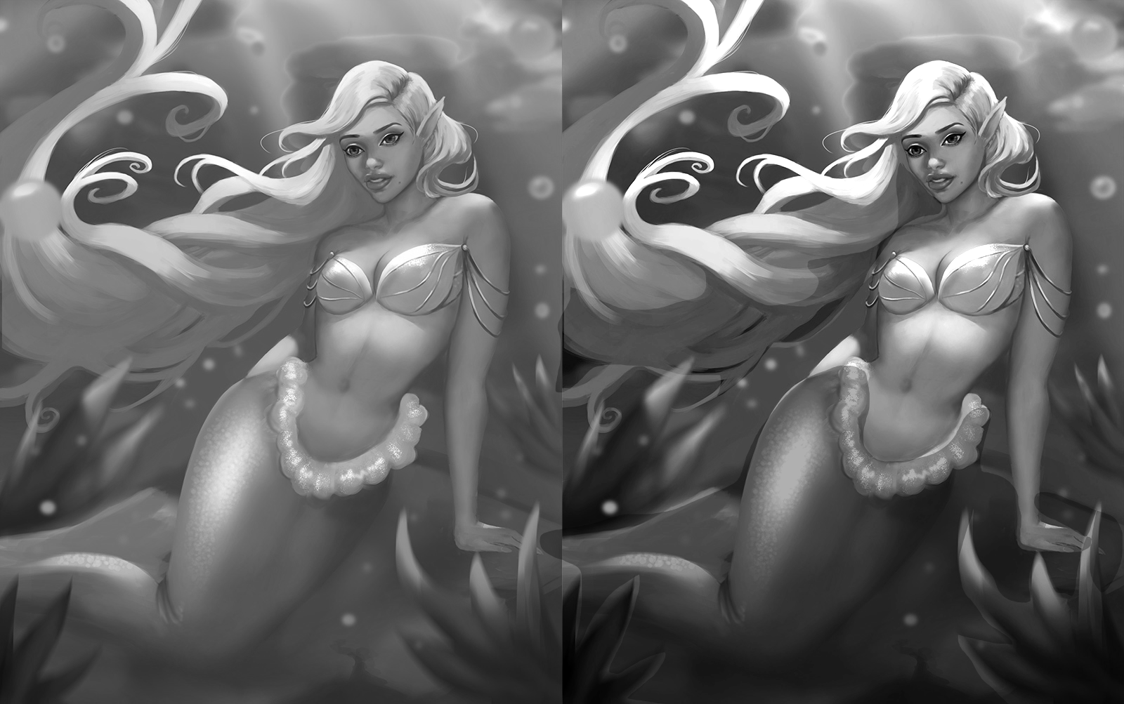
To solve it you could really experiment with what makes you most comfortable. Greyscaling a painting first is a good route for learning and more solid assurance it will turn out great; but you could also do some in depth color studies.
Hope this helps! I love your mermaids and hope to see more 

Thank you so much for the feedback, I just how bad my values are ( I knew before, but I actually saw just now). So I decided to take a step back and always start with greyscale .
This is the new thing I'm experimenting with. I was looking at some league of legends art and I saw the image in grey scale and it just blew my mind, so I'll be trying to work very detailed in greyscale 1st before going to color. But my problem with color is that I make it very muddy(mostly from color picking too much) and the other problem is that it just looks like I'm coloring a coloring book and I'm watching some utube videos to get some color knowledge but it's not going too well Any tips ?
PS. Sorry for the overwhelming comment >.<
here's the image  S
S