


 Thank you! I finally cleaned that up. Meanwhile started 3 more ..I have a habit of taking too long to finish a piece, then I lose interest in it and just start something else. I found 8 from recently i started and abandoned, that are decent enough to not delete, but not finished. There’s also been a number of drawings I felt I “outgrew” - became better before I finished them, and it would be easier to start from scratch than fix them. Anyone else thinking that?in24.1k
 Lady Death Fanart Collectible: Part 6 Polypaint and base Hi, it’s time to share with you another part of the process to create this fanart piece. Polypaint As this is my first collectible fanart I didn’t have previous experience with polypaint so I tried my best and played a bit with it.I wanted to give a ghostly and eerie look to Lady Death, she is beautiful and deadly, but at the end of the day she is a woman that died and was reborn at hell as an avenging spirit, that’s why I gave her skin tone a bluish very cold tone.As you will see I gave myself some creative freedom to deviate from the traditional color scheme that this characater has in comics and illustrations.To add a bit of sensuality by painting some freckles on the face and the chest. The dark nature of this character was the perfect excuse to gave her a kind of goth make up, very dark shadows around the eyes, blue lips and fingernails. I know that the original character includes sexy red lips but I wanted this girl to have a sexy but at the same time creepy look, that’s why we can see some thin veins emanating from her eyes. The biggest chromatic change I did for this character is at the hair. Lady Death has a characteristic white weavy hair but in my fanart I decided to gave her a very saturated blue color.The reason behind this wasn’t only an aesthetic choice. I want that the face area strongly pulls the attention of the viewer so this area needed a stronger contrast. Another reason is that I want her to have a more modern look, as I mentioned before, I’m strongly attracted to women with goth/punk look. I gave myself half an hour or more to analyse the work of experienced sculptors that create collectibles and I discovered that the use of darker values on the skin is often applied to create a greater sense of volume and three-dimensionality. I found that areas with heavy ambient occlusion are the perfect places to paint with darker colors in order to increase the separation between different forms. Even though she has a bluish skin tone, I used a bit of warmer hues in areas that, in real life, tend to go towards red and pink, this is very obvious in the nose, cheeks, and knuckles. Thinking with a logical mind it’s completely absurd to have warmer tones on the body of a zombie like creature but I didn’t want to limit myself by using only blue tones, it looks boring and artificial. In real life these colors are created by blood vessels in areas where the skin is very thin. ** Scythe **for her weapon I applied a cool gray with some warmer variations, this color scheme is influenced by the work of H.R giger. Base I’d like to talk about the design for the base which, to be honest, I forgot to develop along with the character.My main idea with the base is to show that Lady Death inhabits a very sterile and arid land, at the end of the day she is at hell.You can see a that she walks over dirt and rocks, a sign that she’s surrounded by death and loneliness. As part of the landscape we can see some bones and skulls to reinforce the idea of lack of living creatures, yet we can see three hands that try to reach her legs.This hands represent that all creatures are subordinated to her power and seek an evil blessing with a simple touch of the princess of the damned.1- The hand with skin burns represents the souls of those who are newcomers to hell, tortured souls that suffer for the sins comitted on earth.2- The hand with greenish rotten skin and pustules is the reminder of the decay that has infected the souls of those who have been trapped and have forgotten their humanity3- Last but not least, the hand of a demon shows that even dark creatures and entities bow before her presence. The cherry on the top, at least in my vision, are the simese twins that emerge from the ground, this malevolent creatures remind us that in hell there’s only perversion and any trace of innocence is lost. Thanks for reading till this pointI’m really happy to be very close to finish this creative journey, last but not least it’s mandatory to talk about splitting the sculpture in several pieces to be printed, this will be my last entry before showing the final rendered images. See yaMay Zbrush be with youin1.4k


 memory 2min gartic phone, used ref 2m gartic, used ref for pose 2min gartic 2min gartic 2min gartic 2min gartic memory memory memory memory study memory memory memorymemory memory memory memory memory memory study memorystudy study stylized left memory, right study study memory memorymemory memory memory memorymemory memory, porportions r offmemory memorystudystudy memorymemorymemory memory memory memory memory memory memory memory, right leg is a bit broken The feeling of only getting 1 - 3 likes on a social media post will never not be discouraging. But nothing is discouraging enough to make me quit drawing. I think the strategy of drawing a lot of stuff and waiting a while to post is good though rather than posting it immediately and then feeling that sadness on the next set of drawingin


 studies studies juri study imagination, how I feel before a speech imagination imagination study something I drew for my presentation also drew this for my presentation, didn't fix the one hand being bigger than the other imagination + study study studies study study, I need to fix the face a bit based on screenshot from anime but in my style study. except for the eye study studies studies study. changed some things tho imagination imagination imagination study studies, except top right samurai based on anime screenshot wolverine studies, changed some of the poses a lil, not very good at all, but first time i drew the character ever. semi study studies study imagination imagination imagination , for first time ever i tried to draw over 3d model for middle pose, I dont like the result tbh, but it makes it much easier than coming up with it from memory.imagination, except right figurestudies imagination + studies, coming up with action poses r hard, these are not dynamic enough, I will redraw better ones in future. imagination , imagination imagination study, except for eye imagination imagination imagination doodles except for the two chrollos imagination storyboard thumbnail, idk if i ever shared this. my storyboards end up being a little detailed since i usually just draw in one layer.in21.9k


 Hello! My name is Vithor, I am from Brazil, studied Design at a local college worked as an illustrator for more than 10 years. I took a time off around 3 years ago and am trying to get back in my art shape and maybe become professional again. Here are some recent pictures: You can find timelapses for most of them on my instagram: www.instagram.com Vithor Albertim (@vithor_albertim) • Instagram photos and videos 123 Followers, 638 Following, 19 Posts - See Instagram photos and videos from Vithor Albertim (@vithor_albertim) Comments and critiques are always welcome.Cheers!in785


 Thank you @daceronine! If I remember I save in google cloud, I will have to stick a note to do it more often. Lamp is from life. Poses are from refs but I look at refs for a while and then try to do it myself and look it up if needed. Outfits and rest is from imagination Something went wrong while installing system so we will have to wipe everything again... pc works but something is wrong. We will wait till internet is done and I will save everything on cloud this time Threads came out in eu. It's been 3 days and I had more engagement than after half a year on instagram. It feels really nice I hope it stays this way A portrait of old dude. It's the same character I posted a while ago. Inspired by Bayard Wu work. At first I thought of him as a bear but I named him Fenrir and I think wolf suits him better. Eye gave me a bit of hard time but I think it is fine now. I focused on face and forgot about area below. The way I draw hair clashes with greying hair. I had the same problem while doing Lohse's white hair. Does it looks like it is greying here? I love how desaturated red looks blue there. I keep lying to myself that I will use different color scheme but It all comes down to this blue and yellowish one it is just flipped this time Have a great day!in47.5k


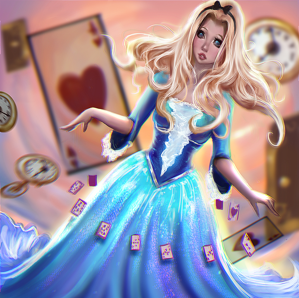

I'm a huge fairy tale fan ,so here's my new piece , It didn't turn out the way I wanted but it's still some practice I guess
Aurora/Sleeping Beauty ~~
10 days later


Here are my last 2 drawing , I don't know how you guys keep your attention on doing 1 thing , I just can't concentrate and finish a drawing w/o constantly doing other random stuff . Any tips? T_T
Adding a few more drawings , sometimes..well often I don't feel like I've actually accomplished something , need to practice more and more T_T 


8 days later
My latest piece 
Actually, its a good thing to take a step back and get away from your painting/drawing from time to time ^ ^ But yea I like your style overall and I'd like to see you play around with more texture in your mark making, or try to capture the "feel" of the fabric your characters are wearing. Ask is it heavy, soft, binding, fluffy; that sort of thing. Other than that I'm sure you've heard something about anatomy, and while I won't say you shouldn't study it because the more you know the more you can do, however, the facial proportions used in your pieces give the characters a doll like image, and the implied anatomy you do have does work. I'd also suggest trying to define a light source in your next piece. The picture of Belle (?glass rose?) hints that you've began working on addressing the problem of a light source, but I'd like to see something a bit more defined in the next piece. Anyway, keep it up, looks good.
Adding this in regarding the texture comment. There's a painterly quality that you have with your mark/brush making, and I think it can be pushed more, as that kind of thing can help liven up your pieces. Do take care in how much you use, and where you use it, because if it's everywhere with the same strength everywhere, it'll flatten. But if you were going for something stylistically around that, it could work. But ugh, I ramble too much, just have fun.
Thanks for all the critique , I really really appreciate it, I would be happy if you keep giving me critiques on future posts and I'll definitely take notes from these comments. Thank you!
4 months later
Hi guys, I'm not sure anyone is actually interested in my blog, but I decided I really wanna become active on this forum. I'm waiting for the new weekly challenge and I decided to post some of new drawings. Feedback is always welcome and highly wanted ~~ I really hope I meet more people from the community and improve my art here . 


And I did online course for character design and the assignment was to build a character, so here's my idea 
Hello !
nice colorful pictures ! 
about improvement, it would be good to know what is the direction you wanna take your career so we can give more specific advises
I see female only pinup portraits so far but I dont wanna assume anything based on that since your needs and taste can be completely different from your current work
regardles your future goals, there are lots of things you can work on now. It seems like you have a sense for design and gesture to express personality, but you lack understanding at fundamentals. You also use established characters and archetypes with rendering shortcuts to solve problems you cant handle yet. Aiming for a finished illustration is not a bad thing at all, but you also need to keep in mind that illustration as a genre has the most problems to solve and takes the longest time to master.
here is my list to start with:
anatomy: crucial to understand form and structure, there are very good free or cheap resources you can find online, all you need to do is practice daily.
some resources. Proko on youtube, Andrew Loomis books, Michael Hampton- design and invention, Anatomy for sculptors, Bridgman's Complete Guide To Drawing From Life, Burne Hogarth - Drawing Dynamic Hands, Steve Huston - new masters academy online courses
colors / painting : as exciting as they are, unfortunately colors are only the last step in the whole workflow, it's more important to establish good values and composition. for basics I highly recommend any video from CTRL + Paint . for advanced coloring there is a book called James Gurney - Color and light. Advanced Lighting course by Sam Nielson on schoolism is a well designed online class with homework, covering literally everything you need to know to have control over your colors. also painting from life will answer many of your questions when you get stuck
style: now this one is a bit tricky, because it's very charming, most of the times style is what we fall in love with first, but its the result of years of development and a simplified version of reality. meaning to make it work you need to have a higher understanding and need to know what's outside the style. so when starting out you gotta let that style thing go and focus on understanding how things work
second thought on the topic, as brush work is a huge part of your style and that's something you mainly steal /learn from other artists. I recommend to learn from more artists, including old masters, not just one. I can discover traces of sakimichan's rendering technique, but with that you also copied her mistakes, you need to aim higher in quality/ experience when it comes to learning from others. that's the main reason its just wiser to use old masters to study from.
storytelling: start making personal content. fanarts are great for rendering practice, because you already have the brief/ design problems solved, but you should aim for a balance between practice and exploration
studies: some things like anatomy you gotta practice as often as you can, because it takes time to learn, but many things like composition and textures you should study with application, so gather references for every image you work on and commit to the problems until you figure them out
one more useful advice, draw on paper with pen, it's gonna force you to make decisions and develop confidence
also keep posting, dedication pays off
OMG, I'm so thankful for your comment ! I didn't actually expect such good feedback. Great advices,really . I'm already watching youtube videos, and I'll try to get the books. Also thanks for mentioning schoolism, I checked the website and I'll definitely try it. I'll finish my Belle xD and I'll start doing more studies and making personal stuff . Thank you so much goldentiger !