


Welcome to the forums Charlie! I am super impressed with this pen control exercise. Just WOW! I look forward to seeing your work and your progress!

 Thank you! I finally cleaned that up. Meanwhile started 3 more ..I have a habit of taking too long to finish a piece, then I lose interest in it and just start something else. I found 8 from recently i started and abandoned, that are decent enough to not delete, but not finished. There’s also been a number of drawings I felt I “outgrew” - became better before I finished them, and it would be easier to start from scratch than fix them. Anyone else thinking that?in24.2k
 Lady Death Fanart Collectible: Part 6 Polypaint and base Hi, it’s time to share with you another part of the process to create this fanart piece. Polypaint As this is my first collectible fanart I didn’t have previous experience with polypaint so I tried my best and played a bit with it.I wanted to give a ghostly and eerie look to Lady Death, she is beautiful and deadly, but at the end of the day she is a woman that died and was reborn at hell as an avenging spirit, that’s why I gave her skin tone a bluish very cold tone.As you will see I gave myself some creative freedom to deviate from the traditional color scheme that this characater has in comics and illustrations.To add a bit of sensuality by painting some freckles on the face and the chest. The dark nature of this character was the perfect excuse to gave her a kind of goth make up, very dark shadows around the eyes, blue lips and fingernails. I know that the original character includes sexy red lips but I wanted this girl to have a sexy but at the same time creepy look, that’s why we can see some thin veins emanating from her eyes. The biggest chromatic change I did for this character is at the hair. Lady Death has a characteristic white weavy hair but in my fanart I decided to gave her a very saturated blue color.The reason behind this wasn’t only an aesthetic choice. I want that the face area strongly pulls the attention of the viewer so this area needed a stronger contrast. Another reason is that I want her to have a more modern look, as I mentioned before, I’m strongly attracted to women with goth/punk look. I gave myself half an hour or more to analyse the work of experienced sculptors that create collectibles and I discovered that the use of darker values on the skin is often applied to create a greater sense of volume and three-dimensionality. I found that areas with heavy ambient occlusion are the perfect places to paint with darker colors in order to increase the separation between different forms. Even though she has a bluish skin tone, I used a bit of warmer hues in areas that, in real life, tend to go towards red and pink, this is very obvious in the nose, cheeks, and knuckles. Thinking with a logical mind it’s completely absurd to have warmer tones on the body of a zombie like creature but I didn’t want to limit myself by using only blue tones, it looks boring and artificial. In real life these colors are created by blood vessels in areas where the skin is very thin. ** Scythe **for her weapon I applied a cool gray with some warmer variations, this color scheme is influenced by the work of H.R giger. Base I’d like to talk about the design for the base which, to be honest, I forgot to develop along with the character.My main idea with the base is to show that Lady Death inhabits a very sterile and arid land, at the end of the day she is at hell.You can see a that she walks over dirt and rocks, a sign that she’s surrounded by death and loneliness. As part of the landscape we can see some bones and skulls to reinforce the idea of lack of living creatures, yet we can see three hands that try to reach her legs.This hands represent that all creatures are subordinated to her power and seek an evil blessing with a simple touch of the princess of the damned.1- The hand with skin burns represents the souls of those who are newcomers to hell, tortured souls that suffer for the sins comitted on earth.2- The hand with greenish rotten skin and pustules is the reminder of the decay that has infected the souls of those who have been trapped and have forgotten their humanity3- Last but not least, the hand of a demon shows that even dark creatures and entities bow before her presence. The cherry on the top, at least in my vision, are the simese twins that emerge from the ground, this malevolent creatures remind us that in hell there’s only perversion and any trace of innocence is lost. Thanks for reading till this pointI’m really happy to be very close to finish this creative journey, last but not least it’s mandatory to talk about splitting the sculpture in several pieces to be printed, this will be my last entry before showing the final rendered images. See yaMay Zbrush be with youin1.4k

 memory 2min gartic phone, used ref 2m gartic, used ref for pose 2min gartic 2min gartic 2min gartic 2min gartic memory memory memory memory study memory memory memorymemory memory memory memory memory memory study memorystudy study stylized left memory, right study study memory memorymemory memory memory memorymemory memory, porportions r offmemory memorystudystudy memorymemorymemory memory memory memory memory memory memory memory, right leg is a bit broken The feeling of only getting 1 - 3 likes on a social media post will never not be discouraging. But nothing is discouraging enough to make me quit drawing. I think the strategy of drawing a lot of stuff and waiting a while to post is good though rather than posting it immediately and then feeling that sadness on the next set of drawingin

 studies studies juri study imagination, how I feel before a speech imagination imagination study something I drew for my presentation also drew this for my presentation, didn't fix the one hand being bigger than the other imagination + study study studies study study, I need to fix the face a bit based on screenshot from anime but in my style study. except for the eye study studies studies study. changed some things tho imagination imagination imagination study studies, except top right samurai based on anime screenshot wolverine studies, changed some of the poses a lil, not very good at all, but first time i drew the character ever. semi study studies study imagination imagination imagination , for first time ever i tried to draw over 3d model for middle pose, I dont like the result tbh, but it makes it much easier than coming up with it from memory.imagination, except right figurestudies imagination + studies, coming up with action poses r hard, these are not dynamic enough, I will redraw better ones in future. imagination , imagination imagination study, except for eye imagination imagination imagination doodles except for the two chrollos imagination storyboard thumbnail, idk if i ever shared this. my storyboards end up being a little detailed since i usually just draw in one layer.in22.1k

 Hello! My name is Vithor, I am from Brazil, studied Design at a local college worked as an illustrator for more than 10 years. I took a time off around 3 years ago and am trying to get back in my art shape and maybe become professional again. Here are some recent pictures: You can find timelapses for most of them on my instagram: www.instagram.com Vithor Albertim (@vithor_albertim) • Instagram photos and videos 123 Followers, 638 Following, 19 Posts - See Instagram photos and videos from Vithor Albertim (@vithor_albertim) Comments and critiques are always welcome.Cheers!in792

 Thank you @daceronine! If I remember I save in google cloud, I will have to stick a note to do it more often. Lamp is from life. Poses are from refs but I look at refs for a while and then try to do it myself and look it up if needed. Outfits and rest is from imagination Something went wrong while installing system so we will have to wipe everything again... pc works but something is wrong. We will wait till internet is done and I will save everything on cloud this time Threads came out in eu. It's been 3 days and I had more engagement than after half a year on instagram. It feels really nice I hope it stays this way A portrait of old dude. It's the same character I posted a while ago. Inspired by Bayard Wu work. At first I thought of him as a bear but I named him Fenrir and I think wolf suits him better. Eye gave me a bit of hard time but I think it is fine now. I focused on face and forgot about area below. The way I draw hair clashes with greying hair. I had the same problem while doing Lohse's white hair. Does it looks like it is greying here? I love how desaturated red looks blue there. I keep lying to myself that I will use different color scheme but It all comes down to this blue and yellowish one it is just flipped this time Have a great day!in48.0k
@Lockenheim thanks for the warm welcome and your kind kind words! Means a lot coming from you.
Well, my first study after line control. Week one of journey: Nude drawing.
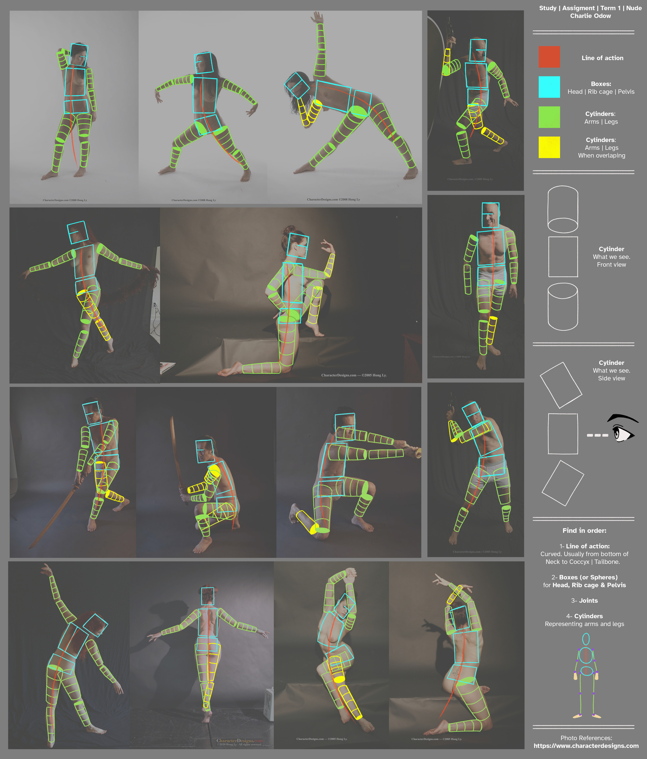
Happy (but kind of terrified  ) to share my study with you all. And on the right side of the image I share some notes I found interesting and worth remembering from the video [inspired by the notes taken by @aphamfx, he shares his thoughts on the process in his posts].
I will definitely keep practicing. Any replies to improve are more than welcome. I know there are lots of things off so I’ll gladly take advice and criticism.
Have a wonderful weekend. ¡Pura Vida!
Reference: www.characterdesigns.com
Love your detailed notes and references from the video! (Love the colour coding too) Keep up the great work! =]
Thanks @aphamfx, really appreciate your kind words. I want to keep sharing notes and thoughts. And your posts inspired me. Just a little something for the community.
Nice work Charlie! These are very well done! I can see you are thinking about the vanishing point on your cylinders. One thing to keep in mind is even if the contour of the cylinder is really close to the vanishing point, the contour will be flatter, but it will be really curved at the ends where it touches the side. Fantastic work! Keep it up!
Thanks @Lockenheim! Thanks for the advice, very much appreciated. You’re right. I’m gonna make sure to pay more attention and practice contours. Any advice on how to study and get better at perspective and shapes?
What I did when I was at this part was to always have a can next to my desk that I would maneuver around to help get a better feel for the cylinders. The perspective one and two assignments will help with that quite a bit as well. I did each assignment several times spending an insane amount of hours on my second one point perspective piece. That will help a lot and then there is an assignment in term two about warping. I make physical models for many things as I feel that helps me a lot, even if its something simple like a can. Hopefully that makes some sense. If it doesn't let me know!
Welcome aboard buddy. We’re all in this together! Can’t wait to see how far you’ll go!
Thanks @alwaysneedsleep! This are the kind words that make my day. I’ll be around for any feedback and sharing tips. Have a great one!
¡Pura vida!
That’s incredible advice @Lockenheim. It does make total sense.
I remember making cardboard shapes and playing with the positions several years ago to get them in different perspectives but stopped because… life. Perfect practice and consistency is key. I’m going back to it. Thanks again!
Quick practice of my room for one One Point Perspective. Just getting the hang of things, perspective kind of wears me down a bit. But perfect practice makes perfect so on to the next study.
Again, any advice would be fantastic and warmly received.
Allons-y!

Looks very cool!
The foreground is perfect, but in the distance, you could improve on the width of things in perspective. Like that door looks like it’s 3 meters wide (which is possible, of course). If you look at a photo reference, you’ll see that the sides of the door are probably much closer together.
I hope this made sense
Keep up the good work!
Thank you @artistchemist! It makes total sense, and I will consider more and more references in future studies. Thanks again for the kind words and please keep helping us grow.
A little study and my version of "male proportions”, as presented in Nude Drawing - Term 1. Again, you can find some notes and interesting facts on the right of the image taken from the lecture.
Any advice on how to improve is always more than welcome.
¡Pura vida! 

Proportion looks solid!
I remember that I memorized where every part lands on the grids back when I was at term 1 ;D.
I see that you don't have pen pressure enabled on the brush size itself, I really recommend to learn how to control your lines even at the beginning.
It's extremely hard when you don't have experience but it will be worthwhile in the end.
I'm pretty sure you've heard line weight at some point, that's something you can improve right now.
@charlieodow I love the simplicity and cleanliness of this 1 point perspective, good work! I agree with @artistchemist the door does look quite wide. also the outer floorboards are quite wide in comparison to the rest of the boards, but that’s just being nit picky. the right bottom corner in the foreground is slightly off from the back wall, if you follow that line all the way to the cupboards you can see that the cupboards look like they are going through the wall. You need to either have the cupboards narrower or extend the back wall further to the right. Alternatively you could give the feeling that there is another room leasing off to the right?
Thanks for the kind words @luke.buersgens! Great advice. I will make sure to practice line weight every day. Any advice on how to implement and practice good line weight when drawing both digitally and traditionally? Have an awesome weekend Luke!
Again, thanks for checking my progress @alwaysneedsleep! Excellent points. Yeah, perspective is a topic that overwhelms me sometimes, but the more I practice the more I like it. Keep the knowledge coming!
The pen control exercise is a start. It teaches you how to be precise with your lines and the pressure exercise teaches how to control the thickness of the line .
It looks like this:
You can find it in the Art School Term 1 - Assignments.zip under "Photoshop for Digital Production 1"
I used to do this everytime as a warm-up.
I'm gonna link you a couple of videos which explain why you even use line weight at certain spots:
First Scott Robertson, extremely skilled in his job and he also has books which are quite difficult to grasp for beginners, so I would wait a little.
This is a website which is useful for a quick recap:
Lesson 7: Introduction to Line Quality
About learning it:
- You can start with simple forms like cubes and cylinders, depending on what you want the line to convey you might have to add forms behind one another to see an effect.
- Traditional is almost the same as digital, try to be consistent with the lines and experiment a lot, back in drawabox we had a technique called ghosting, it's basically this:
- You want to draw a line.
- Try to imagine the line where you want it to be.
- Now, hover with you pen over the imagined spot and do the hand motion but without actually touching the paper, you do this motion till you really feel confident about putting the line down.
- Once you are ready you lower the pen onto the paper and do a quick but confident line.
This is the link:
https://drawabox.com/lesson/1/ghostedlines
Takes a bit of practice at first.