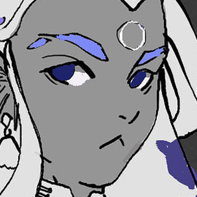
Cloth exercice from artist reference, 4 out of 5.
Decided to go for something more simple, back to Toriyama's style. Nera from Dragon quest 5. I think I've mentioned it before but I really enjoy Toriyama's simple yet pleasent to the eye designs.

I had to rework proportions a bit, since this original design has an almost chibi big head proportion to it. I know there are other versions of the design wich have different proportions and more elaborate textures for the clothes, but I wanted to go with one of the original pieces.
And so, we went through the now common pipeline, body sketch, clothes sketch, inking, tones
And finally shadows and details
Really happy how this one turned out, I think I have the pipeline for these practices well established now. I feel the character fits into the design really well too.
Also worked on the next manga page. Got some feedback about how the white outline for characters makes it feel like they are "stickers" on the panels, which is true, though I kinda had to include it to provide more clarity, since without them, the feedback was that they were easily confused with the BGs, due to the heavy use of tones and grays.
I doubled the ink ont he first panel to give it the feeling of a "tremor", though not sure if it had the desired effect.

I do plan to try a different style eventually, To try to limit myself to pure black and white (and few tones), which I think will resolve the issue to some degree, though I'm still thinking about it.
As of right now, I personally like this style, and I feel like it also makes it feel kind of different, since anyone looking at one of these pages will easily recoginze it.
Nothing urgent, I'll still try out different things and see how they work out.


 :
:


