Name : Quentin Gautier
Email : quentin.l.gautier@gmail.com
Artstation : https://www.artstation.com/blkw
@Facebook : https://www.facebook.com/quentin.gautier.1023

Team : Darkness

Final Entry

At the pinnacle of the war, something changed. A star was dying incredibly fast. Scouts from the Light rushed to the dying star hoping to understand what may be the cause. What they did not expect was to witness the birth of the one responsible of this disater, a being without hatred, without compassion, a deity of Darkness way more dreadful than what they encountered previously... only later they would refer to it as the Scourge, the world-eater.

Thanks for this contest it was fun. GL everyone!!!

Sorry, i was off for a bit!
Thanks a lot glubglubz, much appreciated! For me 9 is still a bit too beasty as you mentionned, i really want to go towards the deity idea :smile:

Edit : I put my original post here to give room to my final entry.

Hello everyone and good luck to you all for this cool contest (i really like the honesty of it :smile: ).

Team : Darkness
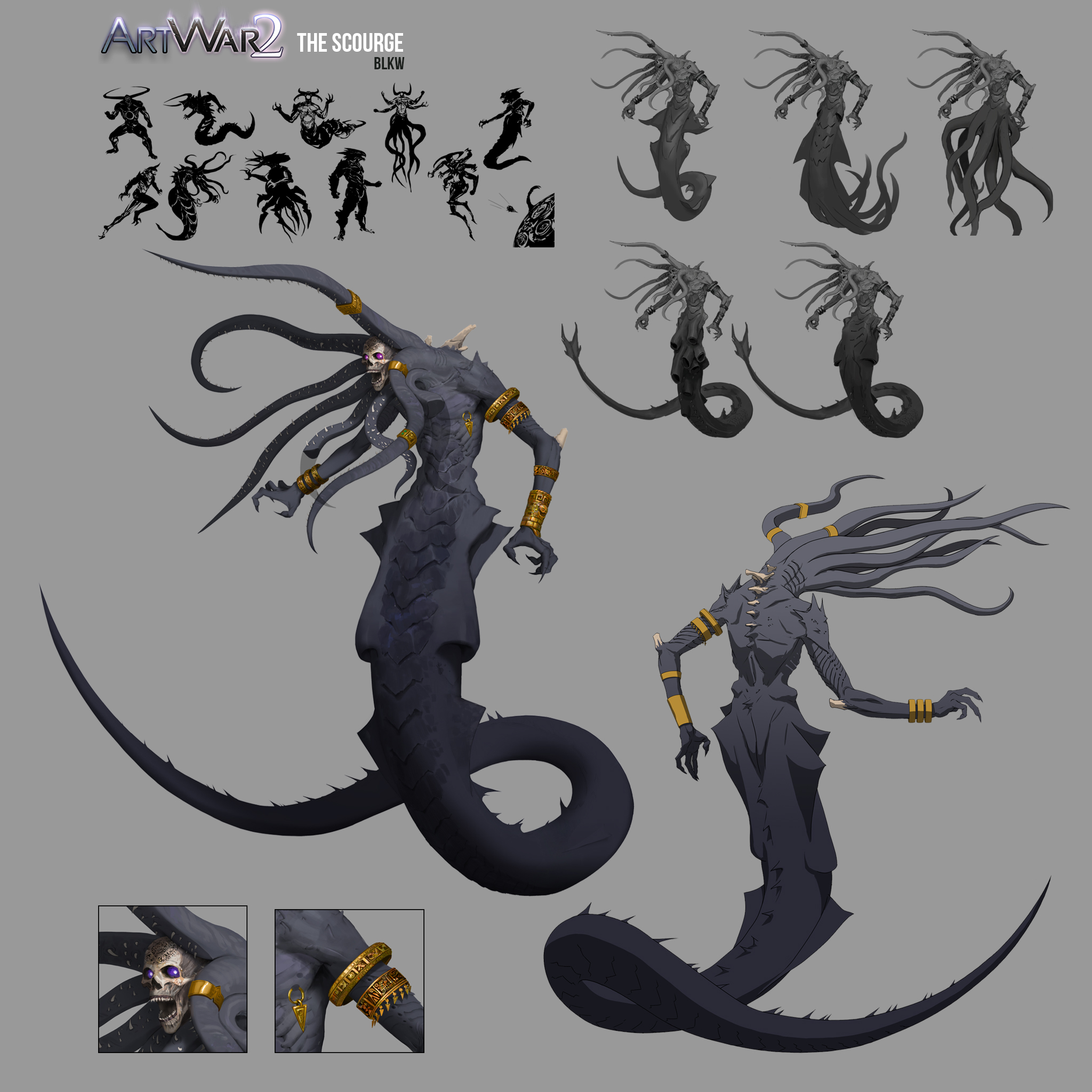
I want to do a massive evil deity who's kind of a world eater. Its embryo form sleeps inside a star from which it feeds itself, destroying it slowly.
At the pinnacle of the conflict it makes is long waited appearance bursting out of the sun ready to spread his havoc across the galaxy (That's gonna be the setting for the illustration).

I tried different directions, more insect or animal inspired but it was going more into a monster and less into a deity. I selected 10 from that batch, focusing on general shapes to find the right feeling.

Hope you'll like it.

Thanks

I'm still uncertain which one i'm gonna go with (4 or 7), so i played a bit with the design, and added aztec inspired props. There is something a bit grim about it but without being just plain evil.

Definately the first or last of the latest bunch.
The first one gets extra points for being unique and cool.
Last one gets it because of the technical skills you can show off by playing with the wings XD

I like the wings. They feel very elegant.

They all look super cool, but I think 1 and 2 more clearly convey "Eater of Worlds." (from the latest designs)

@snakebearer Thanks a lot for the feedback, technical skills are cool but i think the whole illustration will be challenging enough. The first one seems to be a favorite so far indeed.

@glubglubz Thank you, yeah i wanted to try that, it may remove the dark feeling though.

@kaira Thank you, it's much appreciated, i agree with you, the first two seems more dreadful, 3 one is in a grey area compared to the subject.

Thanks again for your feedbacks it really helps, i'm gonna play a bit more with them and start exploring composition too, coming back soon!!

8 days later

Illustrations wips
I used the very cool tool of Jamie Rollo to get a first mood

https://jamie-rollo.itch.io/gamut-maker
really a great way to make a color palette!

Update :
Tune down the contrast on the star surface to keep the focus on the main subject.

Update 2 :
Went a bit more analogous, i was not satisfied with the 'purpleish' background. Put the accent in the back light instead to make it a bit more dramatic.

WIP

Detailed the sun surface and started the character cleaning.