Series of texture study, focusing on helmets mainly. Trying to get the correct texture for metal studies from various references. I also experimented with different brushes, starting from the default photoshop brushes to texture brushes. What are your thoughts or any feedback on this study?


19 days later
10 days later
For term 3 clothing exercise I decided to take a reference from Elden Ring and went ahead with Messmer. This one took quite a lot of patience and wasn't confident that it might not turn out as I expected. But I did come really close to how the original was supposed to look. I would love to hear your thoughts on this or any areas of improvement.

Great progress with the painting. The fingers on the left hand look like they need more definition. It looks like he has only 3 fingers there. You should focus on learning how to use hard and soft edges in your brush work. Everything in your painting except for the smoke stuff on the ground has hard edges, but the original has a mix of both hard and soft transitions. The original also uses more texture brush work in the background and on other elements. The values also look a lot brighter in your painting in many areas.
Yes I'm actually still experimenting with different brushes, earlier I was using the default photoshop brushes but I have been having issues using soft brushes. This is why I usually end up using a mixture brush to meld colours.
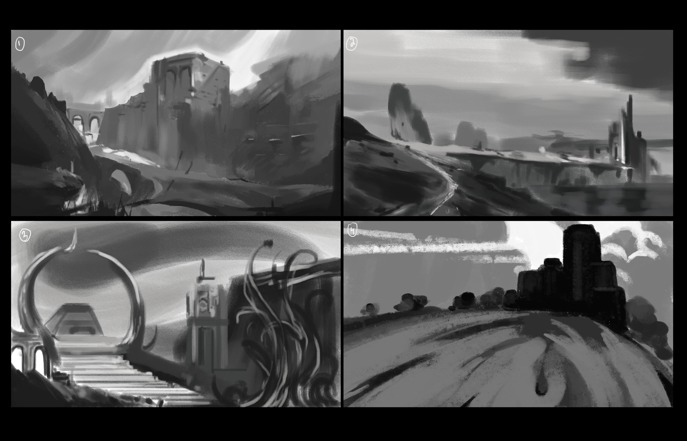
Felt a bit disconnected with environment design hence I decided to revisit it, currently just did a few quick artboards in greyscale. Trying to get the values correct using only shades of black. Some of these aren't refined much but I took like 10 min to do all 4 of them. Would appreciate any feedback on these.
Diving into the world of Elden Ring with my unique rendition of Midra! As I painted him in Photoshop, inspired by the game’s rich lore and atmosphere, I used his reference as it was different from my past references and also challenged the use of color and the way the shades blended with each other. It’s fascinating how concept art allows us to explore and reinterpret iconic characters, making them personal and fresh but also add a playful twist of your own. Any thoughts?

Delving into the intricate world of Elden Ring with my study of Malenia, Blade of Miquella! This character is a masterpiece of design and storytelling, making her a perfect reference for developing my concept art skills. My process involves breaking down her armor, weapons, and flowing fabric to capture the unique details that make her iconic.
While painting from reference, I’ve faced challenges like mastering the dynamic poses and understanding how light interacts with various textures. Would appreciate your take on this and any room for improvements?

Really nice job on this! Your painting is really great. The only areas i see that can be improved are the values. I quickly did a comparison to show you here. There are actually no white highlights in the reference image at all, but maybe you brightened them on purpose?
I think if they were brightened on purpose though, there would be more areas of stronger highlights on the cloth and armor as well. Not just the skin.
Value comparison - original is on the right
Very quick adjustment to show you what i mean
Suggested Topics
| Topic | Category | Replies | Views | Activity |
|---|---|---|---|---|
| Xybb (Sascha) - Art School Journey | Art School | 126 | 14.6k | Dec '22 |
| Emilio - Art School Journey | Art School | 24 | 4.7k | Jul '21 |
| Jynnandtonic - Art School Journey | Art School | 5 | 681 | Jul '23 |
| Nodier N - Art School Journey | Art School | 13 | 2.1k | Sep '22 |
| Andy - Art School Journey | Art School | 117 | 11.3k | Dec '23 |