


 Thank you! I finally cleaned that up. Meanwhile started 3 more ..I have a habit of taking too long to finish a piece, then I lose interest in it and just start something else. I found 8 from recently i started and abandoned, that are decent enough to not delete, but not finished. There’s also been a number of drawings I felt I “outgrew” - became better before I finished them, and it would be easier to start from scratch than fix them. Anyone else thinking that?in24.3k
 Lady Death Fanart Collectible: Part 6 Polypaint and base Hi, it’s time to share with you another part of the process to create this fanart piece. Polypaint As this is my first collectible fanart I didn’t have previous experience with polypaint so I tried my best and played a bit with it.I wanted to give a ghostly and eerie look to Lady Death, she is beautiful and deadly, but at the end of the day she is a woman that died and was reborn at hell as an avenging spirit, that’s why I gave her skin tone a bluish very cold tone.As you will see I gave myself some creative freedom to deviate from the traditional color scheme that this characater has in comics and illustrations.To add a bit of sensuality by painting some freckles on the face and the chest. The dark nature of this character was the perfect excuse to gave her a kind of goth make up, very dark shadows around the eyes, blue lips and fingernails. I know that the original character includes sexy red lips but I wanted this girl to have a sexy but at the same time creepy look, that’s why we can see some thin veins emanating from her eyes. The biggest chromatic change I did for this character is at the hair. Lady Death has a characteristic white weavy hair but in my fanart I decided to gave her a very saturated blue color.The reason behind this wasn’t only an aesthetic choice. I want that the face area strongly pulls the attention of the viewer so this area needed a stronger contrast. Another reason is that I want her to have a more modern look, as I mentioned before, I’m strongly attracted to women with goth/punk look. I gave myself half an hour or more to analyse the work of experienced sculptors that create collectibles and I discovered that the use of darker values on the skin is often applied to create a greater sense of volume and three-dimensionality. I found that areas with heavy ambient occlusion are the perfect places to paint with darker colors in order to increase the separation between different forms. Even though she has a bluish skin tone, I used a bit of warmer hues in areas that, in real life, tend to go towards red and pink, this is very obvious in the nose, cheeks, and knuckles. Thinking with a logical mind it’s completely absurd to have warmer tones on the body of a zombie like creature but I didn’t want to limit myself by using only blue tones, it looks boring and artificial. In real life these colors are created by blood vessels in areas where the skin is very thin. ** Scythe **for her weapon I applied a cool gray with some warmer variations, this color scheme is influenced by the work of H.R giger. Base I’d like to talk about the design for the base which, to be honest, I forgot to develop along with the character.My main idea with the base is to show that Lady Death inhabits a very sterile and arid land, at the end of the day she is at hell.You can see a that she walks over dirt and rocks, a sign that she’s surrounded by death and loneliness. As part of the landscape we can see some bones and skulls to reinforce the idea of lack of living creatures, yet we can see three hands that try to reach her legs.This hands represent that all creatures are subordinated to her power and seek an evil blessing with a simple touch of the princess of the damned.1- The hand with skin burns represents the souls of those who are newcomers to hell, tortured souls that suffer for the sins comitted on earth.2- The hand with greenish rotten skin and pustules is the reminder of the decay that has infected the souls of those who have been trapped and have forgotten their humanity3- Last but not least, the hand of a demon shows that even dark creatures and entities bow before her presence. The cherry on the top, at least in my vision, are the simese twins that emerge from the ground, this malevolent creatures remind us that in hell there’s only perversion and any trace of innocence is lost. Thanks for reading till this pointI’m really happy to be very close to finish this creative journey, last but not least it’s mandatory to talk about splitting the sculpture in several pieces to be printed, this will be my last entry before showing the final rendered images. See yaMay Zbrush be with youin1.4k


 memory 2min gartic phone, used ref 2m gartic, used ref for pose 2min gartic 2min gartic 2min gartic 2min gartic memory memory memory memory study memory memory memorymemory memory memory memory memory memory study memorystudy study stylized left memory, right study study memory memorymemory memory memory memorymemory memory, porportions r offmemory memorystudystudy memorymemorymemory memory memory memory memory memory memory memory, right leg is a bit broken The feeling of only getting 1 - 3 likes on a social media post will never not be discouraging. But nothing is discouraging enough to make me quit drawing. I think the strategy of drawing a lot of stuff and waiting a while to post is good though rather than posting it immediately and then feeling that sadness on the next set of drawingin


 studies studies juri study imagination, how I feel before a speech imagination imagination study something I drew for my presentation also drew this for my presentation, didn't fix the one hand being bigger than the other imagination + study study studies study study, I need to fix the face a bit based on screenshot from anime but in my style study. except for the eye study studies studies study. changed some things tho imagination imagination imagination study studies, except top right samurai based on anime screenshot wolverine studies, changed some of the poses a lil, not very good at all, but first time i drew the character ever. semi study studies study imagination imagination imagination , for first time ever i tried to draw over 3d model for middle pose, I dont like the result tbh, but it makes it much easier than coming up with it from memory.imagination, except right figurestudies imagination + studies, coming up with action poses r hard, these are not dynamic enough, I will redraw better ones in future. imagination , imagination imagination study, except for eye imagination imagination imagination doodles except for the two chrollos imagination storyboard thumbnail, idk if i ever shared this. my storyboards end up being a little detailed since i usually just draw in one layer.in22.2k


 Hello! My name is Vithor, I am from Brazil, studied Design at a local college worked as an illustrator for more than 10 years. I took a time off around 3 years ago and am trying to get back in my art shape and maybe become professional again. Here are some recent pictures: You can find timelapses for most of them on my instagram: www.instagram.com Vithor Albertim (@vithor_albertim) • Instagram photos and videos 123 Followers, 638 Following, 19 Posts - See Instagram photos and videos from Vithor Albertim (@vithor_albertim) Comments and critiques are always welcome.Cheers!in796


 Thank you @daceronine! If I remember I save in google cloud, I will have to stick a note to do it more often. Lamp is from life. Poses are from refs but I look at refs for a while and then try to do it myself and look it up if needed. Outfits and rest is from imagination Something went wrong while installing system so we will have to wipe everything again... pc works but something is wrong. We will wait till internet is done and I will save everything on cloud this time Threads came out in eu. It's been 3 days and I had more engagement than after half a year on instagram. It feels really nice I hope it stays this way A portrait of old dude. It's the same character I posted a while ago. Inspired by Bayard Wu work. At first I thought of him as a bear but I named him Fenrir and I think wolf suits him better. Eye gave me a bit of hard time but I think it is fine now. I focused on face and forgot about area below. The way I draw hair clashes with greying hair. I had the same problem while doing Lohse's white hair. Does it looks like it is greying here? I love how desaturated red looks blue there. I keep lying to myself that I will use different color scheme but It all comes down to this blue and yellowish one it is just flipped this time Have a great day!in48.2k


Great job! There’s nothing wrong with taking a long time. At this point I think the major objective is to simply control that stylus and be able to copy outlines and measure. It’s a plus that you draw the figure as you always learn some anatomy even if you aren’t sure what x or y is called - you just get familiar with it
At least that’s how I see these initial studies
It’s really clever when you think about it, memorize the overall proportions, learn to see the basic 3D forms in space that describe the body, learn to copy the outline and learn to spot the flow
Cheers!
Thank you for the reassurance @snakker!
I felt so frustrated while doing this because I kept making sure my lines where as similar as I could get to the reference photo. (I would take my line art and put it over the photo for comparison the whole time)
I'm glad that what I did actually helped me with the 3rd drawing, because I back tracked a lot less and just tried to make confident lines and I was surprised with the end result.


Here are a few 1 and 2 point perspective drawings.
I'm planning of doing my street corner next week as well as practicing my convergence lines using photo's on the internet.
I'll also be repeating the above exercises weekly as well to compare my progress, and post it here if I'm satisfied with them.
Hope everyone has a blessed weekend!


looks pretty good to my eyes. only thing that i would suggest is to put the vanishing points way far off the canvas, otherwise will look a bit squished, that said, it works as it is, so good stuff.
Ah yes I see what you mean, I'll try it next time and show you guys. I'll see if I can give the next drawing a bit more more detail, but perspective at the moment is such a headache haha.
these look great
I honestly have no idea on how to draw any interior or exterior things.
BRUH Same XD tho i find that i can't just "draw a building" i need to design it first..
- what is it used for?
- what shapes would look good for this building
- is it a building with lots of windows?
- practical uses?
- what would a character see if they walked up to it, went in.
as i answer these then i will know how to design the building and thus then know what to put in, on, and around the building.. most of the time i find that i am not good at drawing enviros cus i didnt design it in detail.. but once i do.. it makes it much easier to draw
Like for example with this one i had such a detailed image of it in my head that i could draw it with relative........ not quite ease... but it wasn't as hard as it used to be either.

Like with this one, i gave the background very little thought XDDD
my goal is to design some buildings for my world in each city so that i know roughly what the buildings would look like then when i make more art i can just be like eyy its that building or that type of building
but with this its more evident i just copied and pasted the buildings on the right side and flipped them on the left side 

I realllly like your interior drawing btw it looks so cozy... i wanna live there lol
Thanks for sharing how you go about designing/drawing your buildings. I'll give it a go and show you guys how it looks when I'm done.
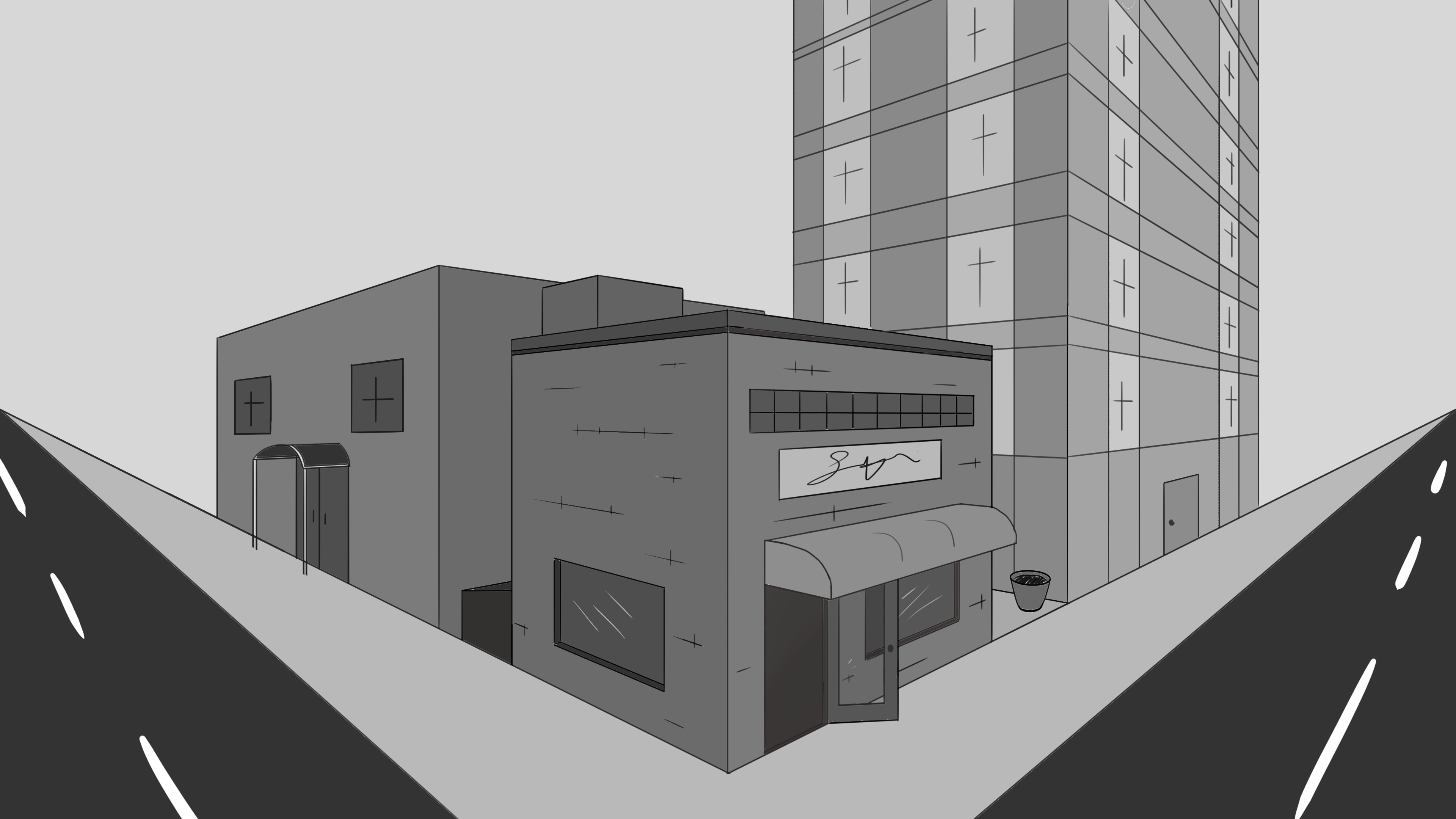
I attempted the street corner drawing again and its slowly getting there.
You can see that I started getting lazy after my first building XD.
I'll keep on practicing how to draw more details and things for buildings.
I don't really enjoy working so much on these buildings now, but maybe as I get better it won't bother me as much.
these look pretty nice!


Hi Leon welcome to the forums! Definitely keep it up with these gestures! You are making good progress!


Yo, construction is looking good
As for improving, I think if you feel nothing is changing then don’t keep doing the same thing - experiment with how much time you use, experiment with brush thickness, your pad position/use of the arm, check out proko or Force videos on youtube
But definitely keep doing gestures 