


hi ... when i'm wright the other two books are "successful drawing" and "figure drawing", both covering the fundamentals ... David Finch showed his way of using the head method in one of his youtube videos ... it was quite easy to understand, probably easier than Loomis texts tho

 Thank you! I finally cleaned that up. Meanwhile started 3 more ..I have a habit of taking too long to finish a piece, then I lose interest in it and just start something else. I found 8 from recently i started and abandoned, that are decent enough to not delete, but not finished. There’s also been a number of drawings I felt I “outgrew” - became better before I finished them, and it would be easier to start from scratch than fix them. Anyone else thinking that?in24.4k
 Lady Death Fanart Collectible: Part 6 Polypaint and base Hi, it’s time to share with you another part of the process to create this fanart piece. Polypaint As this is my first collectible fanart I didn’t have previous experience with polypaint so I tried my best and played a bit with it.I wanted to give a ghostly and eerie look to Lady Death, she is beautiful and deadly, but at the end of the day she is a woman that died and was reborn at hell as an avenging spirit, that’s why I gave her skin tone a bluish very cold tone.As you will see I gave myself some creative freedom to deviate from the traditional color scheme that this characater has in comics and illustrations.To add a bit of sensuality by painting some freckles on the face and the chest. The dark nature of this character was the perfect excuse to gave her a kind of goth make up, very dark shadows around the eyes, blue lips and fingernails. I know that the original character includes sexy red lips but I wanted this girl to have a sexy but at the same time creepy look, that’s why we can see some thin veins emanating from her eyes. The biggest chromatic change I did for this character is at the hair. Lady Death has a characteristic white weavy hair but in my fanart I decided to gave her a very saturated blue color.The reason behind this wasn’t only an aesthetic choice. I want that the face area strongly pulls the attention of the viewer so this area needed a stronger contrast. Another reason is that I want her to have a more modern look, as I mentioned before, I’m strongly attracted to women with goth/punk look. I gave myself half an hour or more to analyse the work of experienced sculptors that create collectibles and I discovered that the use of darker values on the skin is often applied to create a greater sense of volume and three-dimensionality. I found that areas with heavy ambient occlusion are the perfect places to paint with darker colors in order to increase the separation between different forms. Even though she has a bluish skin tone, I used a bit of warmer hues in areas that, in real life, tend to go towards red and pink, this is very obvious in the nose, cheeks, and knuckles. Thinking with a logical mind it’s completely absurd to have warmer tones on the body of a zombie like creature but I didn’t want to limit myself by using only blue tones, it looks boring and artificial. In real life these colors are created by blood vessels in areas where the skin is very thin. ** Scythe **for her weapon I applied a cool gray with some warmer variations, this color scheme is influenced by the work of H.R giger. Base I’d like to talk about the design for the base which, to be honest, I forgot to develop along with the character.My main idea with the base is to show that Lady Death inhabits a very sterile and arid land, at the end of the day she is at hell.You can see a that she walks over dirt and rocks, a sign that she’s surrounded by death and loneliness. As part of the landscape we can see some bones and skulls to reinforce the idea of lack of living creatures, yet we can see three hands that try to reach her legs.This hands represent that all creatures are subordinated to her power and seek an evil blessing with a simple touch of the princess of the damned.1- The hand with skin burns represents the souls of those who are newcomers to hell, tortured souls that suffer for the sins comitted on earth.2- The hand with greenish rotten skin and pustules is the reminder of the decay that has infected the souls of those who have been trapped and have forgotten their humanity3- Last but not least, the hand of a demon shows that even dark creatures and entities bow before her presence. The cherry on the top, at least in my vision, are the simese twins that emerge from the ground, this malevolent creatures remind us that in hell there’s only perversion and any trace of innocence is lost. Thanks for reading till this pointI’m really happy to be very close to finish this creative journey, last but not least it’s mandatory to talk about splitting the sculpture in several pieces to be printed, this will be my last entry before showing the final rendered images. See yaMay Zbrush be with youin1.5k

 memory 2min gartic phone, used ref 2m gartic, used ref for pose 2min gartic 2min gartic 2min gartic 2min gartic memory memory memory memory study memory memory memorymemory memory memory memory memory memory study memorystudy study stylized left memory, right study study memory memorymemory memory memory memorymemory memory, porportions r offmemory memorystudystudy memorymemorymemory memory memory memory memory memory memory memory, right leg is a bit broken The feeling of only getting 1 - 3 likes on a social media post will never not be discouraging. But nothing is discouraging enough to make me quit drawing. I think the strategy of drawing a lot of stuff and waiting a while to post is good though rather than posting it immediately and then feeling that sadness on the next set of drawingin

 studies studies juri study imagination, how I feel before a speech imagination imagination study something I drew for my presentation also drew this for my presentation, didn't fix the one hand being bigger than the other imagination + study study studies study study, I need to fix the face a bit based on screenshot from anime but in my style study. except for the eye study studies studies study. changed some things tho imagination imagination imagination study studies, except top right samurai based on anime screenshot wolverine studies, changed some of the poses a lil, not very good at all, but first time i drew the character ever. semi study studies study imagination imagination imagination , for first time ever i tried to draw over 3d model for middle pose, I dont like the result tbh, but it makes it much easier than coming up with it from memory.imagination, except right figurestudies imagination + studies, coming up with action poses r hard, these are not dynamic enough, I will redraw better ones in future. imagination , imagination imagination study, except for eye imagination imagination imagination doodles except for the two chrollos imagination storyboard thumbnail, idk if i ever shared this. my storyboards end up being a little detailed since i usually just draw in one layer.in22.3k

 Hello! My name is Vithor, I am from Brazil, studied Design at a local college worked as an illustrator for more than 10 years. I took a time off around 3 years ago and am trying to get back in my art shape and maybe become professional again. Here are some recent pictures: You can find timelapses for most of them on my instagram: www.instagram.com Vithor Albertim (@vithor_albertim) • Instagram photos and videos 123 Followers, 638 Following, 19 Posts - See Instagram photos and videos from Vithor Albertim (@vithor_albertim) Comments and critiques are always welcome.Cheers!in803

 Thank you @daceronine! If I remember I save in google cloud, I will have to stick a note to do it more often. Lamp is from life. Poses are from refs but I look at refs for a while and then try to do it myself and look it up if needed. Outfits and rest is from imagination Something went wrong while installing system so we will have to wipe everything again... pc works but something is wrong. We will wait till internet is done and I will save everything on cloud this time Threads came out in eu. It's been 3 days and I had more engagement than after half a year on instagram. It feels really nice I hope it stays this way A portrait of old dude. It's the same character I posted a while ago. Inspired by Bayard Wu work. At first I thought of him as a bear but I named him Fenrir and I think wolf suits him better. Eye gave me a bit of hard time but I think it is fine now. I focused on face and forgot about area below. The way I draw hair clashes with greying hair. I had the same problem while doing Lohse's white hair. Does it looks like it is greying here? I love how desaturated red looks blue there. I keep lying to myself that I will use different color scheme but It all comes down to this blue and yellowish one it is just flipped this time Have a great day!in48.7k
Thanks a lot. I´ll be sure to check out those books as well.
David finch also looks very interesting, i'll be adding him to my list of things to watch during lunch 
I got through "Drawing the Head and Hands" by Loomis and started trying to re-enforce the structures of the planes of the head by doing trace overs on photographs.
Definitely feels like I could use it.
I'm using Marco Bucci's "Understanding and Painting the Head" video course to go over individual parts of the head whenever I have questions about something specific.
I find it quite nice as a supplement to Loomis's book since each part of the head is split up into 30m videos with live examples on how to paint the planes.
(I din't have that much time to draw today since I had to read so much  will continue tomorrow)
Continuing the grind to reinforce the planes of the head.
Struggling a bit with the chin & complexity of the areas around the eyes.

Still studying the head and reading up on everything I can.
I've been having fun trying to capture likeness of some more recognizable faces.
Mainly having trouble keeping proportions and distances between the planes which causes the faces to have resemblance but look off.
This took around 2 hours (Still feeling pretty slow)
In my quest to try and get better at drawing faces I've been experimenting with breaking down famous faces into simple shapes.
I feels like the simple structures of the face holds the secret to creating good faces (and achieving likeness)
I don't care too much about achieving likeness but it bothers me that I'm not capable of doing it well
Here is Emma Watson (which once again shows that I have trouble with proportions and spacing  I need to get better at planning out the face and measuring before i start)
Still just doing basic 20m studies and trying to get the essence of the faces down.
Starting to feel that I'm becoming a bit stagnant in my studies so I'll probably be changing my focus to revitalize my energy.
Definitely feels like I've picked up a bunch of smaller knowledge bombs in the past week that are helping me create faces better/faster.

Been sick so I decided to let the pen rest until I got better.
Currently trying to gauge what I should be working on next. Mainly just experimenting with different drawings to see where I feel uncomfortable and what i have issues drawing.
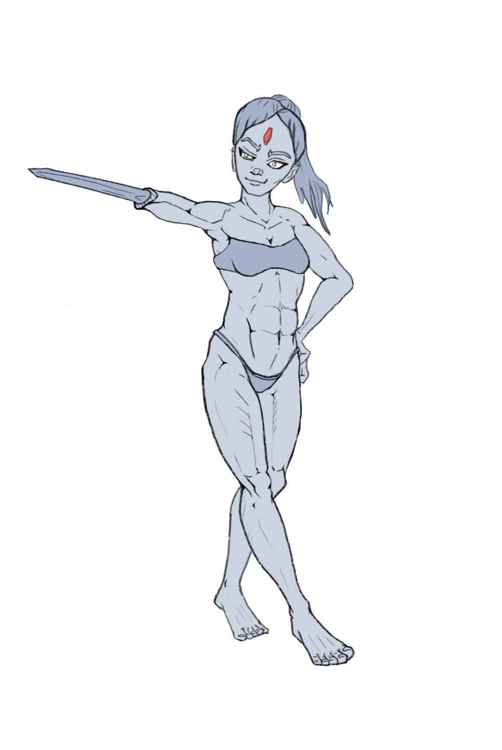
I'm moderately satisfied with my anatomy, but hair and hands are still a struggle.
I'm also not great on clothes which is why I tend to draw figures in underwear.
I'm leaning towards sorting out those 3 subjects and getting a better grasp on them and then trying to get better at rendering.
I can do rendering to an okay extend if I have reference but when I'm drawing from imagination like below, it tends to looks unfinished and messy.

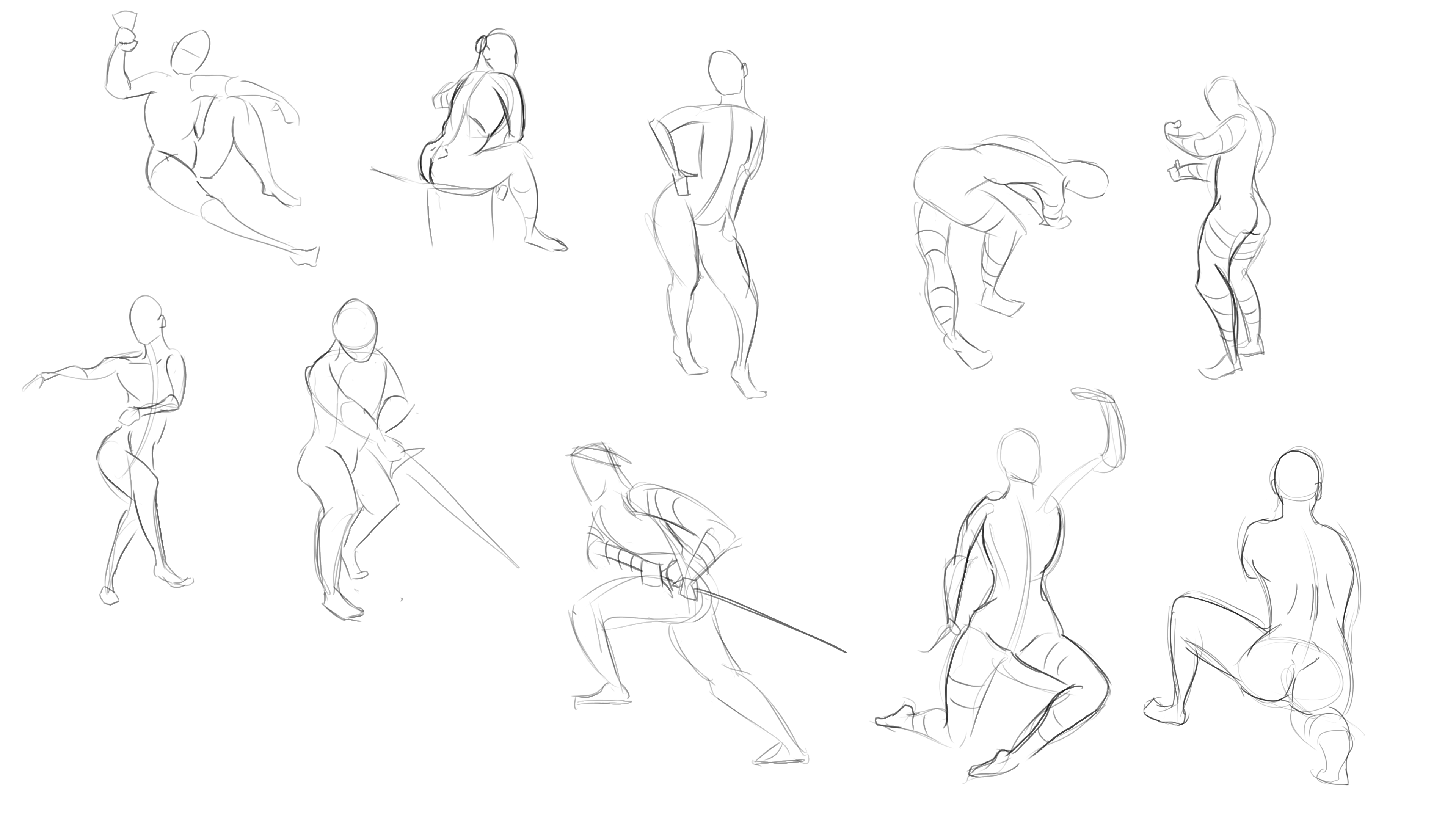
As a side note I've been trying to do gestures by drawing using exclusively my elbow.
They lose a lot of proportion and "finish" but gain a whole lot of movement from it.
Regardless it is helping me let go of my need to populate gestures with anatomy and details which lets me focus on the flow of the pose.
Been switching between practicing hands and clothes today.
Sticking to line-art since it feels like if it can't describe the form using line-art I probably won't be able to shade it anyway.
For clothes it mainly feels like I need to treat it like any other object and start with large shapes then work down into details.
My main issue with hands is figuring out which folds best describe the form without making the hands look too old or manly by giving them too many wrinkles.
I find that if I leave out too much detail on the hands they end up looking more feminine but require much more thought regarding which lines are kept and which are discarded.

Still studying hands and cloth.
Tried starting my studies with a shotgun hour of 60second hand studies since doing things fast usually reveals where your flaws lie pretty quick (as you don't have time to correct and just have to apply your knowledge on the fly)
I'm struggling quite hard with the proportions + attachment of the thumb and the foreshortening of the tips of the fingers when I don't have more time to draw guidelines.
I was surprised at just how difficult it was and just how bad some of the hands I tried drawing came out.
Definitely a humbling exercise to pinpoint the gaps in your knowledge for anyone interested.
Spent the rest of my studying time circling out the hands that were lacking and then focused on studying the specific poses that gave me trouble.

Ur doing very well so far ... don't try to rush thru a sketch or painting. Take ur time, speed comes naturally whilst studying. I personally like to do a rough gesture drawing first followed by a more defined sketch and a clean line drawing afterwards ... that works best for me ... guess what i want to say is focuse on quality rather then quantity while studying
Thanks, perhaps I explained it poorly.
I wasn't looking to become faster by doing this, I was trying to figure out what I should focus my studying on.
I'm not good yet so when I finish something like the first set of hands i posted, I look at them and have a hard time seeing my mistakes.
But if I spent less time on them (like the 60 second ones) and then look at which type of hands I mess up the most, then I can easily spot where the gaps in my knowledge is.
I've always found that you can mix fast and long focused studies to achieve better results as they have different purposes.
It might be controversial but I don't think that doing things fast is bad, as long as you stop after a set interval and make notes on your mistakes and why they happened and then work on them with longer more focused studies.
Haven't had much time to draw these past days but It should be better in the coming weeks.
Still just trying to unlock the secrets of hands by drawing the type of hands that I messed up the most during my 60 second hand galore.
Feeling small improvements here and there in my understand but there is still so many facets to hands and so many places where I fall short.
Main point I've taken away today is that the fingers are a lot more flat on the dorsal side of the hand, and that the contrast between that flatness and the more chubby sections on the palm side can really help describe how the fingers are rotation/bending.
I'm also noticing that I feel less uneasy about drawing hands, so overall positive progress however small.

Today's main project: Master studies on Disney artist Kin Jim
I absolutely adore the emotion and feeling of movement his hands have.
I found a few character reference sheets from the Disney movie Tangled and tried to decipher what makes them feel so alive.
It felt like a good way to start the day before doing more hand studies.
What surprised me the most is how many small muscle/fat pockets the hands have, and much they can be emphasized to get all kinds of movements a relatively simple hand.
Doing this also made me realize I have been ignoring the skin folds opposite of the knuckles (on the palm side) in my hand depictions so far.
Definitely a good day with lots of small discoveries!

Hi Marigo,
I like the gesture in your work the characters have dynamic figures and I think the figure drawing grind really shows. I would recommend that you focus on defining the forms of the figure so that your work does not always look 2 dimensional. One thing that helped me is understanding the very basic cylindrical nature of body parts. I similar to you, do gesture drawings to start my drawing day so I would recommend you add cylinders to the various body parts to show form and direction.
Cheers,
Adonay
Thanks.
I kind of got stuck and tunneled on trying to eradicate my need to add anatomy from my gesture drawings these past few weeks.
I've noticing more and more how I have a very hard time converting/keeping the gesture when trying to refine and polish it into a drawing.
I was going to call it for today, but after you mentioned this I might just have to try doing some more gestures to see if i can figure it out
I would love if I could add more depth/form to my gestures without them losing their flow, and cylinders definitely seem like a dynamic enough shape that they could do the trick.
On a side note I really love how other people can (and are willing) to help and spot mistakes like this since learning alone has a a habit of making you blind to your own mistakes.
When I learned to program a decade ago the developer community was very far from this kind, so thanks again
I hope to one day be at a level where I can help others out with art!
On the studying side I spent another day of drawing hands on repeat.
I'm finally at a stage where I don't feel scared of drawing hands, which is a huuuuge relief.
Finally feeling ready to move on to the next subject for now (I'm 100% coming back to hands. There is so many more facets to learn)

I've drawn like 250+ hands these past few days and boy have I picked up a lot of good info.
My main take away that I found during this grind was:
1: Redraw hands:
When hands look wrong it can often be faster to mark down which areas are off and then start from scratch.
If you start over and focus on setting up extra guidelines for the areas you disliked it becomes much easier to correct them.
I found that when i tried to stick with a drawing and "feel it out" by making adjustments over and over, I ended up frustrating myself because I had no direction. Starting over with better guidelines solves that.
2: A lot of hand can be simplified into a curved/bent piece of paper:
If you are having trouble drawing a specific type of hand. try to think of it like a sheet of paper (disregarding the thumb).
If you consider the top of the pinkie and index finger as the top corners of the paper and the sides of the wrist as the bottom corners you can easily draw a flat piece of paper that connect the 4 corners across the surface of the hand.
It works especially well for heavy foreshortening and cases where the hand overlaps and folds (since a piece of paper is just a rectangle)
Once you have the flat surface you can add depth and flow to it bit by bit and feel out the overall shape.

3: Draw overlapping cylinders for the fingers at first:
This helps speed up the process immensely since drawing 3 overlapping cylinders is so much easier than thinking of the whole form.
Once you have 5 "cylinder fingers" down on paper you can always start thinking above how the dorsal side of the hand is more flat and how the palm side's overlapping pieces would look.
It also just helps practice drawing the small bumps on the hand since you have a mannequin that you can draw over on another layer until you get it right.
4: Asymmetry:
No matter how still or simple a hand pose you draw. Lack of Asymmetry in the fingers/knuckles kills any indication of life or movement.
Bend one finger more than the next, Push the knuckles a little bit further, foreshorten some of the fingers further way.
Whatever you do, just don't draw every finger as the same type of cylinder with varying lengths.
It feels like the more you can master this concept, the more alive your hands become.
And that's it for my very long winded exploration of hands.
Hopefully I have this much success with my next subject of study too.
So I totally didn't get sidetracked and started studying gestures to figure out what I can do to improve them.
Or well.... I kinda did.
I tried doing some freehand gestures using cylinders like @don_ghebray suggested but I couldn't really get it down and I struggle to make it look good.

Realizing that I din't know what I was trying to achieve I decided to spend all of yesterday reading all of "Force - Dynamic Life Drawing for Animators" by Matessi to try and see If i could get any extra pointers on what I'm missing.
I then spent today trying to apply it doing gesture reference draw overs and writing down what I was seeing and then eventually transitioned to doing gestures for like 6~ hours.
I did sets of 10 and switched somewhat regularly between 5, 2 and 1 minutes per gesture.
These are the last ones I did today.
I've noticed that I I'm not good at rotating the torso and showing movement in the torso/hips, but mainly I just have hard time pinpointing what I'm doing wrong.
I can feel that I'm getting better at making things flow but I'm struggling to have any particular "goal" or something to compare it to.
How do you even begin to describe a great gesture outside of "it feels alive"


