• Gave myself 5 days to do something. This is what I managed to do. I'm trying to get better at illustrations, but I have patience to work on something for 3 days maximum :( Splash_Process.jpg5000x3140 2.21 MB Splash_Process-6.jpg3896x2429 2.83 MB concept list char copy.jpg5388x3000 1.7 MB
    20.4k
  • Did a character concept for a course.https://www.artstation.com/artwork/P6gm3y - more:) list1.jpg3541x1920 2.82 MB
    20.4k
  • Day 4: Star Wars May The 4th =] Queen Padmé Amidala in my art style! First time drawing her and I really enjoyed making this one! Used watercolours, ink pen, acrylic markers and gold paint for accents on my Canson mix media sketchbook. I hope you like it!
    80.7k
  • A creature design from a while back
    by
    6.5k
  • Here is some more recent stuff, I need to make more body studies
  • It's been a while and god, it is so cringe to go through all previous messages xDmy study.
    20.4k
  • Thank you! I finally cleaned that up. Meanwhile started 3 more ..I have a habit of taking too long to finish a piece, then I lose interest in it and just start something else. I found 8 from recently i started and abandoned, that are decent enough to not delete, but not finished. There’s also been a number of drawings I felt I “outgrew” - became better before I finished them, and it would be easier to start from scratch than fix them. Anyone else thinking that?
  • Lady Death Fanart Collectible: Part 6 Polypaint and base Hi, it’s time to share with you another part of the process to create this fanart piece. Polypaint As this is my first collectible fanart I didn’t have previous experience with polypaint so I tried my best and played a bit with it.I wanted to give a ghostly and eerie look to Lady Death, she is beautiful and deadly, but at the end of the day she is a woman that died and was reborn at hell as an avenging spirit, that’s why I gave her skin tone a bluish very cold tone.As you will see I gave myself some creative freedom to deviate from the traditional color scheme that this characater has in comics and illustrations.To add a bit of sensuality by painting some freckles on the face and the chest. The dark nature of this character was the perfect excuse to gave her a kind of goth make up, very dark shadows around the eyes, blue lips and fingernails. I know that the original character includes sexy red lips but I wanted this girl to have a sexy but at the same time creepy look, that’s why we can see some thin veins emanating from her eyes. The biggest chromatic change I did for this character is at the hair. Lady Death has a characteristic white weavy hair but in my fanart I decided to gave her a very saturated blue color.The reason behind this wasn’t only an aesthetic choice. I want that the face area strongly pulls the attention of the viewer so this area needed a stronger contrast. Another reason is that I want her to have a more modern look, as I mentioned before, I’m strongly attracted to women with goth/punk look. I gave myself half an hour or more to analyse the work of experienced sculptors that create collectibles and I discovered that the use of darker values on the skin is often applied to create a greater sense of volume and three-dimensionality. I found that areas with heavy ambient occlusion are the perfect places to paint with darker colors in order to increase the separation between different forms. Even though she has a bluish skin tone, I used a bit of warmer hues in areas that, in real life, tend to go towards red and pink, this is very obvious in the nose, cheeks, and knuckles. Thinking with a logical mind it’s completely absurd to have warmer tones on the body of a zombie like creature but I didn’t want to limit myself by using only blue tones, it looks boring and artificial. In real life these colors are created by blood vessels in areas where the skin is very thin. ** Scythe **for her weapon I applied a cool gray with some warmer variations, this color scheme is influenced by the work of H.R giger. Base I’d like to talk about the design for the base which, to be honest, I forgot to develop along with the character.My main idea with the base is to show that Lady Death inhabits a very sterile and arid land, at the end of the day she is at hell.You can see a that she walks over dirt and rocks, a sign that she’s surrounded by death and loneliness. As part of the landscape we can see some bones and skulls to reinforce the idea of lack of living creatures, yet we can see three hands that try to reach her legs.This hands represent that all creatures are subordinated to her power and seek an evil blessing with a simple touch of the princess of the damned.1- The hand with skin burns represents the souls of those who are newcomers to hell, tortured souls that suffer for the sins comitted on earth.2- The hand with greenish rotten skin and pustules is the reminder of the decay that has infected the souls of those who have been trapped and have forgotten their humanity3- Last but not least, the hand of a demon shows that even dark creatures and entities bow before her presence. The cherry on the top, at least in my vision, are the simese twins that emerge from the ground, this malevolent creatures remind us that in hell there’s only perversion and any trace of innocence is lost. Thanks for reading till this pointI’m really happy to be very close to finish this creative journey, last but not least it’s mandatory to talk about splitting the sculpture in several pieces to be printed, this will be my last entry before showing the final rendered images. See yaMay Zbrush be with you
    1.4k
  • memory 2min gartic phone, used ref 2m gartic, used ref for pose 2min gartic 2min gartic 2min gartic 2min gartic memory memory memory memory study memory memory memorymemory memory memory memory memory memory study memorystudy study stylized left memory, right study study memory memorymemory memory memory memorymemory memory, porportions r offmemory memorystudystudy memorymemorymemory memory memory memory memory memory memory memory, right leg is a bit broken The feeling of only getting 1 - 3 likes on a social media post will never not be discouraging. But nothing is discouraging enough to make me quit drawing. I think the strategy of drawing a lot of stuff and waiting a while to post is good though rather than posting it immediately and then feeling that sadness on the next set of drawing
  • Urban Dragon Girl Wip Urban Dragon Girl_wip1.jpg5000x5000 1.11 MB
  • Long time no see! New artworks produced lately
    6.4k
  • studies studies juri study imagination, how I feel before a speech imagination imagination study something I drew for my presentation also drew this for my presentation, didn't fix the one hand being bigger than the other imagination + study study studies study study, I need to fix the face a bit based on screenshot from anime but in my style study. except for the eye study studies studies study. changed some things tho imagination imagination imagination study studies, except top right samurai based on anime screenshot wolverine studies, changed some of the poses a lil, not very good at all, but first time i drew the character ever. semi study studies study imagination imagination imagination , for first time ever i tried to draw over 3d model for middle pose, I dont like the result tbh, but it makes it much easier than coming up with it from memory.imagination, except right figurestudies imagination + studies, coming up with action poses r hard, these are not dynamic enough, I will redraw better ones in future. imagination , imagination imagination study, except for eye imagination imagination imagination doodles except for the two chrollos imagination storyboard thumbnail, idk if i ever shared this. my storyboards end up being a little detailed since i usually just draw in one layer.
    by
    21.8k
  • Quick fun sketch. CyberFish.jpg2394x3857 674 KB
  • Neon Gambit This is a fan art of my all time favorite character Gambit from the X-Men.I made this a birthday gift (26.04.2024) to myself and honestly I really do like how it turned out in the end =] I hope you like it as well =]
    80.7k
  • Art Blog - April to September 2023 Suffer a little burn out. Look at some memes. Here's some art from in between. critique.jpg1333x5736 1.77 MB
    20.1k
  • And some more! Been painting over them a bit more this time. Some variants I tried for the old guy using mainly the liquify tool. Someohow looking a bit like Owen Wilson (not intended :D)
  • Cafe sketch/color study
  • Hello! My name is Vithor, I am from Brazil, studied Design at a local college worked as an illustrator for more than 10 years. I took a time off around 3 years ago and am trying to get back in my art shape and maybe become professional again. Here are some recent pictures: You can find timelapses for most of them on my instagram: www.instagram.com Vithor Albertim (@vithor_albertim) • Instagram photos and videos 123 Followers, 638 Following, 19 Posts - See Instagram photos and videos from Vithor Albertim (@vithor_albertim) Comments and critiques are always welcome.Cheers!
  • @patrycja.lerch Thank you I created another variant, which might capture the witch look I was going for better
  • Thank you @daceronine! If I remember I save in google cloud, I will have to stick a note to do it more often. Lamp is from life. Poses are from refs but I look at refs for a while and then try to do it myself and look it up if needed. Outfits and rest is from imagination Something went wrong while installing system so we will have to wipe everything again... pc works but something is wrong. We will wait till internet is done and I will save everything on cloud this time Threads came out in eu. It's been 3 days and I had more engagement than after half a year on instagram. It feels really nice I hope it stays this way A portrait of old dude. It's the same character I posted a while ago. Inspired by Bayard Wu work. At first I thought of him as a bear but I named him Fenrir and I think wolf suits him better. Eye gave me a bit of hard time but I think it is fine now. I focused on face and forgot about area below. The way I draw hair clashes with greying hair. I had the same problem while doing Lohse's white hair. Does it looks like it is greying here? I love how desaturated red looks blue there. I keep lying to myself that I will use different color scheme but It all comes down to this blue and yellowish one it is just flipped this time Have a great day!
  • Been bad about posting updates on the forum. I figure I should just throw down stuff. instead of waiting until I finish something.
    14.4k
  • Havent done much this year since I am focusing on learning programming and deving my own Indie Game . But here 's a New Year Piece 2024 , she 's the mascot for my Game Studio - Lucid Realm : Lucid Chan ! LucidChan_v001_sketches.jpg3072x4352 973 KB
  • IMG_0637.jpeg3240x4050 1.6 MB
  • Long Crested Eagle studyI had so much fun making this one and honestly I love that Eagle! It looks so cool! Used for this one high quality watercolours, high quality watercolour sketchbook/ cold press and it was 300 grams paper.I hope you like it!
    80.7k

Trying to get better at line-art at the moment (since I have a habit of being too loose with my lines)
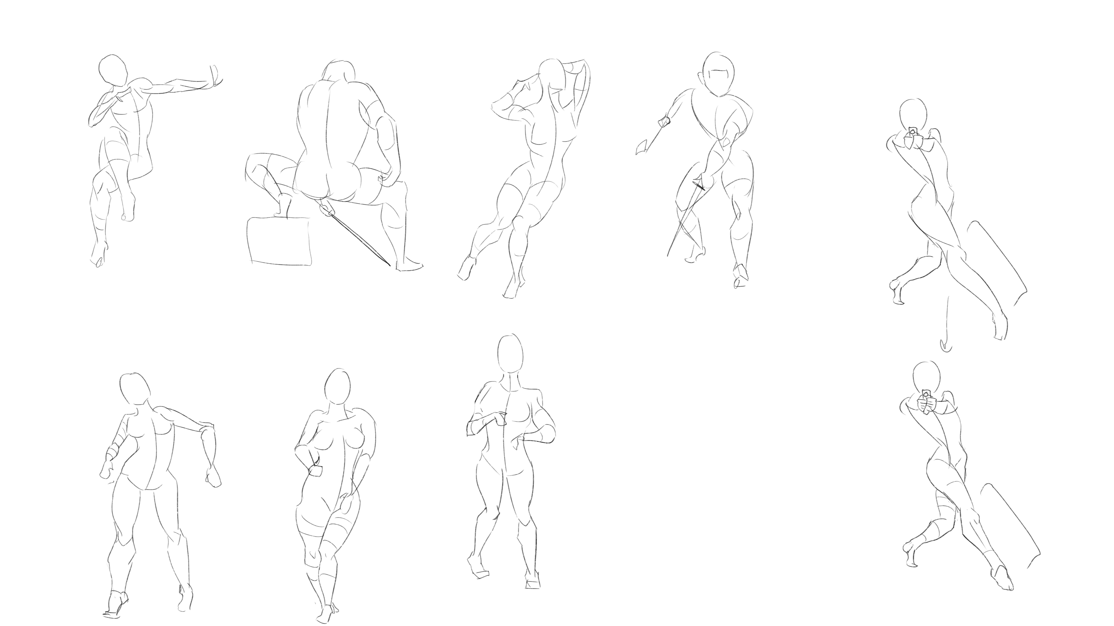
If I have time I like to start line- art by sketching and just testing out ideas until i find something I feel invested in.

Not feeling too confident in drawing accessories like weapons, pouches and just things a character might have on their person. It kinda limits my ability to output interesting concepts at the moment so i´m thinking of taking a short detour from my line-art studies to study props.


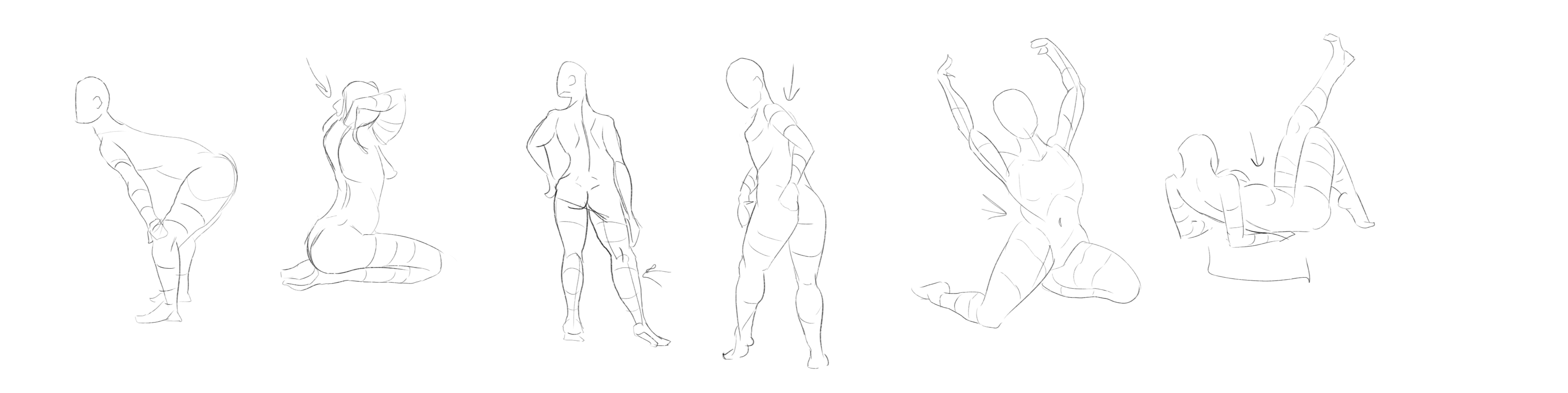
Still doing daily gesture drawings and currently wondering what I need to do to improve my overall gestures.

If anyone has any book recommendations or resources that could help me pinpoint areas to study gesture I would be eternally grateful.

Hello and welcome to the forums! You seem to be doing good so far, especially if you started from 0 and been at it for only 6 months. Your linework is really nice and so are your gesture drawings.

As for resources regarding gesture drawings, I think Proko on youtube has videos on the subject. He also have videos on anatomy which are quite helpful.

I hope you keep going as I think you're showing lots of promises with your art. It will be really cool to see how it evolves.

Thanks for the welcome & kind words.

It definitely doesn't feel like a lot of progress compared to where I hope to be one day. So many topics to tackle, so much knowledge to absorb :sweat_smile:

I watched a few of Prokos videos and this is definitely what I was looking for. I´ll definitely be deep diving that channel in the coming weeks. Thanks a bunch for the recommendation!

Ended up taking that detour from my studies to try out drawing some props and such (Since I realized I have never actually done it as a standalone thing)

Got a pitch from a friend who is writing a short story about a world where bones of large creatures and iron is plentiful but technology is scarce.
The people in the short story discover ancient alien weapons and armor that they then mix with what they have at hand.

I mashed out quite a few concepts, but this is some of the more interesting ones. The idea was that the green parts/metal signified the alien civilization, while the white bony bits and brown iron was tacked on in an attempt make the alien technology usable.

I tried to keep things lose, so not exactly great artistic results, but the entire thing was a blast to do.

I'm not sure if it makes sense or is too much to post something every day.
I hate the idea that most of the things I study and draw get lost in the void of my computer harddrive :dizzy_face: .

Ended up having so much fun making weapons yesterday that I did another set today.
This time focused around candy and condiments. (Oreos, candycanes, waffles etc)

Also realized (after watching the recommended youtube channel proko) that gesture drawing doesn't necesarily have to be constrained to a few minutes and that sitting down afterwards and trying to study the form without any time constraint is immensely helpful.

Today was one of those fun days where nothing seems to work the way you want it to.

I tried creating a short ol-timey pilot character but somewhere along the way I messed up the drawing and it caused me to go down a spiral of trying out different ways to fix it.
I ended up spending way too long trying to figure out what to do when I make a mistake that can't easily be rectified and In the end (after making 6 different versions and deleting them only to start over) I had to leave it be.

I was planning on using the drawing to figure out what to work on next so in a sense I guess it failed successfully?

At least gesture drawing is going well :sweat_smile:
Still trying out different things and studying up on proko material.

In extension of yesterdays failure I have spent today practicing the art of correcting mistakes.
I spent like 5 hours on this one file just drawing shapes, shading them, introducing mistakes and trying to fix them.
Main lesson I learned was to not be afraid to wipe out progress by erasing and just starting over.
I´m not exactly fast at the moment so the fear of having to start from scratch was causing me to try all sorts of creative "fixes" that din't work because I don't yet fully have to eye to see how to correct things like bad shading/lines etc.

Still attempting to improve my gestures and trying to add some more extreme/rigid shapes within the curves.
I've seen it produce some amazing results in other artists gestures but boooooooy is it difficult to get down.


These are all really nice updates! I was wondering, how long do take for your gestures? I'm asking because I almost want to say that they might be "too detailed" for gestures.

By that I mean that you seem to try to indicate anatomy and muscles while I think gestures should focus more on the flow of the pose and the broad shapes. So the whole pose will be simplified and could almost look abstract in a sense. This should however lead to more lively and pushed gestures. Basically, it's all about controlled looseness and energy.

There's not just one way to do it obviously, but here's an example from Michael Hampton's Figure Drawing book (which might be worth checking out) to show a bit what I mean.

With that said, you're still doing good and you clearly have knowledge of anatomy, so that's good! And that lesson you've learned of starting over if things don't quite work is also a good one. Over time, as you get more experience, you won't have to do that as much anymore. Unfortunately it might still happen from time to time though :smile:

Thank you so much for that comment!

I spent 2 minutes on each of the figures I have been posting so far.
Your comment made me realize that I have been trying to capture and study anatomy in my gesture drawings instead of doing gesture.

I picked up the Hampton book and read through the gesture drawing part and it gave me such an aha moment.

I spent a while doing 1 minute gestures and trying to apply some of the things I read but maaaaaaaaaaaaaaaan is it difficult to not try to apply anatomy. :sweat_smile:

This is definitely going to take a while to get used to.
I can sort of grasp the idea of how to apply things but small things like proportions and perspective are hard to think about while trying to find the right curves.

Again, thanks a bunch. I can already tell this is going to help me out a ton. I just need to practice it more. (And then learn to apply the anatomy on top)

Glad I could help! And yes it's really hard to let go of the anatomy and focus more on the gesture itself :joy: I'm sure you'll get it as some of the latest one you did show great promises!