


Pretty solid studies!

 Thank you! I finally cleaned that up. Meanwhile started 3 more ..I have a habit of taking too long to finish a piece, then I lose interest in it and just start something else. I found 8 from recently i started and abandoned, that are decent enough to not delete, but not finished. There’s also been a number of drawings I felt I “outgrew” - became better before I finished them, and it would be easier to start from scratch than fix them. Anyone else thinking that?in24.2k
 Lady Death Fanart Collectible: Part 6 Polypaint and base Hi, it’s time to share with you another part of the process to create this fanart piece. Polypaint As this is my first collectible fanart I didn’t have previous experience with polypaint so I tried my best and played a bit with it.I wanted to give a ghostly and eerie look to Lady Death, she is beautiful and deadly, but at the end of the day she is a woman that died and was reborn at hell as an avenging spirit, that’s why I gave her skin tone a bluish very cold tone.As you will see I gave myself some creative freedom to deviate from the traditional color scheme that this characater has in comics and illustrations.To add a bit of sensuality by painting some freckles on the face and the chest. The dark nature of this character was the perfect excuse to gave her a kind of goth make up, very dark shadows around the eyes, blue lips and fingernails. I know that the original character includes sexy red lips but I wanted this girl to have a sexy but at the same time creepy look, that’s why we can see some thin veins emanating from her eyes. The biggest chromatic change I did for this character is at the hair. Lady Death has a characteristic white weavy hair but in my fanart I decided to gave her a very saturated blue color.The reason behind this wasn’t only an aesthetic choice. I want that the face area strongly pulls the attention of the viewer so this area needed a stronger contrast. Another reason is that I want her to have a more modern look, as I mentioned before, I’m strongly attracted to women with goth/punk look. I gave myself half an hour or more to analyse the work of experienced sculptors that create collectibles and I discovered that the use of darker values on the skin is often applied to create a greater sense of volume and three-dimensionality. I found that areas with heavy ambient occlusion are the perfect places to paint with darker colors in order to increase the separation between different forms. Even though she has a bluish skin tone, I used a bit of warmer hues in areas that, in real life, tend to go towards red and pink, this is very obvious in the nose, cheeks, and knuckles. Thinking with a logical mind it’s completely absurd to have warmer tones on the body of a zombie like creature but I didn’t want to limit myself by using only blue tones, it looks boring and artificial. In real life these colors are created by blood vessels in areas where the skin is very thin. ** Scythe **for her weapon I applied a cool gray with some warmer variations, this color scheme is influenced by the work of H.R giger. Base I’d like to talk about the design for the base which, to be honest, I forgot to develop along with the character.My main idea with the base is to show that Lady Death inhabits a very sterile and arid land, at the end of the day she is at hell.You can see a that she walks over dirt and rocks, a sign that she’s surrounded by death and loneliness. As part of the landscape we can see some bones and skulls to reinforce the idea of lack of living creatures, yet we can see three hands that try to reach her legs.This hands represent that all creatures are subordinated to her power and seek an evil blessing with a simple touch of the princess of the damned.1- The hand with skin burns represents the souls of those who are newcomers to hell, tortured souls that suffer for the sins comitted on earth.2- The hand with greenish rotten skin and pustules is the reminder of the decay that has infected the souls of those who have been trapped and have forgotten their humanity3- Last but not least, the hand of a demon shows that even dark creatures and entities bow before her presence. The cherry on the top, at least in my vision, are the simese twins that emerge from the ground, this malevolent creatures remind us that in hell there’s only perversion and any trace of innocence is lost. Thanks for reading till this pointI’m really happy to be very close to finish this creative journey, last but not least it’s mandatory to talk about splitting the sculpture in several pieces to be printed, this will be my last entry before showing the final rendered images. See yaMay Zbrush be with youin1.4k

 memory 2min gartic phone, used ref 2m gartic, used ref for pose 2min gartic 2min gartic 2min gartic 2min gartic memory memory memory memory study memory memory memorymemory memory memory memory memory memory study memorystudy study stylized left memory, right study study memory memorymemory memory memory memorymemory memory, porportions r offmemory memorystudystudy memorymemorymemory memory memory memory memory memory memory memory, right leg is a bit broken The feeling of only getting 1 - 3 likes on a social media post will never not be discouraging. But nothing is discouraging enough to make me quit drawing. I think the strategy of drawing a lot of stuff and waiting a while to post is good though rather than posting it immediately and then feeling that sadness on the next set of drawingin

 studies studies juri study imagination, how I feel before a speech imagination imagination study something I drew for my presentation also drew this for my presentation, didn't fix the one hand being bigger than the other imagination + study study studies study study, I need to fix the face a bit based on screenshot from anime but in my style study. except for the eye study studies studies study. changed some things tho imagination imagination imagination study studies, except top right samurai based on anime screenshot wolverine studies, changed some of the poses a lil, not very good at all, but first time i drew the character ever. semi study studies study imagination imagination imagination , for first time ever i tried to draw over 3d model for middle pose, I dont like the result tbh, but it makes it much easier than coming up with it from memory.imagination, except right figurestudies imagination + studies, coming up with action poses r hard, these are not dynamic enough, I will redraw better ones in future. imagination , imagination imagination study, except for eye imagination imagination imagination doodles except for the two chrollos imagination storyboard thumbnail, idk if i ever shared this. my storyboards end up being a little detailed since i usually just draw in one layer.in22.1k

 Hello! My name is Vithor, I am from Brazil, studied Design at a local college worked as an illustrator for more than 10 years. I took a time off around 3 years ago and am trying to get back in my art shape and maybe become professional again. Here are some recent pictures: You can find timelapses for most of them on my instagram: www.instagram.com Vithor Albertim (@vithor_albertim) • Instagram photos and videos 123 Followers, 638 Following, 19 Posts - See Instagram photos and videos from Vithor Albertim (@vithor_albertim) Comments and critiques are always welcome.Cheers!in794

 Thank you @daceronine! If I remember I save in google cloud, I will have to stick a note to do it more often. Lamp is from life. Poses are from refs but I look at refs for a while and then try to do it myself and look it up if needed. Outfits and rest is from imagination Something went wrong while installing system so we will have to wipe everything again... pc works but something is wrong. We will wait till internet is done and I will save everything on cloud this time Threads came out in eu. It's been 3 days and I had more engagement than after half a year on instagram. It feels really nice I hope it stays this way A portrait of old dude. It's the same character I posted a while ago. Inspired by Bayard Wu work. At first I thought of him as a bear but I named him Fenrir and I think wolf suits him better. Eye gave me a bit of hard time but I think it is fine now. I focused on face and forgot about area below. The way I draw hair clashes with greying hair. I had the same problem while doing Lohse's white hair. Does it looks like it is greying here? I love how desaturated red looks blue there. I keep lying to myself that I will use different color scheme but It all comes down to this blue and yellowish one it is just flipped this time Have a great day!in48.1k
thanks cedric:)
here's day 15, moving on to long term studies, this is the first hour.
i spent almost the entire time working on the colors, there is a lot of warmth that is part of every single color, even the 'greens' are closer to an olive made of yellow and black, the sky also moves towards a pink hue than just fading into a blue white at the horizon and etc and etc and etc! lots to learn:)


deciding to leave this at 3.5 hours  its been a tough but very rewarding study! ill probably touch it up after crit from here and artschool discord and move on to another 3.5 -er tomorrow
so exciting to be on day 17/21 for noah bradley's habit builder challenge, i think im going to continue minimal 1hr studies every morning, ill probably be doing figures next!
here is a gift i finished for a friend. i had a lot of trouble with creating an unfinished, but good look, especially with the hands. the original pose of the upper body was nothing like this, and the struggle to find what i was looking for came through in that stiffness
as far as personal crit goes, if i dedicate myself more to a loose-looking pose and design, i should put it through much the wringer much more before i develop a final. ie. this had maybe 2 phases of design in it, where 5-6 are needed for a better piece
(the dark grey is dead space to get the image to fit better on screen)

as for the 21DC, im doing my final color masterstudy in acryllic, and i'll probably be getting general critique from the mirror and my bf  will upload like wednesday
WOo!! that dedication is admirable, it pumps me up! Your traditional work is awesome, very creative!
@whymrwho thank you!!!!!
I've finished the 21 days! every morning i painted an hour. the last study i was working on has ended up being very difficult (below) and i will probably push on it until i at least get the canvas covered, maybe at 5 hours

this shows how far i got each day, with the bottom being the last day!
12 days later
Hey all ! figured i'd update.
After I finished the challenged I prepared to do a second 21 days of more studies of things i wanted to learn and keep a ball like that rolling. It didn't work out, after the 2nd day, i realized i wasn't learning or studying, just 'doing' which wasn't getting me anywhere
I decided to step back and adjust what I felt i needed. I'm currently studying still an hour each morning (at least) but its much more loose and realative to current projects. this approach has given me much more reserve and fuel to keep at it
I'm currently doing a master study related to a figure-central painting im finishing off. the figure has a similar pose and similar lighting to what i'm looking for.
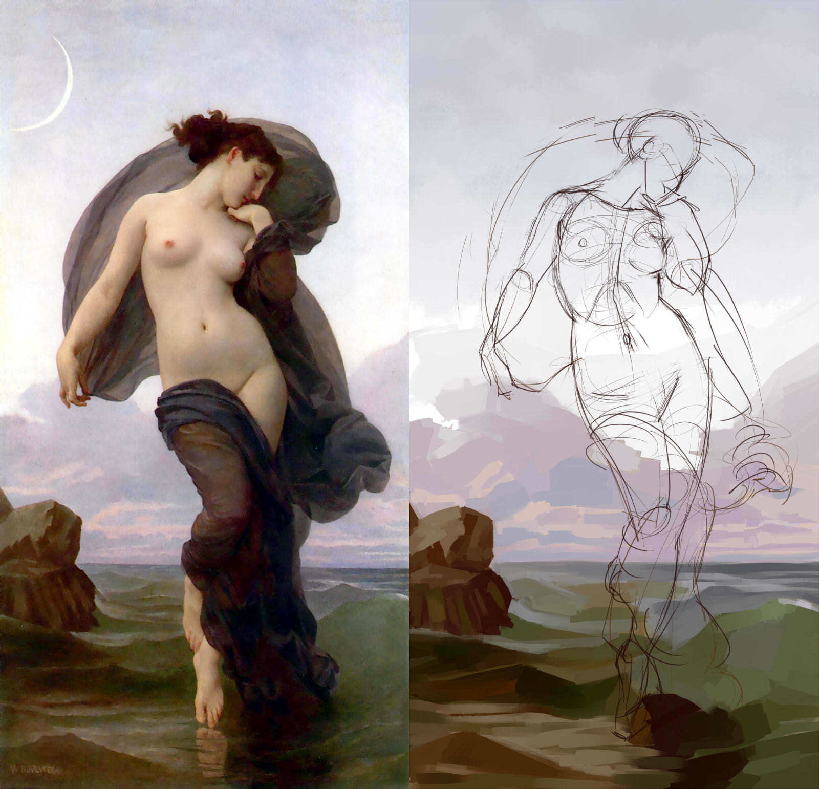
its a bourguereau (i think thats how its spelled XD)
i'll post more about the piece im working on later this week and probably past that. the piece is something from an idea ive had sitting since 2015, and i want to create a big observation on it on how style and creativity change over time.
Good luck! You picked a doozie. There is one here that is similar in lighting in what used to be the google art project. (They didn't have your ref unfortunately) You can zoom in and get some clues to some of his mark making. The paintings are very smooth and layered in person.
He did one of these every week it was crazy.
@brohawx thanks + thanks for the ref! having a close up will be helpful
i had no idea he did these in a week each! they seem so delicate and precise. i'll have to try and visit the museum they are hosted at someday!

starting to lay down basic colors and finish the underdrawing. im seeing that i consistenly like working with tight underdrawings; but, i really hope that doesn't steer me away from this studies' focus! ill have to write down the core for this study and put it on the wall or something! lol
this is the pose im going to be using in combination with the ambient lighting style and composition as bourguereau's.
i will probably be putting up design thumbs for critique soon!

It's coming along nicely. I also like the pose you've chosen for your own piece. I'm looking forward to see how the piece will look like once you'll apply what you have learned from studying Bouguereau's work. Keep it up!
@cedricgo thanks so much for your comment. As good as studying has been going, its still tough now and then to get up and push everyday. Reading this helped me out with that!

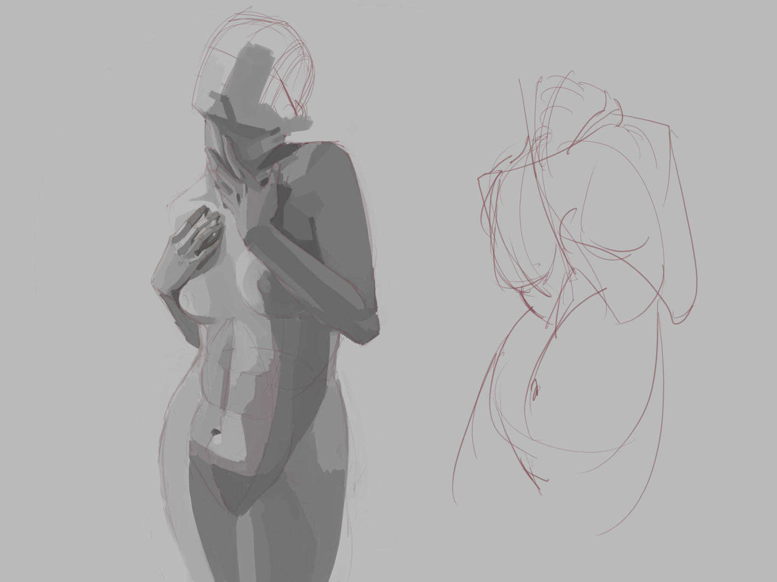
The render is going strong so far! I'm having a gnarly time trying to lay down the shapes of the tummy. I've been recently working with the philosophy that problems, no matter the complexity, can have simple solutions. I'm trying to lay down the critical, simple brushstrokes of the stomach.
Otherwise, the only thing I see is my colors muddying up from rendering. I could filter it of course, but where's the fun in that! 
Finished the study! I did not go for the full render; but, I feel I did stop at a solid place. I will let this sit for now

Also beginning the illustration I studied in the first place for!

To break this down:
- Piece is about anxiety and fear pulling the life out of the body and manifesting it into a physical mass.
- S curved composition, I used tall grasses to counter the weight of the cloth/goop leaning left
- I'm using toned reds/oranges/blue so far
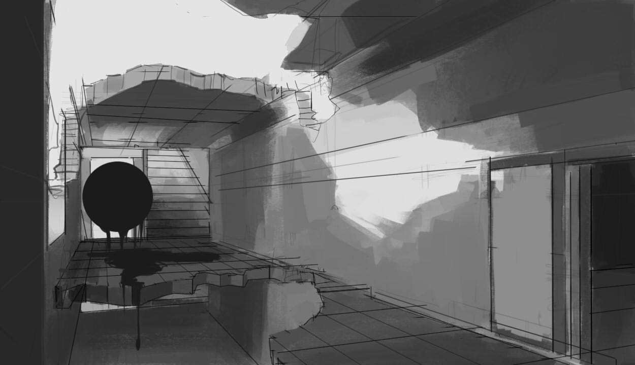
I have the piece at a branch. I was thinking of using classical cloth for the "dark mass" but 1) not great at rendering cloth and 2) Its not very striking. I have a second option to use a flowing, goopy mass which conveys the idea better. I'm leaning towards goop; but, I'm hoping to get a second opinion
(Goop is the right)

menacing orb snuck into my study! i really like drawing creepy dripping orbs in my spare time
this is some work im doing to accompany artschool's perspective 2. i like to push the lessons and find my personal weak points. the study itself is done, but i may render it in my spare time and see how my values are looking!
Your art reminds me of my art school. You experiment a lot and think out of the box! LOVE it!
@shia thanks so much! i try to be out of the box as much as possible 
update on this, I've pushed it a bit more. I really like the vibe and composition, so I may render it enough to label a piece, or portfolio item

Major update on this piece! It has been going really well as of late. I've had a tough time with the right palette and tones, but I think I have something good down. Most importantly, I can feel the depth of the body, something I was really pushing for!
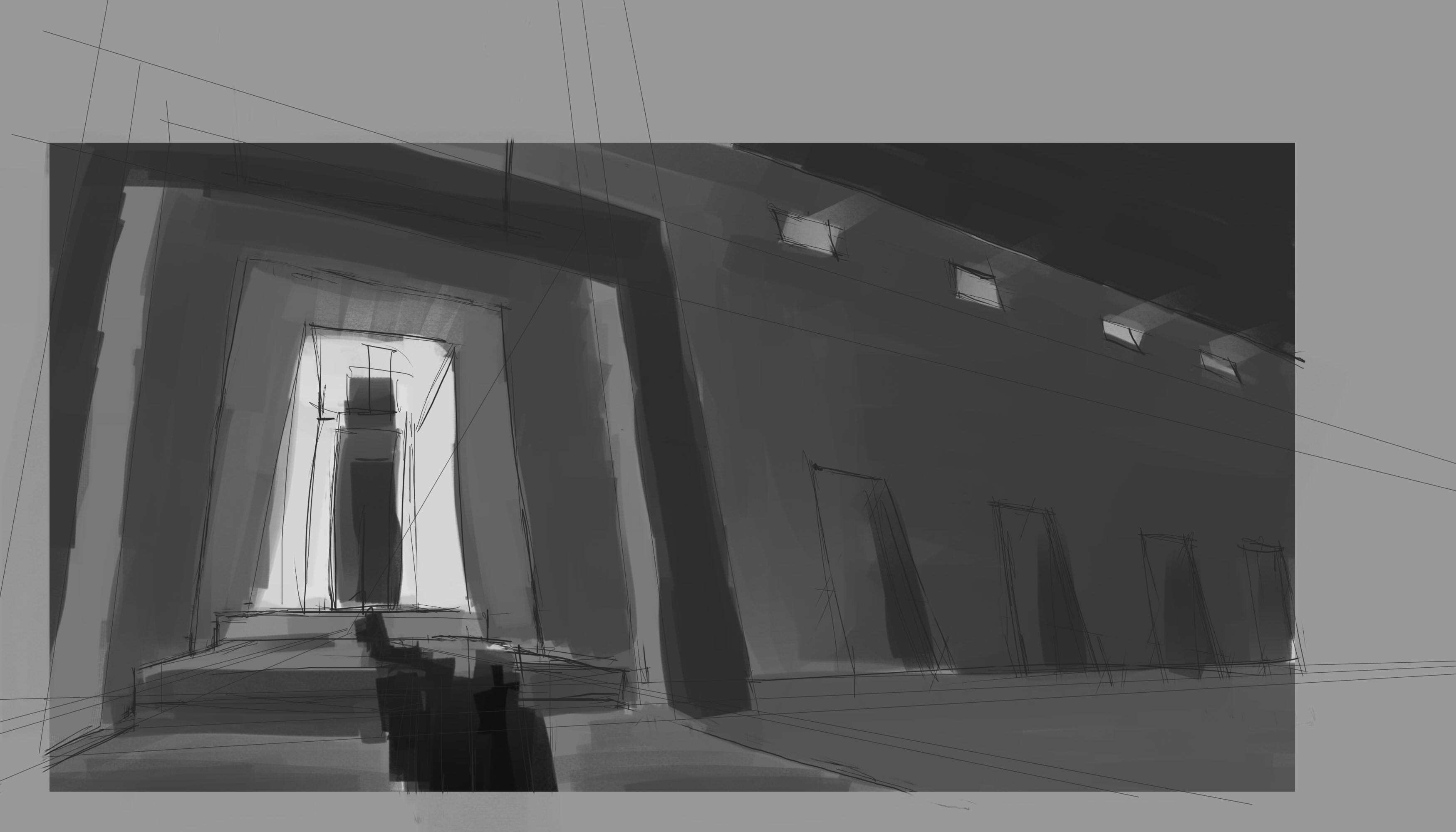
Also began an assignment for Terrm 2 Perspective. Its going well. I'm looking to add giant pillars and detail. I based my design off of the ancient ruins at/of Karnak :))))))))
1 month later
Wow! Can't believe its been since august since uploading. I evacuated from my city for Hurricane Florence, and have been away from my beautiful painting supplies for 2 weeks! O the pain!
Just before leaving, I did however finish this

I'm quite happy with it. It well exasperates my current skill (fresh meat to pry apart and learn from lol) Most of what I'm missing is depth, probably through color and space.