


Tedium, or repetition, is good for building discipline and skill. I want to level up as quickly as possible so I'm trying to really throw myself into my studies.

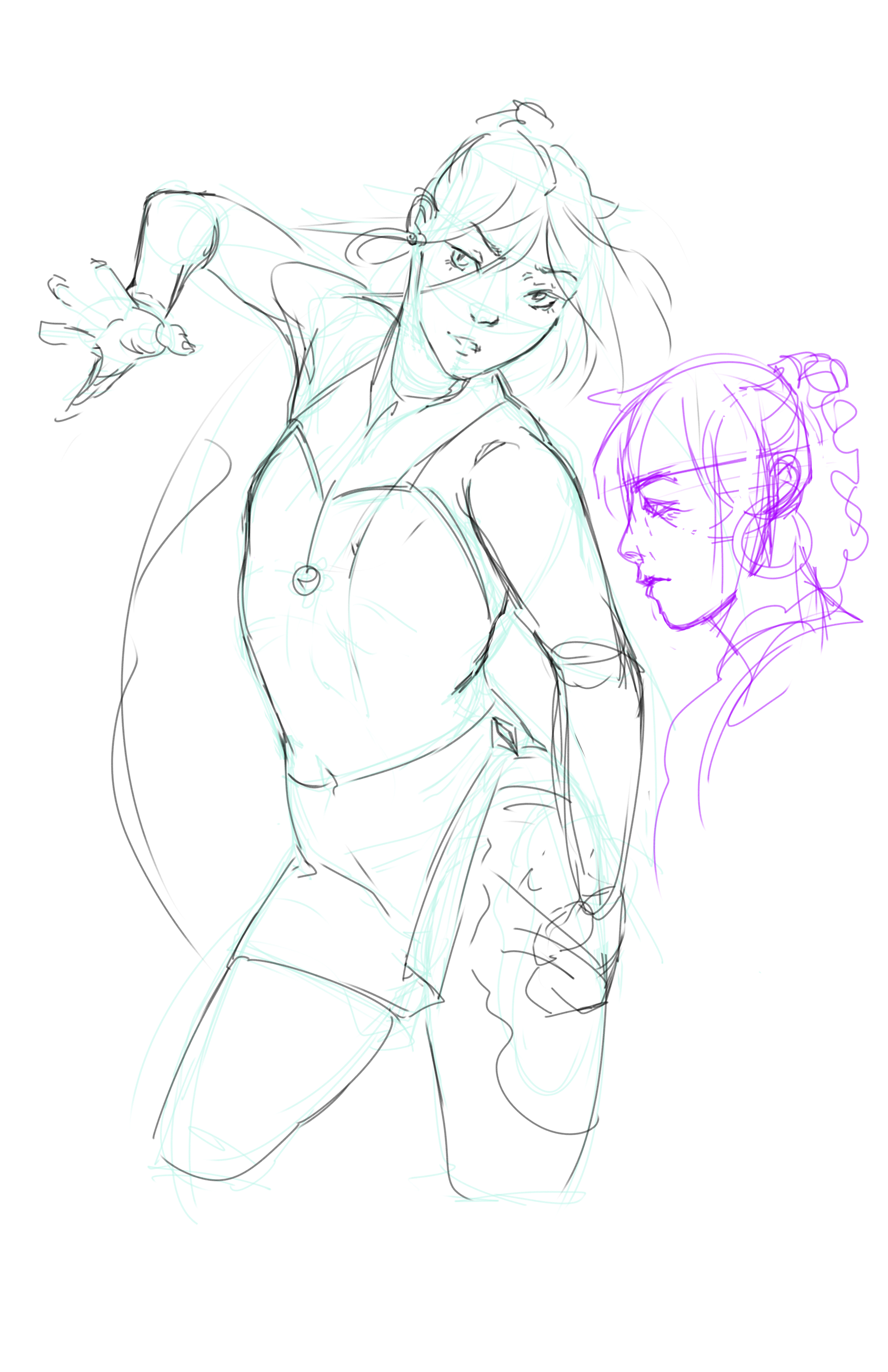
 Thank you! I finally cleaned that up. Meanwhile started 3 more ..I have a habit of taking too long to finish a piece, then I lose interest in it and just start something else. I found 8 from recently i started and abandoned, that are decent enough to not delete, but not finished. There’s also been a number of drawings I felt I “outgrew” - became better before I finished them, and it would be easier to start from scratch than fix them. Anyone else thinking that?in24.2k
 Lady Death Fanart Collectible: Part 6 Polypaint and base Hi, it’s time to share with you another part of the process to create this fanart piece. Polypaint As this is my first collectible fanart I didn’t have previous experience with polypaint so I tried my best and played a bit with it.I wanted to give a ghostly and eerie look to Lady Death, she is beautiful and deadly, but at the end of the day she is a woman that died and was reborn at hell as an avenging spirit, that’s why I gave her skin tone a bluish very cold tone.As you will see I gave myself some creative freedom to deviate from the traditional color scheme that this characater has in comics and illustrations.To add a bit of sensuality by painting some freckles on the face and the chest. The dark nature of this character was the perfect excuse to gave her a kind of goth make up, very dark shadows around the eyes, blue lips and fingernails. I know that the original character includes sexy red lips but I wanted this girl to have a sexy but at the same time creepy look, that’s why we can see some thin veins emanating from her eyes. The biggest chromatic change I did for this character is at the hair. Lady Death has a characteristic white weavy hair but in my fanart I decided to gave her a very saturated blue color.The reason behind this wasn’t only an aesthetic choice. I want that the face area strongly pulls the attention of the viewer so this area needed a stronger contrast. Another reason is that I want her to have a more modern look, as I mentioned before, I’m strongly attracted to women with goth/punk look. I gave myself half an hour or more to analyse the work of experienced sculptors that create collectibles and I discovered that the use of darker values on the skin is often applied to create a greater sense of volume and three-dimensionality. I found that areas with heavy ambient occlusion are the perfect places to paint with darker colors in order to increase the separation between different forms. Even though she has a bluish skin tone, I used a bit of warmer hues in areas that, in real life, tend to go towards red and pink, this is very obvious in the nose, cheeks, and knuckles. Thinking with a logical mind it’s completely absurd to have warmer tones on the body of a zombie like creature but I didn’t want to limit myself by using only blue tones, it looks boring and artificial. In real life these colors are created by blood vessels in areas where the skin is very thin. ** Scythe **for her weapon I applied a cool gray with some warmer variations, this color scheme is influenced by the work of H.R giger. Base I’d like to talk about the design for the base which, to be honest, I forgot to develop along with the character.My main idea with the base is to show that Lady Death inhabits a very sterile and arid land, at the end of the day she is at hell.You can see a that she walks over dirt and rocks, a sign that she’s surrounded by death and loneliness. As part of the landscape we can see some bones and skulls to reinforce the idea of lack of living creatures, yet we can see three hands that try to reach her legs.This hands represent that all creatures are subordinated to her power and seek an evil blessing with a simple touch of the princess of the damned.1- The hand with skin burns represents the souls of those who are newcomers to hell, tortured souls that suffer for the sins comitted on earth.2- The hand with greenish rotten skin and pustules is the reminder of the decay that has infected the souls of those who have been trapped and have forgotten their humanity3- Last but not least, the hand of a demon shows that even dark creatures and entities bow before her presence. The cherry on the top, at least in my vision, are the simese twins that emerge from the ground, this malevolent creatures remind us that in hell there’s only perversion and any trace of innocence is lost. Thanks for reading till this pointI’m really happy to be very close to finish this creative journey, last but not least it’s mandatory to talk about splitting the sculpture in several pieces to be printed, this will be my last entry before showing the final rendered images. See yaMay Zbrush be with youin1.4k

 memory 2min gartic phone, used ref 2m gartic, used ref for pose 2min gartic 2min gartic 2min gartic 2min gartic memory memory memory memory study memory memory memorymemory memory memory memory memory memory study memorystudy study stylized left memory, right study study memory memorymemory memory memory memorymemory memory, porportions r offmemory memorystudystudy memorymemorymemory memory memory memory memory memory memory memory, right leg is a bit broken The feeling of only getting 1 - 3 likes on a social media post will never not be discouraging. But nothing is discouraging enough to make me quit drawing. I think the strategy of drawing a lot of stuff and waiting a while to post is good though rather than posting it immediately and then feeling that sadness on the next set of drawingin

 studies studies juri study imagination, how I feel before a speech imagination imagination study something I drew for my presentation also drew this for my presentation, didn't fix the one hand being bigger than the other imagination + study study studies study study, I need to fix the face a bit based on screenshot from anime but in my style study. except for the eye study studies studies study. changed some things tho imagination imagination imagination study studies, except top right samurai based on anime screenshot wolverine studies, changed some of the poses a lil, not very good at all, but first time i drew the character ever. semi study studies study imagination imagination imagination , for first time ever i tried to draw over 3d model for middle pose, I dont like the result tbh, but it makes it much easier than coming up with it from memory.imagination, except right figurestudies imagination + studies, coming up with action poses r hard, these are not dynamic enough, I will redraw better ones in future. imagination , imagination imagination study, except for eye imagination imagination imagination doodles except for the two chrollos imagination storyboard thumbnail, idk if i ever shared this. my storyboards end up being a little detailed since i usually just draw in one layer.in22.1k

 Hello! My name is Vithor, I am from Brazil, studied Design at a local college worked as an illustrator for more than 10 years. I took a time off around 3 years ago and am trying to get back in my art shape and maybe become professional again. Here are some recent pictures: You can find timelapses for most of them on my instagram: www.instagram.com Vithor Albertim (@vithor_albertim) • Instagram photos and videos 123 Followers, 638 Following, 19 Posts - See Instagram photos and videos from Vithor Albertim (@vithor_albertim) Comments and critiques are always welcome.Cheers!in794

 Thank you @daceronine! If I remember I save in google cloud, I will have to stick a note to do it more often. Lamp is from life. Poses are from refs but I look at refs for a while and then try to do it myself and look it up if needed. Outfits and rest is from imagination Something went wrong while installing system so we will have to wipe everything again... pc works but something is wrong. We will wait till internet is done and I will save everything on cloud this time Threads came out in eu. It's been 3 days and I had more engagement than after half a year on instagram. It feels really nice I hope it stays this way A portrait of old dude. It's the same character I posted a while ago. Inspired by Bayard Wu work. At first I thought of him as a bear but I named him Fenrir and I think wolf suits him better. Eye gave me a bit of hard time but I think it is fine now. I focused on face and forgot about area below. The way I draw hair clashes with greying hair. I had the same problem while doing Lohse's white hair. Does it looks like it is greying here? I love how desaturated red looks blue there. I keep lying to myself that I will use different color scheme but It all comes down to this blue and yellowish one it is just flipped this time Have a great day!in48.1k
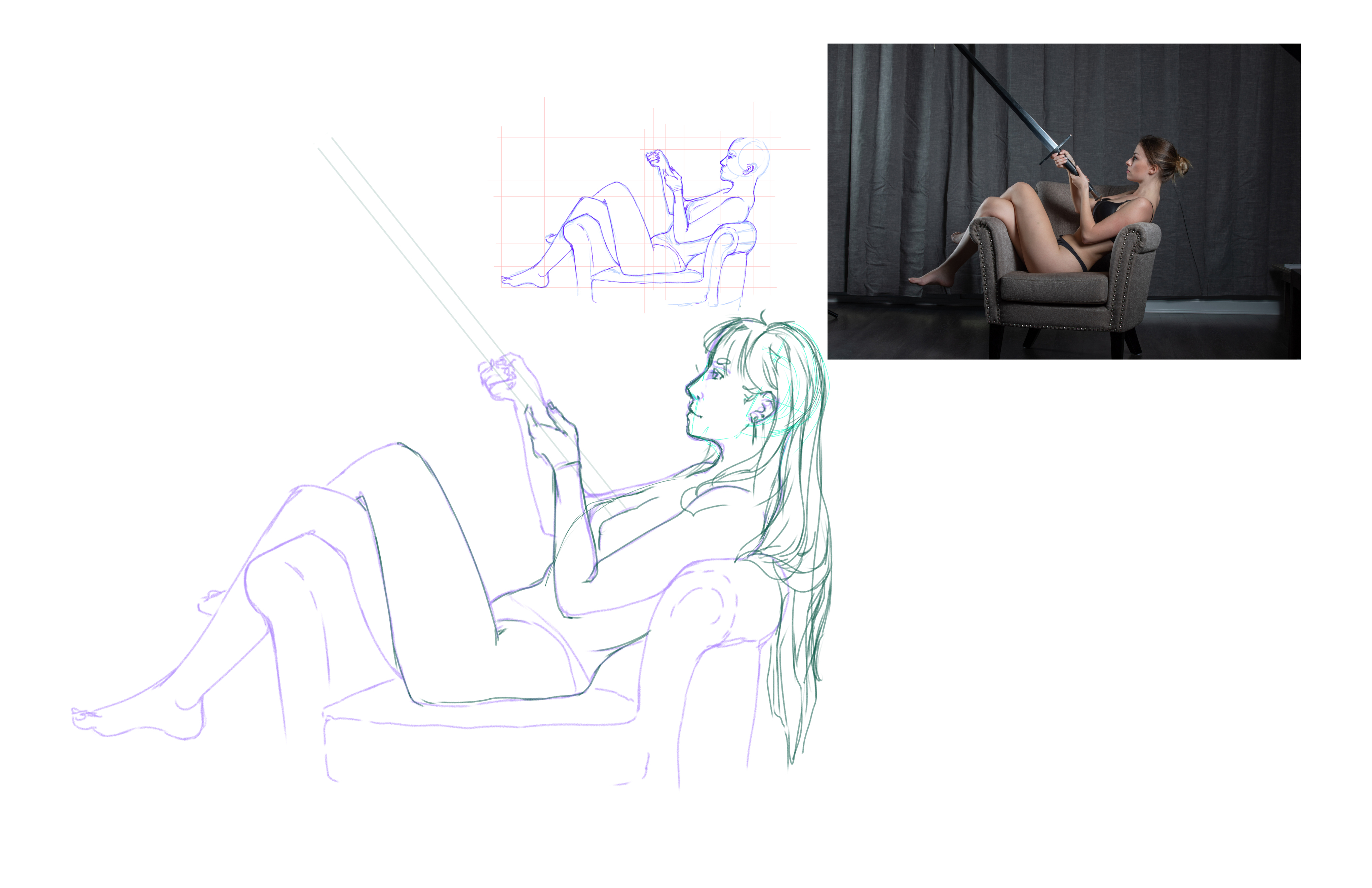
Nude Figure Drawing - Reference Drawing
I finally got around to my referenced drawing. I think it turned out pretty well and I'm glad I choose a pose that pushed me but also worked off of previous knowledge. The model's proportions were much thinner than the average so I went back probably 5 times to shave off the width.


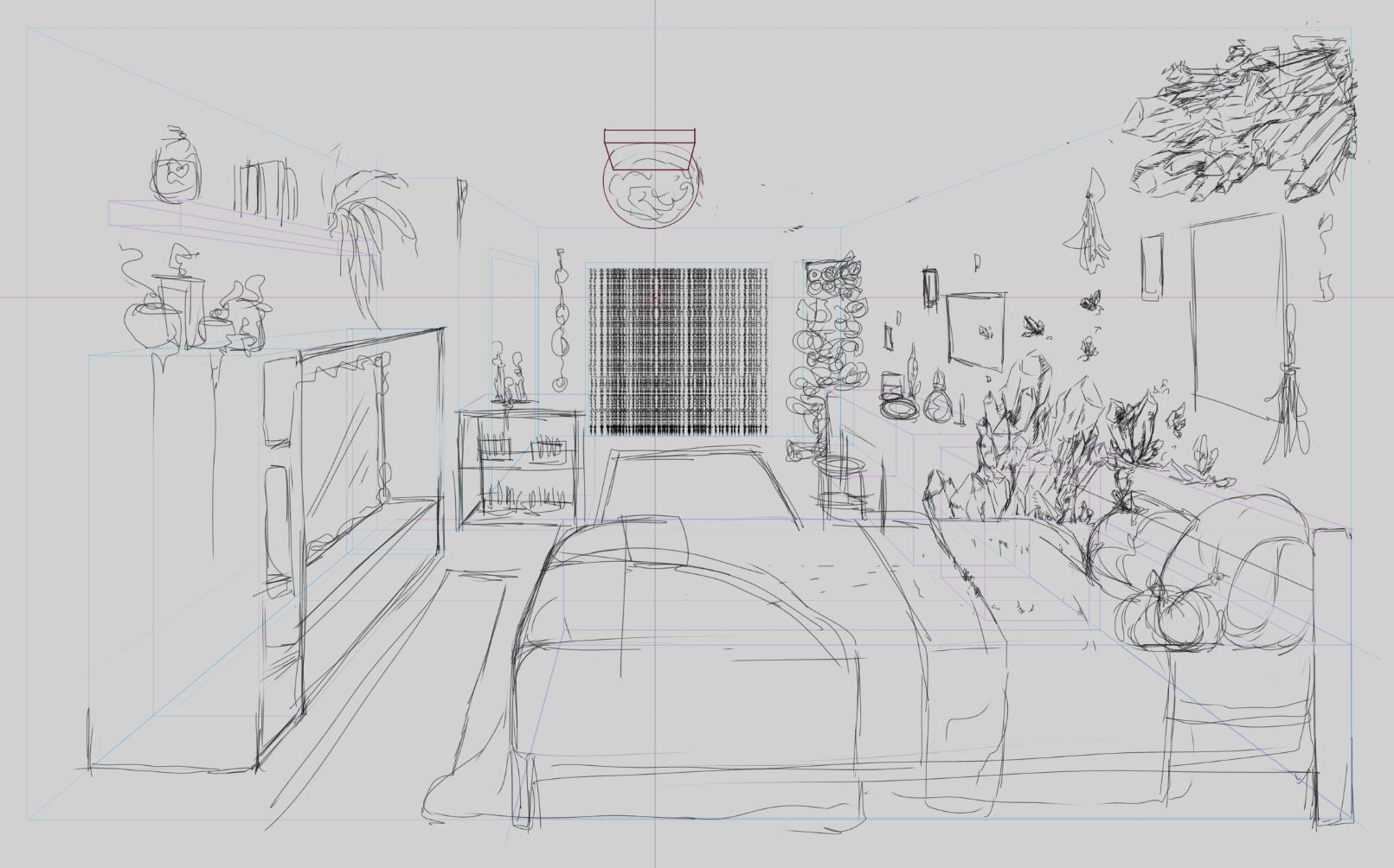
Perspective One - One Point Perspective Room
I'm super busy at work so I won't be able to for a couple of day ;-;
I sketched out my room idea. I went with a magic/witch theme! Hopefully I can start this week if things calm down!
Hi shellac, awesome matte paintin love the composition and the scale of the picture. In regards to the shadow of the godzilla figure you should try looking at the shadow the original godzilla picture is reflecting and follow the direction of that, in order to make it look more believable. Awesome work regardless!
Perspective One - One Point Perspective Room
I've moved on from the sketch to the finished line work now. Still a big work in progress though.

Hey Rubin!
Thanks for the compliment!
As for the Godzilla, there was no shadow in the original picture. It was a product photo with a totally white background so there wasn't much for me to work off.
Nude Figure Drawing - Reference Drawing 2
Had a little break from work today so I did some figure drawing on paper. I didn't get around to taking pictures though so maybe I'll get to post those tomorrow.
I did another long reference of a pose that was more challenging than the first one. I find drawing the faces of people laying down very difficult. I had to block off everything else and focus on just that in order to get it right. I think I probably spent the most time on that. I'm pretty happy with how it turned out!!

Hi Shellac, I really like the linework you did for this!! It has a really gentle and flowy feel and her face is drawn so well! 
Nude Figure Drawing - Reference Drawing 3
Did another long reference drawing along with my usual life drawing routine. This time I did it all freehand, no boxes or guides. I was able to do it pretty fast and accurately so I'm pretty happy with it!

Hey, Shellac. Glad to know i'm not the only one using CSP in this curriculum. Your work is really good. The two point perspective project looks really funky and your latest project seems spot on for freehand.
Hey Stratocastus!
Thanks so much for the compliments! I'm working really hard.
I'm a long time CSP user! I don't think anyone could ever convince me photoshop is better for drawing. I'm glad to know there are others that use it too.
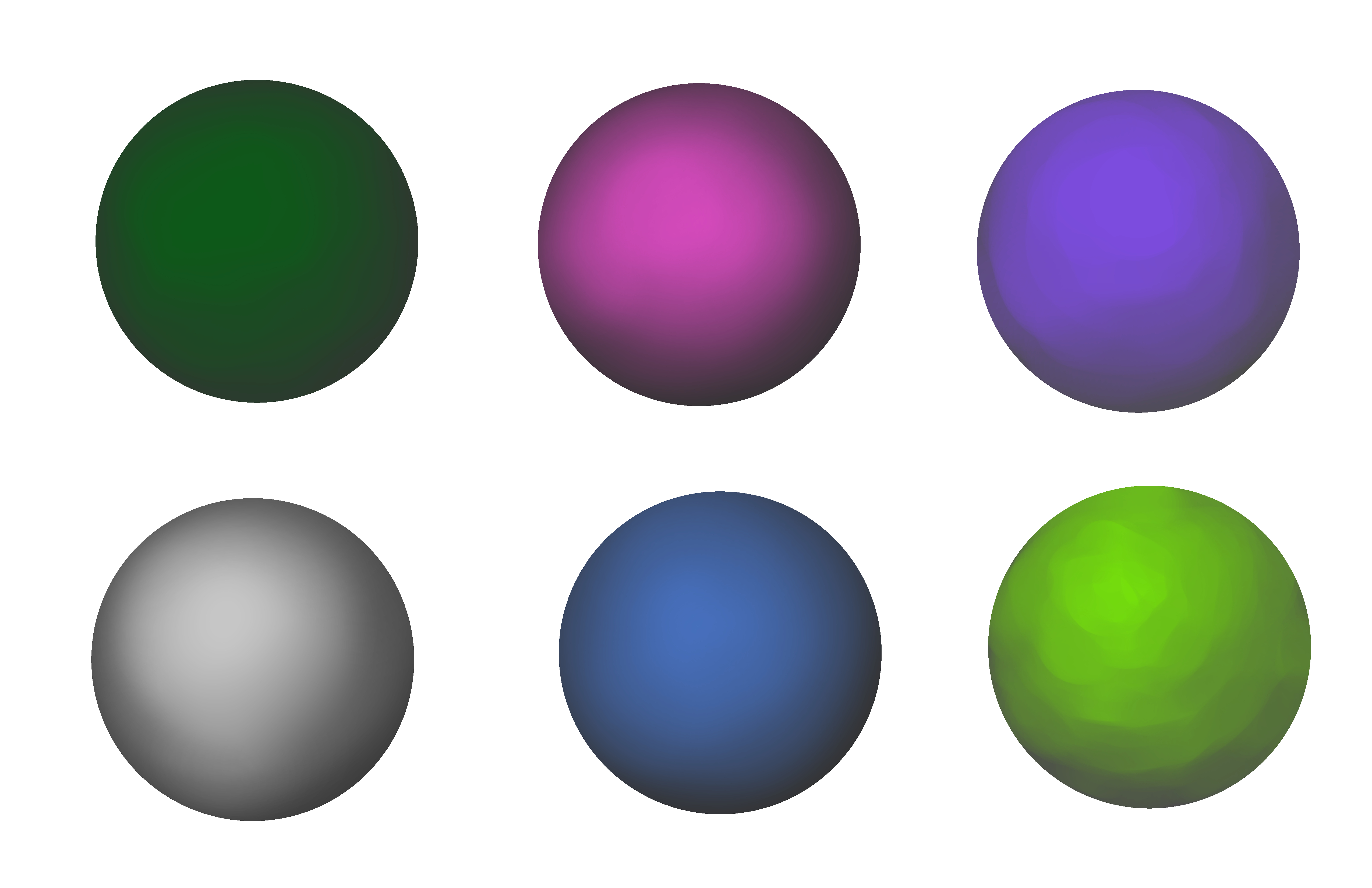
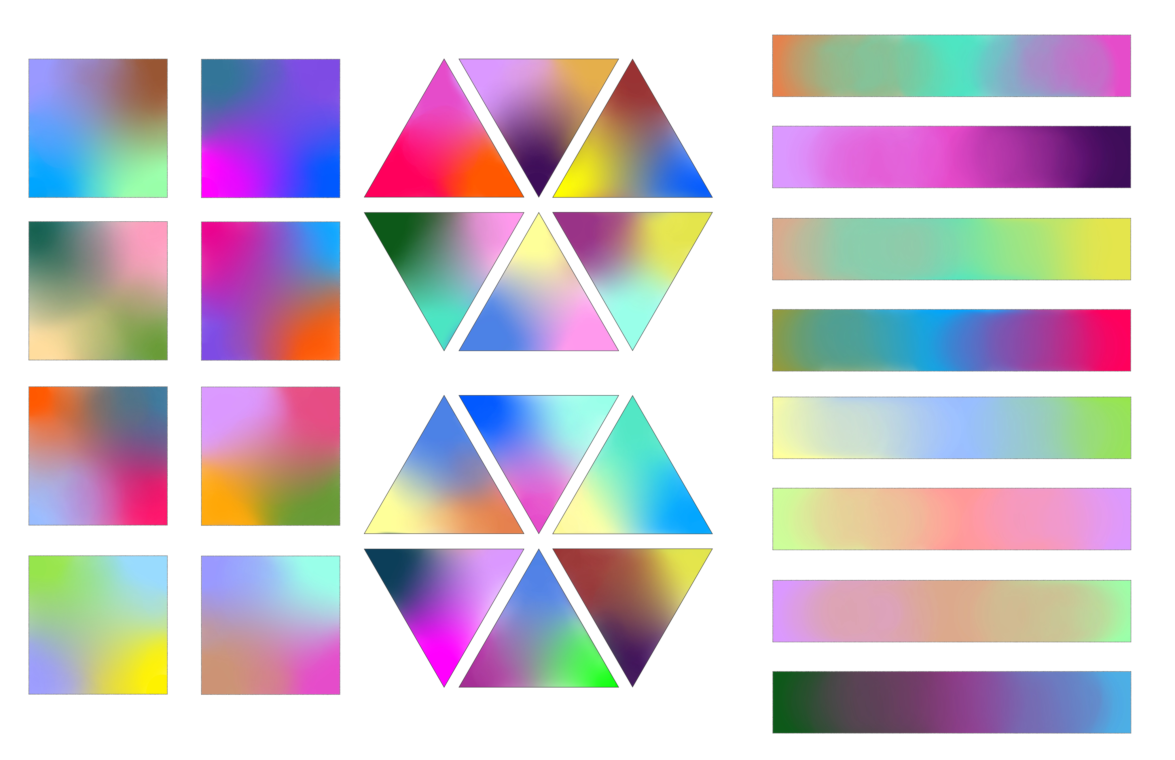
Photoshop 2 - Color and Blending
I decided to start some of my term 2 classes despite still working on perspective one. Working on only one class at a time tends to leave me feeling burned out and I finished everything else from term one.
I started with the blending and color assignment because it was easy to complete with my current busy schedule. I first started with spheres because I wanted to test the abilities of some brushes. The first set of spheres all have a dark gray base. The second set of spheres is the same as the first, but I experimented with what effects I could get by changing the base color. Color association is pretty amazing!!
For the blending assignment, I tried to pick colors randomly because I wanted to see if I could blend colors even if they matched poorly. I used CSP for this assignment. CSP's blending tools seem to be superior, so I feel like I didn't have to put as much work into blending as Marc did in the video. I still don't feel very confident with painting.
Overall, I had a lot of fun with this assignment! I welcome any feedback anyone has!


14 days later
Figure Drawing
Here's a couple long study poses I've done over the last couple weeks. I feel like doing long poses has recently been more beneficial than the 1-3 hour sessions of quick figure drawings.
In order to make them a little more fun, I sketched characters with the same poses after I finished my study. It was a fun way to wind down after studying, even if I didn't have anytime to make them more finished.


Just loved this last one!!! Would love to see a complete render of it <3