


Its been a month since I've uploaded any new work, with my final year of college started, I haven't gotten around to do much. I've been doing a lot of studying of Scott Robertson's How to Draw and I feel as though those exercises aren't worth uploading. If think I should, let me know. On the anatomy's side, I've been studying the arm, which is something I'll definitely upload. I really didn't have much of a plan for the following sketches thus why they may not look as polished. There's definitely some proportional errors but I still wanted to show something for the time I haven't been as active as usual. 


 Thank you! I finally cleaned that up. Meanwhile started 3 more ..I have a habit of taking too long to finish a piece, then I lose interest in it and just start something else. I found 8 from recently i started and abandoned, that are decent enough to not delete, but not finished. There’s also been a number of drawings I felt I “outgrew” - became better before I finished them, and it would be easier to start from scratch than fix them. Anyone else thinking that?in24.4k
 Lady Death Fanart Collectible: Part 6 Polypaint and base Hi, it’s time to share with you another part of the process to create this fanart piece. Polypaint As this is my first collectible fanart I didn’t have previous experience with polypaint so I tried my best and played a bit with it.I wanted to give a ghostly and eerie look to Lady Death, she is beautiful and deadly, but at the end of the day she is a woman that died and was reborn at hell as an avenging spirit, that’s why I gave her skin tone a bluish very cold tone.As you will see I gave myself some creative freedom to deviate from the traditional color scheme that this characater has in comics and illustrations.To add a bit of sensuality by painting some freckles on the face and the chest. The dark nature of this character was the perfect excuse to gave her a kind of goth make up, very dark shadows around the eyes, blue lips and fingernails. I know that the original character includes sexy red lips but I wanted this girl to have a sexy but at the same time creepy look, that’s why we can see some thin veins emanating from her eyes. The biggest chromatic change I did for this character is at the hair. Lady Death has a characteristic white weavy hair but in my fanart I decided to gave her a very saturated blue color.The reason behind this wasn’t only an aesthetic choice. I want that the face area strongly pulls the attention of the viewer so this area needed a stronger contrast. Another reason is that I want her to have a more modern look, as I mentioned before, I’m strongly attracted to women with goth/punk look. I gave myself half an hour or more to analyse the work of experienced sculptors that create collectibles and I discovered that the use of darker values on the skin is often applied to create a greater sense of volume and three-dimensionality. I found that areas with heavy ambient occlusion are the perfect places to paint with darker colors in order to increase the separation between different forms. Even though she has a bluish skin tone, I used a bit of warmer hues in areas that, in real life, tend to go towards red and pink, this is very obvious in the nose, cheeks, and knuckles. Thinking with a logical mind it’s completely absurd to have warmer tones on the body of a zombie like creature but I didn’t want to limit myself by using only blue tones, it looks boring and artificial. In real life these colors are created by blood vessels in areas where the skin is very thin. ** Scythe **for her weapon I applied a cool gray with some warmer variations, this color scheme is influenced by the work of H.R giger. Base I’d like to talk about the design for the base which, to be honest, I forgot to develop along with the character.My main idea with the base is to show that Lady Death inhabits a very sterile and arid land, at the end of the day she is at hell.You can see a that she walks over dirt and rocks, a sign that she’s surrounded by death and loneliness. As part of the landscape we can see some bones and skulls to reinforce the idea of lack of living creatures, yet we can see three hands that try to reach her legs.This hands represent that all creatures are subordinated to her power and seek an evil blessing with a simple touch of the princess of the damned.1- The hand with skin burns represents the souls of those who are newcomers to hell, tortured souls that suffer for the sins comitted on earth.2- The hand with greenish rotten skin and pustules is the reminder of the decay that has infected the souls of those who have been trapped and have forgotten their humanity3- Last but not least, the hand of a demon shows that even dark creatures and entities bow before her presence. The cherry on the top, at least in my vision, are the simese twins that emerge from the ground, this malevolent creatures remind us that in hell there’s only perversion and any trace of innocence is lost. Thanks for reading till this pointI’m really happy to be very close to finish this creative journey, last but not least it’s mandatory to talk about splitting the sculpture in several pieces to be printed, this will be my last entry before showing the final rendered images. See yaMay Zbrush be with youin1.5k

 memory 2min gartic phone, used ref 2m gartic, used ref for pose 2min gartic 2min gartic 2min gartic 2min gartic memory memory memory memory study memory memory memorymemory memory memory memory memory memory study memorystudy study stylized left memory, right study study memory memorymemory memory memory memorymemory memory, porportions r offmemory memorystudystudy memorymemorymemory memory memory memory memory memory memory memory, right leg is a bit broken The feeling of only getting 1 - 3 likes on a social media post will never not be discouraging. But nothing is discouraging enough to make me quit drawing. I think the strategy of drawing a lot of stuff and waiting a while to post is good though rather than posting it immediately and then feeling that sadness on the next set of drawingin

 studies studies juri study imagination, how I feel before a speech imagination imagination study something I drew for my presentation also drew this for my presentation, didn't fix the one hand being bigger than the other imagination + study study studies study study, I need to fix the face a bit based on screenshot from anime but in my style study. except for the eye study studies studies study. changed some things tho imagination imagination imagination study studies, except top right samurai based on anime screenshot wolverine studies, changed some of the poses a lil, not very good at all, but first time i drew the character ever. semi study studies study imagination imagination imagination , for first time ever i tried to draw over 3d model for middle pose, I dont like the result tbh, but it makes it much easier than coming up with it from memory.imagination, except right figurestudies imagination + studies, coming up with action poses r hard, these are not dynamic enough, I will redraw better ones in future. imagination , imagination imagination study, except for eye imagination imagination imagination doodles except for the two chrollos imagination storyboard thumbnail, idk if i ever shared this. my storyboards end up being a little detailed since i usually just draw in one layer.in22.3k

 Hello! My name is Vithor, I am from Brazil, studied Design at a local college worked as an illustrator for more than 10 years. I took a time off around 3 years ago and am trying to get back in my art shape and maybe become professional again. Here are some recent pictures: You can find timelapses for most of them on my instagram: www.instagram.com Vithor Albertim (@vithor_albertim) • Instagram photos and videos 123 Followers, 638 Following, 19 Posts - See Instagram photos and videos from Vithor Albertim (@vithor_albertim) Comments and critiques are always welcome.Cheers!in804

 Thank you @daceronine! If I remember I save in google cloud, I will have to stick a note to do it more often. Lamp is from life. Poses are from refs but I look at refs for a while and then try to do it myself and look it up if needed. Outfits and rest is from imagination Something went wrong while installing system so we will have to wipe everything again... pc works but something is wrong. We will wait till internet is done and I will save everything on cloud this time Threads came out in eu. It's been 3 days and I had more engagement than after half a year on instagram. It feels really nice I hope it stays this way A portrait of old dude. It's the same character I posted a while ago. Inspired by Bayard Wu work. At first I thought of him as a bear but I named him Fenrir and I think wolf suits him better. Eye gave me a bit of hard time but I think it is fine now. I focused on face and forgot about area below. The way I draw hair clashes with greying hair. I had the same problem while doing Lohse's white hair. Does it looks like it is greying here? I love how desaturated red looks blue there. I keep lying to myself that I will use different color scheme but It all comes down to this blue and yellowish one it is just flipped this time Have a great day!in48.7k
1 month later
Nice figure studies either way. Not much to add seeing as you already pointed out what needs work.
27 days later
For while I've been studying Scott Robertson's How to Draw and I thought I'd upload some of the exercises I have done from the chapters I've completed so far. It's nothing fancy but studying perspective has really changed the way how I observe and break down subject matter. These are not all the exercises just some I thought was worth uploading. Does anyone have good ideas to practice perspective aside from drawings boxes and spheres in space? Most reference material I find are too complex.
- Mirroring Technique

SImple 2 Point Perspective with subtraction and Duplicating Curve

Mirroring Offset and Mirroring Tilted Planes. "X" marks incorrect drawing.

Mirroring Curves using the different methods

- Practicing Tilted Planes and Curves

- Combining Mirroring Tilted Planes and Curves

- More of mirroring curves and Tilted Planes

- 2 Point Perspective, drawing the primitive shapes.

- One Point Perspective with a mix of subtraction/addition and primitive shapes

- 2 Point Perspective with 90 degree cone of vision and Grid

8 days later
I haven't done any digital work for quite some time now because I've been spending time studying perspective theory. So I thought I'd try doing some master studies. This is my first time at it, so I'd thought I'd try studying someone who's work I really admired but also simple to approach. I grew up watching Batman: The Animated Series. It was so different from anything that was airing at the time and Bruce Timm was probably the first artist whose style was etched in my head. I started with the Joker. I also made a video for the entire process, it's a bit lengthy but I hope you guys take a look. I should definitely try and shorten the time but that shows how less confident I come across when working digitally compared to sketching with a pencil. Here ye go!
I wanted to do these studies (more coming) because for the longest time I've been studying from references and trying to draw them as realistically as possible with very little creative effort. And that can be daunting. I wanted to take a break from doing anatomy and perspective studies and just have fun with it doing a study. After all that's the point of it right?

1 month later
Continuing with studying Bruce Timm.
BATMAN
BATGIRL
You defintely nailed Bruce Timm style with these. It's definitely recognizable. Are you planning to implement a little bit of it in your onw work eventually? That could be an interesting thing to try.
26 days later
Just as the new year started I bought a yearly subscription to Schoolism. I 've been rather disappointed in my lack of progression in the past few months and I think a lot of it has to do with not giving myself proper assignments and short term objectives.
After giving it much thought, I realized I want to move away from the comfort zone of always doing portraits and value paintings and move to color. So with January (once my college exams are over) I decided to start Schoolism with Sam Neilson's Fundamentals of Light which dwells quite a bit into the technicality of light.
This first post is from the first lesson which is about value. I didn't spend too much time on this (especially the cleaning up) as I'm quite familiar with the fundamentals of painting in grey scale and I'm really eager to move to color. The assignment was a line art that I was required to paint in value with certain things like Bounce Light, Ambient Occlusion and Cast Shadows.
1 month later
Another portrait study. This was just more about getting myself familiar with a certain routine of rendering, which I often get lost in and end up losing motivation simply because I let myself get dragged on by being indecisive on certain things like knowing when to use separate layers to make the workflow easier. 
1 month later
I completely forgot about this painting. I wanted to put to see if I can replicate Bruce Timm's style. A couple of things of note:
- It was surprisingly difficult to keep myself from straying more towards a realistic drawing of the reference which would be how I would go about normally as I prefer a style that is somewhere in between realism while also emphasizing gesture and simple shape design.
- In case of Bruce Timm's, GESTURE is the determining factor for how he creates his characters.
- When rendering, Timm's color palette is limited but that doesn't stop him from making very interesting light and shadow shapes. I actually had a lot of fun with the limited palette.
- I would say my only shortcoming would be the hair, I struggled a lot with keeping it simple, this might have to do with the fact even in my portrait studies I tend to ignore the overall shape design of the hair and flatten it out quite a bit and not spend enough time rendering it. So when looking at the hair on the reference, I struggled to find a good flow in design.
Its always good to find things to improve on.
3 months later
One more study of Bruce Timm's work, this time its Harley Quinn. Also I've included the video process, hope anyone who comes around this thread checks it out!
1 month later
It's been a while since I've updated this thread. I really need to figure out and curve out a time and day for just posting and keeping my profiles up to date.
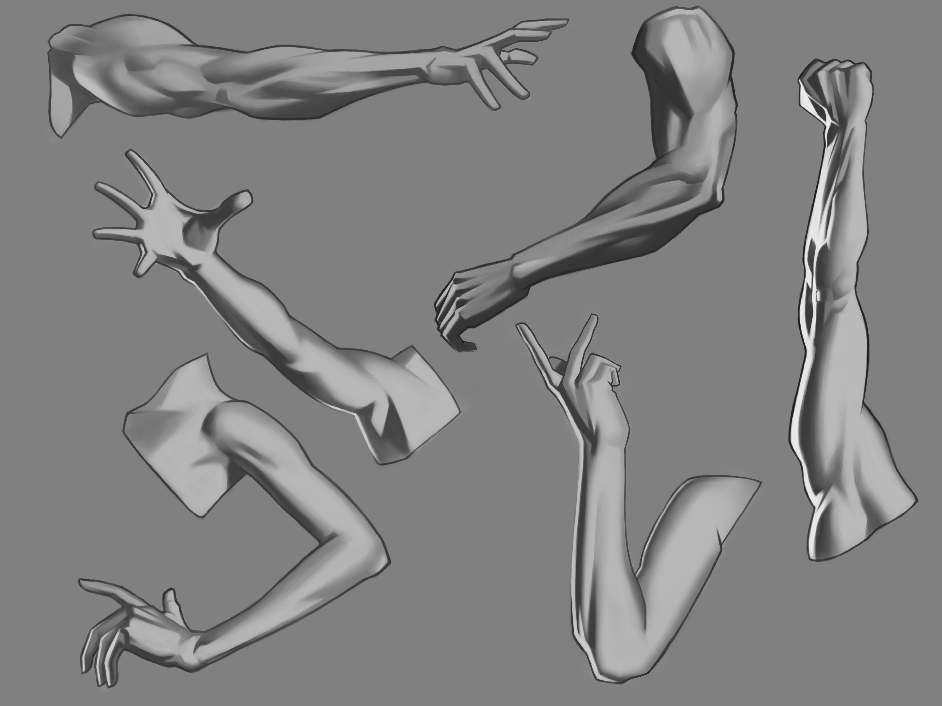
Earlier this year I did some arm studies as part of my anatomy study series that I have planned for this year.
The intention of these studies are as follows:
1. an understanding of the skeletal anatomy and building the muscular anatomy on top
2. make observations about the motion of the anatomy which include the overlaps, contraction and extension and the overall shape and gesture
3. Value rendering as means of understanding both the form and also how light interacts with anatomy
In this first piece I was pushing the values just a little bit too much in the shadows. I was definitely struggling with the subtle changes of the values in the skin. The drastic difference in each value in some areas gives the anatomy a semi-realistic look. It's great with muscular people, as the contrast in values separates the forms of each muscle really well, but it doesn't work well otherwise, especially with females. I found when working with anatomy that has muscle definition, it was easier as there were more shapes to work with as opposed to female anatomy where there's not a lot definition but to make up for the lack of it, I needed to work on making my values blend correctly to represent the skin tone so that the arms don't look like simple cylinders.

I was constantly reminding myself of the observations that I made on the first set of studies when approaching these ones, as you can see I have started to pay more attention to the shadows and how much of I push in terms of value. The use of reflected light really sold the 3 dimensional aspect of the arms, especially when the reflected light is on the side of the shadow.
There's nothing new to add to this set aside from the fact I started softening out the reflected a little bit more to add the illusion of subsurface scattering that occurs in the skin due to its translucent properties. I also started to put effort in the mid tones and blending them to properly indicate the roundness of the forms. At this point, I've started noticing patterns in the forms and the motion and which allowed me to work a faster in pace when drawing and rendering.

I've gotten better at noting the subtle value variations in the mid tones, but there's still work to done in defining the forms of the muscles. But at the same time, I really need to focus on gesture as well, as I've noticed when focusing entirely on the muscular anatomy, they end up looking just a bit too rigid.

Hi spyronite. Im trying to do the bucket method from proko as you have shown but I am struggling to do so, whenever I "squish the bucket" I end up with one illium taller than the other. I dont understand how he is doing this? are you squishing the bucket or just ignoring that step? could you please describe your approach to this please?  also your progress is brilliant and inspiring. please continue to post