

-
created
 Oct 3, '16
-
last reply
Oct 31, '16
-
12
replies
-
2.4k
views
-
5
users
-
11
likes
I really how you paint up your mockups. They look very painterly 
these are amazing.
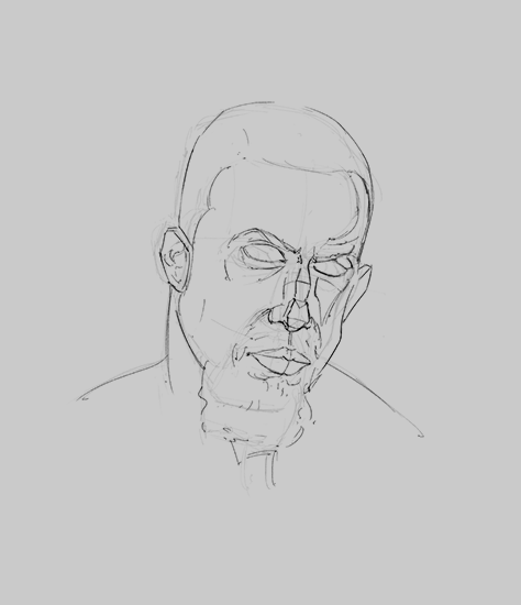
did you make the sketches digitally?
they look very much like a ballpoint pen.
@nickkhoo ty!
@rogueSleipnir digital only 
Today's stuff, i need to take more time with painting..


Holy wow sick hue variation on that coastline, and edge/texture control... masterful.
@karidyas ty, i appreciate it!
Some more color and light practice, took a little bit more time with this one
17 days later
Some stuff from the past few days


dang that first one is very Dave Rapoza, specifically the style he uses with Starveil and Steve Lichman. Very interesting. If you wanted to pursue that further, he uses very vivid colour to sort of offset the griminess of the lines.
Epic rendering on the faces too, nice.
The vampire troll (?) however seems a bit off to me, maybe because the rendering is sort of realistic while the character isn't? Though I've seen that done effectively before... There seems to be some structural issues with the chest, the left pectoral is tiny compared to the right and blends with the shoulder. That then makes the V of his shirt off-centre, accentuating the lop-sidedness. His wrist looks broken as well, I can see what you're going for with dynamic lines but in this case it breaks the expected form of an arm and just looks like his wrist turned to jelly, especially compared to the thick and solid one on the right. I appreciate the sketchy painting rendering style though, just the underlying structure letting it down.
Hope crit is alright, I know some people don't like it unsolicited 
Very cool stuff, hope you keep posting!
@karidyas ty, you nailed it with the critiques, i appreciate it, ty! I will watch out with the construction and ty for pointing out colors with dave's stuff!
@ragamuffin i will! 


Oh yes, those last ones are amazing, I love it :0 Well it's all amazing but those especially so. Feels good to have helped even in the smallest way


Suggested Topics
| Topic | Category | Replies | Views | Activity |
|---|---|---|---|---|
| Mark’s Art Blog | Art Blogs | 0 | 679 | Mar '19 |
| Adrian Birkeland - Realistic Concept Art & Design | Art Blogs | 4 | 2.1k | Nov '18 |
| Adrien’s art blog [Feedback for cookies] | Art Blogs | 36 | 10.2k | Jul '23 |
| Heavy Blaze Night 3D Artblog | Art Blogs | 4 | 2.2k | Jun '17 |
| GardFinvik’s Art Blog | Art Blogs | 13 | 1.8k | Nov '16 |