This is a WIP study of an older portait by Marc. I was having a hard time with how to get faces in the right "position" or pose so I decided to copy his "Daydream" portrait off his art station. I chose that one to copy since the piece really focused in on the facial features with little to no background content to distract from the figure itself. I also tried to rely less on line art and use large brush size to block out shapes. I did take liberties with the hair since I wanted to stay engaged.

Anything that could help me get some new insight on making this portrait more like his original "flavor" would be appreciated. I did not spend too long on it but I decided to stop and ask for guidance because I started down the bottomless rabbit hole of rending skin and I find myself wasting a lot of time for sub-par results. I've been sticking with a soft round so there's quite a bit of this plastic feel which maybe someone can comment on techniques or solutions.

I always get stuck at this post-base color phase and want to make sure I'm not missing the whole point of the portrait. I feel like the portraits never really get past this stage and into the "polish" or "final touch" because there is a strong weakness (or multiple) or lack of something (if its fundamental anatomy, etc, please point out the shortcomings specifically, I can notice a few but please let me know). Any advice/pointers appreciated.

I also linked his original: https://www.artstation.com/artwork/4yGE4

The plastic feel comes from your colors. Marc did an awesome video discussing this on his yt channel.

besides that, when wanting an non blurry look for edges, you can still use a soft brush, but, you have to make it smaller.

off to watch the video. Finding the balance of soft and hard edges still eludes me. i guess that is where the smaller brush comes from. Thank you for pointing me in that direction.

any other areas that you have input, please let me know. I'm aiming for replication more than 100% realism, if that makes sense. Its a study of sorts i guess. Thanks.

Personnally I feel like using a hard brush works much better than a soft one when blocking in the big shapes and colors. I actually do most of my work with a square or triangle brush and I rarely use a soft one. I just feel like it's easier to soften hard edges than it is to harden soft edges.

Maybe it's something that could be worth trying, at least for the initail block in stage.

So i used a hard square brush for blocking in original shapes but i think i lost a lot of the hard edges and shapes when I added color for skin with soft round. It started to get muddled together with the soft brush, probably because I am not using it right I am guessing? I dont use mixer brush, I just alt-click the graduating colors when I add. I like the effect of mixer brush but i have yet to find a decent mixer brush brush. Is eyedropper/ alt-click a legitimate way to color? I found myself with a lot of grays so to problem solve I found myself thinking similar to what Marc said in the tutorial "going down in value but going up in warmth" or something similar. I'll try to practice what he's saying in the tutorial about plastic vs skin.

I think in all of that, I lost a lot of the nice shapes I tried to copy from his original.

I am tempted to do grayscale only study but I also hear starting with color is "better". Since i'm insure I might just do a grayscale study next to find out myself.

Hello, @jonsu72! :smile:
I try to keep it as clear as i can to help you out.

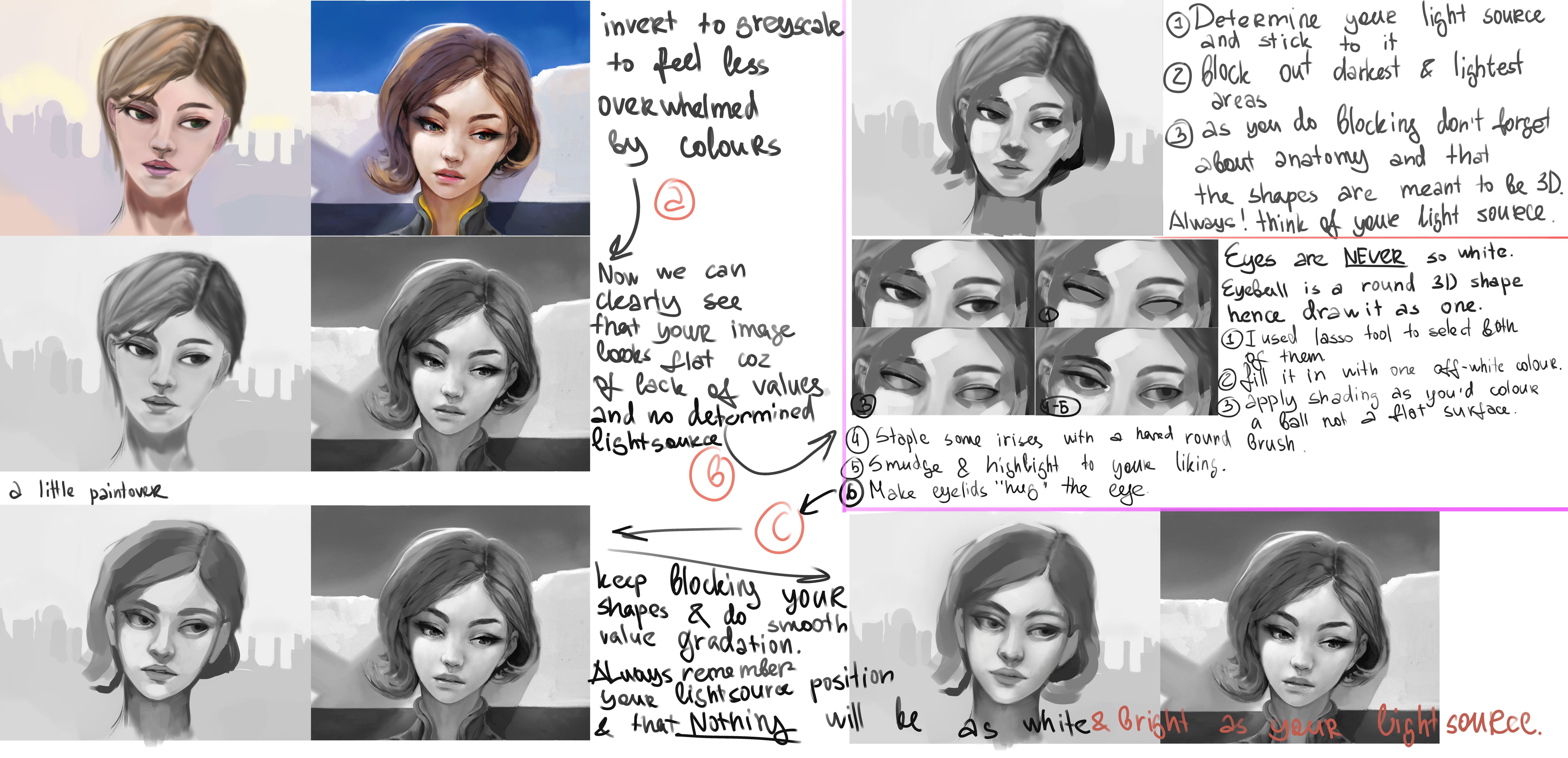
People that say painting from colour is better mean it only because it is hard to convert grayscale into colour. I personally find it very distracting and overwhelming trying to tackle ALL the things like light and shadow, anatomy and perspective, composition AND COLOUR at once.
So for training your eye and learning fundamental principals of painting I'd recommend you to do more greyscales until you will get a good grasp of it.
(of course you can combine greyscale practice and then do the same piece in colour and compare it, or you can keep doing colour.. there are tons of options and you are in your own hands the question will be more about how efficient it is for you :wink: )

Anyway. going back to your drawing here.
I haven't pushed this paint-over as dark as Marc's version is but hopefully I've captured the idea of how to make it looks better.
Main key is Your light source. Always consider it and always think of what will face the light and what not. By doing this you will achieve more 3d look in your paintings.

To do the blocking out part few moment that you need to consider are anatomy and your light source. How each plane of the face will reflect the light.

And the last main thing is that Your value range never will be as white as the light source unless it has a 100% reflect-ability, even eyeballs will be darker.
Preserve all the light reflexes for last and go darker gradually as you work. Don't go 100% black in the beginning of your work.


The face i did doens't look 100% as Marc's piece but again. I hope i captured the main idea.

And I gonna link you few videos in case you will find it helpful.
How to block in
More on blocking in and edge-work
She has even more videos on her channel explaining all the nuances as she critiques other ppls work.

How to colour skin - starts at 5:47
Marci Bucci also has a video on Light and Shadow from his series of 10 minutes to better painting.

Happy painting and I hope that it was helpful:sweat_smile:

Wow, thanks so much for the detailed break down. I've never watched Istebrak but after checking out her blocking-in/edge work video, I really like her personality and the way she explains stuff.

It looks like the forms and the block-in is really what is setting my portraits up for disaster. Lack of lighting makes it even worse in terms of looking flat.

I'll try to post my progress of going through the steps similar to how you isolated areas independently. Thank you again for the time you put into this.

you are welcome :smile:
glad it wa helpful and im looking forward to see your progress
dont give up :muscle:

So i took some time to try to differentiate between line art and blocking-in. So far what i've made sense of is that we block in shapes because we are painting form. Line art, at least to my understanding, is more graphical like comics/anime? I used polygonal lasso tool and smudge to try to work on finding the "shapes" or form. This is the first time i've tried to do something like this and i'm heavily relying on the geometric anatomy (planes) of the face that I find from low-poly 3d. and superimposing on some reference. I look at areas where the light hits similarly and lasso that area while trying to check on the face planes. If I am using reference and trying to replicate a photo, do I really need to do all these planes or should I only be doing the simplified major planes and smudging...This time I literally make a polygonal lasso selection every time I thought there was a dip or indentation. Mostly trying to copy where the light was hitting.

This is super rough but I wanted to check in and see if this is sort of what some were eluding to when mentioning blocking in and form. This seems really different than drawing a circle or drawing outlines and then coloring inside the lines. But if this is a more ideal way to train, I guess i'll commit to this way for the time being. I just wanted to know if this is even the right direction to go in...

You can use line art to get you started for sure. I think it might actually help in the beginning. I think you have the right idea, but as you mentionned, for the blocking in you should really focus on the major planes of the face and ignore all the little details. Here's an example of how I would approach it.

As for what I wrote about control your blending in the last step, you can look at the part under the eyes as an example. The shape starts off with a more defined edge and it fades out more towards the cheek.

As for how you do it, wether it's line or value painting, the important thing is getting to understand what you draw as a 3D object. So go with what you feel works best for you.

I hope this helps :smile:

thank you for explaining the idea more succinctly. Since the last post i've tried to memorize the major planes of the face (which in turn help me place the areas of bone and fatty masses more ideally). I also tried to transition away from lines being the things that create the shape, to lines serving as "edges" where the value changes. So i'm shifting my training more to planes and less of "outlines" i guess? i'll try to post more progress when I feel like I hit a wall, but i need a lot more mileage to get something even close to realistic form. My understanding is that instead of depending on lines to form a shape, it is more about using it as an edge and less as a "paint by number" mentality.

here is some of the eye's I have been trying to study. I can still see often times i revert to the symbolic eyes and the blobs of lashes. In some of the exercises I omitted the lashes to focus on the form. I also found some of my early tests had a very small eye form which was because I wasn't considering the eye sitting in the socket.

The top right example shows my lack of anatomy which I attempted to address in later examples...The eyeball is floating and is not proportionally sitting in socket. In many of them I also notice the top lid not being folded very accurately into the corners of the eye (lacrymal duct area). Including the water line at the bottom lid is also difficult with my line dependency since it is not generally in shadow when I look at my reference.

I have many more studies to do on the eye but I just wanted to keep myself accountable by posting some work here and seeing if I am heading in the right direction...