


 Thank you! I finally cleaned that up. Meanwhile started 3 more ..I have a habit of taking too long to finish a piece, then I lose interest in it and just start something else. I found 8 from recently i started and abandoned, that are decent enough to not delete, but not finished. There’s also been a number of drawings I felt I “outgrew” - became better before I finished them, and it would be easier to start from scratch than fix them. Anyone else thinking that?in24.5k
 Lady Death Fanart Collectible: Part 6 Polypaint and base Hi, it’s time to share with you another part of the process to create this fanart piece. Polypaint As this is my first collectible fanart I didn’t have previous experience with polypaint so I tried my best and played a bit with it.I wanted to give a ghostly and eerie look to Lady Death, she is beautiful and deadly, but at the end of the day she is a woman that died and was reborn at hell as an avenging spirit, that’s why I gave her skin tone a bluish very cold tone.As you will see I gave myself some creative freedom to deviate from the traditional color scheme that this characater has in comics and illustrations.To add a bit of sensuality by painting some freckles on the face and the chest. The dark nature of this character was the perfect excuse to gave her a kind of goth make up, very dark shadows around the eyes, blue lips and fingernails. I know that the original character includes sexy red lips but I wanted this girl to have a sexy but at the same time creepy look, that’s why we can see some thin veins emanating from her eyes. The biggest chromatic change I did for this character is at the hair. Lady Death has a characteristic white weavy hair but in my fanart I decided to gave her a very saturated blue color.The reason behind this wasn’t only an aesthetic choice. I want that the face area strongly pulls the attention of the viewer so this area needed a stronger contrast. Another reason is that I want her to have a more modern look, as I mentioned before, I’m strongly attracted to women with goth/punk look. I gave myself half an hour or more to analyse the work of experienced sculptors that create collectibles and I discovered that the use of darker values on the skin is often applied to create a greater sense of volume and three-dimensionality. I found that areas with heavy ambient occlusion are the perfect places to paint with darker colors in order to increase the separation between different forms. Even though she has a bluish skin tone, I used a bit of warmer hues in areas that, in real life, tend to go towards red and pink, this is very obvious in the nose, cheeks, and knuckles. Thinking with a logical mind it’s completely absurd to have warmer tones on the body of a zombie like creature but I didn’t want to limit myself by using only blue tones, it looks boring and artificial. In real life these colors are created by blood vessels in areas where the skin is very thin. ** Scythe **for her weapon I applied a cool gray with some warmer variations, this color scheme is influenced by the work of H.R giger. Base I’d like to talk about the design for the base which, to be honest, I forgot to develop along with the character.My main idea with the base is to show that Lady Death inhabits a very sterile and arid land, at the end of the day she is at hell.You can see a that she walks over dirt and rocks, a sign that she’s surrounded by death and loneliness. As part of the landscape we can see some bones and skulls to reinforce the idea of lack of living creatures, yet we can see three hands that try to reach her legs.This hands represent that all creatures are subordinated to her power and seek an evil blessing with a simple touch of the princess of the damned.1- The hand with skin burns represents the souls of those who are newcomers to hell, tortured souls that suffer for the sins comitted on earth.2- The hand with greenish rotten skin and pustules is the reminder of the decay that has infected the souls of those who have been trapped and have forgotten their humanity3- Last but not least, the hand of a demon shows that even dark creatures and entities bow before her presence. The cherry on the top, at least in my vision, are the simese twins that emerge from the ground, this malevolent creatures remind us that in hell there’s only perversion and any trace of innocence is lost. Thanks for reading till this pointI’m really happy to be very close to finish this creative journey, last but not least it’s mandatory to talk about splitting the sculpture in several pieces to be printed, this will be my last entry before showing the final rendered images. See yaMay Zbrush be with youin1.5k


 memory 2min gartic phone, used ref 2m gartic, used ref for pose 2min gartic 2min gartic 2min gartic 2min gartic memory memory memory memory study memory memory memorymemory memory memory memory memory memory study memorystudy study stylized left memory, right study study memory memorymemory memory memory memorymemory memory, porportions r offmemory memorystudystudy memorymemorymemory memory memory memory memory memory memory memory, right leg is a bit broken The feeling of only getting 1 - 3 likes on a social media post will never not be discouraging. But nothing is discouraging enough to make me quit drawing. I think the strategy of drawing a lot of stuff and waiting a while to post is good though rather than posting it immediately and then feeling that sadness on the next set of drawingin


 studies studies juri study imagination, how I feel before a speech imagination imagination study something I drew for my presentation also drew this for my presentation, didn't fix the one hand being bigger than the other imagination + study study studies study study, I need to fix the face a bit based on screenshot from anime but in my style study. except for the eye study studies studies study. changed some things tho imagination imagination imagination study studies, except top right samurai based on anime screenshot wolverine studies, changed some of the poses a lil, not very good at all, but first time i drew the character ever. semi study studies study imagination imagination imagination , for first time ever i tried to draw over 3d model for middle pose, I dont like the result tbh, but it makes it much easier than coming up with it from memory.imagination, except right figurestudies imagination + studies, coming up with action poses r hard, these are not dynamic enough, I will redraw better ones in future. imagination , imagination imagination study, except for eye imagination imagination imagination doodles except for the two chrollos imagination storyboard thumbnail, idk if i ever shared this. my storyboards end up being a little detailed since i usually just draw in one layer.in22.4k


 Hello! My name is Vithor, I am from Brazil, studied Design at a local college worked as an illustrator for more than 10 years. I took a time off around 3 years ago and am trying to get back in my art shape and maybe become professional again. Here are some recent pictures: You can find timelapses for most of them on my instagram: www.instagram.com Vithor Albertim (@vithor_albertim) • Instagram photos and videos 123 Followers, 638 Following, 19 Posts - See Instagram photos and videos from Vithor Albertim (@vithor_albertim) Comments and critiques are always welcome.Cheers!in813


 Thank you @daceronine! If I remember I save in google cloud, I will have to stick a note to do it more often. Lamp is from life. Poses are from refs but I look at refs for a while and then try to do it myself and look it up if needed. Outfits and rest is from imagination Something went wrong while installing system so we will have to wipe everything again... pc works but something is wrong. We will wait till internet is done and I will save everything on cloud this time Threads came out in eu. It's been 3 days and I had more engagement than after half a year on instagram. It feels really nice I hope it stays this way A portrait of old dude. It's the same character I posted a while ago. Inspired by Bayard Wu work. At first I thought of him as a bear but I named him Fenrir and I think wolf suits him better. Eye gave me a bit of hard time but I think it is fine now. I focused on face and forgot about area below. The way I draw hair clashes with greying hair. I had the same problem while doing Lohse's white hair. Does it looks like it is greying here? I love how desaturated red looks blue there. I keep lying to myself that I will use different color scheme but It all comes down to this blue and yellowish one it is just flipped this time Have a great day!in49.1k


I was going to go with the first one but I think this one has potential. 
Here's a WIP. I've established the mood I at least imagined like before. Painting in ps allows me a lot of flexibility with my brush set that I wouldn't have been able to utilize within csp. csp, on the other hand, offered me a much faster sketching capacity because it didn't really lag. The strengths and weaknesses of each program lend themselves to the different stages pretty well.  note: this is a screenshot so the values are a bit more intense
Here's another WIP. I'm saving the face for last just because I'm unsure what expression to give Audrey and I still need to work on the Yuraganians. 
I think at this stage I'm going to up the res to 2048 x 2048.
I was on my mary way in the painting and started working on the face XD I forgot I said I would save it for later but I'm really exhausted and it slipped my mind. Anyways, here's another WIP shot, much closer to completion than I expected. I desaturated the colors because they're generally more sat on my laptop. I can still bring them back up if I need to. I think I'm going to work on the Yuraganians in the bg and the one in the fg then do some final VFX touch-ups and call it done. 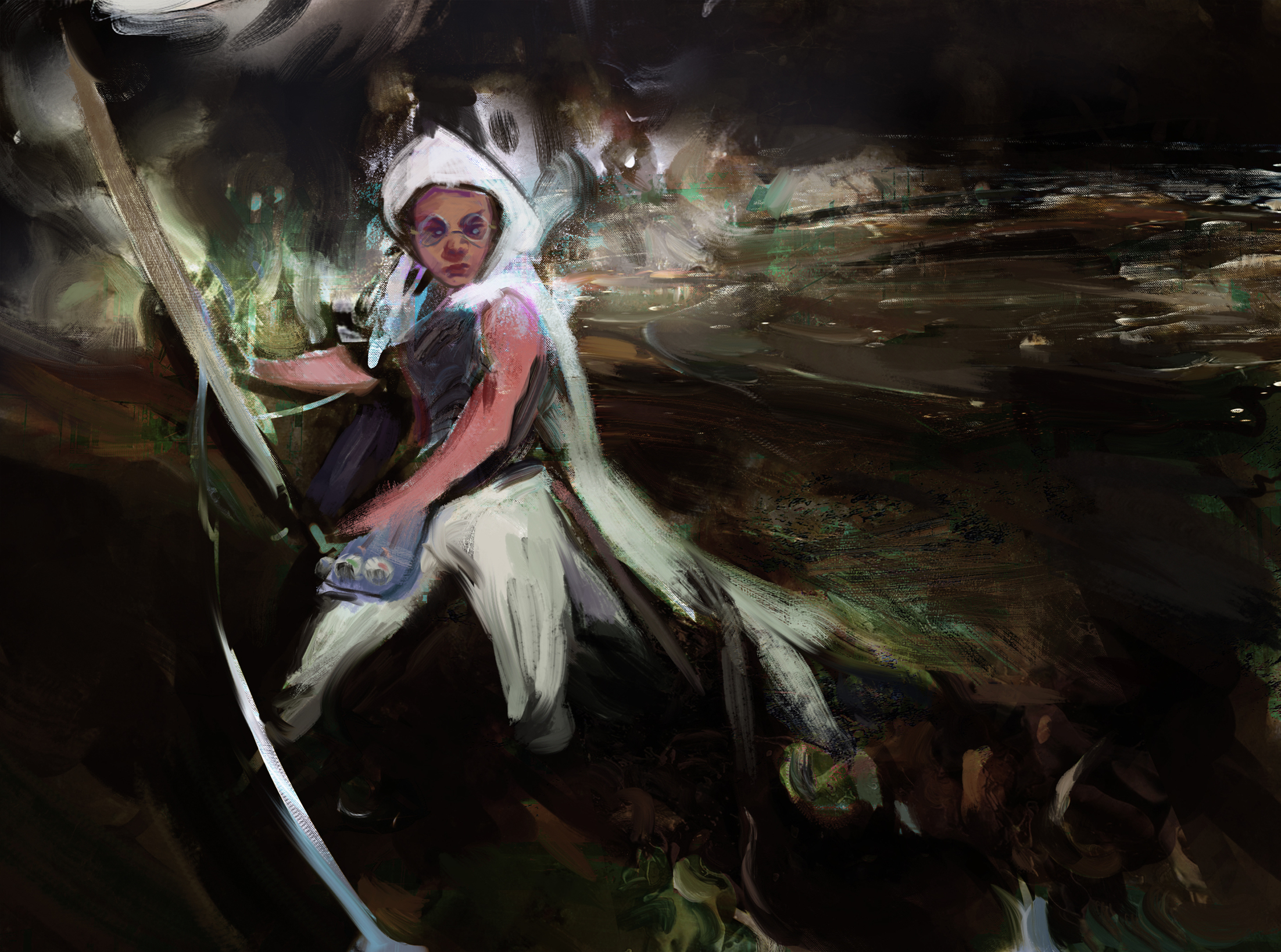
Alrighty, I think I'll stop here. I didn't do much to the Yuraganians because I didn't want them taking over the piece like the last one. I think simplicity tells a better story and leaves it up to the viewers to decide what's going on. I might return to this tomorrow for more edits but if not I wish everyone good luck finishing! 
almost forgot, here's a version with close to the earlier/original saturation levels. I'm leaving this here to check. I also have a version with just my initials which I'll upload separately. I'll submit one of the 3 finals. 
 it appears my files are still not formatting correctly to 2048 even though they are under 5mbs. Will have to troubleshoot later.
ah I see it's gotta be 2 mb or smaller.

again good luck and best wishes everyone who participated!
Jerimiah Adams
Email: canvasengineer@gmail.com
Website: https://www.artstation.com/canvasengineer
Instagram: @canvasenginer
hey peeps, I'm feeling kind of insane for doing this but I've got about 15ish hours of time left and I wanted to see if I could redo this entire thing and have it be the best one I've done XD. I'm crazy but it's worth a shot lol. Anyways, here's my composition. Same idea again but I wanted to make the perspective more intense and put Audrey back on the boat. I'm also looking to utilize my drawing skills a bit more accurately and to also speed up the process of designing through errors, this way I don't have to troubleshoot while painting. 
Awh I'm sad you didn't decide to go through with your original, it was looking really fantastic. And you're brave to reconsider your entire piece mere hours before the deadline, all the more power to you but please be careful xO
Honestly I'd really just buckle down on what you have. 15 hours is not a lot of time for a full piece, and you're bound to stress and mess things up. Imo you're better off taking what work you have and taking it to finish, if something goes wrong again or it crashes it's not going to be happy fun times
Ah yeah, I understand. I don't think either of the pieces I have will place so I don't really have anything to lose. As far as continuing to work on a piece, I've taken those as far as I can within their weaknesses so I'd have to do massive overhauling anyways. It's better to start from the ground up with a better structure, which then allows for a piece to go farther.
Finished the drawing at least to the level of paintability. I kept the sketch underneath because it provides some good energy. I'll be taking this into ps to work on and hopefully be done with it before the deadline. If all goes wrong I've still got my other piece submitted so it's fine. cheers! 
Doing these flats now is going to save me so much time later on. I like to be a little looser and these flats in particular focus on shape rather than local color. I'll do the local color flats next, and then determine a lighting set up to work on top of. From that point, it's just rendering and style. 
Here's a screencap of my general lighting set up. Going to render this a bit and see where I get.
So I finished but I don't know how I feel about it. I'm surprised honestly because I kept thinking about going to bed lol. I'm glad I was able to get a better understanding of my process though. XD 
lmfao, oh yea, grats on finishing it.