


wowow! i love these animations they are so trippy^^ awesome studies too!!

 Thank you! I finally cleaned that up. Meanwhile started 3 more ..I have a habit of taking too long to finish a piece, then I lose interest in it and just start something else. I found 8 from recently i started and abandoned, that are decent enough to not delete, but not finished. There’s also been a number of drawings I felt I “outgrew” - became better before I finished them, and it would be easier to start from scratch than fix them. Anyone else thinking that?in24.4k
 Lady Death Fanart Collectible: Part 6 Polypaint and base Hi, it’s time to share with you another part of the process to create this fanart piece. Polypaint As this is my first collectible fanart I didn’t have previous experience with polypaint so I tried my best and played a bit with it.I wanted to give a ghostly and eerie look to Lady Death, she is beautiful and deadly, but at the end of the day she is a woman that died and was reborn at hell as an avenging spirit, that’s why I gave her skin tone a bluish very cold tone.As you will see I gave myself some creative freedom to deviate from the traditional color scheme that this characater has in comics and illustrations.To add a bit of sensuality by painting some freckles on the face and the chest. The dark nature of this character was the perfect excuse to gave her a kind of goth make up, very dark shadows around the eyes, blue lips and fingernails. I know that the original character includes sexy red lips but I wanted this girl to have a sexy but at the same time creepy look, that’s why we can see some thin veins emanating from her eyes. The biggest chromatic change I did for this character is at the hair. Lady Death has a characteristic white weavy hair but in my fanart I decided to gave her a very saturated blue color.The reason behind this wasn’t only an aesthetic choice. I want that the face area strongly pulls the attention of the viewer so this area needed a stronger contrast. Another reason is that I want her to have a more modern look, as I mentioned before, I’m strongly attracted to women with goth/punk look. I gave myself half an hour or more to analyse the work of experienced sculptors that create collectibles and I discovered that the use of darker values on the skin is often applied to create a greater sense of volume and three-dimensionality. I found that areas with heavy ambient occlusion are the perfect places to paint with darker colors in order to increase the separation between different forms. Even though she has a bluish skin tone, I used a bit of warmer hues in areas that, in real life, tend to go towards red and pink, this is very obvious in the nose, cheeks, and knuckles. Thinking with a logical mind it’s completely absurd to have warmer tones on the body of a zombie like creature but I didn’t want to limit myself by using only blue tones, it looks boring and artificial. In real life these colors are created by blood vessels in areas where the skin is very thin. ** Scythe **for her weapon I applied a cool gray with some warmer variations, this color scheme is influenced by the work of H.R giger. Base I’d like to talk about the design for the base which, to be honest, I forgot to develop along with the character.My main idea with the base is to show that Lady Death inhabits a very sterile and arid land, at the end of the day she is at hell.You can see a that she walks over dirt and rocks, a sign that she’s surrounded by death and loneliness. As part of the landscape we can see some bones and skulls to reinforce the idea of lack of living creatures, yet we can see three hands that try to reach her legs.This hands represent that all creatures are subordinated to her power and seek an evil blessing with a simple touch of the princess of the damned.1- The hand with skin burns represents the souls of those who are newcomers to hell, tortured souls that suffer for the sins comitted on earth.2- The hand with greenish rotten skin and pustules is the reminder of the decay that has infected the souls of those who have been trapped and have forgotten their humanity3- Last but not least, the hand of a demon shows that even dark creatures and entities bow before her presence. The cherry on the top, at least in my vision, are the simese twins that emerge from the ground, this malevolent creatures remind us that in hell there’s only perversion and any trace of innocence is lost. Thanks for reading till this pointI’m really happy to be very close to finish this creative journey, last but not least it’s mandatory to talk about splitting the sculpture in several pieces to be printed, this will be my last entry before showing the final rendered images. See yaMay Zbrush be with youin1.5k

 memory 2min gartic phone, used ref 2m gartic, used ref for pose 2min gartic 2min gartic 2min gartic 2min gartic memory memory memory memory study memory memory memorymemory memory memory memory memory memory study memorystudy study stylized left memory, right study study memory memorymemory memory memory memorymemory memory, porportions r offmemory memorystudystudy memorymemorymemory memory memory memory memory memory memory memory, right leg is a bit broken The feeling of only getting 1 - 3 likes on a social media post will never not be discouraging. But nothing is discouraging enough to make me quit drawing. I think the strategy of drawing a lot of stuff and waiting a while to post is good though rather than posting it immediately and then feeling that sadness on the next set of drawingin

 studies studies juri study imagination, how I feel before a speech imagination imagination study something I drew for my presentation also drew this for my presentation, didn't fix the one hand being bigger than the other imagination + study study studies study study, I need to fix the face a bit based on screenshot from anime but in my style study. except for the eye study studies studies study. changed some things tho imagination imagination imagination study studies, except top right samurai based on anime screenshot wolverine studies, changed some of the poses a lil, not very good at all, but first time i drew the character ever. semi study studies study imagination imagination imagination , for first time ever i tried to draw over 3d model for middle pose, I dont like the result tbh, but it makes it much easier than coming up with it from memory.imagination, except right figurestudies imagination + studies, coming up with action poses r hard, these are not dynamic enough, I will redraw better ones in future. imagination , imagination imagination study, except for eye imagination imagination imagination doodles except for the two chrollos imagination storyboard thumbnail, idk if i ever shared this. my storyboards end up being a little detailed since i usually just draw in one layer.in22.3k

 Hello! My name is Vithor, I am from Brazil, studied Design at a local college worked as an illustrator for more than 10 years. I took a time off around 3 years ago and am trying to get back in my art shape and maybe become professional again. Here are some recent pictures: You can find timelapses for most of them on my instagram: www.instagram.com Vithor Albertim (@vithor_albertim) • Instagram photos and videos 123 Followers, 638 Following, 19 Posts - See Instagram photos and videos from Vithor Albertim (@vithor_albertim) Comments and critiques are always welcome.Cheers!in804

 Thank you @daceronine! If I remember I save in google cloud, I will have to stick a note to do it more often. Lamp is from life. Poses are from refs but I look at refs for a while and then try to do it myself and look it up if needed. Outfits and rest is from imagination Something went wrong while installing system so we will have to wipe everything again... pc works but something is wrong. We will wait till internet is done and I will save everything on cloud this time Threads came out in eu. It's been 3 days and I had more engagement than after half a year on instagram. It feels really nice I hope it stays this way A portrait of old dude. It's the same character I posted a while ago. Inspired by Bayard Wu work. At first I thought of him as a bear but I named him Fenrir and I think wolf suits him better. Eye gave me a bit of hard time but I think it is fine now. I focused on face and forgot about area below. The way I draw hair clashes with greying hair. I had the same problem while doing Lohse's white hair. Does it looks like it is greying here? I love how desaturated red looks blue there. I keep lying to myself that I will use different color scheme but It all comes down to this blue and yellowish one it is just flipped this time Have a great day!in48.7k
@karidyas It is exhausting but when you see it moving it's worth every second you have put in 
@fathomcube GLAD YOU LIKE IT. Thanks. 
@aika Thank you very much!
-
DS #560: Working on thumbnails today. Uploaded 1 page, still working on more
Tools: Pilot ballpoint pen, Moleskine sketchbook
Daily Animation Practice:
Tried to do some character stuff. Pretty hard to get the timing/flow right.
Tools: iPad Pro + Apple Pencil + AnimationDesk

Wow you can tell you really understand the form of that body, it almost looks rotoscoped when it turns. Very impressive! Gets a bit sketchy towards the end but who can blame you that's a lot of frames haha
@karidyas Haha thank you very much! Yeah I overused the smiering (dont know how to write that lol) lines (for 'fast' movements). Didn't come out as I wanted to. Need to minimize that^^
-
DS #561:
Another batch of Blockout-style paintings. Still fun to do
Tools: PS CC, Wacom Intuos Pro M
Daily Animation Practice:
Back to fundamentals Some bouncing (squish&squash, little bit of anticipation, timing)
Tools: iPad Pro + Apple Pencil + AnimationDesk

DS #562:
Tested colouring while studying a photo (not using 1:1 colour, trying to come up with a pallet digitally).
Daily Animation Practice:
More of the basics
Tools: iPad Pro + Apple Pencil + AnimationDesk

Back to ovals I see The roll could still use some work. Right now, it's more like it rolls onto its other point, then moves itself again, rather than being carried by some momentum. You could have also shown a little more force in it initially tossing itself into the first roll, to show the power needed to make it back up onto the other point.
As the the diving board, awesome! Great weight, great emphasis, I really like the mid-air hang (gotta build that anticipation!) and the slight pause as the board bends down. The following quick 2-3 frames of squiggles to represent it flying off the screen are also well done to show the speed the oval has flown away at, whereas in your previous animation with the bouncing ball, the ball stays on the ground a lot more.
In the previous animation, you had the mid-air emphasis right, but you spent too many frames with the ball touching the ground and shifting in momentum. It makes the resulting bounce back up feel like it should be much, much higher, since it takes a significant amount of force to squish a solid object, and that force is then transferred back. If you want a good example of how balls react to impact, watch some videos of tennis balls bouncing and being hit in slow motion. If it doesn't have much force, it won't deform much. If it has a lot of force being applied to it (speed, getting hit by a racket, etc.), it will flatten and stretch.
@JesterSeraph Thank you so much for writing all these detailed and insightful replies! Seems like you really now your animation stuff
Yes I wanted to get the basics right before jumping really into characters and your advice really helps a lot. After today's animation practice and after reading your reply I really noticed that I do not indicate any material/weight in my ovals haha and I'm going to study some real life stuff tomorrow
-
DS #563: Today I kinda studied fundamentals only.
Watched a recent video that Kim Jung Gi recorded and posted on his FB and tried to learn from it. Here's the result.
Tools: Pilot ballpoint pen on paper + some polychromo pencil sketching

Daily animation practice:
Here also some fundamentals. Oval jump and camera movement.
Tools: iPad Pro + Apple Pencil + AnimationDesk

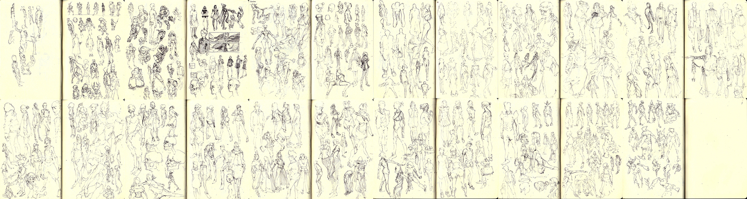
DS #564: Didn't have the time to study real life balls for animation because I had to do 250 thumbnails haha^^
Mostly character stuff. This really helped me getting back my confidence in drawing and improved my strength in visualizing images before I draw them.
(hope you can see everything :D)
Tools: Pilot ballpoint pen, Moleskine sketchbook
(rightclick -> open in new window let's you see a bigger version)
Daily animation practice:
Tried to do the some bouncing balls with weight in mind from imagination. I hope to get more time tomorrow to do some real studying haha
Tools: iPad Pro, Apple Pencil, Animation Desk

Your are doing great with your animation studies! One thing though about the ball jumping of a ledge. I get the feeling that when the ball hits the edge, it should just fall off (or do a gradual fall a bit further forward). This is because it ends up a bit too much off the edge, causing the center of mass to be on thin air.
I took a closer look at one of your animations and noticed that it is about 40 - 50 frames. How long does it take you to make one?
And also, are all those thumbnails done from imagination? They look really great for having been done in a short time, I should probably try to do something like that myself sometime 
@mar_cynwer Thanks, mate! Yeah I thought that too but I wanted to think of the oval as some kind of character so that it pushes its two ends on the side to push him to the other sides and just lands and rolls haha just for practice^^
Yeah I animate in 48frames normally with 12fps. The last days I added about 10 frames to the file so I had to do a bit more^^
I always give myself like one hour, sometimes less and do them just from scratch without thumbnailing first (bad habit, need to fix that if I really want to do little stories )
Currently I only do this to improve my imagination and draughtsmanship. If I wouldn't be in university right now I would do a lot more haha Since I have only like 3-5hours a day to work on art stuff I have to limit myself though and split the time in studying, painting and drawing (animations).
If you want a quick advice: For me to be able to do them so 'fast' I really just studied perspective a lot and tried to master it (like Kim Jung Gi does) but this will take another couple of years probably
-
DS #565:
Trying to get back into rendering 
Daily animation practice:
Quick oval rolling in my 'free time' to not lose the flow of animating.
Tools: iPad Pro + Apple Pencil + Animation Desk

Another good improvement with the ovals and balls. One warning I'd give you with the three bouncing balls is to watch the height of each successive bounce. The initial bounce gives the viewer an idea of the material based on how much of the height the ball drops from is regained, and the percentage then can remain pretty stable.
So the ball will (roughly) always reach the same percentage of its previous drop height. your first ball shows this enough, getting back less than 10% of the initial drop height in the first bounce, and then barely even getting off the ground again after. Your second ball, however, breaks this rule. It bounces to 60% of its starting height, then to about 80-90% of the new drop height, then repeating some amount closer to 70%.
then your final ball loses a tiny bit of height, loses a bit more, then regains some height. Losing a very small amount of height is no problem, since rubber balls maintain most of their height each bounce, but regaining some height is impossible without intervention (such as it not actually being a bounce, but a character jumping repeatedly, at which point the inconsistency is welcomed).
As for your latest oval, I love everything about it up until the end when it eventually bounces straight up into the air after face planting. The issue I have with it is that if it's a character controlling itself, then it's bouncing itself back up after falling (which is fine), but it does so very quickly after falling, which means that it wouldn't actually lose all of that momentum. When jumping back up, it should have continued in a small arc towards the right of the screen, thanks to the force in that direction from throwing itself beyond the threshold of the oval tip.
I really love animation, and between studying it and physics I got a really solid understanding of how to make something animated look and feel realistic enough. I was never a fantastic animator back when I practiced, but boy could I make balls bounce and move around. They're the best practice, I find, for learning weight, momentum, pacing, and emphasis. These are the essentials which allow you to make an animation look real, but also push that realism into the epic. If you have one character jumping onto another, the "real" would technically be a very straight forward jump. If you wanted to stylize and make the jump important, you could have the character jump up, slow mid-air, then fall down atop the other. I wish I could pull up the old tutorials I used to learn all this stuff for you, but the website they were once on has long since been destroyed.
@JesterSeraph Daaammnn, another epic analyzation of my animations and great advice! Thank you so much
Never thought about the consistency of the dropoff, that's a really good advice! That last ball bouncing back above/higher at the end was not intended, didn't check good enough but I tried to implement your advice into today's animation practice. I hope I did everything right today. (need to study the deformations of balls more, I dont feel like today was right. It's finally the weekend so I can study as much as I want )
Another great advice! Continuous force into that rolling direction, didnt think about that! Ha, animation is so difficult and hard, but also the most rewarding (what I feel at least).
Yeah I also want to master the balls and fundamentals first before jumping back into character animation (might throw in 1 or 2 occasionally just to try to use the basics).
Wish I could read and learn from all those tutorials but, oh well, haha just gotta observer reality a bit better and it will work out
Thanks again for your input! Really helps me a LOT.
-
DS #566:
Tried to do something with shapes only but ended up giving into the habbit of rendering here and there... Haha need to fix that.
Tools: PS CC, Wacom Intuos Pro M

Daily Animation Practice:
Another day of basics and fundamentals. Bouncing balls.
Tools: iPad Pro, Apple Pencil, AnimationDesk

A ball only deforms if it's travelling/hitting something at a very high speed, and is also a material capable of deforming (such as a tennis ball, because tennis balls are hollow).
Anyway, if you're wondering why they look off, it's because of two factors. One is a misunderstanding of how an object reacts when it hits something (deformation is one way an object reacts, but it's not the most common. It's mostly when two forces are fighting against each other and compression is possible that you find deformation occur). Your balls hit the ground, but then they're sticking there for a number of frames. when a ball hits the ground, all of its force goes into the ground, and the ground then returns an equal, opposite force (Newton's 3rd law). So when it collides with the ground, it loses all of its force, thus there's nothing making it push down anymore, and it also receives the force from the ground, so it begins immediately shooting back up. Even with a deformation, the compression and expansion (squish and return to normal shape) is very fast. So your 4th ball down the line makes sense. It has a ton of speed, but notice how you also made it only compress for a single frame, and after that it shot back up with high speed. That's proper! The others spend a lot of time squishing against the ground, when they don't even actually need the actions.
The other issue is your spacing. How you've spaced out the motion of the ball doesn't fit nature properly, specifically the force of gravity on a ball. Gravity is a constant force, and it's the only reason a ball slowly loses speed as it travels upwards, and the only reason the ball then falls back down. What this means is that the rate at which the ball decelerates while flying upwards is about the same as how quickly it accelerates downwards.
Because the spacing of your balls is uneven, where they suddenly start picking up speed and flying downwards after a slow deceleration to a rest mid-air, it makes the tempo very hard to read.
I dug around a bunch through videos and tutorials on the community site of where all the animators I used to follow moved to, and although I didn't find the series I was talking about previously, I did find a great TED video on animation, specifically timing and spacing (the time you give something and how you move an object across frames). It covers a lot of what I've tried to teach you, though it doesn't focus on the more stylistic lessons like time spent as a way of showing effort or importance, and I think you'd really get a lot out of it. It especially helps since it's all visual, and I haven't provided you with any images throughout all my posts.  Enjoy.
@JesterSeraph Damn, damn, damn. Thanks again. Another piece of knowlegde added to my brain haha
I completely neglected/didn't think about the force of being shared between the two participants (ball AND floor). Need to brush up on my physics haha (It's been years and now I'm actually intrested ^^) I will keep that in mind forever now, will have to practice with that in mind to keep it.
Again, didn't think of the initial force of the ball being 'pushed* up again from the floor, only thought of it falling and the 'arc' haha Added to my brain-notes.
Thanks for investing so much time into my edutcation/developement in animation! Really appreciate it. This video helped a lot and will study it intensely again tomorrow and search for similar ones.
Today was a rather painting heavy day, so not much animation done, because I 'fixed' (not entirely) an issue/error in my PS that kept me from 'flowing' while painting and re-experienced my love in rendering^^
-
DS #567: Started a collab with a friend where I paint something and he writes the story to the painting. May be adding them in the future when he finishes them and if they're not too long

Tools: PS CC, Wacom Intuos Pro M
Daily Animation Practice:
Wanted to do some character and effect animation to not forget what I already learned. A bit messy. Tried to test a lot in these 48 frames haha

Tools: iPad Pro + Apple Pencil + AnimationDesk
DS #568: Did a lot of character sketches today so I just pick one and post it here:
Experimentated quite a bit on this one.

Tools: PS CC, Wacom Intuos Pro M
Daily animation practice:
Had some craving for effects/explosions. Tried to put too much into the few frames that I have so the pacing/timing is aweful. Everything moves so fast but learned a lot on how to use dark/whites.

Tools: iPad Pro + Apple pencil + AnimationDesk

