• Gave myself 5 days to do something. This is what I managed to do. I'm trying to get better at illustrations, but I have patience to work on something for 3 days maximum :( Splash_Process.jpg5000x3140 2.21 MB Splash_Process-6.jpg3896x2429 2.83 MB concept list char copy.jpg5388x3000 1.7 MB
    20.8k
  • Did a character concept for a course.https://www.artstation.com/artwork/P6gm3y - more:) list1.jpg3541x1920 2.82 MB
    20.8k
  • Day 4: Star Wars May The 4th =] Queen Padmé Amidala in my art style! First time drawing her and I really enjoyed making this one! Used watercolours, ink pen, acrylic markers and gold paint for accents on my Canson mix media sketchbook. I hope you like it!
    82.3k
  • A creature design from a while back
    by
    6.7k
  • Here is some more recent stuff, I need to make more body studies
  • It's been a while and god, it is so cringe to go through all previous messages xDmy study.
    20.8k
  • Thank you! I finally cleaned that up. Meanwhile started 3 more ..I have a habit of taking too long to finish a piece, then I lose interest in it and just start something else. I found 8 from recently i started and abandoned, that are decent enough to not delete, but not finished. There’s also been a number of drawings I felt I “outgrew” - became better before I finished them, and it would be easier to start from scratch than fix them. Anyone else thinking that?
  • Lady Death Fanart Collectible: Part 6 Polypaint and base Hi, it’s time to share with you another part of the process to create this fanart piece. Polypaint As this is my first collectible fanart I didn’t have previous experience with polypaint so I tried my best and played a bit with it.I wanted to give a ghostly and eerie look to Lady Death, she is beautiful and deadly, but at the end of the day she is a woman that died and was reborn at hell as an avenging spirit, that’s why I gave her skin tone a bluish very cold tone.As you will see I gave myself some creative freedom to deviate from the traditional color scheme that this characater has in comics and illustrations.To add a bit of sensuality by painting some freckles on the face and the chest. The dark nature of this character was the perfect excuse to gave her a kind of goth make up, very dark shadows around the eyes, blue lips and fingernails. I know that the original character includes sexy red lips but I wanted this girl to have a sexy but at the same time creepy look, that’s why we can see some thin veins emanating from her eyes. The biggest chromatic change I did for this character is at the hair. Lady Death has a characteristic white weavy hair but in my fanart I decided to gave her a very saturated blue color.The reason behind this wasn’t only an aesthetic choice. I want that the face area strongly pulls the attention of the viewer so this area needed a stronger contrast. Another reason is that I want her to have a more modern look, as I mentioned before, I’m strongly attracted to women with goth/punk look. I gave myself half an hour or more to analyse the work of experienced sculptors that create collectibles and I discovered that the use of darker values on the skin is often applied to create a greater sense of volume and three-dimensionality. I found that areas with heavy ambient occlusion are the perfect places to paint with darker colors in order to increase the separation between different forms. Even though she has a bluish skin tone, I used a bit of warmer hues in areas that, in real life, tend to go towards red and pink, this is very obvious in the nose, cheeks, and knuckles. Thinking with a logical mind it’s completely absurd to have warmer tones on the body of a zombie like creature but I didn’t want to limit myself by using only blue tones, it looks boring and artificial. In real life these colors are created by blood vessels in areas where the skin is very thin. ** Scythe **for her weapon I applied a cool gray with some warmer variations, this color scheme is influenced by the work of H.R giger. Base I’d like to talk about the design for the base which, to be honest, I forgot to develop along with the character.My main idea with the base is to show that Lady Death inhabits a very sterile and arid land, at the end of the day she is at hell.You can see a that she walks over dirt and rocks, a sign that she’s surrounded by death and loneliness. As part of the landscape we can see some bones and skulls to reinforce the idea of lack of living creatures, yet we can see three hands that try to reach her legs.This hands represent that all creatures are subordinated to her power and seek an evil blessing with a simple touch of the princess of the damned.1- The hand with skin burns represents the souls of those who are newcomers to hell, tortured souls that suffer for the sins comitted on earth.2- The hand with greenish rotten skin and pustules is the reminder of the decay that has infected the souls of those who have been trapped and have forgotten their humanity3- Last but not least, the hand of a demon shows that even dark creatures and entities bow before her presence. The cherry on the top, at least in my vision, are the simese twins that emerge from the ground, this malevolent creatures remind us that in hell there’s only perversion and any trace of innocence is lost. Thanks for reading till this pointI’m really happy to be very close to finish this creative journey, last but not least it’s mandatory to talk about splitting the sculpture in several pieces to be printed, this will be my last entry before showing the final rendered images. See yaMay Zbrush be with you
    1.5k
  • memory 2min gartic phone, used ref 2m gartic, used ref for pose 2min gartic 2min gartic 2min gartic 2min gartic memory memory memory memory study memory memory memorymemory memory memory memory memory memory study memorystudy study stylized left memory, right study study memory memorymemory memory memory memorymemory memory, porportions r offmemory memorystudystudy memorymemorymemory memory memory memory memory memory memory memory, right leg is a bit broken The feeling of only getting 1 - 3 likes on a social media post will never not be discouraging. But nothing is discouraging enough to make me quit drawing. I think the strategy of drawing a lot of stuff and waiting a while to post is good though rather than posting it immediately and then feeling that sadness on the next set of drawing
  • Urban Dragon Girl Wip Urban Dragon Girl_wip1.jpg5000x5000 1.11 MB
  • Long time no see! New artworks produced lately
    6.7k
  • studies studies juri study imagination, how I feel before a speech imagination imagination study something I drew for my presentation also drew this for my presentation, didn't fix the one hand being bigger than the other imagination + study study studies study study, I need to fix the face a bit based on screenshot from anime but in my style study. except for the eye study studies studies study. changed some things tho imagination imagination imagination study studies, except top right samurai based on anime screenshot wolverine studies, changed some of the poses a lil, not very good at all, but first time i drew the character ever. semi study studies study imagination imagination imagination , for first time ever i tried to draw over 3d model for middle pose, I dont like the result tbh, but it makes it much easier than coming up with it from memory.imagination, except right figurestudies imagination + studies, coming up with action poses r hard, these are not dynamic enough, I will redraw better ones in future. imagination , imagination imagination study, except for eye imagination imagination imagination doodles except for the two chrollos imagination storyboard thumbnail, idk if i ever shared this. my storyboards end up being a little detailed since i usually just draw in one layer.
    by
    22.3k
  • Quick fun sketch. CyberFish.jpg2394x3857 674 KB
  • Neon Gambit This is a fan art of my all time favorite character Gambit from the X-Men.I made this a birthday gift (26.04.2024) to myself and honestly I really do like how it turned out in the end =] I hope you like it as well =]
    82.3k
  • Art Blog - April to September 2023 Suffer a little burn out. Look at some memes. Here's some art from in between. critique.jpg1333x5736 1.77 MB
    20.4k
  • And some more! Been painting over them a bit more this time. Some variants I tried for the old guy using mainly the liquify tool. Someohow looking a bit like Owen Wilson (not intended :D)
  • Cafe sketch/color study
  • Hello! My name is Vithor, I am from Brazil, studied Design at a local college worked as an illustrator for more than 10 years. I took a time off around 3 years ago and am trying to get back in my art shape and maybe become professional again. Here are some recent pictures: You can find timelapses for most of them on my instagram: www.instagram.com Vithor Albertim (@vithor_albertim) • Instagram photos and videos 123 Followers, 638 Following, 19 Posts - See Instagram photos and videos from Vithor Albertim (@vithor_albertim) Comments and critiques are always welcome.Cheers!
  • @patrycja.lerch Thank you I created another variant, which might capture the witch look I was going for better
  • Thank you @daceronine! If I remember I save in google cloud, I will have to stick a note to do it more often. Lamp is from life. Poses are from refs but I look at refs for a while and then try to do it myself and look it up if needed. Outfits and rest is from imagination Something went wrong while installing system so we will have to wipe everything again... pc works but something is wrong. We will wait till internet is done and I will save everything on cloud this time Threads came out in eu. It's been 3 days and I had more engagement than after half a year on instagram. It feels really nice I hope it stays this way A portrait of old dude. It's the same character I posted a while ago. Inspired by Bayard Wu work. At first I thought of him as a bear but I named him Fenrir and I think wolf suits him better. Eye gave me a bit of hard time but I think it is fine now. I focused on face and forgot about area below. The way I draw hair clashes with greying hair. I had the same problem while doing Lohse's white hair. Does it looks like it is greying here? I love how desaturated red looks blue there. I keep lying to myself that I will use different color scheme but It all comes down to this blue and yellowish one it is just flipped this time Have a great day!
  • Been bad about posting updates on the forum. I figure I should just throw down stuff. instead of waiting until I finish something.
    14.6k
  • Havent done much this year since I am focusing on learning programming and deving my own Indie Game . But here 's a New Year Piece 2024 , she 's the mascot for my Game Studio - Lucid Realm : Lucid Chan ! LucidChan_v001_sketches.jpg3072x4352 973 KB
  • IMG_0637.jpeg3240x4050 1.6 MB
  • Long Crested Eagle studyI had so much fun making this one and honestly I love that Eagle! It looks so cool! Used for this one high quality watercolours, high quality watercolour sketchbook/ cold press and it was 300 grams paper.I hope you like it!
    82.3k

Thank you Ghostmonst3r :smile: I take full advantage of the rulers on Photoshop - without them I struggle a lot to get the measurements down.

I have a question though for anyone who can advise... How do you get past the 'wall'. I'm starting to find that going over things is starting to get less exciting and I feel like I'm reaching a point of stagnation with my learning. With gesture drawings I am trying to do them as warm ups, which keeps me doing it - but with figure drawing I'm struggling to identify how to improve. How do you identify where improvements are needed?
One place I know I need to improve is cleaner lines, but I'm not sure how to do this effectively..
I also know anatomy is a thing I should really focus on, but I am aware its covered in some of the other terms.
I am going to be moving onto perspective this week for a change up, but I want to keep practising figure drawing as well. I just don't want to start becoming bored and start sliding off the drawing wagon.

Hey @ashley.durnall1 ,

I would say 2 things here:
1) Don't repeat one thing too much to a point where it becomes too boring. When you feel you got the hang of something, move on to the next lesson. Or even if you didn't entirely, nothing keeps you from moving on to something and then coming back to it. It's important to manage that energy so you keep moving forward.

2) Feedback is one of the keys to learning and improving, in my opinion. Share your pieces here, at the discord channel, and ask people for feedback. It's through feedback we can start seeing things from a different perspective and we can improve. And off course keep on the daily practice.

Hope that helps 😊

keep going with the lessons. one thing I have found is that marc has structured the classes so that many of the skills will compound on each other. by that i mean the perspective class has definitely helped me with my anatomy. you can always go back and revisit.

9 days later

After my last image post, I tried a figure drawing with clothing... While it's not bad, i'm definitely not as well versed with clothes than nude figures.

I have also started the perspective video of term 1. I'll be honest, I didn't want to draw boxes in perspective due to potential boredom, but going straight into drawing rooms was super motivating. Marc is definitely very good at setting tasks that are fun.


This took me a lot longer than I really wanted, and technically it's not finished to the full extent of the reference I used (my own kitchen). But it was a lot more fun to do this. There's some areas where the picture looks flat - and i struggled to get the full extent of the third dimension - but i'm certain that indicating the light and shadow would help there.
I have a couple ideas for other perspective drawings, and i want to do some more curves.

Because this took me so long, i've not gone back to gesture and figure drawings - my fear is that i'll be back where I started (it does happen often). I'm going to try and re-motivate myself to draw in the mornings before work for recap.

As always, any critique and advise is much appreciated - I'm going to try and get more into this.

I think your being a bit hard on yourself. I don't see any flat spots in this. there is no shading and all the perspective looks correct. Maybe the cupboards and sink could have had a bit more, but this looks good. if boxes sound boring, maybe try house hold objects, that will keep your brain in the mode of the exercise and be a bit more fun.

I do have a tendency to be overly hard on myself - it's something i've always done. With the kitchen, I purposefully stopped so I didn't burn out with it. In place of that I started another perspective drawing from imagination, which i'll be posting up at some point. I may go back to the kitchen and add in the extra bits.

Now you've mentioned it, doing random objects sounds interesting too - I might have a go at that.

I should also watch the rest of the video - I couldn't watch it all due to time constraints and I was engrossed in the two perspective drawings i've been doing.

I will try to be less hard on myself in future.

I had a pretty lax week with drawing and ended up not doing much else :c Work was particularly draining.

In light of that, I did manage to 'finish' my second perspective drawing - this time completely from imagination. There are some additional details I think I should go and add, for example the rest of the road detailing and the building in the background doesn't have any features.

I also want to redo the fencing by the small shop; I couldn't quite figure out the spacing. I didn't want to draw it on a separate layer and transform it to the shape... but i'm not quite sure how to get the spacing to look better - this version was a little more rushed.
I am a little scared i'm using too many guide lines (which is a silly fear, i know, especially while i'm still learning). Does anyone else get this?

I tried to add some shadows, but I definitely need to do some shadow studies of some sort. I could not wrap my head around it - I even tried to add some guides for it:


So as a result, I just decided to finish up there and not add more shadows... I've never done anything with values and colour, so I'm fine with it at this point. I'm not going to be a 'master' of everything straight away, and that's fine :smiley: I've still got much I want to learn.

I do think I have some issues with finishing up these things - scenery takes a lot of work, I respect background artists a whole lot more now.

One thing I realise i'm not doing is drawing 'for myself'. Every session I do is something related to the course, I only create personal things via doodles and scribbly sketches. The justification is that "I'll draw my ideas when I'm more confident".
I don't know that this is the best mindset to be in...
I have redrawn one of my only personal drawings (one that I did almost a year ago now), and it turned out pretty well.

I'm going to continue with the perspective drawings! I want to add more details and possibly fully finish what I've started. I'll be sure to keep this updated with my progress and thanks to everyone for the help and advice!!

Your perspective assignments look really good. I totally get the worry of using too many guidelines in a perspective drawing but when you're starting out or just struggling it's totally normal to have a ton of guidelines. If I still had some of my first attempts at the perspective I would share them because the paper was worn thin because I had drawn, erased, and redrawn so many guidelines. The shadows you have in the second image look good to me, you're definitely going in the right direction.

I did a quick drawing to demonstrate how to do the spacing on the fence. First (black lines) define where the whole fence is going to go. Second (red square) define how big the fence post and space next to it are going to be. Next (green) use the "X" to find the center and draw a line all the way through the shape. Then (purple) from the bottom corner of the red shape draw a line that goes through where the black and green lines intersect. When you get to the top draw a line down. Repeat that (blue) until you get to the point where your essentially just drawing the lines on top of each other(orange). Finally, define the size of the post and the gap between posts (olive) and draw a line all the way to the VP (also olive). when you draw a line down each time it intersects with another line you'll have both the gap and post in perspective.

Okay, that was a bit longer than I meant for it to be and sounds like a lot of steps to remember but after a while, it just becomes second nature. Perspective is a tricky subject and just about every artist I've talked to has struggled with it so don't be discouraged.

Looking forward to seeing more of your assignments in the future, and let me know if you've got any questions about the whole perspective thing.

11 days later

So some life stuff happened and I couldn't work on learning :frowning:
I need to strengthen my resolve to learn again - I think it's the slog of learning that gets me thinking 'oh I can do it later, i'll play video games now'.
I've not completely quit though, I have been doodling :smiley: There's so much I want to draw and I do feel like a small fish in a giant ocean.
My experience will grow the more I draw! I am determined!

I took on board what @MattD showed me, which by the way has been super helpful - I think I understood all of it. I used it in the redraw of my street - most of it was tracing over my other drawing.

I copped out with the fence a bit and just drew the lines, but it's still using your method Matt!! I found it so much easier to make it look nice.
I tried to add a few details, but ultimately it's still sparse - I wanted to get a feel for the environment and practise the perspective.
The curve of the arch was super difficult - I opted for a flat bottom because I struggled to get a second curve to follow the first and keep the same distance as the pole. Though I also notice that I forgot it's 3rd dimension "-"
I used the path tool in PS to create the curve which I traced over. This made it a lot easier than just eyeballing it.
All in all - this has been successful. I don't think perspective in itself is difficult - it the details that aren't simple straight shapes that makes it difficult. Practise it be!

I did watch the video again and realised that Marc uses a lot of lines himself. Additionally, I was watching a backgrounds video from Drawfee on Youtube and a couple of them also used a load of lines to help. I think seeing professional artists do the same sort of thing reassured me a little. I know I'm very different to them in how I draw, but it's nice to see those with more experience still using these techniques :smiley:

I'm hoping to at least try for consistency here, mainly for my sake. Its very useful being able to see your journey and realise that you've made progress. And the advice given and seeing other people's journeys makes it all the better. Thanks all :smiley:

I've got a little more structure now! I'm doing perspective stuff on my iPad at work, and practising that there (which seems to take a long time when you have a dedicated time to stop drawing because of starting work).
At home on photoshop i've gone back to doing gesture and figure drawings, as a refresh before moving to term 2.

I've got to say, it hit me realising i'd lost some of my ability to do gesture. I'm not super happy with what i've done. But I know it's fully because I've not done any for a couple weeks (while focusing on perspective). Once I get back into it - I know that i'll figure it all out again (pun intended).


I think one of the issues I find is that the site I use to throw gestures at me has a lot of side on or foreshortened gestures and they're not too easy to represent in stick form and in 30 seconds. But they aren't turning out too badly, i'm just not sure how to test if it's going in.

Does anyone have any sort of 'self-tests' to check if things are going in?
I know that if I try to do gesture drawings on Procreate on iPad, the results are much worse because I don't have the rulers like I do on Photoshop - I cant 'see' where the lines are supposed to be, even when the image is next to where i'm drawing. Maybe this is a way of testing myself :stuck_out_tongue:

Thanks for reading :smile: and any advice, or tips for self-testing are much appreciated.
I'm also enjoying going through other people's journeys and seeing that I'm not alone... Though i'm not very active outside of here D: I might try - but it is very intimidating as I don't feel like I can offer anyone advice at this point in my art journey.

I feel like you when I don't practice gesture drawing for a long period hahah it's like having lost a skill :joy:
These are great stick figure, the pose is so readable. I could give you the advice to try to do maybe a minute or two to create like a "simple" figure drawing, with volumes instead of lines, it really helps understanding the basic shapes and maybe it's a bit more funny and challenging :grin:

I use the iPad for gesture drawing but usually I don't "self test" if it's good like with overlaying my drawing on the photo. Most of the times I check if my line quality is loose without hard edges and the pose is well executed, even if it's a bit exaggerated and the proportion are not perfect.

I'm not the queen of gesture drawing but I hope that could help :sweat_smile: And don't worry to comment or give advice, everybody always appreciate that :grin: Sometimes instead I feel sorry to comment to much (sorry for that hahah)

Looking forward to see your next posts on term 2! :relaxed:

So.. I just learned from your thread that I have Aphantasia, this is... life altering to me, I don't actually know how to feel, how can you miss something you never knew you we're missing. It has taken me a couple of days to come here and write about this, I want to say thank you for bringing it up, I never would have looked it up it wasn't for you.
I feel very ambiguous about it.

I do hope its not a negative though - I mean, I was in the same boat as you for so long. I didn't realise it was a thing I couldn't do until i started talking to more people - a teacher at my high school said I must be brain dead because I couldn't visualise things.
I've found I struggle with art because of it - but I have seen someone with Aphantasia create beautiful artwork (i'd reference it if I could find it again).
Don't see it as a negative, I'm not sure what it is, or why some people have it - but not everything is bad :smile:

Thanks for the advice :smile: I've looked at some of your work @chiara.arcidiaco and you're quite good at gestures, so your advice definitely has weight :stuck_out_tongue:

One area I constantly think i'm lacking in is being able to simplify the forms and build up the gesture. Maybe it's because I've not done them for a while so my foundation for the gesture is not as strong. I've started to do some longer gesture drawings to try and build up the gesture more.
Though, I will admit my brain has sort of been elsewhere due to life things. Hopefully I'll have some more gestures by the end of the week that show some progress.

I come here today with the question of: am I being too harsh on myself?

Because of life things I haven't spent as much time on gesture drawings as I want. But i wanted to share after my session today because I think I need to readjust my perspective a little.

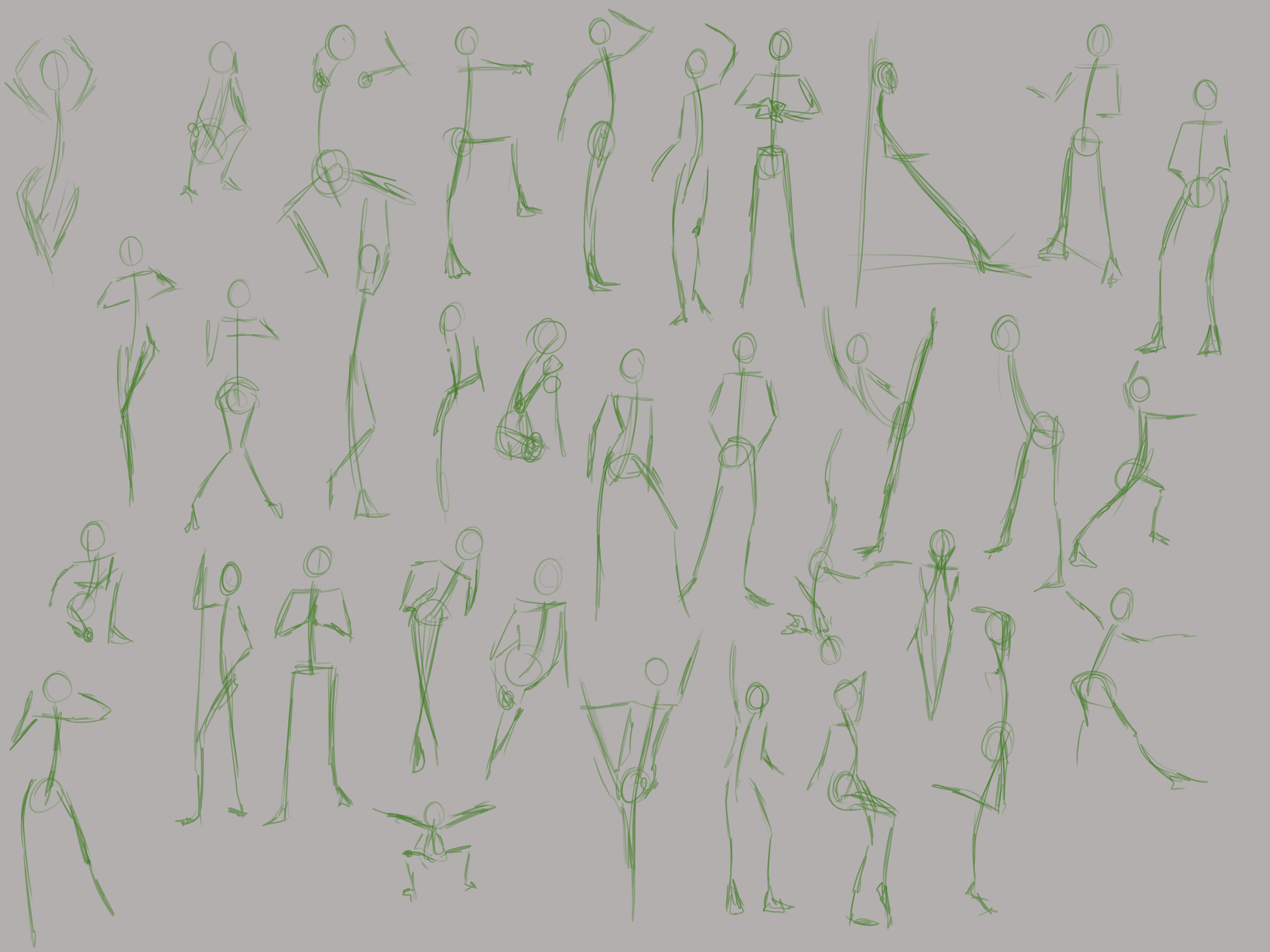
Here's the gestures:

I decided to go with minute long gestures to try and fill out the bodies a bit more. The gestures to the left and above the red line were my previous attempts. Looking at them, the proportions feel bad. I've been struggling with identifying the proportions in such a short time scale. Because of that, I was getting frustrated and each subsequent drawing was tilting my perspective until I had to give up.

All of the gestures to the right of the red line (or below) were from today. I started disliking this sessions because the drawings looked messy and the proportions felt poor.
Most of the lines were pretty scratchy at first, but I went in after and cleaned them up where I could and I'll be honest - I am proud of these.
I spent a bit longer than a minute on some of these because they were negatively affecting me and I wanted to 'fix' them. The drawing next to the image was the worst culprit and I'm still not happy with it - and this is why i'm questioning my self-harshness.
I brought the image in to trace over to try and help before noticing the layers were merged and I was too frustrated to redo it :confused: Originally, the proportions I had done felt constricted, with the torso being too short and the legs just being awkwardly placed. I messed with it so much and in the end left it where it is. I really like the pose though.

My main issue is that i've been trying to learn now for 2 years, and up until doing Art School here my improvements were non-existent. I'm still unable to draw any of my D&D Characters as I wanted to, and this frustrates me. I'm definitely putting more effort into learning now - but I thought I might be able to at least create some artworks, even if they weren't pieces I was proud of.
Maybe it's my impatience (or more likely ADHD) stopping me from sitting for the hours it would take to just create something. I'm not sure. How have you taken the plunge into your first non-learning art pieces?

In other news, I am doing perspective in the morning before work. I've worked on a room that I am honestly happier with.

I've been using Procreate for this on my iPad pro. Doing this made me realise, I have no idea what goes into a room :smiley: I wanted to draw a lamp on the bedside table, but the rounded bottom kept throwing me off - non-linear shapes are probably my nightmare with perspective. I've gone back to Marc's explanation a view times, but it's not clicking with me.
I'm not totally sure where I want to go with this - I want to add a window, but other than that i'm a little stumped, my bedroom is pretty much empty other than a bed and wardrobe.
I also want to practise more with round objects in perspective and not necessarily 'perfect' circles.
I've seen some other people's work on this and the amount of detail is impressive, I'm not sure how it's done - The monitor was difficult for me to get to that stage :stuck_out_tongue:

Any feedback or advice is much appreciated.
I'm sorry if i'm a bit negative, I treat art as I would an academic subject and I've been trying to distinguish between the two.

I put some more work into the perspective room - looking at other people's work I saw that so many people were filling the spaces with objects and mine looked pretty bare. I'm still not convinced there's enough here :stuck_out_tongue_winking_eye:

I've had an issue getting the chair right, and even now it could be better, but I don't know how to make it look like a well proportioned chair. I measure out a person sized shape (3/5ths of the room height) and tried to measure it all out but that's on separate layers. I can port it from my iPad if anyone wants to see.

I did this pretty much entirely from 'imagination' which, obviously, is difficult when you can't visualise anything. But all in all, i'm pretty happy with this - I want to do some more. But I want to try and make it a bit faster. I have a few ideas in mind to increase my skills and I can't wait to share the work I do here.
Any critique is much appreciated - I know there's places I can improve, I'm just not totally sure how?
Colour is definitely one - but i'm hoping some of the later classes in Art School help there. It's a very daunting thing for me, and I know I'll tie myself in knots over it D:

I've thought about possibly using illustrator to help make at least a framework for the perspective - thanks to work, I know the shape manipulation tools a bit better that with PS. Also, working with vectors might help out a bit maybe? I got the idea from a YouTube channel - the artist (Fernando Nunes) created illustrations from his pencil sketches on Illustrator and it totally inspired me to use multiple tools to achieve my goals. To this end, I also want to try learning to 3D model my backgrounds to help... I know there's some ZBrush stuff in Art School which may be useful (do the skills transfer to Blender?)