


Thanks Matt!
I tried making the edges of the flowers being harder, but then there was the whole cutout issue as well. I'll go through that part of the lesson again and give the assignment another go soon 

 Thank you! I finally cleaned that up. Meanwhile started 3 more ..I have a habit of taking too long to finish a piece, then I lose interest in it and just start something else. I found 8 from recently i started and abandoned, that are decent enough to not delete, but not finished. There’s also been a number of drawings I felt I “outgrew” - became better before I finished them, and it would be easier to start from scratch than fix them. Anyone else thinking that?in23.9k
 Lady Death Fanart Collectible: Part 6 Polypaint and base Hi, it’s time to share with you another part of the process to create this fanart piece. Polypaint As this is my first collectible fanart I didn’t have previous experience with polypaint so I tried my best and played a bit with it.I wanted to give a ghostly and eerie look to Lady Death, she is beautiful and deadly, but at the end of the day she is a woman that died and was reborn at hell as an avenging spirit, that’s why I gave her skin tone a bluish very cold tone.As you will see I gave myself some creative freedom to deviate from the traditional color scheme that this characater has in comics and illustrations.To add a bit of sensuality by painting some freckles on the face and the chest. The dark nature of this character was the perfect excuse to gave her a kind of goth make up, very dark shadows around the eyes, blue lips and fingernails. I know that the original character includes sexy red lips but I wanted this girl to have a sexy but at the same time creepy look, that’s why we can see some thin veins emanating from her eyes. The biggest chromatic change I did for this character is at the hair. Lady Death has a characteristic white weavy hair but in my fanart I decided to gave her a very saturated blue color.The reason behind this wasn’t only an aesthetic choice. I want that the face area strongly pulls the attention of the viewer so this area needed a stronger contrast. Another reason is that I want her to have a more modern look, as I mentioned before, I’m strongly attracted to women with goth/punk look. I gave myself half an hour or more to analyse the work of experienced sculptors that create collectibles and I discovered that the use of darker values on the skin is often applied to create a greater sense of volume and three-dimensionality. I found that areas with heavy ambient occlusion are the perfect places to paint with darker colors in order to increase the separation between different forms. Even though she has a bluish skin tone, I used a bit of warmer hues in areas that, in real life, tend to go towards red and pink, this is very obvious in the nose, cheeks, and knuckles. Thinking with a logical mind it’s completely absurd to have warmer tones on the body of a zombie like creature but I didn’t want to limit myself by using only blue tones, it looks boring and artificial. In real life these colors are created by blood vessels in areas where the skin is very thin. ** Scythe **for her weapon I applied a cool gray with some warmer variations, this color scheme is influenced by the work of H.R giger. Base I’d like to talk about the design for the base which, to be honest, I forgot to develop along with the character.My main idea with the base is to show that Lady Death inhabits a very sterile and arid land, at the end of the day she is at hell.You can see a that she walks over dirt and rocks, a sign that she’s surrounded by death and loneliness. As part of the landscape we can see some bones and skulls to reinforce the idea of lack of living creatures, yet we can see three hands that try to reach her legs.This hands represent that all creatures are subordinated to her power and seek an evil blessing with a simple touch of the princess of the damned.1- The hand with skin burns represents the souls of those who are newcomers to hell, tortured souls that suffer for the sins comitted on earth.2- The hand with greenish rotten skin and pustules is the reminder of the decay that has infected the souls of those who have been trapped and have forgotten their humanity3- Last but not least, the hand of a demon shows that even dark creatures and entities bow before her presence. The cherry on the top, at least in my vision, are the simese twins that emerge from the ground, this malevolent creatures remind us that in hell there’s only perversion and any trace of innocence is lost. Thanks for reading till this pointI’m really happy to be very close to finish this creative journey, last but not least it’s mandatory to talk about splitting the sculpture in several pieces to be printed, this will be my last entry before showing the final rendered images. See yaMay Zbrush be with youin1.4k

 memory 2min gartic phone, used ref 2m gartic, used ref for pose 2min gartic 2min gartic 2min gartic 2min gartic memory memory memory memory study memory memory memorymemory memory memory memory memory memory study memorystudy study stylized left memory, right study study memory memorymemory memory memory memorymemory memory, porportions r offmemory memorystudystudy memorymemorymemory memory memory memory memory memory memory memory, right leg is a bit broken The feeling of only getting 1 - 3 likes on a social media post will never not be discouraging. But nothing is discouraging enough to make me quit drawing. I think the strategy of drawing a lot of stuff and waiting a while to post is good though rather than posting it immediately and then feeling that sadness on the next set of drawingin

 studies studies juri study imagination, how I feel before a speech imagination imagination study something I drew for my presentation also drew this for my presentation, didn't fix the one hand being bigger than the other imagination + study study studies study study, I need to fix the face a bit based on screenshot from anime but in my style study. except for the eye study studies studies study. changed some things tho imagination imagination imagination study studies, except top right samurai based on anime screenshot wolverine studies, changed some of the poses a lil, not very good at all, but first time i drew the character ever. semi study studies study imagination imagination imagination , for first time ever i tried to draw over 3d model for middle pose, I dont like the result tbh, but it makes it much easier than coming up with it from memory.imagination, except right figurestudies imagination + studies, coming up with action poses r hard, these are not dynamic enough, I will redraw better ones in future. imagination , imagination imagination study, except for eye imagination imagination imagination doodles except for the two chrollos imagination storyboard thumbnail, idk if i ever shared this. my storyboards end up being a little detailed since i usually just draw in one layer.in21.8k

 Hello! My name is Vithor, I am from Brazil, studied Design at a local college worked as an illustrator for more than 10 years. I took a time off around 3 years ago and am trying to get back in my art shape and maybe become professional again. Here are some recent pictures: You can find timelapses for most of them on my instagram: www.instagram.com Vithor Albertim (@vithor_albertim) • Instagram photos and videos 123 Followers, 638 Following, 19 Posts - See Instagram photos and videos from Vithor Albertim (@vithor_albertim) Comments and critiques are always welcome.Cheers!in782

 Thank you @daceronine! If I remember I save in google cloud, I will have to stick a note to do it more often. Lamp is from life. Poses are from refs but I look at refs for a while and then try to do it myself and look it up if needed. Outfits and rest is from imagination Something went wrong while installing system so we will have to wipe everything again... pc works but something is wrong. We will wait till internet is done and I will save everything on cloud this time Threads came out in eu. It's been 3 days and I had more engagement than after half a year on instagram. It feels really nice I hope it stays this way A portrait of old dude. It's the same character I posted a while ago. Inspired by Bayard Wu work. At first I thought of him as a bear but I named him Fenrir and I think wolf suits him better. Eye gave me a bit of hard time but I think it is fine now. I focused on face and forgot about area below. The way I draw hair clashes with greying hair. I had the same problem while doing Lohse's white hair. Does it looks like it is greying here? I love how desaturated red looks blue there. I keep lying to myself that I will use different color scheme but It all comes down to this blue and yellowish one it is just flipped this time Have a great day!in47.0k
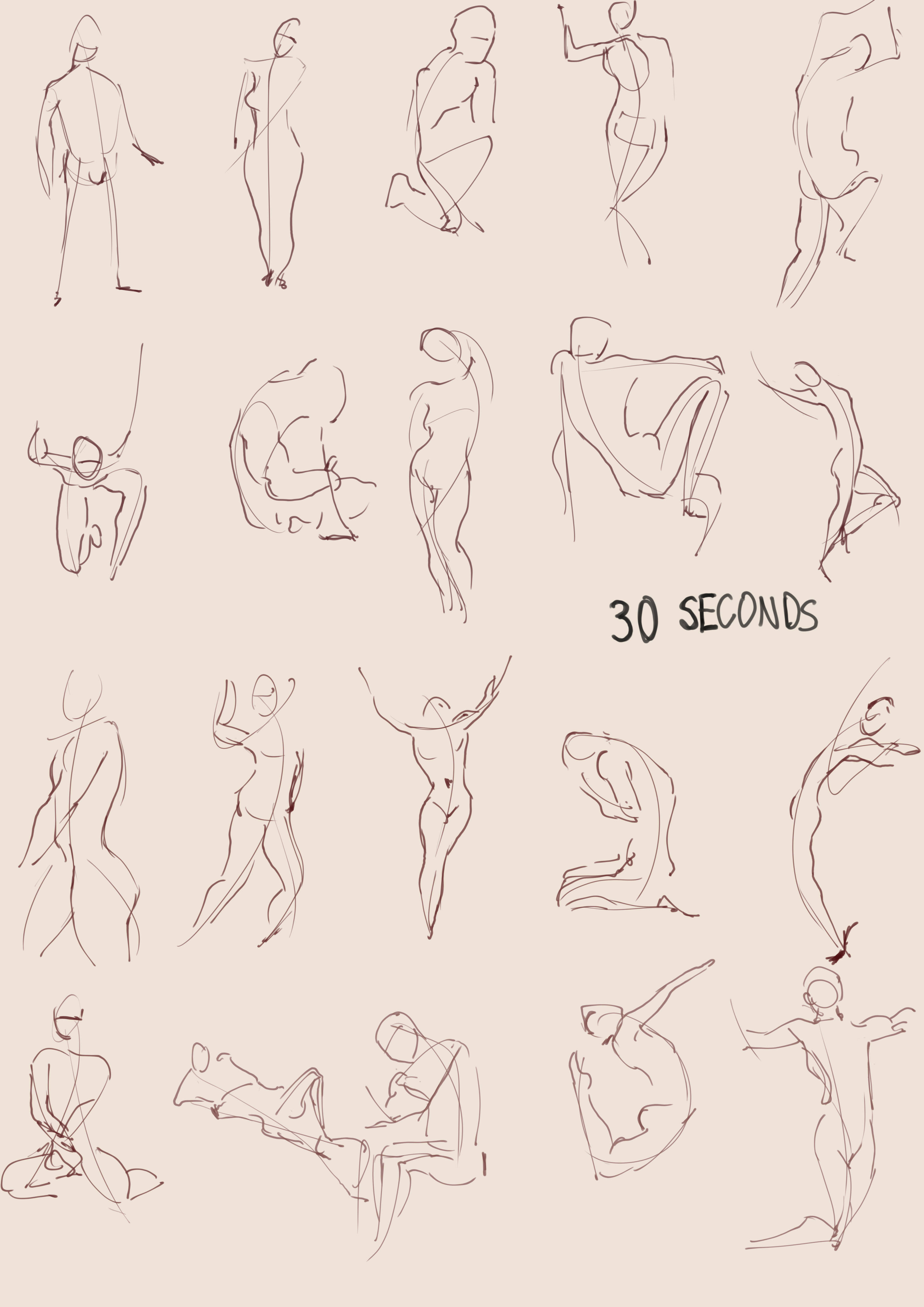
Today's 30 second gesture drawings before I go back to working on my webcomic!
I typically draw my gestures in my sketchbook with a coloured pencil and I know Marc said in the Nude figure drawing class that I should use whatever I'm most comfortable with for the gestures, but everyone else here seems to be doing them digitally and it is a digital art course... it's not like I can't do digital art either, so I took the challenge!
One thing is that I need to remember to draw feet lmao
Day 2 of gestures!
Today feels a lot worse than yesterday. My 1 minute poses even look worse than my 30 second ones from yesterday, but oh well :'D We all have our bad da
 ys.
ys.
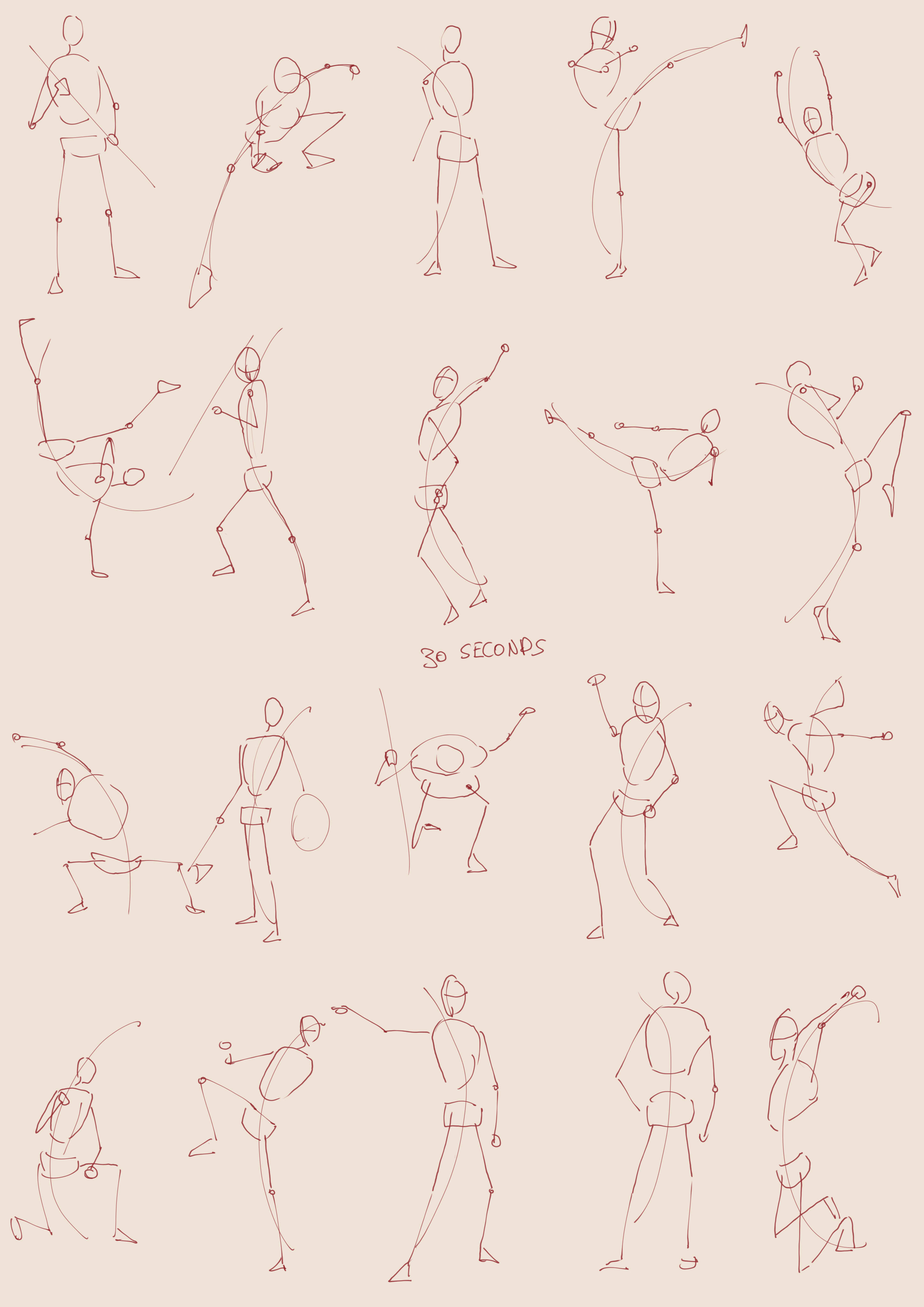
Day 3 of digital gestures!
Although I've been doing gestures on and off for a couple years now, what Marc said about how the poses need to feel grounded has really helped a lot! I try to put feet in on every pose now, although sometimes in the images, the feet aren't visible. so then I don't. I've also been trying to focus a lot more on the pose itself before building up the form, which creates much less complete looking drawings, but I think there's a lot more to be learned this way.
Unfortunately I'm still busy with commitments to other art projects, so I can't get through assignments very quickly, but I figured that just doing 30 mins of gestures every day can't hurt!
Anyways, here are my gestures! I'm more happy with them than yesterday and I also made a photo set, so that I can track my progress on the specific photos, which is exciting!

Here's my gestures for day 4!
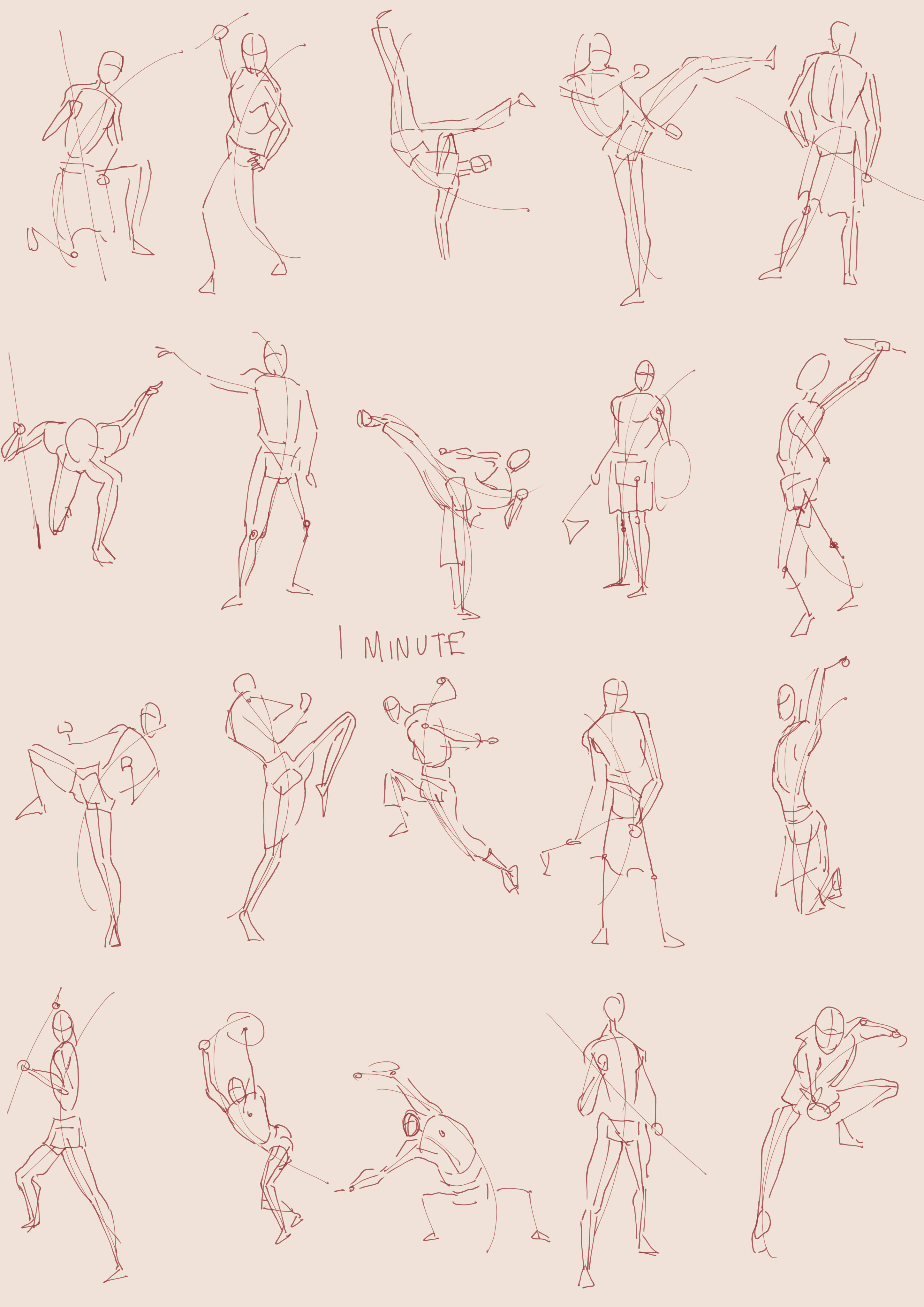
Today I took the advice of @Shellac-Belly to add markers where the elbows and knees are. I think this made my poses a bit stiffer and it definitely took a lot more time away from things such as form, but it definitely did help me to be much more aware of where the joints actually are. I also decided that it would be helpful if I drew basic ribcage and pelvis markers. This helped me to understand where the legs attached a lot more than without.
The suggestions I've been getting have been really changed my view on what it is to make a gesture drawing. It's difficult, but I'm sure I'll learn a lot from it!


Day 5 of gestures!
I didn't get round to doing any yesterday, oops! I'm not too worried about that though. I think it's more important to do it as frequently as possible rather than being incredibly strict with a streak and then feeling like you've ruined everything if you miss a day.
Currently, what I have learnt with doing gestures in a lot more of a structured way than usual, is that it has been helping me to spot the line of action a lot more quickly and to begin to spot subtle bends in joints and such. I wonder if this is because I'm using the same photos over and over again, or if I truly am learning. Maybe I should mix it up and try some different photos to see if I can apply my skills elsehwhere. Idk
I think today I was a bit too stiff with everything. Hopefully I'll loosen up a bit tomorrow!


Also, as a bonus, here is a WIP of some Lucifer fanart that I'm making. I usually prefer much thicker lines, so this feels quite odd tbh. 
Good work on the line-art!
Using thin lines feels weird because thicker lines tend to hide mistakes. As students, we should aim for thin lines because they require confidence and more attention to detail to suggest volume. Keep at it, I promise that when the thing is finished, the sketch will look crude in comparison to the final line-art 
Thank you so much!!
I actually really like thick lineart because of the line weight variance that you can get. Since starting to make comics this year, I've been leaning a little bit more on thin lines. It's funny because I feel like you can get away with more having thin lines, since they're less noticeable when coloured. I dunno. Thinner lines are definitely making me more conscious about proportions though! In hindsight, I think using thicker lines made me make the features of my faces, such as eyes and noses a lot bigger than they really should be, because I simply couldn't achieve enough detail with the right sized features. Ahh I've been doing art for so long and yet I have so far to go. It's an exciting, albeit occasionally irritating journey haha.
Here's day 6 of gestures!
Today, for some reason, I think I fell back on some old habits. Like I kept forgetting to put markers in for joints or drawing the direction that the head is facing. In the first 30 second gesture, I even forgot the line of action!! Oh well, we all have our bad days. I'll make sure to try to fix these issues tomorrow 
Day 7 of gestures was a failure D:<
First, half way though my 30 second gestures, my drawing program decided to do this thing where it basically freezes until I reboot it. So, I restarted it and decided to start from scratch. Ok, take 2. Now, usually no-one messages me on my phone, so I don't put it on full silent, just a buzz. Well, someone I barely know started spamming me with messages. That sort of repetitive, intermittent buzzing really stresses me out. I guess it's like a sort of sensory overload. I paused the Quickposes timer thing and turned my phone onto silent. I continued with my gestures, although I was just feeling annoyed at that point. I did more gestures and then my stepdad starts calling me because he wants to play on my Nintendo Switch. That's fine, but like WORLD GIMME A BREAK I JUST WANNA PRACTICE MY ART!! Even worse was, I guess I forgot to press pause, so I lost my place with the poses.
Ehh, I guess the world is telling me to get on with comic work because I have deadlines coming up.
Anyway, here are my wonky 30 second gestures. They look so bad. I guess this just proves that you need a calm work environment to work well.

I totally understand what you are saying. And you already got it: when practicing, try to get a "disturbance-free environment" mas much as you can. This way you can progress with no one disturbing you and you will feel less annoyed or stressed, which will definitely have an impact on the pieces you are making.
What usually works for me is to practice in a time where everyone is sleeping (I wake up very early 😅)
In any case, keep up the amazing work!
Cheers,