• Gave myself 5 days to do something. This is what I managed to do. I'm trying to get better at illustrations, but I have patience to work on something for 3 days maximum :( Splash_Process.jpg5000x3140 2.21 MB Splash_Process-6.jpg3896x2429 2.83 MB concept list char copy.jpg5388x3000 1.7 MB
    20.6k
  • Did a character concept for a course.https://www.artstation.com/artwork/P6gm3y - more:) list1.jpg3541x1920 2.82 MB
    20.6k
  • Day 4: Star Wars May The 4th =] Queen Padmé Amidala in my art style! First time drawing her and I really enjoyed making this one! Used watercolours, ink pen, acrylic markers and gold paint for accents on my Canson mix media sketchbook. I hope you like it!
    81.5k
  • A creature design from a while back
    by
    6.6k
  • Here is some more recent stuff, I need to make more body studies
  • It's been a while and god, it is so cringe to go through all previous messages xDmy study.
    20.6k
  • Thank you! I finally cleaned that up. Meanwhile started 3 more ..I have a habit of taking too long to finish a piece, then I lose interest in it and just start something else. I found 8 from recently i started and abandoned, that are decent enough to not delete, but not finished. There’s also been a number of drawings I felt I “outgrew” - became better before I finished them, and it would be easier to start from scratch than fix them. Anyone else thinking that?
  • Lady Death Fanart Collectible: Part 6 Polypaint and base Hi, it’s time to share with you another part of the process to create this fanart piece. Polypaint As this is my first collectible fanart I didn’t have previous experience with polypaint so I tried my best and played a bit with it.I wanted to give a ghostly and eerie look to Lady Death, she is beautiful and deadly, but at the end of the day she is a woman that died and was reborn at hell as an avenging spirit, that’s why I gave her skin tone a bluish very cold tone.As you will see I gave myself some creative freedom to deviate from the traditional color scheme that this characater has in comics and illustrations.To add a bit of sensuality by painting some freckles on the face and the chest. The dark nature of this character was the perfect excuse to gave her a kind of goth make up, very dark shadows around the eyes, blue lips and fingernails. I know that the original character includes sexy red lips but I wanted this girl to have a sexy but at the same time creepy look, that’s why we can see some thin veins emanating from her eyes. The biggest chromatic change I did for this character is at the hair. Lady Death has a characteristic white weavy hair but in my fanart I decided to gave her a very saturated blue color.The reason behind this wasn’t only an aesthetic choice. I want that the face area strongly pulls the attention of the viewer so this area needed a stronger contrast. Another reason is that I want her to have a more modern look, as I mentioned before, I’m strongly attracted to women with goth/punk look. I gave myself half an hour or more to analyse the work of experienced sculptors that create collectibles and I discovered that the use of darker values on the skin is often applied to create a greater sense of volume and three-dimensionality. I found that areas with heavy ambient occlusion are the perfect places to paint with darker colors in order to increase the separation between different forms. Even though she has a bluish skin tone, I used a bit of warmer hues in areas that, in real life, tend to go towards red and pink, this is very obvious in the nose, cheeks, and knuckles. Thinking with a logical mind it’s completely absurd to have warmer tones on the body of a zombie like creature but I didn’t want to limit myself by using only blue tones, it looks boring and artificial. In real life these colors are created by blood vessels in areas where the skin is very thin. ** Scythe **for her weapon I applied a cool gray with some warmer variations, this color scheme is influenced by the work of H.R giger. Base I’d like to talk about the design for the base which, to be honest, I forgot to develop along with the character.My main idea with the base is to show that Lady Death inhabits a very sterile and arid land, at the end of the day she is at hell.You can see a that she walks over dirt and rocks, a sign that she’s surrounded by death and loneliness. As part of the landscape we can see some bones and skulls to reinforce the idea of lack of living creatures, yet we can see three hands that try to reach her legs.This hands represent that all creatures are subordinated to her power and seek an evil blessing with a simple touch of the princess of the damned.1- The hand with skin burns represents the souls of those who are newcomers to hell, tortured souls that suffer for the sins comitted on earth.2- The hand with greenish rotten skin and pustules is the reminder of the decay that has infected the souls of those who have been trapped and have forgotten their humanity3- Last but not least, the hand of a demon shows that even dark creatures and entities bow before her presence. The cherry on the top, at least in my vision, are the simese twins that emerge from the ground, this malevolent creatures remind us that in hell there’s only perversion and any trace of innocence is lost. Thanks for reading till this pointI’m really happy to be very close to finish this creative journey, last but not least it’s mandatory to talk about splitting the sculpture in several pieces to be printed, this will be my last entry before showing the final rendered images. See yaMay Zbrush be with you
    1.4k
  • memory 2min gartic phone, used ref 2m gartic, used ref for pose 2min gartic 2min gartic 2min gartic 2min gartic memory memory memory memory study memory memory memorymemory memory memory memory memory memory study memorystudy study stylized left memory, right study study memory memorymemory memory memory memorymemory memory, porportions r offmemory memorystudystudy memorymemorymemory memory memory memory memory memory memory memory, right leg is a bit broken The feeling of only getting 1 - 3 likes on a social media post will never not be discouraging. But nothing is discouraging enough to make me quit drawing. I think the strategy of drawing a lot of stuff and waiting a while to post is good though rather than posting it immediately and then feeling that sadness on the next set of drawing
  • Urban Dragon Girl Wip Urban Dragon Girl_wip1.jpg5000x5000 1.11 MB
  • Long time no see! New artworks produced lately
    6.5k
  • studies studies juri study imagination, how I feel before a speech imagination imagination study something I drew for my presentation also drew this for my presentation, didn't fix the one hand being bigger than the other imagination + study study studies study study, I need to fix the face a bit based on screenshot from anime but in my style study. except for the eye study studies studies study. changed some things tho imagination imagination imagination study studies, except top right samurai based on anime screenshot wolverine studies, changed some of the poses a lil, not very good at all, but first time i drew the character ever. semi study studies study imagination imagination imagination , for first time ever i tried to draw over 3d model for middle pose, I dont like the result tbh, but it makes it much easier than coming up with it from memory.imagination, except right figurestudies imagination + studies, coming up with action poses r hard, these are not dynamic enough, I will redraw better ones in future. imagination , imagination imagination study, except for eye imagination imagination imagination doodles except for the two chrollos imagination storyboard thumbnail, idk if i ever shared this. my storyboards end up being a little detailed since i usually just draw in one layer.
    by
    22.1k
  • Quick fun sketch. CyberFish.jpg2394x3857 674 KB
  • Neon Gambit This is a fan art of my all time favorite character Gambit from the X-Men.I made this a birthday gift (26.04.2024) to myself and honestly I really do like how it turned out in the end =] I hope you like it as well =]
    81.5k
  • Art Blog - April to September 2023 Suffer a little burn out. Look at some memes. Here's some art from in between. critique.jpg1333x5736 1.77 MB
    20.3k
  • And some more! Been painting over them a bit more this time. Some variants I tried for the old guy using mainly the liquify tool. Someohow looking a bit like Owen Wilson (not intended :D)
  • Cafe sketch/color study
  • Hello! My name is Vithor, I am from Brazil, studied Design at a local college worked as an illustrator for more than 10 years. I took a time off around 3 years ago and am trying to get back in my art shape and maybe become professional again. Here are some recent pictures: You can find timelapses for most of them on my instagram: www.instagram.com Vithor Albertim (@vithor_albertim) • Instagram photos and videos 123 Followers, 638 Following, 19 Posts - See Instagram photos and videos from Vithor Albertim (@vithor_albertim) Comments and critiques are always welcome.Cheers!
  • @patrycja.lerch Thank you I created another variant, which might capture the witch look I was going for better
  • Thank you @daceronine! If I remember I save in google cloud, I will have to stick a note to do it more often. Lamp is from life. Poses are from refs but I look at refs for a while and then try to do it myself and look it up if needed. Outfits and rest is from imagination Something went wrong while installing system so we will have to wipe everything again... pc works but something is wrong. We will wait till internet is done and I will save everything on cloud this time Threads came out in eu. It's been 3 days and I had more engagement than after half a year on instagram. It feels really nice I hope it stays this way A portrait of old dude. It's the same character I posted a while ago. Inspired by Bayard Wu work. At first I thought of him as a bear but I named him Fenrir and I think wolf suits him better. Eye gave me a bit of hard time but I think it is fine now. I focused on face and forgot about area below. The way I draw hair clashes with greying hair. I had the same problem while doing Lohse's white hair. Does it looks like it is greying here? I love how desaturated red looks blue there. I keep lying to myself that I will use different color scheme but It all comes down to this blue and yellowish one it is just flipped this time Have a great day!
  • Been bad about posting updates on the forum. I figure I should just throw down stuff. instead of waiting until I finish something.
    14.5k
  • Havent done much this year since I am focusing on learning programming and deving my own Indie Game . But here 's a New Year Piece 2024 , she 's the mascot for my Game Studio - Lucid Realm : Lucid Chan ! LucidChan_v001_sketches.jpg3072x4352 973 KB
  • IMG_0637.jpeg3240x4050 1.6 MB
  • Long Crested Eagle studyI had so much fun making this one and honestly I love that Eagle! It looks so cool! Used for this one high quality watercolours, high quality watercolour sketchbook/ cold press and it was 300 grams paper.I hope you like it!
    81.5k

Hey everyone! My names Brad! I'm 19 and am a newer artist, from Ontario, Canada.

Due to Covid and having all this extra time, I figured I'd try and do something productive. I'm currently not able to go to a Art College, so wanted to try the next best thing and sign up to a online art course.

I started drawing when I was about 12 and then moved to digital roughly 4 years ago. I've always wanted to be like these amazing artists you see creating beautiful illustrations, but I never had the skill, nor drive. It's always taken me a while to finish an art piece and I have been pretty inconsistent when it comes to staying on a schedule. I'm always getting discouraged because I don't have a "style" and I'm not producing nearly enough art like these other artists.

That's why I joined Art School! I'm hoping that the structured lessons and assignments are gonna help push me to stay consistent and help me improve way faster than if I were to do this alone. I'm super excited to get this started and can't wait to meet you guys! I'm going to be posting updates when I finish stuff so feel free to comment and critique!

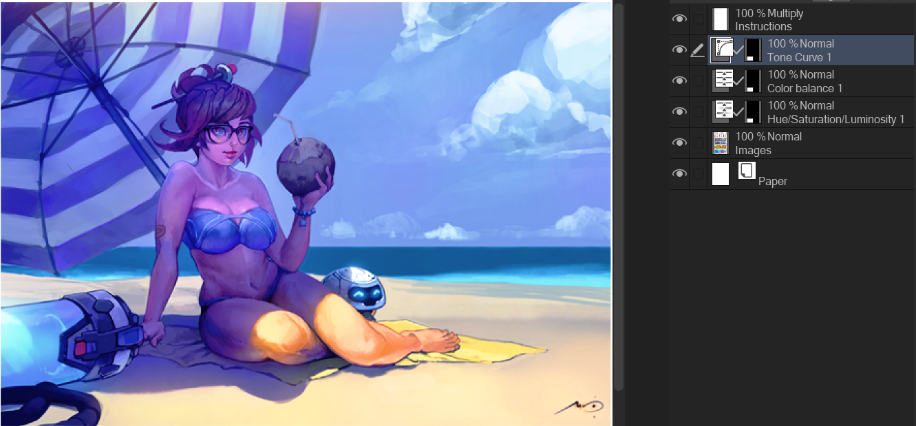
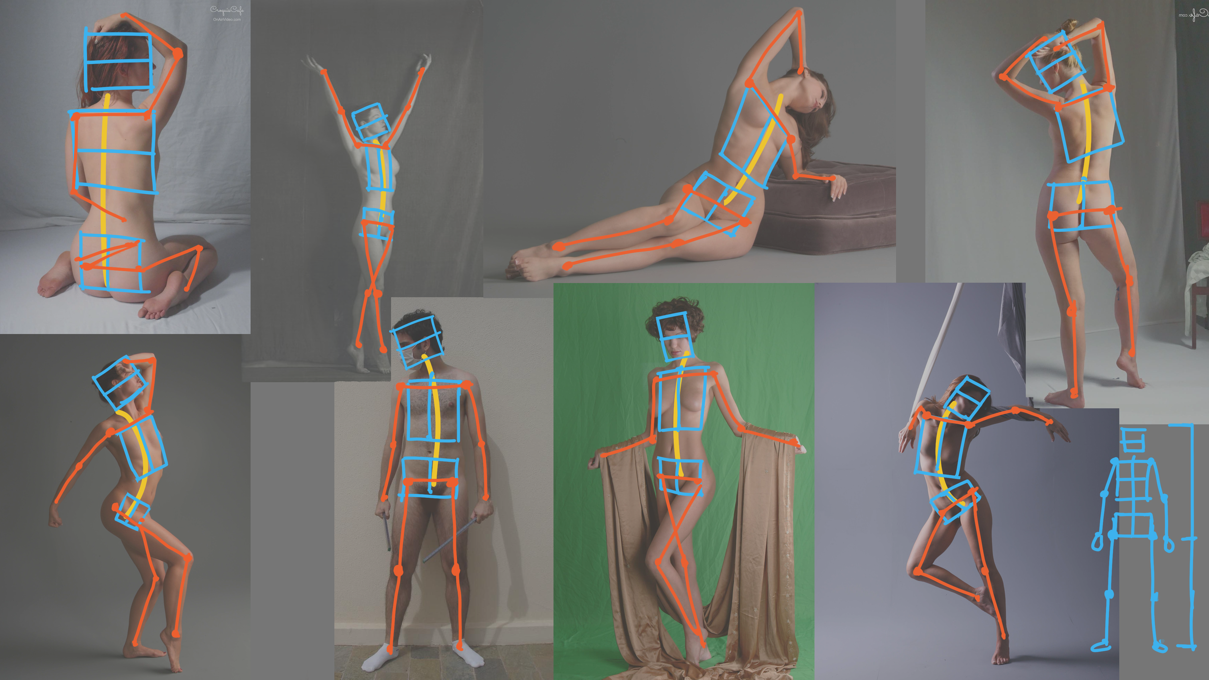
Here's the first few lessons I completed :smile:

Had a hard time with the very last one. Could never get the shadows to match and somehow I killed a lot of the shine, especially on her ice thing to the left.

Hey Brad, welcome to the club! I decided to pick up art school for similar reasons, hope it works out for you.

I've noticed that for the last image if you apply brightness/contrast/curves adjustments first then it tends to sort of dull the image which might be why you are losing some of that shine.


these two images have the exact same adjustments but the second one has the curves applied before the colour balance and hue adjustments and you can see how much it muddies the image. This may or may not be what happened with your image but it's something I noticed while spending hours on this assignment myself so I figured I'd share it.

Thanks for the reply @hyoi! I think that was my problem, no matter what I did, it always seemed to turn really muddy. Makes sense now since I did use the brightness/contrast/curves adjustments at the start. I'll definitely keep this in mind for future projects, thanks!

Also thought I'd share my next assignment! I had a lot of fun with this one. Never really done photo manipulation before, so was interesting to see what I could achieve. Didn't realize how powerful some of the healing brushes were. Literally took out an entire boat and added new waves, crazy! One thing I'd change next time is the perspective I think. I feel like I struggled a bit with it and the dock maybe doesn't fit correctly? Spent a lot of time on this one, but I'm pretty happy overall with how it came out.
(PS: This isn't my ideal home, just wanted to go for more of a old/rundown aesthetic lol)

Edit: I forgot to add the castle ruins to my reference list x.x

1 month later

Haven't been super active the last lil bit, been real busy around here haha. Just been doing anatomy studies and gesture stuff. I always have a super hard time with anatomy so just been taking my time I guess. Here's a couple little recent studies I've done. After Christmas I'm going to be really getting back into the course, just right now there's not a ton of time. I'm having a harder time with the cylinders, but I'm hoping that they turned out okay. if you see anything incorrect or off, critiques are always welcome!

(Covered anything explicit, so hope this is okay to share as it's part of the course)