Eey, my real name is private, but you may just refer to me as CYP2C19, or just CYP to make your life easier!.
I'm an extremely introvert person, who doesn't socialize a lot so my confidence is very low, which is why I'm forcing myself to make this "little" forum post, to push myself out of my comfort zone and just bite the bullet.
Also if I come off as hard to conversate with then I apologize, blame my introverted-ness on that, I'm not good at socializing at all but I'm trying 
I've had 0 Art experience in my life, but I've always enjoyed drawing, whether it'd just be a character from a show I've enjoyed, or a character from a video game, so I guess you could say I have SOME experience with drawing, but no experience with the fundamentals, that is until I started Marc's Art School a month or so ago.
Due to personal reasons, and life being so unpredictable, I haven't put in nearly as much effort or felt like drawing as much as I wish I did, but I'm hoping to change that. And I'm hoping we can give each other valuable feedback, and grow together as Artists!.
Now here's the fun stuff, there's going to be a MASSIVE dump of stuff I've done over a few months, from the very beginning to now. Some things I did before I started Marc's Art School, but mostly just study related material, with some copied drawings I did of other people's amazing art some time ago.
Starting off, The very beginning of my art journey, I had just received my Wacom 16 non pro version, and wanted to test it out one night while relaxing with friends in Discord.
I did some random little head practices, and an attempted drawing of Neon from Valorant
Now you can obviously see that I have 0 experience with the fundamentals, proportions are off, I don't know anatomy, I don't know how to construct a head, or just construct things in general, the Neon drawing was done by just "eyeing" everything, drawing it as a typical newbie would with no construction before-hand.
And also some quick little eyes, You're gonna see a few more eyes as time progresses, I love eyes too much.

Everything you'll see is in a non-particular order as I don't 100% remember the order of which I drew everything in, or when I drew it.
Here's some more random drawing dumps, most of them are "sketches", though I tend to get carried away and turn the sketch into more of a complete drawing. Remember that I didn't make the original Artwork, nor do I have sources of them, though I wish I did so I could give proper credit to the original Artists.

Drawings are of Akali and Irelia (League of Legends), And Viper and Killjoy (Valorant)
Also apologies for the Doctor handwriting, it runs in the family

And here's more random stuff, Some random line drawings, to get better pen control, a single cylinder cause I didn't have any structure to my drawings, some ellipses in the shape of an Atom (Ty telepurte for that exercise tip), and some very beginner perspective boxes.
There were also a fair few head drawings, at this point I hadn't started taking Marc's school, I was just watching his Youtube videos and going from there, problem was there was no structure to follow, so I didn't know what to practice or for how long to practice a set subject.
Ok I'm going to try to calm it down with the typing, It's getting overwhelming sorry..
Here's some more Perspective related studies, as well as some random Toilet paper cylinder attempts, and some sphere attempts using a strange type of "Hatching?". Also some
non-sensical boxes drawn in perspective, just as early attempts.

Ok, let's go to the early days of my ACTUAL Art School Journey, This is where the embarrassment starts.
Term 1, Very basic construction of the human figure, also in correct order of when it was drawn (roughly) This was my very first attempt at construction, traced over reference.
As you can see, Cylinders weren't very Cylindrical at all, the "ovals/ellipses" used to represent the ribs/torso/head were very iffy..

More very basic Construction


Top left drawing here was my first try at constructing from an imagined pose, it didn't go so well looking back now..

More Constructions, but something happened here that made the cylinders actually cylinder(ish)

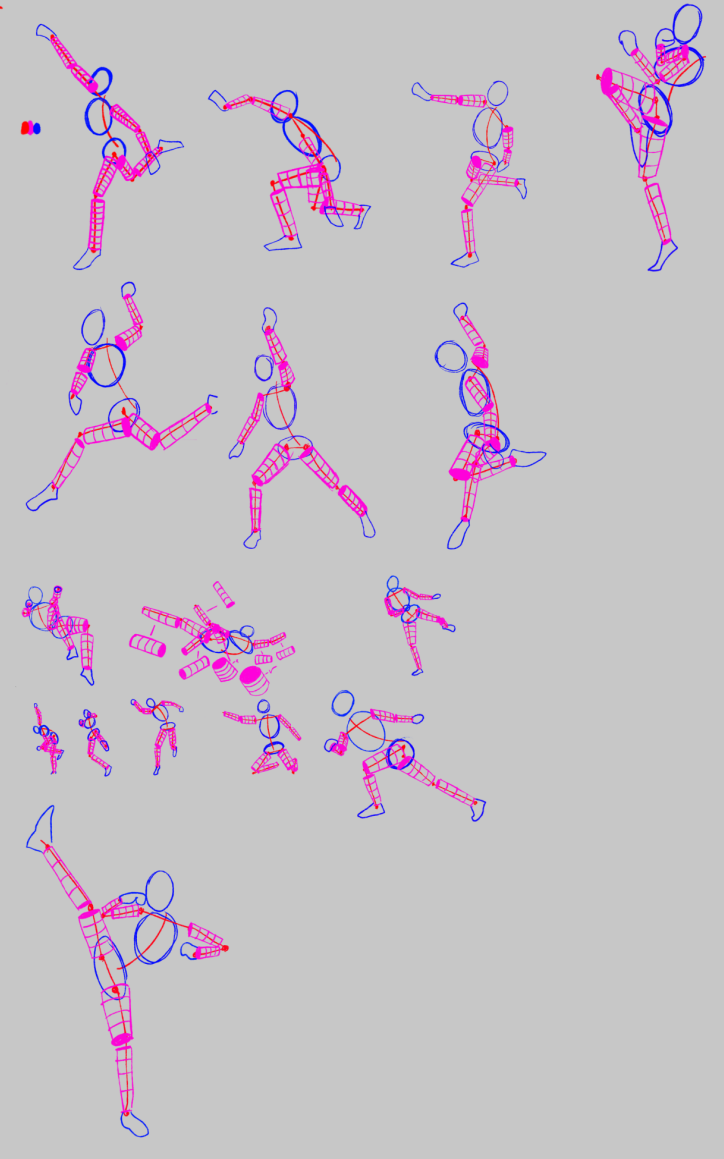
I then felt more confident and tried with Boxes in stead of Ovals to represent the ribs, hips and head, I'm still pretty new to boxes so most of them might look off, or be in the wrong perspective given the pose.


I then took a small break from construction cause I felt like I understood it fairly well, but I also didn't have a structure to my studies, so I got lost very often on what to do when.
Here were some random head attempts, the ones on the very left, using a more sketch like brush were drawn using my "old" way of finding the chin, which was drawing a line slightly tilted outwards from the nose line down towards the bottom of the sphere of my head constructions, I later on (on the right side) switched to drawing that line almost straight down and it gave me some slightly better heads, though this is still way out of my league.

Here's just a very small shape attempt dump, some arrows and a few boxes, with the 2D arrows showing my intended light direction, though I haven't started studying light.
Now I did some proportions while studying the basic construction, if I remember right I started with proportions before I started with boxes for the hips, ribs and head during construction.
This was my first attempt, followed by a picture of more attempts I did over some time, i also didn't use my brain and instead of simply drawing on separate layers and using only 1 grid, I decided to copy the grid over and over.. Go figure

Here's some Figure drawing exercises I did, now I started off by doing the figure drawing in a very dumb way, I started off by going straight into constructing the human figure, no measurements, no nothing. Just eyeballing it all, and in doing so I'm still to this day struggling with measuring when figure drawing, and I struggle with getting the proportions right, such as thickness on basically all body parts.
And very obviously you can see some drawings have limbs extend way too far to be considered "normal", that's what I get for not measuring, lesson learned now.


These were the last drawings I made in Paint tool SAI, all just copied, no tracing from other people's art. I should've mentioned if I didn't earlier that none of my drawings of characters from movies/games were traced, I wanted to test myself and I find it more fun to copy than tracing.
Most of these aren't finished, and I don't see myself going back and finishing any of them either as I'd be lost on where to continue, I'd rather start from scratch.


At this point I started taking Art School a bit more serious, this is also the last we'll see from SAI 2 before I moved over to PhotoShop
Random Cylinder attempts

Last Constructions in SAI2

And a few Pen Control Practices.

Over to Photoshop we go
Starting at Term 1, Photoshop for Digital Production, I decided to temporarily skip over the first few Assignments as I don't see myself using any of the tools featured there YET, However I will go back and do them soon just so I can say I've completed them.
There's small mistakes on them all, but this is as close as I got on my first attempt at adjusting the images.

Here's all the constructions I've done after moving over to PS. Don't worry, it's not as much as I wish.

I got lazy on these ones, don't remember why.

After this point I stopped tracing, and went over to just constructing from observing references.


And after this I started drawing some constructions in different poses from imagination, it was fun seeing the difference from early on in SAI2 to now, there's still loads of problems, I'm sure of it, so don't hesitate in leaving feedback.
Constructions with numbers next to them were from imagination.

Just a quick Proportion drawing to make sure I remembered it.

Perspective 1.
I'm still not good at perspective at all, but here's some random cubes and shapes I did just to get started. Any feedback on what to work on is greatly appreciated.


Here's some 3Point Perspective attempts, with some 2 points and 1 points mixed in too, just for funsies.

Here's my 1st try at the 1Point room Assignment, I say 1st try cause I wasn't satisfied with this attempt at all, I didn't have a plan going into it, nor did I like my execution of what's there, which isn't a lot cause I didn't have a theme or plan going.

My 2nd attempt went way better imo, but it's still lacking, I went for a sort of space station/workshop/industrial feel.. must be comfy sleeping here..

From my uneducated eye, my main complaints is that there's no small details, so it feels very empty, there's no texture on any surface so it looks very plain and the "pipes" look very flat, especially the ones under the floor/iron bar thingie, I don't know what it's called.
For my 2 point perspective I'm not satisfied either, same problem as my 1st try at the 1 point room, I didn't have a plan, I just went with it so I lost motivation very fast. I'll remember that for next time, cause I will revisit this just to make sure I got a fair grasp at 2 point.

From another uneducated eye, it's very flat.. Everything is very flat, the details around the windows, the surrounding buildings are very empty cause I lost motivation to keep working on this, I'll do better later on when I do a retake on this.
The assignment on finding the vanishing point from different street view photos were slightly boring as I did my 1 and 2 point assignments before tackling that, however I will still post my attempts at it, and if you may, please correct me on any mistakes I made, and show me how to do it right 
Also sorry for the bad quality, google wasn't willing to give me good res photos.

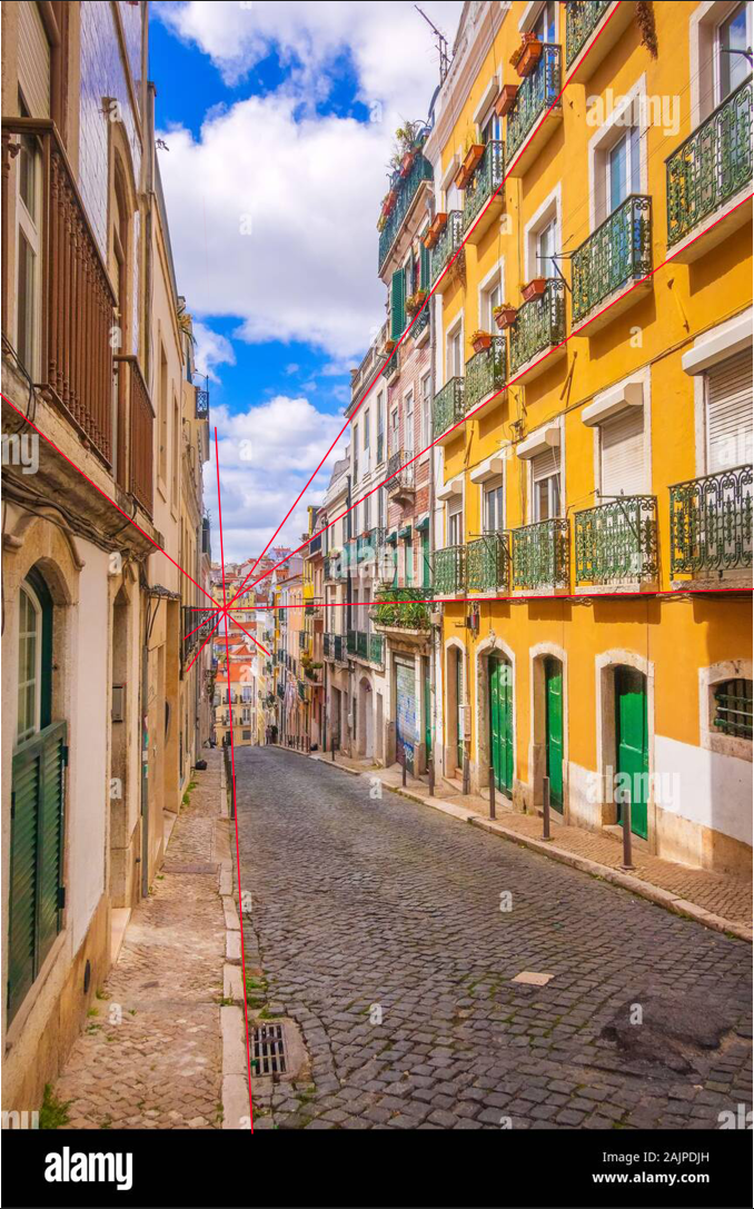
This one was kind of interesting, cause using the windows or the roof on the building on the right side gave me a completely different vanishing point from the one I went with, or no points at all. I'm guessing that's cause the building isn't 100% straight, so it gives us off-angles and messes up our Vanishing Point, Correct me if I'm wrong again, and please show how to do it correctly.


Now this one was actually kind of fun, But I'm pretty sure this is far from correct, I got tired of google's bad quality photos so I went into google street view and took screenshots from there.
I used the roof's "ridges?" to try and find the vanishing point cause I couldn't think of any other way of doing it, please show a better way of doing it if you can.

On this picture I only used the building on the right, so this one is 99% wrong.

Then I got a 2 point perspective one, Don't know if it's correct, but hopefully it is.

And the last little "find the vanishing point" assignment I did.

On to Gesture Drawing, maan this is some tuff stuff.
I'm still too slow for 30 seconds, so I'm sticking with 45 seconds until it gets easy enough, I haven't done any 1 minute ones yet but I'm thinking of starting tomorrow. Also it's very hard to see unfortunately, I'm a bit too gentle with the lines on this, also some of the proportions are a fair bit off, I'm working on improving it but it's not that easy, it'll come with time though.. right? xp.
As usual any feedback is appreciated!.


Again sorry for the poor visibility, I need to increase pressure a bit so you can see anything.
Over to some Figure drawings, some actually measured ones this time.
I'm still really struggling with this though, I struggle with measuring the head and counting how many heads tall a person is, and I struggle a liittle bit with placing the joints in their correct position. But most of all I struggle with drawing the correct thickness of their limbs, I mean I struggle A LOT, so any tips here is probably most appreciated.

This was my 1st try, it took forever to reach a fairly close drawing, with lots of back and forwarding my drawing over the reference to look for errors, then correcting them, then rinse and repeat.

There's still tons of errors that are easily spotted by even an untrained eye like mine, but this is nowhere near as bad as if I try drawing without going back and forward.
Here I even tried a different way of "measuring" her height, just by drawing straight lines from one part to another, then using a pencil I measure the distance of her joints from the lines I drew over the reference and try to place them accordingly on my end. I still end up with minute errors with the joints, but mostly it's with the thickness of body parts.
Example below.


There's really no need to point out the mistakes, they're so blaringly obvious it hurts, this is my 13th try so I'm not really getting anywhere, I'm just repeating the same old all the time, so any help here would be a life savior thank you. ♥
I also decided to stick my toes in the water in Term 2, I still haven't gone to the depths of Photoshop, as most of the tools used there are for image manipulation, which isn't what I'm interested in, I'll still go back at one point and do them just so I can get a simple grasp of what they're capable of, I did however go through every tool as shown in Term 2's Photoshop class, but I didn't save anything to show off, I will say, the drop shadow on any brush is very cool.
Then I decided to try shading/color blending, just the very basics of it. I haven't gone too far just yet as I feel like I'm very lacking in some Term 1 fundamentals still, Such as figure drawing, Gesture drawing and perspective.
Anyways here's my tries at shading/color blending and a quick little chain brush.

Nr. 1, and 2's color blending are fair results that I'm pleased with, However blending more and more colors turned out to be way harder than what I thought, gotta give it another try sometime soon.
Some more testing around.

Yes that was it.. an abrupt ending.. Finally, my fingers can rest from typing for like, 3-4 hours straight, taking screenshots from the beginning of my journey to the point I'm at now, I have a lot to learn, and hopefully a lot of friends to make. And hopefully a lot of advice and tips to gain from others with more experience. If you read through this entire thing, then you're crazy, but I love you regardless.
As I've said throughout this mess, any feedback is really appreciated, it's taking a lot of gut for me to post all of my old, and current progress as I'm extremely shy, and not social at all, nor do I like putting myself out there, but it's infinitely better to just jump into it and get it over with. Thank you, much love♥.


