Thank you! I finally cleaned that up. Meanwhile started 3 more ..I have a habit of taking too long to finish a piece, then I lose interest in it and just start something else. I found 8 from recently i started and abandoned, that are decent enough to not delete, but not finished. There’s also been a number of drawings I felt I “outgrew” - became better before I finished them, and it would be easier to start from scratch than fix them. Anyone else thinking that?in24.2k
 Lady Death Fanart Collectible: Part 6 Polypaint and base Hi, it’s time to share with you another part of the process to create this fanart piece. Polypaint As this is my first collectible fanart I didn’t have previous experience with polypaint so I tried my best and played a bit with it.I wanted to give a ghostly and eerie look to Lady Death, she is beautiful and deadly, but at the end of the day she is a woman that died and was reborn at hell as an avenging spirit, that’s why I gave her skin tone a bluish very cold tone.As you will see I gave myself some creative freedom to deviate from the traditional color scheme that this characater has in comics and illustrations.To add a bit of sensuality by painting some freckles on the face and the chest. The dark nature of this character was the perfect excuse to gave her a kind of goth make up, very dark shadows around the eyes, blue lips and fingernails. I know that the original character includes sexy red lips but I wanted this girl to have a sexy but at the same time creepy look, that’s why we can see some thin veins emanating from her eyes. The biggest chromatic change I did for this character is at the hair. Lady Death has a characteristic white weavy hair but in my fanart I decided to gave her a very saturated blue color.The reason behind this wasn’t only an aesthetic choice. I want that the face area strongly pulls the attention of the viewer so this area needed a stronger contrast. Another reason is that I want her to have a more modern look, as I mentioned before, I’m strongly attracted to women with goth/punk look. I gave myself half an hour or more to analyse the work of experienced sculptors that create collectibles and I discovered that the use of darker values on the skin is often applied to create a greater sense of volume and three-dimensionality. I found that areas with heavy ambient occlusion are the perfect places to paint with darker colors in order to increase the separation between different forms. Even though she has a bluish skin tone, I used a bit of warmer hues in areas that, in real life, tend to go towards red and pink, this is very obvious in the nose, cheeks, and knuckles. Thinking with a logical mind it’s completely absurd to have warmer tones on the body of a zombie like creature but I didn’t want to limit myself by using only blue tones, it looks boring and artificial. In real life these colors are created by blood vessels in areas where the skin is very thin. ** Scythe **for her weapon I applied a cool gray with some warmer variations, this color scheme is influenced by the work of H.R giger. Base I’d like to talk about the design for the base which, to be honest, I forgot to develop along with the character.My main idea with the base is to show that Lady Death inhabits a very sterile and arid land, at the end of the day she is at hell.You can see a that she walks over dirt and rocks, a sign that she’s surrounded by death and loneliness. As part of the landscape we can see some bones and skulls to reinforce the idea of lack of living creatures, yet we can see three hands that try to reach her legs.This hands represent that all creatures are subordinated to her power and seek an evil blessing with a simple touch of the princess of the damned.1- The hand with skin burns represents the souls of those who are newcomers to hell, tortured souls that suffer for the sins comitted on earth.2- The hand with greenish rotten skin and pustules is the reminder of the decay that has infected the souls of those who have been trapped and have forgotten their humanity3- Last but not least, the hand of a demon shows that even dark creatures and entities bow before her presence. The cherry on the top, at least in my vision, are the simese twins that emerge from the ground, this malevolent creatures remind us that in hell there’s only perversion and any trace of innocence is lost. Thanks for reading till this pointI’m really happy to be very close to finish this creative journey, last but not least it’s mandatory to talk about splitting the sculpture in several pieces to be printed, this will be my last entry before showing the final rendered images. See yaMay Zbrush be with youin1.4k

 memory 2min gartic phone, used ref 2m gartic, used ref for pose 2min gartic 2min gartic 2min gartic 2min gartic memory memory memory memory study memory memory memorymemory memory memory memory memory memory study memorystudy study stylized left memory, right study study memory memorymemory memory memory memorymemory memory, porportions r offmemory memorystudystudy memorymemorymemory memory memory memory memory memory memory memory, right leg is a bit broken The feeling of only getting 1 - 3 likes on a social media post will never not be discouraging. But nothing is discouraging enough to make me quit drawing. I think the strategy of drawing a lot of stuff and waiting a while to post is good though rather than posting it immediately and then feeling that sadness on the next set of drawingin

 studies studies juri study imagination, how I feel before a speech imagination imagination study something I drew for my presentation also drew this for my presentation, didn't fix the one hand being bigger than the other imagination + study study studies study study, I need to fix the face a bit based on screenshot from anime but in my style study. except for the eye study studies studies study. changed some things tho imagination imagination imagination study studies, except top right samurai based on anime screenshot wolverine studies, changed some of the poses a lil, not very good at all, but first time i drew the character ever. semi study studies study imagination imagination imagination , for first time ever i tried to draw over 3d model for middle pose, I dont like the result tbh, but it makes it much easier than coming up with it from memory.imagination, except right figurestudies imagination + studies, coming up with action poses r hard, these are not dynamic enough, I will redraw better ones in future. imagination , imagination imagination study, except for eye imagination imagination imagination doodles except for the two chrollos imagination storyboard thumbnail, idk if i ever shared this. my storyboards end up being a little detailed since i usually just draw in one layer.in22.1k

 Hello! My name is Vithor, I am from Brazil, studied Design at a local college worked as an illustrator for more than 10 years. I took a time off around 3 years ago and am trying to get back in my art shape and maybe become professional again. Here are some recent pictures: You can find timelapses for most of them on my instagram: www.instagram.com Vithor Albertim (@vithor_albertim) • Instagram photos and videos 123 Followers, 638 Following, 19 Posts - See Instagram photos and videos from Vithor Albertim (@vithor_albertim) Comments and critiques are always welcome.Cheers!in792

 Thank you @daceronine! If I remember I save in google cloud, I will have to stick a note to do it more often. Lamp is from life. Poses are from refs but I look at refs for a while and then try to do it myself and look it up if needed. Outfits and rest is from imagination Something went wrong while installing system so we will have to wipe everything again... pc works but something is wrong. We will wait till internet is done and I will save everything on cloud this time Threads came out in eu. It's been 3 days and I had more engagement than after half a year on instagram. It feels really nice I hope it stays this way A portrait of old dude. It's the same character I posted a while ago. Inspired by Bayard Wu work. At first I thought of him as a bear but I named him Fenrir and I think wolf suits him better. Eye gave me a bit of hard time but I think it is fine now. I focused on face and forgot about area below. The way I draw hair clashes with greying hair. I had the same problem while doing Lohse's white hair. Does it looks like it is greying here? I love how desaturated red looks blue there. I keep lying to myself that I will use different color scheme but It all comes down to this blue and yellowish one it is just flipped this time Have a great day!in48.0k
Well I think I do that too and I don't think it's really a bad thing unless you have something very specific in mind.
As for this last piece, I think it's coming along very well. I like the more muted colors you're using. It feels a bit different than your other work, but it works very well. Keep it up!
ah, thanks, @cedricgo!
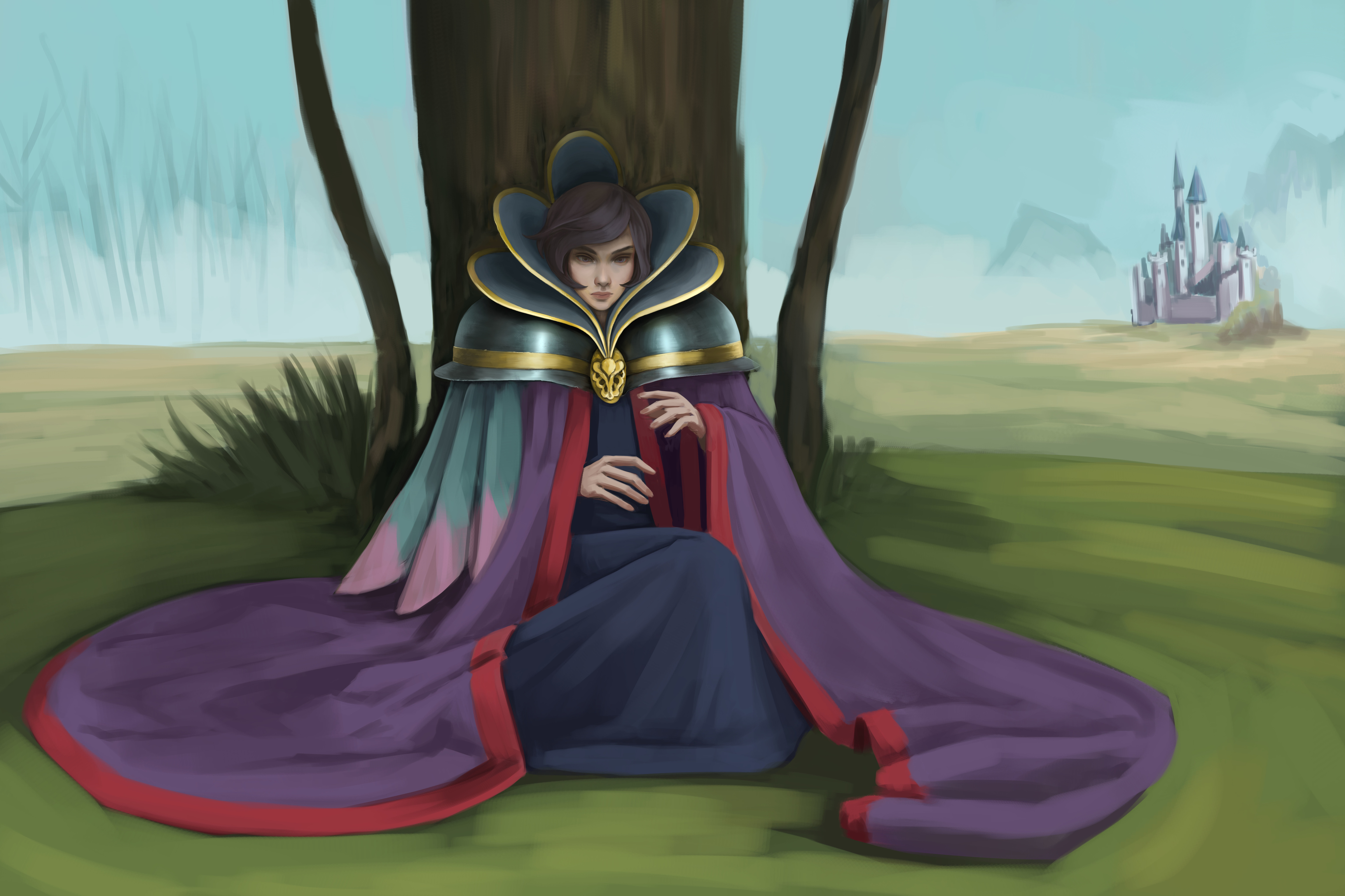
another update on this piece, it slowly moves towards the end. I am very confused by metals, I know super new and polished ones will reflect light etc..
i need to google for some master paintings that have metals in it.. for some reason i have a hard time understanding it 
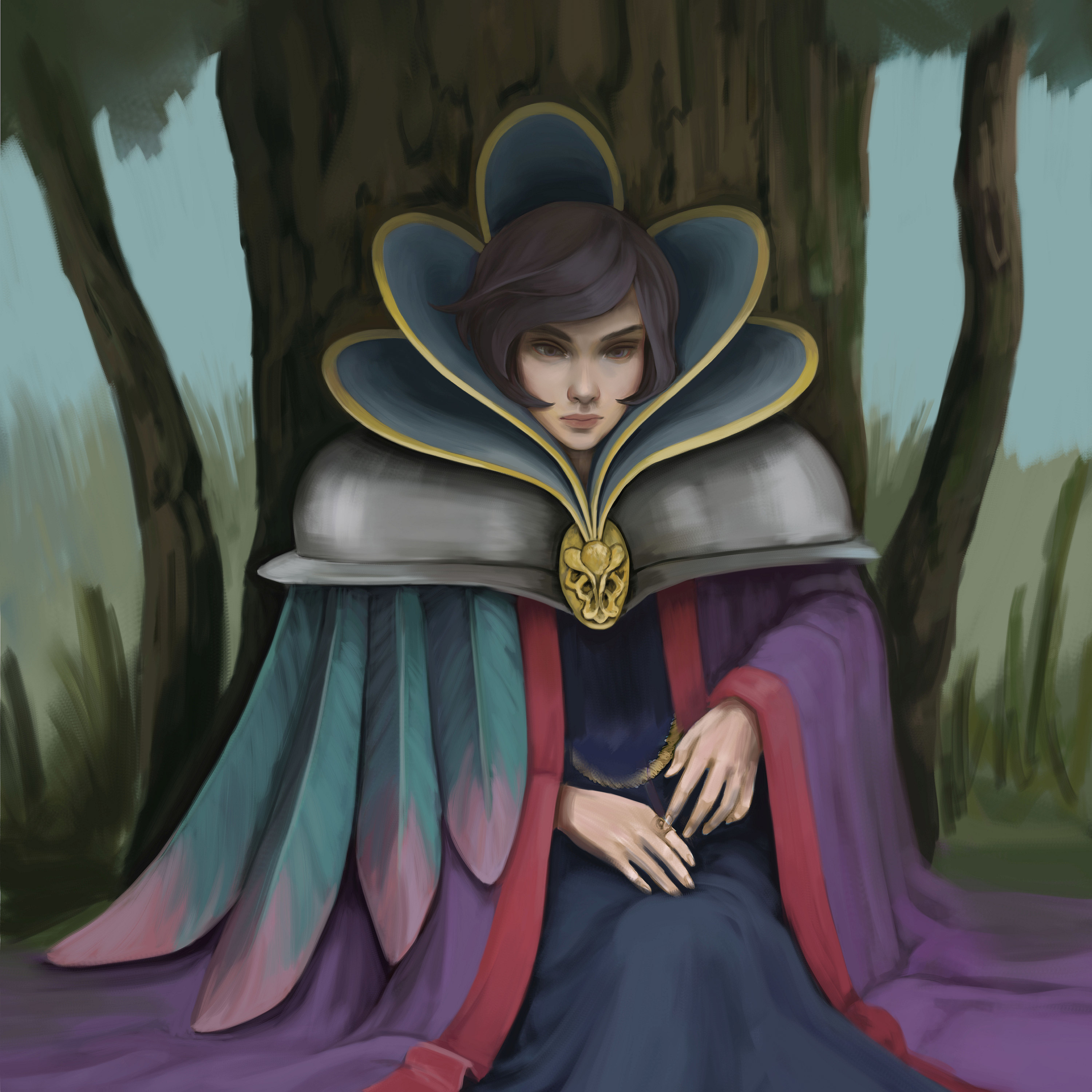
I did some studies about metals... i think this looks somewhat more metal-like haha :>
rn im seeing that the trees are pretty flat... and im thinking to add tiny details like some ring on her fingers and maybe some low hanging necklace...will see ;>
This is really progressing nicely
I agree with malcom, it's coming along very well. I love the hands!
Seems like it will be a nice challenge for you with all the different types of materials present in this. I feel like it's one of those piece that once you're done, you'll have leveled up as an artist, or at least you will have learned a lot.

I am not entirely sure what causes the style switch in my head. Perhaps the amount of time i am willing to spend on the piece. Maybe the mood? Maybe the fact that i've always been doing more cartoony things and with previous piece I was trying to explore a bit more classical paintings with a hint of stylezation?
If you ever had the same experience, please share your story. If you have any advices - i would happily receive them.
I dont think i will finish previous piece any time soon as im going away for a few days. Im planning to take a sketchbook with me and if i will have a chance i will draw things and stuff 

I think I understand the realism vs cartoony "trouble" (it is not really a problem) but I grew up loving Joe Mad art (still do) and I find his influence in many artist like L D Austin and many others. They all have a very heavy mixture of realism and stylization that makes that kind of art so appealing to me, so the "problem", I think, is where to push forms and where to keep it more close to reallity. Idk if this is of any help, but I want to share that thougths.
ye, thanks for sharing :>
i think it is just a question of finding the perfect balance between both 
For me, the style that I use for a piece depends on what I'm drawing. A comic page is going to be a lot simpler than a character illustration which will be simpler than a still life painting. Over the years I've just developed a slightly way of working for each.
Also, your blog is awesome. I really like that last piece, the lighting is really great
This week im attending one course of 3ds max basic stuff. I never did 3d in my life so this is indeed a very interesting experience
My head hurts from thinking differently haha 
little progress on this one 
It is really fascinating to see how fast you learn ^^ great work !
@toutydroid thanks!
and i think this is final result so far from this course. I might do something else in 3ds max if i have some time ;D
That is so cute =] I love it!
haha thank you so much!
Not a problem =]
I finally upgraded my pc a little bit. Got new graphics card with more memory and more ram. Now my workflow goes smoother when i work on large canvases and overall my pc work better now.
I am able to go back to this piece now and hopefully finish it.
I've changed my composition and size of this canvas.
I keep changing some things as initially I didn't plan this painting to be so huge and I didnt have any idea in my head for it that is why it takes so long.
I think in the future I will try to come up with a short plan of what I gonna draw and spend more time on composition first as it much easier to tweak all the little things at the sketch stage. So this is gonna be my last piece that I go into with no plan.