• Gave myself 5 days to do something. This is what I managed to do. I'm trying to get better at illustrations, but I have patience to work on something for 3 days maximum :( Splash_Process.jpg5000x3140 2.21 MB Splash_Process-6.jpg3896x2429 2.83 MB concept list char copy.jpg5388x3000 1.7 MB
    20.5k
  • Did a character concept for a course.https://www.artstation.com/artwork/P6gm3y - more:) list1.jpg3541x1920 2.82 MB
    20.5k
  • Day 4: Star Wars May The 4th =] Queen Padmé Amidala in my art style! First time drawing her and I really enjoyed making this one! Used watercolours, ink pen, acrylic markers and gold paint for accents on my Canson mix media sketchbook. I hope you like it!
    81.3k
  • A creature design from a while back
    by
    6.6k
  • Here is some more recent stuff, I need to make more body studies
  • It's been a while and god, it is so cringe to go through all previous messages xDmy study.
    20.5k
  • Thank you! I finally cleaned that up. Meanwhile started 3 more ..I have a habit of taking too long to finish a piece, then I lose interest in it and just start something else. I found 8 from recently i started and abandoned, that are decent enough to not delete, but not finished. There’s also been a number of drawings I felt I “outgrew” - became better before I finished them, and it would be easier to start from scratch than fix them. Anyone else thinking that?
  • Lady Death Fanart Collectible: Part 6 Polypaint and base Hi, it’s time to share with you another part of the process to create this fanart piece. Polypaint As this is my first collectible fanart I didn’t have previous experience with polypaint so I tried my best and played a bit with it.I wanted to give a ghostly and eerie look to Lady Death, she is beautiful and deadly, but at the end of the day she is a woman that died and was reborn at hell as an avenging spirit, that’s why I gave her skin tone a bluish very cold tone.As you will see I gave myself some creative freedom to deviate from the traditional color scheme that this characater has in comics and illustrations.To add a bit of sensuality by painting some freckles on the face and the chest. The dark nature of this character was the perfect excuse to gave her a kind of goth make up, very dark shadows around the eyes, blue lips and fingernails. I know that the original character includes sexy red lips but I wanted this girl to have a sexy but at the same time creepy look, that’s why we can see some thin veins emanating from her eyes. The biggest chromatic change I did for this character is at the hair. Lady Death has a characteristic white weavy hair but in my fanart I decided to gave her a very saturated blue color.The reason behind this wasn’t only an aesthetic choice. I want that the face area strongly pulls the attention of the viewer so this area needed a stronger contrast. Another reason is that I want her to have a more modern look, as I mentioned before, I’m strongly attracted to women with goth/punk look. I gave myself half an hour or more to analyse the work of experienced sculptors that create collectibles and I discovered that the use of darker values on the skin is often applied to create a greater sense of volume and three-dimensionality. I found that areas with heavy ambient occlusion are the perfect places to paint with darker colors in order to increase the separation between different forms. Even though she has a bluish skin tone, I used a bit of warmer hues in areas that, in real life, tend to go towards red and pink, this is very obvious in the nose, cheeks, and knuckles. Thinking with a logical mind it’s completely absurd to have warmer tones on the body of a zombie like creature but I didn’t want to limit myself by using only blue tones, it looks boring and artificial. In real life these colors are created by blood vessels in areas where the skin is very thin. ** Scythe **for her weapon I applied a cool gray with some warmer variations, this color scheme is influenced by the work of H.R giger. Base I’d like to talk about the design for the base which, to be honest, I forgot to develop along with the character.My main idea with the base is to show that Lady Death inhabits a very sterile and arid land, at the end of the day she is at hell.You can see a that she walks over dirt and rocks, a sign that she’s surrounded by death and loneliness. As part of the landscape we can see some bones and skulls to reinforce the idea of lack of living creatures, yet we can see three hands that try to reach her legs.This hands represent that all creatures are subordinated to her power and seek an evil blessing with a simple touch of the princess of the damned.1- The hand with skin burns represents the souls of those who are newcomers to hell, tortured souls that suffer for the sins comitted on earth.2- The hand with greenish rotten skin and pustules is the reminder of the decay that has infected the souls of those who have been trapped and have forgotten their humanity3- Last but not least, the hand of a demon shows that even dark creatures and entities bow before her presence. The cherry on the top, at least in my vision, are the simese twins that emerge from the ground, this malevolent creatures remind us that in hell there’s only perversion and any trace of innocence is lost. Thanks for reading till this pointI’m really happy to be very close to finish this creative journey, last but not least it’s mandatory to talk about splitting the sculpture in several pieces to be printed, this will be my last entry before showing the final rendered images. See yaMay Zbrush be with you
    1.4k
  • memory 2min gartic phone, used ref 2m gartic, used ref for pose 2min gartic 2min gartic 2min gartic 2min gartic memory memory memory memory study memory memory memorymemory memory memory memory memory memory study memorystudy study stylized left memory, right study study memory memorymemory memory memory memorymemory memory, porportions r offmemory memorystudystudy memorymemorymemory memory memory memory memory memory memory memory, right leg is a bit broken The feeling of only getting 1 - 3 likes on a social media post will never not be discouraging. But nothing is discouraging enough to make me quit drawing. I think the strategy of drawing a lot of stuff and waiting a while to post is good though rather than posting it immediately and then feeling that sadness on the next set of drawing
  • Urban Dragon Girl Wip Urban Dragon Girl_wip1.jpg5000x5000 1.11 MB
  • Long time no see! New artworks produced lately
    6.5k
  • studies studies juri study imagination, how I feel before a speech imagination imagination study something I drew for my presentation also drew this for my presentation, didn't fix the one hand being bigger than the other imagination + study study studies study study, I need to fix the face a bit based on screenshot from anime but in my style study. except for the eye study studies studies study. changed some things tho imagination imagination imagination study studies, except top right samurai based on anime screenshot wolverine studies, changed some of the poses a lil, not very good at all, but first time i drew the character ever. semi study studies study imagination imagination imagination , for first time ever i tried to draw over 3d model for middle pose, I dont like the result tbh, but it makes it much easier than coming up with it from memory.imagination, except right figurestudies imagination + studies, coming up with action poses r hard, these are not dynamic enough, I will redraw better ones in future. imagination , imagination imagination study, except for eye imagination imagination imagination doodles except for the two chrollos imagination storyboard thumbnail, idk if i ever shared this. my storyboards end up being a little detailed since i usually just draw in one layer.
    by
    22.0k
  • Quick fun sketch. CyberFish.jpg2394x3857 674 KB
  • Neon Gambit This is a fan art of my all time favorite character Gambit from the X-Men.I made this a birthday gift (26.04.2024) to myself and honestly I really do like how it turned out in the end =] I hope you like it as well =]
    81.3k
  • Art Blog - April to September 2023 Suffer a little burn out. Look at some memes. Here's some art from in between. critique.jpg1333x5736 1.77 MB
    20.2k
  • And some more! Been painting over them a bit more this time. Some variants I tried for the old guy using mainly the liquify tool. Someohow looking a bit like Owen Wilson (not intended :D)
  • Cafe sketch/color study
  • Hello! My name is Vithor, I am from Brazil, studied Design at a local college worked as an illustrator for more than 10 years. I took a time off around 3 years ago and am trying to get back in my art shape and maybe become professional again. Here are some recent pictures: You can find timelapses for most of them on my instagram: www.instagram.com Vithor Albertim (@vithor_albertim) • Instagram photos and videos 123 Followers, 638 Following, 19 Posts - See Instagram photos and videos from Vithor Albertim (@vithor_albertim) Comments and critiques are always welcome.Cheers!
  • @patrycja.lerch Thank you I created another variant, which might capture the witch look I was going for better
  • Thank you @daceronine! If I remember I save in google cloud, I will have to stick a note to do it more often. Lamp is from life. Poses are from refs but I look at refs for a while and then try to do it myself and look it up if needed. Outfits and rest is from imagination Something went wrong while installing system so we will have to wipe everything again... pc works but something is wrong. We will wait till internet is done and I will save everything on cloud this time Threads came out in eu. It's been 3 days and I had more engagement than after half a year on instagram. It feels really nice I hope it stays this way A portrait of old dude. It's the same character I posted a while ago. Inspired by Bayard Wu work. At first I thought of him as a bear but I named him Fenrir and I think wolf suits him better. Eye gave me a bit of hard time but I think it is fine now. I focused on face and forgot about area below. The way I draw hair clashes with greying hair. I had the same problem while doing Lohse's white hair. Does it looks like it is greying here? I love how desaturated red looks blue there. I keep lying to myself that I will use different color scheme but It all comes down to this blue and yellowish one it is just flipped this time Have a great day!
  • Been bad about posting updates on the forum. I figure I should just throw down stuff. instead of waiting until I finish something.
    14.5k
  • Havent done much this year since I am focusing on learning programming and deving my own Indie Game . But here 's a New Year Piece 2024 , she 's the mascot for my Game Studio - Lucid Realm : Lucid Chan ! LucidChan_v001_sketches.jpg3072x4352 973 KB
  • IMG_0637.jpeg3240x4050 1.6 MB
  • Long Crested Eagle studyI had so much fun making this one and honestly I love that Eagle! It looks so cool! Used for this one high quality watercolours, high quality watercolour sketchbook/ cold press and it was 300 grams paper.I hope you like it!
    81.3k

Hello! I've been trying to improve my character design skills, and I was hoping to get some feedback on this piece. The idea is that she's a strawberries and whipped cream clown, so I wanted her to look whimsical and cute. It's still a WIP, so I'd appreciate any feedback on pushing the piece further, and especially if the idea is coming across too!

Hi @agoodman13242

First of all, great effort. Way to push it. Bravo. And thank you for posting.

it helps us immensely that you have posted your intention as well as your art.

Sure lets see what we can do.

First off just a note. You have a bit of skewed vertical proportions here. Lets flip it and see if you can see what I see.

All I did here was transform the image vertically until I liked it. Now one could argue that this was design choice but I will get back to that in a moment and show you how it relates to your design decisions.

Secondly I like to compare what the written prompt communicates to me, the art director, versus what the image communicates. and what shape language tools you have at your disposal.

You say that ,

.
But what I see with the items, character, body language and proportions is elegant and royal. The poise of a dancer is very prominent especially with that toe. The costume is ornate, there's a large gold fork, which is most relatable to me as a scepter or her weapon. Her hand gesture looks like it says, "Here is my hand to kiss the royal ring..." . With all that said, I see this character as a princess in candy land and not a cute and whimsical whipped cream and strawberry clown.

The argument could be made that this clown has a french mime influence, or is a clown with Victorian era dress, and therefore negates all those previous notions. But I must remind you to consider your audience of the modern era and their 6 second attention span. You have exactly 6 seconds to tell me that she is whimsical and cute.

Did you know that Steve - O from Jack Ass went to clown school? The art of the clown has a long and rich history, and involves exaggerated acting and sometimes a professional dancers skill in acrobatics, juggling and yoga like techniques.

The show 'Baskets' on A&E has a fantastic portrayal by Zach Galifinakis. 'Chip' is a character who desires to be a classical sad french clown so bad it blinds him to the fact that he's a brilliant clown in real life without any effort. His name, "Chip Basket" is literally what people used to collect cow dung with in the old west. And if it was intentional, wow, even his real name is a great clown name compared to his made up french clown fantasy.

These are just facts that I know about clowns as an adult viewing regular media, and listening to podcasts. I'm your modern average audience with that 6 second attention span. Now imagine how your character looks to someone who has trained as a clown, or is related to someone who is a clown for a living. How about to someone who asked you for a cute and whimsical clown in an art prompt? Did they get that from you?


Anyhow that's enough of the subjective critique and we shall move onto the objective critique and how you could push it further, as you requested.


Lets internalize now the overall shape language communicated from your piece. And perhaps see some design adjustments in order to enforce your prompt.

In the mere moments that you have to digest a character you are pejoratively informed by their shape language.

Every inch of your draft must be constructed and contribute to your goal. Which is a specific portrayal you have already planned. Once you have my attention, then its up to the details to relate to the story of the character.


updated.


So I drew a basic mannequin armature over your character:

It helps to find the figure in space just doing simple shapes. I stopped here because It seems maybe pose was a little forced. The arms, hands and forearms felt a little flat in perspective and the muscle grouping felt a little lost. It really helps to know that stuff because even in characters which are thinner the contour of a drawing can inform the perspective of the human body. For example:

I even tried to put my hands in in the characters right hand position and it might be impossible. Knowing the limits of the human body helps in its representation too.


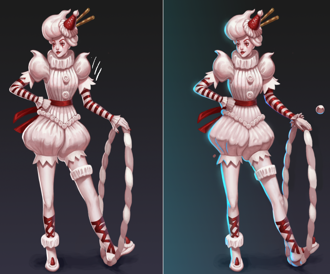
Moving on to the character costume, honestly I think its the best part. I really enjoy it. But I wanted the strawberry pushed more. Examples in paint over below. A little knee and calve anatomy thrown in too.

The red balls help to the ode of a clown...maybe.


Overall your best post. And good design. Lots of thought and work put in. Keep it up. Once you think its finished. Sleep on it and then spend two more hours on it or untill you think your done again. Rinse and repeat and you will start to learn what finished is for yourself, and what paying jobs ask for.

Laters

Wow thanks @brohawx! Super helpful critique, I spent a good chunk of the past week trying to fix the stuff you mentioned in your first post, and then the rest of it over this past weekend. I definitely wanted her to read more "clown-y" and more "candy" so I changed a few things in the design so that it hopefully better reflects that. I also really didn't want to get rid of the fork, but I agree that it felt a little too regal!

I also liked the pose in the first draft, but as I was noodling on it some more I decided I'd like to do a series of circus/candy-themed characters, so I thought a subtler pose might work better in a lineup.

Again, thanks so much for the crit and for the paintovers! I am much happier with the way she looks now, and I think your suggestions and observations definitely helped push it to the next level. If you have any other thoughts on this new draft I'd love to hear them! Thanks again dude!

:exclamation: :heart_eyes_cat: :exclamation: :clap: :clap: :clap:

Wowy wow wow, excellent job, excellent follow up. She looks jaunty, fun, cute and ready to pop around with that hoop and do a trick! It is looking great, AND looks like you found the road back to your intention you set upon.

As rendering goes it is probably finished for a zoomed out line up shot resolution and any critique would be more of a tip for rendering. And rendering after all is an entire stylistic choice. I'll update with a couple tips in the coming days.

Okay first the disclaimer. Like I've said in many other critiques any paint overs I present here are not how your piece is supposed to look, the changes made here are to reflect certain artistic concepts to push your understanding.

Not everyone follows up with a response, let alone a new submission to the same thread.

So lets get Started. And seriously, this is nitpicking. But interestingly there is a fine line between what clients will pay for and what experienced draftsmen spot right away. Most of the time though it's the small things that will pay the bills.

Tangents : In screen grabs 1 and 2 the strawberry toe and cuff are almost touching other objects which are not related to them on the z axis (depth) and when tangents occur you lose the illusion of depth in any drawing or painting designed to represent a 3D object.

In screen grab one it also seems like the fist is floating and not resting on the hip. And In screen grab 2 it also feels like the contrast on the shoe is too high against the sock and the hoop.

Anatomy: In screen grab 3 the main problem I have here is that the cuff looks slapped on and flat, and maybe hiding the perspective of the hand and the forearm anatomy.

People look at faces and hands, then back to faces, then back to hands. It's how we communicate as primates. Make sure your anatomy communicates well.

It is bones that make everything seem solid and real. From someone studying anatomy and going to life drawing this looks squishy like it has no bones.

In screen grab 4 the hamstring of her left leg is a little convex, and the quadriceps is concave, if not merely flat, it should be reverse for the pushing and pulling muscles of the leg's muscle groups,

Rendering:
I noticed that you had a rim light coming in from the left hand side. I will suggest making it a different color than your main light source so that it doesn't confuse the viewer's idea about form.

There are lots of places where you nailed it. I even see that you are using a limited pallet and making sure not be be over complicated. But the concept of overlapping elements and forms is very subtle and easily controlled by your limited pallet. But I know how it is after so many hours on a piece. And maybe even the complication of putting a new tool in your control.

Just remember the elements of shadow on form:

Paint the Shape. Shadow Blocking. High lights. Reflected light. Occlusions.

Refine and refine and refine the edges forever.

In the example below I show how one can spend time studying the areas of anatomy and also applying the above list to painting forms.

Always remember that a core shadow is going to inform where the light direction is coming from and the texture, form and shape of the object you are painting.

And I just threw on a gradient to represent the blue light source. Just to show the source of the blue light. But it will add atmosphere.

Now I only spent as much time as I could and focused most of my energy on the places that I mentioned so that I could relate the ideas of form and anatomy that I wanted you to see. I didn't want to finish your piece for you but let you see where you might be able to take it. If you have any other questions please post them and I can try to answer them to the best of my ability.

Here is a more up close version so you can see the hand detail changes, the cuff, the poofy shorts rendering etc. The little floating ball is all the colors that I used to render. Shape flat, shadow shape, highlight, reflected light, rim light. render render render edges.