


Update 
I tweak the pose a bit and i notice that flygon arms were super short XD , i just did a rough paint on the drawing so give me some advice with this part since im not good with colors  will put like sandstorm effects once i've done everything like how flygon would pop out of the sandstorm he created and use his moves

 Thank you! I finally cleaned that up. Meanwhile started 3 more ..I have a habit of taking too long to finish a piece, then I lose interest in it and just start something else. I found 8 from recently i started and abandoned, that are decent enough to not delete, but not finished. There’s also been a number of drawings I felt I “outgrew” - became better before I finished them, and it would be easier to start from scratch than fix them. Anyone else thinking that?in24.3k
 Lady Death Fanart Collectible: Part 6 Polypaint and base Hi, it’s time to share with you another part of the process to create this fanart piece. Polypaint As this is my first collectible fanart I didn’t have previous experience with polypaint so I tried my best and played a bit with it.I wanted to give a ghostly and eerie look to Lady Death, she is beautiful and deadly, but at the end of the day she is a woman that died and was reborn at hell as an avenging spirit, that’s why I gave her skin tone a bluish very cold tone.As you will see I gave myself some creative freedom to deviate from the traditional color scheme that this characater has in comics and illustrations.To add a bit of sensuality by painting some freckles on the face and the chest. The dark nature of this character was the perfect excuse to gave her a kind of goth make up, very dark shadows around the eyes, blue lips and fingernails. I know that the original character includes sexy red lips but I wanted this girl to have a sexy but at the same time creepy look, that’s why we can see some thin veins emanating from her eyes. The biggest chromatic change I did for this character is at the hair. Lady Death has a characteristic white weavy hair but in my fanart I decided to gave her a very saturated blue color.The reason behind this wasn’t only an aesthetic choice. I want that the face area strongly pulls the attention of the viewer so this area needed a stronger contrast. Another reason is that I want her to have a more modern look, as I mentioned before, I’m strongly attracted to women with goth/punk look. I gave myself half an hour or more to analyse the work of experienced sculptors that create collectibles and I discovered that the use of darker values on the skin is often applied to create a greater sense of volume and three-dimensionality. I found that areas with heavy ambient occlusion are the perfect places to paint with darker colors in order to increase the separation between different forms. Even though she has a bluish skin tone, I used a bit of warmer hues in areas that, in real life, tend to go towards red and pink, this is very obvious in the nose, cheeks, and knuckles. Thinking with a logical mind it’s completely absurd to have warmer tones on the body of a zombie like creature but I didn’t want to limit myself by using only blue tones, it looks boring and artificial. In real life these colors are created by blood vessels in areas where the skin is very thin. ** Scythe **for her weapon I applied a cool gray with some warmer variations, this color scheme is influenced by the work of H.R giger. Base I’d like to talk about the design for the base which, to be honest, I forgot to develop along with the character.My main idea with the base is to show that Lady Death inhabits a very sterile and arid land, at the end of the day she is at hell.You can see a that she walks over dirt and rocks, a sign that she’s surrounded by death and loneliness. As part of the landscape we can see some bones and skulls to reinforce the idea of lack of living creatures, yet we can see three hands that try to reach her legs.This hands represent that all creatures are subordinated to her power and seek an evil blessing with a simple touch of the princess of the damned.1- The hand with skin burns represents the souls of those who are newcomers to hell, tortured souls that suffer for the sins comitted on earth.2- The hand with greenish rotten skin and pustules is the reminder of the decay that has infected the souls of those who have been trapped and have forgotten their humanity3- Last but not least, the hand of a demon shows that even dark creatures and entities bow before her presence. The cherry on the top, at least in my vision, are the simese twins that emerge from the ground, this malevolent creatures remind us that in hell there’s only perversion and any trace of innocence is lost. Thanks for reading till this pointI’m really happy to be very close to finish this creative journey, last but not least it’s mandatory to talk about splitting the sculpture in several pieces to be printed, this will be my last entry before showing the final rendered images. See yaMay Zbrush be with youin1.4k

 memory 2min gartic phone, used ref 2m gartic, used ref for pose 2min gartic 2min gartic 2min gartic 2min gartic memory memory memory memory study memory memory memorymemory memory memory memory memory memory study memorystudy study stylized left memory, right study study memory memorymemory memory memory memorymemory memory, porportions r offmemory memorystudystudy memorymemorymemory memory memory memory memory memory memory memory, right leg is a bit broken The feeling of only getting 1 - 3 likes on a social media post will never not be discouraging. But nothing is discouraging enough to make me quit drawing. I think the strategy of drawing a lot of stuff and waiting a while to post is good though rather than posting it immediately and then feeling that sadness on the next set of drawingin

 studies studies juri study imagination, how I feel before a speech imagination imagination study something I drew for my presentation also drew this for my presentation, didn't fix the one hand being bigger than the other imagination + study study studies study study, I need to fix the face a bit based on screenshot from anime but in my style study. except for the eye study studies studies study. changed some things tho imagination imagination imagination study studies, except top right samurai based on anime screenshot wolverine studies, changed some of the poses a lil, not very good at all, but first time i drew the character ever. semi study studies study imagination imagination imagination , for first time ever i tried to draw over 3d model for middle pose, I dont like the result tbh, but it makes it much easier than coming up with it from memory.imagination, except right figurestudies imagination + studies, coming up with action poses r hard, these are not dynamic enough, I will redraw better ones in future. imagination , imagination imagination study, except for eye imagination imagination imagination doodles except for the two chrollos imagination storyboard thumbnail, idk if i ever shared this. my storyboards end up being a little detailed since i usually just draw in one layer.in22.2k

 Hello! My name is Vithor, I am from Brazil, studied Design at a local college worked as an illustrator for more than 10 years. I took a time off around 3 years ago and am trying to get back in my art shape and maybe become professional again. Here are some recent pictures: You can find timelapses for most of them on my instagram: www.instagram.com Vithor Albertim (@vithor_albertim) • Instagram photos and videos 123 Followers, 638 Following, 19 Posts - See Instagram photos and videos from Vithor Albertim (@vithor_albertim) Comments and critiques are always welcome.Cheers!in797

 Thank you @daceronine! If I remember I save in google cloud, I will have to stick a note to do it more often. Lamp is from life. Poses are from refs but I look at refs for a while and then try to do it myself and look it up if needed. Outfits and rest is from imagination Something went wrong while installing system so we will have to wipe everything again... pc works but something is wrong. We will wait till internet is done and I will save everything on cloud this time Threads came out in eu. It's been 3 days and I had more engagement than after half a year on instagram. It feels really nice I hope it stays this way A portrait of old dude. It's the same character I posted a while ago. Inspired by Bayard Wu work. At first I thought of him as a bear but I named him Fenrir and I think wolf suits him better. Eye gave me a bit of hard time but I think it is fine now. I focused on face and forgot about area below. The way I draw hair clashes with greying hair. I had the same problem while doing Lohse's white hair. Does it looks like it is greying here? I love how desaturated red looks blue there. I keep lying to myself that I will use different color scheme but It all comes down to this blue and yellowish one it is just flipped this time Have a great day!in48.3k
Things depend on what kind of style your going for with the colors?
Do you want something painterly? Cel shaded? Something like a comic book where you can still see the lines or a semi realistic render?
These have somewhat different approaches but also kinda similar.
But some general things to keep in mind would be as follows.
1. Knowing your light source direction. Since this takes place outside, you can use a simple 3 point light setup.
Your Sun is coming from the top left.
Blue Sky light from above
Sandy light browns from the bottom right side
What you would do is apply these colors/lights to the parts of the forms that face each light.
(Hope that made sense)
I did a quick and very simple version of what I mean using basic shapes. 
When I say apply 1 light at a time, you can have separate layers per light as well. I like to use the overlay blend mode as well as soft light and hard light at times. You can play with others like lighten. Just use what looks cool.
You can use the basic shapes I laid out if you want.
Don't forget your shadow layer as well. Use a nice cool color like a purple, or some variation of a blue color and set that to multiply. Try using something that isn't to saturated. 
Something in this range.
Focus on the drawing first and get that looking good.
Then move on to your flats on anther layer
Shadows on multiply
Sky light, and Sun Light on overlay
Bounce light works nice on normal. Lightly press down with your pen.
Extra highlights layer and or rim light can be added after
The sand storm can come last probably
If your doing a Cel shaded look
Keep your line art and flats layer. What you'll want is a nice gradient for your colors
You'll keep your shadow layer and highlights layer as well.
Anyway I know this was super long. Sorry for that. Hope it helps though.
i guess i am still having trouble with the lighting part in the end and shadow... I changed its move to Dragon Breath instead of Dragon claw cause after watching the anime version of it, it's most use set is Dragon breath, and Dragon claw is more like glows on the nails >< also I notice i drew his arms too long so ya... I need help with the lighting part again I'm really not good at it when background is involved in the art..
It's really as Malcom said. Just take it slow and work each light source individually. I will say that seeing as it seems to be a very sunny scene, the shadow will probably fairly strong and defined. Actually, I think you should probably start with shadows like you did as I think it will help you show forms and it should make it easier to add the other light sources.
This was done very quickly, so it's likely not completely accurate, but it could look like something like this.
8 days later
I tried but it didn't work so I tried again but using Ambient occlusion which I was still not good at so this is what I got. Haven't completed him yet > < 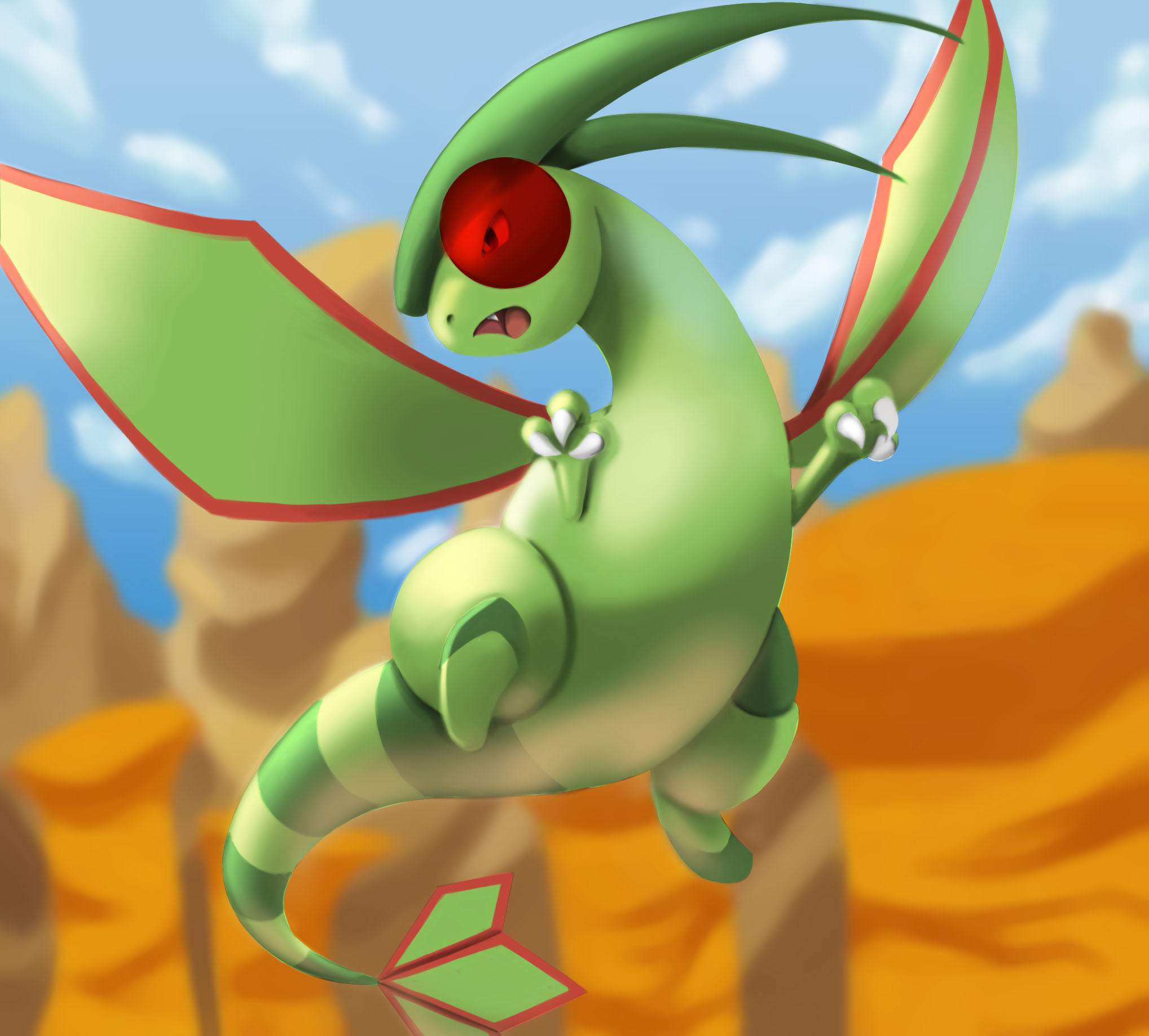
The bounce light should be a lot more subtle. With the top of the head really close to the top of the canvas, have it go through the canvas like I have. If not, you end up with this weird tangent. I think it'll be a lot easier to critique this without the colors and lighting. Just show off the AO and the line art only as well as the AO only so it'll be easier to see where you're making the mistake. You can do the same for the other parts of the character as long as things are on their own layers.
Also when it comes to the values of the background, you can make it a little darker to allow the character to pop more.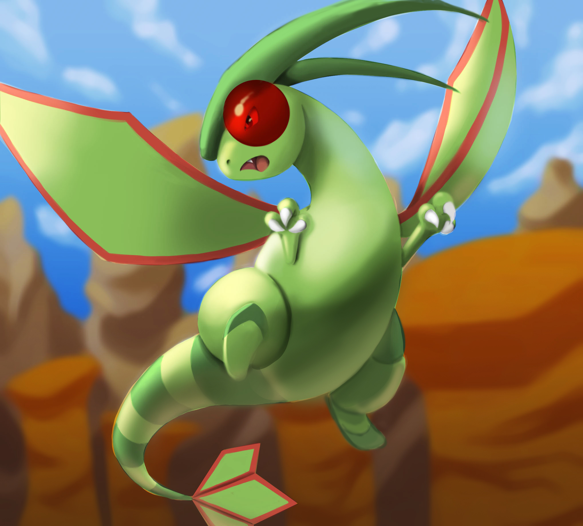
If anything, Marc has an old but still good tutorial on coloring.
here is the shadow and AO layer  , Sorry I really don't know what to say or do at this point


OK this makes things a bit easier. Lets tackle the AO. I didn't do the entire character but hopefully this gets the point across. 
Your goal in this step is to be able to see your drawing without the lineart being there. You should have a good idea of what the piece should look like with out the lines. After your finished, set that layer to multiply and add everything else in.
Now Shadows
Make your shadows darker the further away they are from your main light.
19 days later
Hi, Haven't been updating awhile cause was doing a commission for someone > < finally got the time to do this again  . I am still a bit confuse with the AO thing so I removed the BG first and tested it out again so this time I removed the Grey gradient and followed Marc's AO Gradient layer. Don't know if I did it right or no but here's the result of it before touch up
I think this looks a lot better. Just keep practicing.
21 days later
Hi, took me a long time to finish this cause I been in a situation where I self doubted my skills. So ended up prioritizing on practices and forgot about the things I've drawn half way. This is how much I can do with the drawing. I'm quite weak in background art and Effects. Would like some advice on those . This is basically my finalize of Flygon. 
Suggested Topics
| Topic | Category | Replies | Views | Activity |
|---|---|---|---|---|
| Dishonored fan-fiction character | WIPs | 0 | 1.5k | Jul '17 |
| Glends 3D WIP | WIPs | 1 | 1.1k | Oct '16 |
| Dark Elf – RPG character | WIPs | 2 | 2.3k | Sep '21 |
| Animated Marmoset scene WIP | WIPs | 0 | 544 | Mar '23 |
| Fantasy Serpent Environment Painting | WIPs | 0 | 2.0k | Sep '17 |