• Gave myself 5 days to do something. This is what I managed to do. I'm trying to get better at illustrations, but I have patience to work on something for 3 days maximum :( Splash_Process.jpg5000x3140 2.21 MB Splash_Process-6.jpg3896x2429 2.83 MB concept list char copy.jpg5388x3000 1.7 MB
    20.4k
  • Did a character concept for a course.https://www.artstation.com/artwork/P6gm3y - more:) list1.jpg3541x1920 2.82 MB
    20.4k
  • Day 4: Star Wars May The 4th =] Queen Padmé Amidala in my art style! First time drawing her and I really enjoyed making this one! Used watercolours, ink pen, acrylic markers and gold paint for accents on my Canson mix media sketchbook. I hope you like it!
    80.7k
  • A creature design from a while back
    by
    6.5k
  • Here is some more recent stuff, I need to make more body studies
  • It's been a while and god, it is so cringe to go through all previous messages xDmy study.
    20.4k
  • Thank you! I finally cleaned that up. Meanwhile started 3 more ..I have a habit of taking too long to finish a piece, then I lose interest in it and just start something else. I found 8 from recently i started and abandoned, that are decent enough to not delete, but not finished. There’s also been a number of drawings I felt I “outgrew” - became better before I finished them, and it would be easier to start from scratch than fix them. Anyone else thinking that?
  • Lady Death Fanart Collectible: Part 6 Polypaint and base Hi, it’s time to share with you another part of the process to create this fanart piece. Polypaint As this is my first collectible fanart I didn’t have previous experience with polypaint so I tried my best and played a bit with it.I wanted to give a ghostly and eerie look to Lady Death, she is beautiful and deadly, but at the end of the day she is a woman that died and was reborn at hell as an avenging spirit, that’s why I gave her skin tone a bluish very cold tone.As you will see I gave myself some creative freedom to deviate from the traditional color scheme that this characater has in comics and illustrations.To add a bit of sensuality by painting some freckles on the face and the chest. The dark nature of this character was the perfect excuse to gave her a kind of goth make up, very dark shadows around the eyes, blue lips and fingernails. I know that the original character includes sexy red lips but I wanted this girl to have a sexy but at the same time creepy look, that’s why we can see some thin veins emanating from her eyes. The biggest chromatic change I did for this character is at the hair. Lady Death has a characteristic white weavy hair but in my fanart I decided to gave her a very saturated blue color.The reason behind this wasn’t only an aesthetic choice. I want that the face area strongly pulls the attention of the viewer so this area needed a stronger contrast. Another reason is that I want her to have a more modern look, as I mentioned before, I’m strongly attracted to women with goth/punk look. I gave myself half an hour or more to analyse the work of experienced sculptors that create collectibles and I discovered that the use of darker values on the skin is often applied to create a greater sense of volume and three-dimensionality. I found that areas with heavy ambient occlusion are the perfect places to paint with darker colors in order to increase the separation between different forms. Even though she has a bluish skin tone, I used a bit of warmer hues in areas that, in real life, tend to go towards red and pink, this is very obvious in the nose, cheeks, and knuckles. Thinking with a logical mind it’s completely absurd to have warmer tones on the body of a zombie like creature but I didn’t want to limit myself by using only blue tones, it looks boring and artificial. In real life these colors are created by blood vessels in areas where the skin is very thin. ** Scythe **for her weapon I applied a cool gray with some warmer variations, this color scheme is influenced by the work of H.R giger. Base I’d like to talk about the design for the base which, to be honest, I forgot to develop along with the character.My main idea with the base is to show that Lady Death inhabits a very sterile and arid land, at the end of the day she is at hell.You can see a that she walks over dirt and rocks, a sign that she’s surrounded by death and loneliness. As part of the landscape we can see some bones and skulls to reinforce the idea of lack of living creatures, yet we can see three hands that try to reach her legs.This hands represent that all creatures are subordinated to her power and seek an evil blessing with a simple touch of the princess of the damned.1- The hand with skin burns represents the souls of those who are newcomers to hell, tortured souls that suffer for the sins comitted on earth.2- The hand with greenish rotten skin and pustules is the reminder of the decay that has infected the souls of those who have been trapped and have forgotten their humanity3- Last but not least, the hand of a demon shows that even dark creatures and entities bow before her presence. The cherry on the top, at least in my vision, are the simese twins that emerge from the ground, this malevolent creatures remind us that in hell there’s only perversion and any trace of innocence is lost. Thanks for reading till this pointI’m really happy to be very close to finish this creative journey, last but not least it’s mandatory to talk about splitting the sculpture in several pieces to be printed, this will be my last entry before showing the final rendered images. See yaMay Zbrush be with you
    1.4k
  • memory 2min gartic phone, used ref 2m gartic, used ref for pose 2min gartic 2min gartic 2min gartic 2min gartic memory memory memory memory study memory memory memorymemory memory memory memory memory memory study memorystudy study stylized left memory, right study study memory memorymemory memory memory memorymemory memory, porportions r offmemory memorystudystudy memorymemorymemory memory memory memory memory memory memory memory, right leg is a bit broken The feeling of only getting 1 - 3 likes on a social media post will never not be discouraging. But nothing is discouraging enough to make me quit drawing. I think the strategy of drawing a lot of stuff and waiting a while to post is good though rather than posting it immediately and then feeling that sadness on the next set of drawing
  • Urban Dragon Girl Wip Urban Dragon Girl_wip1.jpg5000x5000 1.11 MB
  • Long time no see! New artworks produced lately
    6.4k
  • studies studies juri study imagination, how I feel before a speech imagination imagination study something I drew for my presentation also drew this for my presentation, didn't fix the one hand being bigger than the other imagination + study study studies study study, I need to fix the face a bit based on screenshot from anime but in my style study. except for the eye study studies studies study. changed some things tho imagination imagination imagination study studies, except top right samurai based on anime screenshot wolverine studies, changed some of the poses a lil, not very good at all, but first time i drew the character ever. semi study studies study imagination imagination imagination , for first time ever i tried to draw over 3d model for middle pose, I dont like the result tbh, but it makes it much easier than coming up with it from memory.imagination, except right figurestudies imagination + studies, coming up with action poses r hard, these are not dynamic enough, I will redraw better ones in future. imagination , imagination imagination study, except for eye imagination imagination imagination doodles except for the two chrollos imagination storyboard thumbnail, idk if i ever shared this. my storyboards end up being a little detailed since i usually just draw in one layer.
    by
    21.8k
  • Quick fun sketch. CyberFish.jpg2394x3857 674 KB
  • Neon Gambit This is a fan art of my all time favorite character Gambit from the X-Men.I made this a birthday gift (26.04.2024) to myself and honestly I really do like how it turned out in the end =] I hope you like it as well =]
    80.7k
  • Art Blog - April to September 2023 Suffer a little burn out. Look at some memes. Here's some art from in between. critique.jpg1333x5736 1.77 MB
    20.1k
  • And some more! Been painting over them a bit more this time. Some variants I tried for the old guy using mainly the liquify tool. Someohow looking a bit like Owen Wilson (not intended :D)
  • Cafe sketch/color study
  • Hello! My name is Vithor, I am from Brazil, studied Design at a local college worked as an illustrator for more than 10 years. I took a time off around 3 years ago and am trying to get back in my art shape and maybe become professional again. Here are some recent pictures: You can find timelapses for most of them on my instagram: www.instagram.com Vithor Albertim (@vithor_albertim) • Instagram photos and videos 123 Followers, 638 Following, 19 Posts - See Instagram photos and videos from Vithor Albertim (@vithor_albertim) Comments and critiques are always welcome.Cheers!
  • @patrycja.lerch Thank you I created another variant, which might capture the witch look I was going for better
  • Thank you @daceronine! If I remember I save in google cloud, I will have to stick a note to do it more often. Lamp is from life. Poses are from refs but I look at refs for a while and then try to do it myself and look it up if needed. Outfits and rest is from imagination Something went wrong while installing system so we will have to wipe everything again... pc works but something is wrong. We will wait till internet is done and I will save everything on cloud this time Threads came out in eu. It's been 3 days and I had more engagement than after half a year on instagram. It feels really nice I hope it stays this way A portrait of old dude. It's the same character I posted a while ago. Inspired by Bayard Wu work. At first I thought of him as a bear but I named him Fenrir and I think wolf suits him better. Eye gave me a bit of hard time but I think it is fine now. I focused on face and forgot about area below. The way I draw hair clashes with greying hair. I had the same problem while doing Lohse's white hair. Does it looks like it is greying here? I love how desaturated red looks blue there. I keep lying to myself that I will use different color scheme but It all comes down to this blue and yellowish one it is just flipped this time Have a great day!
  • Been bad about posting updates on the forum. I figure I should just throw down stuff. instead of waiting until I finish something.
    14.4k
  • Havent done much this year since I am focusing on learning programming and deving my own Indie Game . But here 's a New Year Piece 2024 , she 's the mascot for my Game Studio - Lucid Realm : Lucid Chan ! LucidChan_v001_sketches.jpg3072x4352 973 KB
  • IMG_0637.jpeg3240x4050 1.6 MB
  • Long Crested Eagle studyI had so much fun making this one and honestly I love that Eagle! It looks so cool! Used for this one high quality watercolours, high quality watercolour sketchbook/ cold press and it was 300 grams paper.I hope you like it!
    80.7k

Hi. I've been drawing for some years, little bit on and off. Been through hectic times without economic security to really be able to dig into digital art :smile: But now I do, so have started out for full now. My main goal is to get my drawings to be able to tell a story. May start animating again after awhile too as I studied it for a year in Canada.

Second goal is to be able to live by it. I am a worker at heart, and can work for hours without end. But After 29 years I have noticed that the social jobs I usually end up getting does not fit an highly introverted person like me x)

Here's my journey:

It first started back in December 2018 so thought I'll share the first half year progress:

After that year I had to move back home, but spent some time just drawing anatomy over and over again between sending job applications:

(These)

Don't ask how many times I've drawn them :smile: I have no idea.

But no, onto the Journey: Have done the tasks from term 1, except Perspective. Focused a lot on Gesture drawings:

Image adjustments, was not able to get the last picture correct. Any tips :wink: I either had too much red or broken colors.

I went to the next class after awhile of failing hehe. So for 13 days I've been doing gestures. Here's a quick overview.

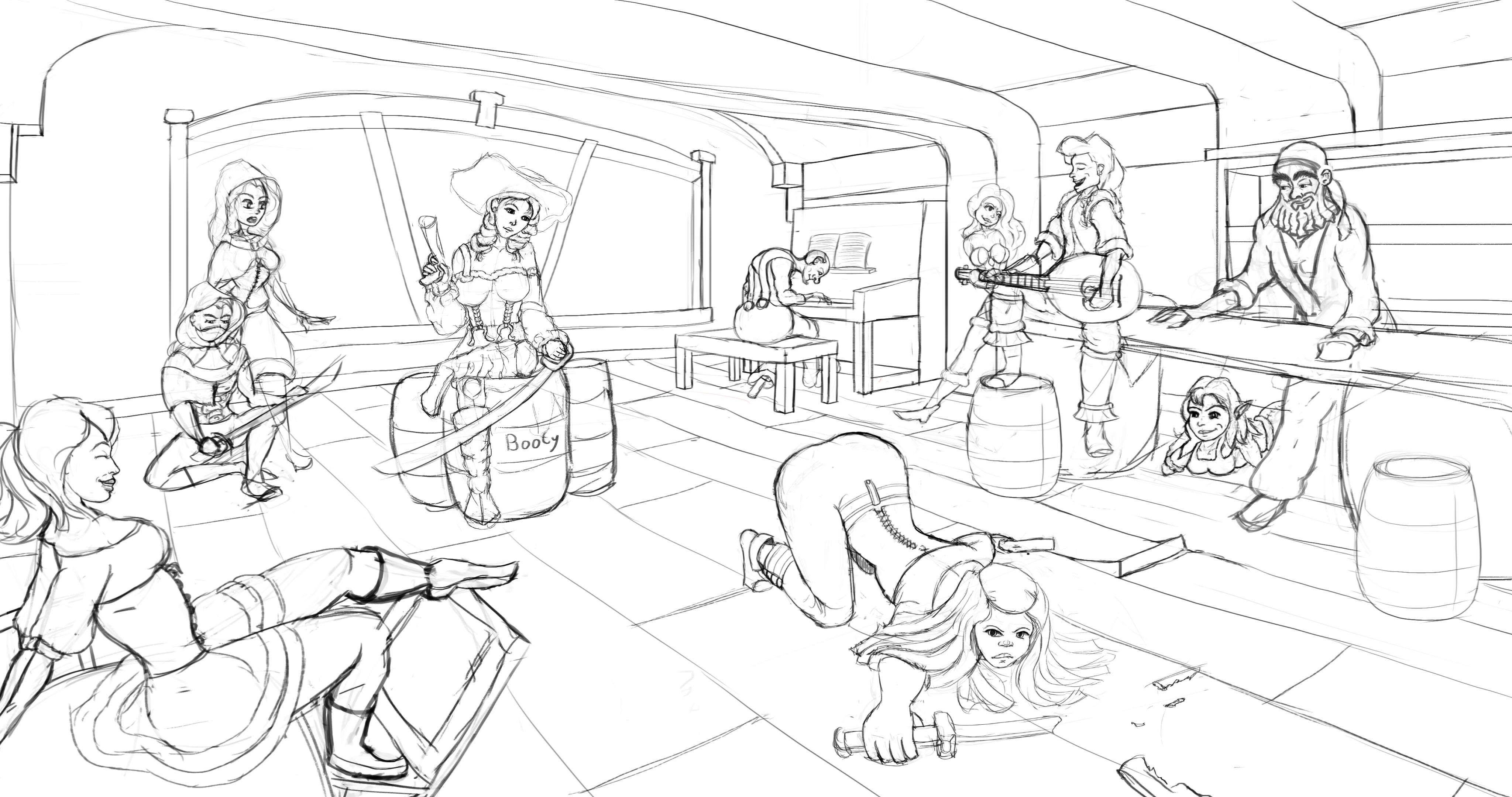
I wanted to experiment with it so started working on a project. This is how far I've got with the art class for now:

Date 12.16.2020

Little bit of improvement :smile:

Hey! I would say u are going in right direction with this figure drawing... something that I noticed in this last pic, seems like girl`s legs are disproportional with upper part of her body, it seems like they are too "strong"... anyway good job and keep practicing :relaxed:

Thanks. Yeah, had a tendency to give my figures strong legs back in beginning 2019 late 18 which is the time it was drawn. Probably still do hehe even though I have started to become more free and dynamic with my proportions.

I'm pretty much all over the place on how I draw things, but it seems to be settling down more and more on a particular kind of look as I keep at it. So will see where it goes :smile:

1 year later

This is a really ambitions project and hope you finish it so we can see the finished piece!

As for feedback, I would recommend pushing the values, higher contrast for things that are close to the camera, and lower contrast (everything closer to grey) the further away from the camera it is. At the moment the painting feels a bit flat so that should help it pop a bit more.

Also to keep in mind, if you've got the character and crab quite bright/close to white, have the areas around them darker in value so they stand out more. It looks like you've done that a bit already but it doesn't feel 100% grounded, I think you need to make the whole rock behind them a fairly consistent value. And remember that you won't be getting ambient occlusion on the rock from the character as they're not close together in 3D space, even if they are on the page.

Hope this helps at all, and good luck!

Thanks :blush: "I would recommend pushing the values, higher contrast for things that are close to the camera, and lower contrast (everything closer to grey) the further away from the camera it is" ^^ I'm actually doing that right now. Already looks better after lowering the contrast.

I'm confusing myself a little with the lighting though, as the crab eyes that the character hold onto are also going to have a glow. So far I've mostly sticked to the default front right side pointed lighting. So it's new to try having a 3 point lighting system. Some light from entrance and light from the two crab eyes.

For the multiple light issue, what you could do is each light source on a different layer, light the character with each of the eyes individually then just set them to a layer mode like screen or overlay, that way you can focus on a single light source at a time.

And that second version has a better sense of focus I think. it's clear the character and crab are the points of attention.

Though I do think having the sky a nice bright colour with some subtle light beams leading into the cave towards the character could be a nice touch if you were so inclined.

Sasha has already input some great tips! If I were to try to add on to hers, you might also want to keep in mind that the time of day can also dramatically change your lighting setup in this artwork.

For example, let's say your cave entrance was facing east and the sun was rising. A lot of the light would make it into the cave and be the dominate light source so the glow of the crab's eyes wouldn't affect the surroundings much.

But let's say it was midday in this scene. Then the sun would be on top of the cave so not much of the light will directly enter the cave. In this case, the crab's glowing eyes could affect the surroundings a lot more.

Lots of good things here :smile: Thanks. As I've already have lights on it's own layer, I think I'll just start over and try out the one light at the time on each layer. Should make it simpler by a lot. I do fancy me some light beams.

It's taking shape. I had a little try on coloring with Gradients in Krita like I usually did with Photoshop and Clip Studio Paint, but will have to try again tomorrow.

11 days later

I'm on a standstill now. I know there's plenty that can be done, but my brain just can't comprehend it and take it further than I have got so far. Neither do I have some magic detailed rock brushes like Marc use in Term 10 Digital Illustration x) Just swoop over, bam. Rocky surface.

This is what I've been able to do with what I do have at the moment. I do feel like ending it soon and do more character drawings.

I think it looks good, you've clearly put a lot of time and effort into it.

There is definitely value in knowing when to stop, as there's always ways to add more details. And although that in itself can be a selling point, you don't want to get stuck in a rutt if it's causing you trouble!

Can't wait to see what else you make ^-^

Thanks, then it's decided. Gonna put my sign on it when I got the time and put it out :relaxed: Kinda want to do more complex character poses together with all the steps I've used on this drawing next. With clothes as my cloth visual library needs a boost.

4 months later

Slowly going over to less lines. This one was to study lights from reference but still have heaps of distance to go with lighting and composition. It looks pleasing, but I do want my lights to be interesting. And my drawings to look less like clay, more like all the semi realistic professional drawings that are so easy to stumble upon on the net.

My latest project, There's this Griffon mount in the game Guild Wars 2 I wanted to make into a humanoid. This is the final result :smile:

28 days later

Have stumbled into a group of other artists and we draw together many times a week. Got quite the progress compared to last time. If you scroll up on this topic you can see the old version of the drawing I've reworked here :blush: