Here's another 10-minute gesture drawing of a pirate this time. 
I started working on the background. I wanted a winter setting.
I finished my faerie and the background. the lighter one looked good, but I think the darker one works better. 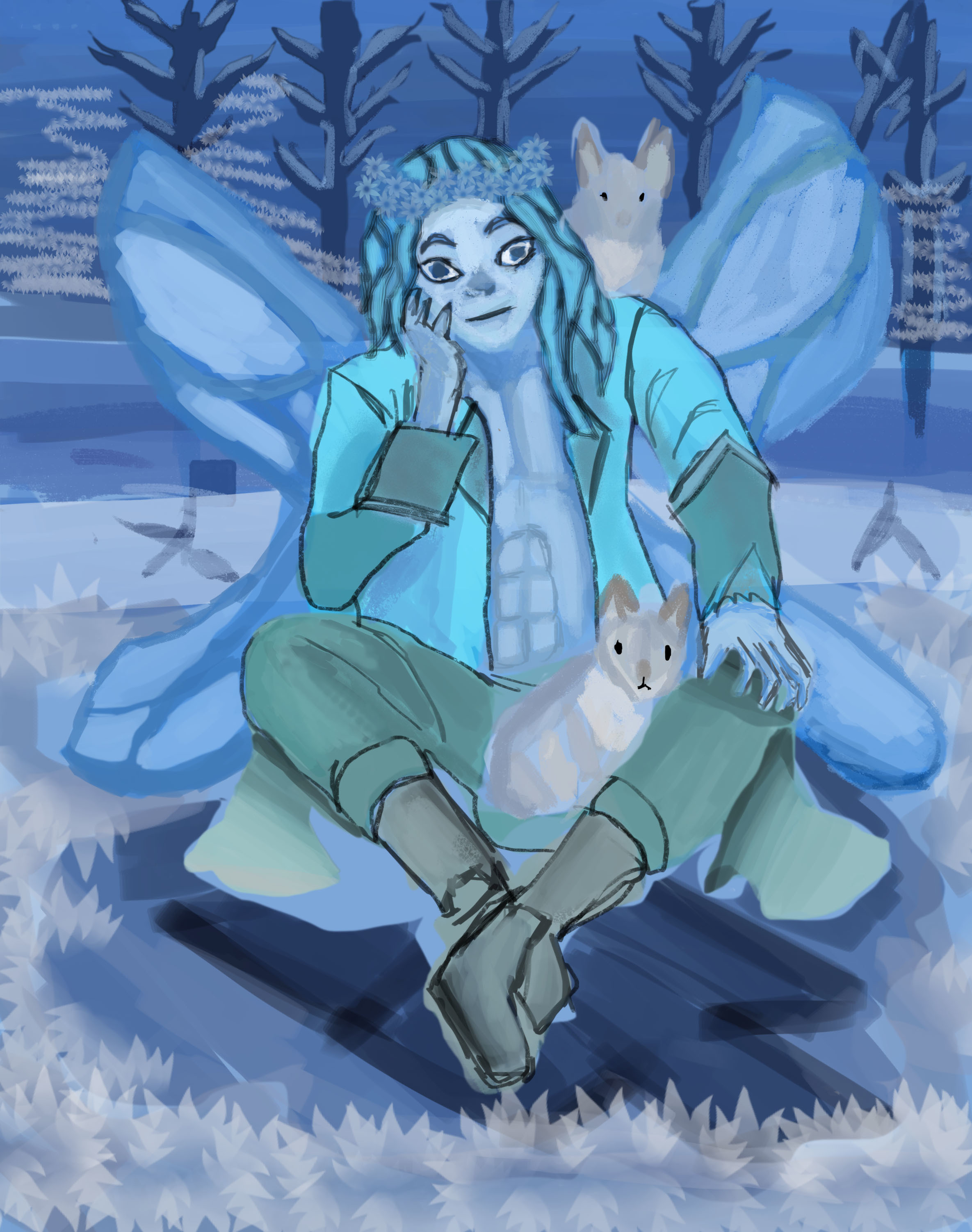
Here are some thumbnail sketches for a Term 2 box art idea. A new king was given a crown, and I had an idea about him holding one, but that was challenging, so I drew him already wearing one. I liked that idea and drew two versions of it. 
The sketch on the bottom right, I might use. 
Good job on all the ideation, you definitely have a creative spark
Thank you @snakker.
I made some logos from the term 2. I might add some details later. I wanted them to have the burnet look. If you have already done the Logo/ Title project, I'd like to know some more tips. Which one looks better?
For this one, I had an idea of a jester gunner. Maybe she works at a circus/cirque. 
Haven't really done the logo thing personally XD From the ones I see I'd probably go for the first or third one, but be wary of the background as the outline is different throughout the font, you may run into contrast issues. I think if the last one has shadows additionally to bevels with that up down gradient, it loses contrast near the bottom and becomes harder to read. And one thing that jumps into my head is why not add some fire? or make the text look like fire? given the name I mean
cheers!
Thank you @snakker. I thought you need to do all of the homework, so that's what I'm doing.
I see. I did have an idea about making the logo into fire in one of my sketches, and with another logo. I might try that again. The first and third one was a burned gothic font. the second was a plastic explosive font that had flames on it. So I thought it was helpful.
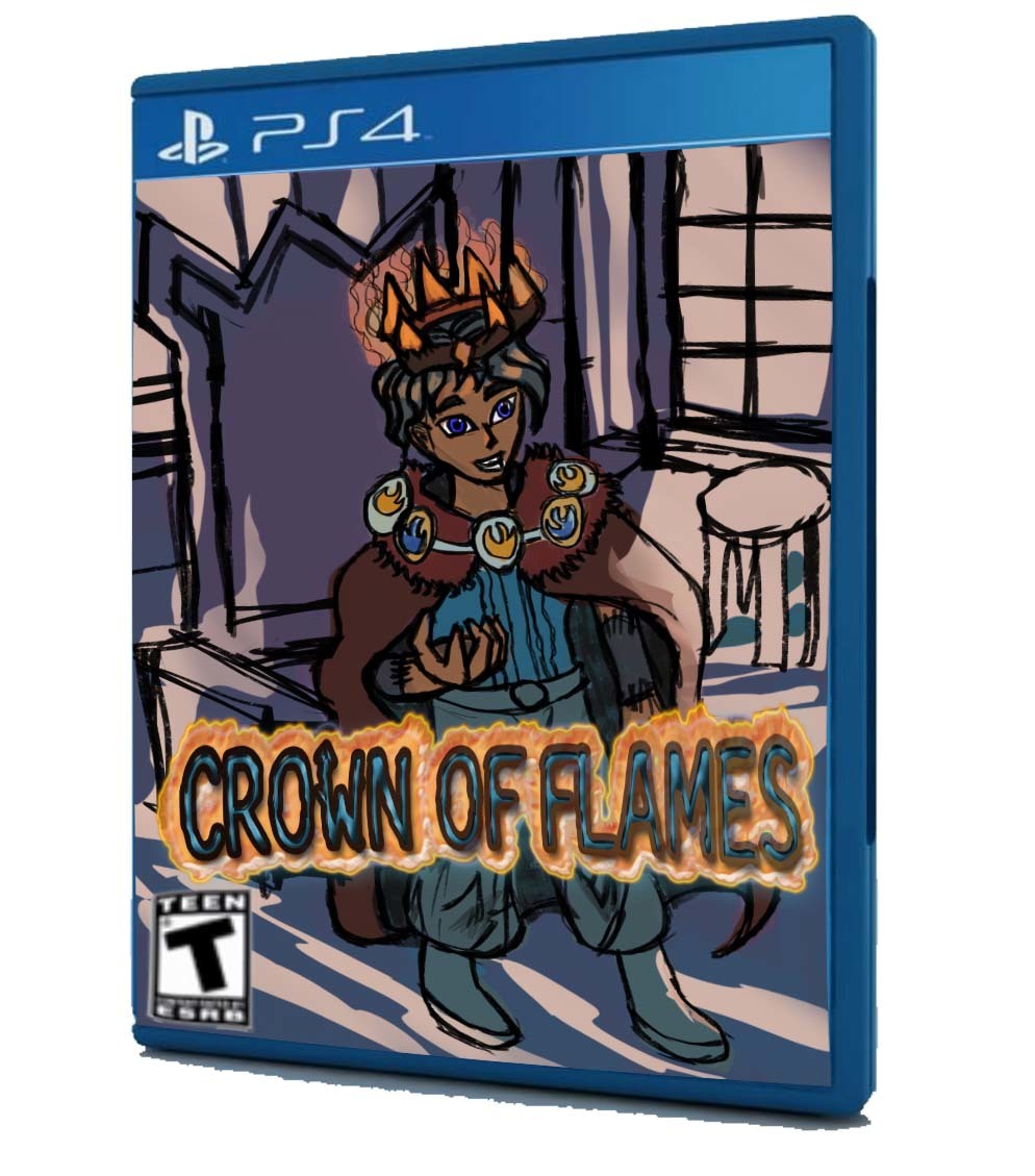
Here is my sketch of my flame king who has the crown. I liked this pose and wanted to draw this one. 
Here's the gray tones so far. I wanted to get the pose and shading right before I continued. It looks okay so far. I may have to adjust the crown and face. Are there any critiques I should work on?
I have some ideas for some characters from gesture drawing references. Here are some of the sketches. 
I added some flames to the logos. They're either blue or orange. Maybe orange text over blue flames or vice versa.
I have a sketch of Medusa. This was from a Draw This in Your Style challenge. I found it on Twitter by the artist Philtomato celebrating the Year of the Snake with Medusa. In my version, she was given a shirt and jewelry from her sons, Chrysaor and Pegasus. It's the #philtomatoartchallenge.

She looks great! Love her expression
thank you, @patrycja.lerch.
I've been busy this week. Here's what I have for the box art assignment. I've made some adjustments to my character and added a background and a light source. Now, I think I'll work on the colors. That's about it.


I mostly did gesture drawings last week. I don't think it'll be interesting to show a week's worth of gesture drawings, so I posted this day because I started some 2-minute gesture drawings again.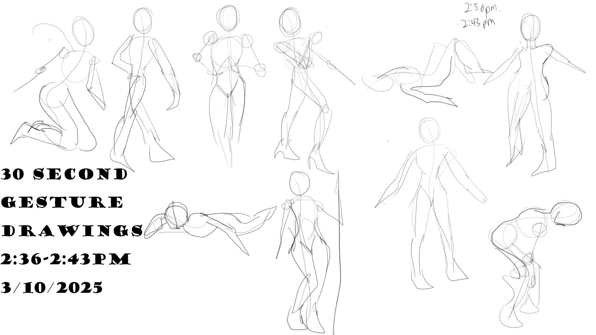


Suggested Topics
| Topic | Category | Replies | Views | Activity |
|---|---|---|---|---|
| Term 2, 3, 4 - Anatomy | Art School | 6 | 3.3k | Sep '18 |
| Crash_JJ (James) - Art School Journey | Art School | 30 | 2.1k | 4d |
| Rhian - Art School Journey | Art School | 16 | 1.2k | Nov '23 |
| Leonarto - My ART School Journey | Art School | 130 | 10.0k | Mar '24 |
| Term 1 Perspective | Art School | 0 | 867 | Aug '18 |