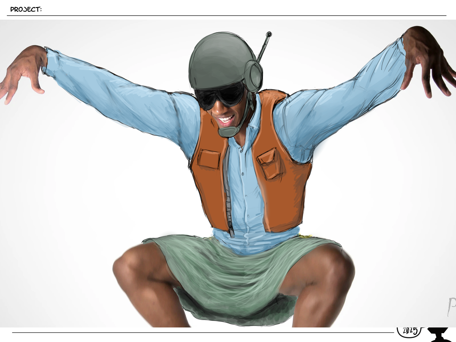
@mitsuki-youko Thank you! I'm really happy with how it turned out. Only a couple things I want to go back and fix. LOL
And see below for more info about "Wait"... 
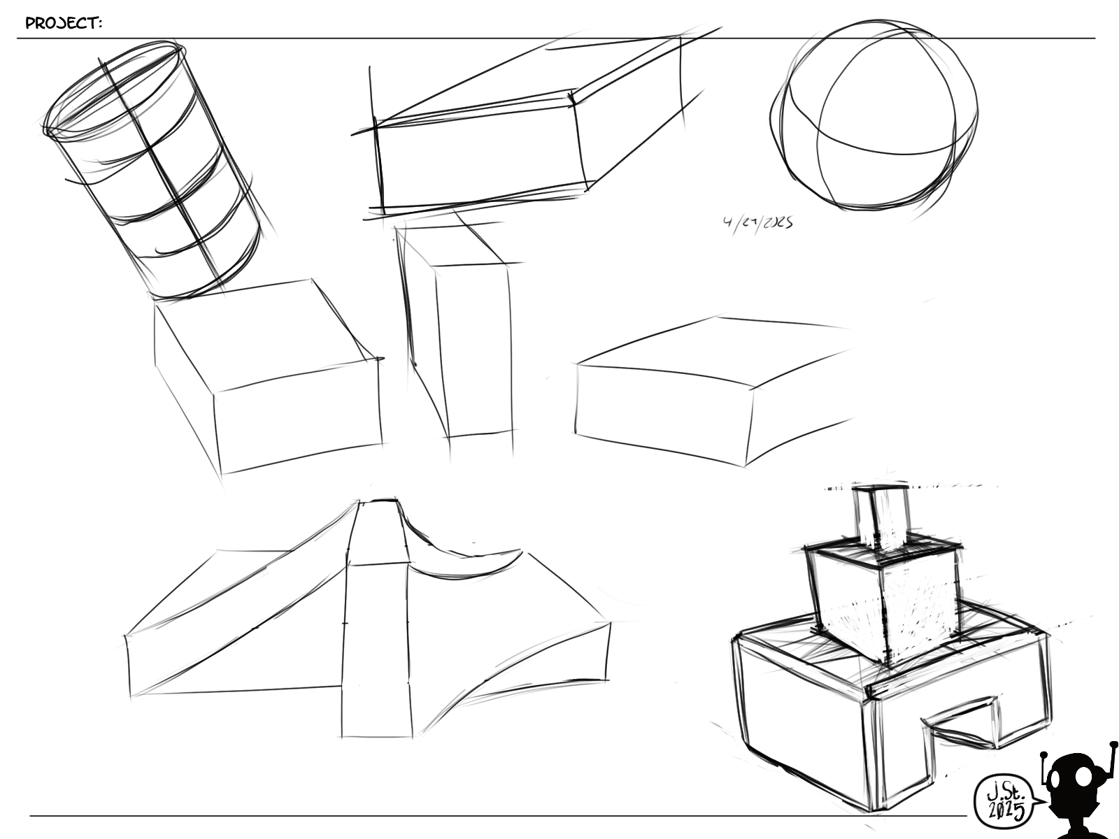
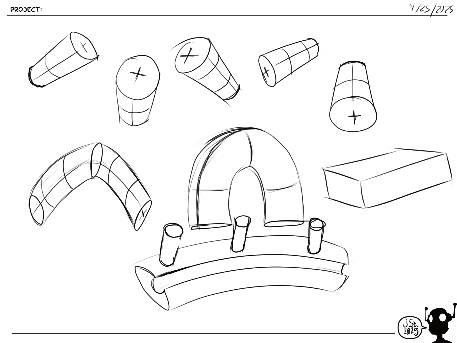
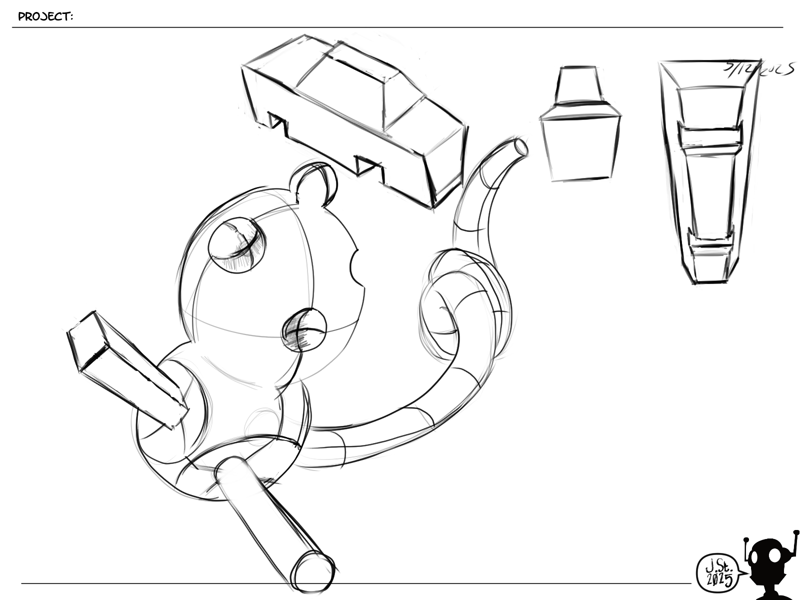
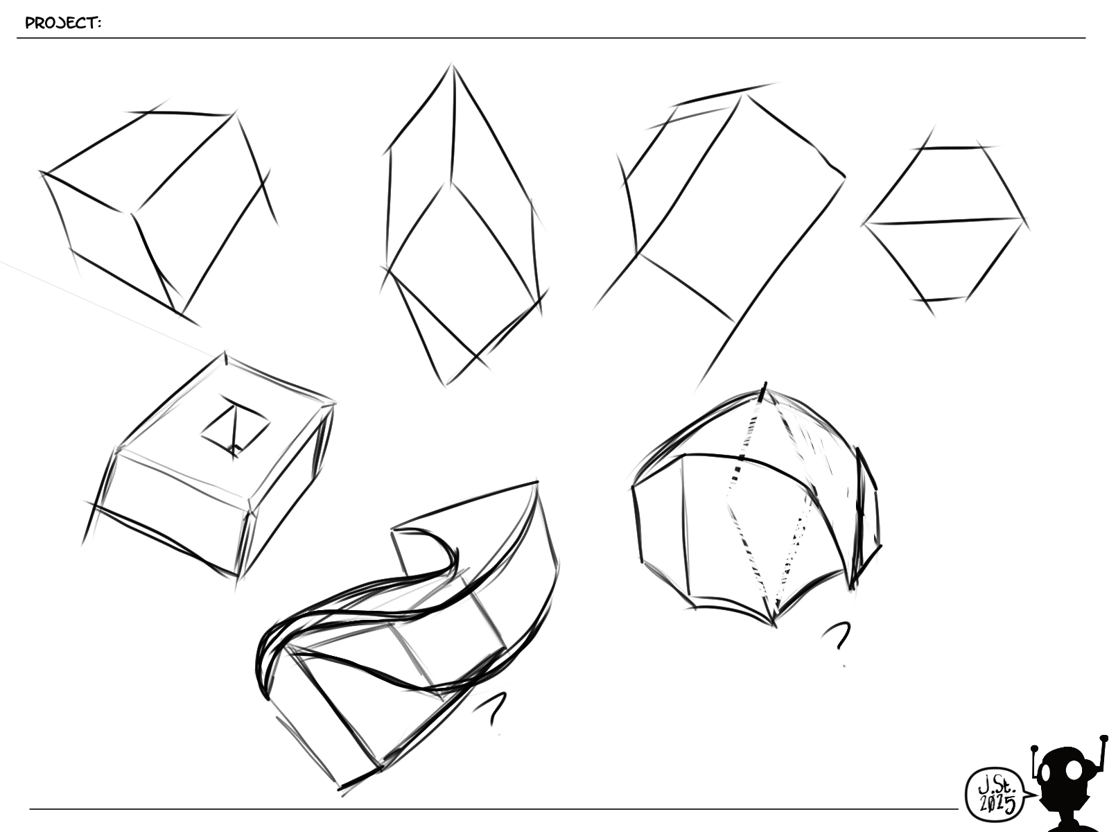
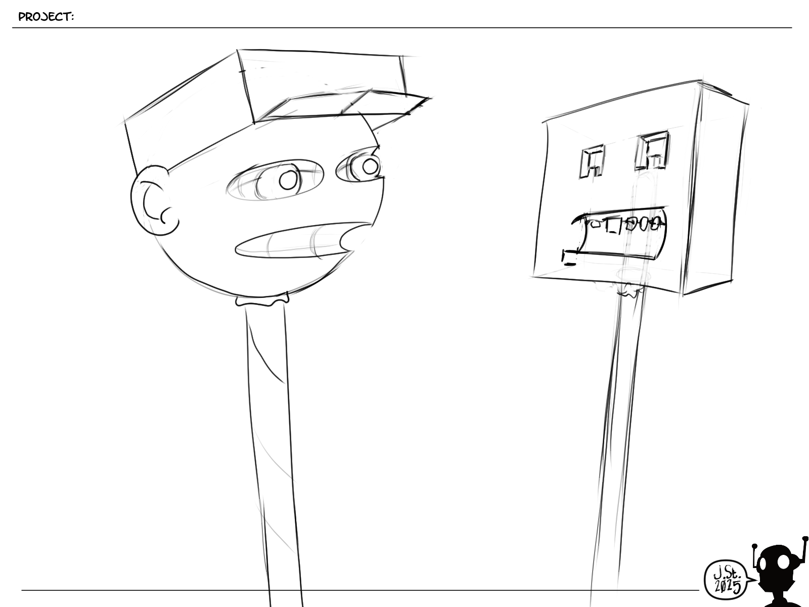
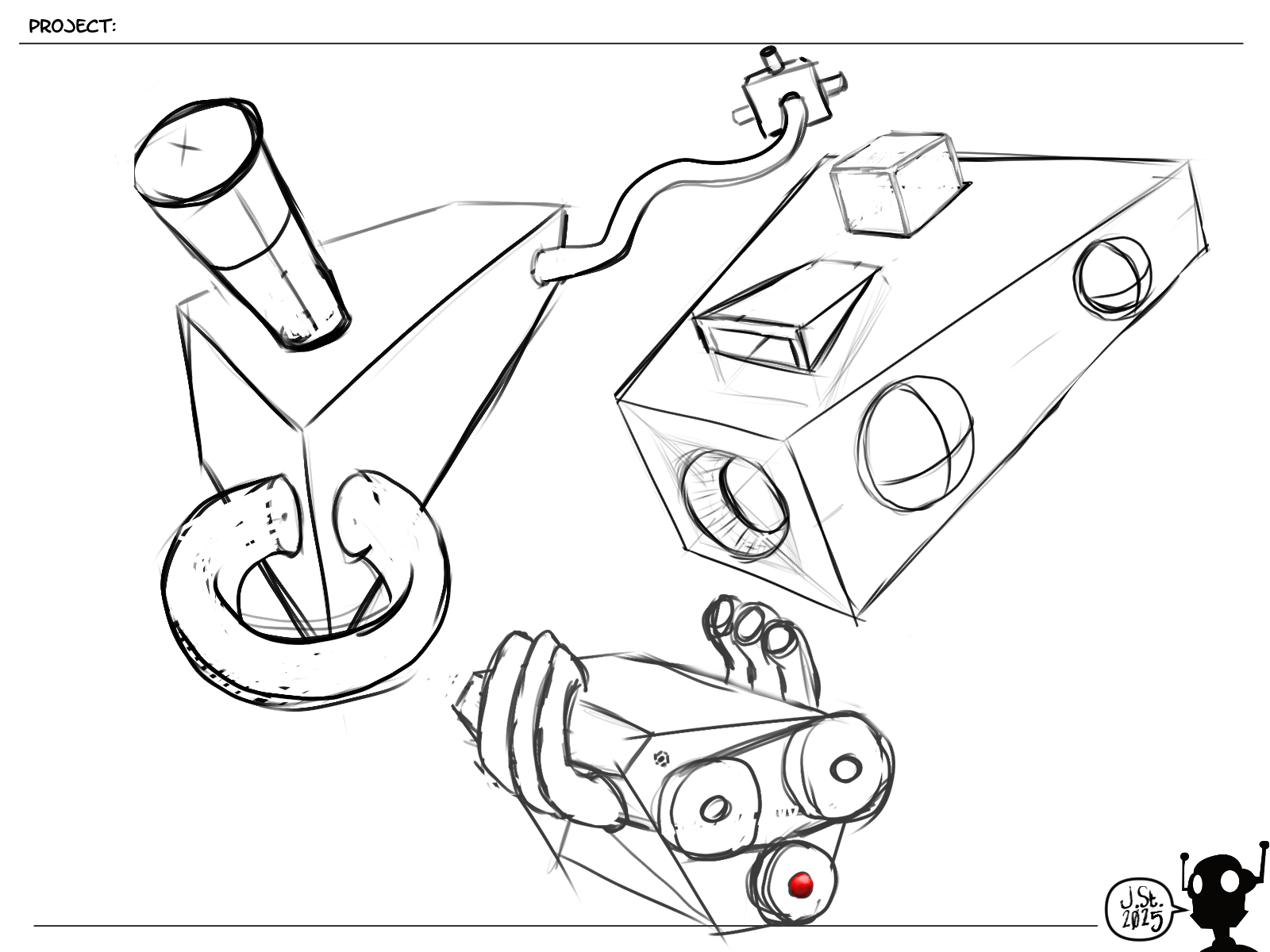
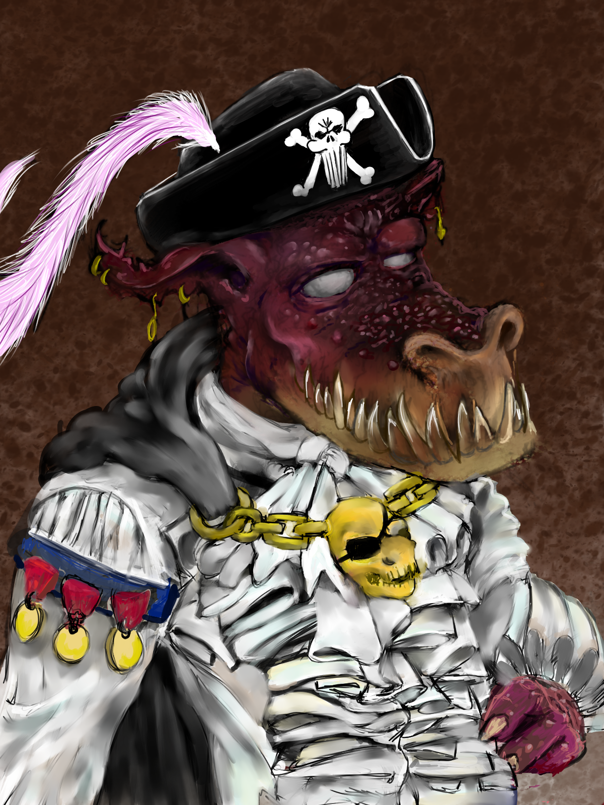
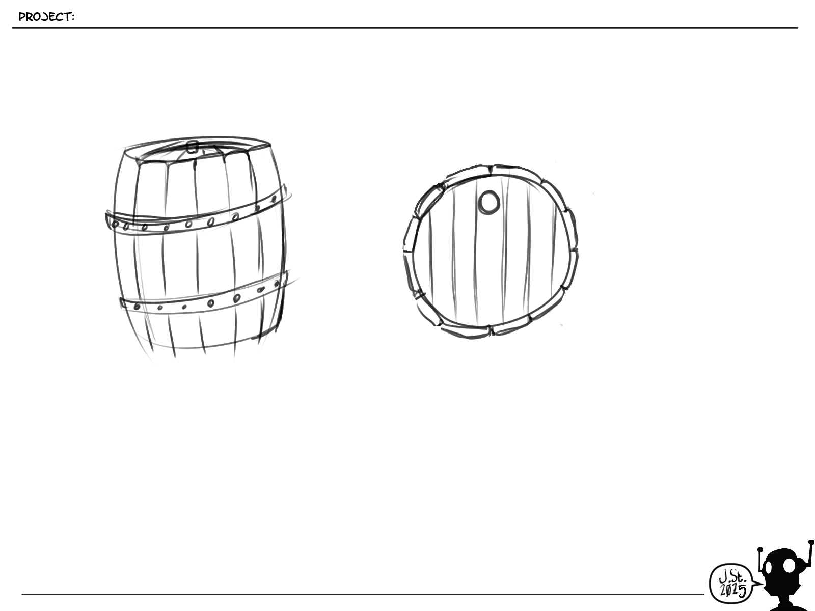
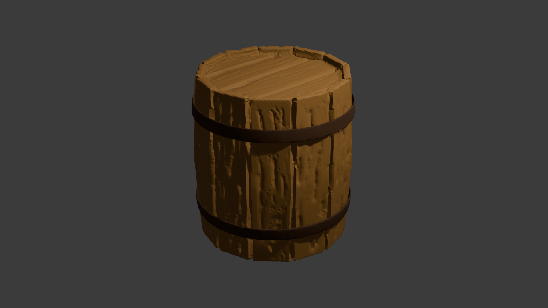
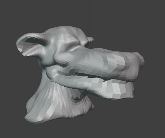
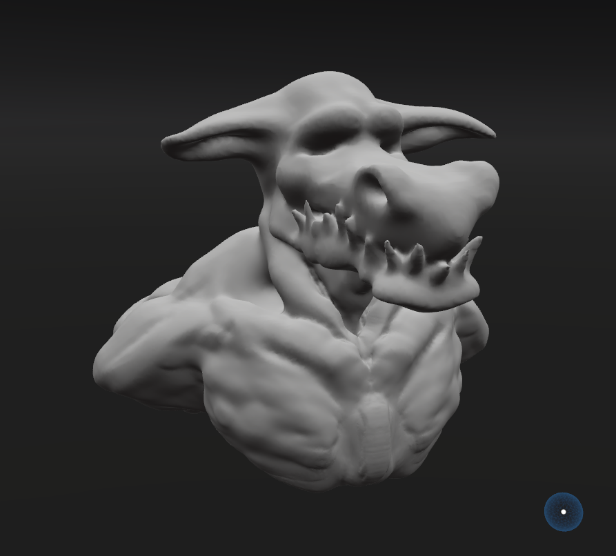
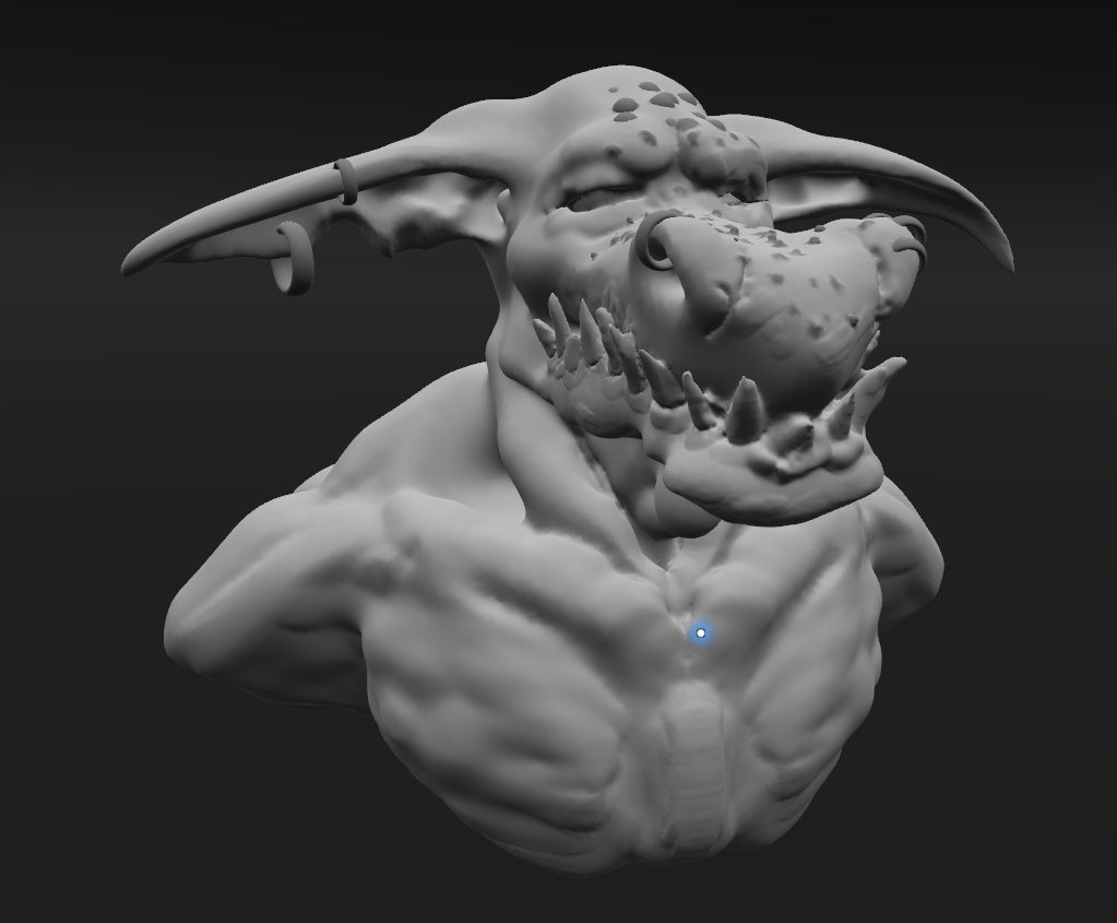
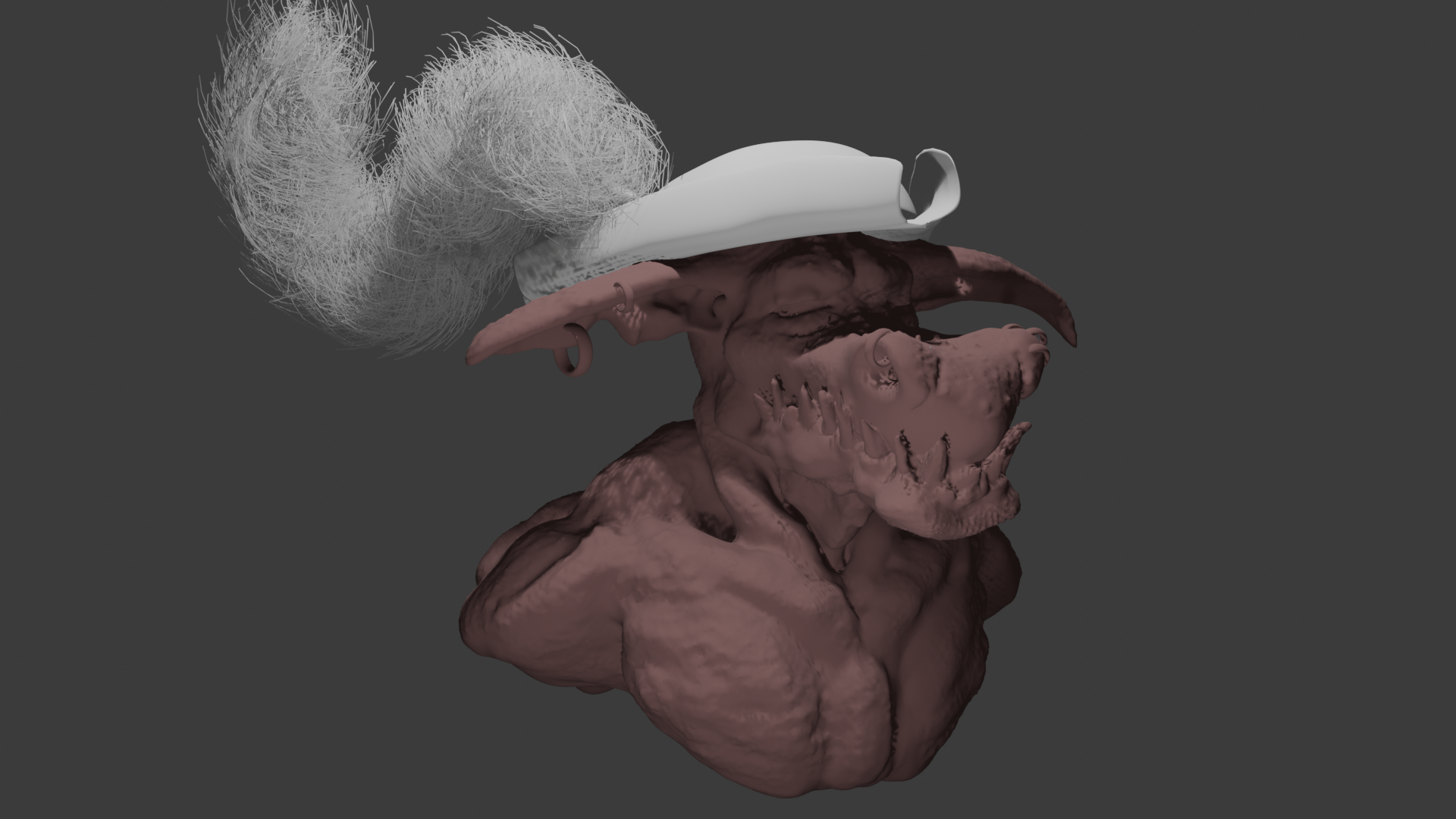
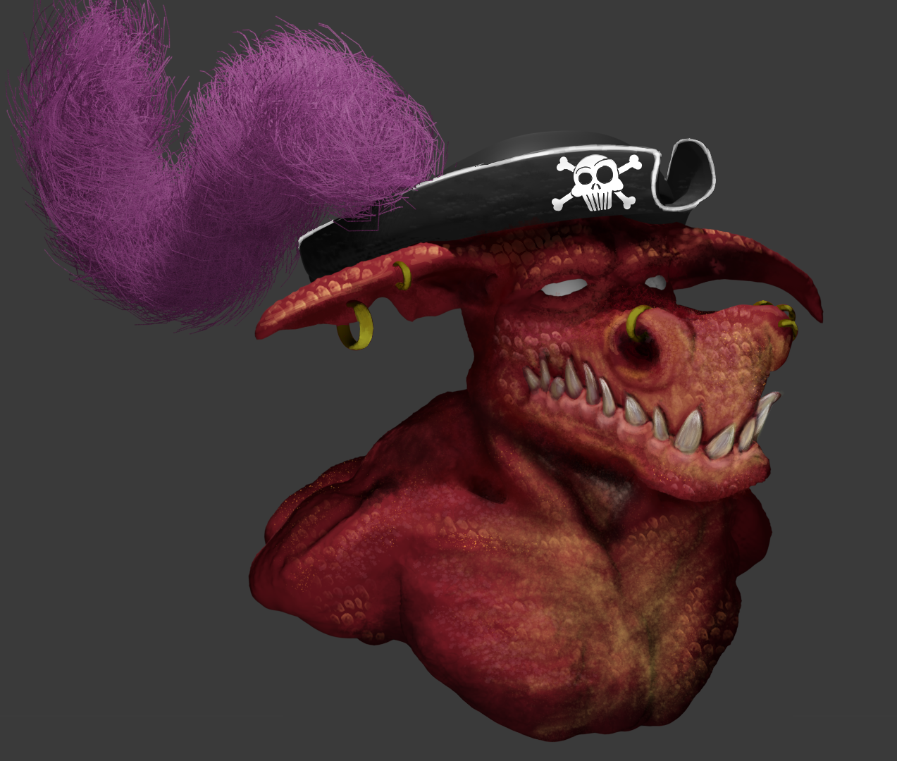
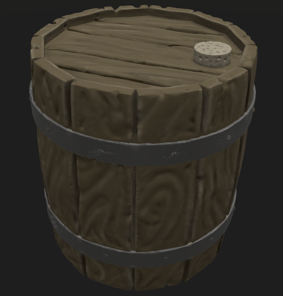
3D Sculpting
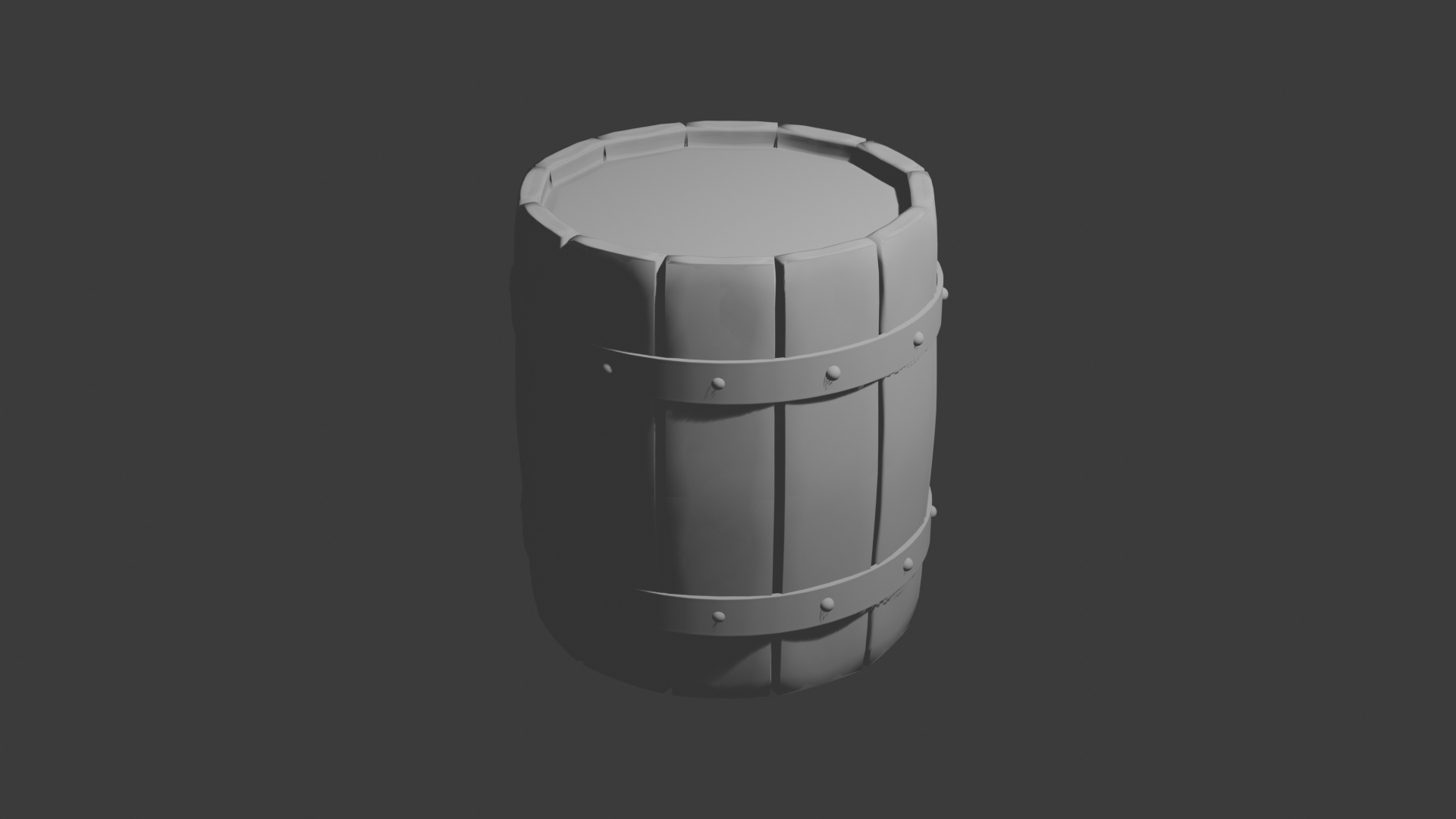
I went back and did another iteration on my barrel. I imported the Blender model into Shapelab and then used the Crease brush (and other subtractive tools) to carve into the boards, but once I had done all of that, I decided that I went overboard because the wood grain would be much finer than what I did and probably should just be a bump map rather than sculpted texture. So I smoothed it back a lot, then painted in something of a wood grain. Given that these 3D projects are the first I have done in quite some time, I'm pleased with the outcome and arguably more important, I learned a bunch about Shapelab and Blender. It also reminded me of where I stopped learning last time: Texturing. I've box modeled a ton and see these sculpting tools the best way to create something artistically, but there is still an element of technical modeling that needs to be done with kbd+m instead of a stylus. Good stuff.
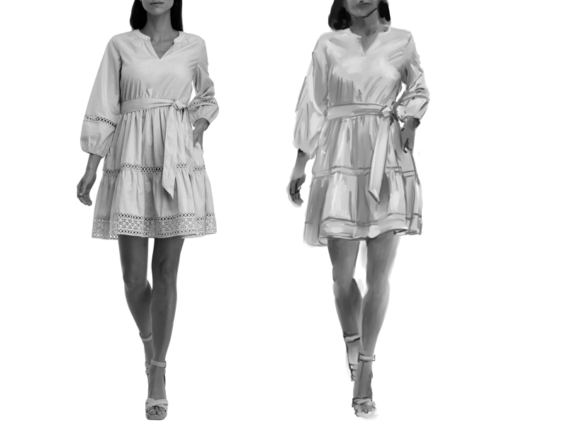
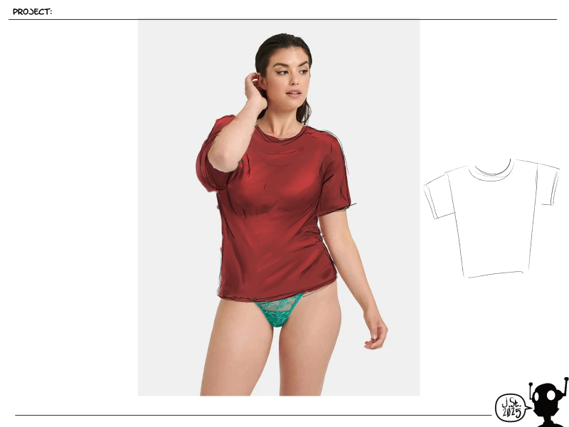
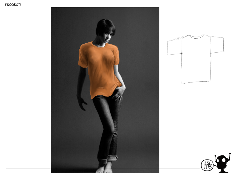
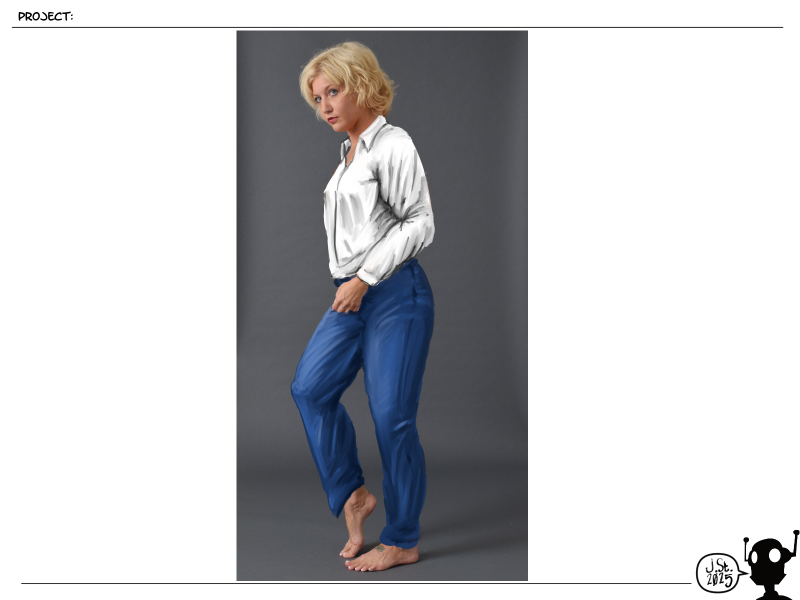
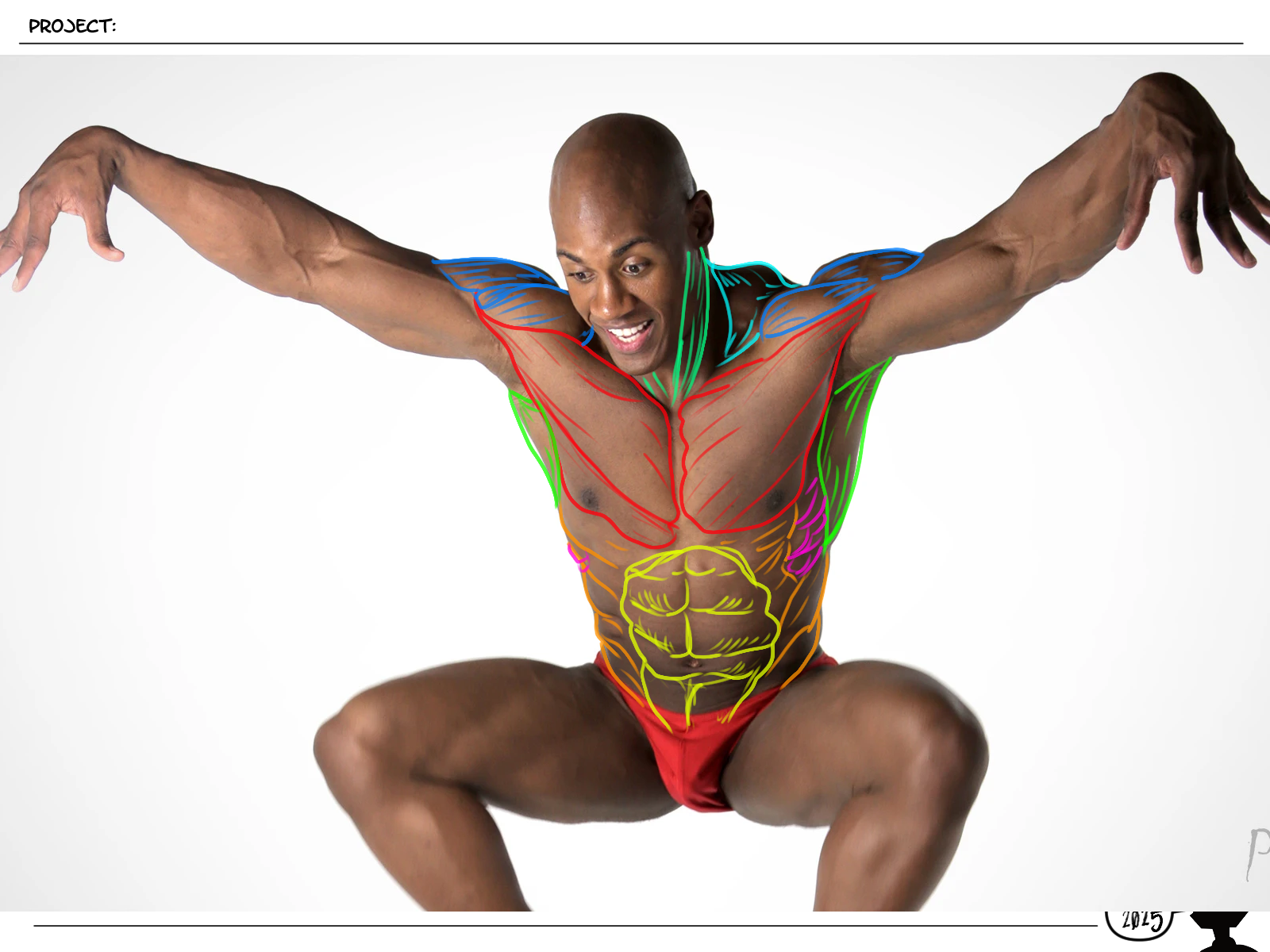
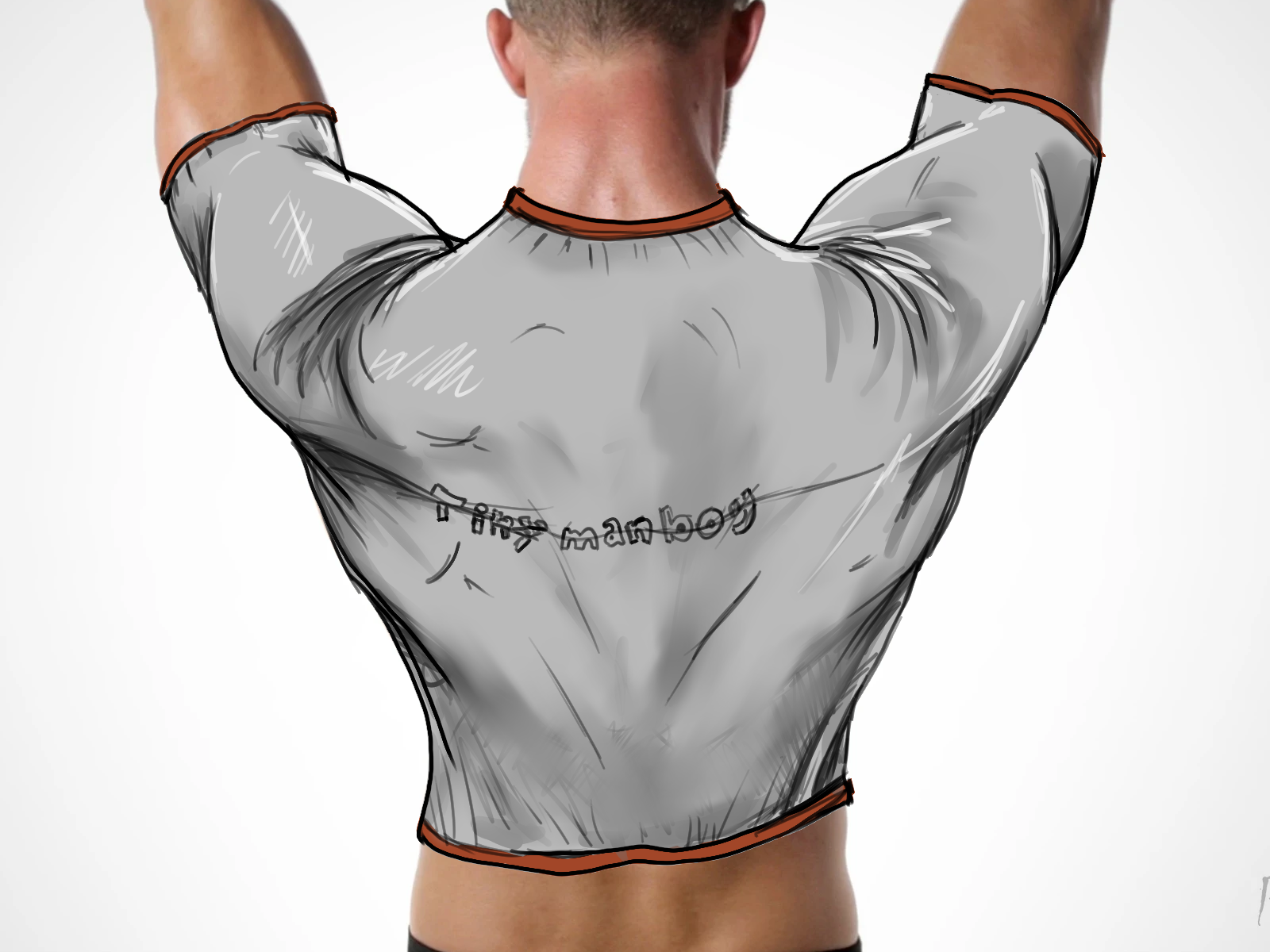
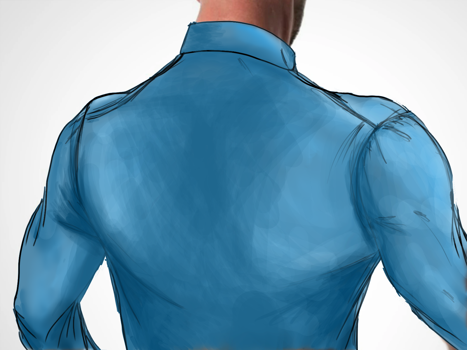
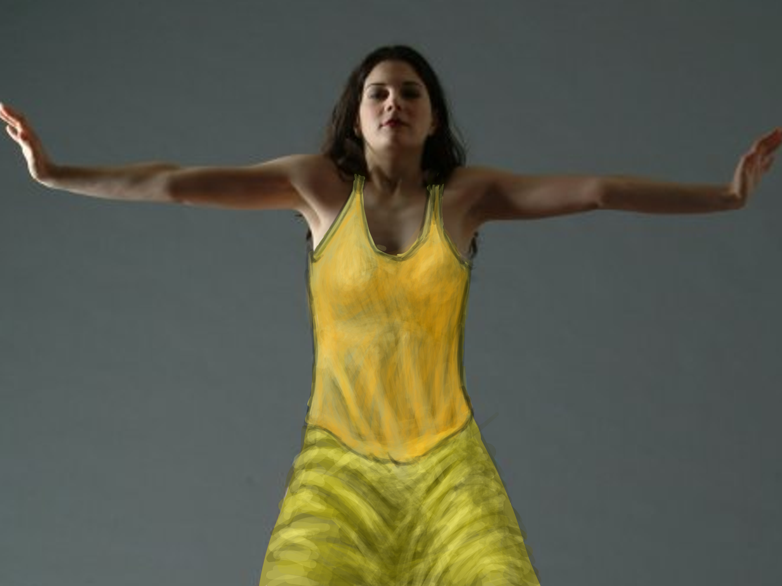
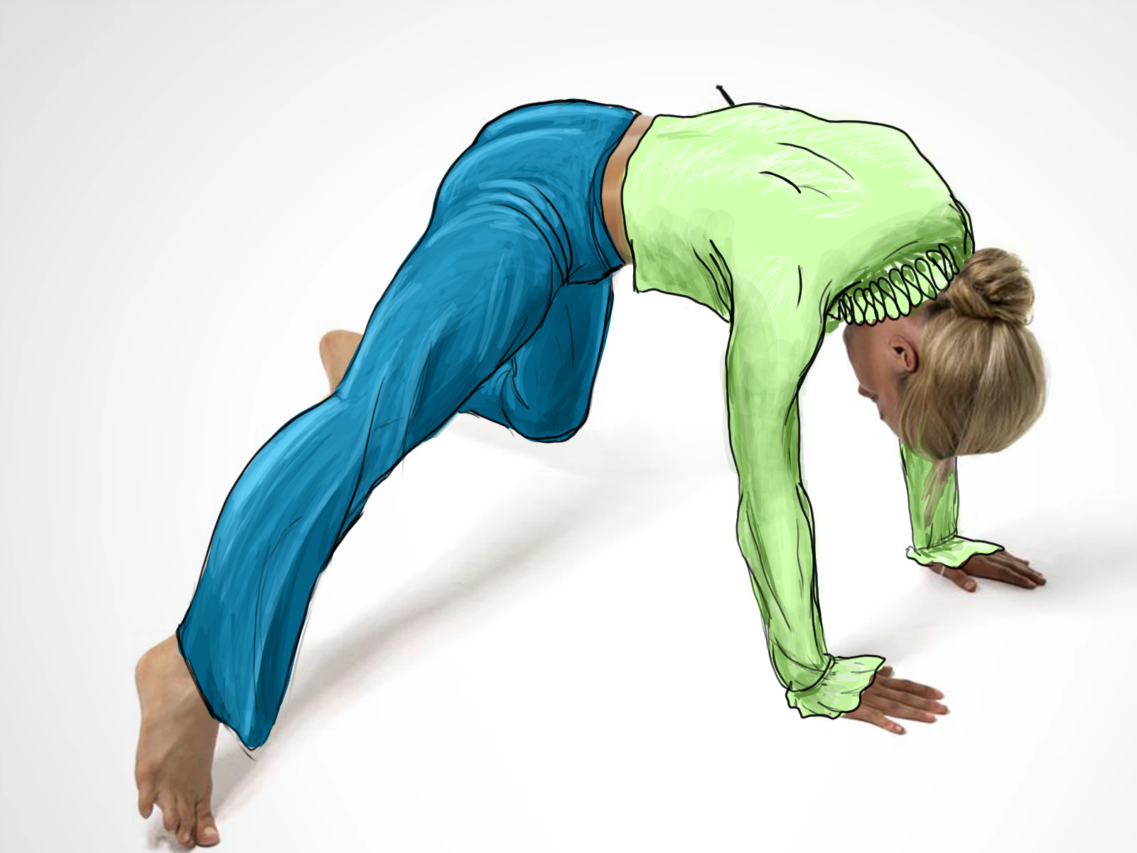
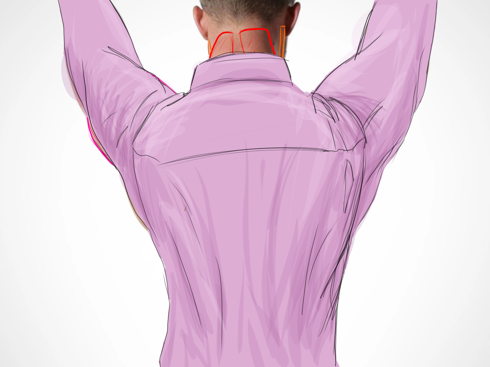
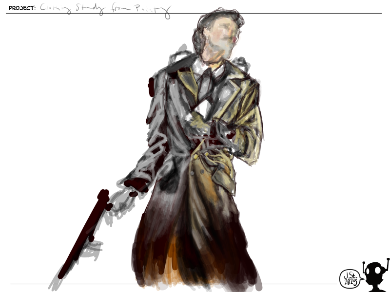
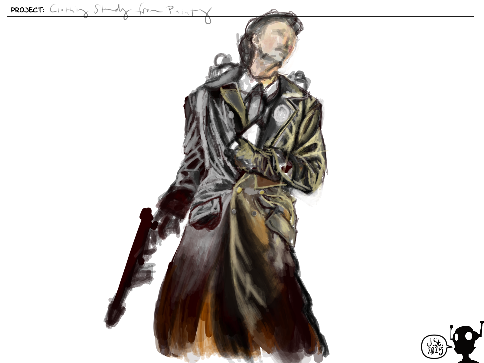
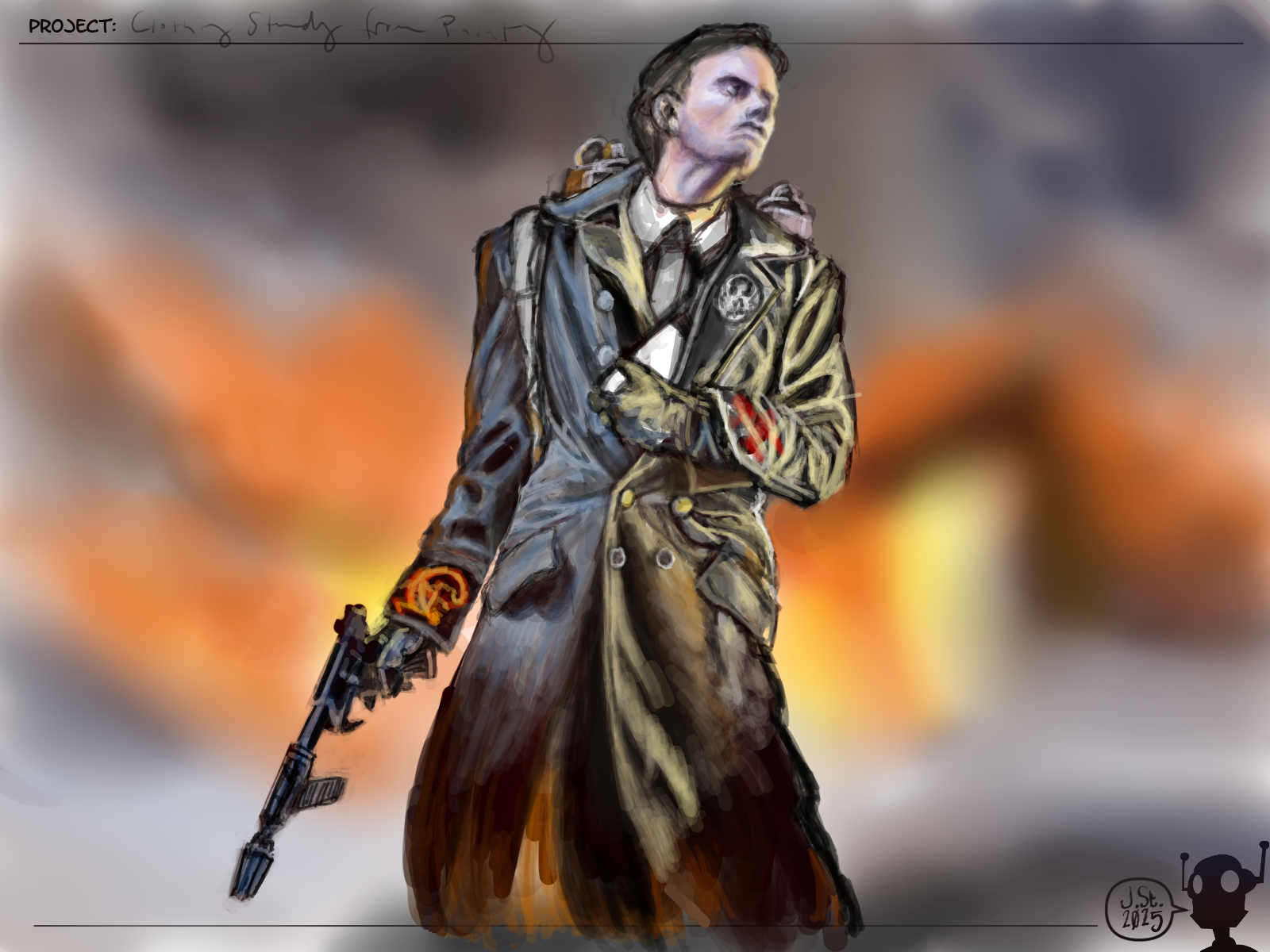
Clothing Study
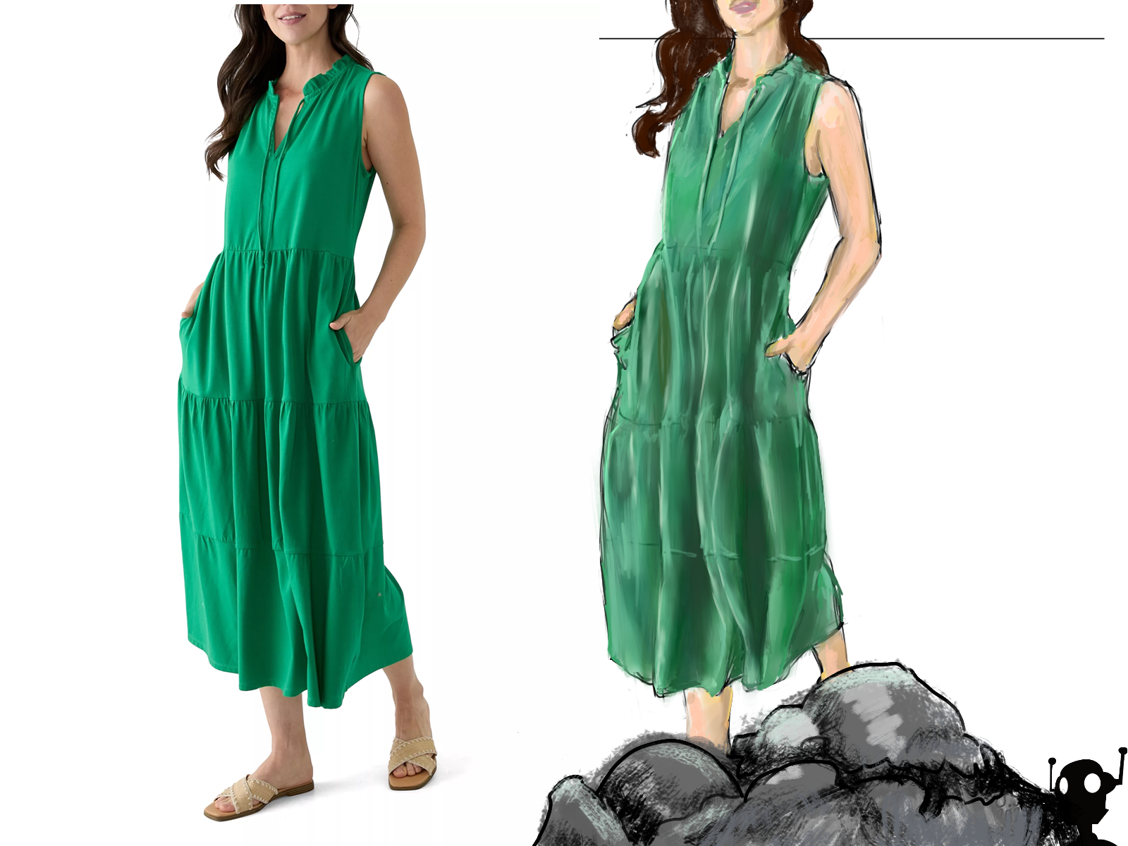
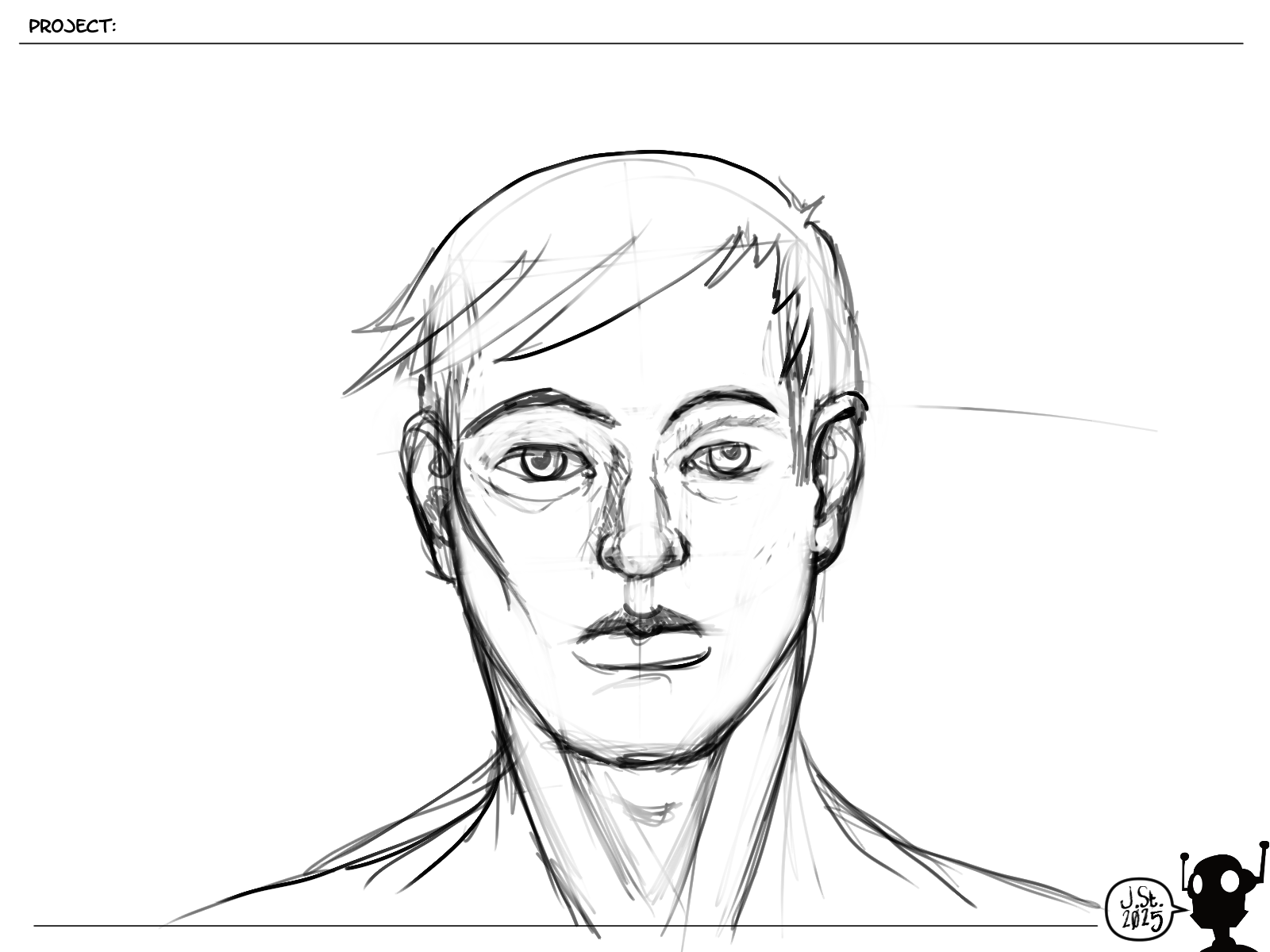
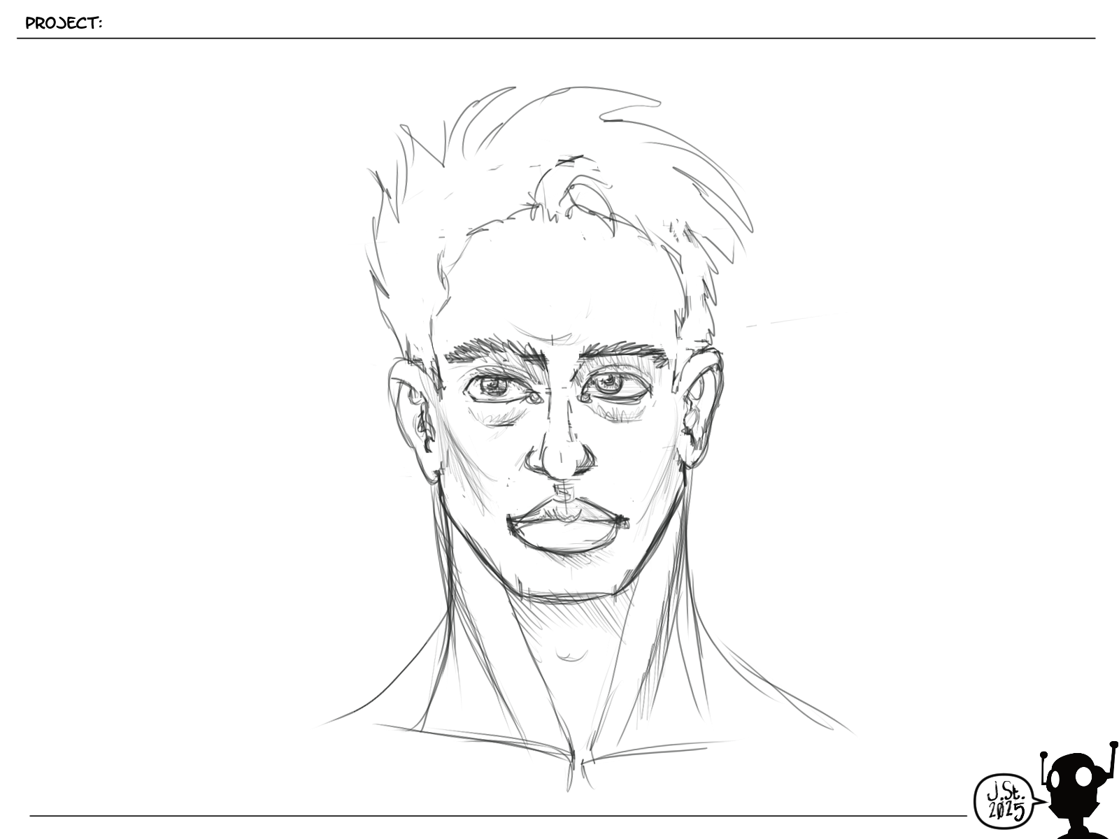
This isn't perfect, but I think I have learned enough from it. I took the opportunity to do a bit of a skin study and digital painting study. I did a few different things that I think turned out great, but there's clearly some inaccuracies. I'm afraid if I keep working on this, I'm going to stall out on progressing on other things.
Review Term 3:
Looking back over these 17 weeks, I've put in a lot of miles on the stylus & pencils. I had hoped that with only 6 weeks in the term I would have been able to finish it quickly and get Term 4 done before July. But that ain't happening. So anyway, I'm still plugging away at it, making progress and learning.
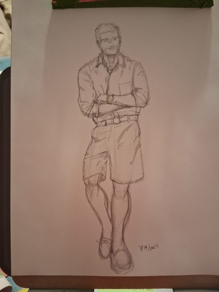
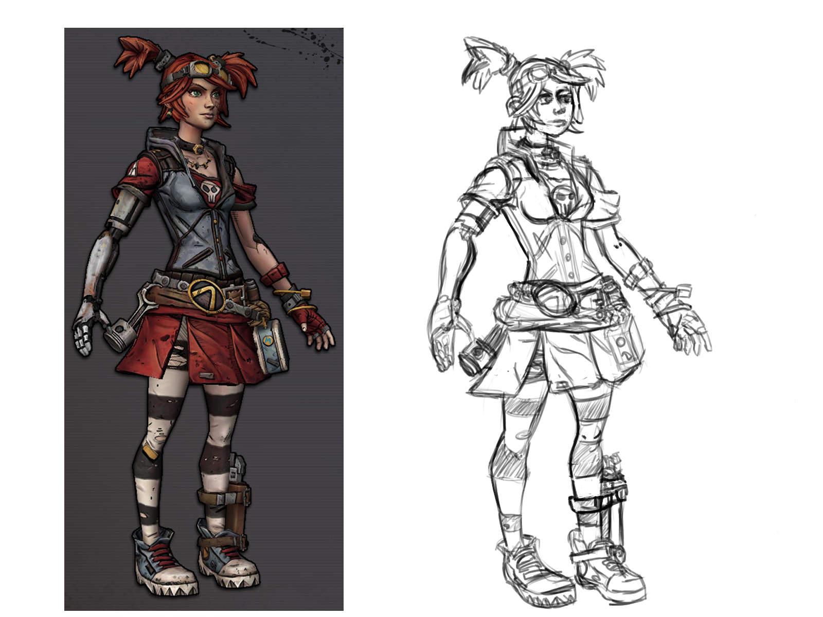
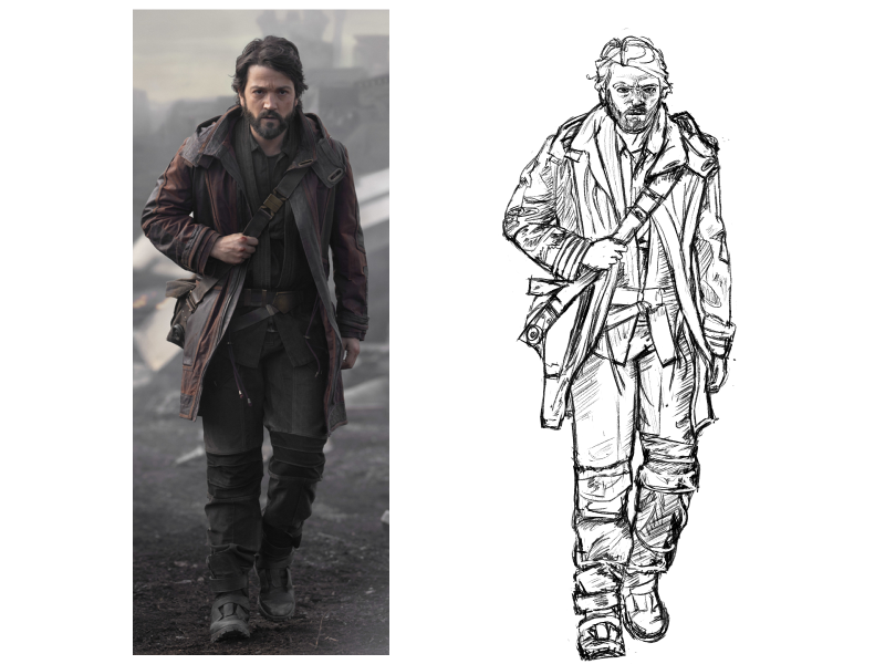
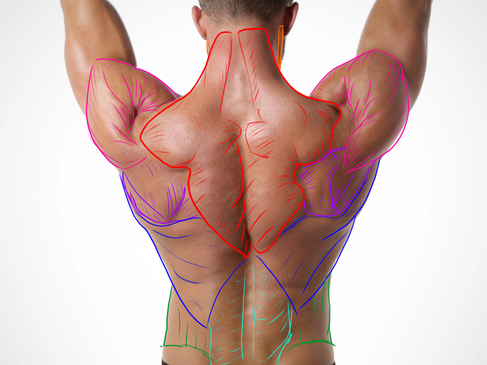
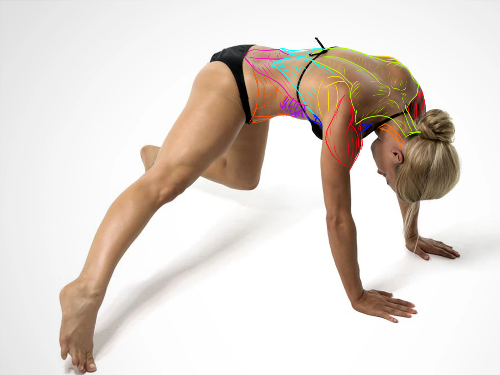
Clothing Studies: The amount of detail and patience to accurately copy from life is very high. I want to spend some more time with this some time, as there was a lot of interesting elements to this because the complexities due to what materials are used. Overall, I think I grasped a better understanding of clothing as overlaid cylinders that bunch at points of contact and tension across the surface underneath. Doing the studies in greyscale also helped me focus on form rather than tackling color at the same time. I also really enjoyed drawing with a pencil.
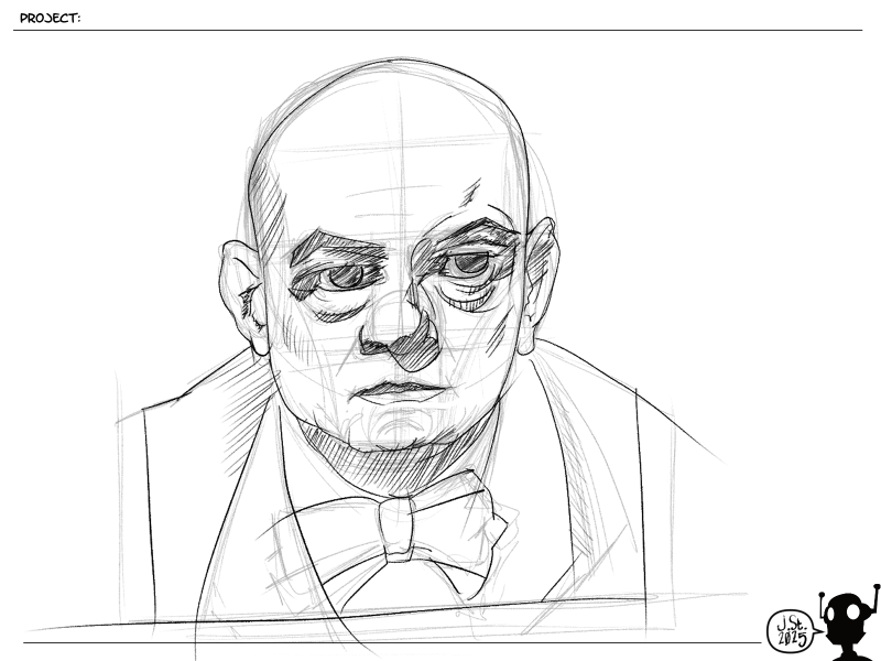
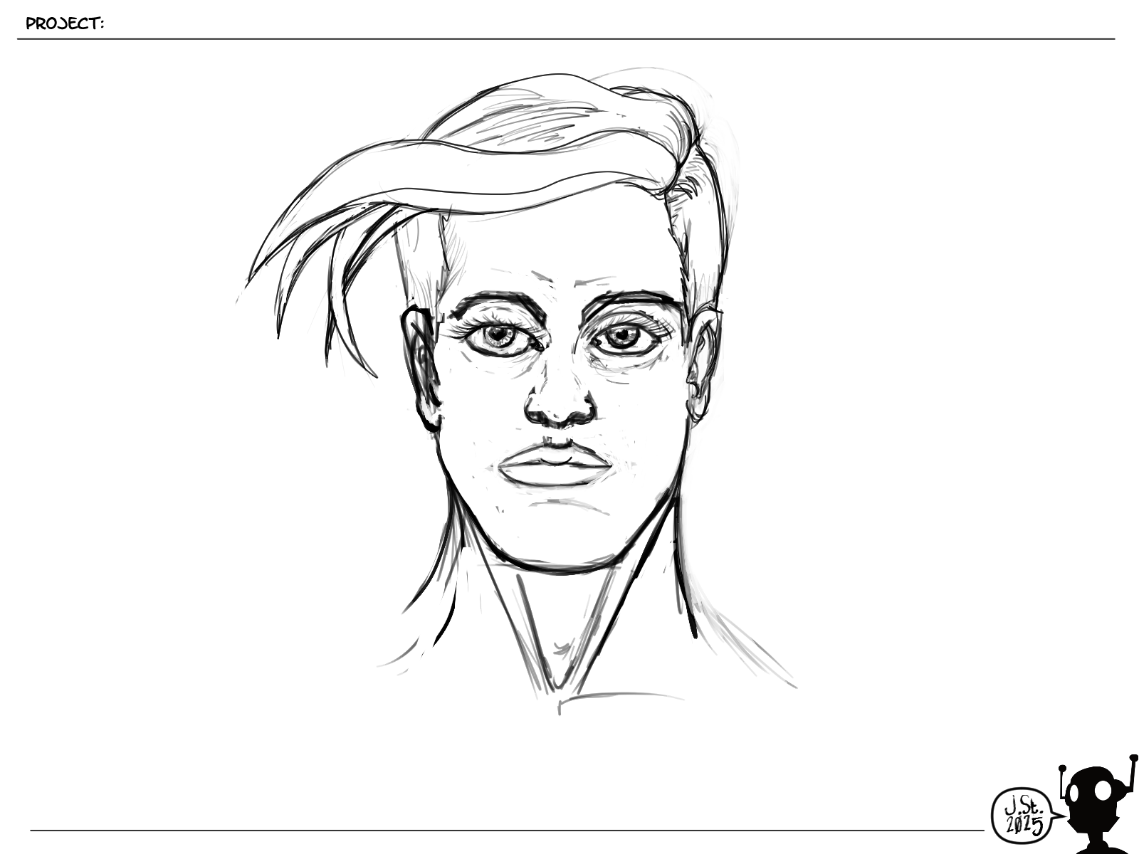
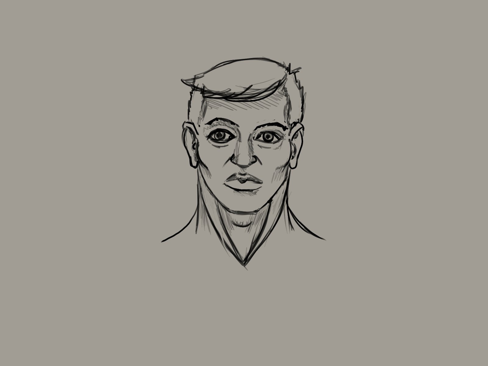
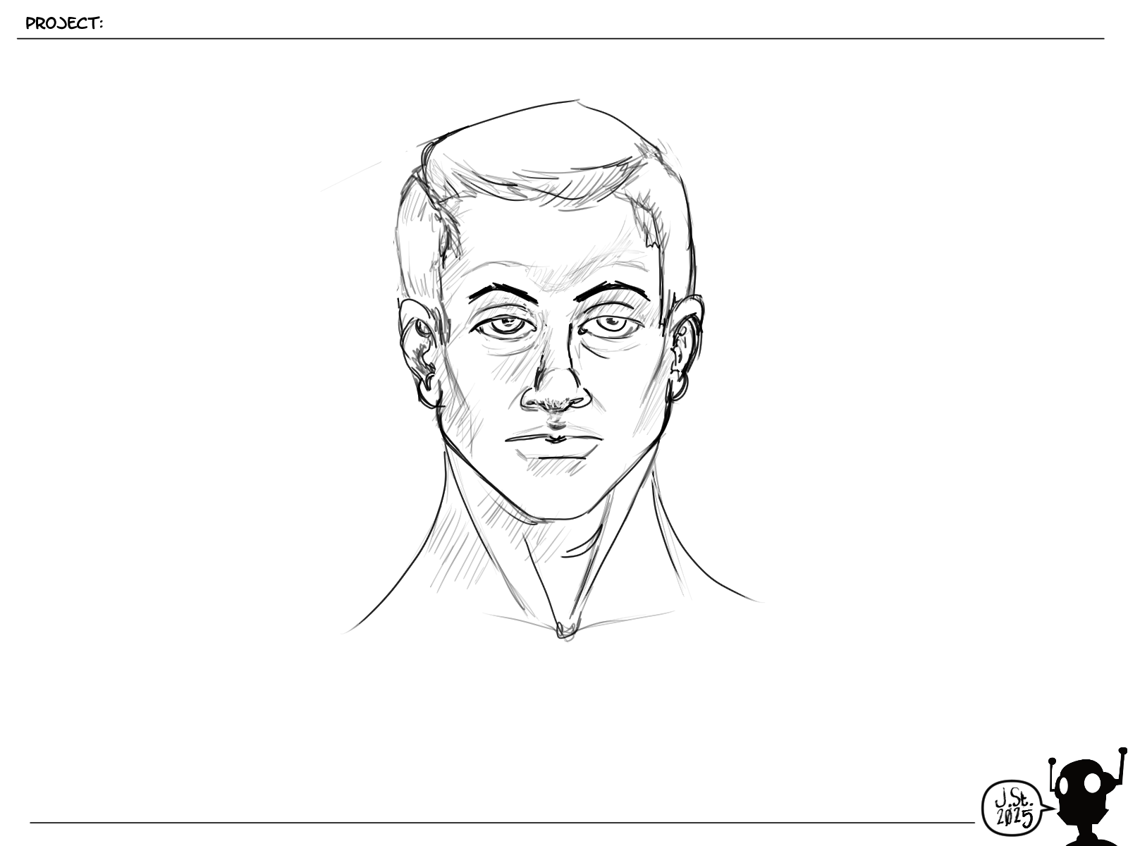
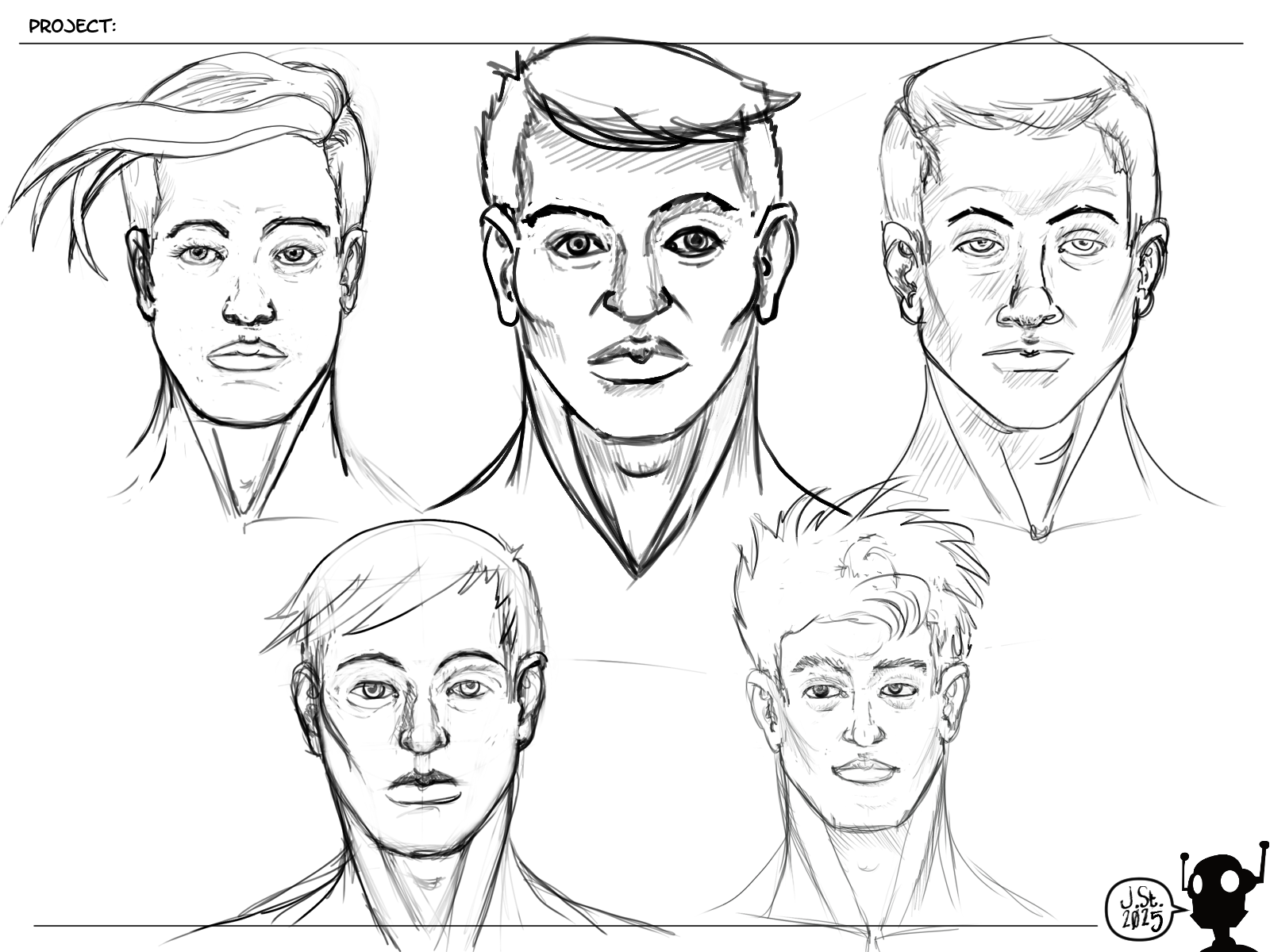
Heads: I need to spend another fortnight on drawing heads. I'm only going to get better, right? Right?
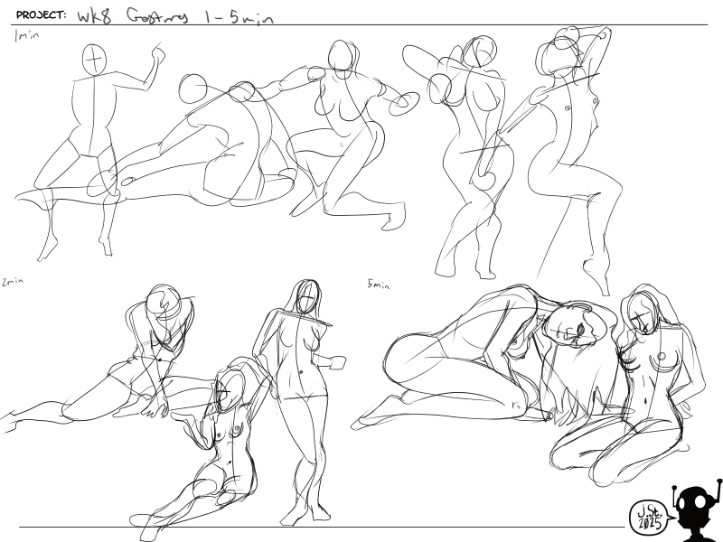
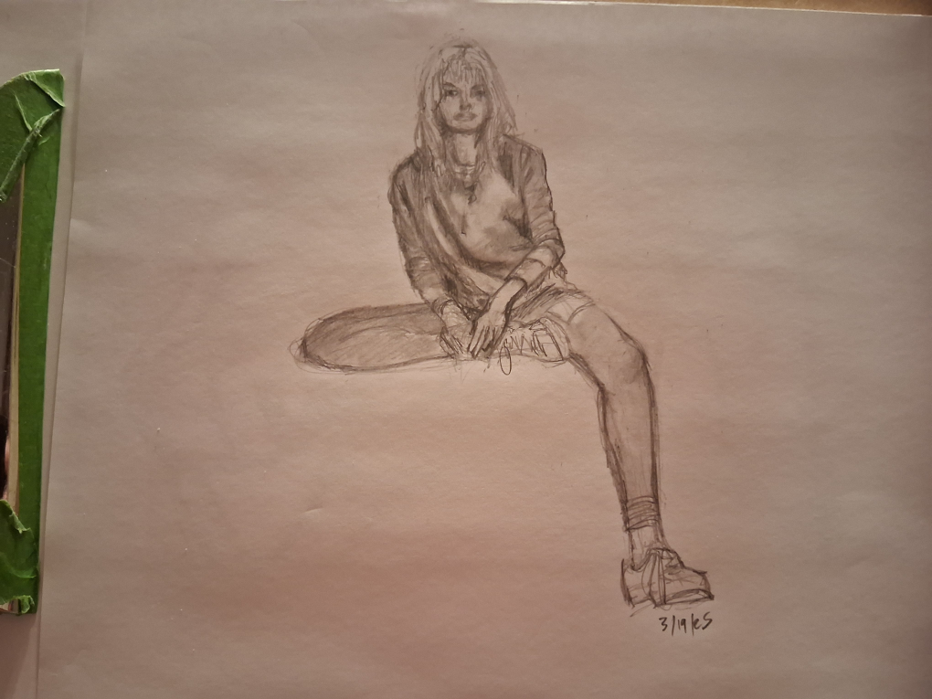
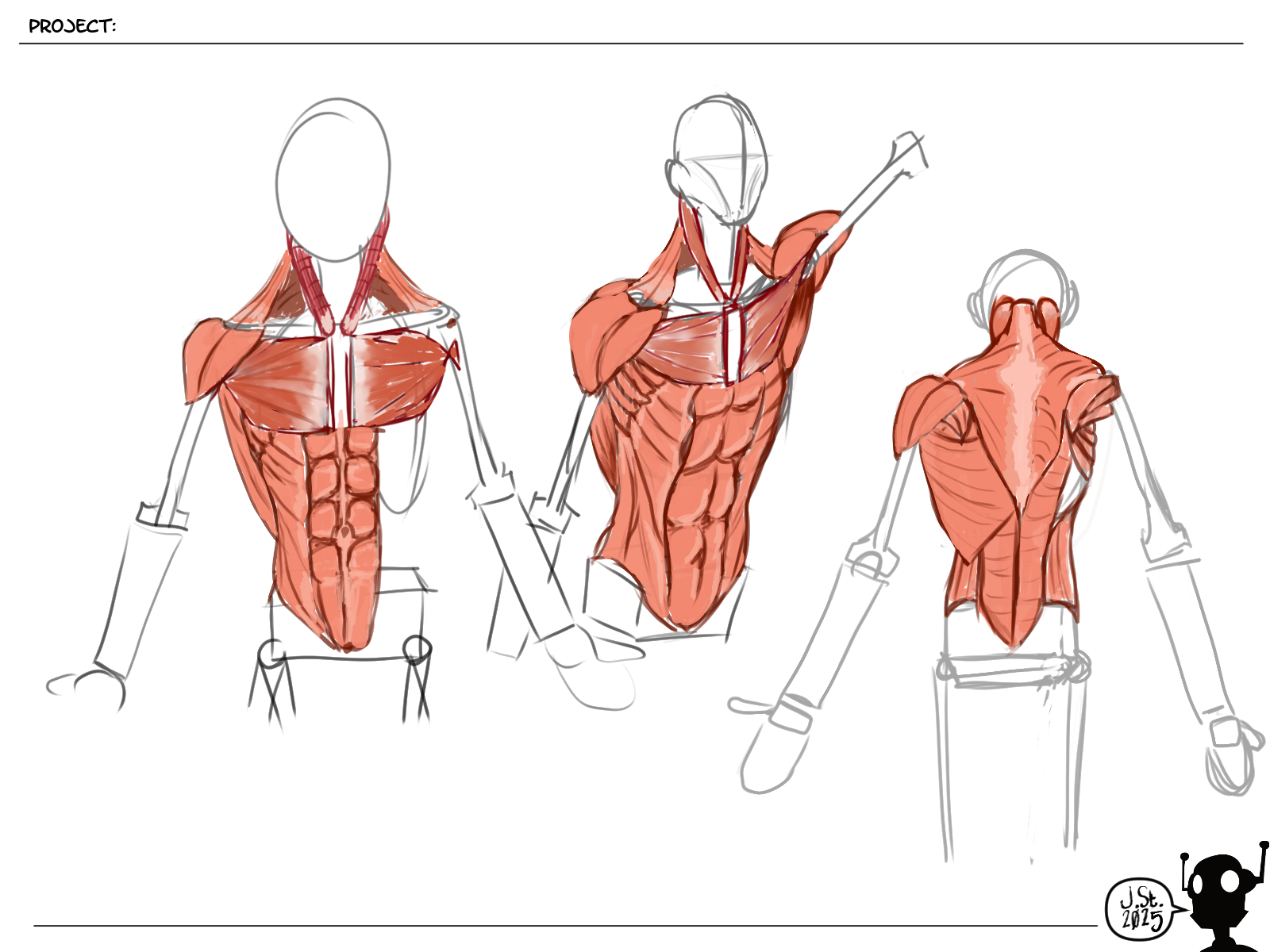
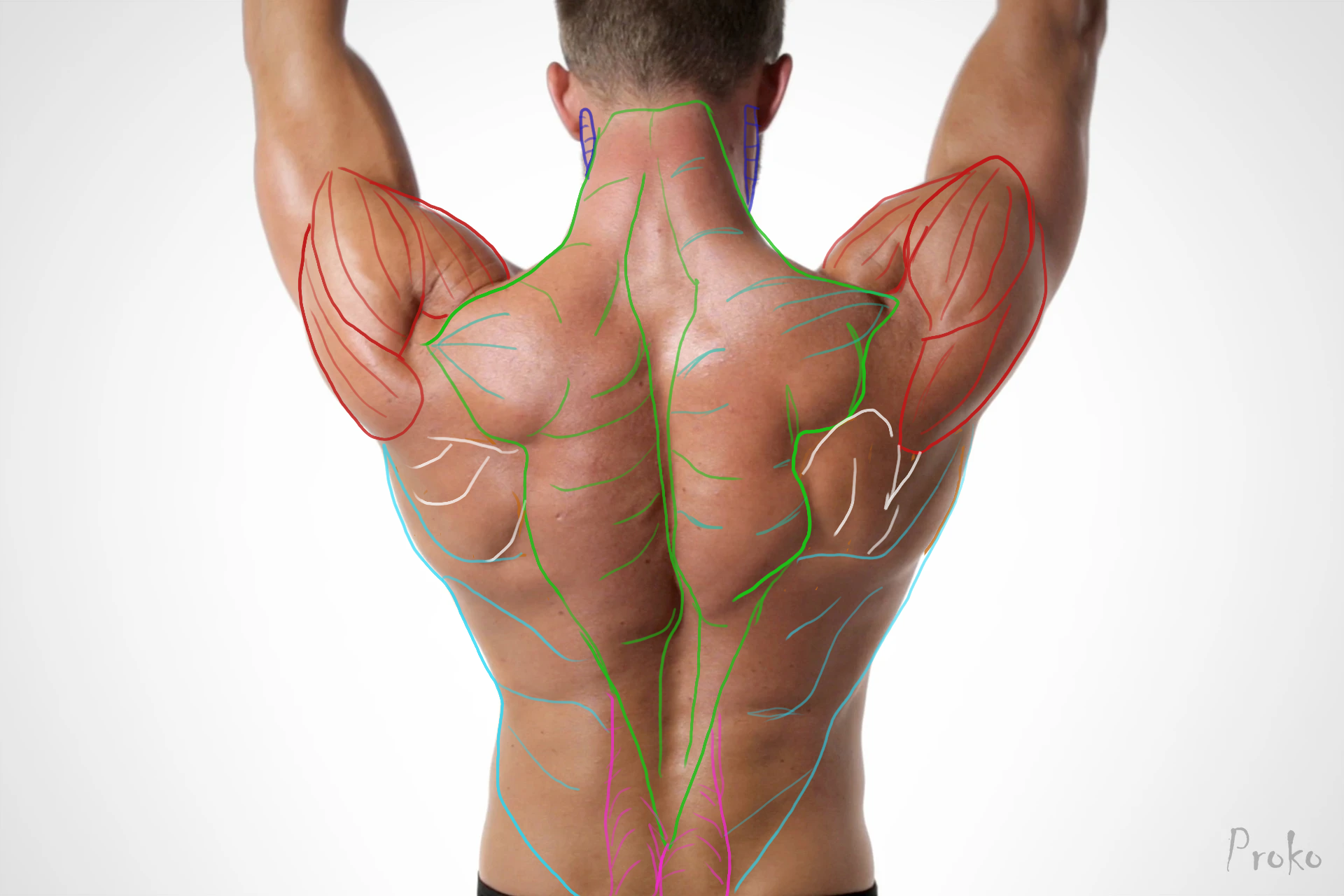
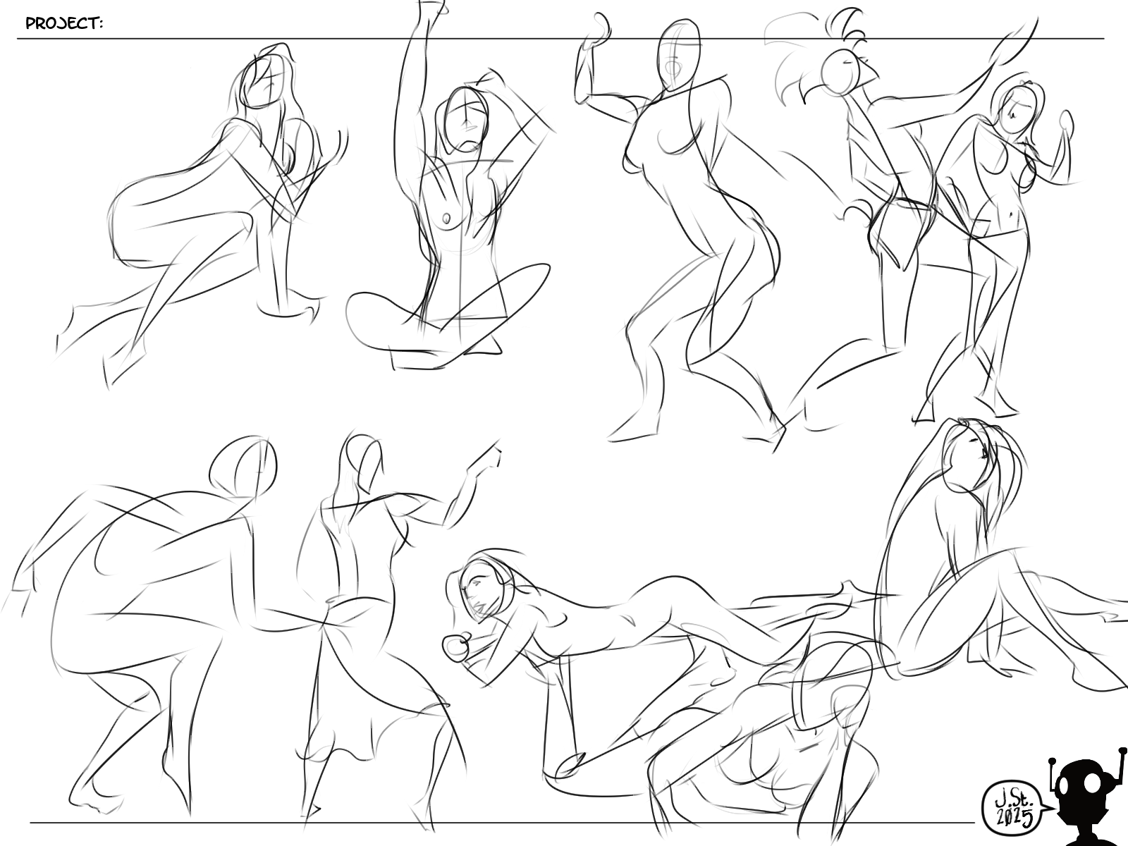
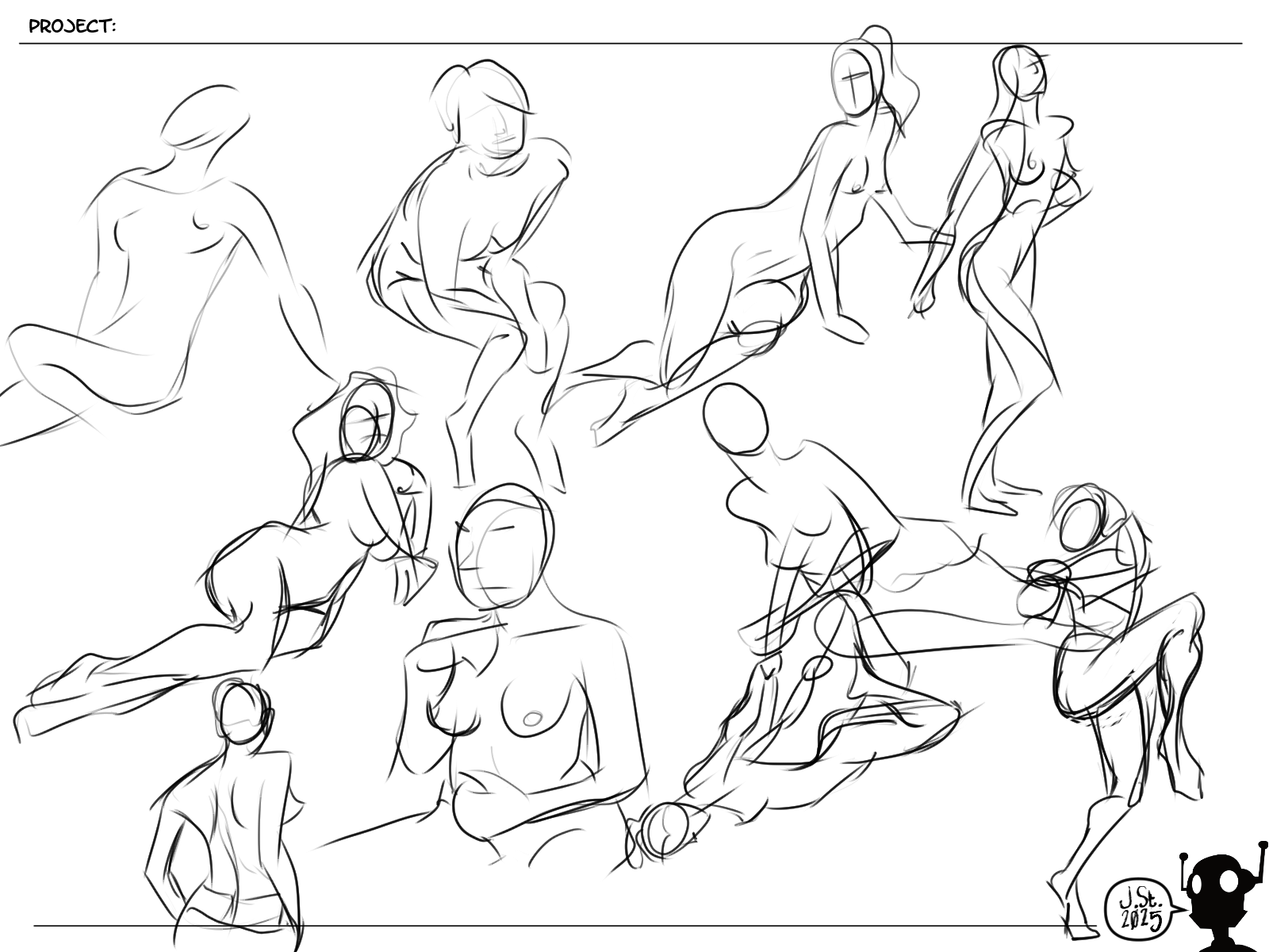
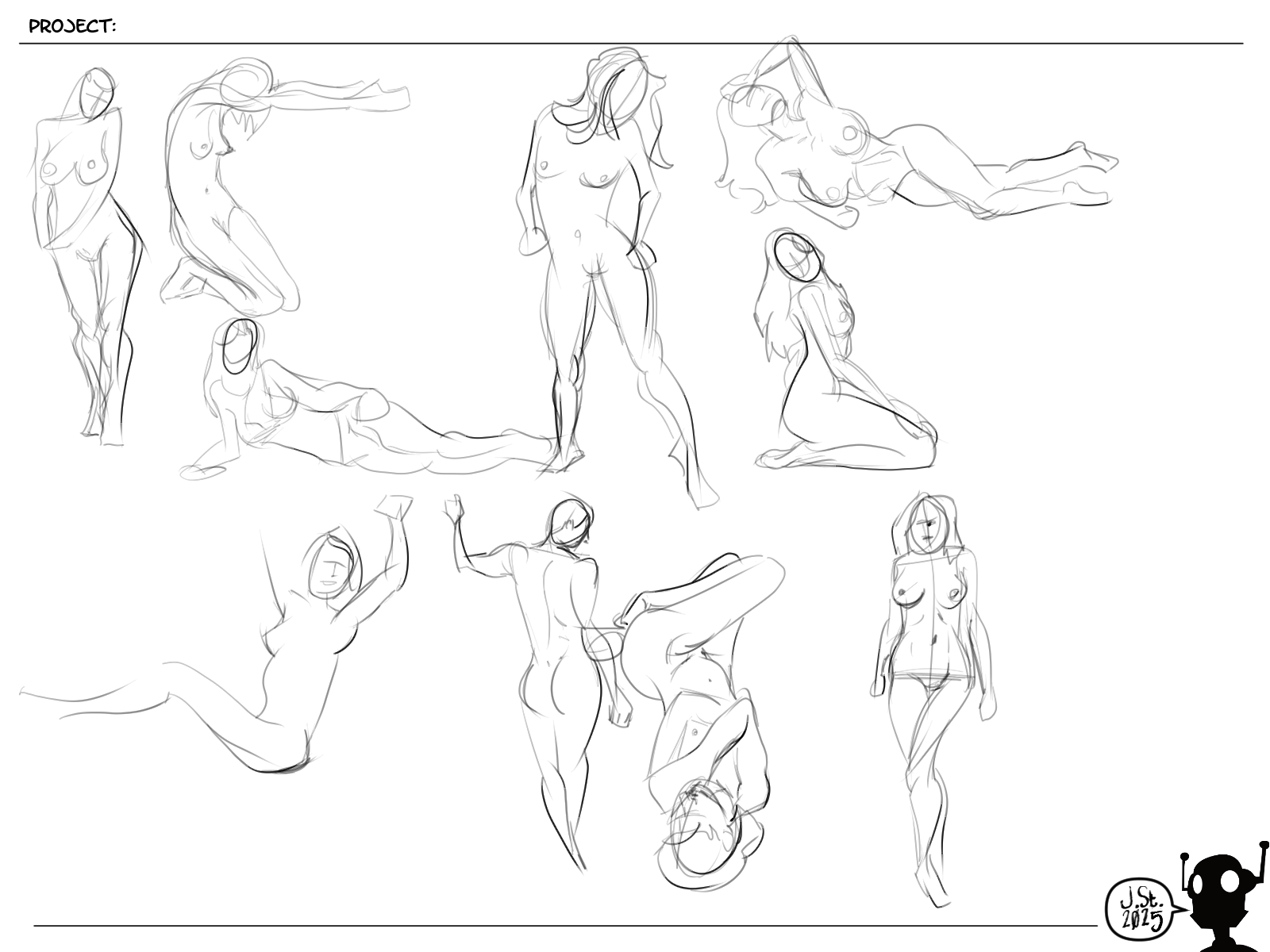
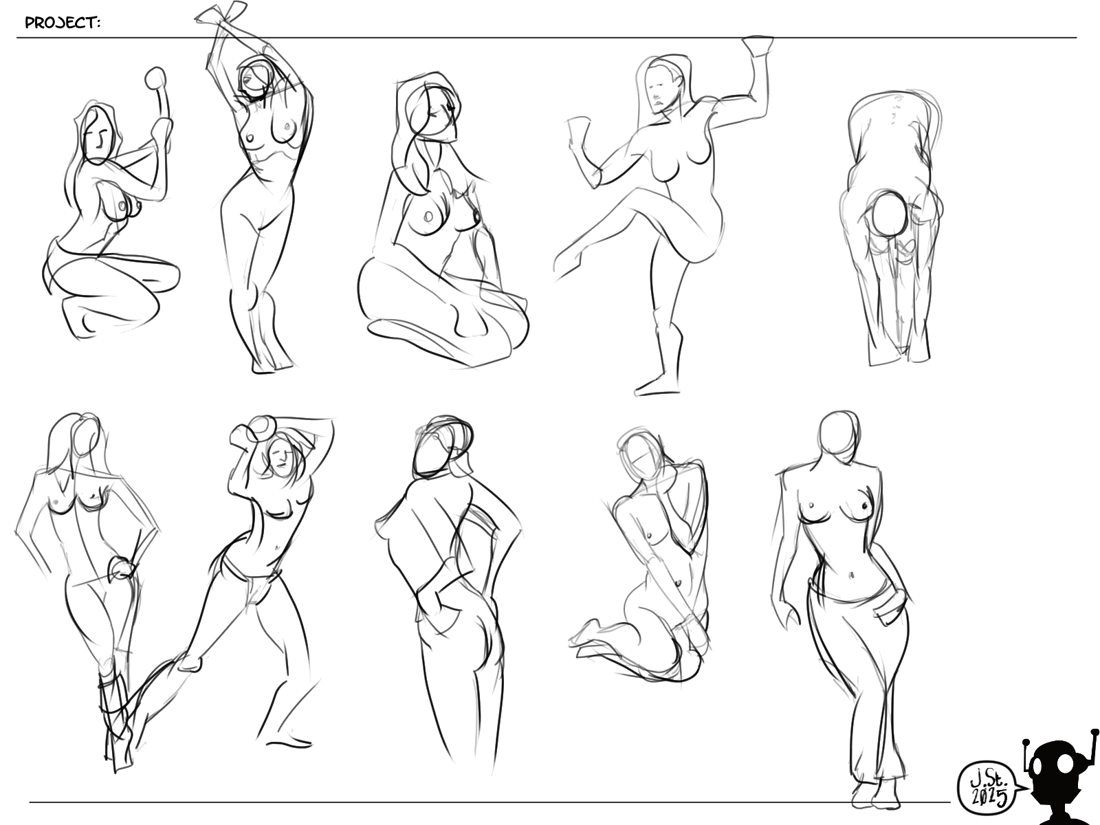
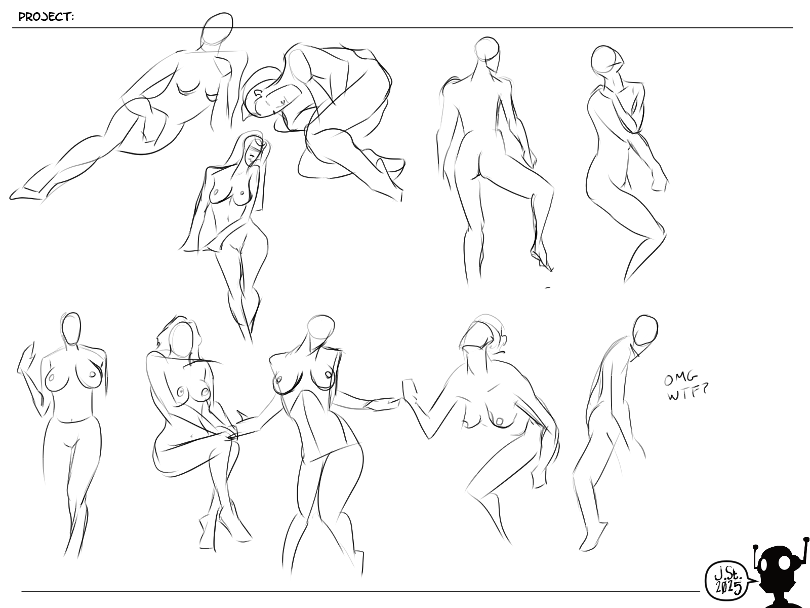
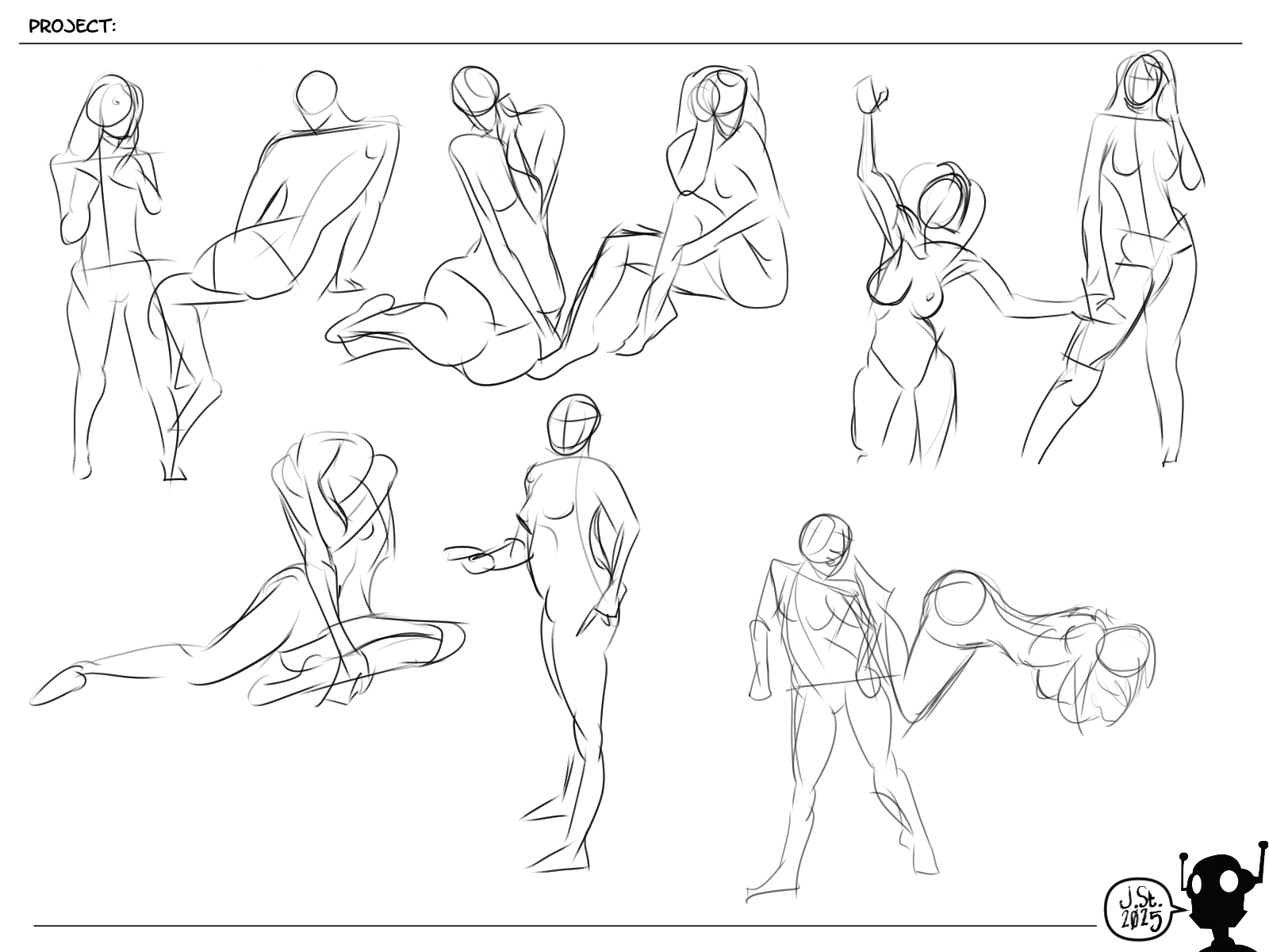
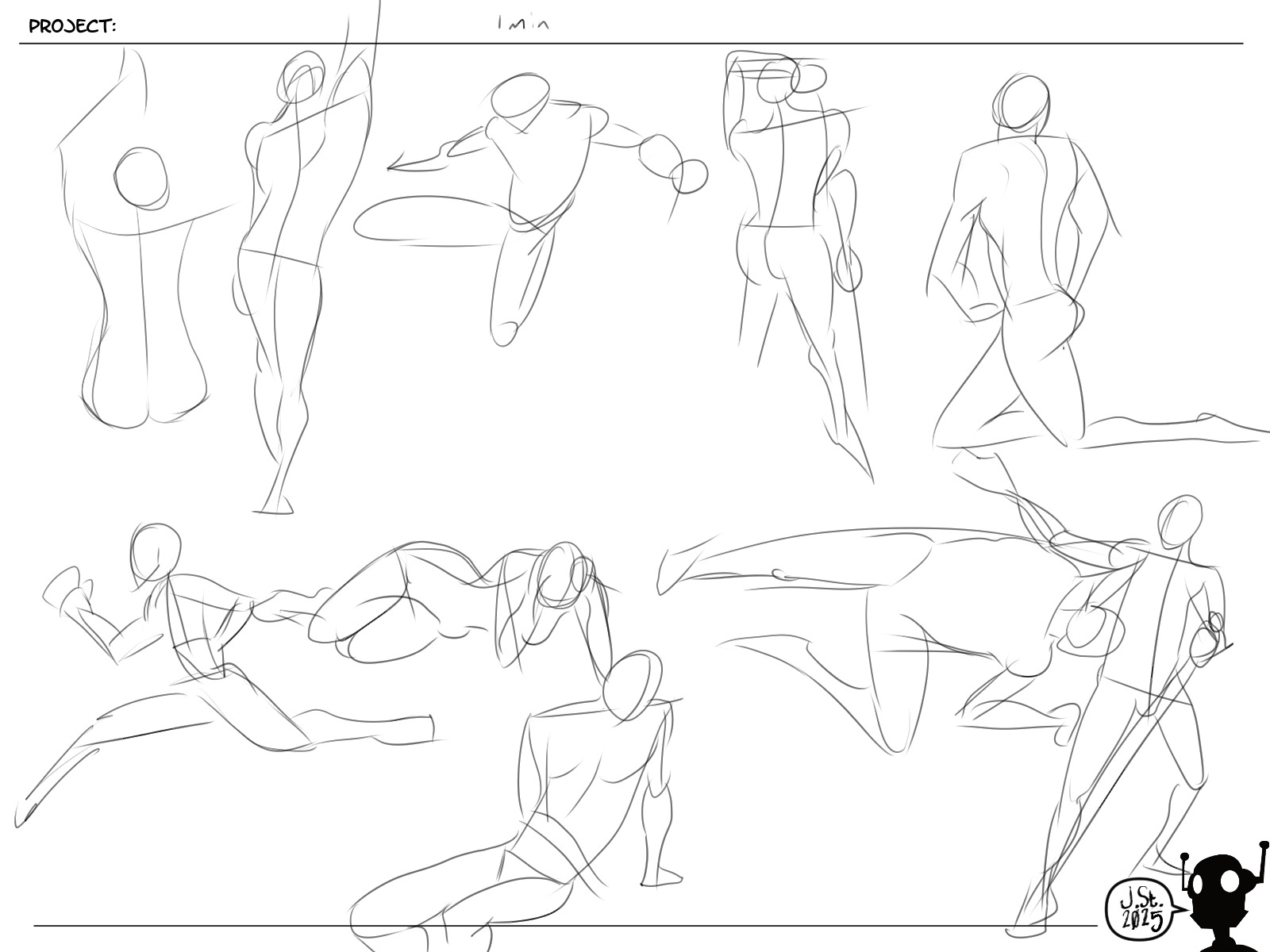
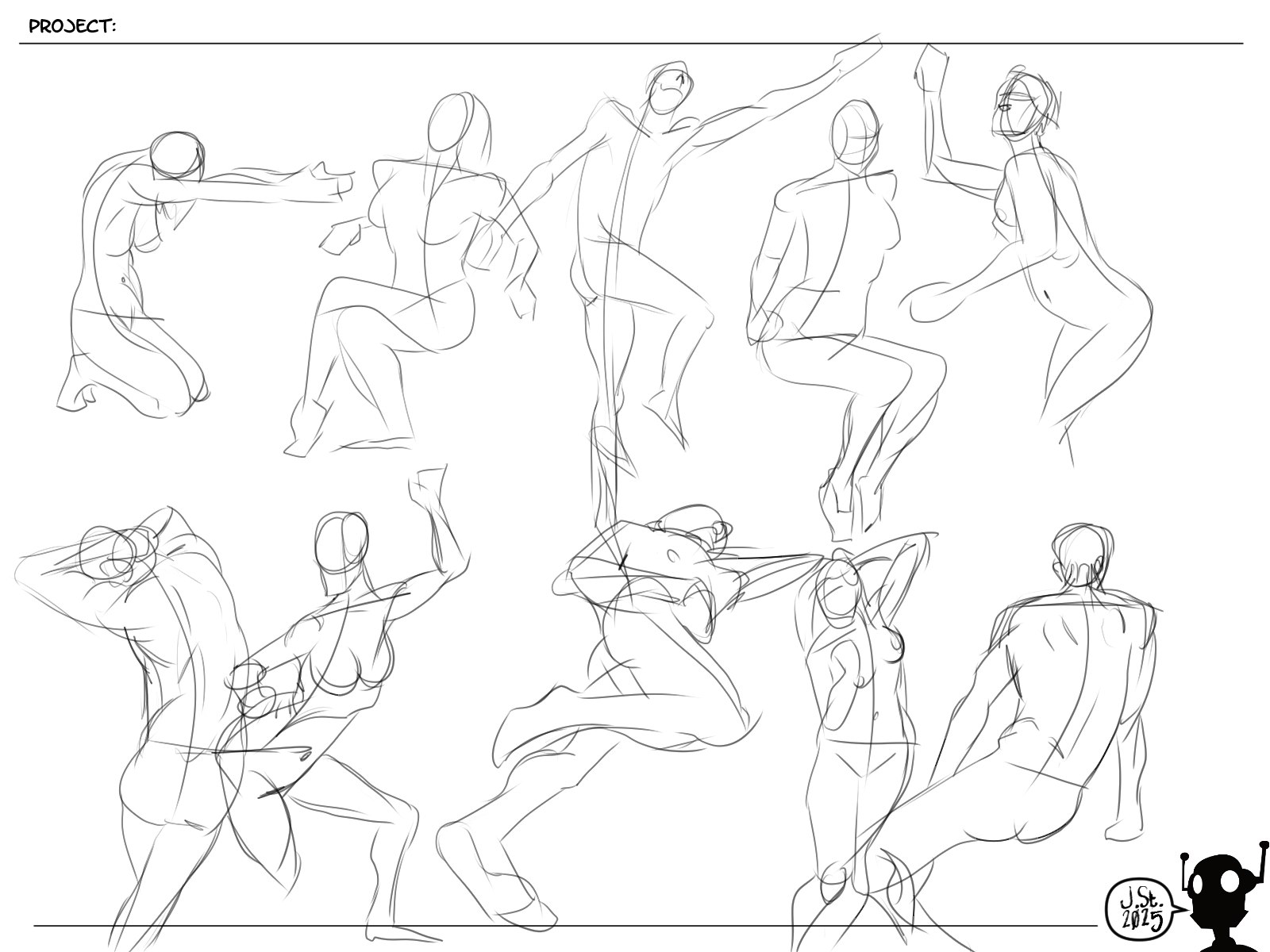
Gestures: I started trying to make more flowing lines and working on line width within the strokes. Still working on it, but you probably can see a difference in my line handling during the anatomy studies.
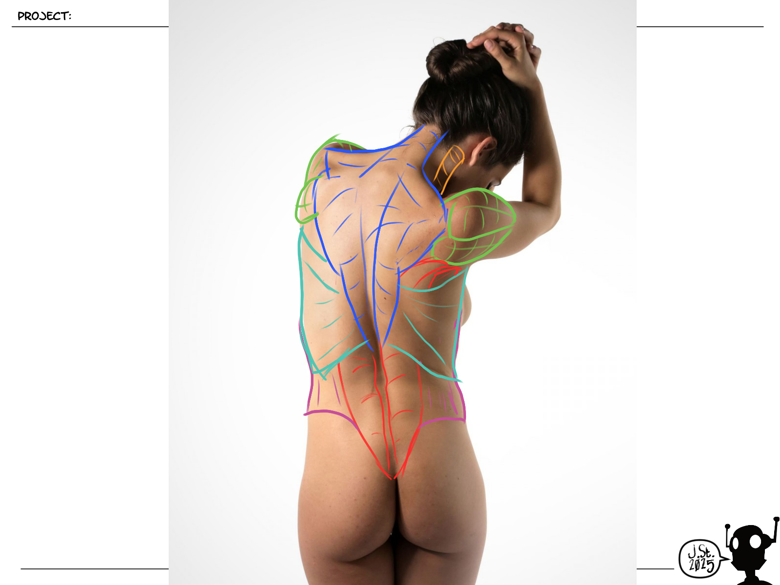
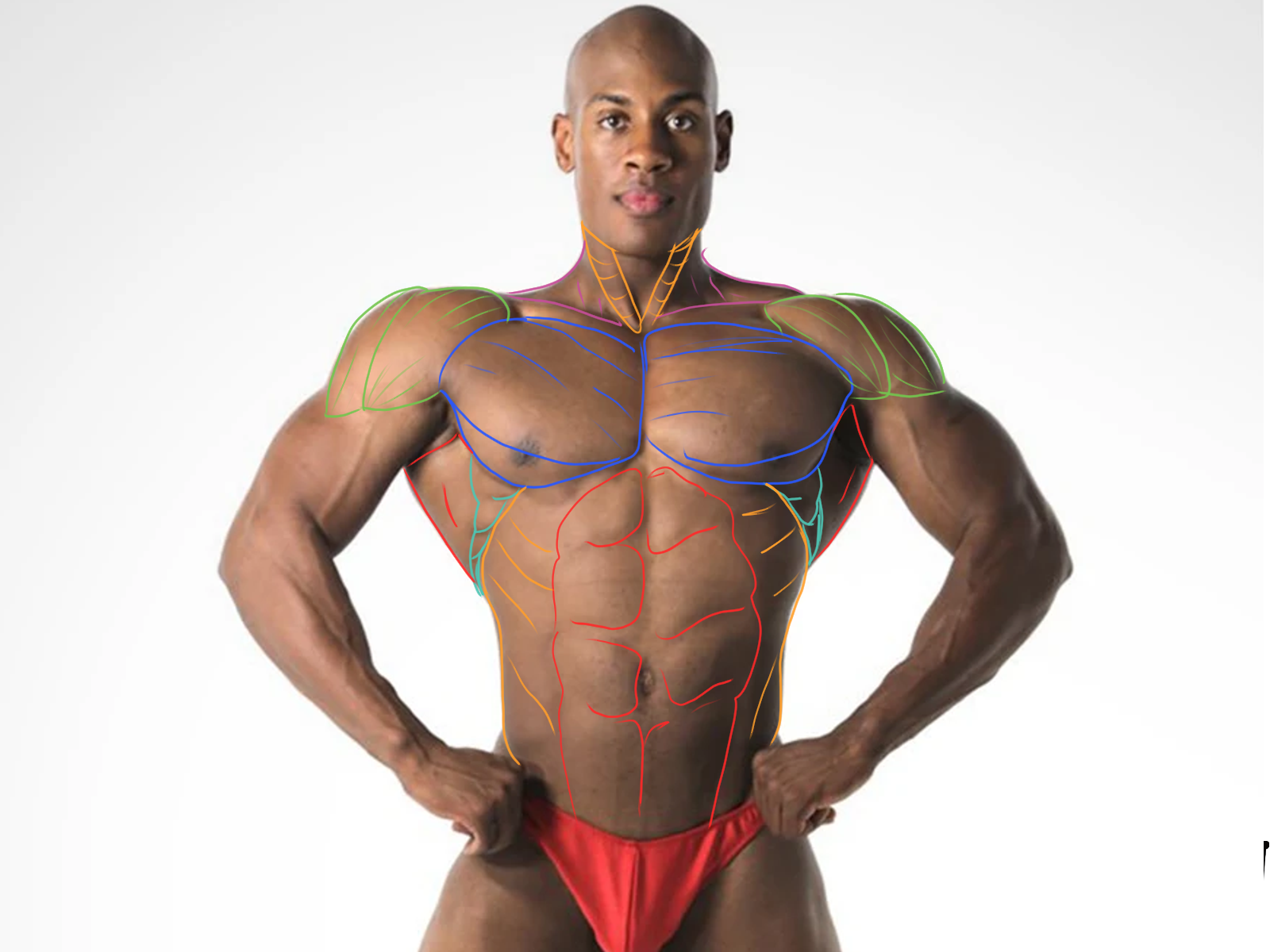
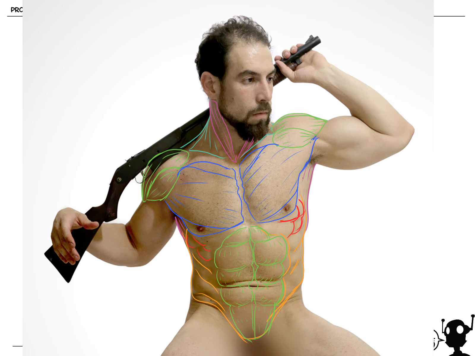
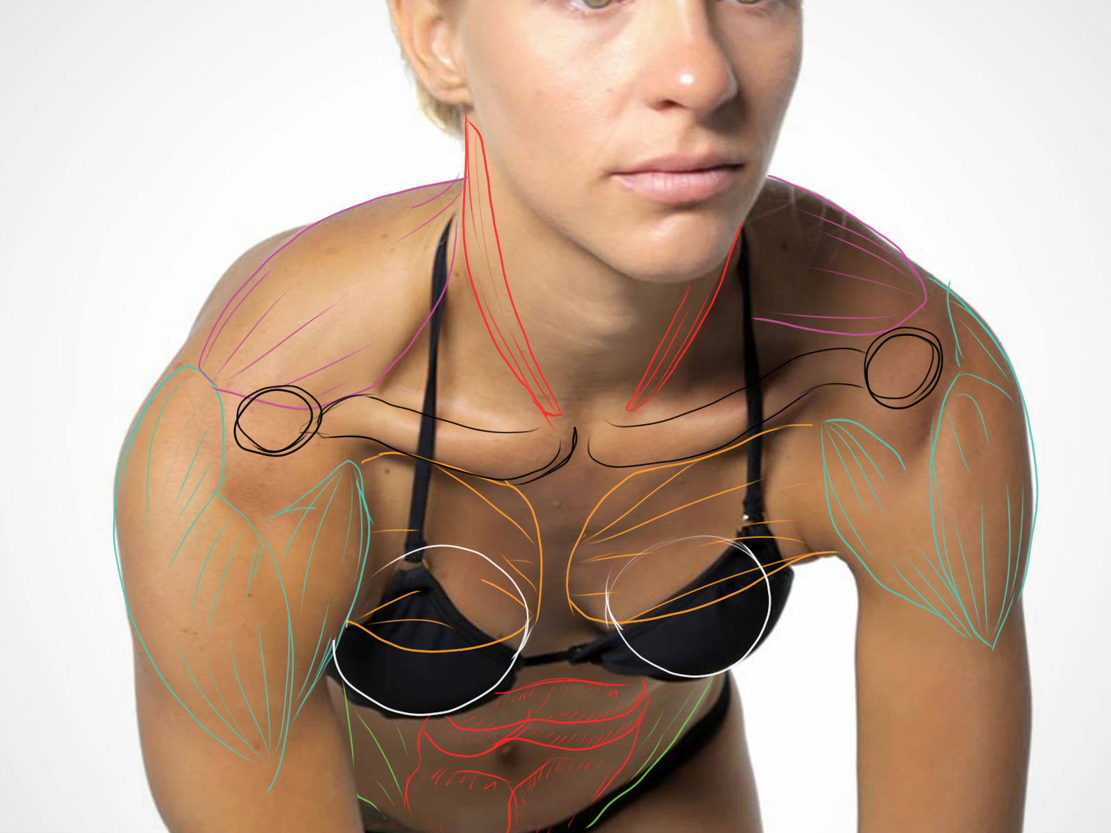
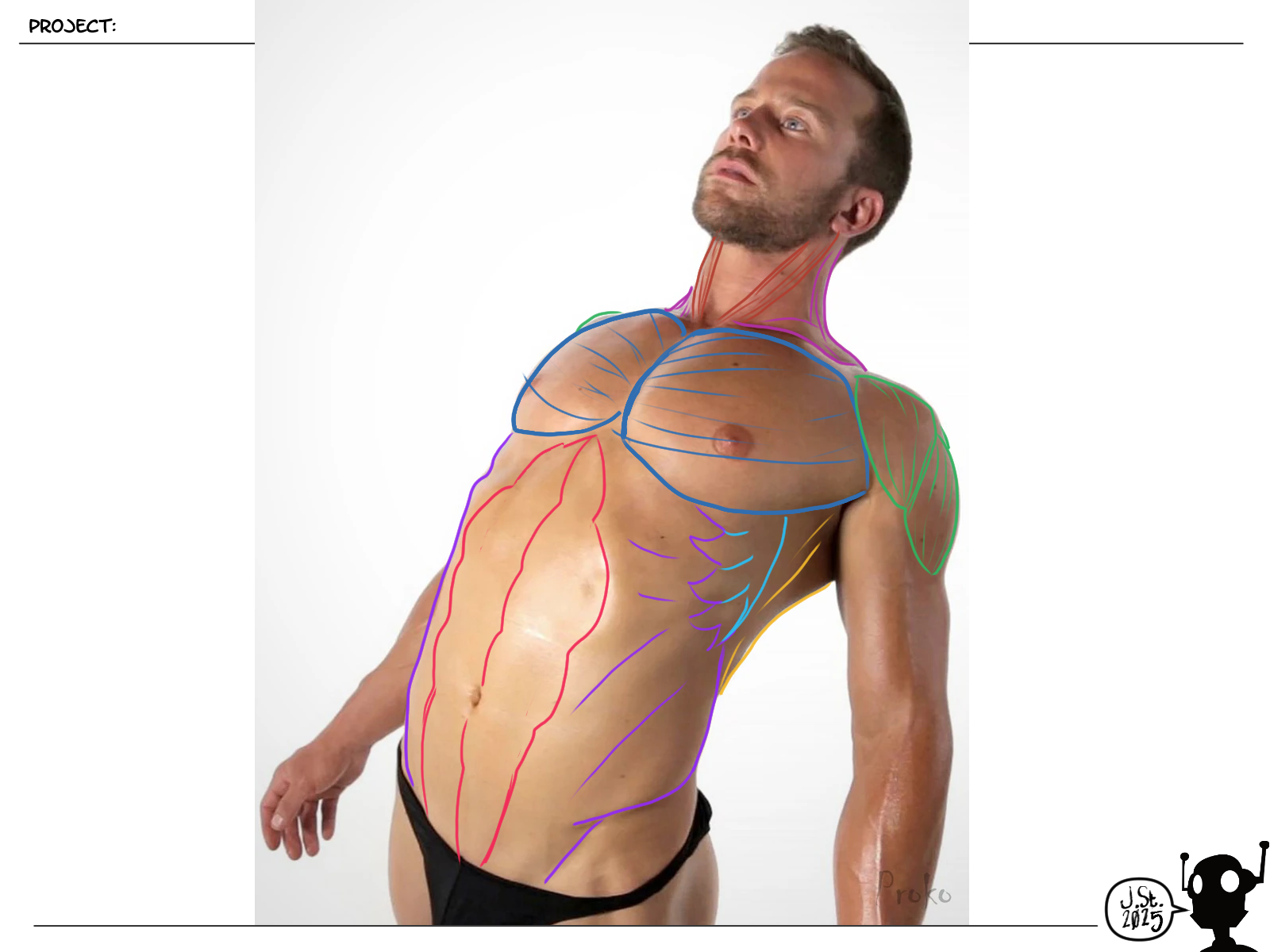
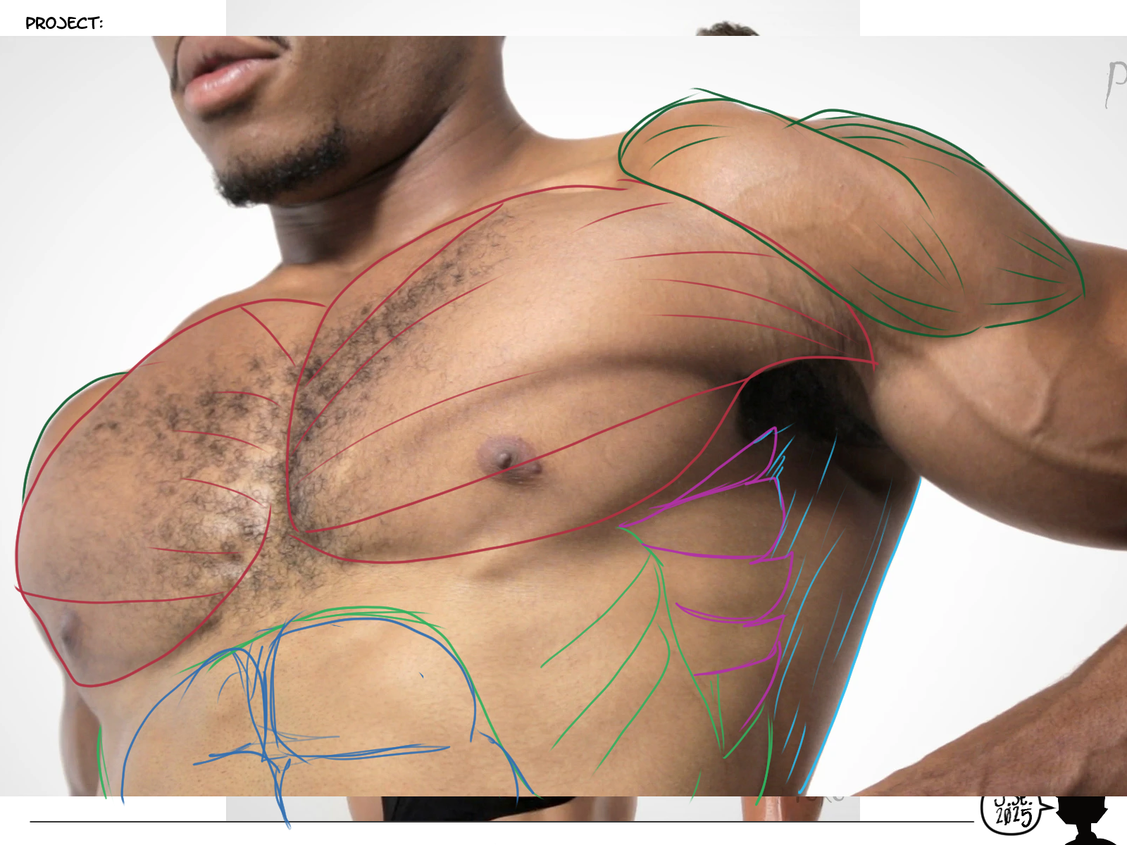
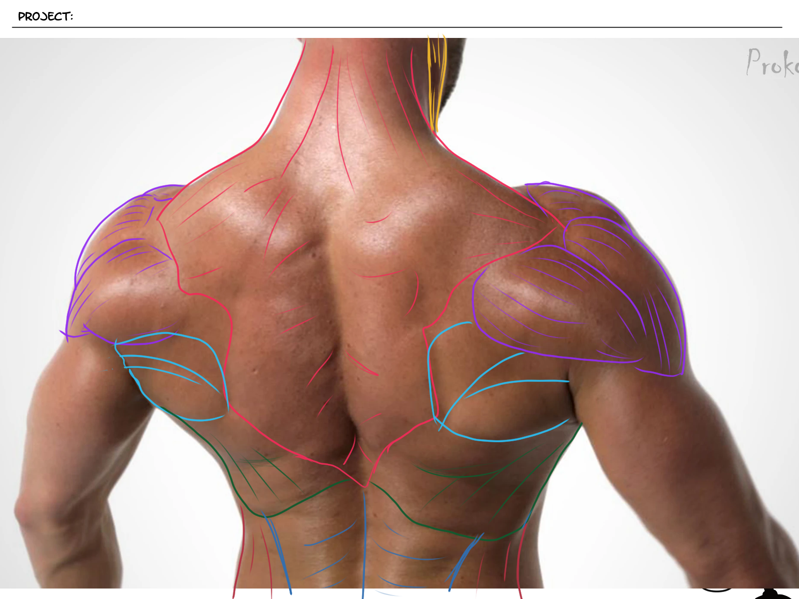
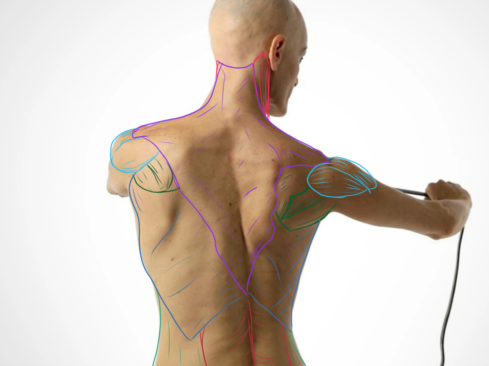
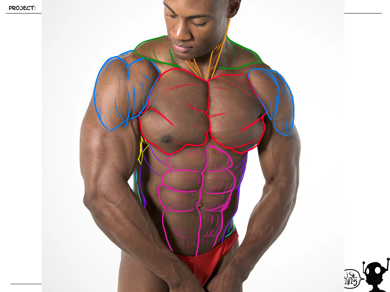
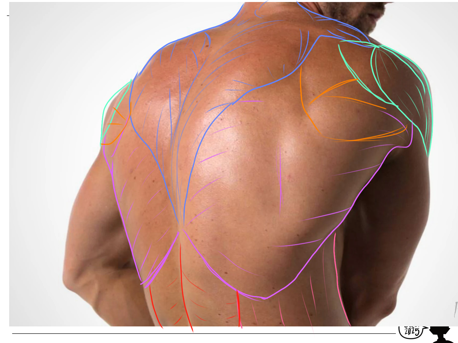
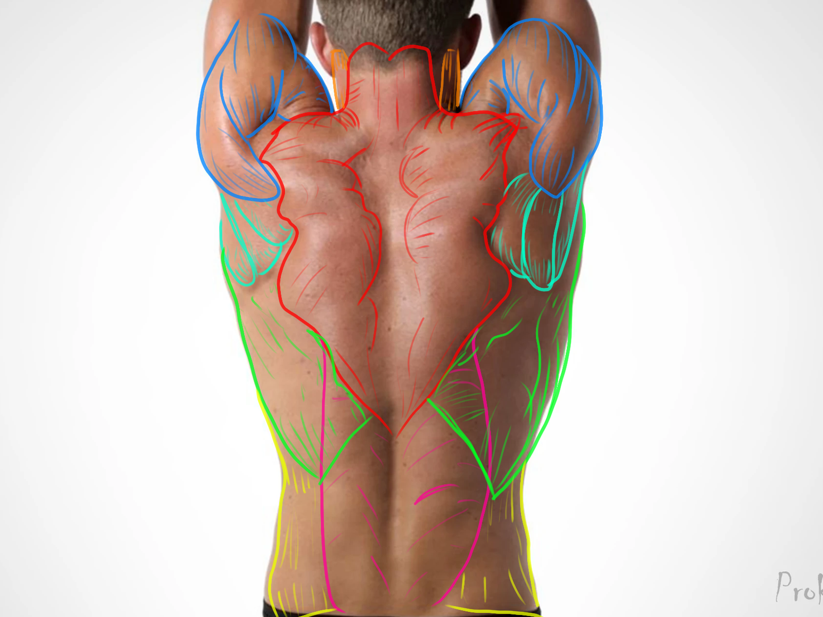
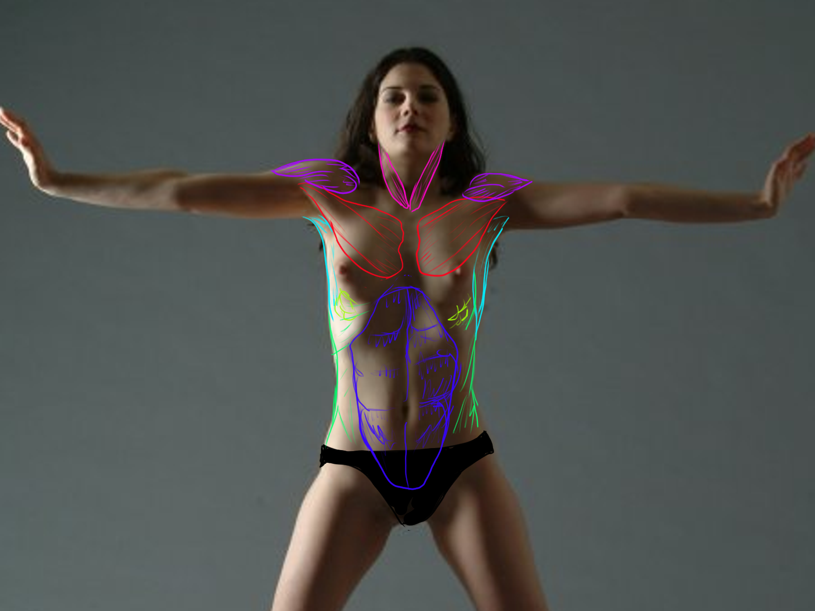
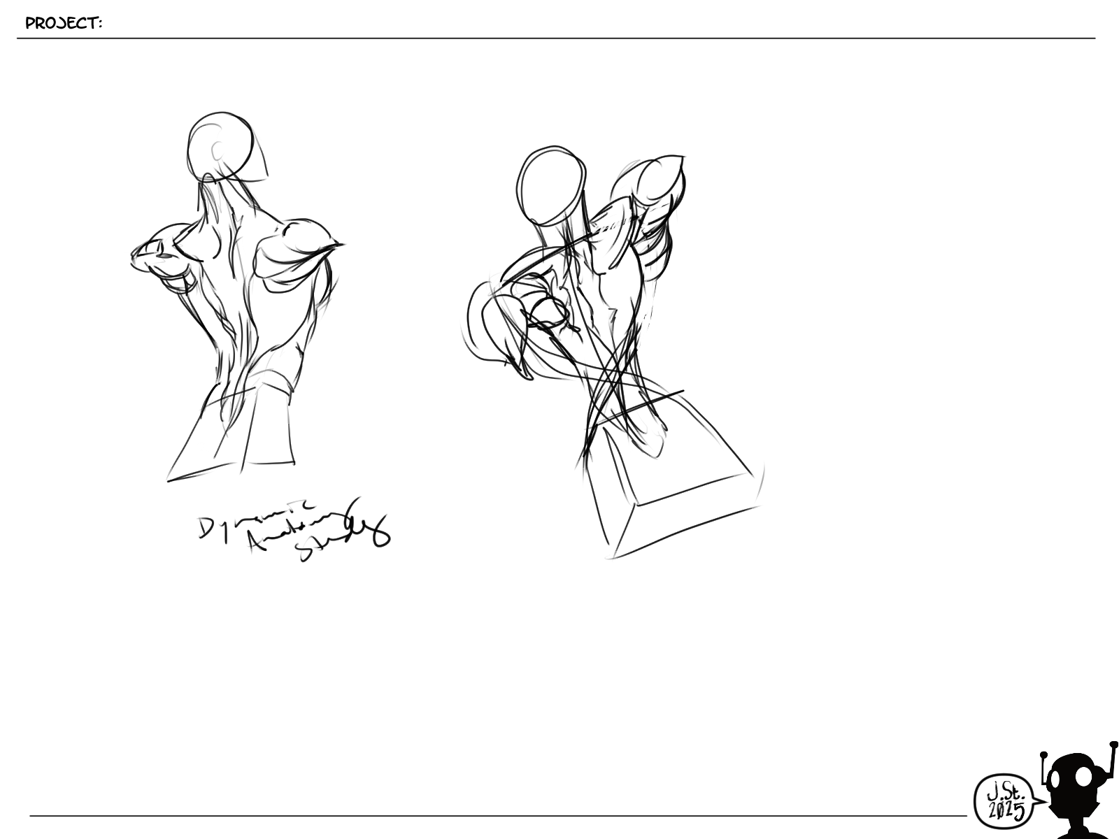
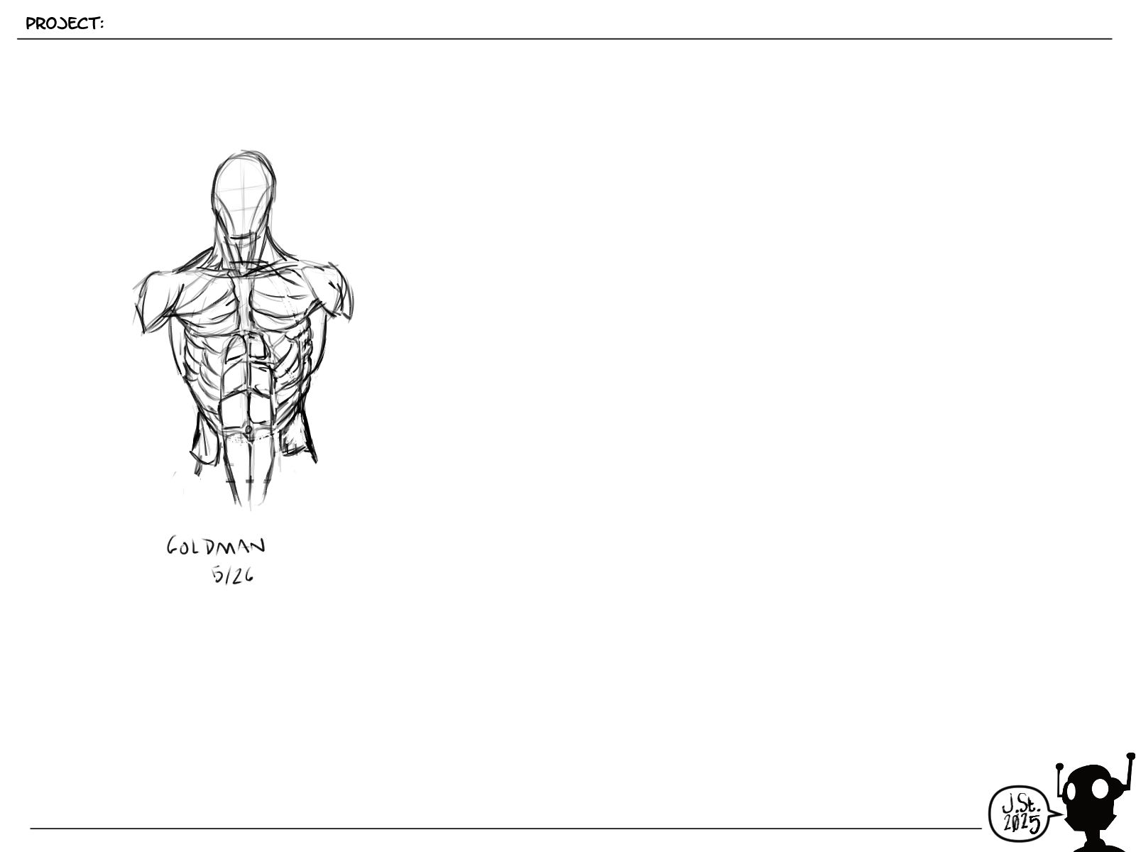
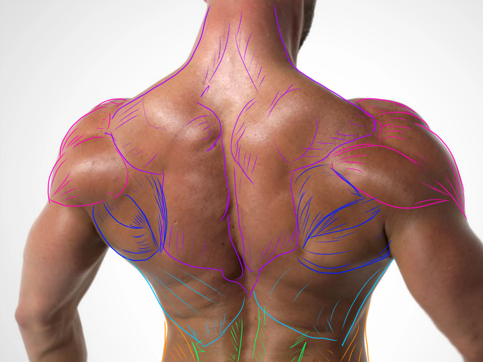
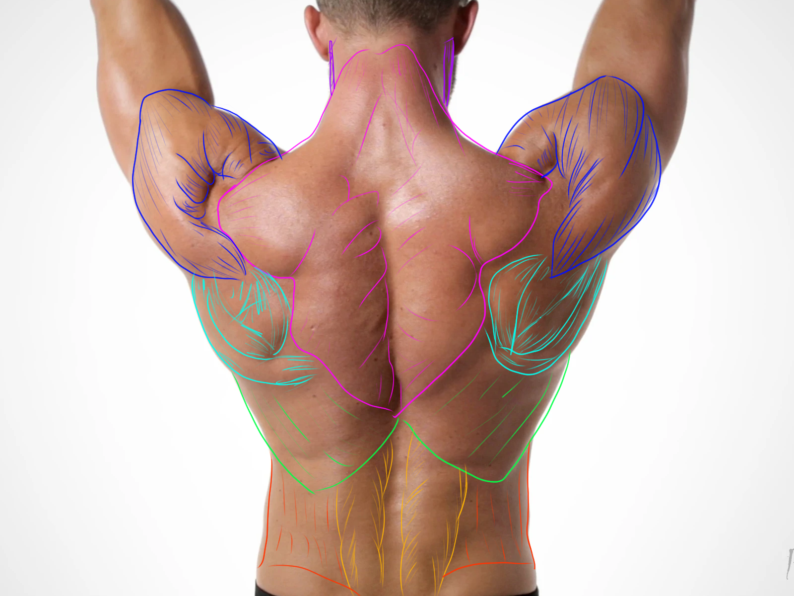
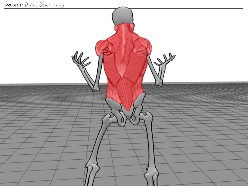
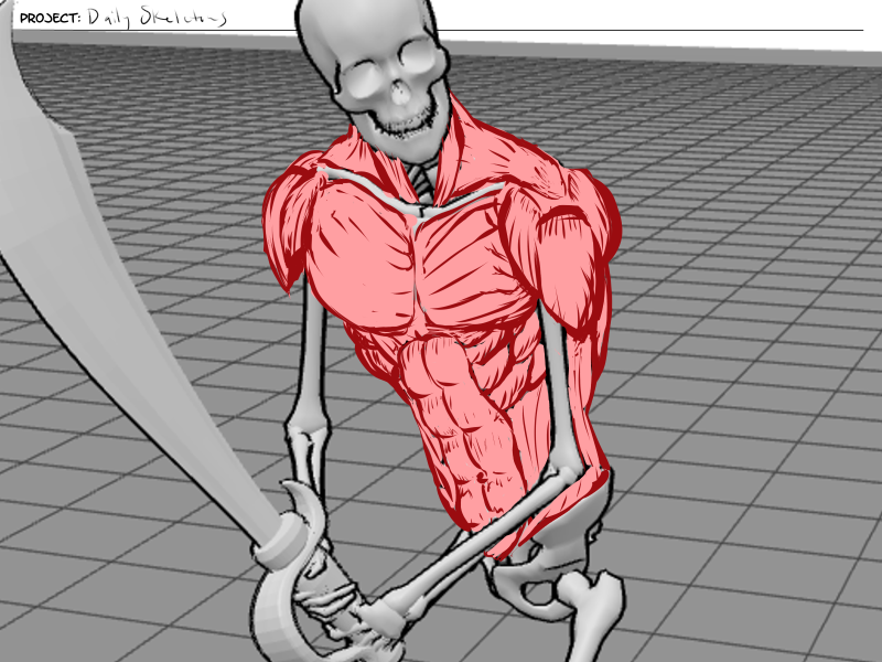
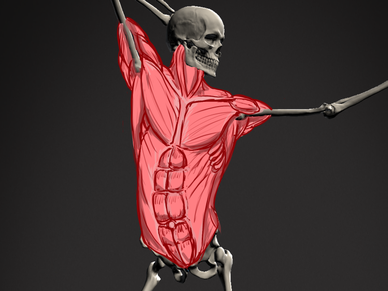
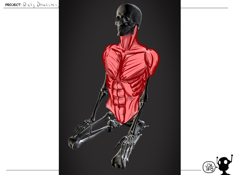
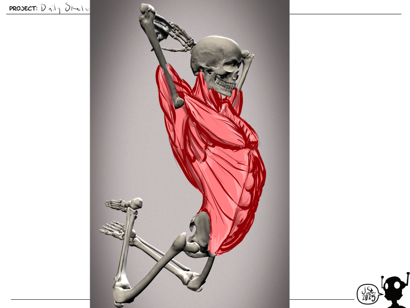
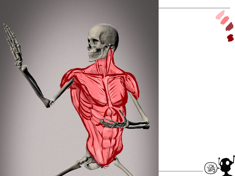
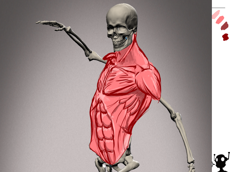
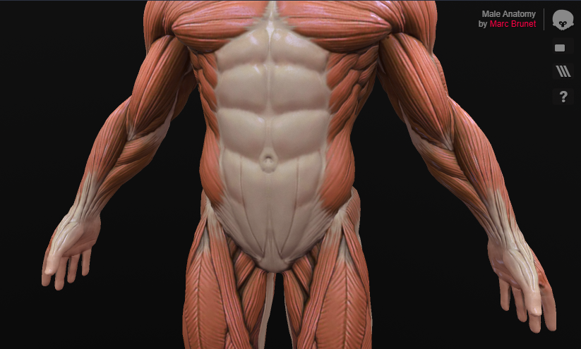
Anatomy: I've been studying anatomy informally via comic art since my teen years. I picked up a lot of the main muscle forms and names in passing, but not everything. So I still have a good bit to learn, especially with translating the muscles to people who are not cut.
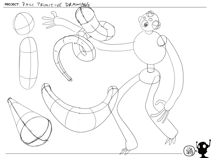
3D Sculpting: This was an enjoyable return to things I've done before, but not all that recently. Now that I think about it, trying to learn how to rig is the thing that caused me to be derailed & distracted from making more comics in the 2000s. I was trying to make comics using a now defunct software called trueSpace.
What's Next: Term 4 & Wait
I'm going to start Term 4 Week 1 today or tomorrow. But I'm also going to work on a 15 page comic story that I started back in 2001. At the time it was an existential examination of reality creation sprinkled with mystical truths and had a page count of 48, to make it qualify as a graphic novel. It was very high minded and I had a lot of doubt about whether I had experienced enough to really write anything that ambitious. So I titled it "Wait" and did just that. I waited. Well, I'm done waiting and I'm ready to make that comic and break whatever spell I had cast on myself and my creativity. This story will likely be a truncated version of what I intended and largely coded, which will be gathered together with a couple other weird experiments in "Project ColoRingBook #3." And at some point, I probably need to re-release PCB 1, PCB 2, and "-ines." Maybe a Kickstarter in 2026?
Here are the three pages from 2001 and the thumbnail sheets I did over the last couple weeks.
Side Note on Intermediated Experiences:
Outside of my art studies, I've been doing a lot of reading. Mostly philosophy, bent towards models of human consciousness. And one of the things that I find alarming is how much time I spend entangled in intermediated experiences. This is basically anything that steps between my body or self interacting with a physical environment, object, or person would be considered an intermediated experience. Most things that we do are now intermediated experiences and the easiest way to determine if it is, is to ask the question: But do I have to stare at a screen? Having a direct verbal conversation with someone vs. staring at a screen. Playing a board game, working a puzzle, vs. staring at a screen. Reading a book versus staring at a screen. Drawing/inking a comic vs. staring at a screen. So anyway, as you can see by the comic art from 2001, I'm going to make Wait using traditional media for lines and inks, but I'm probably going to do lettering and coloring (if it is going to be colored) digitally. And likewise, I'm going to try to do a chunk of Term 4 using traditional media. I looked at the assignments and I think I want to learn how to use these alcohol markers I bought awhile back with the color theory piece.
What else?
I'm playing through the classic game "Freedom Force" and reading the Discworld novels. There's a ton of adulting that needs to be done with the house. I'm playing around with being way more intentional and slow with doing things as the rush to and through one activity after another is just meaningless. All of that is from me realizing that it is vitally important to me to actually enjoy what I'm spending my time doing. That's not to say that speed is not important, but since I'm not really racing toward some huge goal (like getting a job making art in a sweat shop), taking the time to enjoy it is very important. This impacts my daily scheduling because I find that by the time I get into the flow of something, it's time to move to the next activity. And it might be possible to get into the flow again with the new activity, but it isn't guaranteed to happen - but it is 100% guaranteed to disrupt whatever flow I might be in. So I'm feeling like I probably need to widen the scheduling windows for things, decrease the amount of stuff I try to cram in by prioritizing, and focus on doing the things while I am doing them and just Flow.
Whew. Term 3 was great and I'm sure Term 4 will be even better! Cheers and good luck to everyone!
-Jim