


Yeah, it was pretty helpful. I think I will also do it for the mouth before I attempt to draw those.

 Thank you! I finally cleaned that up. Meanwhile started 3 more ..I have a habit of taking too long to finish a piece, then I lose interest in it and just start something else. I found 8 from recently i started and abandoned, that are decent enough to not delete, but not finished. There’s also been a number of drawings I felt I “outgrew” - became better before I finished them, and it would be easier to start from scratch than fix them. Anyone else thinking that?in24.6k
 Lady Death Fanart Collectible: Part 6 Polypaint and base Hi, it’s time to share with you another part of the process to create this fanart piece. Polypaint As this is my first collectible fanart I didn’t have previous experience with polypaint so I tried my best and played a bit with it.I wanted to give a ghostly and eerie look to Lady Death, she is beautiful and deadly, but at the end of the day she is a woman that died and was reborn at hell as an avenging spirit, that’s why I gave her skin tone a bluish very cold tone.As you will see I gave myself some creative freedom to deviate from the traditional color scheme that this characater has in comics and illustrations.To add a bit of sensuality by painting some freckles on the face and the chest. The dark nature of this character was the perfect excuse to gave her a kind of goth make up, very dark shadows around the eyes, blue lips and fingernails. I know that the original character includes sexy red lips but I wanted this girl to have a sexy but at the same time creepy look, that’s why we can see some thin veins emanating from her eyes. The biggest chromatic change I did for this character is at the hair. Lady Death has a characteristic white weavy hair but in my fanart I decided to gave her a very saturated blue color.The reason behind this wasn’t only an aesthetic choice. I want that the face area strongly pulls the attention of the viewer so this area needed a stronger contrast. Another reason is that I want her to have a more modern look, as I mentioned before, I’m strongly attracted to women with goth/punk look. I gave myself half an hour or more to analyse the work of experienced sculptors that create collectibles and I discovered that the use of darker values on the skin is often applied to create a greater sense of volume and three-dimensionality. I found that areas with heavy ambient occlusion are the perfect places to paint with darker colors in order to increase the separation between different forms. Even though she has a bluish skin tone, I used a bit of warmer hues in areas that, in real life, tend to go towards red and pink, this is very obvious in the nose, cheeks, and knuckles. Thinking with a logical mind it’s completely absurd to have warmer tones on the body of a zombie like creature but I didn’t want to limit myself by using only blue tones, it looks boring and artificial. In real life these colors are created by blood vessels in areas where the skin is very thin. ** Scythe **for her weapon I applied a cool gray with some warmer variations, this color scheme is influenced by the work of H.R giger. Base I’d like to talk about the design for the base which, to be honest, I forgot to develop along with the character.My main idea with the base is to show that Lady Death inhabits a very sterile and arid land, at the end of the day she is at hell.You can see a that she walks over dirt and rocks, a sign that she’s surrounded by death and loneliness. As part of the landscape we can see some bones and skulls to reinforce the idea of lack of living creatures, yet we can see three hands that try to reach her legs.This hands represent that all creatures are subordinated to her power and seek an evil blessing with a simple touch of the princess of the damned.1- The hand with skin burns represents the souls of those who are newcomers to hell, tortured souls that suffer for the sins comitted on earth.2- The hand with greenish rotten skin and pustules is the reminder of the decay that has infected the souls of those who have been trapped and have forgotten their humanity3- Last but not least, the hand of a demon shows that even dark creatures and entities bow before her presence. The cherry on the top, at least in my vision, are the simese twins that emerge from the ground, this malevolent creatures remind us that in hell there’s only perversion and any trace of innocence is lost. Thanks for reading till this pointI’m really happy to be very close to finish this creative journey, last but not least it’s mandatory to talk about splitting the sculpture in several pieces to be printed, this will be my last entry before showing the final rendered images. See yaMay Zbrush be with youin1.5k

 memory 2min gartic phone, used ref 2m gartic, used ref for pose 2min gartic 2min gartic 2min gartic 2min gartic memory memory memory memory study memory memory memorymemory memory memory memory memory memory study memorystudy study stylized left memory, right study study memory memorymemory memory memory memorymemory memory, porportions r offmemory memorystudystudy memorymemorymemory memory memory memory memory memory memory memory, right leg is a bit broken The feeling of only getting 1 - 3 likes on a social media post will never not be discouraging. But nothing is discouraging enough to make me quit drawing. I think the strategy of drawing a lot of stuff and waiting a while to post is good though rather than posting it immediately and then feeling that sadness on the next set of drawingin

 studies studies juri study imagination, how I feel before a speech imagination imagination study something I drew for my presentation also drew this for my presentation, didn't fix the one hand being bigger than the other imagination + study study studies study study, I need to fix the face a bit based on screenshot from anime but in my style study. except for the eye study studies studies study. changed some things tho imagination imagination imagination study studies, except top right samurai based on anime screenshot wolverine studies, changed some of the poses a lil, not very good at all, but first time i drew the character ever. semi study studies study imagination imagination imagination , for first time ever i tried to draw over 3d model for middle pose, I dont like the result tbh, but it makes it much easier than coming up with it from memory.imagination, except right figurestudies imagination + studies, coming up with action poses r hard, these are not dynamic enough, I will redraw better ones in future. imagination , imagination imagination study, except for eye imagination imagination imagination doodles except for the two chrollos imagination storyboard thumbnail, idk if i ever shared this. my storyboards end up being a little detailed since i usually just draw in one layer.in22.6k

 Hello! My name is Vithor, I am from Brazil, studied Design at a local college worked as an illustrator for more than 10 years. I took a time off around 3 years ago and am trying to get back in my art shape and maybe become professional again. Here are some recent pictures: You can find timelapses for most of them on my instagram: www.instagram.com Vithor Albertim (@vithor_albertim) • Instagram photos and videos 123 Followers, 638 Following, 19 Posts - See Instagram photos and videos from Vithor Albertim (@vithor_albertim) Comments and critiques are always welcome.Cheers!in825

 Thank you @daceronine! If I remember I save in google cloud, I will have to stick a note to do it more often. Lamp is from life. Poses are from refs but I look at refs for a while and then try to do it myself and look it up if needed. Outfits and rest is from imagination Something went wrong while installing system so we will have to wipe everything again... pc works but something is wrong. We will wait till internet is done and I will save everything on cloud this time Threads came out in eu. It's been 3 days and I had more engagement than after half a year on instagram. It feels really nice I hope it stays this way A portrait of old dude. It's the same character I posted a while ago. Inspired by Bayard Wu work. At first I thought of him as a bear but I named him Fenrir and I think wolf suits him better. Eye gave me a bit of hard time but I think it is fine now. I focused on face and forgot about area below. The way I draw hair clashes with greying hair. I had the same problem while doing Lohse's white hair. Does it looks like it is greying here? I love how desaturated red looks blue there. I keep lying to myself that I will use different color scheme but It all comes down to this blue and yellowish one it is just flipped this time Have a great day!in49.6k
9 days later
Some lip studies. I could have spent time and done more realistic rendering but didn't feel like it was worth it so I just quickly laid in some values under the line art again while zoomed out. Things were busy again this week with work so I didn't make as much progress with my studies as I would have liked. I guess eyes are next.  .
.
I have been playing a lot of Infinity Nikki lately and for the box cover, I decided to make a new treatment for the Infinity Nikki logo and imagine what a physical box for the game might look like if they sold physical copies of it. I staged the whole thing in a marketing banner design and photoshopped different imagery together to make it look nicer.
The lip studies look good. The Infinity Nikki box looks adorable. Normally the E rating is on the front or back of the game box. I'm not sure if it's on the side.
27 days later
Work got extremely busy again and I completely fell off the wagon with my practices. Balancing life, work and practicing art is a real struggle for me at times and It makes me feel bad because I had such a good momentum going too. I made a little chain and fence brush tonight which was all I could fit in for today. Hopefully this small step will kickstart me to continue again.

I also made an ugly character in photoshop with the pen tools. There's a reason why graphic designers use illustrator instead of photoshop for vectors. lol I guess I can say I tried the tools and don’t like them.
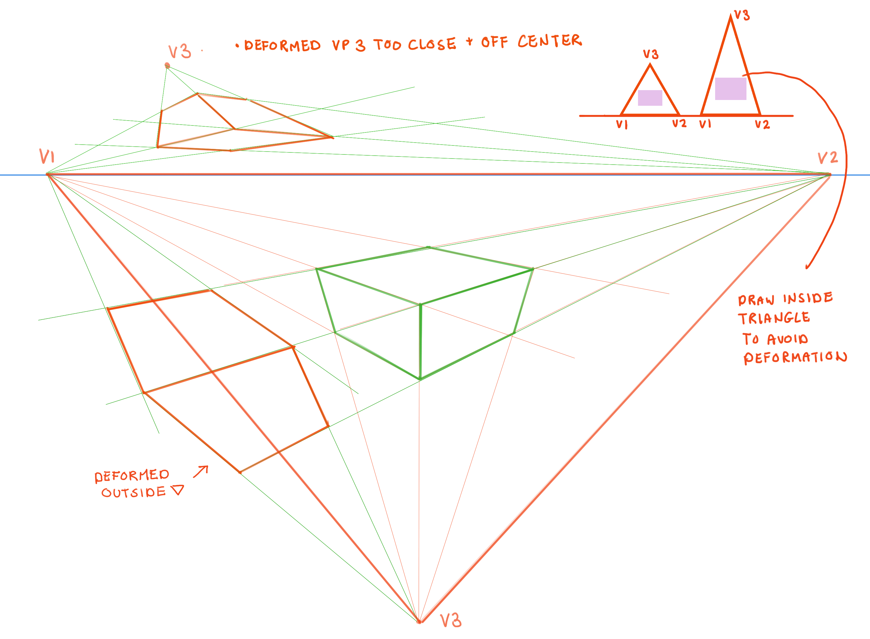
Notes from the 3 point perspective lesson. I started on some eye studies as well but haven't shaded them in yet. Glad I was able to make a little bit of progress this week after being away for a while.


I really like the clear planes you're using in this, especially in the nose section. I always overwork that, making it look too blocky.
I drew some boxes on the 5 point grid.
I'm still struggling with daily practice. Sometimes it's a fight with myself to get going but once I get going then it's much easier. Just starting is the hardest part for me. Especially when I am already feeling burnt out with everything else that's going on in my life.
Even one small thing a day is better than nothing at all though.

I tried the man in 4 point perspective. This was turning out soooooo wonky looking while I was working on it that I burst out laughing because he was so wide! I must have gotten the initial measuring proportion off, so i slimmed him down by squishing the art horizontally. I also had to go back and adjust the head since it was super tiny compared to the rest of the body. I think it turned out ok in the end, but don't think I am ready to attempt more of this just yet on my own.

I took a bit more time to render these eye studies than the others. I had to cut myself off though cuz i could just keep going further into hyperrealism.
I want to study some anime and cartoon artworks next I think since I kind of want to get away from realism eventually and I'm interested in learning more about stylization.

Nice work on the chains and fence brushes. You may need more practice with the 3-point perspective. Nice work on the faces and the deformations of its shapes.
The 5-point grid looks great, as well as the eye studies.
The four-point perspective mand does look a little challenging. But it works
Thanks for the comments. The 3 point perspective stuff was a note taking copy from Marc's lesson. I haven't actually tried applying that to any art yet.
Taking notes while watching the lesson helps me to remember what he said, but I think i'm going to do some perspective lessons out of a book soon though since his lessons on that topic aren't very in-depth.
I did some studies from the 100 heads challenge pinterest board. I stuck with just line art for these since they were pretty time consuming.

Back to some gestures and feeling rusty. I really need to make time for these every day.
Nice work on the heads. the line work looks great. The gesture drawings are pretty good as well.