Here is my attempt at painting cloth from the reference that Marc used. It definitely didn't turn out as well as Marc's did but it at least resembles cloth, so I'll take it. I definitely need to work on my values more and adding more contrast to my painting as a whole. Some parts look as if they blend in together because of the lack of contrast...
Feedback would be nice.
Hello! I used a technique on Youtube that I saw from Sam Does Arts to make this painting. I can definitely see progress coming along, so hopefully I can keep it up!

You did a really nice job with this, Don't be discouraged by clothing, in my opinion its one of the most difficult things to tackle that relies on a ton of skills that come later in the program. Clothing is my least favorite thing to work on so I understand! The main feedback I would give for the dress is to use a darker black in the deep folds, don't be afraid of using nearly pure black in the deepest recesses it will help give more depth and volume. Also same thing with the shirt! Take a look at the armpit area on her left, dont be afraid to go really dark! I know its hard and I also have to break my habit also I do the same thing. Keep up the good work!
This one took super long, but I managed to do this figure drawing from imagination. I had a lot of trouble mostly with the neck / shoulder area when it came to placing it properly, so it might be a little bit off. My anatomical knowledge when it comes to arms isn't great either so they may look a bit off too.... but overall I'm pretty happy with the result especially since I did this without a reference.

This is some really great work. You do have a point about the hands but overall it looks really natural. The fact that you did this from imagination is even more impressive since it is a complex pose. Great job!
Hey! Thanks for the nice comments on my last post, I appreciate them 
I did another drawing from imagination. I'm getting the feeling that something is off with this one, but it's hard for me to exactly pinpoint what that is. It's definitely a sign that I should go back to drawing from references for a while. I'd appreciate any sort of feedback!
Really lovely job with these recent poses! I did a quick trace over to see if I could isolate some of the issues and I think this is where the problems may be. I think most of the issues are coming with the perspective of the chest. The chest is pointing away from the viewer at a pretty good angle because we can see the top of the chest box. So the chest box is being forshorttened quite a bit and the pelvis is pretty close to front facing. But the length of the chest box here is normal length maybe even a bit longer and the pelvis is pretty short. I think this contributes to it looking a bit off, I think if the torso was forshorrtened more and the pelvis extended a bit more it would be more balanced. I think there is also some issues with how the deltoid is connected, they appear to be a bit out of perspective for me, but not 100% sure. Also, the bicep tricep area on her right arm feels a bit short. I erased her hair to get a visual for the skill and I think the face may be a bit large as well. This is a tricky pose for sure and Im not 100% sure on them but thats what stood out to me. Great job with these poses from imagination and keep it up!

Yeah, now that you point it out, I definitely do see the issues with foreshortening. I'll try to keep that in mind next time I do one of these poses. Thank you!
Hello! I did a little study of one of SamDoesArts' works. I think it generally came out well. Mine is on the left obviously.

Hey! From the studies I've done of SamDoesArt's figures, I decided to try to incorporate his emphasis on shape and gesture into my own figure drawings. Previous figure drawings I've done have had more of an emphasis on structure and I feel like I lose a lot of flow by doing so, so I might try to stick to this new style more. Feedback is appreciated!
Oh, and here are some other studies I've done of Sam's work before I approached the figure drawing above.

Hey! It's been a week since I posted due to my laziness / other stuff I've got going on...
I decided to do a portrait to warm back up into the art mentality. Feedback would be nice!
Hello! I'm doing a little bit of a change in direction as I really want to get into painting and not simply continue with line art alone...
Along with the portrait I did today, I also attached two images of basic geometric shapes that I gave an attempt at rendering. I'd appreciate feedback, especially on the shape renders!

Different shapes...

From a photo (I feel like I should have made the values darker here)
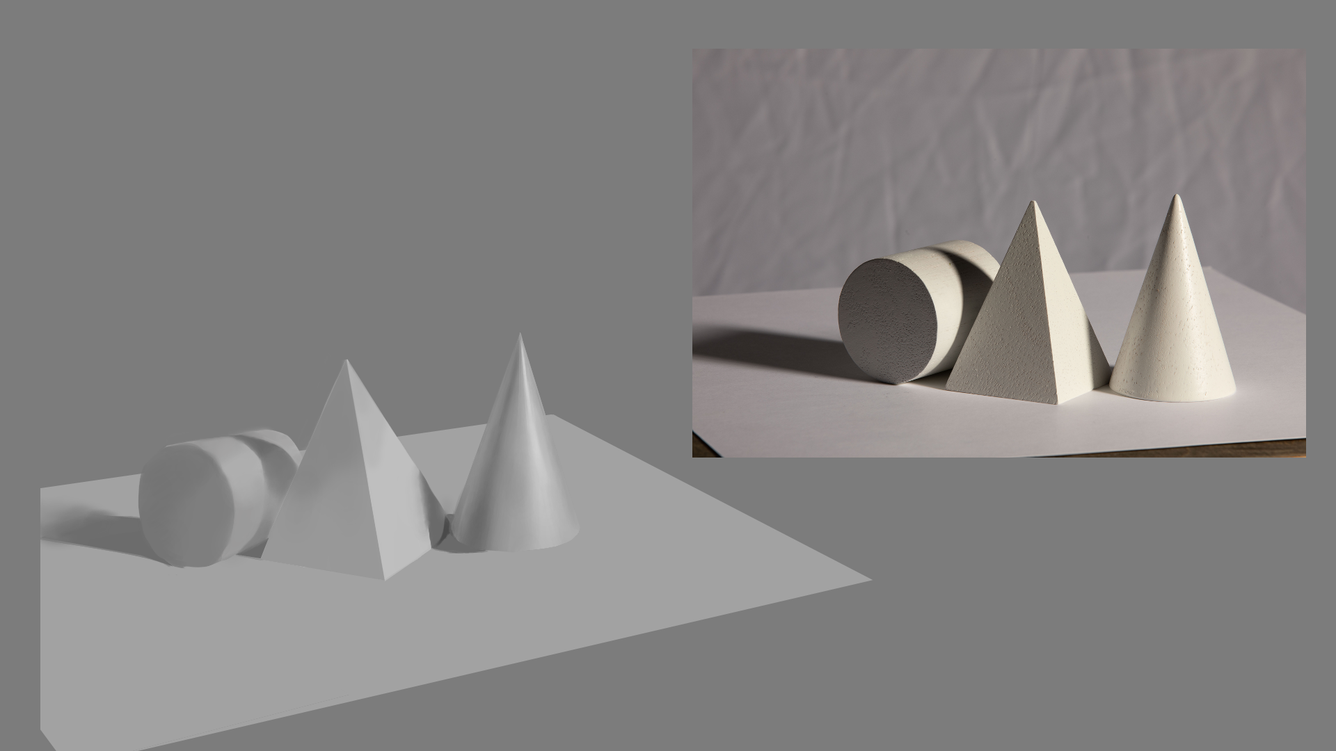
You did a nice job with these! In terms of the shape render I think you are correct, about going dark enough in the shadow areas. The cast shadows here are super dark. The two main things I did on this quick paint over was 1. add ambient occlusion under the shapes, without it they feel like they are floating in space. The sides of the pyramid and cylinder are in shadow so I darkened those quite a bit. The cone also has a pretty dark spot on the opposite side of the light. Overall you did a very nice job and keep up the hard work!

Thanks, I see how I can improve my future studies now. I appreciate the paint-over!
I'm working on shading and stuff, but in the mean time, I thought I'd try practicing poses again. I gave this one basic flat colors to make it pop more. I couldn't manage to make the face look good because of how small this drawing was, so that's something I'll keep in mind for next time. Feedback would be great!

Alright, so today I painted an apple...
I think I did well on my color values on this one, but one thing I see I could improve on is probably my brush work. A lot of the painting seems to blend in really easily and it lacks contrast of sharper edges, so that's probably something I'll work on next time.
I'd really appreciate feedback on this as I haven't done much with color.
(I had an attempt at an apple before this but I realized it had a lot of mistakes, so I repainted it and came up with this one)

Suggested Topics
| Topic | Category | Replies | Views | Activity |
|---|---|---|---|---|
| CYP2C19’s Art School Journey | Art School | 120 | 9.9k | Jan '23 |
| Cosmo - Art School Journey | Art School | 118 | 7.1k | 15d |
| PlayForWho’s - Art School Journey | Art School | 86 | 11.8k | Apr '24 |
| Alex Fucile - Art School Progress | Art School | 1 | 562 | Dec '20 |
| Owlott - Art School Journey | Art School | 40 | 5.1k | Dec '23 |