Welcome
To the forums!
Make a blog and join the slog. Tell your friends - forums are pretty chill way to interact without the content demand of social media. Old school internet.
Critique Disclaimer
I want to say that I am not a manga guy. A manguy. No I am a manguy just.......never-mind.
My critique is not how your artwork is supposed to look. It is to help you find your errors and move onto the next step in your journey. My years of experience and practice has a subjective opinion attached to it - as well as my own limitations of any knowledge of popular medium like manga or anime. I am classically trained in figure drawing and illustration. So I bring what I know to help you solve some problems.
Overall Critique
And you will never have too again.
I dont know what video you are referencing but it really doesn't matter - If you already have a face drawn, drawing a cube over it in perfect geometric perspective -- over an organic object -- might help you with proportions...or MAYBE learning perspective but its still not the right way. Make it look however you want.
This practice -- I am guessing -- is probably to teach someone new the idea of a construction technique and how it can be used to have any angle you want.
Getting people to draw shapes in perspective is the idea for basic figure construction
from imagination. I say construction because there are several steps involved in having to make something out of nothing with a figure.
I would put money on it being a video about perspective and proportions for students to learn how to draw something in 3d Space. I show you in the critique below how to do that without using cubes drawing over. You just need to be able to count to five. And I know you can.
Height,
Width,
Center,
Side,
Landmarks,
Broadly speaking that is - those subjects are decided very quickly in all early stages -- at least in the world of figure drawing techniques by proko, watts atelier etc... Their examples can be found online in endless videos.
Commonly anime and manga fans do not cross paths with those figure drawing worlds - but expert anime and manga artists HAVE. Old manga drawing books, let alone social media and youtube videos - hold the most basic things secret to keep you buying more.
If you look at other videos of Marc drawing, he does not draw cubes over it to check his technique of construction - but has mastered perspective and can make height, width, center line judgement calls very quickly.
Your portraits have a clear read, are clean, and expressive. You have the skills to pay the bills. Or at least the skills to develop assets for yourself and others. Lets streamline that so you dont have to be confused adding something over top of everything to make sure it is "right" every single time.
...
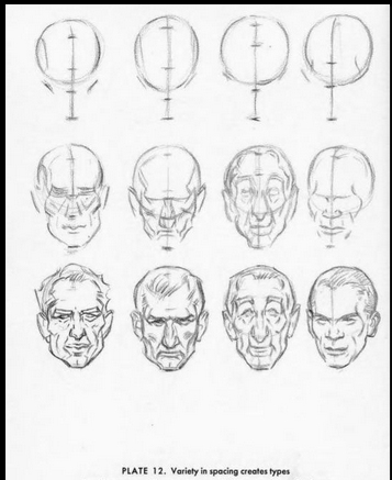
You made Massive improvements from your first post to your last - so your problem I dont think is perspective like I first thought it was going to be in the first post. It is more in making sure you have knowledge of the rock solid landmarks of the human skull lined up in your construction techniques for manga/anime. And I try to illustrate that below.
..
open in new tab to see full image.
...
...
...
...
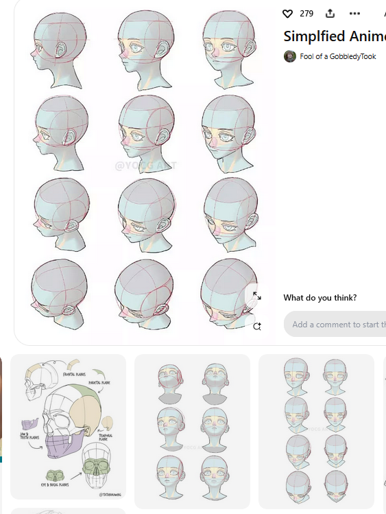
Another example
Look how virgil hoo flips his canvas constantly in the beginning stages - his first head looks like this.

And final drawing is more like this.

There are five examples in the video above. In his construction technique he decides the direction of the head with cube maybe at first - but then corrects to find height, width and center of the facial feature landmarks and sideplane for the right expressive portrait.
He constantly corrects until there is nothing left to correct. That is how you find that if it is right or not - but he solved all the perspective and contours in that set up stage. Then the rest of the time he spent all his time making the face and linework look good.
That is the difference I want to show you, and tried to in the critique and this example. Your first stages spend 20 percent of your time doing 80 percent of the work (construction perspective)
Then spend the rest of your time (80 percent) making it look good. 
.
Thank you
For the opportunity to learn more about manga and anime and to solve a few interesting problems. I enjoyed this very much. I hope you get something out of it. I'm sorry for any misspellings or any handwriting you cannot read.
I want you to mirror your canvas more often as I think it will help you in the early stages to find those errors and change to make corrections as you go and your final will look just fine.
Best of luck.
Later tater