ARTSTATION | DEVIANTART | INSTAGRAM | TUMBLR | FACEBOOK

Hi cubebrushers, my name is Roman Vinogradov and I’m 21 years old self-taught artist from Minsk, Belarus. I'm still kind of "in searching", things like style, what to study, subjects of drawing, specialization and even a good community (this forum looks pretty promising, so...) and this sketchbook like an attempt to figure out all this weird stuff.

And, of course, critique is very very welcome, basically it's all I need. Please, think about my stuff in terms of what i did wrong or poorly. Don't be afraid to be too harsh or honest. It's ok. I don't care since you help to improve. Even if smth just looks strange - tell me. It'll be best reward for me and, even, for you, because of practice of critical & analytical thinking, which are extremely important for every artist which want to grow.

So, let's go, and no retreat! :octopus:

There are 70 replies with an estimated read time of 9 minutes.

Welcome! Really cool work so far. That first piece is awesome, it's got depth, and a strong focal point!
I think that beam of light may be a bit too strong. The very visible rays of light indicate there are a lot of reflecting particles in the air, so maybe you could add more fog to the pic between the creature and the foreground? I think it could balance it out and add even more depth. Or maybe tone down the light and make the pic more low-key overall.
These are just suggestions really, i don't think i'm not very good at giving critique :sweat_smile:

No-no, You're right. It's little bit old piece, but I viewed it few days ago and I thought about the same things. It was first time when I did such kind of work and it was rather intuitive than logical process, so, next time I'll try to be more careful with light. Thanks!

Hi Roman!
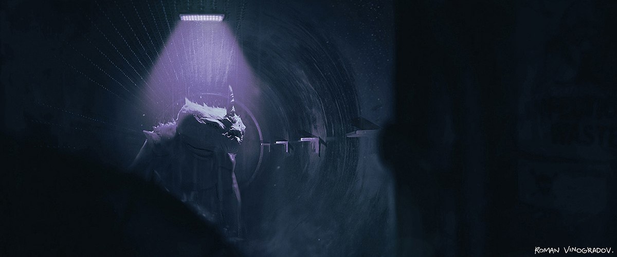
My opinion regarding the first one: I can't really tell what the monster is. The interior seems okay, but the creature makes no sense. It seems deformed somehow, and the mouth doesn't seem in the right place. Also there is the awkward connection to the neck, assuming it has one, and no difference in values to flesh out the creature's limbs.

There is also the matter of reflected light: while there is very strong light from the top putting the planes of the forms of the creature's body which face downward in shadow, there should also be light reflected from the sewer/ tunnel walls which would light to a lesser degree those same plane aforementioned. This should, I think, provide for a variety of values that would make the creature's limbs if not completely visible, then at least recognizable.

Also, before you put in all the grey tones to blur the scene, draw the outline of the creature and see if it makes sense and if it is recognizable. Blurring a drawing doesn't make it mysterious, it just makes it confusing.

As for the second painting, and while a lot of people seem to do this, I think you should try to finish your drawings/paintings. Putting something off as a WIP is merely giving in to the fear of not being able to finish it right. I get that too. But it is better to finish something badly and recognize not only what you're weak at but precisely what you're doing wrong and what misconceptions you have of a form/object in you mind, and then replace those with correct technique. If you're not very good at hands then draw them the best you can. Then study and try to improve. You can look at reference pictures and use them to finish the paining. Never impatiently smudge an area, but take your time and draw clearly defined lines.

Imagine you were writing an essay or story in a new language you're still learning -- which is exactly what drawing is: a language for story telling using lines and values rather than words -- Imagine you've learned some of the basics of that language, but not all, and that you wanted write an essay. A few paragraphs in you felt tired or disappointed, and one more paragraph in you couldn't think of a way to express an idea. Now instead of stopping, looking at a dictionary, or a textbook, then writing on a scrap paper, and rewriting as necessary, you just sort of smudge things by writing somehtn dfkg, rixykaroud krooq lkjiitaa felkafu dafagdif lofig, dafigdf lsusdabnh dadidodooozzzzzzz....

If I am to give an advice that I think is most important, and I by no means imply I know all there is to know about art, but lets ignore that for a moment and assume I do know what I'm talking about; my advice would be not to smudge damn it!

If you reach a spot you can't draw yet, get you sketchbook, look for pictures online or at your own body, and draw them in the sketchbook. Once you've found something you can use then redraw it in your painting/illustration. Of course the thing you should aim for is to be able to analyze figures as a collection of interconnected simple forms and be able to draw anything form imagination.

Also, still concerning the second painting, the colour looks sickly and too pale. Mark Brunet (Cubebrush on youtube) published a video where he shows how to paint skin; take a look at it it's very well explained.
The neck seems too thick and the ear is too far off to the right.

Final advice: Learn to draw in line before dabbling in painting. Learn to draw the figure convincingly in lines and values and you will be a terrific painter.

Best of luck.

@anir Wow, man! Thank you for this detailed response. I totally agree with you about first one. Too many things that I missed, especially silhouette, like...HOLY MOLY, WHERE I WAS, WHEN I BEEN DOING THIS! And overall design now looks too awkward. Although, it's good feeling, cuz I was proud of this work and now I like "meh, this one not so cool as I thought, I need to go further ".

As second one...I get your point, but there's a little misunderstanding. I'm not a "smudge/blur guy" (may be little bit, but still not so), rather I don't like super polished stuff and with this piece I wanted to achieve raw aesthetic, smth like alla prima paintings. Also, this looseness is like a tool of composition: the farther away from the focal point, the wider become strokes. Pale colors and low contrast is also my personal preferences (but, yeah, still sick). With other I completely agree...Oh..c'mon! I agree and with your comments about smudge, colors and detalization, but it's little complicated in this case. This piece was experimental and I tried to find balance between what you say and what I explained above. Simply, between polished and bright look and raw and dull look. So, All things, that you said, is fair, but need to be slightly adapted for my aims. By me, of course.

Yeah, I need to learn more about drawing, but...MAN, I'M SO IN LOVE WITH PAINTING STUFF! Lol, I know, still should learn fundamentals, anyway...Thank you again, really glad to read your thoughts with such a scrupulous breakdown. It helps a lot to figure out what is what. :octopus:

Ooh. I'm really enjoying the looseness of the female portrait. Was the reference as muted or a style choice in color?

@ESL Cool, glad you appreciate this. No, like COMPLETELY NO, mostly I picked colors from imagination, so it was very challenging too. :octopus:

Just spontaneous piece, mostly for experimenting with brushwork. Yeah, failed with values a little bit. Also, I drew this one before the portrait from post above, the first attempt so to speak. :octopus:

smth different, few works from my ongoing personal project. :octopus:
Better resolution, if someone interested.

Really like those illustrations! I get a pretty pretty evocative horror mood, a general sense of the story told, though i won't say i "get it"

@ragamuffin Maybe later, with new pieces, it'll become more clear, but for now as it is. I'm working on it, anyway, it's all about balance, as always. Thanks! :octopus: