


I think the concept sheet looks cool! What do you think you waht to change about the concept sheets design? Also I ma getting very curious what is this thing you are secretly changing about the Illustration? You mentioned "Next update will either make me or break me"

 Thank you! I finally cleaned that up. Meanwhile started 3 more ..I have a habit of taking too long to finish a piece, then I lose interest in it and just start something else. I found 8 from recently i started and abandoned, that are decent enough to not delete, but not finished. There’s also been a number of drawings I felt I “outgrew” - became better before I finished them, and it would be easier to start from scratch than fix them. Anyone else thinking that?in23.9k
 Lady Death Fanart Collectible: Part 6 Polypaint and base Hi, it’s time to share with you another part of the process to create this fanart piece. Polypaint As this is my first collectible fanart I didn’t have previous experience with polypaint so I tried my best and played a bit with it.I wanted to give a ghostly and eerie look to Lady Death, she is beautiful and deadly, but at the end of the day she is a woman that died and was reborn at hell as an avenging spirit, that’s why I gave her skin tone a bluish very cold tone.As you will see I gave myself some creative freedom to deviate from the traditional color scheme that this characater has in comics and illustrations.To add a bit of sensuality by painting some freckles on the face and the chest. The dark nature of this character was the perfect excuse to gave her a kind of goth make up, very dark shadows around the eyes, blue lips and fingernails. I know that the original character includes sexy red lips but I wanted this girl to have a sexy but at the same time creepy look, that’s why we can see some thin veins emanating from her eyes. The biggest chromatic change I did for this character is at the hair. Lady Death has a characteristic white weavy hair but in my fanart I decided to gave her a very saturated blue color.The reason behind this wasn’t only an aesthetic choice. I want that the face area strongly pulls the attention of the viewer so this area needed a stronger contrast. Another reason is that I want her to have a more modern look, as I mentioned before, I’m strongly attracted to women with goth/punk look. I gave myself half an hour or more to analyse the work of experienced sculptors that create collectibles and I discovered that the use of darker values on the skin is often applied to create a greater sense of volume and three-dimensionality. I found that areas with heavy ambient occlusion are the perfect places to paint with darker colors in order to increase the separation between different forms. Even though she has a bluish skin tone, I used a bit of warmer hues in areas that, in real life, tend to go towards red and pink, this is very obvious in the nose, cheeks, and knuckles. Thinking with a logical mind it’s completely absurd to have warmer tones on the body of a zombie like creature but I didn’t want to limit myself by using only blue tones, it looks boring and artificial. In real life these colors are created by blood vessels in areas where the skin is very thin. ** Scythe **for her weapon I applied a cool gray with some warmer variations, this color scheme is influenced by the work of H.R giger. Base I’d like to talk about the design for the base which, to be honest, I forgot to develop along with the character.My main idea with the base is to show that Lady Death inhabits a very sterile and arid land, at the end of the day she is at hell.You can see a that she walks over dirt and rocks, a sign that she’s surrounded by death and loneliness. As part of the landscape we can see some bones and skulls to reinforce the idea of lack of living creatures, yet we can see three hands that try to reach her legs.This hands represent that all creatures are subordinated to her power and seek an evil blessing with a simple touch of the princess of the damned.1- The hand with skin burns represents the souls of those who are newcomers to hell, tortured souls that suffer for the sins comitted on earth.2- The hand with greenish rotten skin and pustules is the reminder of the decay that has infected the souls of those who have been trapped and have forgotten their humanity3- Last but not least, the hand of a demon shows that even dark creatures and entities bow before her presence. The cherry on the top, at least in my vision, are the simese twins that emerge from the ground, this malevolent creatures remind us that in hell there’s only perversion and any trace of innocence is lost. Thanks for reading till this pointI’m really happy to be very close to finish this creative journey, last but not least it’s mandatory to talk about splitting the sculpture in several pieces to be printed, this will be my last entry before showing the final rendered images. See yaMay Zbrush be with youin1.4k

 memory 2min gartic phone, used ref 2m gartic, used ref for pose 2min gartic 2min gartic 2min gartic 2min gartic memory memory memory memory study memory memory memorymemory memory memory memory memory memory study memorystudy study stylized left memory, right study study memory memorymemory memory memory memorymemory memory, porportions r offmemory memorystudystudy memorymemorymemory memory memory memory memory memory memory memory, right leg is a bit broken The feeling of only getting 1 - 3 likes on a social media post will never not be discouraging. But nothing is discouraging enough to make me quit drawing. I think the strategy of drawing a lot of stuff and waiting a while to post is good though rather than posting it immediately and then feeling that sadness on the next set of drawingin

 studies studies juri study imagination, how I feel before a speech imagination imagination study something I drew for my presentation also drew this for my presentation, didn't fix the one hand being bigger than the other imagination + study study studies study study, I need to fix the face a bit based on screenshot from anime but in my style study. except for the eye study studies studies study. changed some things tho imagination imagination imagination study studies, except top right samurai based on anime screenshot wolverine studies, changed some of the poses a lil, not very good at all, but first time i drew the character ever. semi study studies study imagination imagination imagination , for first time ever i tried to draw over 3d model for middle pose, I dont like the result tbh, but it makes it much easier than coming up with it from memory.imagination, except right figurestudies imagination + studies, coming up with action poses r hard, these are not dynamic enough, I will redraw better ones in future. imagination , imagination imagination study, except for eye imagination imagination imagination doodles except for the two chrollos imagination storyboard thumbnail, idk if i ever shared this. my storyboards end up being a little detailed since i usually just draw in one layer.in21.8k

 Hello! My name is Vithor, I am from Brazil, studied Design at a local college worked as an illustrator for more than 10 years. I took a time off around 3 years ago and am trying to get back in my art shape and maybe become professional again. Here are some recent pictures: You can find timelapses for most of them on my instagram: www.instagram.com Vithor Albertim (@vithor_albertim) • Instagram photos and videos 123 Followers, 638 Following, 19 Posts - See Instagram photos and videos from Vithor Albertim (@vithor_albertim) Comments and critiques are always welcome.Cheers!in782

 Thank you @daceronine! If I remember I save in google cloud, I will have to stick a note to do it more often. Lamp is from life. Poses are from refs but I look at refs for a while and then try to do it myself and look it up if needed. Outfits and rest is from imagination Something went wrong while installing system so we will have to wipe everything again... pc works but something is wrong. We will wait till internet is done and I will save everything on cloud this time Threads came out in eu. It's been 3 days and I had more engagement than after half a year on instagram. It feels really nice I hope it stays this way A portrait of old dude. It's the same character I posted a while ago. Inspired by Bayard Wu work. At first I thought of him as a bear but I named him Fenrir and I think wolf suits him better. Eye gave me a bit of hard time but I think it is fine now. I focused on face and forgot about area below. The way I draw hair clashes with greying hair. I had the same problem while doing Lohse's white hair. Does it looks like it is greying here? I love how desaturated red looks blue there. I keep lying to myself that I will use different color scheme but It all comes down to this blue and yellowish one it is just flipped this time Have a great day!in47.1k
Hey ..
What's happening is .. few new things are being added .. for which the concept sheet wil have to be updated.
Design is final.
As for the illustration ....
Detailing 
That's the most painful .. most time consuming ...
If I rush through it ... everything will look bad and not cared for ...
That's why i'm very worried.
But... I'm trying to do things carefully.
Let's see what happens.
I hope you finish ...
Your concept is really cute.
Wish you all the luck!!
Ok, I know what you mean. I will get to that stage soon. I´ll be working the whole weekend on the character and illustration.
Thank you for the kind words and good luck to you too!
I think i'm almost done. Still tons of tweaks left.. but can't cover them all, it's endless..... an artwork can never be stopped ... there will always be room for improvement.
Few hours to go .. will update the concept sheet with a small change. Then the final artwork.
What about you??? How's progress??
I´ll be witing your upploads! Well I still have lot of work to do. I´ll probably be able to post just before deadline.

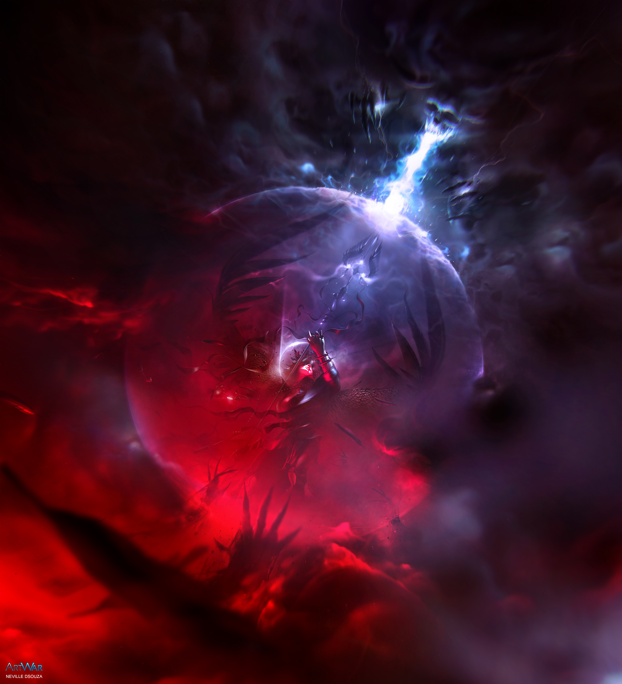
On a personal note :
I really wanted to come up with something that we could all relate to in some way.
The main highlight of this piece ... The Grim Angel ; she could be us in the real world, totally away from the crowd, trying to fight our own personal demons every single day. There are some of us who remain silent about it, while the rest of us confide in our friends and family.
The important is.... it's up to us to try and stay strong till the end... and eventually become our very own champion.
Technical info :
After a lot of experimentation .. i settled down for : 5165 x 5677 px
This gave me an option for a portrait crop as well, not worrying about revealing more of the artwork.
I used Photoshop CC 2015 and a mouse; years back, i had a wacom bamboo (old model) but gave it to a friend of mine since she was in need of it. On the other hand, i wasn't able to use it properly. Obviously, i needed a lot of practice. This also explains why i have so much trouble with my signature; i don't have a steady hand. But with a mouse, though it's hard work.... i'm able to control it better. So, for blocking shapes i use the pen tool, then hard / soft smudge brushes for fog, mist effects, specially to pull wispy shapes and thin strands.
Then, for the shading process, the "Adjustment layers" these guys rule big time!
"CURVES" , "LEVELS" , "COLOR BALANCE" etc ... they can completely change the look and feel of your artwork in so many ways.
For the first time in this piece, i used "FIELD BLUR". This allowed me to blur certain areas and keep the rest in focus.
Other than that ... endless, crazy hours of tweaking, taking advice from few of my friends and a mocha smoothie to keep me awake.
You've done an incredible job on your submission. And to think you did the whole thing with only a mouse is insane. Well done and best of luck in the voting.
Pretty sick stuff dude! Best of luck!
@jogri Thank you so much! \m/ wishing you the all the luck as well! \m/
I was really scared that i wouldn't have been able to finish this. I'm very slow when it comes to working with the mouse. Usually i take two months .. maybe more to finish a painting properly. O_o This was seriously a challenge for me.
@johnnybillydobby Thanks a lot mate! All the best to you too!!
 you nailed man~
Jesus you did it with a mouse? 
amazing artwork! and all with a mouse .. wow!
great you finished!! good luck!
Whoah this is amazing! I wish you the best of luck in the competition!
Wow great work! You have worked hard on this image. I hold my fingers crossed for you!
@katsu93
Thanks a million for your kind words  i always feel that i'm still in the learning process.. and that itself helps me go forward.
@Iago_Cavalcante  i seriously don't know what to say
  LOL .. even a simple yes is so lame XD but you know what .... i have the same exact reaction when i see the most realistic painting done with a simple paintbrush, on a single canvas.
A fine example, but mostly my top inspiration : http://www.helnwein.com/works/
Just see his paintings ... you'll know why i'm so obsessed with detail(s).
There are few/many people who enjoy painting on a single photoshop layer. Their works will blow anyone out of the water.
That's my driving force.
@maxloegler :
MADMAX heheee XD
Seriously bro ..... I hope you win !!!
As for me .... last few hours ... i just shut down all stupid thoughts about the many elements that had to be covered. I just jumped from one task to the next.
@nesokaiyoh
I thank you immensely >: hugs :< wishing you all the luck as well
@berrysquare
Thank you my friend >:D< This challenge taught me one of many things in particular ... MULTITASKING. And i hope i make better artworks in the future.
All the best to you too ! I'm waiting for your entry!!!!!
It's you isn't? From the legends they tell, the oldest tale of photoshopia, a far magic land of the greatest masters?
You all drink tea and draw with a mouse there, you and Craig Mullins.
HEHE 
That made me happy <3
Craig Mullins is AMAZZIING!!!! I love "BROM" too
http://www.bromart.com/ - these guys are on another level. I'm very much inspired by them.
OMG .. TEA <3 desperate for a nice fruit fusion brew. I ran out of it ... Will definitely visit my fav store this weekend and just splurge. _
By the way ... is that your kitty?? .. i have 17 cats at home @_@ .. it's a nightmare.