


 Thank you! I finally cleaned that up. Meanwhile started 3 more ..I have a habit of taking too long to finish a piece, then I lose interest in it and just start something else. I found 8 from recently i started and abandoned, that are decent enough to not delete, but not finished. There’s also been a number of drawings I felt I “outgrew” - became better before I finished them, and it would be easier to start from scratch than fix them. Anyone else thinking that?in24.7k
 Lady Death Fanart Collectible: Part 6 Polypaint and base Hi, it’s time to share with you another part of the process to create this fanart piece. Polypaint As this is my first collectible fanart I didn’t have previous experience with polypaint so I tried my best and played a bit with it.I wanted to give a ghostly and eerie look to Lady Death, she is beautiful and deadly, but at the end of the day she is a woman that died and was reborn at hell as an avenging spirit, that’s why I gave her skin tone a bluish very cold tone.As you will see I gave myself some creative freedom to deviate from the traditional color scheme that this characater has in comics and illustrations.To add a bit of sensuality by painting some freckles on the face and the chest. The dark nature of this character was the perfect excuse to gave her a kind of goth make up, very dark shadows around the eyes, blue lips and fingernails. I know that the original character includes sexy red lips but I wanted this girl to have a sexy but at the same time creepy look, that’s why we can see some thin veins emanating from her eyes. The biggest chromatic change I did for this character is at the hair. Lady Death has a characteristic white weavy hair but in my fanart I decided to gave her a very saturated blue color.The reason behind this wasn’t only an aesthetic choice. I want that the face area strongly pulls the attention of the viewer so this area needed a stronger contrast. Another reason is that I want her to have a more modern look, as I mentioned before, I’m strongly attracted to women with goth/punk look. I gave myself half an hour or more to analyse the work of experienced sculptors that create collectibles and I discovered that the use of darker values on the skin is often applied to create a greater sense of volume and three-dimensionality. I found that areas with heavy ambient occlusion are the perfect places to paint with darker colors in order to increase the separation between different forms. Even though she has a bluish skin tone, I used a bit of warmer hues in areas that, in real life, tend to go towards red and pink, this is very obvious in the nose, cheeks, and knuckles. Thinking with a logical mind it’s completely absurd to have warmer tones on the body of a zombie like creature but I didn’t want to limit myself by using only blue tones, it looks boring and artificial. In real life these colors are created by blood vessels in areas where the skin is very thin. ** Scythe **for her weapon I applied a cool gray with some warmer variations, this color scheme is influenced by the work of H.R giger. Base I’d like to talk about the design for the base which, to be honest, I forgot to develop along with the character.My main idea with the base is to show that Lady Death inhabits a very sterile and arid land, at the end of the day she is at hell.You can see a that she walks over dirt and rocks, a sign that she’s surrounded by death and loneliness. As part of the landscape we can see some bones and skulls to reinforce the idea of lack of living creatures, yet we can see three hands that try to reach her legs.This hands represent that all creatures are subordinated to her power and seek an evil blessing with a simple touch of the princess of the damned.1- The hand with skin burns represents the souls of those who are newcomers to hell, tortured souls that suffer for the sins comitted on earth.2- The hand with greenish rotten skin and pustules is the reminder of the decay that has infected the souls of those who have been trapped and have forgotten their humanity3- Last but not least, the hand of a demon shows that even dark creatures and entities bow before her presence. The cherry on the top, at least in my vision, are the simese twins that emerge from the ground, this malevolent creatures remind us that in hell there’s only perversion and any trace of innocence is lost. Thanks for reading till this pointI’m really happy to be very close to finish this creative journey, last but not least it’s mandatory to talk about splitting the sculpture in several pieces to be printed, this will be my last entry before showing the final rendered images. See yaMay Zbrush be with youin1.5k


 memory 2min gartic phone, used ref 2m gartic, used ref for pose 2min gartic 2min gartic 2min gartic 2min gartic memory memory memory memory study memory memory memorymemory memory memory memory memory memory study memorystudy study stylized left memory, right study study memory memorymemory memory memory memorymemory memory, porportions r offmemory memorystudystudy memorymemorymemory memory memory memory memory memory memory memory, right leg is a bit broken The feeling of only getting 1 - 3 likes on a social media post will never not be discouraging. But nothing is discouraging enough to make me quit drawing. I think the strategy of drawing a lot of stuff and waiting a while to post is good though rather than posting it immediately and then feeling that sadness on the next set of drawingin


 studies studies juri study imagination, how I feel before a speech imagination imagination study something I drew for my presentation also drew this for my presentation, didn't fix the one hand being bigger than the other imagination + study study studies study study, I need to fix the face a bit based on screenshot from anime but in my style study. except for the eye study studies studies study. changed some things tho imagination imagination imagination study studies, except top right samurai based on anime screenshot wolverine studies, changed some of the poses a lil, not very good at all, but first time i drew the character ever. semi study studies study imagination imagination imagination , for first time ever i tried to draw over 3d model for middle pose, I dont like the result tbh, but it makes it much easier than coming up with it from memory.imagination, except right figurestudies imagination + studies, coming up with action poses r hard, these are not dynamic enough, I will redraw better ones in future. imagination , imagination imagination study, except for eye imagination imagination imagination doodles except for the two chrollos imagination storyboard thumbnail, idk if i ever shared this. my storyboards end up being a little detailed since i usually just draw in one layer.in22.6k


 Hello! My name is Vithor, I am from Brazil, studied Design at a local college worked as an illustrator for more than 10 years. I took a time off around 3 years ago and am trying to get back in my art shape and maybe become professional again. Here are some recent pictures: You can find timelapses for most of them on my instagram: www.instagram.com Vithor Albertim (@vithor_albertim) • Instagram photos and videos 123 Followers, 638 Following, 19 Posts - See Instagram photos and videos from Vithor Albertim (@vithor_albertim) Comments and critiques are always welcome.Cheers!in828


 Thank you @daceronine! If I remember I save in google cloud, I will have to stick a note to do it more often. Lamp is from life. Poses are from refs but I look at refs for a while and then try to do it myself and look it up if needed. Outfits and rest is from imagination Something went wrong while installing system so we will have to wipe everything again... pc works but something is wrong. We will wait till internet is done and I will save everything on cloud this time Threads came out in eu. It's been 3 days and I had more engagement than after half a year on instagram. It feels really nice I hope it stays this way A portrait of old dude. It's the same character I posted a while ago. Inspired by Bayard Wu work. At first I thought of him as a bear but I named him Fenrir and I think wolf suits him better. Eye gave me a bit of hard time but I think it is fine now. I focused on face and forgot about area below. The way I draw hair clashes with greying hair. I had the same problem while doing Lohse's white hair. Does it looks like it is greying here? I love how desaturated red looks blue there. I keep lying to myself that I will use different color scheme but It all comes down to this blue and yellowish one it is just flipped this time Have a great day!in49.7k


8 days later
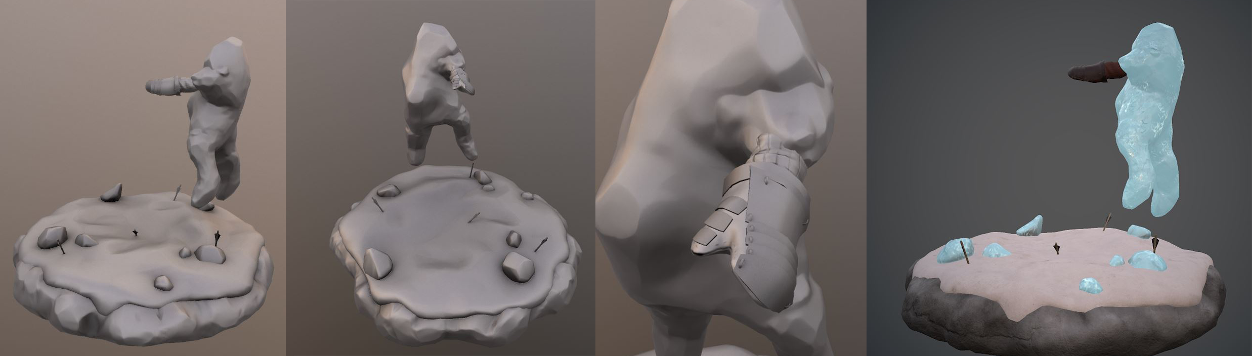
Havent had the chance to do much in the last week, but have started retopo work(currently, the ice, helmet and belt skull). for the hardbody areas of the character, such as the belt centerpiece, helmet, ice and other objects that will not deform, I am using a combination of decimate/ zremesh and reduce to lower the polycount, then adjusting any harsh areas and making sure it fits over the highpoly correctly. this isnt the neatest way of doing things, but i dont think ill have time to qaud draw and properly retopo everything. Instead, I will do this just for the main areas of deformation, ie- the skin, pants, boots, and also look to redo the ice fingers, as the current topology will be unsuitable for rigging. The race is on to finish in time 

Because I love nothing more than procrastinating, instead of doing import things like retopology and UVs, i decided to take all the ice, and do a quick bake of some maps. i then chucked those into quixel, and added a concrete normal to break up the surface, and some color variation using masks, before exporting the textures, bringing into marmoset, and having a play round with refraction and emission. was pretty happy with the result. the fingers are pretty broken, as i didnt have proper uvs, and so the map baked out for them were pretty bad. Now back to retopo work tho...

Ive managed to get all my retopology down, and all my UV's unwrapped. I intend to try a couple different UV layouts, and then test baking, having a look at using various numbers of maps. I want to try keep this to a reasonably low number, so that i do not run into issues with my marmoset file. I also had a look at creating a beard from hair cards. when viewed from behind, it looks a bitt iffy, so i will see what i can do to try fix that.

I got my UV's all laid out. Ive decided to use 4 maps. one contains the body, pants, eyes and mouth. Once contains all the ice. the third is dedicated to the beard and mo, and the final map is for all the remaining objects, ie the armour and such. Got my normals and occlusion baked for all of these, and have begun texturing inside Quixel. The ice will look closer to what i have shown in a previous post, when i add emision and refraction.

A small progress update. I have continued working on my texture maps, and have started cross checking them in marmoset as i go, as this will be what i do my final renders in. Ive got the refractions set back up on the ice. this will also be applied to the ice on the body and helmet, but I will need to create masks for the effect in these cases

Quick test upload of my texture WIP to see if this is viewable. Also wondering if the blood I have is pushing the boundaries at all?? If anyone knows if this would be unacceptable, let me know haha. I will also have a small amount of blood on the right fist once finished, and droplets on the ground- nothing too extreme tho
Thought I would take a quick break from texturing to start thinking about my characters pose and scene composition. I am thinking of having him in the process of freezing/ defeating an enemy, with broken ice scattered around a snowy ground, depicting other frozen and shattered foes. Then I will have a snowy downpour/blizzard obscuring the background, with some faint rock formations. maybe also the enemies sword broken on the ground somewhere, and arrows and a small amount of blood on the snow. Here are a couple test examples( forgive the lack of weight painting haha). I am leaning mostly towards 3, unless any1 has some suggestions. For the moment tho- back to texturing

Ive decided to focus on pose 3, and have done a quick mockup of how i will be presenting the character in my Mview file. The background in my final image will be an extension of this. I am also working on creating an arm asset for the secondary character. Since he isnt impervious to the cold like ulf, Im modeling it in a thick gambeson, with heavy leather gloves on( not that either of those protected him from being turned into a popsicle ) If i get time, id still like to create a basic sword or axe or something to place on the ground, as well as some shattered ice

The Finish line is now in sight!! Still a fair amount to do, but i think i will make it on time. Pretty much ready to start polishing things. My mview file is cutting it close, at 18.9 megs, but hopefully that is okay when i upload it... If i get the chance, I might make a model/detail sheet aswell.

WIP sketchfab upload. I cant seem to get the same refraction effect going in sketchfab, so will definately stick to mview my main file. Ive addressed several things, such as the ice colour( looks better in marmoset) faint footsteps, the rock texture- the frost transition, and some other general tweaks and fixes. still need to address the texture stretching however, and a few other things. after that, itll be on to setting up my final images
https://skfb.ly/6FWLw
Ive been looking at putting together my final image. I am just wondering If i am doing too much editing to the scene? I have added fake volumetric lightling, as well as snow flurries, and mist at the characters feet. The brief states that the character needs to be 100% 3D, and Im just wondering if this image breaks the rules? I havent painted over any of the characters textures to enhance them or touched the hues and saturations. The reflections and colours and everything like that are all in the render. If someone could let me know if i need to go with something more basic, that would be great 
The image on the right is the render straight out of marmoset

The background can be whatever you want. What you have works within the rules.
by the way if you have a question you can also tag the mods in your forum thread as well.
awesome- thank you for that!
I love the character, and the model, very nice!
I would have a bit of critique about the final image though, if you'd like. I feel like model on its own is a bit more striking than the final image, which gets a bit drowned out in the storm and mist. The background doesn't seem to be very contrasting to the character, it's all similar values.
I also don't like that much the grey color in the snow. I see you wanted to create a dreary atmosphere and maybe it's just a personal preference, but the gray looks a bit dirty, I would suggest trying it out with dark blue instead.
Hope some of this helps!
And finally, just for fun, I was curious how it would look with a bright background so I did a very quick edit (Not saying you have do it this way - it's your image, but maybe you'll find it interesting too :).
Thank you for the critique! Your right, the character does get a little lost beneath it all. I was trying to create a stormy battleground feel, with silhouettes of soldiers still fighting in the near distance, but ill see if theres anything i can do to that, that might bring the character into better focus. Ive also got a couple days still to concept up other backgrounds and ways of presenting him. Cheers again
I had a look at some various ways of presenting my final image, i tired a brighter kind of day, and then a mid rand, with the storm billowing, but a brighter background. In the end, my personal preference is still the darker grittier tone, however i have reduced the opacity of some of the effects, and this lets the character stand out a little better.

