


I was re-reading the rules of the contest and I realized that it says that you can't take models that you made yourself, so I thought that maybe someone would look at my retopology and believe that it is the retopology of "Genesis" the models of DAZ. But the truth is that the original base belongs to a work I did before and to which (as I didn't know much about rhetopaedics (and I'm still learning)) I took as a reference the predefined model of Daz, it was very useful especially to see how to do rhetopaedics in very specific areas such as elbows and ears. For this work I eliminated all the parts of the body that were not seen to save polygons.
To finish off, I looked at a "genesis" model to get a better idea of some of the details that appear in the image. Above all I did it to look at the nails (because my model seemed to have black puddings for XD fingers) and the reference nails have always seemed very nice but it is much more laborious than it seemed especially in the foot, because the fingers had stuck to each other, so I had to make them thin and once done the bolverlos retopology has made them fat carefully. Finally, I replaced the two spheres that I had left for eyes and again I copied the topology of the reference to save all the polygons that were not seen.
I have accompanied it with a sketch that I have made of a possible texture of the face, still I do not have it clear because perhaps inpida to see with clarity the face What do you think?

 Thank you! I finally cleaned that up. Meanwhile started 3 more ..I have a habit of taking too long to finish a piece, then I lose interest in it and just start something else. I found 8 from recently i started and abandoned, that are decent enough to not delete, but not finished. There’s also been a number of drawings I felt I “outgrew” - became better before I finished them, and it would be easier to start from scratch than fix them. Anyone else thinking that?in24.7k
 Lady Death Fanart Collectible: Part 6 Polypaint and base Hi, it’s time to share with you another part of the process to create this fanart piece. Polypaint As this is my first collectible fanart I didn’t have previous experience with polypaint so I tried my best and played a bit with it.I wanted to give a ghostly and eerie look to Lady Death, she is beautiful and deadly, but at the end of the day she is a woman that died and was reborn at hell as an avenging spirit, that’s why I gave her skin tone a bluish very cold tone.As you will see I gave myself some creative freedom to deviate from the traditional color scheme that this characater has in comics and illustrations.To add a bit of sensuality by painting some freckles on the face and the chest. The dark nature of this character was the perfect excuse to gave her a kind of goth make up, very dark shadows around the eyes, blue lips and fingernails. I know that the original character includes sexy red lips but I wanted this girl to have a sexy but at the same time creepy look, that’s why we can see some thin veins emanating from her eyes. The biggest chromatic change I did for this character is at the hair. Lady Death has a characteristic white weavy hair but in my fanart I decided to gave her a very saturated blue color.The reason behind this wasn’t only an aesthetic choice. I want that the face area strongly pulls the attention of the viewer so this area needed a stronger contrast. Another reason is that I want her to have a more modern look, as I mentioned before, I’m strongly attracted to women with goth/punk look. I gave myself half an hour or more to analyse the work of experienced sculptors that create collectibles and I discovered that the use of darker values on the skin is often applied to create a greater sense of volume and three-dimensionality. I found that areas with heavy ambient occlusion are the perfect places to paint with darker colors in order to increase the separation between different forms. Even though she has a bluish skin tone, I used a bit of warmer hues in areas that, in real life, tend to go towards red and pink, this is very obvious in the nose, cheeks, and knuckles. Thinking with a logical mind it’s completely absurd to have warmer tones on the body of a zombie like creature but I didn’t want to limit myself by using only blue tones, it looks boring and artificial. In real life these colors are created by blood vessels in areas where the skin is very thin. ** Scythe **for her weapon I applied a cool gray with some warmer variations, this color scheme is influenced by the work of H.R giger. Base I’d like to talk about the design for the base which, to be honest, I forgot to develop along with the character.My main idea with the base is to show that Lady Death inhabits a very sterile and arid land, at the end of the day she is at hell.You can see a that she walks over dirt and rocks, a sign that she’s surrounded by death and loneliness. As part of the landscape we can see some bones and skulls to reinforce the idea of lack of living creatures, yet we can see three hands that try to reach her legs.This hands represent that all creatures are subordinated to her power and seek an evil blessing with a simple touch of the princess of the damned.1- The hand with skin burns represents the souls of those who are newcomers to hell, tortured souls that suffer for the sins comitted on earth.2- The hand with greenish rotten skin and pustules is the reminder of the decay that has infected the souls of those who have been trapped and have forgotten their humanity3- Last but not least, the hand of a demon shows that even dark creatures and entities bow before her presence. The cherry on the top, at least in my vision, are the simese twins that emerge from the ground, this malevolent creatures remind us that in hell there’s only perversion and any trace of innocence is lost. Thanks for reading till this pointI’m really happy to be very close to finish this creative journey, last but not least it’s mandatory to talk about splitting the sculpture in several pieces to be printed, this will be my last entry before showing the final rendered images. See yaMay Zbrush be with youin1.5k

 memory 2min gartic phone, used ref 2m gartic, used ref for pose 2min gartic 2min gartic 2min gartic 2min gartic memory memory memory memory study memory memory memorymemory memory memory memory memory memory study memorystudy study stylized left memory, right study study memory memorymemory memory memory memorymemory memory, porportions r offmemory memorystudystudy memorymemorymemory memory memory memory memory memory memory memory, right leg is a bit broken The feeling of only getting 1 - 3 likes on a social media post will never not be discouraging. But nothing is discouraging enough to make me quit drawing. I think the strategy of drawing a lot of stuff and waiting a while to post is good though rather than posting it immediately and then feeling that sadness on the next set of drawingin

 studies studies juri study imagination, how I feel before a speech imagination imagination study something I drew for my presentation also drew this for my presentation, didn't fix the one hand being bigger than the other imagination + study study studies study study, I need to fix the face a bit based on screenshot from anime but in my style study. except for the eye study studies studies study. changed some things tho imagination imagination imagination study studies, except top right samurai based on anime screenshot wolverine studies, changed some of the poses a lil, not very good at all, but first time i drew the character ever. semi study studies study imagination imagination imagination , for first time ever i tried to draw over 3d model for middle pose, I dont like the result tbh, but it makes it much easier than coming up with it from memory.imagination, except right figurestudies imagination + studies, coming up with action poses r hard, these are not dynamic enough, I will redraw better ones in future. imagination , imagination imagination study, except for eye imagination imagination imagination doodles except for the two chrollos imagination storyboard thumbnail, idk if i ever shared this. my storyboards end up being a little detailed since i usually just draw in one layer.in22.6k

 Hello! My name is Vithor, I am from Brazil, studied Design at a local college worked as an illustrator for more than 10 years. I took a time off around 3 years ago and am trying to get back in my art shape and maybe become professional again. Here are some recent pictures: You can find timelapses for most of them on my instagram: www.instagram.com Vithor Albertim (@vithor_albertim) • Instagram photos and videos 123 Followers, 638 Following, 19 Posts - See Instagram photos and videos from Vithor Albertim (@vithor_albertim) Comments and critiques are always welcome.Cheers!in828

 Thank you @daceronine! If I remember I save in google cloud, I will have to stick a note to do it more often. Lamp is from life. Poses are from refs but I look at refs for a while and then try to do it myself and look it up if needed. Outfits and rest is from imagination Something went wrong while installing system so we will have to wipe everything again... pc works but something is wrong. We will wait till internet is done and I will save everything on cloud this time Threads came out in eu. It's been 3 days and I had more engagement than after half a year on instagram. It feels really nice I hope it stays this way A portrait of old dude. It's the same character I posted a while ago. Inspired by Bayard Wu work. At first I thought of him as a bear but I named him Fenrir and I think wolf suits him better. Eye gave me a bit of hard time but I think it is fine now. I focused on face and forgot about area below. The way I draw hair clashes with greying hair. I had the same problem while doing Lohse's white hair. Does it looks like it is greying here? I love how desaturated red looks blue there. I keep lying to myself that I will use different color scheme but It all comes down to this blue and yellowish one it is just flipped this time Have a great day!in49.7k
I have been drawing the textures and approving them to get more bolument than the model originally has, that way I intend to increase the quality without increasing the number of polygons, I have made the gif so you can see that really much of the bolument is painted on the texture. I have also added the gradient that more or less I pretend the character has in his clothes.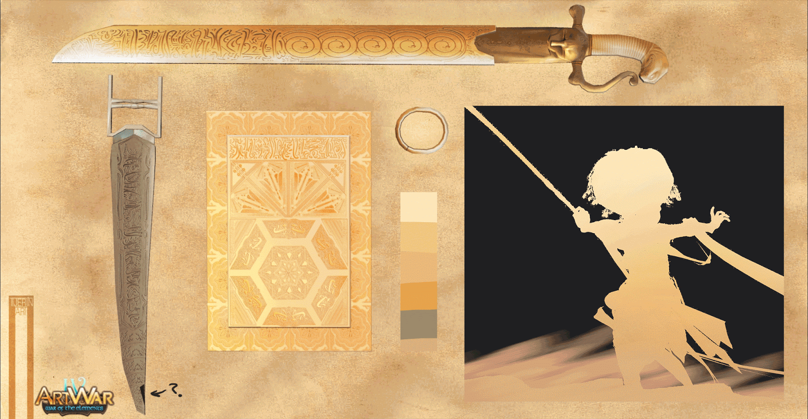
I'm now on the subject of face textures as @Sergei_Pakhomov said in the previous comments.
I'm trying out textures for the face to see where the final design can go. They are just "smart materials" of subtance painter (except the white face in the center which is the model without texture)
Now I have the whole model modelled and uploaded to Sketchfab with almost all the textures in place (these days have been crazy trying out textures and effects to make everything look good in Sketchfab (I've never uploaded a model to Sketchfab before)
Thank you! The truth is that it took me a long time to make up my mind, but I don't think there's anything left.
I haven't touched the design for a few days to let it rest. Now I'll start applying the textures and applying the corrections that need to be made. For the moment I leave you with these captures of the "Skechup".

So dynamic! So cool! 
@dancerindarkk @dreamsequenz Thank you both very much for your comments!
I will publish the project between today and tomorrow if there are no problems. While I make a video to review the details and test the movement of the camera in 3d. In instagran I leave a preview with the music I created for the occasion.

Oh man this is looking really dynamic and awesome so far keep it up!


Here you have a comparative image between the 3d with real time render and another one with only the textures so you can see the difference.
Later on I will show you a detailed picture of the face and a video showing every detail in depth.
In the rules it says that if you upload the model to skechfab you don't need to publish an image with the different views and details, but as it doesn't let you have less than 2 images I decided to put a detail shot of the face; I don't know if @malcom can tell me if this is valid or not.

Congrats! Very original idea!
@nesokaiyoh thank you! I tried to make it as dynamic as possible.
@Erigo Thank you, I'm glad you like it!
I just hope that not putting a page with the details does not make me be disqualified since I put the model in skechup.
Wow! se ve fantastico! muy dinamico y me encanta los efectos de la arena y piedras. Buen trabajo!!
I saw your artwork in the contest collection moments ago and it seems as if we have a somewhat similar character design even if we fight for different teams  I really love all the tiny details you've put into your work and the beautiful dynamism.
Wish you good luck!!
Wow! Incredible!
Congradulations!!!
it's impressive, great pose, great facial, I'm really amazed
Wow! This is really cool
@marianoeliceche Muchas gracias denuevo.
@EllyettWee Thank you very much, it seems to me that the tullo is much more dynamic and powerful, I also wish you good luck!
@Sergei_Pakhomov Thank you very much, I read in a comment that you were very exhausted after finishing your model and the same goes for me; I'm going to take a break after this and continue making comics.
@dmitriygyrniak Thank you very much, I don't know if you saw it, but I told you in your work that it seems to me prescient because it reminds me of the aurora borealis.
@lucas.bour.protomedi Thank you very much! Go, ground team!
@nikita666 Thank you very much! Although compared to the tullo, mine looks like a child's game. I really spent a lot of time looking at all the details of your design and I hope to learn from it next time.
WOW ! Great work, i realy like her pose, very dynamic. Well done =)
Amazing! great dynamics in pose and fabric! facial expressions and posture of the hands perfectly transmit tension.
@etienne.ferrero THANK YOU VERY MUCH! I really had a hard time making the line of motion in all angles.
@Michael_Black THANK YOU! I tried very hard to bring it to life for.