• Gave myself 5 days to do something. This is what I managed to do. I'm trying to get better at illustrations, but I have patience to work on something for 3 days maximum :( Splash_Process.jpg5000x3140 2.21 MB Splash_Process-6.jpg3896x2429 2.83 MB concept list char copy.jpg5388x3000 1.7 MB
    20.6k
  • Did a character concept for a course.https://www.artstation.com/artwork/P6gm3y - more:) list1.jpg3541x1920 2.82 MB
    20.6k
  • Day 4: Star Wars May The 4th =] Queen Padmé Amidala in my art style! First time drawing her and I really enjoyed making this one! Used watercolours, ink pen, acrylic markers and gold paint for accents on my Canson mix media sketchbook. I hope you like it!
    81.6k
  • A creature design from a while back
    by
    6.6k
  • Here is some more recent stuff, I need to make more body studies
  • It's been a while and god, it is so cringe to go through all previous messages xDmy study.
    20.6k
  • Thank you! I finally cleaned that up. Meanwhile started 3 more ..I have a habit of taking too long to finish a piece, then I lose interest in it and just start something else. I found 8 from recently i started and abandoned, that are decent enough to not delete, but not finished. There’s also been a number of drawings I felt I “outgrew” - became better before I finished them, and it would be easier to start from scratch than fix them. Anyone else thinking that?
  • Lady Death Fanart Collectible: Part 6 Polypaint and base Hi, it’s time to share with you another part of the process to create this fanart piece. Polypaint As this is my first collectible fanart I didn’t have previous experience with polypaint so I tried my best and played a bit with it.I wanted to give a ghostly and eerie look to Lady Death, she is beautiful and deadly, but at the end of the day she is a woman that died and was reborn at hell as an avenging spirit, that’s why I gave her skin tone a bluish very cold tone.As you will see I gave myself some creative freedom to deviate from the traditional color scheme that this characater has in comics and illustrations.To add a bit of sensuality by painting some freckles on the face and the chest. The dark nature of this character was the perfect excuse to gave her a kind of goth make up, very dark shadows around the eyes, blue lips and fingernails. I know that the original character includes sexy red lips but I wanted this girl to have a sexy but at the same time creepy look, that’s why we can see some thin veins emanating from her eyes. The biggest chromatic change I did for this character is at the hair. Lady Death has a characteristic white weavy hair but in my fanart I decided to gave her a very saturated blue color.The reason behind this wasn’t only an aesthetic choice. I want that the face area strongly pulls the attention of the viewer so this area needed a stronger contrast. Another reason is that I want her to have a more modern look, as I mentioned before, I’m strongly attracted to women with goth/punk look. I gave myself half an hour or more to analyse the work of experienced sculptors that create collectibles and I discovered that the use of darker values on the skin is often applied to create a greater sense of volume and three-dimensionality. I found that areas with heavy ambient occlusion are the perfect places to paint with darker colors in order to increase the separation between different forms. Even though she has a bluish skin tone, I used a bit of warmer hues in areas that, in real life, tend to go towards red and pink, this is very obvious in the nose, cheeks, and knuckles. Thinking with a logical mind it’s completely absurd to have warmer tones on the body of a zombie like creature but I didn’t want to limit myself by using only blue tones, it looks boring and artificial. In real life these colors are created by blood vessels in areas where the skin is very thin. ** Scythe **for her weapon I applied a cool gray with some warmer variations, this color scheme is influenced by the work of H.R giger. Base I’d like to talk about the design for the base which, to be honest, I forgot to develop along with the character.My main idea with the base is to show that Lady Death inhabits a very sterile and arid land, at the end of the day she is at hell.You can see a that she walks over dirt and rocks, a sign that she’s surrounded by death and loneliness. As part of the landscape we can see some bones and skulls to reinforce the idea of lack of living creatures, yet we can see three hands that try to reach her legs.This hands represent that all creatures are subordinated to her power and seek an evil blessing with a simple touch of the princess of the damned.1- The hand with skin burns represents the souls of those who are newcomers to hell, tortured souls that suffer for the sins comitted on earth.2- The hand with greenish rotten skin and pustules is the reminder of the decay that has infected the souls of those who have been trapped and have forgotten their humanity3- Last but not least, the hand of a demon shows that even dark creatures and entities bow before her presence. The cherry on the top, at least in my vision, are the simese twins that emerge from the ground, this malevolent creatures remind us that in hell there’s only perversion and any trace of innocence is lost. Thanks for reading till this pointI’m really happy to be very close to finish this creative journey, last but not least it’s mandatory to talk about splitting the sculpture in several pieces to be printed, this will be my last entry before showing the final rendered images. See yaMay Zbrush be with you
    1.4k
  • memory 2min gartic phone, used ref 2m gartic, used ref for pose 2min gartic 2min gartic 2min gartic 2min gartic memory memory memory memory study memory memory memorymemory memory memory memory memory memory study memorystudy study stylized left memory, right study study memory memorymemory memory memory memorymemory memory, porportions r offmemory memorystudystudy memorymemorymemory memory memory memory memory memory memory memory, right leg is a bit broken The feeling of only getting 1 - 3 likes on a social media post will never not be discouraging. But nothing is discouraging enough to make me quit drawing. I think the strategy of drawing a lot of stuff and waiting a while to post is good though rather than posting it immediately and then feeling that sadness on the next set of drawing
  • Urban Dragon Girl Wip Urban Dragon Girl_wip1.jpg5000x5000 1.11 MB
  • Long time no see! New artworks produced lately
    6.6k
  • studies studies juri study imagination, how I feel before a speech imagination imagination study something I drew for my presentation also drew this for my presentation, didn't fix the one hand being bigger than the other imagination + study study studies study study, I need to fix the face a bit based on screenshot from anime but in my style study. except for the eye study studies studies study. changed some things tho imagination imagination imagination study studies, except top right samurai based on anime screenshot wolverine studies, changed some of the poses a lil, not very good at all, but first time i drew the character ever. semi study studies study imagination imagination imagination , for first time ever i tried to draw over 3d model for middle pose, I dont like the result tbh, but it makes it much easier than coming up with it from memory.imagination, except right figurestudies imagination + studies, coming up with action poses r hard, these are not dynamic enough, I will redraw better ones in future. imagination , imagination imagination study, except for eye imagination imagination imagination doodles except for the two chrollos imagination storyboard thumbnail, idk if i ever shared this. my storyboards end up being a little detailed since i usually just draw in one layer.
    by
    22.1k
  • Quick fun sketch. CyberFish.jpg2394x3857 674 KB
  • Neon Gambit This is a fan art of my all time favorite character Gambit from the X-Men.I made this a birthday gift (26.04.2024) to myself and honestly I really do like how it turned out in the end =] I hope you like it as well =]
    81.6k
  • Art Blog - April to September 2023 Suffer a little burn out. Look at some memes. Here's some art from in between. critique.jpg1333x5736 1.77 MB
    20.3k
  • And some more! Been painting over them a bit more this time. Some variants I tried for the old guy using mainly the liquify tool. Someohow looking a bit like Owen Wilson (not intended :D)
  • Cafe sketch/color study
  • Hello! My name is Vithor, I am from Brazil, studied Design at a local college worked as an illustrator for more than 10 years. I took a time off around 3 years ago and am trying to get back in my art shape and maybe become professional again. Here are some recent pictures: You can find timelapses for most of them on my instagram: www.instagram.com Vithor Albertim (@vithor_albertim) • Instagram photos and videos 123 Followers, 638 Following, 19 Posts - See Instagram photos and videos from Vithor Albertim (@vithor_albertim) Comments and critiques are always welcome.Cheers!
  • @patrycja.lerch Thank you I created another variant, which might capture the witch look I was going for better
  • Thank you @daceronine! If I remember I save in google cloud, I will have to stick a note to do it more often. Lamp is from life. Poses are from refs but I look at refs for a while and then try to do it myself and look it up if needed. Outfits and rest is from imagination Something went wrong while installing system so we will have to wipe everything again... pc works but something is wrong. We will wait till internet is done and I will save everything on cloud this time Threads came out in eu. It's been 3 days and I had more engagement than after half a year on instagram. It feels really nice I hope it stays this way A portrait of old dude. It's the same character I posted a while ago. Inspired by Bayard Wu work. At first I thought of him as a bear but I named him Fenrir and I think wolf suits him better. Eye gave me a bit of hard time but I think it is fine now. I focused on face and forgot about area below. The way I draw hair clashes with greying hair. I had the same problem while doing Lohse's white hair. Does it looks like it is greying here? I love how desaturated red looks blue there. I keep lying to myself that I will use different color scheme but It all comes down to this blue and yellowish one it is just flipped this time Have a great day!
  • Been bad about posting updates on the forum. I figure I should just throw down stuff. instead of waiting until I finish something.
    14.5k
  • Havent done much this year since I am focusing on learning programming and deving my own Indie Game . But here 's a New Year Piece 2024 , she 's the mascot for my Game Studio - Lucid Realm : Lucid Chan ! LucidChan_v001_sketches.jpg3072x4352 973 KB
  • IMG_0637.jpeg3240x4050 1.6 MB
  • Long Crested Eagle studyI had so much fun making this one and honestly I love that Eagle! It looks so cool! Used for this one high quality watercolours, high quality watercolour sketchbook/ cold press and it was 300 grams paper.I hope you like it!
    81.6k

I usually post on the weekend due to time, but I've found a potential roadblock and want to ask for help/tips before I let it get to me.

I moved onto the gesture drawing - I feel like i've gotten the 'stick skeleton' down, so I wanted to focus more on gesture and then figure drawing (I am making sure to revisit previous tasks, as that helps cement the concepts).
The roadblock i'm facing though is proportion - I know general proportions, and I do tend to doodle out figures when my mind wanders at work/home etc. But something about gesture drawing throws me off and I end up with oddly proportioned stick gestures.
Below are my first 3 attempts at 1 minute drawings (I wanted to go a bit longer to familiarise myself with simplification/proportion before going down to 30seconds).


It's not all bad, and I'm not going to quit yet because i've far from spent enough time on this. However, I constantly find myself misplacing the legs and arms so my gestures just look weird.
I look at the reference images and find that I struggle to transpose any of the proportions to canvas in the short time. Is there anything I can try to do to help smooth this process?

I have checked the video a couple of times, but there's nothing really that seems to help.

Thanks in advance :smile:

Hi! Sorry I do not have an answer for your problem, because I have the same question hahah
That's not a real question but I started today gesture drawing and my proportions are, orribol :joy: Maybe we have just to gain the skill :sweat_smile: Just saying that I feel you.
Keep us update!

Hey @ashley.durnall1

One thing you could do is start from an even longer time and slowly move to a shorter time - instead of jumping right into 30 sec or a 1 min, try to have more time to observe and than slowly move towards having less and less time.

But honestly, this one is really a matter of practice. If you do the work, you'll get there.

And also, try to "ignore" the proportions at first. The focus now initially - I think - is more about the dynamism of the pose instead of the proportions, so focus on that first and allow yourself to do some really weird sticky figures 😅 and with time, after you are more used to nail the poses, you'll slowly move up to adjust the proportions as well.

Hope that helps 👍 Amazing stuff so far, keep the updates coming!

8 days later

It's been a short while! I'm not good at keeping on top of these sorts of things D: so unfortunately, this is going to be a long one. Sorry in advance, but also thanks in advance :smiley:

My eyes are hurting (from a day staring at computers without my glasses), and I'm also feeling a little stuck, so I wanted to make this post.
I don't quite know where to go next - I want to use my morning drawing sessions to go over the stuff I've done to keep that practised, but I'm not sure where to go in my evening drawing sessions. I don't know when is an appropriate time to move onto the next bit, nor where to go. I do get that fear that I'm not good enough at the stuff I have done, but don't want to burn out by only focusing on those sections until I'm a master of them

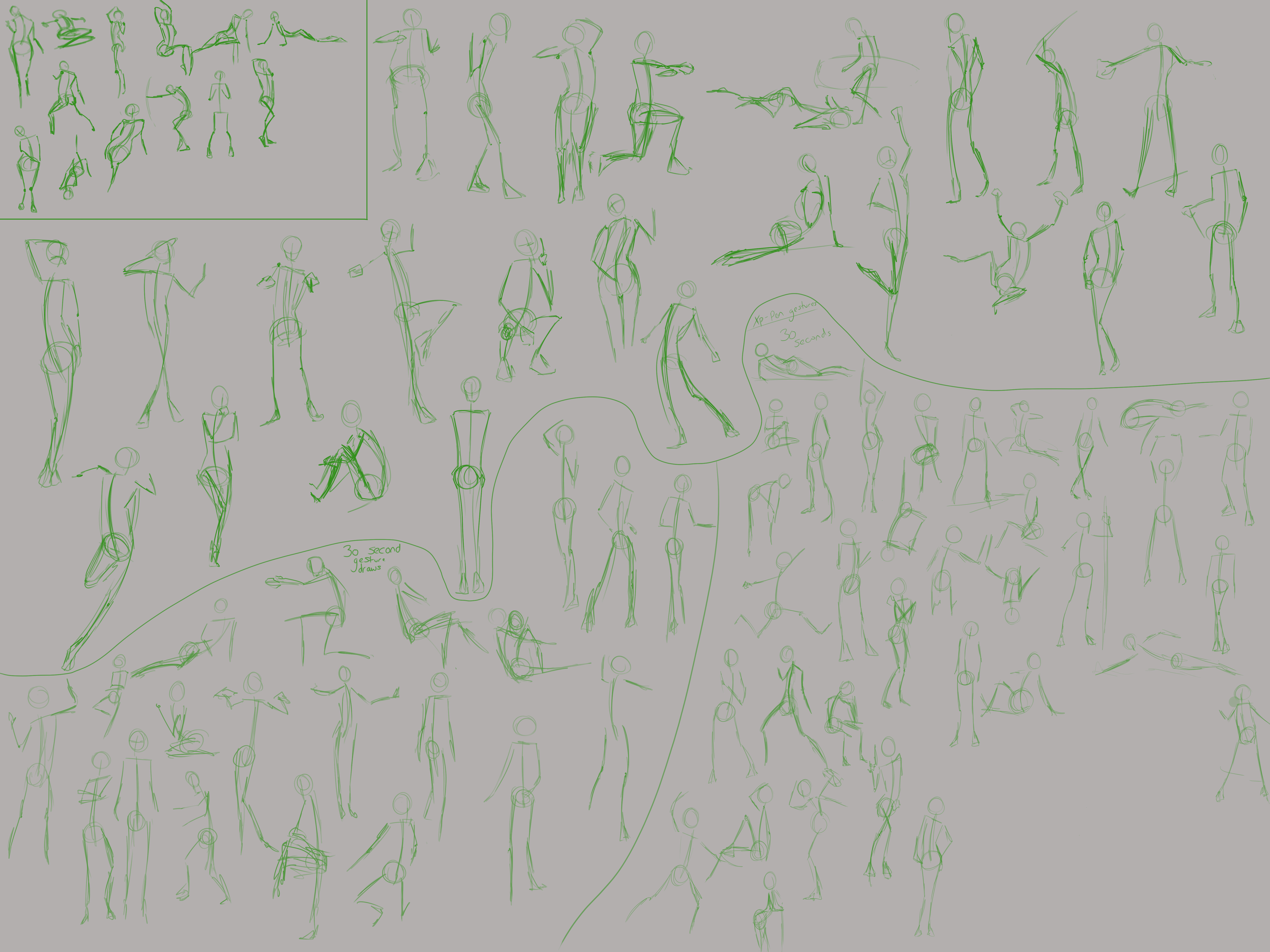
I took the advice of @dangras-almeida with a lot more ease than I expected and was a lot more proud of my gesture drawings - also, the compliment made me feel so much more pumped. There's something to a 'stranger' giving you compliments that makes it all that more special, so thanks; you helped strengthen my motivation.

Here's my 4th/5th day's work:


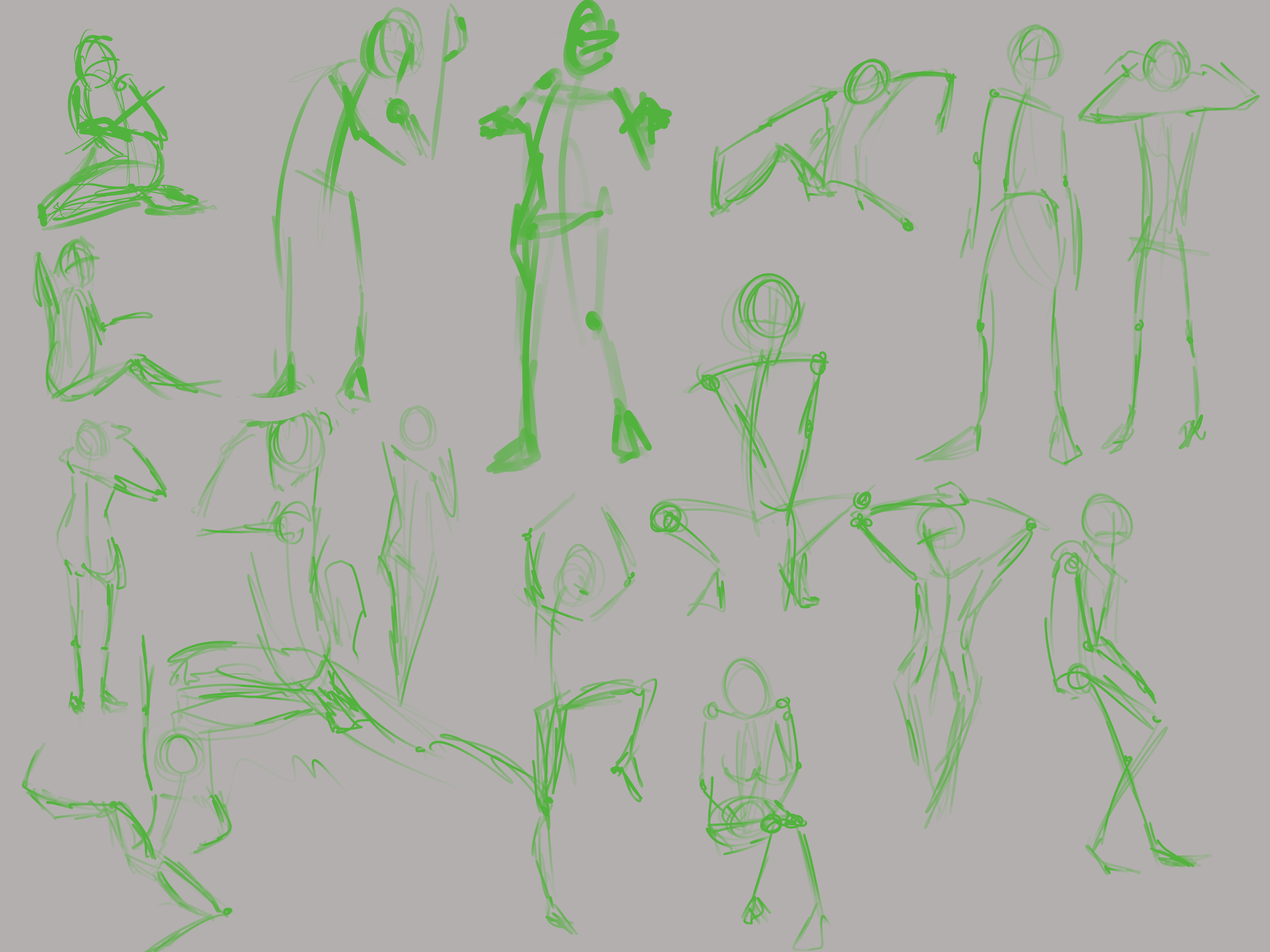
I'm still going for a minute, but the proportions here were so much better. I don't know what changed, either way, i'm crediting @dangras-almeida for assisting with this improvement.

My iPad attempt however, is not as good:

I'm putting this down to difference in hardware; I may need to adjust the pressure curve for opacity to suit me better - I still need experience with pressure controlled size jitter. It might be my pickiness though.

I am able to draw a lot more, I've got about an hour before I start work, and then all night when I'm back. My only issue now is getting out the tablet to actually start. So i'm hoping to improve a little faster and actually make some 'non-studying' art :stuck_out_tongue:

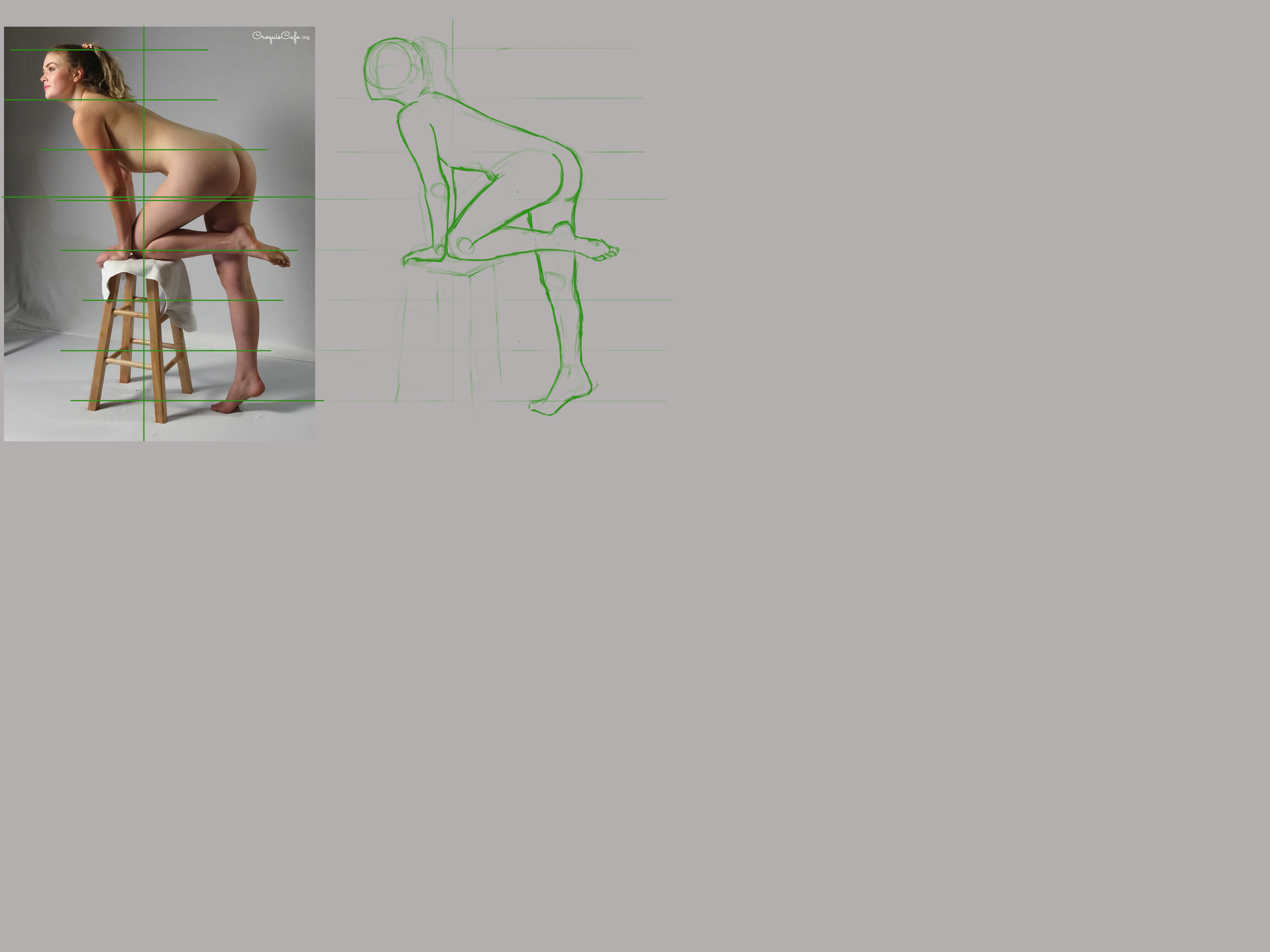
I also tried out figure drawing from an image - i've done it before in my sketchbook and was a little successful.


It's not perfect, but it's definitely a start. Using my pen to measure, I was pretty accurate with the height of the figure - I drew the lines in afterwards to help me remember where the splits were. I originally squashed the figure a bit too much horizontally, so I may need to work on that a bit more. But I dragged the outline over the image to correct myself, which resulted in the above.

I have to say, aphantasia makes it difficult to use this method without drawing lines over the image. I can't remember where the line should go after I've made my measurement as I can't visualise it on the canvas - but I do feel that this won't help me in the long term.

I also have an issue with certain body curves, mainly the buttocks and breasts. It took many attempts before I left it alone. I do plan to focus specifically on the areas I struggle when i'm happy with my understanding of proportions, so that will fix this 'issue'.

I did however, doodle a couple of figures (from imagination) at work and was incredibly impressed by what I'd drawn. It's weird seeing actual progress.

Sorry this was so long - I do massively appreciate the time taken to give me some advice, and I thank you for helping me with this journey :blush: .

I see it pretty well the drawing from an image ! Maybe it helps you -for the issue with certain body curves, mainly the buttocks and breasts- to thing with the angles a little. Measure with the pen but also see wich angle is getting the line when is not straight (not vertical or horizontal).

Hope i explain myself good enough and it helps!

Hello there!

Thank you for the kind words, but I had nothing to do with it. You did the work! You did the practice! And the results are SUPER clear! The progress on the last gesture drawing to this one is super visible for me. All the gestures feel more loose and confident. Great job!

And I was amazed by your image reference drawing! All the shapes are really represented. I remembered it took me WEEKS to do something that good, and your first post on it already nails it. Congrats!

I don't think I see the problems you see on the buttocks (and since this image doesn't have breasts, no problem there as well 😅).

But again, one day at a time. Right now, the exercise is to train your eye to spot the angles, negative space, and shapes and transfer to something else. Having the reference really close to the actual drawing should help (I think) not rely on memory so much.

What I do sometimes (even for feature drawing) is: I keep the reference image super close to the actual drawing. Then I look right in the middle of the two pieces and use my peripheral vision to assess whether things are in the right place or not. This way I don't have to "remember" since with the peripheral vision I can almost "see the 2 things at the same time" without having to move the eyes so much. It's kinda weird explaining like this but hopefully, it makes some sense? 😅

Anyway, keep up the good work and keep the updates coming!

Hello @ashley.durnall1

I read your question about having trouble with misplacing the legs and arms in your gesture drawing and I used to face the same problem too!

Apart from practice, I think the problem is not knowing exactly where the shapes and sticks ( aka. landmarks of the body, it changes with the artist but it depends which one you decide to go with :raised_hands: 
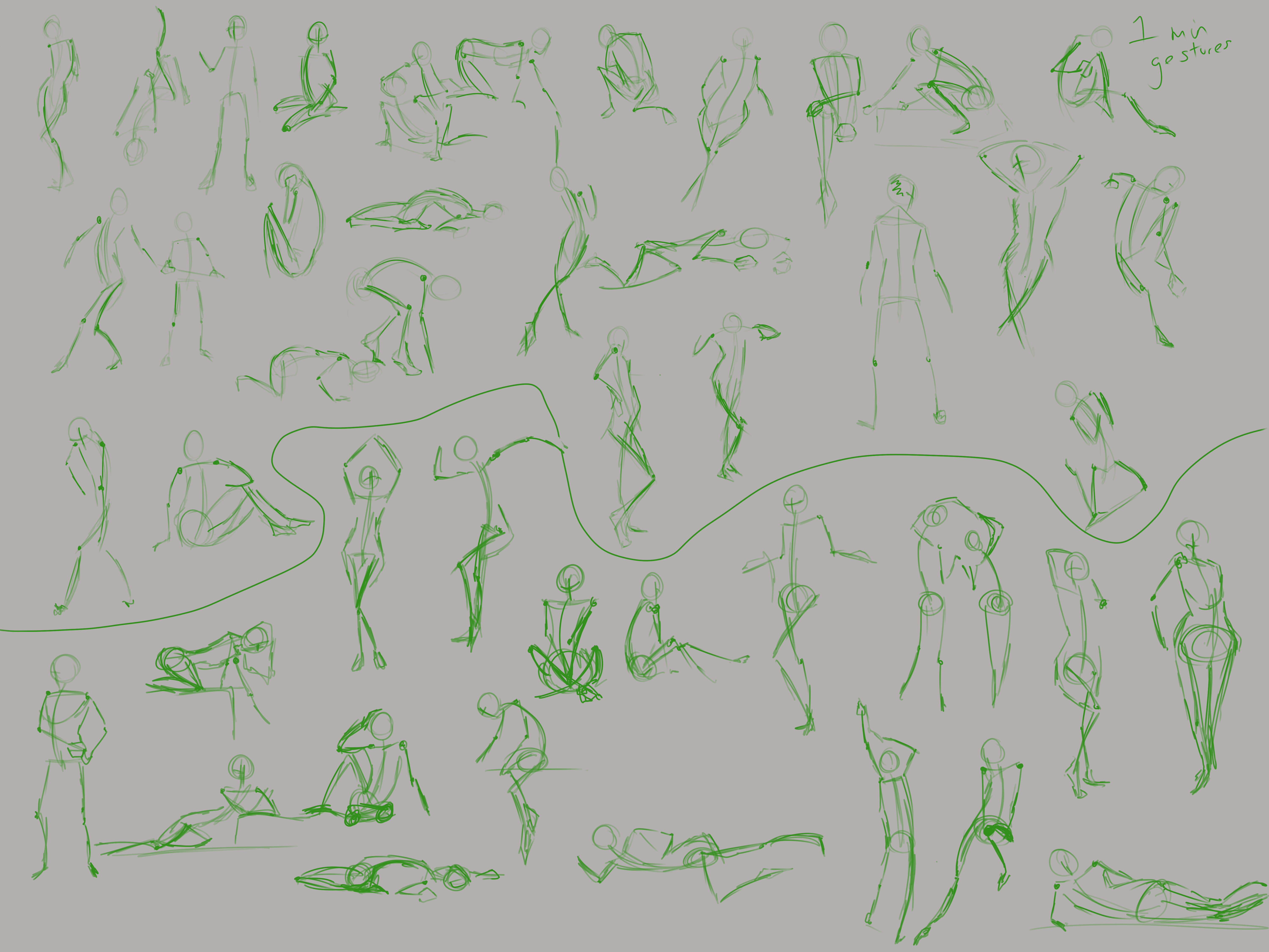
), used in the gestures, are inferred from?
Below I attached, like a simple breakdown of the body from the book framed. You can use it as a guideline of where to look out for the landmarks etc. straight line for the shoulder you can infer from the person's collar bone etc.

For your gesture drawing, I don't think you need to place the landmarks exactly, but it will be good to keep a mental note about it!

I think being aware of this helped me out! I hope it will for you too!

Hey all,
I'm going to make an effort to post more - I think having a goal of posting somewhere makes me want to do more to actually improve. Motivation is probably my worst obstacle.

This week's been weird - I took a break most of the week while I waited for my new tablet (XP-Pen 24 Artist Pro display tablet). I think the dual pairing of Asperger's and waiting for the delivery overwhelmed me..
Despite this, I have been doodling while I have a couple minutes at work (which isn't as bad as it seems), and have come up with a little character, which I don't have any images of yet. But for those with an internal imagination, its currently heavily inspired by Bellsprout (Pokemon) - I may have to alter it a bit more....

I have done some gesture drawings - I got down to 30 seconds!!! And they don't look terrible. I feel like this is a massive improvement and I aim to continue doing this - mainly as a warm up now I think.


The bottom right is from using my new tablet - being able to see where I'm drawing feels like it's helped. Though it's maybe not too visible in gesture drawings :stuck_out_tongue: Though i now wish i finished the page >.>

I've also done a couple more figure drawings:


Now I look at these on here, I feel like my lines are too thick - maybe. I don't know. I think improvement here is definitely just a case of practising and putting the time into this - anatomy included.
Due to the contrast of the reference in the bottom image I wanted to try and play with the shadows a little. It's also the first figure drawing with the display tablet, and I wanted to push myself a little. I definitely need to practise this - I haven't really experienced adding shadow/colour to my drawings - but that's something that will have to change.
The main thing I've noticed is that I'm going to struggle using my pen to measure - being so close to the drawing surface, i can't stick my arm out. But I used the ruler in PS once I'd identified my distances. That may be the tradeoff possibly.

I feel confident in my abilities so far, and think I might move onto one of the other videos in term 1. So there'll be a bit more variety in my next posts (hopefully).

I am very grateful to all the kind words and advice given here. I want to be able to spread my experiences and maybe help some other people out too - but I'm not feeling that confident yet.

your figure and gesture drawings show a good grasp and confidence for what your seeing. keep it up :+1:

Thank you Ghostmonst3r :smile: I take full advantage of the rulers on Photoshop - without them I struggle a lot to get the measurements down.

I have a question though for anyone who can advise... How do you get past the 'wall'. I'm starting to find that going over things is starting to get less exciting and I feel like I'm reaching a point of stagnation with my learning. With gesture drawings I am trying to do them as warm ups, which keeps me doing it - but with figure drawing I'm struggling to identify how to improve. How do you identify where improvements are needed?
One place I know I need to improve is cleaner lines, but I'm not sure how to do this effectively..
I also know anatomy is a thing I should really focus on, but I am aware its covered in some of the other terms.
I am going to be moving onto perspective this week for a change up, but I want to keep practising figure drawing as well. I just don't want to start becoming bored and start sliding off the drawing wagon.

Hey @ashley.durnall1 ,

I would say 2 things here:
1) Don't repeat one thing too much to a point where it becomes too boring. When you feel you got the hang of something, move on to the next lesson. Or even if you didn't entirely, nothing keeps you from moving on to something and then coming back to it. It's important to manage that energy so you keep moving forward.

2) Feedback is one of the keys to learning and improving, in my opinion. Share your pieces here, at the discord channel, and ask people for feedback. It's through feedback we can start seeing things from a different perspective and we can improve. And off course keep on the daily practice.

Hope that helps 😊

keep going with the lessons. one thing I have found is that marc has structured the classes so that many of the skills will compound on each other. by that i mean the perspective class has definitely helped me with my anatomy. you can always go back and revisit.

9 days later

After my last image post, I tried a figure drawing with clothing... While it's not bad, i'm definitely not as well versed with clothes than nude figures.

I have also started the perspective video of term 1. I'll be honest, I didn't want to draw boxes in perspective due to potential boredom, but going straight into drawing rooms was super motivating. Marc is definitely very good at setting tasks that are fun.


This took me a lot longer than I really wanted, and technically it's not finished to the full extent of the reference I used (my own kitchen). But it was a lot more fun to do this. There's some areas where the picture looks flat - and i struggled to get the full extent of the third dimension - but i'm certain that indicating the light and shadow would help there.
I have a couple ideas for other perspective drawings, and i want to do some more curves.

Because this took me so long, i've not gone back to gesture and figure drawings - my fear is that i'll be back where I started (it does happen often). I'm going to try and re-motivate myself to draw in the mornings before work for recap.

As always, any critique and advise is much appreciated - I'm going to try and get more into this.

I think your being a bit hard on yourself. I don't see any flat spots in this. there is no shading and all the perspective looks correct. Maybe the cupboards and sink could have had a bit more, but this looks good. if boxes sound boring, maybe try house hold objects, that will keep your brain in the mode of the exercise and be a bit more fun.

I do have a tendency to be overly hard on myself - it's something i've always done. With the kitchen, I purposefully stopped so I didn't burn out with it. In place of that I started another perspective drawing from imagination, which i'll be posting up at some point. I may go back to the kitchen and add in the extra bits.

Now you've mentioned it, doing random objects sounds interesting too - I might have a go at that.

I should also watch the rest of the video - I couldn't watch it all due to time constraints and I was engrossed in the two perspective drawings i've been doing.

I will try to be less hard on myself in future.

I had a pretty lax week with drawing and ended up not doing much else :c Work was particularly draining.

In light of that, I did manage to 'finish' my second perspective drawing - this time completely from imagination. There are some additional details I think I should go and add, for example the rest of the road detailing and the building in the background doesn't have any features.

I also want to redo the fencing by the small shop; I couldn't quite figure out the spacing. I didn't want to draw it on a separate layer and transform it to the shape... but i'm not quite sure how to get the spacing to look better - this version was a little more rushed.
I am a little scared i'm using too many guide lines (which is a silly fear, i know, especially while i'm still learning). Does anyone else get this?

I tried to add some shadows, but I definitely need to do some shadow studies of some sort. I could not wrap my head around it - I even tried to add some guides for it:


So as a result, I just decided to finish up there and not add more shadows... I've never done anything with values and colour, so I'm fine with it at this point. I'm not going to be a 'master' of everything straight away, and that's fine :smiley: I've still got much I want to learn.

I do think I have some issues with finishing up these things - scenery takes a lot of work, I respect background artists a whole lot more now.

One thing I realise i'm not doing is drawing 'for myself'. Every session I do is something related to the course, I only create personal things via doodles and scribbly sketches. The justification is that "I'll draw my ideas when I'm more confident".
I don't know that this is the best mindset to be in...
I have redrawn one of my only personal drawings (one that I did almost a year ago now), and it turned out pretty well.

I'm going to continue with the perspective drawings! I want to add more details and possibly fully finish what I've started. I'll be sure to keep this updated with my progress and thanks to everyone for the help and advice!!

Your perspective assignments look really good. I totally get the worry of using too many guidelines in a perspective drawing but when you're starting out or just struggling it's totally normal to have a ton of guidelines. If I still had some of my first attempts at the perspective I would share them because the paper was worn thin because I had drawn, erased, and redrawn so many guidelines. The shadows you have in the second image look good to me, you're definitely going in the right direction.

I did a quick drawing to demonstrate how to do the spacing on the fence. First (black lines) define where the whole fence is going to go. Second (red square) define how big the fence post and space next to it are going to be. Next (green) use the "X" to find the center and draw a line all the way through the shape. Then (purple) from the bottom corner of the red shape draw a line that goes through where the black and green lines intersect. When you get to the top draw a line down. Repeat that (blue) until you get to the point where your essentially just drawing the lines on top of each other(orange). Finally, define the size of the post and the gap between posts (olive) and draw a line all the way to the VP (also olive). when you draw a line down each time it intersects with another line you'll have both the gap and post in perspective.

Okay, that was a bit longer than I meant for it to be and sounds like a lot of steps to remember but after a while, it just becomes second nature. Perspective is a tricky subject and just about every artist I've talked to has struggled with it so don't be discouraged.

Looking forward to seeing more of your assignments in the future, and let me know if you've got any questions about the whole perspective thing.