


Hello everyone! In this challenge of WORLDS, I am thinking of the idea of Mother ship (a large spacecraft or ship from which smaller craft are launched or maintained) in a fantasy genre.
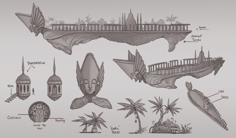
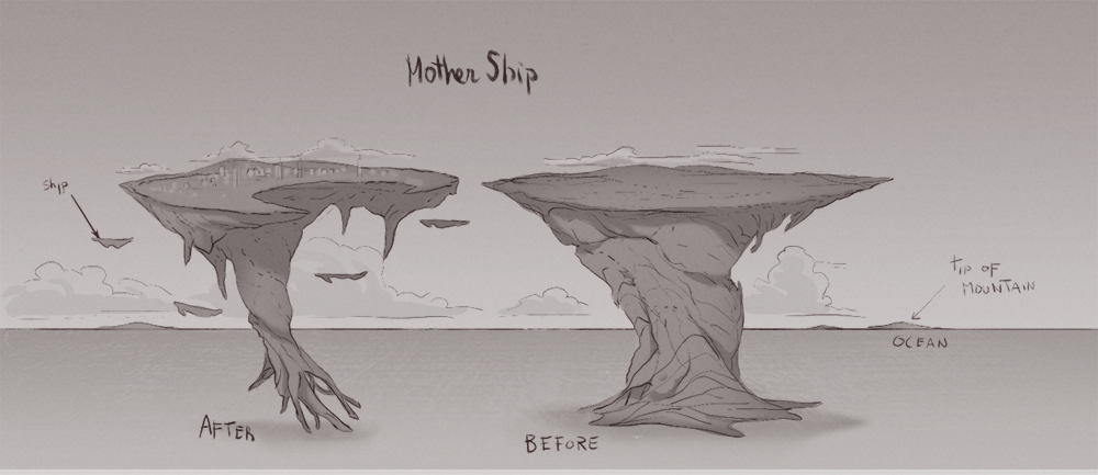
After natural disasters erupted all over the world, these ambulant, exotic ships were built to preserve the last humans on Earth. The Earth is now an endless ocean so the last humans live in ambulant ships with everything they need. Mother ship is their new home.
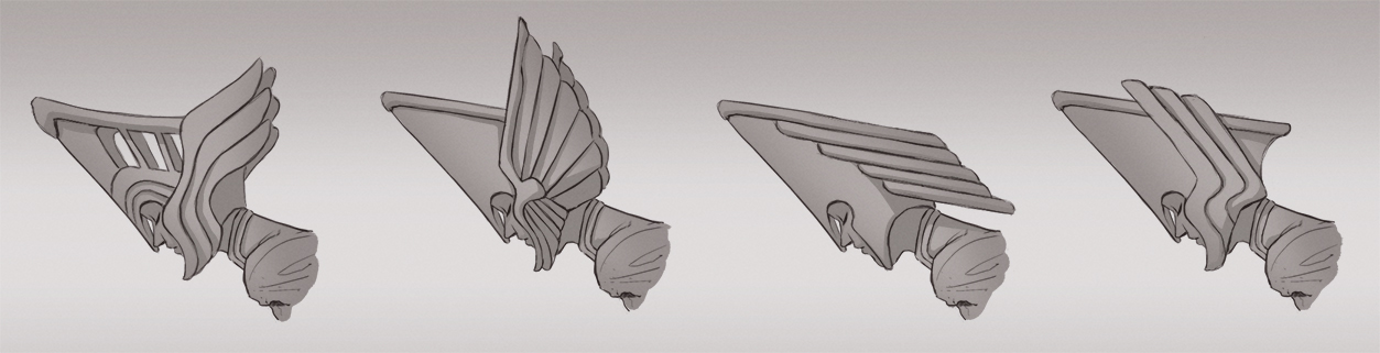
Concept Sheet

Final Illustration:
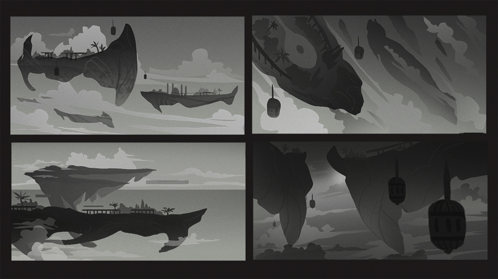
Managed to finish this! I wanted to create a serene environment. Ships moving very slowly like the clouds. Two characters having a stroll and looking at the old world ( Earth ) and the new (Ambulant ships). When I struggling with the composition I left a lot of ideas out of the final piece otherwise it would be too crowded.
There are so many good entries, I wish everyone good luck!

-
created
 Sep 28, '17
-
last reply
Oct 19, '17
-
24
replies
-
8.0k
views
-
7
users
-
11
likes
-
4
links


 I agree with
 By the way the old civilization in my entry is the earth and the new civilization is living literally above of it, so as long as I am showing clouds and ocean I think it's fine.
