• Gave myself 5 days to do something. This is what I managed to do. I'm trying to get better at illustrations, but I have patience to work on something for 3 days maximum :( Splash_Process.jpg5000x3140 2.21 MB Splash_Process-6.jpg3896x2429 2.83 MB concept list char copy.jpg5388x3000 1.7 MB
    20.6k
  • Did a character concept for a course.https://www.artstation.com/artwork/P6gm3y - more:) list1.jpg3541x1920 2.82 MB
    20.6k
  • Day 4: Star Wars May The 4th =] Queen Padmé Amidala in my art style! First time drawing her and I really enjoyed making this one! Used watercolours, ink pen, acrylic markers and gold paint for accents on my Canson mix media sketchbook. I hope you like it!
    81.8k
  • A creature design from a while back
    by
    6.6k
  • Here is some more recent stuff, I need to make more body studies
  • It's been a while and god, it is so cringe to go through all previous messages xDmy study.
    20.6k
  • Thank you! I finally cleaned that up. Meanwhile started 3 more ..I have a habit of taking too long to finish a piece, then I lose interest in it and just start something else. I found 8 from recently i started and abandoned, that are decent enough to not delete, but not finished. There’s also been a number of drawings I felt I “outgrew” - became better before I finished them, and it would be easier to start from scratch than fix them. Anyone else thinking that?
  • Lady Death Fanart Collectible: Part 6 Polypaint and base Hi, it’s time to share with you another part of the process to create this fanart piece. Polypaint As this is my first collectible fanart I didn’t have previous experience with polypaint so I tried my best and played a bit with it.I wanted to give a ghostly and eerie look to Lady Death, she is beautiful and deadly, but at the end of the day she is a woman that died and was reborn at hell as an avenging spirit, that’s why I gave her skin tone a bluish very cold tone.As you will see I gave myself some creative freedom to deviate from the traditional color scheme that this characater has in comics and illustrations.To add a bit of sensuality by painting some freckles on the face and the chest. The dark nature of this character was the perfect excuse to gave her a kind of goth make up, very dark shadows around the eyes, blue lips and fingernails. I know that the original character includes sexy red lips but I wanted this girl to have a sexy but at the same time creepy look, that’s why we can see some thin veins emanating from her eyes. The biggest chromatic change I did for this character is at the hair. Lady Death has a characteristic white weavy hair but in my fanart I decided to gave her a very saturated blue color.The reason behind this wasn’t only an aesthetic choice. I want that the face area strongly pulls the attention of the viewer so this area needed a stronger contrast. Another reason is that I want her to have a more modern look, as I mentioned before, I’m strongly attracted to women with goth/punk look. I gave myself half an hour or more to analyse the work of experienced sculptors that create collectibles and I discovered that the use of darker values on the skin is often applied to create a greater sense of volume and three-dimensionality. I found that areas with heavy ambient occlusion are the perfect places to paint with darker colors in order to increase the separation between different forms. Even though she has a bluish skin tone, I used a bit of warmer hues in areas that, in real life, tend to go towards red and pink, this is very obvious in the nose, cheeks, and knuckles. Thinking with a logical mind it’s completely absurd to have warmer tones on the body of a zombie like creature but I didn’t want to limit myself by using only blue tones, it looks boring and artificial. In real life these colors are created by blood vessels in areas where the skin is very thin. ** Scythe **for her weapon I applied a cool gray with some warmer variations, this color scheme is influenced by the work of H.R giger. Base I’d like to talk about the design for the base which, to be honest, I forgot to develop along with the character.My main idea with the base is to show that Lady Death inhabits a very sterile and arid land, at the end of the day she is at hell.You can see a that she walks over dirt and rocks, a sign that she’s surrounded by death and loneliness. As part of the landscape we can see some bones and skulls to reinforce the idea of lack of living creatures, yet we can see three hands that try to reach her legs.This hands represent that all creatures are subordinated to her power and seek an evil blessing with a simple touch of the princess of the damned.1- The hand with skin burns represents the souls of those who are newcomers to hell, tortured souls that suffer for the sins comitted on earth.2- The hand with greenish rotten skin and pustules is the reminder of the decay that has infected the souls of those who have been trapped and have forgotten their humanity3- Last but not least, the hand of a demon shows that even dark creatures and entities bow before her presence. The cherry on the top, at least in my vision, are the simese twins that emerge from the ground, this malevolent creatures remind us that in hell there’s only perversion and any trace of innocence is lost. Thanks for reading till this pointI’m really happy to be very close to finish this creative journey, last but not least it’s mandatory to talk about splitting the sculpture in several pieces to be printed, this will be my last entry before showing the final rendered images. See yaMay Zbrush be with you
    1.4k
  • memory 2min gartic phone, used ref 2m gartic, used ref for pose 2min gartic 2min gartic 2min gartic 2min gartic memory memory memory memory study memory memory memorymemory memory memory memory memory memory study memorystudy study stylized left memory, right study study memory memorymemory memory memory memorymemory memory, porportions r offmemory memorystudystudy memorymemorymemory memory memory memory memory memory memory memory, right leg is a bit broken The feeling of only getting 1 - 3 likes on a social media post will never not be discouraging. But nothing is discouraging enough to make me quit drawing. I think the strategy of drawing a lot of stuff and waiting a while to post is good though rather than posting it immediately and then feeling that sadness on the next set of drawing
  • Urban Dragon Girl Wip Urban Dragon Girl_wip1.jpg5000x5000 1.11 MB
  • Long time no see! New artworks produced lately
    6.6k
  • studies studies juri study imagination, how I feel before a speech imagination imagination study something I drew for my presentation also drew this for my presentation, didn't fix the one hand being bigger than the other imagination + study study studies study study, I need to fix the face a bit based on screenshot from anime but in my style study. except for the eye study studies studies study. changed some things tho imagination imagination imagination study studies, except top right samurai based on anime screenshot wolverine studies, changed some of the poses a lil, not very good at all, but first time i drew the character ever. semi study studies study imagination imagination imagination , for first time ever i tried to draw over 3d model for middle pose, I dont like the result tbh, but it makes it much easier than coming up with it from memory.imagination, except right figurestudies imagination + studies, coming up with action poses r hard, these are not dynamic enough, I will redraw better ones in future. imagination , imagination imagination study, except for eye imagination imagination imagination doodles except for the two chrollos imagination storyboard thumbnail, idk if i ever shared this. my storyboards end up being a little detailed since i usually just draw in one layer.
    by
    22.2k
  • Quick fun sketch. CyberFish.jpg2394x3857 674 KB
  • Neon Gambit This is a fan art of my all time favorite character Gambit from the X-Men.I made this a birthday gift (26.04.2024) to myself and honestly I really do like how it turned out in the end =] I hope you like it as well =]
    81.8k
  • Art Blog - April to September 2023 Suffer a little burn out. Look at some memes. Here's some art from in between. critique.jpg1333x5736 1.77 MB
    20.3k
  • And some more! Been painting over them a bit more this time. Some variants I tried for the old guy using mainly the liquify tool. Someohow looking a bit like Owen Wilson (not intended :D)
  • Cafe sketch/color study
  • Hello! My name is Vithor, I am from Brazil, studied Design at a local college worked as an illustrator for more than 10 years. I took a time off around 3 years ago and am trying to get back in my art shape and maybe become professional again. Here are some recent pictures: You can find timelapses for most of them on my instagram: www.instagram.com Vithor Albertim (@vithor_albertim) • Instagram photos and videos 123 Followers, 638 Following, 19 Posts - See Instagram photos and videos from Vithor Albertim (@vithor_albertim) Comments and critiques are always welcome.Cheers!
  • @patrycja.lerch Thank you I created another variant, which might capture the witch look I was going for better
  • Thank you @daceronine! If I remember I save in google cloud, I will have to stick a note to do it more often. Lamp is from life. Poses are from refs but I look at refs for a while and then try to do it myself and look it up if needed. Outfits and rest is from imagination Something went wrong while installing system so we will have to wipe everything again... pc works but something is wrong. We will wait till internet is done and I will save everything on cloud this time Threads came out in eu. It's been 3 days and I had more engagement than after half a year on instagram. It feels really nice I hope it stays this way A portrait of old dude. It's the same character I posted a while ago. Inspired by Bayard Wu work. At first I thought of him as a bear but I named him Fenrir and I think wolf suits him better. Eye gave me a bit of hard time but I think it is fine now. I focused on face and forgot about area below. The way I draw hair clashes with greying hair. I had the same problem while doing Lohse's white hair. Does it looks like it is greying here? I love how desaturated red looks blue there. I keep lying to myself that I will use different color scheme but It all comes down to this blue and yellowish one it is just flipped this time Have a great day!
  • Been bad about posting updates on the forum. I figure I should just throw down stuff. instead of waiting until I finish something.
    14.6k
  • Havent done much this year since I am focusing on learning programming and deving my own Indie Game . But here 's a New Year Piece 2024 , she 's the mascot for my Game Studio - Lucid Realm : Lucid Chan ! LucidChan_v001_sketches.jpg3072x4352 973 KB
  • IMG_0637.jpeg3240x4050 1.6 MB
  • Long Crested Eagle studyI had so much fun making this one and honestly I love that Eagle! It looks so cool! Used for this one high quality watercolours, high quality watercolour sketchbook/ cold press and it was 300 grams paper.I hope you like it!
    81.8k

How will I structure my progress?

When I did animation electives back in my uni, my uni teacher told my class to write an online journal on our processing and understanding. This particularly helps me in my 3D animation so I figure I give it another shot.

So for each lesson I do, I split the lesson into key section where I:

  • Summarises key points gained

  • Explains my view and perspective on this section

  • Displays my work after some practices on it
  • With that in mind, it's time to go with the first lesson - Photoshop Manipulation (I)

    Photoshop Lesson (I)

    I have used Photoshop before but not for digital drawing purpose. No, I rather used Photoshop to add special effects such as shadow via a reference vector image or remove a particular part from an image. Drawing wise, I use both Krita and Sai.

    As a result, my Photoshop skill is decent as I can produce good manipulated images for particular idea, but I believe that I haven't used all of the tools available in Photoshop.

    Key note to make is I'm using an old version of Photoshop which is CS6. So, I may not do some of the section of this lesson due to the limitation.

    Lesson Notes

    The lesson may be quite slow and dreary as I already know most of the tools on Photoshop. However, in the best interest of going slowly, I watched the whole Photoshop lesson video... while doing something else such as programming or moving around.

    After watching and rewatching key parts again, there are some tools that Marc touched on that I was surprised to not know, let alone try it...

  • You can manipulate your image colour via Hue/Saturation, Levels or Curves.

  • Healing Brush is great to remove minor detail such as scratches.

  • Clone Stamp Tool is great to add part of other images into the primary image, which is then blended in carefully via the healing brush.
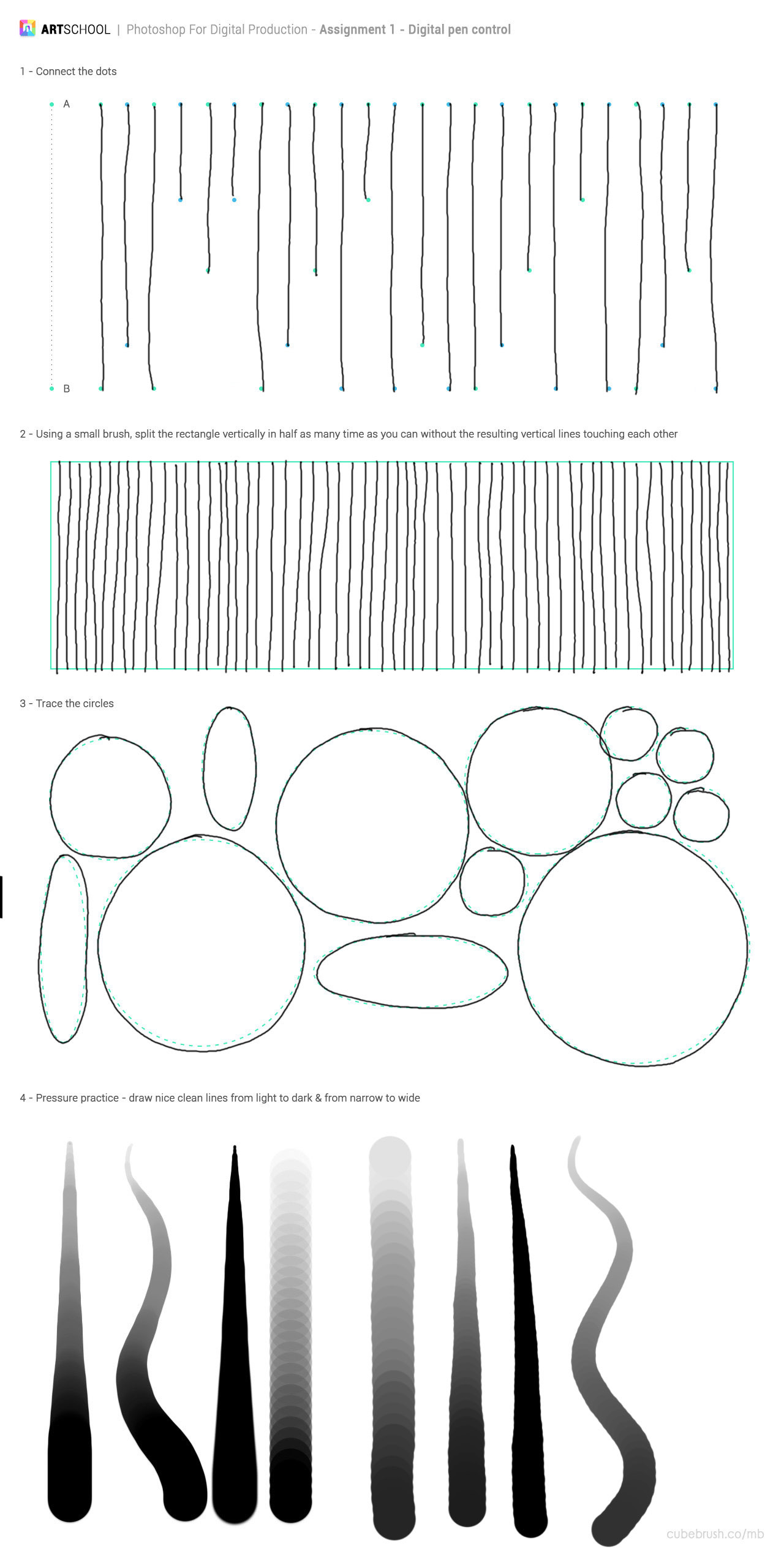
  • Part 1 - Pen Control

    I'm relatively new to my XP Artist Pro 15.6 tablet (only been 2 months so far) as this is my first visual graphic tablet. Before, I have used my Wacom Medium Tablet for the past 5 years.

    As a result, this is relatively no trouble when doing pen control. For me, there's no particular technique to make this easier; just practice using the pen/pencil more and more.

    Part 2 - Image Adjustment

    An interesting challenge as it's more touch and feel if it is right or not.

    In the first part, I note that it's easier to brighten the colour via the hue/saturation and then try to get the hue right. Then, you can slightly adjust the saturation and lightness to then get the target colour. As a result, my accuracy was pretty high and quicker as I continued onto the exercises.

    The last exercise proved to be a big challenge as there are multiple ways of getting the colour nearly right. I think my downfall was that I look and compare just one item (e.g. the sand). In a hindsight, I think I need to stop and think about how the current effect affects the WHOLE image, not just one part.

    This part definitely worth a review in the future once I get better at manipulating image colour.

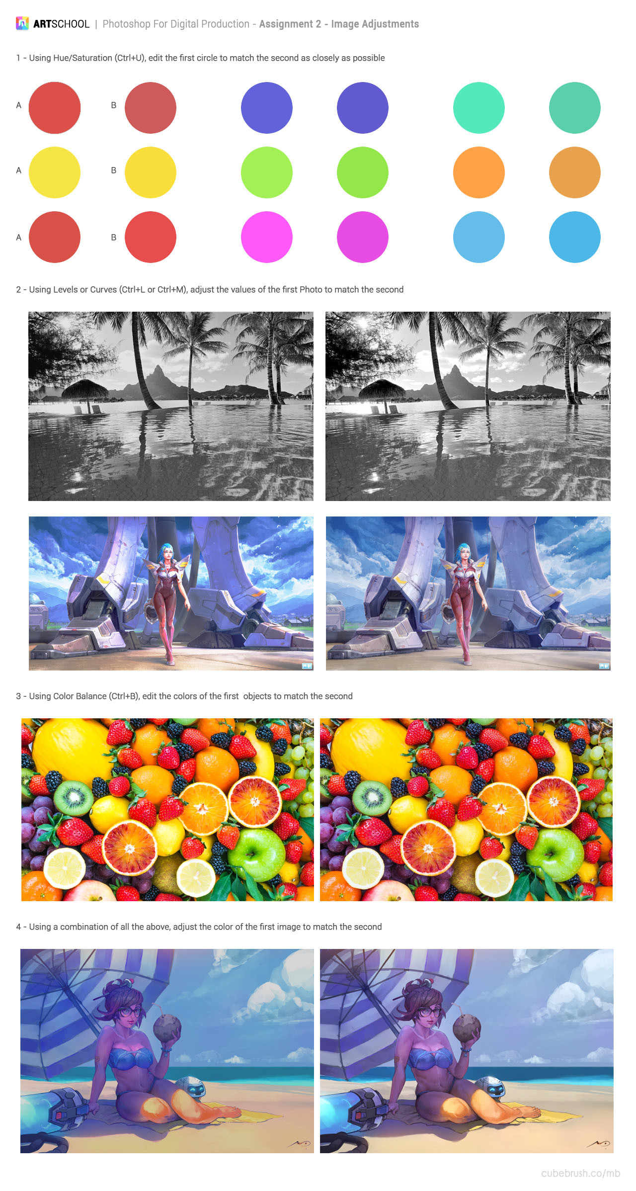
    Part 3 - Combining Image

    Again, this has some challenges as although I have experiences using the selection tools, I have never adjusted the image colour ever so this is a first time for me.

    In my opinion, I think I got the correct atmosphere appearance for my main building. I put the building on the right to not only ruin a great view of the Chinese lake but also challenge myself to place the building behind the trees. Pretty difficult but it just shows the power of Photoshop as with more touches on it, you can easily make it look like the building actually belongs in the lake, when really it's not.

    I may want to do this one again at a later basis to have a new view on this work and do this one more time.

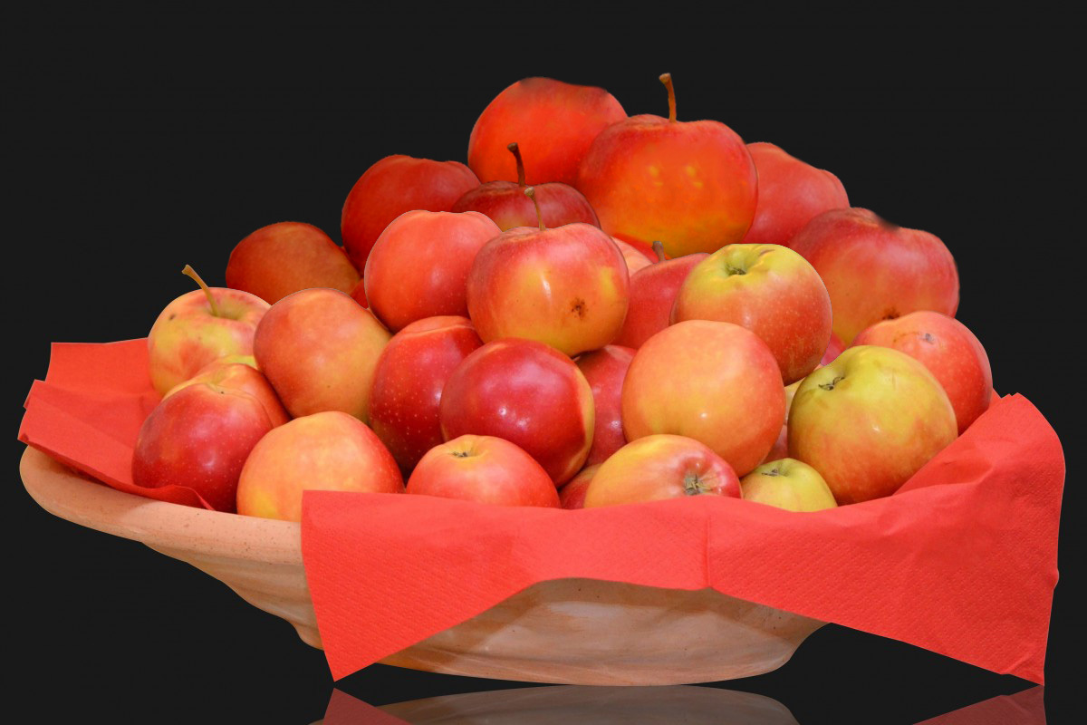
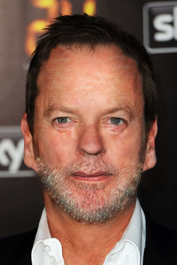
    Part 4 - Selection/Liquify/Heal/Stamp

    Due to my Photoshop version, I was unable to do the last task. However, I did complete the other tasks.

    For the first task, the main challenge is to add apples from existing image but make sure it doesn't look like it's from the existing image! This involves some manipulation techniques such as adjusting the image colour and using healing brush to remove key feature of existing apples (e.g. black spot).

    I placed the duplicated apple layers in the back as it's easier to blend in, supported by a quote from somebody who said to me "The easiest way to animate a walk is to put a bush in front of their leg!". That quote somehow stuck to my head for a long time...

    The next challenge is harder but kinda fun to lay around with the cloning tool. I was kinda shocked as how easy it is to use Photoshop to manipulate a person image into something else entirely. Sorry Kendrick Lamar but I'm not sick and tired of Photoshop.

    Overall

    First video, this was a refresher for me. Yes, it was kinda tedious as I know most of the tools on Photoshop. But so is programming concept back in my uni time so I remain committed and it paid off as I now learnt how to use the healing brush and manipulate the image to my liking.

    14 days later

    Perspective 1

    Much like the Photoshop lesson from before, this is a pretty quick lesson as I have done perspective drawing before (thx to engineering and maths) so I'm kinda familiar with 1 and 2-point perspective but not in a drawing sense. But the key is "kinda" so I went through the video in full.

    Key Lesson Notes

  • Vanishing point and Horizion Line help us set up perspective.

  • The most common perspective is 1-point and 2-point . It depends on how many vanishing points you want to use.
  • Part 1 - Horizon Line and Vanishing Point

  • You can find vanishing point by drawing all straight line together.

  • Horizon Line is basically the horizontal line of the vanishing point.

  • Part 2 - 1 Point Perspective

  • Involves 1 vanishing point.

  • Just draw straight line via the vanishing point.

  • To draw a cube, draw a square face in front and then draw toward the vanishing point to display "depth"
  • Part 3 - 2 Point Perspective

  • Involves 2 vanishing points.

  • Involves twice as much lines drawn compared to 1 Point Perspective

  • To draw a cube, draw a straight line and follow the lines drawn through each vanishing point
  • Room Assignment

    I didn't spent too much time compared to other people whose perspective work are simply amazing. The main reason is I want to focus on nude figure drawing which was my goal for this term. However, I don't want to just draw some cube and be done with so I add some non-cube object such as the machine on the right and an air-con on the top left.

    In the future, I may need to do more perspective drawing but as of this moment, I feel my current perspective skill are good for now.

    Overall

    Like the Photoshop video, this was a refresher for me. However, I learnt new concepts at some time such as how to draw curve in 1 point perspective. Aside from that, it was mostly straight forward but worth rewatching.

    Nice job! I like how you added that stool in there. Good to practice round forms in perspective like that.

    If I were to leave some pointers, I'm going to assume your vanishing point is on the horizon line. If that's the case, you will be able to see the top plane of the window sill on the left since the top plane will be visible for everything below the horizon line.
    Also on the couch(?) there to the left. The distance between the lines indicating the separation of the couch cushions will get closer and closer as it moves toward the vanishing point. I'm pretty sure there was a method on accurately measuring the distance, but I don't quite remember. I think Marc does go over it on a video though.

    I hope these have been helpful! You're doing well :smiley:

    Nice work! I love the sci fi feel. I have been working on one point perspective a lot recently so I thought this may be helpful. If you draw an X in between the rectangle you are working in you can find the halfway point. Then you can repeat this as many times as needed. This is pretty simple if you are working on just the horizontal and vertical planes as the lines are straight. However if you are working at an angle, the lines must be parallel to the other angular lines on the side. I don't know how to divide the cushions into thirds but here is an example of how to divide it into fourths. You can also use this to find the halfway point on other objects such as the circles and checker pattern on the ceiling. Take this advice with a grain of salt please as I am very new and it may not be correct it just seems to work for me. I hope this is helpful. Also love this style!

    @leeireo

    aha yes! I think that's the method I was thinking of. Thanks for clarifying it for the both of us

    Thanks for explaining your view on my Chinese couch (random inspiration), @leeireo. I was trying to indicate equal distribution. But yeah, I should used @Lockenheim solution to draw the couch in equal distribution.

    Thanks for your awesome explanation on how to split the couch equally. That's something I and @leeireo didn't know but should have due to mathematics knowledge lmao. And no, the advice makes absolute good sense.

    Btw, the orange and blue lines you draw are not parallel if I'm assuming correctly. That's the case, that's me doing work at 1am - brings out the worst accuracy out of me. XD

    But I do appreciate that you read my blogs, @Lockenheim . :smile:

    :laughing: Ive been grinding perspective so much the past few weeks these problems are fresh in my mind and very dear to me :joy:

    Nude Figure Drawing

    Now, this is where the interesting bits is coming in. Drawing people is never my strength (excluding cartoon lmao) so this took some considerable times in comparison to other courses in term 1. But this is very beneficial as it strengthens my observation out on what to look for.

    NOTE - There are a lot of good examples on Discord chat. Go have a look for more reference on there. My Discord is Gordon003#7031 if interested to chat to.

    Part 1 - Line of Action

  • Imaginary Line running from neck to tailbone.

  • First Line ever.

  • Always start with LOA when drawing figure.

  • Avoid S-Curve - our spine can only do much.

  • Can have secondary LOA to complement - in particular, the leg.
  • Part 2 - Head, Ribcage & Pelvis

  • Key parts of human body - each rotate independently of each other.

  • Can use (sphere or circle)/(box or square) to represent each part.

  • Use LOA to help the placement of those parts.

  • Part 3 - Joints

  • More mobile part of the skeleton

  • Represented as a circle which is connected by a line (simple) or cylinder (advanced)

  • Shoulder -> Elbow -> Wrist

  • Hips (at end of pelvis) -> Knee (Bottom Level) -> Ankle

    Part 4 - Cylinders

  • A better representation of joints connection.

  • Cylinder is better to show perspective and foreshortening.

  • Cylinder shows which joint is front/back of each other.
  • Full Process Combined


    Part 5 - Proportion

  • Use head measurement to measure out other key parts.

  • Have reference points to allow you position each body parts accurately.

  • Place your key body parts (head, ribcage, pelvis) and the joints as the first step.

  • Set up skeleton before you add detail.

  • Part 6 - Gesture Drawing

    Most challenging but also the most rewarding. I have done Gesture Drawing before but I don't see the main goal/point of doing it every day until Marc and other Youtubers videos recommended by other artist on Discord explained it.

    Basically, it helps me refine my observation skill in detecting key body parts quickly and find the flow of action since it's meant to be quick. In summary, this one took some considerable time and will continue to do as warmup activity.

    Initial Gesture Drawing

    Current Gesture Drawing

    Overall

    This is the hardest course in Term 1. But it's the most rewarding as it forces to work on my fundamental skill which was one of my art goal and reason to join this art school. And I'm happy to notice that I'm less rigid in my drawing and more fluent.

    I like the improvement on your gesture drawings! The planes on the faces add a lot in my opinion. I try to do that myself but run out of time! :blush: Gesture drawing is also the hardest part for me as well. I also feel like it improves my speed considerably when working on other practice. Keep up the good work!

    These are looking great and you had some difficult poses too. You really capture the attitude of the people!