• Gave myself 5 days to do something. This is what I managed to do. I'm trying to get better at illustrations, but I have patience to work on something for 3 days maximum :( Splash_Process.jpg5000x3140 2.21 MB Splash_Process-6.jpg3896x2429 2.83 MB concept list char copy.jpg5388x3000 1.7 MB
    20.5k
  • Did a character concept for a course.https://www.artstation.com/artwork/P6gm3y - more:) list1.jpg3541x1920 2.82 MB
    20.5k
  • Day 4: Star Wars May The 4th =] Queen Padmé Amidala in my art style! First time drawing her and I really enjoyed making this one! Used watercolours, ink pen, acrylic markers and gold paint for accents on my Canson mix media sketchbook. I hope you like it!
    81.4k
  • A creature design from a while back
    by
    6.6k
  • Here is some more recent stuff, I need to make more body studies
  • It's been a while and god, it is so cringe to go through all previous messages xDmy study.
    20.5k
  • Thank you! I finally cleaned that up. Meanwhile started 3 more ..I have a habit of taking too long to finish a piece, then I lose interest in it and just start something else. I found 8 from recently i started and abandoned, that are decent enough to not delete, but not finished. There’s also been a number of drawings I felt I “outgrew” - became better before I finished them, and it would be easier to start from scratch than fix them. Anyone else thinking that?
  • Lady Death Fanart Collectible: Part 6 Polypaint and base Hi, it’s time to share with you another part of the process to create this fanart piece. Polypaint As this is my first collectible fanart I didn’t have previous experience with polypaint so I tried my best and played a bit with it.I wanted to give a ghostly and eerie look to Lady Death, she is beautiful and deadly, but at the end of the day she is a woman that died and was reborn at hell as an avenging spirit, that’s why I gave her skin tone a bluish very cold tone.As you will see I gave myself some creative freedom to deviate from the traditional color scheme that this characater has in comics and illustrations.To add a bit of sensuality by painting some freckles on the face and the chest. The dark nature of this character was the perfect excuse to gave her a kind of goth make up, very dark shadows around the eyes, blue lips and fingernails. I know that the original character includes sexy red lips but I wanted this girl to have a sexy but at the same time creepy look, that’s why we can see some thin veins emanating from her eyes. The biggest chromatic change I did for this character is at the hair. Lady Death has a characteristic white weavy hair but in my fanart I decided to gave her a very saturated blue color.The reason behind this wasn’t only an aesthetic choice. I want that the face area strongly pulls the attention of the viewer so this area needed a stronger contrast. Another reason is that I want her to have a more modern look, as I mentioned before, I’m strongly attracted to women with goth/punk look. I gave myself half an hour or more to analyse the work of experienced sculptors that create collectibles and I discovered that the use of darker values on the skin is often applied to create a greater sense of volume and three-dimensionality. I found that areas with heavy ambient occlusion are the perfect places to paint with darker colors in order to increase the separation between different forms. Even though she has a bluish skin tone, I used a bit of warmer hues in areas that, in real life, tend to go towards red and pink, this is very obvious in the nose, cheeks, and knuckles. Thinking with a logical mind it’s completely absurd to have warmer tones on the body of a zombie like creature but I didn’t want to limit myself by using only blue tones, it looks boring and artificial. In real life these colors are created by blood vessels in areas where the skin is very thin. ** Scythe **for her weapon I applied a cool gray with some warmer variations, this color scheme is influenced by the work of H.R giger. Base I’d like to talk about the design for the base which, to be honest, I forgot to develop along with the character.My main idea with the base is to show that Lady Death inhabits a very sterile and arid land, at the end of the day she is at hell.You can see a that she walks over dirt and rocks, a sign that she’s surrounded by death and loneliness. As part of the landscape we can see some bones and skulls to reinforce the idea of lack of living creatures, yet we can see three hands that try to reach her legs.This hands represent that all creatures are subordinated to her power and seek an evil blessing with a simple touch of the princess of the damned.1- The hand with skin burns represents the souls of those who are newcomers to hell, tortured souls that suffer for the sins comitted on earth.2- The hand with greenish rotten skin and pustules is the reminder of the decay that has infected the souls of those who have been trapped and have forgotten their humanity3- Last but not least, the hand of a demon shows that even dark creatures and entities bow before her presence. The cherry on the top, at least in my vision, are the simese twins that emerge from the ground, this malevolent creatures remind us that in hell there’s only perversion and any trace of innocence is lost. Thanks for reading till this pointI’m really happy to be very close to finish this creative journey, last but not least it’s mandatory to talk about splitting the sculpture in several pieces to be printed, this will be my last entry before showing the final rendered images. See yaMay Zbrush be with you
    1.4k
  • memory 2min gartic phone, used ref 2m gartic, used ref for pose 2min gartic 2min gartic 2min gartic 2min gartic memory memory memory memory study memory memory memorymemory memory memory memory memory memory study memorystudy study stylized left memory, right study study memory memorymemory memory memory memorymemory memory, porportions r offmemory memorystudystudy memorymemorymemory memory memory memory memory memory memory memory, right leg is a bit broken The feeling of only getting 1 - 3 likes on a social media post will never not be discouraging. But nothing is discouraging enough to make me quit drawing. I think the strategy of drawing a lot of stuff and waiting a while to post is good though rather than posting it immediately and then feeling that sadness on the next set of drawing
  • Urban Dragon Girl Wip Urban Dragon Girl_wip1.jpg5000x5000 1.11 MB
  • Long time no see! New artworks produced lately
    6.5k
  • studies studies juri study imagination, how I feel before a speech imagination imagination study something I drew for my presentation also drew this for my presentation, didn't fix the one hand being bigger than the other imagination + study study studies study study, I need to fix the face a bit based on screenshot from anime but in my style study. except for the eye study studies studies study. changed some things tho imagination imagination imagination study studies, except top right samurai based on anime screenshot wolverine studies, changed some of the poses a lil, not very good at all, but first time i drew the character ever. semi study studies study imagination imagination imagination , for first time ever i tried to draw over 3d model for middle pose, I dont like the result tbh, but it makes it much easier than coming up with it from memory.imagination, except right figurestudies imagination + studies, coming up with action poses r hard, these are not dynamic enough, I will redraw better ones in future. imagination , imagination imagination study, except for eye imagination imagination imagination doodles except for the two chrollos imagination storyboard thumbnail, idk if i ever shared this. my storyboards end up being a little detailed since i usually just draw in one layer.
    by
    22.0k
  • Quick fun sketch. CyberFish.jpg2394x3857 674 KB
  • Neon Gambit This is a fan art of my all time favorite character Gambit from the X-Men.I made this a birthday gift (26.04.2024) to myself and honestly I really do like how it turned out in the end =] I hope you like it as well =]
    81.4k
  • Art Blog - April to September 2023 Suffer a little burn out. Look at some memes. Here's some art from in between. critique.jpg1333x5736 1.77 MB
    20.2k
  • And some more! Been painting over them a bit more this time. Some variants I tried for the old guy using mainly the liquify tool. Someohow looking a bit like Owen Wilson (not intended :D)
  • Cafe sketch/color study
  • Hello! My name is Vithor, I am from Brazil, studied Design at a local college worked as an illustrator for more than 10 years. I took a time off around 3 years ago and am trying to get back in my art shape and maybe become professional again. Here are some recent pictures: You can find timelapses for most of them on my instagram: www.instagram.com Vithor Albertim (@vithor_albertim) • Instagram photos and videos 123 Followers, 638 Following, 19 Posts - See Instagram photos and videos from Vithor Albertim (@vithor_albertim) Comments and critiques are always welcome.Cheers!
  • @patrycja.lerch Thank you I created another variant, which might capture the witch look I was going for better
  • Thank you @daceronine! If I remember I save in google cloud, I will have to stick a note to do it more often. Lamp is from life. Poses are from refs but I look at refs for a while and then try to do it myself and look it up if needed. Outfits and rest is from imagination Something went wrong while installing system so we will have to wipe everything again... pc works but something is wrong. We will wait till internet is done and I will save everything on cloud this time Threads came out in eu. It's been 3 days and I had more engagement than after half a year on instagram. It feels really nice I hope it stays this way A portrait of old dude. It's the same character I posted a while ago. Inspired by Bayard Wu work. At first I thought of him as a bear but I named him Fenrir and I think wolf suits him better. Eye gave me a bit of hard time but I think it is fine now. I focused on face and forgot about area below. The way I draw hair clashes with greying hair. I had the same problem while doing Lohse's white hair. Does it looks like it is greying here? I love how desaturated red looks blue there. I keep lying to myself that I will use different color scheme but It all comes down to this blue and yellowish one it is just flipped this time Have a great day!
  • Been bad about posting updates on the forum. I figure I should just throw down stuff. instead of waiting until I finish something.
    14.5k
  • Havent done much this year since I am focusing on learning programming and deving my own Indie Game . But here 's a New Year Piece 2024 , she 's the mascot for my Game Studio - Lucid Realm : Lucid Chan ! LucidChan_v001_sketches.jpg3072x4352 973 KB
  • IMG_0637.jpeg3240x4050 1.6 MB
  • Long Crested Eagle studyI had so much fun making this one and honestly I love that Eagle! It looks so cool! Used for this one high quality watercolours, high quality watercolour sketchbook/ cold press and it was 300 grams paper.I hope you like it!
    81.4k

I think I'm understanding heads a lot more now! I really have made a lot of progress once I switched up how I practiced. I don't even know why it didn't come to me from the beginning to practice this way ugh. I guess it got to do with it being a lot like " studying " instead of what drawing meant to me which is something that is supposed to be free and easygoing. So whenever I practiced drawing, I would just sketch instead of breaking it down every step of the way. Never using enough brains and making enough logical deductions.
I think another reason why I didn't like to do this was I considered it/ felt it was cheating which was so so stupid. I think it got to do with the feeling that it felt like copying instead of something that comes from you but I now realized that art comes directly from what you observe and you should do whatever you can to understand the things you are seeing. I think right now we're really blessed to have photoshop and all these art tools, it really makes learning art easier.

Observe, breakdown, test yourself without seeing and rinse and repeat. I think I'll continue learning this way :cry:

These are some painting practices I did. I did some head plane practices base on head references before the painting though, https://www.artstation.com/artwork/GX3Ax1. I tried to get a lot of different angles ( Above HL, AT HL, Bottom HL ) so I can understand the relationships of the different face features better and just practice from there.

Once I practiced that, I decided to test my understanding by drawing from photographs and that made me realize I don't really understand where the eyes, nose, and lips lay on the face once the perspective gets more complicated.

Like I get the overall picture right but the face is so off. :cry: The main issue was that I treated it very flat and I didn't adjust it to the tilt of the head AUgh. I'll work more on that more sigh.

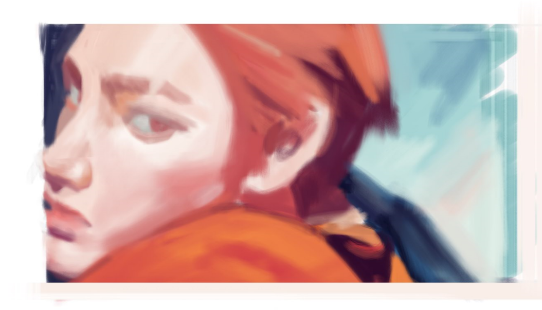
For painting, I'm really happy with the progress I made so far. I felt like I understood more about it now once I have broken the picture into planes. It made understanding how light hits on the surface easier and more manageable. Another point I'd like to make is that it's best to treat your painting every step of the way, makes it more manageable. I used to paint straightaway without many guidelines and that was so difficult and time-consuming. It made me backtrack a lot and "feel" my way through the painting, instead of basing my painting on my understanding, you'll naturally just end up copying in the end and I believe you won't learn much like that in the end I feel.

I used art from https://twitter.com/mamongmay, and just bought https://cubebrush.co/naranbaatarcg?order_by=popular stuff ( I'm really excited to learn from this :relaxed: ). References are all NCT :grimacing: really like their aesthetics :cry: . Looking at their stuff really helped me understand a lot more now.

Future stuff I'd like to practice more on,
- Heads in perspective/ alignment
- Hair Parts
- Greyscale and Lighting Transitions
- Eyes/ Nose forms
- Brushes/ Blending/ Textures


Some head studies from references. I tried to gauge the proportions but I'm always off unless I spend a lot of time tweaking. Also, been doing a lot of drawabox lately. My drawings are less misaligned and I'm happy about that :"D Less frustration for me.

I also did some random sketches of my OC. He's still a bit bare right now. I will need to do more research and concept sketches for him. My proportions for him is also whack sigh. I need to put in more effort to be consistent.

My part-time job is in a rush-hour period so I've been more tired than usual but I still have energy to draw surprisingly. I wanted to put my head drawing skills to the test after studying heads for awhile. I think I'm more familiar with head proportions now. It's easier to draw than it was for me a few months ago :sweat_smile: But I guess being consistent is still a big weakness for me. The heads I drew are kinda consistent but not consistent enough. Might be because I'm still unsure on how to draw for certain things.

I'll continue practicing the other stuff. Run run run

I was tired of doing studies and decided to doodle and sketch something. It's really been a long time since I doodled something that turned out the way I liked. Instead, of doing hair I normally sketched, I tried to be more creative with my hair shapes, and made it have that gentle but haggard look.

Even though I sketched finished, I think it will be a waste not to do some cool effects for it. It turned out to be spiders webs and a ghostly effect HAHAHAHAHA. It's nice to mess around sometimes and not worry so much about the process.

I will try to do this more often :relieved:

That hair looks really good! Some of those strands at the bottom have a cool wet look to them. And that top image looks very ethereal

Another Painting Study, but this time I didn't really spend so much time trying to eyeball the colours but kinda gauge and estimate based on the knowledge I've gotten from breaking down colours. It turns out it WORKS REALLY WELL. I barely had to change anything from the palette I did beforehand.
I guess limiting your colour choice and KEEPING IN MIND OF YOUR value changes are really important T-T I didn't know this before and would just whack any random colour of the colour wheel depending on how I felt like it.
Now, my new issue is my brushstrokes and cleanliness. I think I'm having issues rendering forms too. T-T There's so many things I want to work on but gotta remind myself to take things one step at a time and to learn it well. :cry:

Learning about head forms definitely made it easier for me to paint the head too. Just understanding the planes from the Asaro head will do WONDERS. :sleepy: I'd just wish I've implemented the stuff I learned from other sources more often. Before I will just eye power a lot of things and that made things so much more difficult for me.


You're paintings are so good!! I'm so jealous of your painting skills :joy: I can really tell that your studies are helping you too!

Do you have any tips for painting? Your colors are very clean and I've always had trouble with them getting muddy.

Hi @Shellac-Belly!

Oh yeah I do have some and thanks!
Nah it's just a lot of trial and error and observing how other artists do it. My paintings were really muddy too :') The biggest reason why my paintings were muddy was that I wasn't conscious/aware of my colour choices enough? :'D

But now that I'm taking my art studies more seriously, the information I got from watching art vids is starting to click in my head lol :'D. Wished I wasn't just lazy and start implementing those tips more.

Haha about the tips actually my friend just asked me about that too :joy:. If you don't mind I'll just post what I've just said to him below :hand:

Aye thanks man! Yeah sure. I think colour picking alot of like artists works. You will start to see that their colours are not random but have a certain pattern in them. So I believe that they do know how to sequence their colours in some way. You can see in some speedpaints they will have colour palettes in photoshop open and for some artists, they will say how they pick colours and it's through a certain order in the photoshop colour wheel. So it's all very technical, you just have to compare the value and saturation numbers in photoshop, and you will notice how the colour patterns. This might not be for all artworks. I haven't compared enough HAHAHA

But my values still need work. You still have to eyeball and adjust for the prepicked colours cause you might have picked wrongly, so if you have to make certain colours lighter or darker or saturated just do it. 🤔 It just helps you so you won't stray too far from the set values and colour theme yeah.

End of convo.

I think I have examples in my above paintings. You can see that I wrote out the colour values and saturations of the colours I colour picked so you can try doing that too! Just have to keep trying to breakdown other artists works enough so you can see how it works. I never really did this because I wanted to be " original " but yeah just do it! :raised_hands: Like that quote: You have to know the rules before you can break them :''')

Here's some videos too that I think will help with painting and some other tips I got:
- Knowing how light works on objects, the terminator, highlights
- Notice Value Changes/ transitions in light and dark. Here's a video where I got of that
: https://www.youtube.com/watch?v=Nuhd2TgAlPY&list=PLwbkBfXxH3HCu0wR_K3ncvb0ks4qwV9d3&index=14&t=0s. I think this is most important after you have established the basic lights and shadow areas of your painting. This is where your painting will really pop I feel. I think, in the beginning, I never took notice of this but in lights and shadows there are also differences in them. Like in shadows, there're terminators/ bounced light etc. and these will affect the values in the shadows and light have its own thing too. You can see it happening in these sphere

A phrase that helped me understand this well is the darkest light cannot be as dark as the lightest dark. Somewhere along those lines.
If you implement these it will help add more depth to your painting!
- Soft and Hard edges for lights and shadows *
- Knowing your the object your painting forms and PLANES* ARE IMPT. Like from the Asaro's head, I think that was a key part in helping me paint better. It helps you how to separate the value groups of the head easier
- Simplify Shadows and light in shapes and know where the light is hitting
- Brushes and your strokes are important! Test your brushes and make sure it gives you the results you want. I know there's a lot of videos out there that says it is not ABOUT THE BRUSH and I can tell you I think I spent so long painting and having a hard time getting the values that I wanted JUST CAUSE I STUCK WITH THE DEFAULT BRUSHES. It's really about the BRUSH so yeah just make sure your brushes settings work for you :'D.
-Paint in the contours of the object. If you have sloppy strokes, it will show.
-Paint Step by Step, don't jump to painting details too quickly. - I fall victim to this so much in the beginning and I still do sigh. Always try to fix the main problems like proportion, light and shadows etc.
- Limit Palette, decide the value range of your painting and what colours are needed before you paint. - The thing I realise if you were to pick paints as you go, you won't keep track of the colours are using and eventually, things will start going muddy. I think this helps minimise that the most! You will have an easier time trying other colours once you have the palette working.

Other tips:
There's a video where it says to have a good painting you just have to have 5 steps of values. I guess it's true from what I've gotten
-If you're using photoshop, I think one useful trick I learnt you can do to see your painting in grey value in realtime is to go Window> Arrange> New window. It will duplicate an identical canvas as the one you're working on. The useful thing about this is it keeps the settings in each canvas separate :joy: so you can go View> Proof Colours> Custom> Select Grey Dot 20% to see things in greyscale and just pop the window out and downscale it so you can see the greyscale of your painting.
-Try your best to replicate someone's painting you admire to the best of your ability/ photography. I think this helped me the most when I was starting to paint because it really forces you to think about how to prepare your painting so you can get the end result but it will take a long long time though. I spent almost 24 hrs on a painting.

or you can just get Naranbaatar head tutorials, I think he covers some concepts I stated above really well and you can see how it all comes together! It's really good not only for painting but for construction too which is important too if you want to paint well. You can also learn how to organise your drawing process more T u T.

Sorry if everything is all over the place, I just like to ramble without organising my thoughts well haha. I will try and organise better next time, I hope it is still helpful in some way :raised_hands: :'D

I did another painting study from the same ref as the previous painting study I did. I really like the colours they used in the video so I wanted to paint it once more. The head in this reference was a lot more difficult so I guess I have to practice drawing heads in more complex angles more T - T

I'm happy with how the colours turned out but I really wanted to capture the same feel as the previous study for the skin but I wasn't able to do it :''D I thought the skin in that one looked pretty cool but I guess this has its own vibe too.

Here's the process:


11 days later

I took a break from studies to do something fun. I'm really happy with how the colours turned out but er I guess I need to learn how to properly make use of my line art with the right colouring technique. I think the black outline kind of mess with my brain so I can't paint properly lol. I will get back to doing proper studies after this :cry:

I played around with the photoshop filters etc. to get this effect I guess I learned some cool stuff!

Some head proportions studies I did. I'm slowly taking the time to understand things. It's more helpful now, I'm beginning to see what are the mistakes I'm making and understanding the heads I'm seeing better. Now I'm just figuring how to rotate a head around and it's messing with my brain HAHAHA. I guess I'm just used to drawing heads intuitively but when u start wondering what actually changes when the head turns, yeah that's when my brain starts hurting.

Well I'll slowly figure it out somehow. :mask:


Another page of head studies. After doing studies for a while, I'm starting to miss doodling but doodling for me has started to become a sort of fear cause many things can go ugly when I doodle. I think I just need to overcome that and just focus on exploring ideas more instead of doing a perfect drawing. It's probably one of the reasons why I keep holding off from exploring my ideas cause I feel like I'll never be able to do them or I'll fail. I hope I'll eventually learn how to try without fearing to fail. I'll keep working on it T-T