• Gave myself 5 days to do something. This is what I managed to do. I'm trying to get better at illustrations, but I have patience to work on something for 3 days maximum :( Splash_Process.jpg5000x3140 2.21 MB Splash_Process-6.jpg3896x2429 2.83 MB concept list char copy.jpg5388x3000 1.7 MB
    20.5k
  • Did a character concept for a course.https://www.artstation.com/artwork/P6gm3y - more:) list1.jpg3541x1920 2.82 MB
    20.5k
  • Day 4: Star Wars May The 4th =] Queen Padmé Amidala in my art style! First time drawing her and I really enjoyed making this one! Used watercolours, ink pen, acrylic markers and gold paint for accents on my Canson mix media sketchbook. I hope you like it!
    81.0k
  • A creature design from a while back
    by
    6.6k
  • Here is some more recent stuff, I need to make more body studies
  • It's been a while and god, it is so cringe to go through all previous messages xDmy study.
    20.5k
  • Thank you! I finally cleaned that up. Meanwhile started 3 more ..I have a habit of taking too long to finish a piece, then I lose interest in it and just start something else. I found 8 from recently i started and abandoned, that are decent enough to not delete, but not finished. There’s also been a number of drawings I felt I “outgrew” - became better before I finished them, and it would be easier to start from scratch than fix them. Anyone else thinking that?
  • Lady Death Fanart Collectible: Part 6 Polypaint and base Hi, it’s time to share with you another part of the process to create this fanart piece. Polypaint As this is my first collectible fanart I didn’t have previous experience with polypaint so I tried my best and played a bit with it.I wanted to give a ghostly and eerie look to Lady Death, she is beautiful and deadly, but at the end of the day she is a woman that died and was reborn at hell as an avenging spirit, that’s why I gave her skin tone a bluish very cold tone.As you will see I gave myself some creative freedom to deviate from the traditional color scheme that this characater has in comics and illustrations.To add a bit of sensuality by painting some freckles on the face and the chest. The dark nature of this character was the perfect excuse to gave her a kind of goth make up, very dark shadows around the eyes, blue lips and fingernails. I know that the original character includes sexy red lips but I wanted this girl to have a sexy but at the same time creepy look, that’s why we can see some thin veins emanating from her eyes. The biggest chromatic change I did for this character is at the hair. Lady Death has a characteristic white weavy hair but in my fanart I decided to gave her a very saturated blue color.The reason behind this wasn’t only an aesthetic choice. I want that the face area strongly pulls the attention of the viewer so this area needed a stronger contrast. Another reason is that I want her to have a more modern look, as I mentioned before, I’m strongly attracted to women with goth/punk look. I gave myself half an hour or more to analyse the work of experienced sculptors that create collectibles and I discovered that the use of darker values on the skin is often applied to create a greater sense of volume and three-dimensionality. I found that areas with heavy ambient occlusion are the perfect places to paint with darker colors in order to increase the separation between different forms. Even though she has a bluish skin tone, I used a bit of warmer hues in areas that, in real life, tend to go towards red and pink, this is very obvious in the nose, cheeks, and knuckles. Thinking with a logical mind it’s completely absurd to have warmer tones on the body of a zombie like creature but I didn’t want to limit myself by using only blue tones, it looks boring and artificial. In real life these colors are created by blood vessels in areas where the skin is very thin. ** Scythe **for her weapon I applied a cool gray with some warmer variations, this color scheme is influenced by the work of H.R giger. Base I’d like to talk about the design for the base which, to be honest, I forgot to develop along with the character.My main idea with the base is to show that Lady Death inhabits a very sterile and arid land, at the end of the day she is at hell.You can see a that she walks over dirt and rocks, a sign that she’s surrounded by death and loneliness. As part of the landscape we can see some bones and skulls to reinforce the idea of lack of living creatures, yet we can see three hands that try to reach her legs.This hands represent that all creatures are subordinated to her power and seek an evil blessing with a simple touch of the princess of the damned.1- The hand with skin burns represents the souls of those who are newcomers to hell, tortured souls that suffer for the sins comitted on earth.2- The hand with greenish rotten skin and pustules is the reminder of the decay that has infected the souls of those who have been trapped and have forgotten their humanity3- Last but not least, the hand of a demon shows that even dark creatures and entities bow before her presence. The cherry on the top, at least in my vision, are the simese twins that emerge from the ground, this malevolent creatures remind us that in hell there’s only perversion and any trace of innocence is lost. Thanks for reading till this pointI’m really happy to be very close to finish this creative journey, last but not least it’s mandatory to talk about splitting the sculpture in several pieces to be printed, this will be my last entry before showing the final rendered images. See yaMay Zbrush be with you
    1.4k
  • memory 2min gartic phone, used ref 2m gartic, used ref for pose 2min gartic 2min gartic 2min gartic 2min gartic memory memory memory memory study memory memory memorymemory memory memory memory memory memory study memorystudy study stylized left memory, right study study memory memorymemory memory memory memorymemory memory, porportions r offmemory memorystudystudy memorymemorymemory memory memory memory memory memory memory memory, right leg is a bit broken The feeling of only getting 1 - 3 likes on a social media post will never not be discouraging. But nothing is discouraging enough to make me quit drawing. I think the strategy of drawing a lot of stuff and waiting a while to post is good though rather than posting it immediately and then feeling that sadness on the next set of drawing
  • Urban Dragon Girl Wip Urban Dragon Girl_wip1.jpg5000x5000 1.11 MB
  • Long time no see! New artworks produced lately
    6.5k
  • studies studies juri study imagination, how I feel before a speech imagination imagination study something I drew for my presentation also drew this for my presentation, didn't fix the one hand being bigger than the other imagination + study study studies study study, I need to fix the face a bit based on screenshot from anime but in my style study. except for the eye study studies studies study. changed some things tho imagination imagination imagination study studies, except top right samurai based on anime screenshot wolverine studies, changed some of the poses a lil, not very good at all, but first time i drew the character ever. semi study studies study imagination imagination imagination , for first time ever i tried to draw over 3d model for middle pose, I dont like the result tbh, but it makes it much easier than coming up with it from memory.imagination, except right figurestudies imagination + studies, coming up with action poses r hard, these are not dynamic enough, I will redraw better ones in future. imagination , imagination imagination study, except for eye imagination imagination imagination doodles except for the two chrollos imagination storyboard thumbnail, idk if i ever shared this. my storyboards end up being a little detailed since i usually just draw in one layer.
    by
    21.9k
  • Quick fun sketch. CyberFish.jpg2394x3857 674 KB
  • Neon Gambit This is a fan art of my all time favorite character Gambit from the X-Men.I made this a birthday gift (26.04.2024) to myself and honestly I really do like how it turned out in the end =] I hope you like it as well =]
    81.0k
  • Art Blog - April to September 2023 Suffer a little burn out. Look at some memes. Here's some art from in between. critique.jpg1333x5736 1.77 MB
    20.2k
  • And some more! Been painting over them a bit more this time. Some variants I tried for the old guy using mainly the liquify tool. Someohow looking a bit like Owen Wilson (not intended :D)
  • Cafe sketch/color study
  • Hello! My name is Vithor, I am from Brazil, studied Design at a local college worked as an illustrator for more than 10 years. I took a time off around 3 years ago and am trying to get back in my art shape and maybe become professional again. Here are some recent pictures: You can find timelapses for most of them on my instagram: www.instagram.com Vithor Albertim (@vithor_albertim) • Instagram photos and videos 123 Followers, 638 Following, 19 Posts - See Instagram photos and videos from Vithor Albertim (@vithor_albertim) Comments and critiques are always welcome.Cheers!
  • @patrycja.lerch Thank you I created another variant, which might capture the witch look I was going for better
  • Thank you @daceronine! If I remember I save in google cloud, I will have to stick a note to do it more often. Lamp is from life. Poses are from refs but I look at refs for a while and then try to do it myself and look it up if needed. Outfits and rest is from imagination Something went wrong while installing system so we will have to wipe everything again... pc works but something is wrong. We will wait till internet is done and I will save everything on cloud this time Threads came out in eu. It's been 3 days and I had more engagement than after half a year on instagram. It feels really nice I hope it stays this way A portrait of old dude. It's the same character I posted a while ago. Inspired by Bayard Wu work. At first I thought of him as a bear but I named him Fenrir and I think wolf suits him better. Eye gave me a bit of hard time but I think it is fine now. I focused on face and forgot about area below. The way I draw hair clashes with greying hair. I had the same problem while doing Lohse's white hair. Does it looks like it is greying here? I love how desaturated red looks blue there. I keep lying to myself that I will use different color scheme but It all comes down to this blue and yellowish one it is just flipped this time Have a great day!
  • Been bad about posting updates on the forum. I figure I should just throw down stuff. instead of waiting until I finish something.
    14.4k
  • Havent done much this year since I am focusing on learning programming and deving my own Indie Game . But here 's a New Year Piece 2024 , she 's the mascot for my Game Studio - Lucid Realm : Lucid Chan ! LucidChan_v001_sketches.jpg3072x4352 973 KB
  • IMG_0637.jpeg3240x4050 1.6 MB
  • Long Crested Eagle studyI had so much fun making this one and honestly I love that Eagle! It looks so cool! Used for this one high quality watercolours, high quality watercolour sketchbook/ cold press and it was 300 grams paper.I hope you like it!
    81.0k

Thanks so much, Chiara - I appreciate you dropping by my thread. :hearts:

That's exactly why I joined up with Art School, in fact: Marc's practical approach, his technical skills and the structured way he approaches anatomy, colour and light. I've learned how important emotion is to the creative process, and I don't discount it, but I always feel a bit more at home with teachers who deeply analyse their own process, and know how to extract practical insights. =)

Talent must run in the family. I, for various reasons, got my hands on a pre-launch copy of Little Grey Cells and was always disappointed we never got to play it.

I remember seeing the art work on the front and liking it. It fit a lot better than a lot of Kickstarter RPG book art I've seen and I'm just a sucker for that era visually as well which probably helped.

I have enjoyed reading your story so much - I will finish next year my last term in Computer Science to get an engineer :smiley: but I guess it will be the end of my university education - my great graphics teacher convinced me that art career is a thing and then I am trying my best to get one, so I think we will find common ground!

For the art itself it looks really cool and it really suits its purpose you have made it for so that the most important thing.
As my feedback 2 things stands out for me:
1) the tie is negating the gravity laws (that's pretty technical, hyhy)
2) you have misplaced some of the cast shadows, you have made them like he was standing outdoor in the sun and I understand the glass in the door is the source of the light in this room - there may be some exceptions I don't know about but light always comes through the windows like a point light not sun light so it goes from the center of the glass in every direction, so book and camera are right but hands shadows would look much different. And it is hard to tell what time it is, the mood seems to be like the evening with dim light coming but shadows are extra sharp like in full light.

Hope it helps and welcome!

Wow, that's really great subtle feedback -- the issues with how I'm doing colouring (which make everything I paint look "outdoors") is something that's taken me months to notice, and which I still haven't quite fixed (because the way I do ambient occlusion, I tend to kindof apply "camera light source" and sky-lighting without meaning to). I wish I'd had a chance to hear from you sooner -- it's impressive you can pick up such subtle details. Speaks to your skills and the quality of this course. =D

Oh wow -- small world, @Brett88. I could ask him to throw you an invite to one of his weekend games, I'm sure he'd love to hear from you again, and he's wrapping up work on the Fantasy supplement, so there's lots to playtest!

Actually, I'm hoping to do the cover for that one too. Might put together some concepts for that as part of this course!

Even smaller world when I mention that I've only just signed up and this was literally my first forum click :smile:

Online perhaps but I'm currently moving house amongs a lot of other things that will make my scheduling a nightmare for quite a while. But I will keep a look out for the art you do for the rest.

Hey there Liv and welcome to ArtSchool. It's really interesting what you did so far and what your goals and dreams are.

I really like the image you drew for your brother's Kickstarter. There's a lot to discover in your image.

I'd slightly redraw his tie though. It seems like it is not influenced by gravity, but it looks like it sticks to his shirt. I hope it's okay that I pointed that out.

Great to have you here!

Constructive feedback is very welcome, thanks -- two of you have pointed that out, now, so I'll definitely have to straighten it up for the second edition! =D

21 days later

Last week Marc gave me some positive feedback on my ability to accurately identify 3D forms and angles in figure photos, and speed is a real challenge for me, so this week I'll be focusing on gesture drawing, and starting a daily practice as suggested in his lesson, trying 30 minutes of quick gestures per day.

These ones are 30 second poses. I'll be posting a bunch of them, so hopefully you folks won't get too sick of gestures. =)

It's a pretty challenging exercise. Hope to see some improvement after a week or two!

I agree, it is very challenging. And annoying. I've been slacking. Good job on doing those, you're already capturing the poses. Volumes will come later.

Keeping it up with the 30 second gestures.

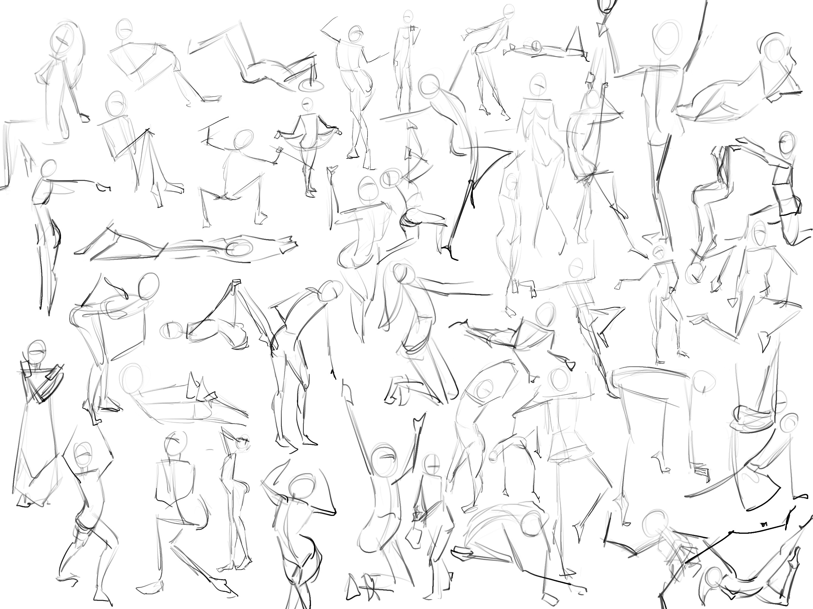
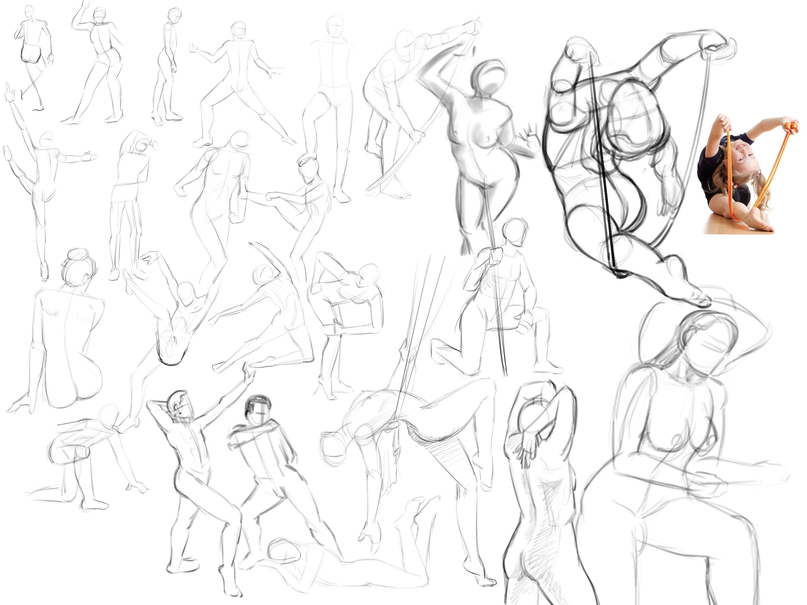
I tried to capture a bit of the volume this time, where I could get it in fast enough.

I find that certain angles go real fast for me, and others confuse me and I take so long on line-of-action and joints and such that I run out of time.

Actually, it's a great way to figure out what I need to study more of. =)

Have also noticed that on line-of-action.com, whenever one of their pics of kids comes up, it's REALLY DIFFICULT to draw. I've noticed that most of the students posting their work are only doing adult/nude figures, so I guess maybe I should filer down to only the adult/nude stuff too, until I've perfected my "ideal proportions", can follow the body under clothing a bit better, and know foreshortening really well.

On the other hand, it's a challenge... and maybe I shouldn't be encouraging my brain to think in terms of one limited set of "correct" proportions?

I don't really know. =/

It probably doesn't really matter until I move beyond the basic ribcage-and-joints mannequin anyway. =P

Today's set of gestures:

I found myself drifting into 60 second poses, as I was starting to get shapes and energy and poses which I liked, and which seemed to demand a bit of extra time and effort. Of course, as soon as I doubled my time, I started to drift towards doubling that and starting to detail things further... but I'm resisting the urge, and trying to stick to gestures, albeit I think I like them better around the 60 second mark, as there's a little more opportunity to get things right.

I did some longer-form gesture drawings this time, around 2 minutes, on WeirdOwl's advice -- and when I ran into a really crazy pose, I took a little longer and tried to get the construction right.

I feel like I start to get things a bit wrong when I have more time, because I start to look at the volumes and the negative space, and lose sight of the 'construction' side of it. That is, I copy in 2D a bit more, and then kindof 'conform' the outline to what I drew... which might explain why I feel like this kind of exercise doesn't work for me, a lot of the time.

Going to try and force myself to do the fast-construction side before I start getting into details and outlines and negative space, from now on. Already interested to try a few more difficult poses, and try to break them down a bit better.

your breakdown of the little girl doing the gymnastics is very well done

Thanks kindly -- I've actually been putting in some effort to try and make this part of my regular art practice: breaking down tricky gestures into construction, to try and capture the body's anatomy in a properly 3D way.

Would love to get some feedback on my approach - trying my best to get things right, but I feel it takes a lot of the life out of the poses, breaking them down like this... and honestly I'm not satisfied at all with my linework, etc., but it seems quite out of reach right now to be doing this level of construction/detail and still have good enough line-quality for stuff to look 'artistic'.

Your constructions are really nice! I especially like the girl at the bottom, looks so good in perspective. I think you will always loose some flow when making more details, figure drawing is to exaggerate the gesture and then when you build anatomy over it it won't look stiff, on the other hand when your figure drawing is already stiff then anatomy on top will look even worse. So you are doing very good job on your constructions but you want to learn too much stuff at once :stuck_out_tongue: do some 30-60s poses for flow, some constructions of poses you liked most afterwards and then learn some anatomy on different body parts - you will learn faster that way.

In case you’re interested where my updates are, this month I’ve been contributing them here:

Please support me in attempting Brushtober. It’s been very difficult for me, but I am pushing myself to complete as many finished submissions as I can.

8 days later

Oh really? I didn't realise I have a 'style'. xD

1 month later

Your gesture drawings are really improving! Love how you construct the human body. Keep it up. :smiley: