


good stuff Mau, these are once again really good. I don't really have much to say since i don't know too much about light & values! sorry about that.

 Thank you! I finally cleaned that up. Meanwhile started 3 more ..I have a habit of taking too long to finish a piece, then I lose interest in it and just start something else. I found 8 from recently i started and abandoned, that are decent enough to not delete, but not finished. There’s also been a number of drawings I felt I “outgrew” - became better before I finished them, and it would be easier to start from scratch than fix them. Anyone else thinking that?in24.5k
 Lady Death Fanart Collectible: Part 6 Polypaint and base Hi, it’s time to share with you another part of the process to create this fanart piece. Polypaint As this is my first collectible fanart I didn’t have previous experience with polypaint so I tried my best and played a bit with it.I wanted to give a ghostly and eerie look to Lady Death, she is beautiful and deadly, but at the end of the day she is a woman that died and was reborn at hell as an avenging spirit, that’s why I gave her skin tone a bluish very cold tone.As you will see I gave myself some creative freedom to deviate from the traditional color scheme that this characater has in comics and illustrations.To add a bit of sensuality by painting some freckles on the face and the chest. The dark nature of this character was the perfect excuse to gave her a kind of goth make up, very dark shadows around the eyes, blue lips and fingernails. I know that the original character includes sexy red lips but I wanted this girl to have a sexy but at the same time creepy look, that’s why we can see some thin veins emanating from her eyes. The biggest chromatic change I did for this character is at the hair. Lady Death has a characteristic white weavy hair but in my fanart I decided to gave her a very saturated blue color.The reason behind this wasn’t only an aesthetic choice. I want that the face area strongly pulls the attention of the viewer so this area needed a stronger contrast. Another reason is that I want her to have a more modern look, as I mentioned before, I’m strongly attracted to women with goth/punk look. I gave myself half an hour or more to analyse the work of experienced sculptors that create collectibles and I discovered that the use of darker values on the skin is often applied to create a greater sense of volume and three-dimensionality. I found that areas with heavy ambient occlusion are the perfect places to paint with darker colors in order to increase the separation between different forms. Even though she has a bluish skin tone, I used a bit of warmer hues in areas that, in real life, tend to go towards red and pink, this is very obvious in the nose, cheeks, and knuckles. Thinking with a logical mind it’s completely absurd to have warmer tones on the body of a zombie like creature but I didn’t want to limit myself by using only blue tones, it looks boring and artificial. In real life these colors are created by blood vessels in areas where the skin is very thin. ** Scythe **for her weapon I applied a cool gray with some warmer variations, this color scheme is influenced by the work of H.R giger. Base I’d like to talk about the design for the base which, to be honest, I forgot to develop along with the character.My main idea with the base is to show that Lady Death inhabits a very sterile and arid land, at the end of the day she is at hell.You can see a that she walks over dirt and rocks, a sign that she’s surrounded by death and loneliness. As part of the landscape we can see some bones and skulls to reinforce the idea of lack of living creatures, yet we can see three hands that try to reach her legs.This hands represent that all creatures are subordinated to her power and seek an evil blessing with a simple touch of the princess of the damned.1- The hand with skin burns represents the souls of those who are newcomers to hell, tortured souls that suffer for the sins comitted on earth.2- The hand with greenish rotten skin and pustules is the reminder of the decay that has infected the souls of those who have been trapped and have forgotten their humanity3- Last but not least, the hand of a demon shows that even dark creatures and entities bow before her presence. The cherry on the top, at least in my vision, are the simese twins that emerge from the ground, this malevolent creatures remind us that in hell there’s only perversion and any trace of innocence is lost. Thanks for reading till this pointI’m really happy to be very close to finish this creative journey, last but not least it’s mandatory to talk about splitting the sculpture in several pieces to be printed, this will be my last entry before showing the final rendered images. See yaMay Zbrush be with youin1.5k

 memory 2min gartic phone, used ref 2m gartic, used ref for pose 2min gartic 2min gartic 2min gartic 2min gartic memory memory memory memory study memory memory memorymemory memory memory memory memory memory study memorystudy study stylized left memory, right study study memory memorymemory memory memory memorymemory memory, porportions r offmemory memorystudystudy memorymemorymemory memory memory memory memory memory memory memory, right leg is a bit broken The feeling of only getting 1 - 3 likes on a social media post will never not be discouraging. But nothing is discouraging enough to make me quit drawing. I think the strategy of drawing a lot of stuff and waiting a while to post is good though rather than posting it immediately and then feeling that sadness on the next set of drawingin

 studies studies juri study imagination, how I feel before a speech imagination imagination study something I drew for my presentation also drew this for my presentation, didn't fix the one hand being bigger than the other imagination + study study studies study study, I need to fix the face a bit based on screenshot from anime but in my style study. except for the eye study studies studies study. changed some things tho imagination imagination imagination study studies, except top right samurai based on anime screenshot wolverine studies, changed some of the poses a lil, not very good at all, but first time i drew the character ever. semi study studies study imagination imagination imagination , for first time ever i tried to draw over 3d model for middle pose, I dont like the result tbh, but it makes it much easier than coming up with it from memory.imagination, except right figurestudies imagination + studies, coming up with action poses r hard, these are not dynamic enough, I will redraw better ones in future. imagination , imagination imagination study, except for eye imagination imagination imagination doodles except for the two chrollos imagination storyboard thumbnail, idk if i ever shared this. my storyboards end up being a little detailed since i usually just draw in one layer.in22.4k

 Hello! My name is Vithor, I am from Brazil, studied Design at a local college worked as an illustrator for more than 10 years. I took a time off around 3 years ago and am trying to get back in my art shape and maybe become professional again. Here are some recent pictures: You can find timelapses for most of them on my instagram: www.instagram.com Vithor Albertim (@vithor_albertim) • Instagram photos and videos 123 Followers, 638 Following, 19 Posts - See Instagram photos and videos from Vithor Albertim (@vithor_albertim) Comments and critiques are always welcome.Cheers!in809

 Thank you @daceronine! If I remember I save in google cloud, I will have to stick a note to do it more often. Lamp is from life. Poses are from refs but I look at refs for a while and then try to do it myself and look it up if needed. Outfits and rest is from imagination Something went wrong while installing system so we will have to wipe everything again... pc works but something is wrong. We will wait till internet is done and I will save everything on cloud this time Threads came out in eu. It's been 3 days and I had more engagement than after half a year on instagram. It feels really nice I hope it stays this way A portrait of old dude. It's the same character I posted a while ago. Inspired by Bayard Wu work. At first I thought of him as a bear but I named him Fenrir and I think wolf suits him better. Eye gave me a bit of hard time but I think it is fine now. I focused on face and forgot about area below. The way I draw hair clashes with greying hair. I had the same problem while doing Lohse's white hair. Does it looks like it is greying here? I love how desaturated red looks blue there. I keep lying to myself that I will use different color scheme but It all comes down to this blue and yellowish one it is just flipped this time Have a great day!in49.0k
Haha no worries  I still appreciate the nice words a lot Thank u!
Really awesome progress! If you feel comfortable, I think you could push the values in the shadows even further for more contrast. Congrats on graduation and keep up the great work!
These look great! I think the contrast is good and you can really tell the light source.
I'd say try to add lighting and shadow to the background like your reference. It might help with the figure in the far back.
Thank you Adam and Lesley for your feedback! I'll make sure to implement it in the next practise session
And here I go with another form study. I think I've made some good improvements in the last weeks with those...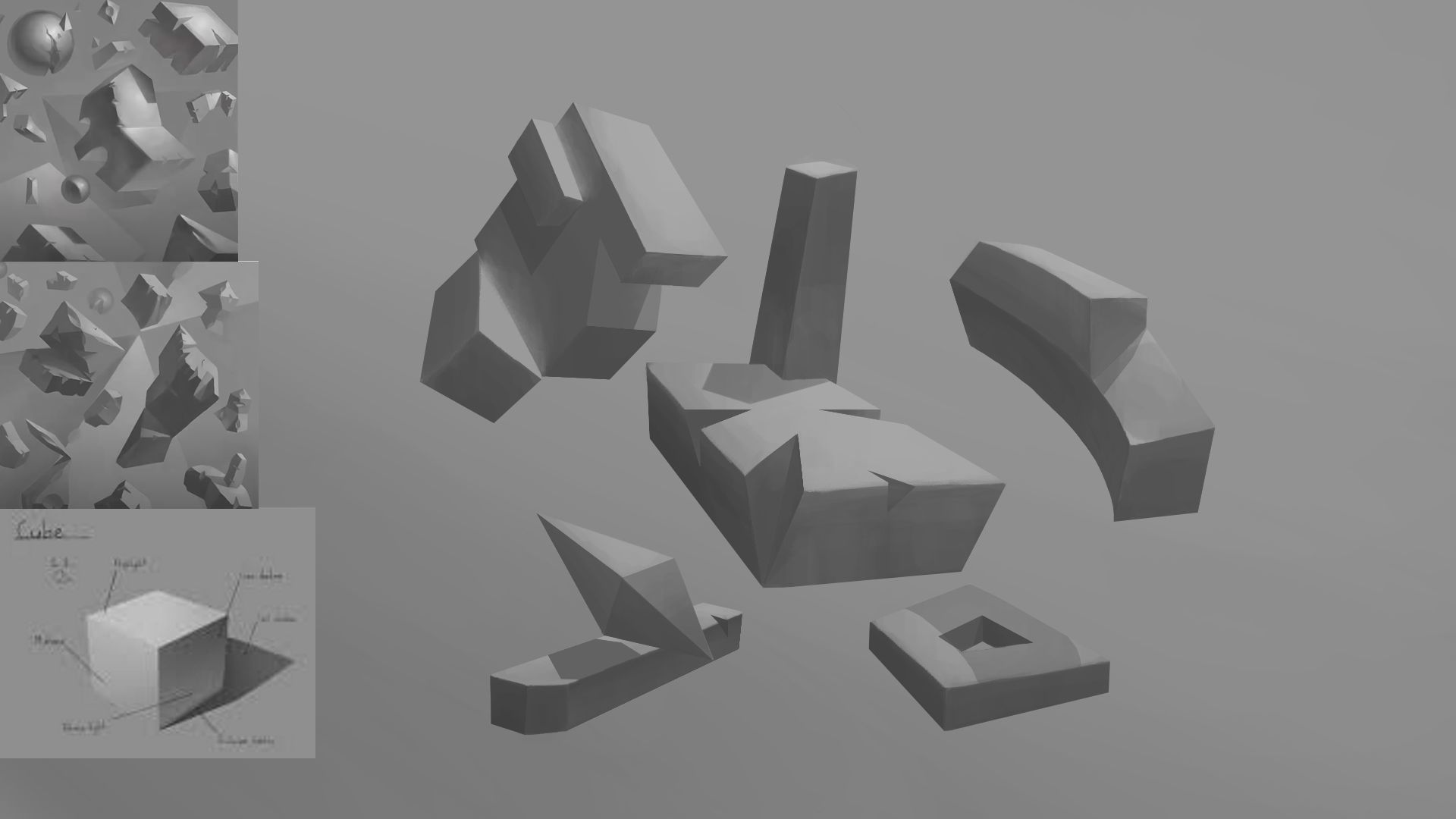
There is another thing I want to hear your all opinions on: as I am going to have a little more time on my hands now, I feel like I want to do some personal stuff as well.
The big thing I've encountered whenever I want to start a little personal project, is that I tend to give up midway because I feel overwhelmed with all the stuff I have to consider and comparing the idea I have in my head with the work I can put down on the page is always super discouraging.
I am not sure how to tackle this, all my art journey up until now has been studies, studies and studies.
How do you guys cope with that? do you just go big, like the things you want to do eventually, embrace that you suck and try to learn as much as you can from it? Or do you try to scale your personal projects so that you can get a little win out of it? and if so, how do you do that...
Sorry for the wall of text Thanks in advance for your thoughts. 

This is super coincidental since i had this thought a few days ago, most of my stuff has just been studies and i have rarely set aside time for any personal work. I've seen several discussions on people just tending to do alot of studying yet rarely do personal projects. There are several things to think about such as; make multiple pieces and cycle between them if you find that you've kind of got tired of one (however then you may not go back to it since you're discouraged), another is your 'eye' growing faster than your hands but the big thing for me is that i needed to just create. 'my purpose for starting art was to create, so even if it is bad and i suck terribly, i need to push forward, step up and cling to the hope that i will one day reach where i want to' is what i said to myself yesterday. I have the same kind of mindset where i'll start a piece then leave it midway through alot of the times since i feel like it's bad and get discouraged. I don't want to extend this out too long so i'll link this: https://www.youtube.com/watch?v=GFHNyGWVYQU
i watched this yesterday and had a little bit of a thought that i should set aside some time for drawing, even if it turned out bad. I hope this helps!
First of all, DAAAAAAAAAAAAMMMMMMN! This is aesthetic. I think the side values for the tall skinny figure could be lighter, but overall everything works so well together. Love it, so much progress here.
The following is hella long, so here's a summary: Keep studying as much as you can, do study challenges but make a theme and infuse some creativity into it. As your studies get more complicated the easier it will be to do illustrations. Each of the videos/topics here are like tools, so if you try to tackle something you might get frustrated because you don't have all the tools yet to finish the job. Also, focus on the research and process rather than the finished product.
tldr;
For your other question I'll give my experience and you can take what you want from it.
One big thing I learned from doing the later terms and the design course from CGMA is: I was being too ambitious and diving in head first to my personal projects. So much thought needs to go into the shape of things, the style that you want everything to be in, which reference material you want to use etc. When I did personal projects in the past I felt discouraged and gave up on a few. When I did finish something I would share it but the feedback was even more discouraging because I was lacking in so many fundamentals.
One thing I noticed was that I got more satisfaction from modifying studies or doing challenges where the focus was practicing something but I added an element to make it fun.
When I did Inktober a few years ago, I decided to practice anatomy so I treated my Inktober drawings as figure studies and made it fun by adding clothes based on the themes.
I finished the challenge and I'm really proud of it, despite not liking every design lol.
Another thing I noticed is that focusing more on the process and research makes me put less emphasis on the art techniques and makes everything more enjoyable. I think I used to worry too much about the textures, anatomy, etc and that crippled my creativity. Before I knew it I got turned off from what I was doing and gave up (ie that 2-d city project I was doing  ) But when I started to be okay with ugly scribbles at the beginning of the process and focused more on how things work and shape language of my ideas it became easier to draw more finished things.
I think it's good to be study and research focused at all times and have fun with it. Once I started studying more advanced topics it was easier to do more advanced images. Now I feel more confident with tackling character art, props, and general illustrations.
One concrete example is the whole "what should I do for the background?" phenomenon that plagues most of us artists. Before, I used to think of a cool character, draw the skeleton, pile on the details, and put some generic gradient in the back or "suggest" a street or room etc.
Now going into my personal project I wrote out characters that I want to focus on and listed characteristics for them. Then I went and gathered photo references for the general feel of each character and the world they live in. After that I looked up art that sums up the general style I want the project to be in. (I promise I'm getting to backgrounds, stay with me  )
)
From this point on, once I get the character sheets down, I will have a ton of information to construct an illustration. I can tell myself "Okay, this character has this personality and would stand like this. They have this kind of role and live in this time period so they'd most likely be in this location." After that it's a matter of making composition thumbnails and bam, I have a full scene instead of a random character with a bokeh background.
On top of that, I'm so hyped from the inspirational references and art I collected that it will be hard for me to abandon it. I'm excited to see how everything turns out.
Sorry this is so long, but I hope it helps you in some way 
Thank you so much, @OpaqueApple for your reply! You wont believe it but I just recently watched this exact video And it is a great video, Astri has such a positive mindset about the topic she talks about and her point are all really good! I'll make sure to watch it again to really get its essence
@LesleyCarol, thank you so much for taking the time to put together such a comprehensive and also entertaining post, it was great to read, so no worries about its length and also thanks for the feedback and compliment about my form studies (thanks to you they turned out so great, as you introduced Istebraks content to me and you always took the time to critique my work). I remember Ethan Becker saying sth similar about turning your studies into original pieces, which was at the time I heard it an interesting idea, but I did not quite understand how to do it. With your post, its a lot clearer to me now.
BIG THANKS to you two!
your 3d shapes are really inspiring in a sense
they look so good that they could count as an artwork themselves. I'm just starting this whole art school thing and doing those shapes is an assignment I try to motivate myself to do right now and seeing your result helps with that!
Thank you for the kind words, Nori! Happy to hear that they look good
It's great that youre somewhat motivated by my studies Wish you the best with your practise!
Here is todays practise. I thought I'd put my new knowledge of forms and value to the test by doing a study of the Asaro head. Doing a proper line art sketch of it plus assigning values took about 4hours 
Though most of the time was spent copying and trying to make sense of the orientation of certain planes (the eye and mouth area gave me the most trouble), it was still fun to draw.
The values are probably not 100% correct, but its a start!
Have a great day, everyone!

This is awesome! I think it's great that you're taking the time to understand challenging concepts. This approach will definitely help you apply that knowledge to future pieces and help you work more quickly in the future! Keep up the great work!
This looks amazing! Your value knowledge is really shining here!
The main things that sticks out to me are the front plane of the forehead and the back of the head. The forehead's front plane is pushed forward too far and a little too curved. The back of the head is too rounded and pulled back a little.
Keep up the awesome work!
Thank you @afoster1138 and @LesleyCarol for your encouraging words and helpfuls feedback!
I did another one today using the already existing lineart and attempting to go for a different light setting. I might add some cast shadows later, but this is the progress so far.
I feel like I understand values in forms with hard edges a lot more now. A big thing I'll have to tackle in the nearer future is radial shading (balls and cylinder)... I think this head's eyeball shows why
Anyways, have a great day, everyone!

these are really good, the asaro head study feels so alive. it makes me excited to get onto light & value but that'll be a good while away , keep up the good work mau.
These are awesome Mau.wamp! Keep it up!
That is a really good exercise! Haven't seen many people do it actually. Getting to know the head planes is probably the number one pitfall for many artists.
You did really good with shading, I can only point out one issue: the plane on the cheekbone facing up should probably be lit the strongest as well as the upward-facing plane above the lips. I presume the light on your source photo is still slightly above the head (judging by forehead and eyelid ligting).
Thank you two @OpaqueApple and @EricjC for your kind words!
And thank you Viktoriya for pointing that mistake out, now that you said it, it's pretty obvious!
I think what Marco Bucci said when he was talking about Asaro head studies was to only use 4 values, and then use more painterly techniques to group faces and do hard/soft edges to do more than just try to copy the value of each plane. Regardless I think your study is sick keep it up