Lady Death Fanart Collectible: Part 7 Cuts and keys

Hello guys, this is the final entry of this process, it’s a long post but maybe you can find some useful information.
Cuts and keys
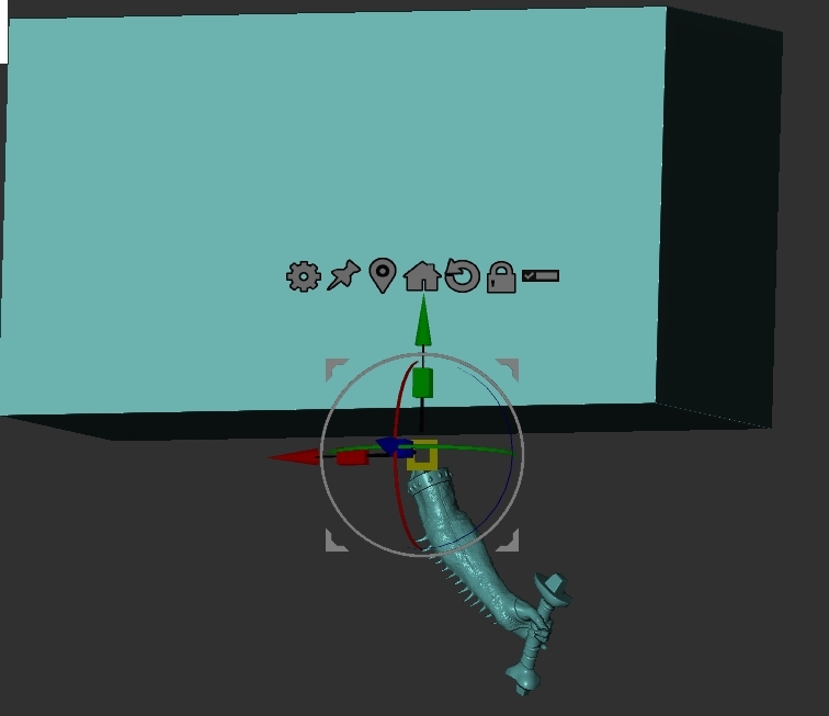
Before explaining my process to create the separated pieces I must say that it’s mandatory to understand how scale works in Zbrush.
For this task I watched some YouTube videos in order to really understand this basic but very important subject. If you have some doubts about this I will advice you to watch the tutorial on YouTube “How Does Zbrush Deal With Units and Scale? (and How to Fix issues You May Have)” posted by Outgang
If you are new to creating sculpts for 3D printing, like me, I can’t recommend you enough to watch the video series Demystifying Post-Production: 3D Printing by Ian Robinson. He’s a Zbrush trainer working at Maxon, this four video series has amazing information about the fundamentals and steps to create a 3D print from a zbrush model.
Important Disclaimer-
At the moment of writting this blog entry I haven’t printed the sculpture so, it’s likely that some pieces could need adjustments in order to print correctly or fit in the place they belong (I wish this won’t happen and everything goes beautifully).
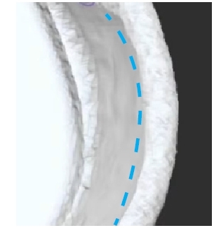
Planning the cuts
The ideal is that the clothes, accesories or props of your character allow you to hide the cuts, this way you won’t have to do much post-processing and the sculpt will have a cleaner look.
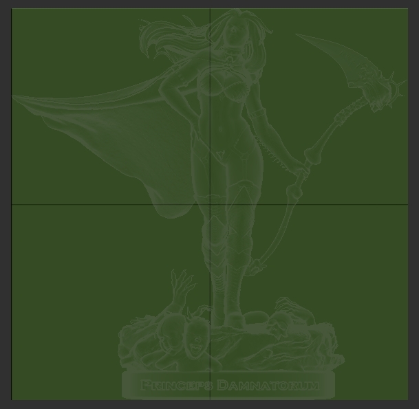
In my case the few clothes she’s wearing helped me with this, the following image shows the division of pieces with a yellow line.
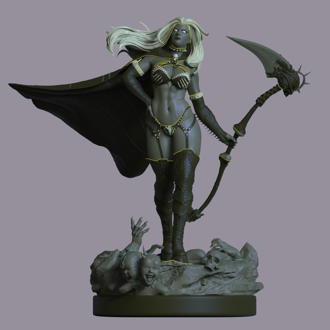
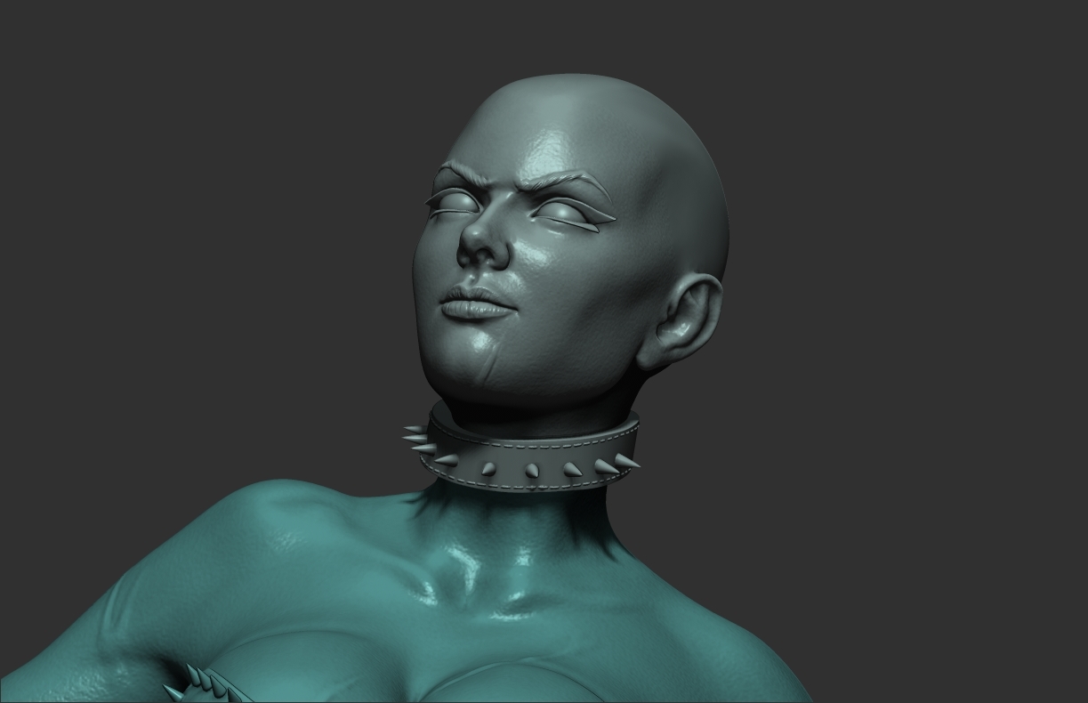
In case you have the chance, it’s important to take advantage of creative freedom with the design. In my original design the choker around the neck wasn’t considered but it allowed me to divide the head from the torso, it’s an element that integrates well with the other accesories and functions to hide the cut.
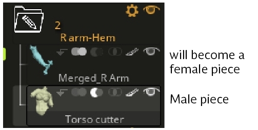
It’s very helpful to use folders in order to group the meshes that will conform each piece of the sculpture. Another simple and useful strategy is to name the subtools in order to easily identify each mesh.
Filling spaces
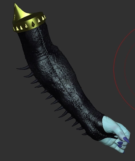
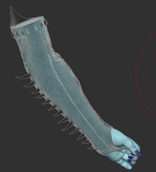
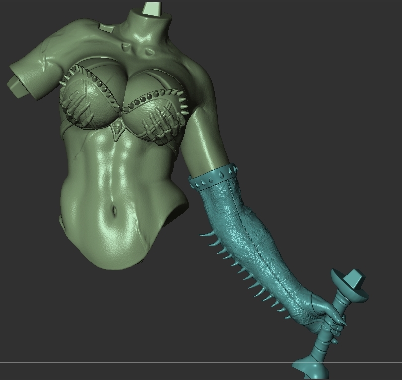
For this subject I’ll use the right arm as an example; I knew that part of the arm and the forearm were going to be covered by the long glove, even though this geometry wouldn’t be visible it was necessary to keep it in order to fill the hollow space of the long sleeve.
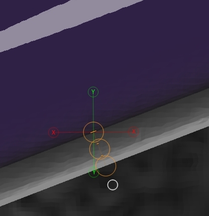
The key has nothing fancy or special it’s just a tappered cube with smooth edges,
this softened edges are important in order to facilitate the connection between the male and female piece,
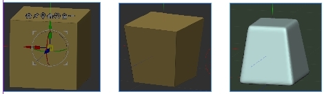
At this point we need to weld using dynamesh, not only merge, the connector to the subtool that will be part of it, the boolean operation to get the female piece will be generated later in the process.
Merging subtools
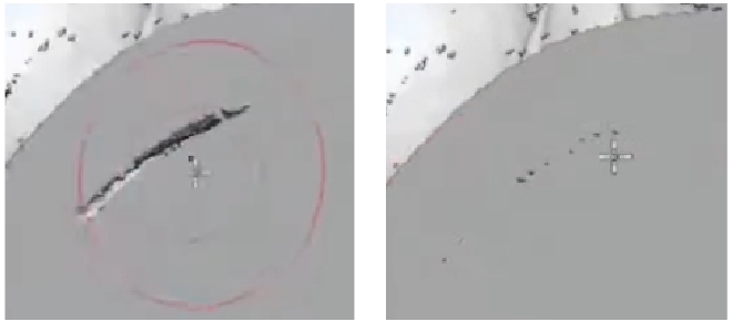
It’s substantial that your mesh doesn’t have any holes or floating polygons, this issues could throw errors with the slicing software, therefore, before merging the subtools contained in the folder as one subtool it’s important to close any gap or space between each other.
With the move brush and using the transparent button, you can push portions of the mesh in order to facilitate not only conntact between them, but a penetration.
This ensures that the polygons that penetrate the geometry will be erased and the piece will be solid, any existing holes will be eliminated.
On the left there are two gaps between the two meshes, on the right the gaps have been eliminated.
Once there are no spaces, the process was something like:
1-Apply Merge folder to join all subtools just in one. Apparently the pieces have been united but this is not true, they are only merged but not weld, for that you can use Dynamesh or Remesh by union. This workflow uses the Dynamesh approach; it was the one I learnt from Ian Robinson, in his videos he mentions that sometimes Remesh by union can generate problems.
2-Open Dynamesh/elimante blur/turn off groups and with the picker button slide the pointer along all surfaces in order to have a better number of the resolution needed for the dynamesh.
3-To the highest number given by the picker add aproximately 300
4-On the history bar CTRL+click on the latest step, this function saves the level of detail at that history point.
5-Hit Dynamesh, if the resulting subtool has lost detail and quality you must return to step 2 and increase the resolution for the dynamesh.
In my case for almost every piece it was necessary to increase the scale by 200% or 300% in order to keep details, remember Dynamesh it’s a process scale dependent.
It’s adviceable to have a balance between the level of detail and the number of points in the subtool, you don’t want trillions of polygons on each one.
6-You can use the Project history function (inside the project menu) to tell Zbrush to recall the history step that you saved on step 4, this will help to recover some details.
Note: Always remember that Dynamesh can wipeout about 5% or 10% of the details and project history may not be able to recover that. In some cases I had to sculpt again some details that were important for me to keep, the DamStandard brush or some alphas could be helpful depending on the details.
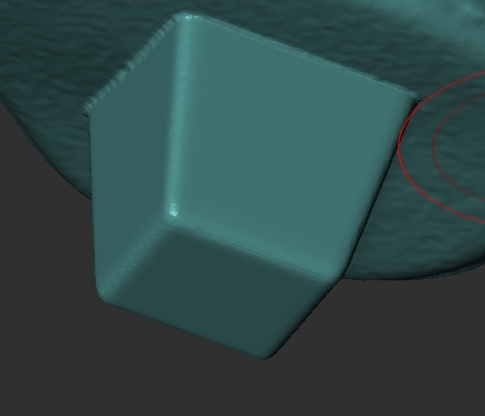
Fixing holes
To make sure the resulting subtool has no holes:
1-Create a cube big enough that covers the subtool
2-Create a new folder with the subtool to be cheked and the cube below it
3-Turn on the arrow in the boolean menu of the subtool to be checked
4-Select subtract mode in the boolean menu of the cube
5-Position the cube over the subtool and move its pivot below it
6-Slowly move the cube in order that covers the subtool. With the subtract boolean it gives the impression that the cube is slicing the piece, just as the real slicer software. The goal is to locate holes inside the geometry and fix them
If you find areas that need to be adjusted
7-Select Move brush/turn on Backface mask (Brush/Automasking menu) and move the inner walls of the meshes in order to create a penetration
8-Dynamesh again, this welds both meshes and closes the hole
On the left mesh with inner hole. On the right the hole has disappeared.
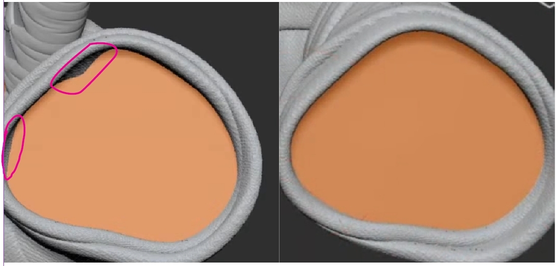
IMPORTANT NOTE: Be careful with the move brush and adjustments you make, if you are not careful enough you can modify the outer forms (visible areas of the piece) and afect the original design.
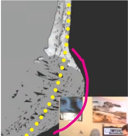
The pink line represents a deformation
Floating Geometry Check
Sometimes booleans and dynamesh can leave some floating polygons that will cause errors with the slicing softwares, to check if this si happening and fix it:
1-Select the subtool you want to check/turn on solo/turn on Polyframe (you can hide the polygon edges by clicking on line)
2-Go to Polygroups/Auto group
3-Select the Rectangle Select brush and CTRL+Shift click on the subtool (this isolates the polygroup of the subtool from other polygroups)
4-CTRL+Shift drag on the canvas to invert the selection
If your subtool didn’t dissapear, congrats you don’t have floating polygons, if it did go to step 5
5- Invert again the selection by CTRL+Shift drag on the canvas (this turns on visibility on the main subtool you’re checking)
6-Go to Modify topology/Delete hidden, and the floating polygons have been erased.
After this I used the Check mesh Integrity/Fix mesh operations that are located in the Geometry tab, then I rescaled the subtool to its original size with the Size parameter
Checking scale
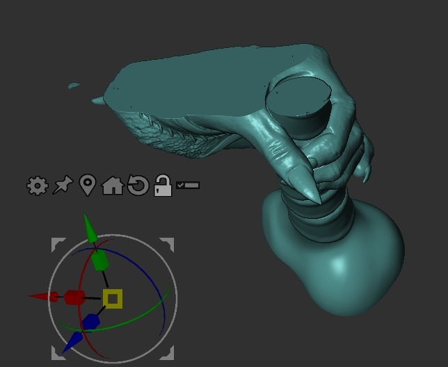
I used the scale master plugin with a bounding box previously generated to check the real physical size of each piece.
I want to take the opportunity to complain about the scaling and measurement system inside zbrush, I understand that this is the way it was programmed but I find it super unintuitive, other software has a more understandable manner to deal with units, scale and measurements.
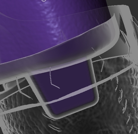
Making the key cut (female parts)
Before creating the female piece by using booleans, it’s very important to add all the necessary male connectors to the male piece and be sure these won’t be modified or moved.
I’ll use the torso and the right arm as male and female pieces respectively, the process is something like this:
1-First I duplicated the male part that will provoke the key cut (torso), then create a folder
Note: It’s very important to duplicate and not to use the original male piece
2-Rename this duplicate with the sufix cutter “Torso cutter”
3-The subtool that will have the key cut (right arm) must go over the male piece
4-Turn on subtract boolean in the male piece/Turn on the live boolean button
5- Apply the inflate function to the male piece in order to create a physical gap between the key and the female piece.
This is a crucial step in order to have a size tolerance that will ensure that the male piece will enter into the female, take into consideration that this gap will be filled with glue in the printed piece.
6- If the boolean operation created “walls” it’s important that these have a measurement of 1mm as minimum. If this walls are thinner use the Move brush (backface mask turned off) to pull out the mesh in order to increase their thickness, be careful not affect in a destructive way the original design.
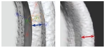
On the left the wall thickness is less than 1mm, on the right it has been increased to 1mm
7-In the folder containing male and female pieces, push the gear button and select Boolean folder. This will generate a merged version of both subtools with the boolean cut applied. It’s necessary to measure the gap distance between the male and the female.
8- Select the new subtool with the boolean cut, go to Display properties/**Flip**
9-Turn on visibility of the original piece, not the duplicate in the folder, I mean the male that will connect to it and turn on Transparent button
10-With the transpose line measure the gap. I followed the advice of Ian Robinson to have something between .2 and .3 mm of gap
If you’re happy with the gap distance select again the female piece, go to Display properties/Flip, this will return the normals back to the original orientation.
In case you are not happy with the separations on the pieces:
1-Erase the merged subtool with the boolean cut, it has the prefix Umesh if you didn’t change it
2-Select the male subtool and undo the inflate
3-Inflate again with a numeric value that can give you the desired separation
4-Adjust the walls created by the boolean operation if they measure less than 1mm
5-Repeat steps 7 to 10
In order to find the ideal inflate value I had to do several tests and repeat this steps, my inflate value was 1.75 and the resulting separation was around .27 and .28 mm, which is perfectly acceptable as physical tolerance. It’s a good practice to write and have a record of the inflate value and the gap that it provokes, this way the guessing work is less chaotic.
Refining the female piece
After getting the female piece it’s necessary to make some adjustments before calling the piece finished.
Most of the time the boolean substract operation will produce very hard edges on the cut surface, this can lead to difficulties at the moment of connecting the printed pieces.
1-To fix this just grab de TrimDynamic brush and turn on Sculptris to soften those razor sharp edges
The blue line represents a very hard edge that needs to be softened
2-Open Dynamesh/elimante blur/turn off groups and with the picker button slide the pointer along all surfaces in order to have a better number of the resolution needed for the dynamesh.
3-To the highest number given by the picker add aproximately 300
4-On the history bar CTRL+click on the latest step, this function saves the level of detail at that history point.
5-Hit Dynamesh, if the resulting subtool has lost detail and quality you must return to step 2 and increase the resolution for the dynamesh.
6-If the lost level of detail is not considerable you can use the Project history function (inside the project menu) to tell Zbrush to recall the history step that you saved on step 4, this will help to recover some details.
7-Execute the Floating geometry Check described some paragraphs above
8- Use the Check mesh Integrity/Fix mesh operations to be sure your geometry doesn’t have problems with the topology.
9-You can check if your piece is watertight, go to transform menu/Analyze mesh/and select the right scale at mm
If Zbrush says it’s NOT watertight don’t panic, leave the piece like that. Fortunately most of the slicers (Chitubox,Lychee,etc) have processes to fix simple errors.
10-Rename your female piece with a clear name to easily identify it
Decimating
In order to import the mesh into the slicer and work on it without problems it’s mandatory to reduce the polygon count. It’s adviceable to export each piece with a maximum count of 700K points
1-Open the plugin Decimation master
To have better results with this process avoid reducing the polygon from the highest value to the lowest, it’s better to work with intermediate steps; for example if your piece has 3.5 Million points don’t decimate to 350 K with one pass, you can reduce it by 50% resulting on 1.75 M points.
2-In the preset area write 500k and click custom
3-Finally write 350k or the value you consider correct and click custom again
This way Zbrush has a better way to organize the topology and process bit by bit.
Tip: If you worry about loosing detail on a certain area, you can mask it and then decimate, the process will avoid touching the protected area.
I repeated all this steps for every separated piece to obtain the final female pieces.
STL export
This can be easily done by using the zplugin 3D print hub
1-Select the subtool that you want to export
2-Click Update Size Ratios and select the right measurements in mm
IMPORTANT NOTE: If you need to export several subtools do not select another one different from the first you selected. Changing the selection will create scaling issues.
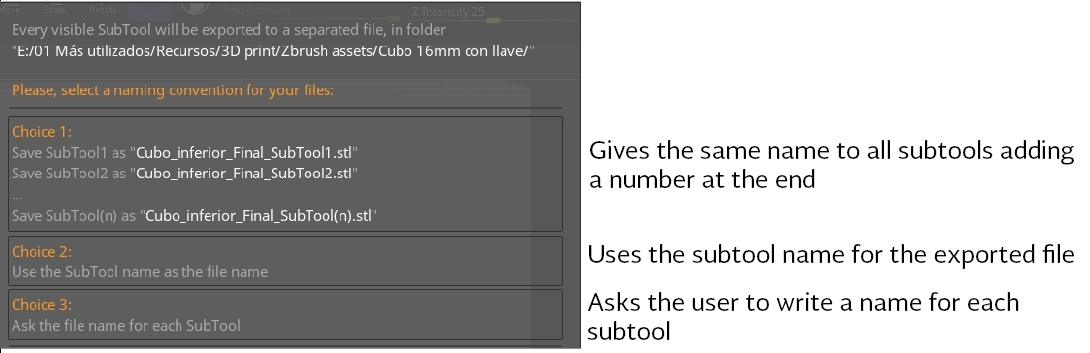
3-Go to Export options/Visible (it will export only visible subtools) or Selected (to only export the selected subtool).
4-Export STL and define the file location. If you selected visible in step 3, a window will prompt with the naming options for the exported pieces.
I followed these steps for all separated pieces and obviously this presented lots of challenges to me, remember it’s my first sculpt for 3D printing. Naturally I had to rework some areas because I didn’t know the rules and characteristics for a piece to be 3D printed.
As I mentioned at the beginning, the pieces haven’t been printed so I don’t know if I had success with this sculpt, only facing the demon of 3D printing I’ll know if more adjustments need to be made.
Final Thoughts
This blog entry closes the adventure I had with the creation of this fan art. Along the process I’ve learnt lots of things to consider for my next pieces.
First walk, then run
To be honest I didn’t think this piece would be so complex to finish, maybe I forgot it was my first attempt to sculpt a semirealistic female figure and prepare it for 3D printing.
I think it’s important to learn and acquire new skills bit by bit and focus on a main aspect, for example: human anatomy, sculpting hair, hard surface or whatever. With this piece I faced lots of challenges and difficulties for the first time and in some point of the process I felt overwhelmed, sometimes my inner voice said “maybe it’s time to quit and start an easier sculpt”, fortunately I didn’t hear it.
It’s okey to put yourself in front of challenges but be careful not to overexert your capabilities and skills, this could lead to frustration and quiting the project.
Even though I haven’t printed the piece I’m very proud and happy with the final result, obviously is not perfect but it’s a great first step.
I’ll be posting the final renders as soon as possible, feel free to comment and critique.
Thanks for sharing this journey with me and see ya’ in my next quest.
May Zbrush be with you.


