• Gave myself 5 days to do something. This is what I managed to do. I'm trying to get better at illustrations, but I have patience to work on something for 3 days maximum :( Splash_Process.jpg5000x3140 2.21 MB Splash_Process-6.jpg3896x2429 2.83 MB concept list char copy.jpg5388x3000 1.7 MB
    20.6k
  • Did a character concept for a course.https://www.artstation.com/artwork/P6gm3y - more:) list1.jpg3541x1920 2.82 MB
    20.6k
  • Day 4: Star Wars May The 4th =] Queen Padmé Amidala in my art style! First time drawing her and I really enjoyed making this one! Used watercolours, ink pen, acrylic markers and gold paint for accents on my Canson mix media sketchbook. I hope you like it!
    81.4k
  • A creature design from a while back
    by
    6.6k
  • Here is some more recent stuff, I need to make more body studies
  • It's been a while and god, it is so cringe to go through all previous messages xDmy study.
    20.6k
  • Thank you! I finally cleaned that up. Meanwhile started 3 more ..I have a habit of taking too long to finish a piece, then I lose interest in it and just start something else. I found 8 from recently i started and abandoned, that are decent enough to not delete, but not finished. There’s also been a number of drawings I felt I “outgrew” - became better before I finished them, and it would be easier to start from scratch than fix them. Anyone else thinking that?
  • Lady Death Fanart Collectible: Part 6 Polypaint and base Hi, it’s time to share with you another part of the process to create this fanart piece. Polypaint As this is my first collectible fanart I didn’t have previous experience with polypaint so I tried my best and played a bit with it.I wanted to give a ghostly and eerie look to Lady Death, she is beautiful and deadly, but at the end of the day she is a woman that died and was reborn at hell as an avenging spirit, that’s why I gave her skin tone a bluish very cold tone.As you will see I gave myself some creative freedom to deviate from the traditional color scheme that this characater has in comics and illustrations.To add a bit of sensuality by painting some freckles on the face and the chest. The dark nature of this character was the perfect excuse to gave her a kind of goth make up, very dark shadows around the eyes, blue lips and fingernails. I know that the original character includes sexy red lips but I wanted this girl to have a sexy but at the same time creepy look, that’s why we can see some thin veins emanating from her eyes. The biggest chromatic change I did for this character is at the hair. Lady Death has a characteristic white weavy hair but in my fanart I decided to gave her a very saturated blue color.The reason behind this wasn’t only an aesthetic choice. I want that the face area strongly pulls the attention of the viewer so this area needed a stronger contrast. Another reason is that I want her to have a more modern look, as I mentioned before, I’m strongly attracted to women with goth/punk look. I gave myself half an hour or more to analyse the work of experienced sculptors that create collectibles and I discovered that the use of darker values on the skin is often applied to create a greater sense of volume and three-dimensionality. I found that areas with heavy ambient occlusion are the perfect places to paint with darker colors in order to increase the separation between different forms. Even though she has a bluish skin tone, I used a bit of warmer hues in areas that, in real life, tend to go towards red and pink, this is very obvious in the nose, cheeks, and knuckles. Thinking with a logical mind it’s completely absurd to have warmer tones on the body of a zombie like creature but I didn’t want to limit myself by using only blue tones, it looks boring and artificial. In real life these colors are created by blood vessels in areas where the skin is very thin. ** Scythe **for her weapon I applied a cool gray with some warmer variations, this color scheme is influenced by the work of H.R giger. Base I’d like to talk about the design for the base which, to be honest, I forgot to develop along with the character.My main idea with the base is to show that Lady Death inhabits a very sterile and arid land, at the end of the day she is at hell.You can see a that she walks over dirt and rocks, a sign that she’s surrounded by death and loneliness. As part of the landscape we can see some bones and skulls to reinforce the idea of lack of living creatures, yet we can see three hands that try to reach her legs.This hands represent that all creatures are subordinated to her power and seek an evil blessing with a simple touch of the princess of the damned.1- The hand with skin burns represents the souls of those who are newcomers to hell, tortured souls that suffer for the sins comitted on earth.2- The hand with greenish rotten skin and pustules is the reminder of the decay that has infected the souls of those who have been trapped and have forgotten their humanity3- Last but not least, the hand of a demon shows that even dark creatures and entities bow before her presence. The cherry on the top, at least in my vision, are the simese twins that emerge from the ground, this malevolent creatures remind us that in hell there’s only perversion and any trace of innocence is lost. Thanks for reading till this pointI’m really happy to be very close to finish this creative journey, last but not least it’s mandatory to talk about splitting the sculpture in several pieces to be printed, this will be my last entry before showing the final rendered images. See yaMay Zbrush be with you
    1.4k
  • memory 2min gartic phone, used ref 2m gartic, used ref for pose 2min gartic 2min gartic 2min gartic 2min gartic memory memory memory memory study memory memory memorymemory memory memory memory memory memory study memorystudy study stylized left memory, right study study memory memorymemory memory memory memorymemory memory, porportions r offmemory memorystudystudy memorymemorymemory memory memory memory memory memory memory memory, right leg is a bit broken The feeling of only getting 1 - 3 likes on a social media post will never not be discouraging. But nothing is discouraging enough to make me quit drawing. I think the strategy of drawing a lot of stuff and waiting a while to post is good though rather than posting it immediately and then feeling that sadness on the next set of drawing
  • Urban Dragon Girl Wip Urban Dragon Girl_wip1.jpg5000x5000 1.11 MB
  • Long time no see! New artworks produced lately
    6.5k
  • studies studies juri study imagination, how I feel before a speech imagination imagination study something I drew for my presentation also drew this for my presentation, didn't fix the one hand being bigger than the other imagination + study study studies study study, I need to fix the face a bit based on screenshot from anime but in my style study. except for the eye study studies studies study. changed some things tho imagination imagination imagination study studies, except top right samurai based on anime screenshot wolverine studies, changed some of the poses a lil, not very good at all, but first time i drew the character ever. semi study studies study imagination imagination imagination , for first time ever i tried to draw over 3d model for middle pose, I dont like the result tbh, but it makes it much easier than coming up with it from memory.imagination, except right figurestudies imagination + studies, coming up with action poses r hard, these are not dynamic enough, I will redraw better ones in future. imagination , imagination imagination study, except for eye imagination imagination imagination doodles except for the two chrollos imagination storyboard thumbnail, idk if i ever shared this. my storyboards end up being a little detailed since i usually just draw in one layer.
    by
    22.0k
  • Quick fun sketch. CyberFish.jpg2394x3857 674 KB
  • Neon Gambit This is a fan art of my all time favorite character Gambit from the X-Men.I made this a birthday gift (26.04.2024) to myself and honestly I really do like how it turned out in the end =] I hope you like it as well =]
    81.4k
  • Art Blog - April to September 2023 Suffer a little burn out. Look at some memes. Here's some art from in between. critique.jpg1333x5736 1.77 MB
    20.3k
  • And some more! Been painting over them a bit more this time. Some variants I tried for the old guy using mainly the liquify tool. Someohow looking a bit like Owen Wilson (not intended :D)
  • Cafe sketch/color study
  • Hello! My name is Vithor, I am from Brazil, studied Design at a local college worked as an illustrator for more than 10 years. I took a time off around 3 years ago and am trying to get back in my art shape and maybe become professional again. Here are some recent pictures: You can find timelapses for most of them on my instagram: www.instagram.com Vithor Albertim (@vithor_albertim) • Instagram photos and videos 123 Followers, 638 Following, 19 Posts - See Instagram photos and videos from Vithor Albertim (@vithor_albertim) Comments and critiques are always welcome.Cheers!
  • @patrycja.lerch Thank you I created another variant, which might capture the witch look I was going for better
  • Thank you @daceronine! If I remember I save in google cloud, I will have to stick a note to do it more often. Lamp is from life. Poses are from refs but I look at refs for a while and then try to do it myself and look it up if needed. Outfits and rest is from imagination Something went wrong while installing system so we will have to wipe everything again... pc works but something is wrong. We will wait till internet is done and I will save everything on cloud this time Threads came out in eu. It's been 3 days and I had more engagement than after half a year on instagram. It feels really nice I hope it stays this way A portrait of old dude. It's the same character I posted a while ago. Inspired by Bayard Wu work. At first I thought of him as a bear but I named him Fenrir and I think wolf suits him better. Eye gave me a bit of hard time but I think it is fine now. I focused on face and forgot about area below. The way I draw hair clashes with greying hair. I had the same problem while doing Lohse's white hair. Does it looks like it is greying here? I love how desaturated red looks blue there. I keep lying to myself that I will use different color scheme but It all comes down to this blue and yellowish one it is just flipped this time Have a great day!
  • Been bad about posting updates on the forum. I figure I should just throw down stuff. instead of waiting until I finish something.
    14.5k
  • Havent done much this year since I am focusing on learning programming and deving my own Indie Game . But here 's a New Year Piece 2024 , she 's the mascot for my Game Studio - Lucid Realm : Lucid Chan ! LucidChan_v001_sketches.jpg3072x4352 973 KB
  • IMG_0637.jpeg3240x4050 1.6 MB
  • Long Crested Eagle studyI had so much fun making this one and honestly I love that Eagle! It looks so cool! Used for this one high quality watercolours, high quality watercolour sketchbook/ cold press and it was 300 grams paper.I hope you like it!
    81.4k

Hello everyone, wanted to start a thread here to document my progress in creating 3D game assets. I'll start with my most recent asset. I created it for a contest over at Sketchfab. The challenge was to create a battle axe.

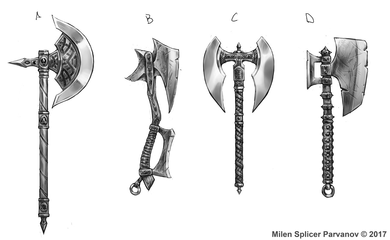
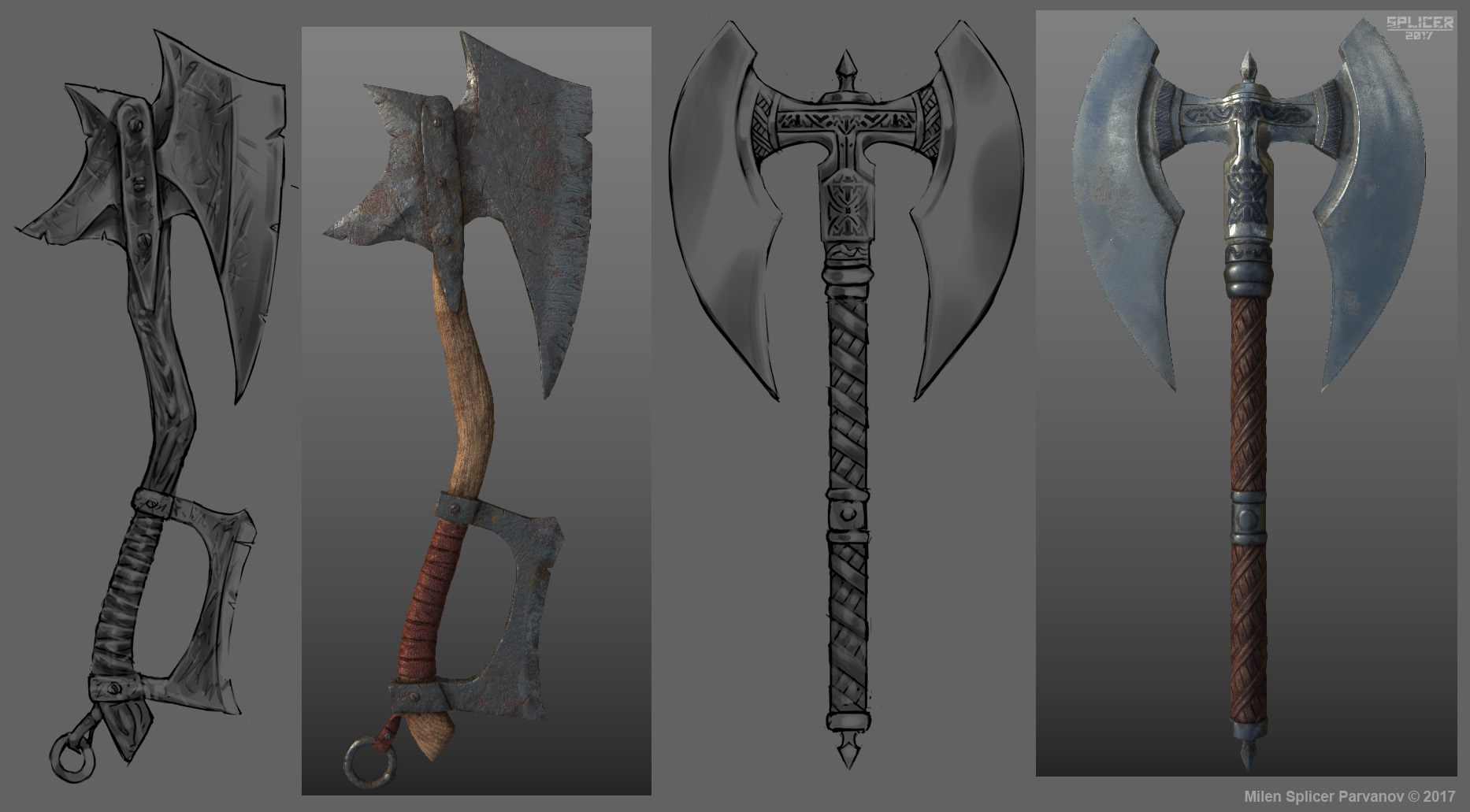
I started by drawing a few concepts.

I asked some friends which one would be best to model for the contest and C was the one.

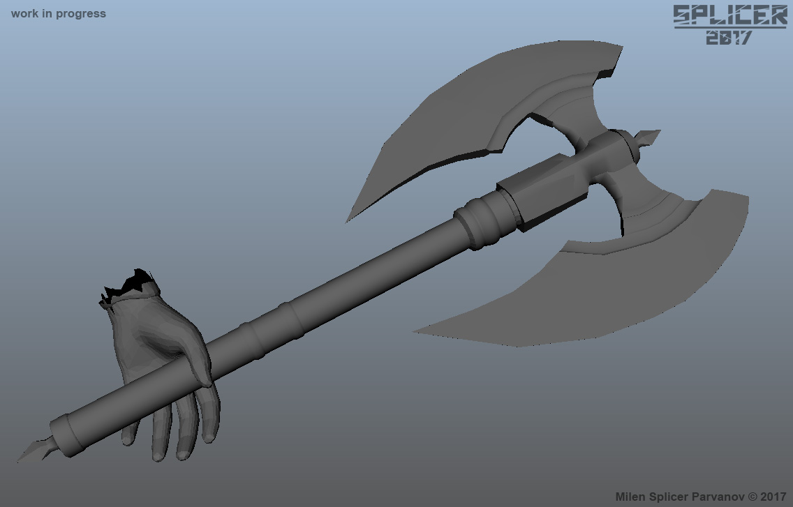
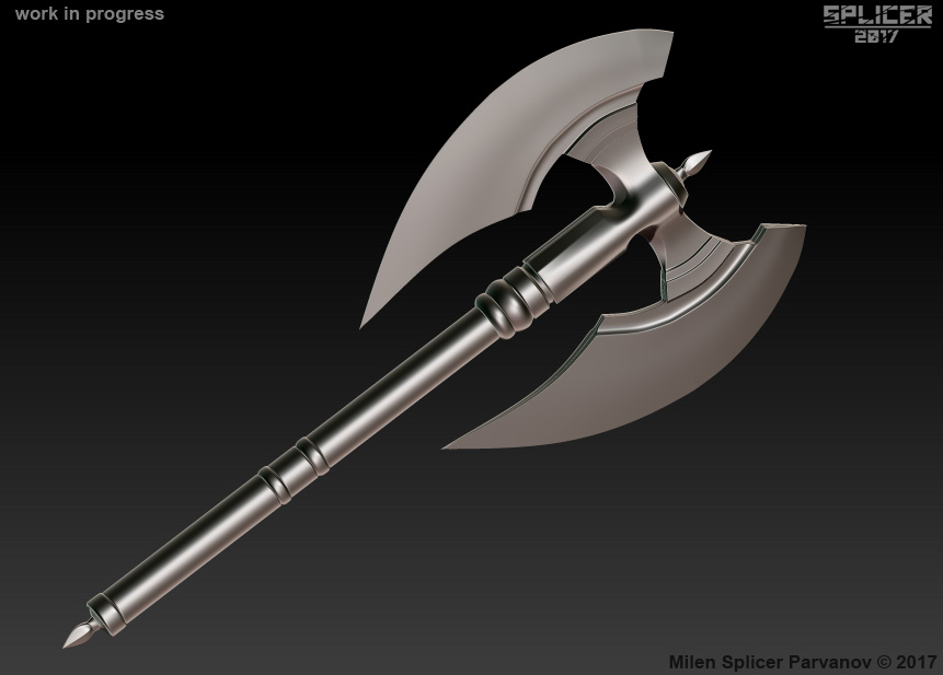
I then started by blocking out the base shape in Maya.

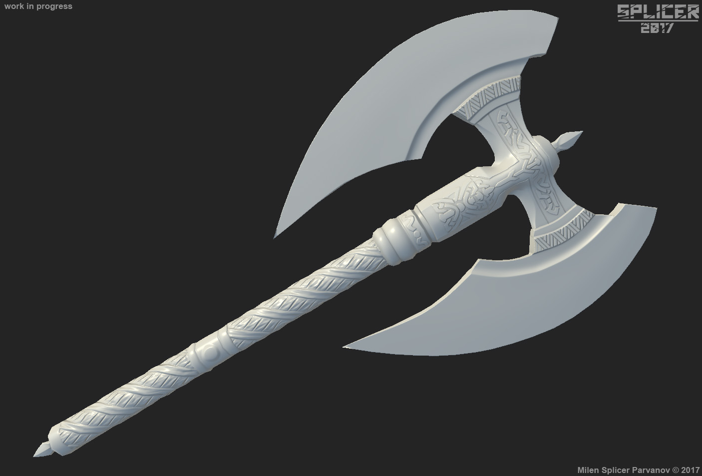
I then took that and turned it into a initial high poly and into Zbrush for detailing.

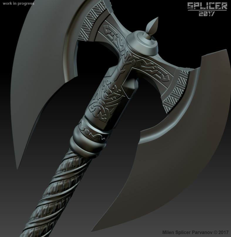
Here it is fully detailed and finished high poly sculpt.

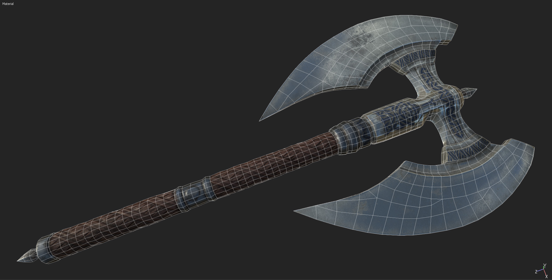
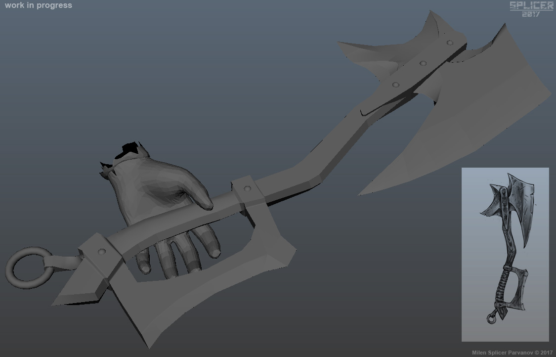
Then it was onto retopology. I use 3D coat for this. Here is the final topology.

After that UVs, which were done in 3D coat and Maya.

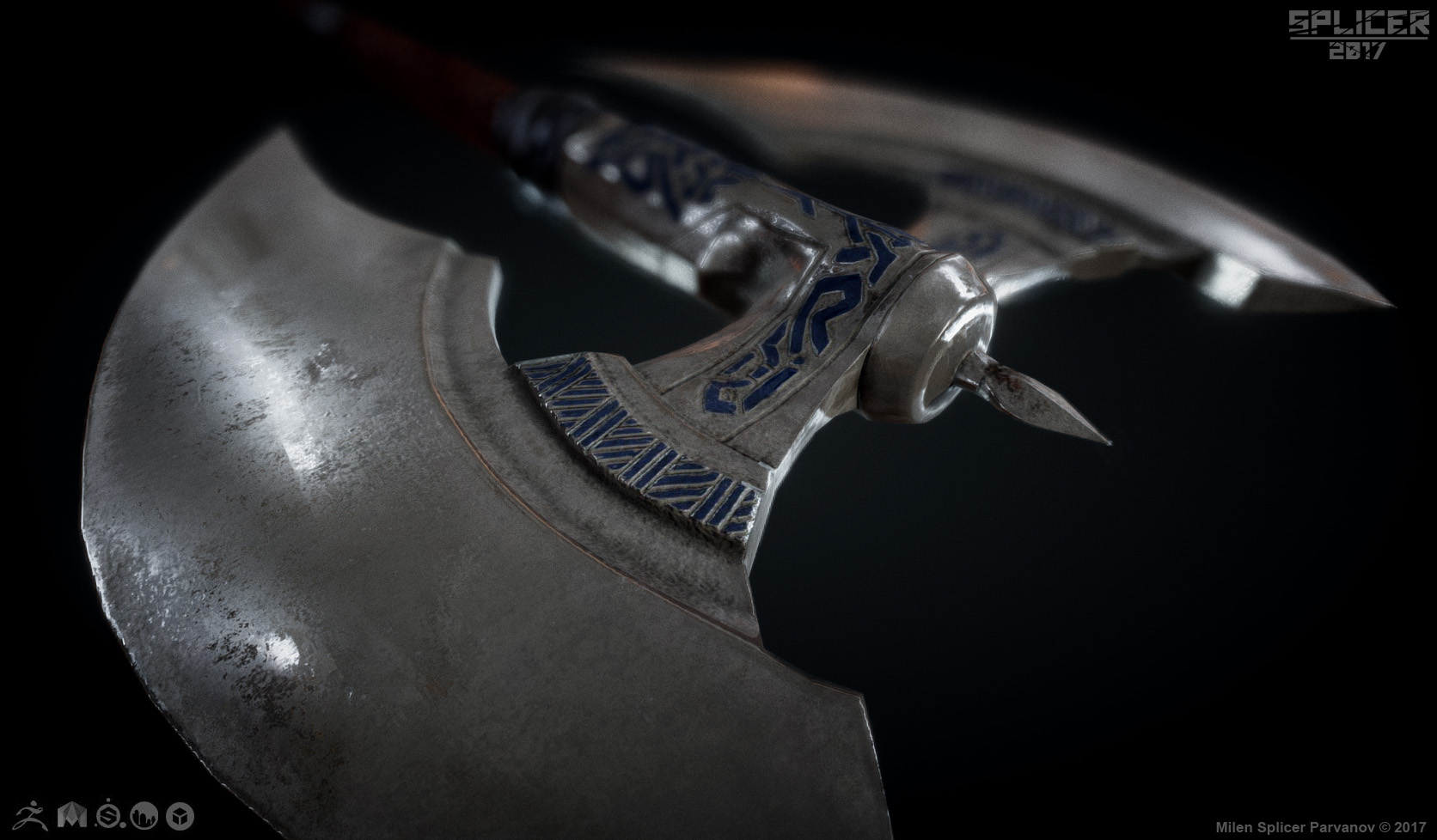
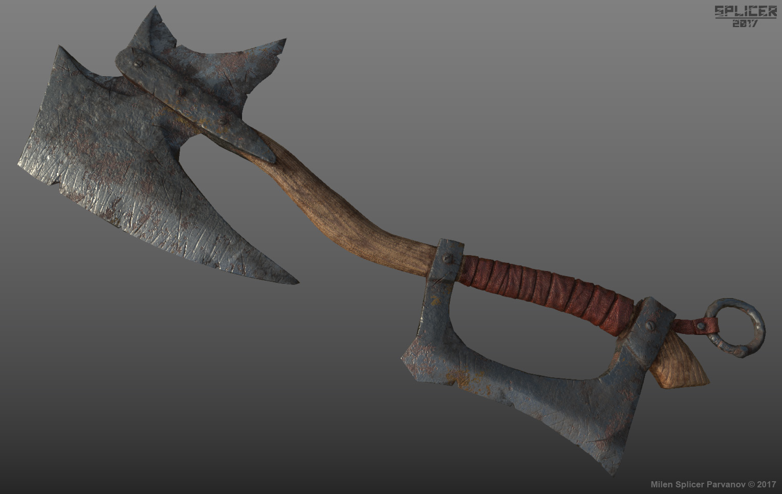
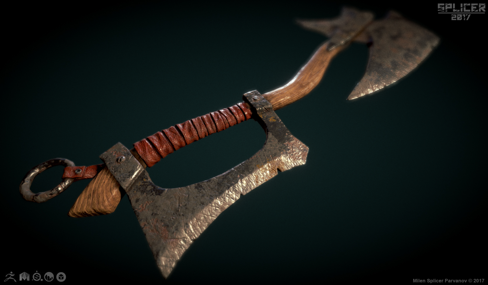
And last into Substance Painter where I do my bakes and texturing.


And link to the Sketchfab viewer.

Thanks for looking. Love to hear your thoughts and opinions.

This is really cool. I love the little details on the axe handle. The textures are good in my opinion. If I could recommend something it would be to add scratches and cuts to the bladed areas. These things made the other concepts with them standout more. The wear and tear added to the story of the weapon. In the texture version it shows it's been used somewhat so a few battle scars would be nice to have as well. Over this is tell a solid job. I look forward to more work in the future.

Thank you for the compliments and feedback Malcom, I see what you mean about adding the scratches and damage to tell a story. I will apply it to my next one.

I am already working on it, here is the final low poly and initial high poly which I'll detail. This one is more of a barbaric style, crudely made with low end materials.

Will be making the other 2 once this one is finished. Trying to get my work flow down!

Updating to show my finished high poly. @malcom how are the details? Maybe I went a little over board, never gone this dense on the mesh resolution. The wood I didn't want to overdo as I found a nice Substance Material I already tested which will work, and don't want the wood grain to conflict. I'm anxious to finish this. Looking forward to getting more feedback from you.

In my opinion I think it might be a bit overboard as well. It feels "fack" in a way. I like the little chips on the outside of the blade and the thing that holds it together. I think you should keep that. The inside cuts are a bit much. Other than that, this is looking good. I feel you lost the transitions for the top part of the axe blade. The bladed part on the holding area looks nice. Try to get the same look on the top blades. Lessen the scratch details on the blade and I think you'll be good to go. Some blades can have a lot of scraches but usually they have a bit of rust and age look to them, but I don't believe thats what your going for. Again keep up the good work. I like where this is going. I look forward to the textured version.

edit: I think you just need to spreed the scrach details in a good ration. Think of the 70/30 rule. Have 30% be detail and the rest pretty clean. This way it looks used but not overly used. Hope this feedback helps.

Malcom thanks for the feedback. I see all the points you've made, all makes sense. On the transition of the top blade, I'm thinking maybe try some primitive looking welds between the blades and how they attach to the center piece. Or maybe like the bottom, make it look like it's cast out of one piece and hammered into shape. Also I think there needs to be some gap and definition where the wood sticks into the metal piece on the top blade. I'll redo the scratches to create the balance you're talking about. And for the rust, I'm going to add that in when I texture in substance, the micro detail is for the normal map anyway, and substance does a great job creating that and having it match with the metalness and rough maps.

That looks pretty good. Ok I see where your going with this now. Look forward to more updates

8 days later

Thanks Malcom! I'll be finished within the week and I'll post!

12 days later

Some progress update. Retopology finished, as well as UVs.

Bakes are done, have a little cleaning to do on them, then onto the texture.

Here is the high poly baked onto the low poly as well as topology.

This is looking really good. Keep up the good work.

Thanks Malcom, good to hear you like it! And I will, starting on the next one today.

Here's another project I'm working on. My Artwar Character which I was originally going to enter in both the 2D and 3D portion of the challenge but didn't have enough time to finish the 3D one. Haven't been working on it lately but that's going to change. Here's where I'm at.

The 2D design.

And some 3D wip.
Working on suit and armor blocking.

Creating initial low poly block out to then turn into high poly.

I'm going to try and do her suit in Marvelous Designer, which I started learning a few months ago, the biggest reason this is taking so long. Also the hair will be a challenge as I've never done real time hair with alpha cards, been studying and learning how to do it. Really looking forward to getting feed back on this as I progress with it and show updates.

5 months later

Has been some time since I posed here.

This is my latest finished 3D piece.

Marmoset Viewer

This was done for the Beyond Human challenge on Artstation. A link to my thread is here.
https://www.artstation.com/contests/beyond-human/challenges/24/submissions/20899

I made a lot of changes to the final version, removing the pose as I did it in transpose and rushed to finish in time for the deadline, so certain areas were off. Decided to release just the t pose and move onto my next project.

Looking forward to getting some feedback on this one to apply to my next one, here:

8 months later

I want to make update on this thread. First this is part of the other set of axes and the definition for each step. First I create low poly based off my 2D concepts. I use primitives when I can here and extrude out a flat plane for more irregular shapes. This gets turned into the high poly sculpt which I make entirely in Zbrush. Low poly retop, bakes, then finally texture, my software is...

Maya, Zbrush, 3D Coat, Substance Painter, Sketchfab.

https://www.artstation.com/splicer

Suggested Topics

Want to read more? Browse other topics in Art Blogs or view latest topics.